Have you ever wondered what makes up a great design?
Alina WheelerDesign is intelligence made visible.
Creating a beautiful and effective design is more than just inspiration or a great idea. It is about understanding the fundamentals of the subject. Design elements are the basic building blocks in visual design, and they support designers in constructing and developing their works of art or design pieces.
Gaining an understanding of when, why, and how to use the design elements below will greatly improve the effectiveness of your design solutions.
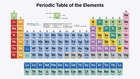
The Periodic Table of the Elements isn't just an elegant information design. It's also a good analogy for design in general. In the same way that elements make up our physical world, the elements covered in this topic help artists develop countless new worlds.

To get us started in the vast topic of design, we'll look to Wassily Kandinsky for inspiration.
Documenta-BauhausThe artist and Bauhaus teacher Wassily Kandinsky, who was prominently represented in the early documenta exhibitions, is regarded as the founder of these color-shape associations, which he tested with his students. Today, the yellow triangle, the blue circle, and the red square are unmistakably connected to the Bauhaus.
Take some time with the following two links — as they offer an interesting and engaging look into shape, colour, and form:
The second design element is shape.
All objects are composed of shapes, and all elements of design are shapes in some way. Using the element of shape is important as it is used to add interest and substance to a piece of graphic work.
They can be used to decorate, create patterns, textures and provide symbolic meaning.
Whether your design is simple or complex, the relationship between shapes can trigger feelings, convey messages, engage an audience and create movement.
Shapes can be used to create two-dimensional pieces through both organic and geometric shapes.
Geometric shapes can be drawn using a ruler, compass or digital instrument. They feel very precise, like an architectural rendering.
Organic shapes are found in nature or drawn by hand. They are the opposite of geometric and often feel natural or smooth. The utilisation of both embeds creativity and creates form within your design.
Shapes can be seen in logos, layouts, packaging and illustrations.
Reflective question: Can you think of a logo that has resonated with you or powerfully conveyed its message?
Below are some examples of very good illustrations of shapes in logo designs.

Colour is also an important element to consider when creating your design. Colour can help the organisation of a design and give emphasis to specific areas or actions.
It has the ability to connect people to objects, images and scenes, as well as ignite emotions.
- Red is typically seen as a colour of passion, danger, romance or violence.
- Green relates to nature or sickness.
- Blue is linked to calm or depression.
- Yellow is warm and inviting or a warning.
- Purple is connected with royalty.
Colour is one of the hardest elements to harness and probably one of the most challenging to understand as you work with all the different ranges — including all the hues, tints and tones within the colour spectrum.
When creating a portfolio, the colours you choose can help or harm your work. There are amazing techniques when playing with colour. The video below explains some of these cool techniques.
Line is one of the most fundamental of all the elements of design. It is the starting place for most artistic creations.
A line is a mark between two points that can be expanded into all sorts of forms — changing shape, direction or style. It can also create patterns, shapes, movement, elements, rhythm, emphasis, effects and much more.
Lines are an important element within your design plan as they can be used as dividing points to organise and structure your layout, and they play a vital role in setting the mood, message, and tone of your design. They can direct the user’s eyes, create flow, add emphasis on certain information, create the illusion of movement and organise all design elements into form.
Below are some examples of how the design element line can portray various messages within your design piece.
Value is a design element that refers to the relationship between light and dark on a surface or object. The amount of darkness or light that tonal ranges have is used to create depth, shape and texture.
Value is also referred to as tone when talking about black-and-white images. It is created by a light source that shines on an object, creating highlights and shadows. It also illuminates the local or actual colour of the subject.
There are various techniques that are used to maximise the power of value when creating your design piece.
Next time you are looking at a photograph, painting or drawing, try to notice how the artist is rendering value and when you are creating your own artwork, practice creating value scales with a variety of different mediums and hues.
Let's experiment with value in drawings. Select a photo of a cityscape or landscape. In pencil, redraw the image. To show distance, eliminate the detail in further objects. This is not a drawing to show precision but to show detail in closer objects and haziness in farther objects.
Below are some examples of artworks that have effectively incorporated the design element value.
Typography is everywhere we look! The websites we visit, the books we read, advertisements on television and the packaging of food and materials. We use typography in everyday life.
Typography is defined as 'the style or appearance of text'. But it is so much more than that because it can communicate feelings. The following image drives this home better than mere words:
Typography is considered one of the most important elements in graphic design. It is an element in the form of visual communication. It conveys a message you want to communicate to your targeted audience and has the powerful ability to evoke a mood or emotion in its readers.
Reading the exact words with different display fonts can release different feelings from the audience as well as establish an information hierarchy by guiding the readers' eyes.
When designers repeat the same pattern throughout their design, it creates harmony and continuity throughout their pieces.
Below are some examples of how typography can draw out specific emotions and messages.
Product typefaces
Choosing the right typeface for your project can be difficult. We can look at products on the market to see how the typefaces they have used match the feeling they want their consumers to have while considering their product. Which ones are successful?

- Each typeface has a specific voice and style that needs to reflect the style of the product and appeal to the target audience.
- Businesses are constantly trying to improve their products by making them more exciting and unique.
- Using a standard off-the-shelf will look cheap in the eyes of consumers, so creating something more customised gives designers the ability to enhance the impact of that typeface on consumers, which makes clients happy.
Texture is the way a surface feels or the way it’s perceived to feel. It has the power to attract or detract an interest and can be applied to lines, shapes and forms.
There are two types of textures: pattern and image.
Image texture triggers feelings of sensation and touch. Some examples of image texture include wood, fur, sand and grain. Textures can add a distinct visual tone to a piece of graphic design work.
Patterns trigger our visual sensors instead of our emotional senses. Pattern is more about visual recognition due to the shapes that repeat themselves. A good example of this is branding materials and gift wrap.
Texture is important as it allows the viewer to use their senses to imagine how something might feel and may provide a visual illusion towards the message you are wanting to convey.
Below are some examples of how you can influence the feel of texture throughout your creative work.
Graphics are visual elements often used to point readers and viewers to specific information. They are also used to supplement text to aid readers in understanding a particular concept and to inform, illustrate or entertain.
Great graphics differentiate from the rest as they communicate with their customers through eye-catching design and alluring colours.
Have a look at the famous logos below. Their designs have made it easier for customers to recognise the brand and their products in a matter of seconds.
Reflect on your favourite logos — what caught your attention? These are important aspects to think about when designing, as this is the impression you want to pass on to your client.

When creating designs and font sizes, it is crucial you consider the audience, as this will determine the effectiveness of the message to be delivered.
You can contrast large and small elements or make an image larger and crop it in an interesting way to make it appealing to their eyes.

To attract your viewers' attention, make the most important element the largest and the least important element the smallest.
Headlines are usually the largest type element on the page, while sub-headlines and body text are smaller. Larger objects appear to be closer on the page than smaller ones, and that can be used to reinforce the importance of the message being conveyed.

As an element of design, space refers to the area around, above, below or behind an object.
The main objects in a work of art are identified as 'positive space', and the area around them is called 'negative space'.
Positive space is the area of space the objects occupy, and negative space is all the other areas and space between and around the objects.
Space can be used to both separate and connect elements in a design. Wider spaces separate elements from each other, and narrower spaces connect elements to reveal relationships between them.
Examples:
Below are a few examples that showcase how space has been successfully used in everyday design.
In this section, we'll review the learning from the whole topic. After we cover off some knowledge, we'll give you an opportunity to put it into practice.
For these five questions, you will find out if you are right immediately, and the quiz will progress automatically.
Novice Activity - Client poster
🕔 Less than 60 minutes — We recommend you put about 60 minutes of effort into this, after which you likely have understood the concepts (or not), so only complete the assignment if you want.
Now, let's get creative with the elements! Use whatever digital software or crafting tools you connect with for this activity. (Make it digital or make it in real life; it's up to you - these principles work across all art disciplines.)
Scenario - The Edge is coming to town!
You have been hired as a Digital Designer for a new music festival called 'Edge'. Edge producers hired you to create the flyers to post on their social media platforms, as well as to be posted around the cities where the event will be held.
The brief:
Spotify's playlist, Are & Be, is bringing together the pulse of R&B for Edge — a full-day music festival. The festival will include special guests such as Brandy, Jhene Aiko, and Rotimi, with five special guests not yet announced.
Details of the event:
Theme: Modern R&B
Time: 12:00pm- 11:00pm
Locations:
- New Zealand - Wellington, Christchurch and Auckland.
- Australia - Sydney, Melbourne, Brisbane, Perth and Adelaide.
Company slogan: Bringing together the pulse of R&B music today.
Details of clients/campaign:
Client: Spotify Are & Be
Target Audience: R&B lovers 18+ years
---
It is your role to create this flyer and have it ready for distribution.
Be as creative as you like, ensuring you implement the elements of design, including line, shape, colour, value, type, texture, graphics, size and space.
Note: Be creative, but remember to follow the brief.
Forum Post
When you are done and ready to share your work, upload a copy (take a photo if it's not digital yet) to the activity Forum. Take some time to look at — and comment supportively — on the work of others. When you are ready, get started by clicking the link to the forum and following the instructions in the first thread.
At the end of the following topic, we'll ask you to revise your work and upload a new version that reflects your growing knowledge!
Good luck with your first activity, and have fun!
