Web Design Overview
Designing a website that's easy to navigate, clearly branded, engaging to use, and targeted to the right audience relies on many of the skills and techniques previously covered in this course. Now, we'll add to your understanding of design and interactivity principles, elements, and tools with web-specific principles and practices.
We approach web development in two ways. The first will be to introduce you to the language of the Internet, HTML and its accompaniment, CSS. You'll build a website using the code that underpins the internet. After that, you'll switch to building a website using an online website application that enables you to plan and build your website using drag-and-drop features and element specifications with a user interface that allows you to edit the code or not.
Important
Before you embark on the fun and interesting activities in this course, please ensure you have done the reading and activities in the Design Principles and Tools > Website Development, which will introduce you to the tools we'll use to code interactivity for Web Design and App creation:
- Visual Studio Code
- Webflow
When you are done, come back here to learn about the principles and process of building websites and get coding!
Principle: KISS | Keep it Simple, Sweetheart
A cluttered website can be difficult to engage with. Try not to over-design by putting too many elements on the page. Remember that white space will make your designs look clean and fresh and help to highlight your content. Every element on the page should have a purpose, so avoid including things that might be distracting.
You'll also want to design for a mobile view of your site alongside the desktop version. If you design for mobile first, it will be easier to tweak the design for computer screens rather than going the other way.
Have a look at the difference between these two car rental websites: lingscars.com and budget.co.nz.
Principle: Make it consistent
'Consistency' is one of the principles of interaction design and is an important consideration for all types of design. Applying consistency to your fonts, sizes, headings, and colours will make your pages easier to understand and feel familiar. Once you have decided on a style for your buttons, links, images and text, stick to it!
Every product page on the trademe.co.nz marketplace has the same layout, fonts and colours. It is very consistent.
ebay.com users have more control over how their listings are presented. This can make it feel inconsistent when looking at an item's description.
Compare the two sites:
Principle: Text as communication
Websites are usually for reading. Text is particularly important, and you must make it easy for your users to read. Choose highly legible fonts. (Remember, modern sans-serif fonts often look great on the web.) Choose fonts that work well together, and avoid using too many fonts. It is better to use a few different weights of one or two fonts than to find a new font for every element.
Take a look at gatesnfences.com. This site has a lot of poorly formatted text with very little hierarchy. It is difficult to see how important each element is.

Principle: Make it responsive

There is a good chance that any website you design is going to be viewed on a mobile device — the first interaction a user will have with your site will probably be on a phone or tablet. It is important to design your pages to adapt and respond to both mobile and desktop-sized browsers.
Airbnb’s website is accessible on both mobile and desktop browsers (see below). The layout, colours and typography are consistent.

The mobile version has fewer input fields and simpler navigation elements that are more suited to touch-based interaction.
Most modern web templating systems (like Wix, SquareSpace and Webflow) have easy-to-use tools for applying responsive design techniques.
Responsive design techniques can also be implemented using CSS media queries, grids and percentage-based sizing in CSS. (These more advanced techniques are covered in Yoobee’s Level 5 and Level 6 programmes.)
Principle: Make it easy to navigate
Easy and effective navigation is crucial whether your website is single or multiple pages. Make sure it is clear where your users are on your site and how to get to where they want to go. Using breadcrumbs can be helpful on large websites or following the 3-click rule so that users are never more than three clicks from the content they are looking for.
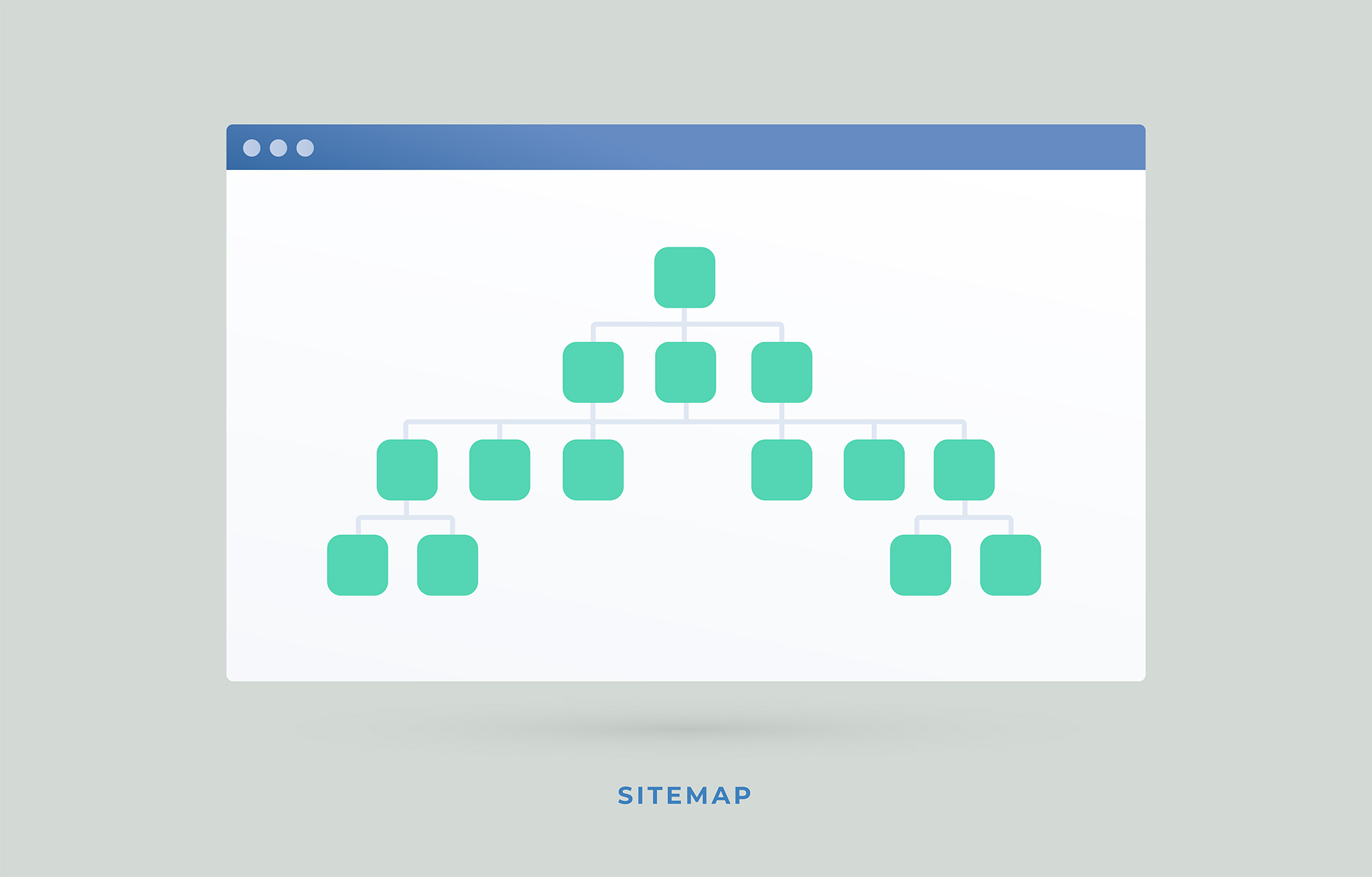
Creating a sitemap of all your pages will provide a better idea of how easy your site is to navigate. The image above shows a sitemap template with the index page at the top, three channels for content, two of which lead onto three more pages each of content...etc.
Users rely on the Back button of their browser a lot, but they should be able to navigate without it. One way to help users know where they are on your site is by showing them all of the pages on their journey to the current page like Trademe has done.
Look at the image below. Each listing page on Trademe includes breadcrumbs (Home / Marketplace/Gaming/PlayStation 5) near the top of the page. Each of those are text links directly to the appropriate pages and show the user exactly where they are within the website.


Take your learning further?
Remember that this class is a taster class, so you should check in with yourself as you go to see what you enjoy doing and then lean into the tasks and activities you find more enjoyable than others. If web design is your thing, then you'll want to jump in with two feet and gain fluency in the current web languages, of which HTML and CSS are entry-level, and we are only providing the basics of that.
This topic will cover the fundamental concepts for reading and understanding HTML and CSS. To take it further, head over to Scrimba, where you can expand your knowledge for free. After completing this course, consider enrolling in the Diploma in Digital Design – Web and Graphic Design course at Yoobee.
Overview of HTML and CSS
Later in this course, you will have an opportunity to code your own website using Webflow, a code editor for building websites. They have excellent explanations of HTML and CSS in the following videos.
Intro to HTML for beginners - Web fundamentals
The video mentions the Box Model, which, put simply, is the feature of a web browser that supplies each element as a square prism container holding multiple properties for elements, including borders, margin, padding, and the content itself. It is used to create the design and layout of web pages. HTML needs to know the position requirements for all of the elements of a page so everything fits. CSS provides those properties. It is always shown on the inspect tab.
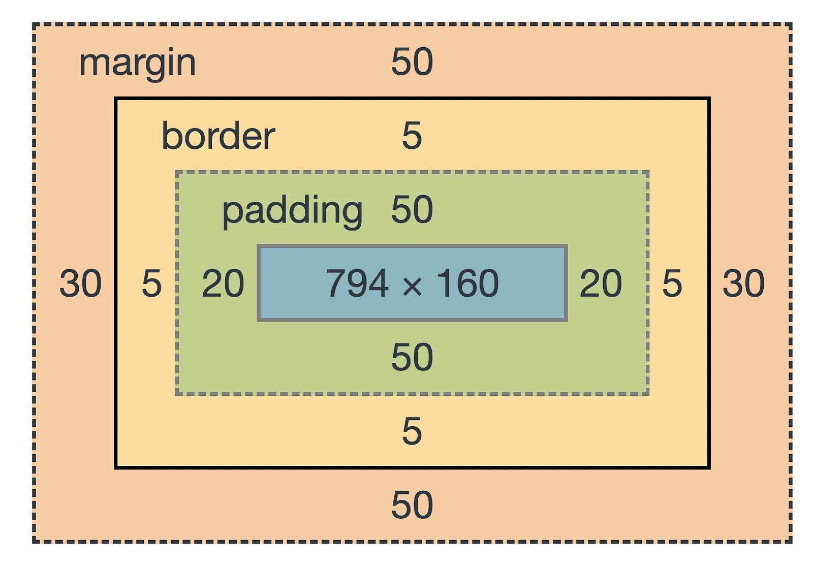
The element in the box model shown above has the following specified properties:
- Margin top and bottom (extra space above and below the content) = 50px
- Margin right and left (extra space on either side of the content) = 30px
- Border (the stroke around the content) = 5px on all sides
- Padding top and bottom (cushioning above and below the content, but before the border) = 50px
- Padding right and left (cushioning on both sides of the content, but before the border) = 20px
- Content (image, text, media)= 794px x 160px
- The total amount of pixels this single element requires is: 914 x 408 pixels.
- Content plus space right and left:30+5+20+794+20+5+30=914px
- Content plus space above and below: 50+5+50+160+50+5+50=480px
Intro to CSS for beginners - Web fundamentals
Novice Activity — Slow news day
🕔 Less than an hour
Look closely at this Stuff homepage. Do any of the articles look a little sus?
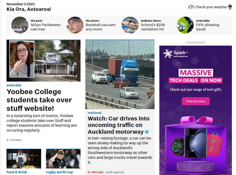
Did you notice the article about Yoobee students? Stuff didn't write that. We did!
Have a little fun with this new skill and change the news of the day to whatever makes you happy or laugh.
Task:
- Go to the Stuff index (homepage)
- Right-click anywhere on the page, and select inspect from the context menu.
- The HTML and CSS appear in a panel (it may be on the side as shown or on the bottom of your screen.)
- Select the arrow icon shown here at the top right in a red box, and then move your mouse around the webpage.
- Notice the pop-up windows showing the CSS properties.
- On the right, the panel will also focus on the HTML tags that make up the element.
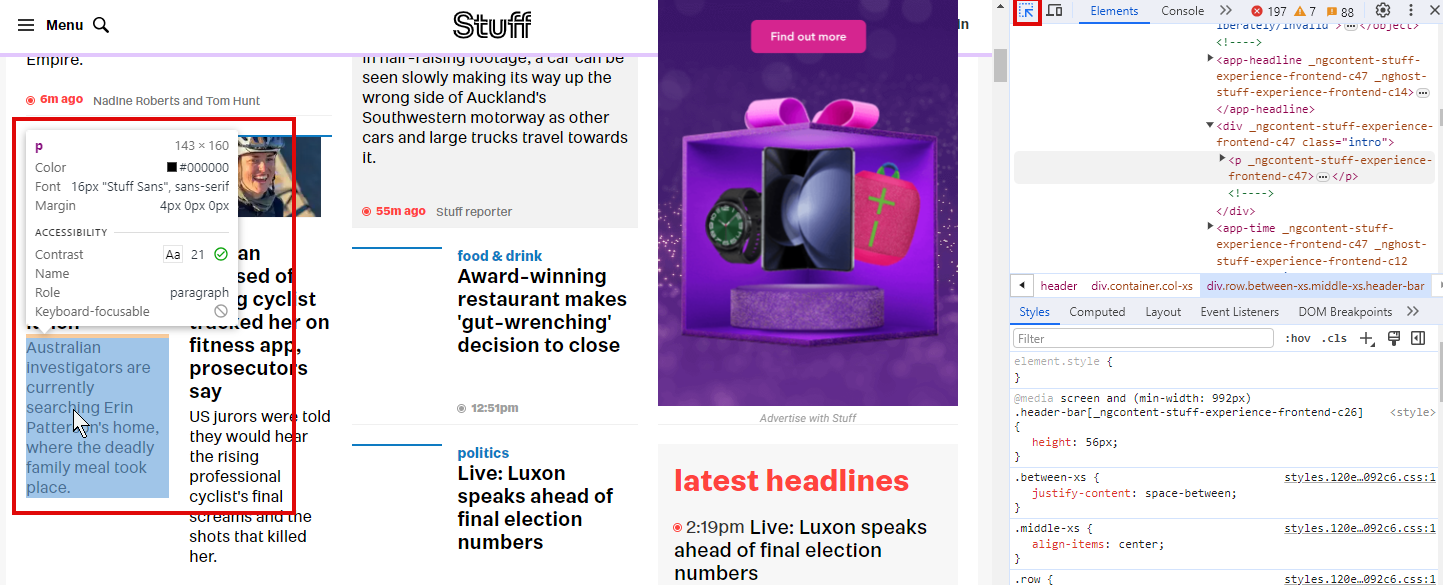
- With the arrow icon selected (you'll need to reselect each time you click elsewhere), choose a story to change by hovering over the text of the article.
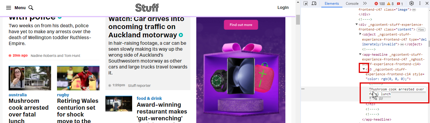
- Find that text in the HTML code (you may need to expand the block of code if the arrow is showing it is collapsed as it is in the image above) and double-click directly on that code.
- It will become editable, and you can change the text directly on the screen.
- Clicking away changes the text on the page!
- It isn't permanent, and no other computer can see it — the change is only temporary, on your browser only.
- Locate the headline of the same article. Change it to something with a similar character length. Now, see if you can 'break' the page by adding a really long headline. Does the site act dynamically to manage the change?
 Have fun!
Learn HTML
We use HTML to create documents designed to be displayed online in a web browser and stands for 'HyperText Markup Language'. It is one of the many markup languages (computer languages used in documents, databases and so on — applying 'tags' to mark elements to allow the arranging and retrieval of data). HTML defines elements within a document so that they can be displayed meaningfully.
'Hypertext' refers to the ability to link pages together using hyperlinks.
HTML Elements
So, elements in an HTML document are represented by tags. Each tag can include a number of attributes that provide more information about the element and change the way the element is displayed.

- Opening tag
- Closing tag
- An attribute and its value
- Enclosed text content
id and class attributes are often used within HTML tags to help define the purpose and provide context for the information to be displayed.
In a basic webpage, the elements we are likely to want to define are:
HTML
An HTML page will always start and end with <html></html> tags. It represents the root of the document and is a 'container' for the rest of the HTML elements used in the document.
Head
The <head> element is the first element that sits within <html></html> tags. It contains metadata relating to the document.
The head tag will often contain the following:
Title
<title></title> tags are used to define what is displayed at the top of the browser window or in the browser tab.
Link
<link/> tags are used to define how the document relates to others. It is often used to define where an external CSS style sheet is located.
Body
The <body> element is the container for all elements that will be displayed in the browser. All the text, images, headings and links are created inside the body of the document.
Paragraphs
Each paragraph within an HTML document will be encapsulated with <p></p> tags.
<p>Lorem ipsum dolor sit amet, consectetur adipiscing elit, sed do eiusmod tempor incididunt ut labore et dolore magna aliqua. Ut enim ad minim veniam, quis nostrud exercitation ullamco laboris nisi ut aliquip ex ea commodo consequat.</p>
Images
Because HTML documents only contain text, images can only be included by providing a path to their location. We can use the <img/> tag to define the location of the image, its alt text (important for screen readers) and its width and height.
<img alt="A ginger cat" height="600" src="cat.jpg" width="600"/>
The <img/> tag is an example of a self-closing tag, meaning it doesn’t require a closing slash (/).
Links
Anchor tags <a></a> are used to create links to other pages within the same website or to other websites. The 'href' attribute is used to define where the link will go and the text between the opening and closing tags defines what the link will say. (Notice the closing '>' for the initial <a> tag below sits at the end of the contained link: '"https://www.yoobee.ac.nz/"; i.e. the <a> tag contains the link detail within; while the text element sits between the anchor tags.)
<a href="https://www.yoobee.ac.nz/">Visit Yoobee Colleges</a>
Headings
Headings are an important way to add hierarchy to a document and provide context to the information to be displayed. HTML has six levels of heading.
<h1> is the biggest, <h6> is the smallest.
It’s important that headings are used appropriately and in the correct order. You wouldn't use an <h2> after an <h3> in the same section.
<!-- An example of <h1></h1> tags -->
<h1>Heading Level One</h1>

<!-- An example of <h2></h2> tags -->
<h2>Heading Level Two</h2>

<!-- An example of <h3></h3> tags -->
<h3>Heading Level Three</h3>

<!-- An example of <h4></h4> tags -->
<h4>Heading Level Four</h4>

<!-- An example of <h5></h5> tags -->
<h5>Heading Level Five</h5>

<!-- An example of <h6></h6> tags -->
<h6>Heading Level Six</h6>
Lists
Lists are a great way to either group related items together or to provide information in stages or steps. HTML includes both ordered and unordered lists.
An Ordered list will usually have a number or letter associated with each item on the list, and an Unordered list will often include a bullet or other symbol before each item.
Each item on the list will be flagged by <li></li> tags (list item) and the entire list enclosed in <ol></ol> tags (ordered list) or <ul></ul> tags (unordered list).
<!-- An example of an ordered list -->
<ol>
    <li>Step one</li>
    <li>Step two</li>
    <li>Step three</li>
</ol>
- Step one
- Step two
- Step three
<!-- An example of an unordered list -->
<ul>
    <li>Coffee</li>
    <li>Tea</li>
    <li>Milk</li>
</ul>
- Coffee
- Tea
- Milk
To learn more about these and other tags, have a look at w3schools.com.
Have a look at the sample file provided at csszengarden.com.
Can you identify the tags being used without looking at the source code? Watch the following video for reinforcement.
You probably noticed how boring the csszengarden.com sample page looks. That’s because there is no styling, and it is being displayed using browser defaults. This is where CSS comes in.
Learn CSS: Cascading Style Sheets

CSS stands for Cascading Style Sheets. CSS is used to define how the content of an HTML document will be displayed.
We can use CSS to control the layout and positioning of elements, and the visual characteristics such as colour, size, borders and typography.
'Cascading' refers to how the styles are applied. All elements within a styled element will be styled and styles written later in a CSS document will override earlier ones.
Including CSS in HTML documents
CSS is often written in a separate document and linked to an HTML document or it can be included within <style> tags within the <head> of an HTML document or in the same tag as the element itself by using the <style> property.
W3schools has a great explanation of how to include CSS in your HTML document. Please read that explanation and return here when you are done.
Writing CSS
CSS is written by first defining a 'selector'. This is the element we want to style. Then, within curly { } brackets, we can add a property and value pair separated by a colon, known as a 'declaration'. Each declaration ends with a semicolon, as displayed below.

- Selector
- Declaration
- Declaration
- Property
- Value
- Property
- Value
It can be written on a single line like this:
p {
    color: red;
    text-align: center;
}
However, it is easier to read when written like this:
p {
color: red;
text-align: center;
}
The example above will style all paragraphs to have red text color and center-aligned text (note the use of American English spelling).
In the following example text, note the difference between the two blocks of text. The first one has the style of text our design team coded in their CSS for default paragraph text. The second one has a style tag applied directly in the paragraph tag, which supersedes the default style. (It has more specificity, which we'll learn more about shortly.) If you want, inspect the code for this small Div below to see the inline style yourself.
1. Default paragraph text.
2. Styled text.
When we want to stray from the default text, we need to consider the context for the change to determine the best way to achieve the new style. It might be cumbersome if we had to use inline styles for every type of text that strays from default. We can use classes and IDs to be more specific about what we are styling.
Classes
Creating a class allows you to create a category of text, which you can specify to act differently from the default behaviour.
<p class="intro">Yoobee Colleges is New Zealand’s largest specialist creative and IT college. We’ve been fuelling the creative and IT industries for over 30 years with talented Animators, Filmmakers, Designers, Game Developers, and Techies.</p>
We can style it using its class as the selector:
.intro {
    color: red;
    text-align: center;
}
'Classes' are used to identify elements on a page for the purpose of styling or positing that element. Each class can be used multiple times. It's often used with Div sections, paragraphs, headings, and images.
IDs
'IDs' are used to define a unique element on a page and are commonly used to identify a section that can be navigated to within a page using an anchor or jump link (linking within a page), but they can also be used to target a single instance of an element that we wish to be styled or positioned differently from the default.
Specificity
CSS has a number of Specificity rules that dictate how styles are applied when more than one CSS style is to be applied. The rules can be a little complicated; however, there is a great resource for understanding them at W3schools.com.
You can have fun with this idea using the resources at csszengarden.com, which include some notable examples of what is possible with CSS. Download the HTML and CSS files on the homepage to get started. You can then see the same HTML styled with different stylesheets.
This section provides activities that will help you to learn how websites are designed and built. We start with website analysis and end with web development.
Novice Activity – Identifying elements on a web page
🕔 Less than an hour
This activity enables you to break down websites into the elements on the page so you can start to understand how to design a cohesive, consistent web page by positioning elements using code.
Task:
Visit NZ Herald. Scroll around and look at it from a bird's eye view of the visual themes, colours, and look and feel. Then, make a list of the elements you see on the page. Examples of elements are head, footer, sections, columns, etc. Use the code inspector to help you identify the elements. Don't get bogged down by terminology at this point though. Just try and list the elements you see. Also, the code may appear a bit overwhelming. Just look at the opening tags to learn what sort it is.
When you are done, return here to see if you have these or similar on your list:
- Header (contains masthead)
- Advertisement bar (Div)
- Ad containers
- Breadcrumbs (navigation journey)
- Sections for Main content in three columns
- Image links
- Text headings
- Personalised stories container (a strip)
- Sections for Premium content in six columns
- Footer
Newbie Activity - W3schools
🕔 Less than an hour
This may be one of the very best online resources for novice and practising web developers to learn and gain experience. We just want you to spend a few minutes with their 'try it yourself' feature, changing values and seeing the results.
Getting started
- Go to W3schools Try it Yourself page
- On the left is the code, and on the right is what it looks like in a browser:
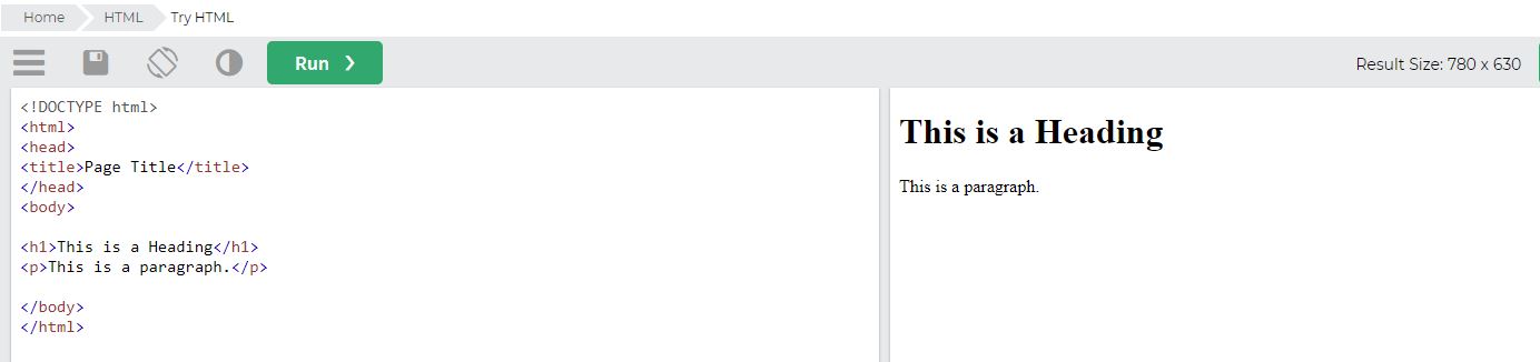
- On the left is the code, and on the right is what it looks like in a browser:
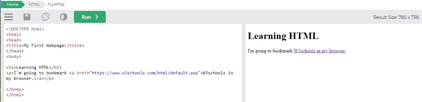
- Change the:
- Page title to "My First Webpage"
- Heading 1 <H1> to "Learning HTML"
- Paragraph text <p> to "I'm going to bookmark W3schools in my browser."
- Select the green Run button and note the changes on the right of the screen as shown here:
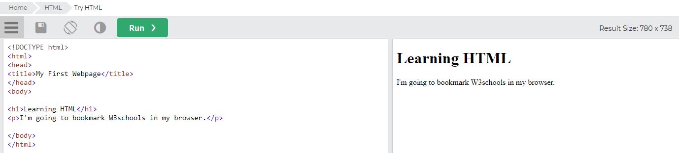
Are all of the changes you made visible on the screen?
No. The title didn't change because anything in the <head> section is not rendered by the browser and is only considered as information about the page. If this were real, the title would appear in the browser tab.
4. Wouldn't it be great if you could click on W3schools, and it would bring you to that page? Let's code a link! We'll use an anchor tag for that and provide what text will be clickable and where that click takes the user. Change the appropriate line of code to the following, and then click Run:
<p>I'm going to bookmark <a href="https://www.w3schools.com/html/default.asp">W3schools in my browser.</a></p>
Now, go ahead and bookmark this fantastic resource. You'll see the navbar across the top, so when the time comes, you can switch over to CSS and use the tool to discover how to style your HTML:
Great work! Next, we'll use a code editor instead of the Try it Yourself editor.
Newbie Activity – My first webpage
🕔 1 -2 hours (don't spend more time - if you are still confused, after a couple of hours, please reach out to your peers or tutor.)
In order to write code, you'll need to select a code editor that you enjoy using. Code editors allow web developers and software engineers to work quickly by anticipating what tags you will need with auto-complete and syntax highlighting (snippets of code are colour-coded based on their purpose, which helps mistakes stand out.)
Important
Visual Studio Code is a robust free program that will enable you to save time while hand-coding websites.
If you haven't already, please complete the tutorials and activities in Design Principles and Tools:
- Visual Studio Code
Getting started
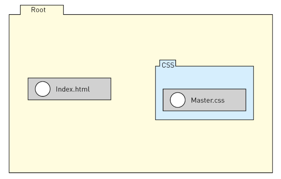
Task 1: Before you even start to code anything, you'll want to ensure your folder structure is sorted out. You'll need to determine what your 'root' folder/directory is and then how you want to organise your assets within the root folder. For now, please make yours look like this:
- Root Folder "Root"
- Index.html (document: this is your homepage, and must be named this way.)
- Assets (folder: this will hold your images, video and audio assets)
- CSS folder (the folder that will hold your CSS)
- Master.css (document: this is the CSS file; name it this way when you create it.)
Task 2: Copy our code to create your first webpage. Remember to save it to your root folder with the name Index.html.
In your VS Studio, having started a new project and linked the root folder, you can now start entering code!
Type in the following code:
<!DOCTYPE html>
Before you even finish it, you should see the following code autocomplete.
<html lang=”en” dir=”ltr”>

 <head>

 <meta charset=”utf-8”>
Step 1: Create the Document type and Head section
Edit the code so your first block of code looks like this:
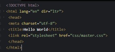
Now, Run the code. Nothing renders because we haven't told the browser to render anything. We've just given it information about the page.
Step 2: Add in some navigation
Now, let's add in some links. Paste the following code below between the </head> and </html>tags.
The links will be broken for now since you haven't built out the default news, contact or about pages yet. Sometimes, developers use a placeholder for a link when the linked page hasn't been built yet by just entering a hashtag (#) for the linked URL.
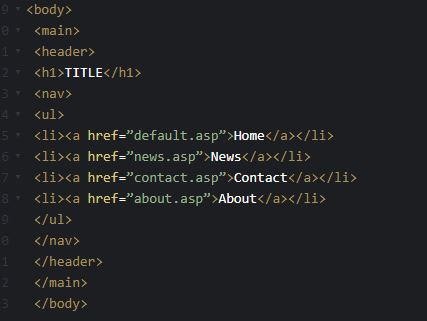
Click the Run button and check your progress. If your code editor has a window for you to see the output, it may change dynamically as you change the text.
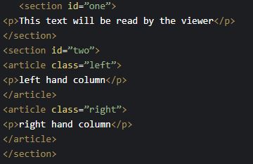
Step 3: Add content sections
Now we have a bit of navigation. Let's add content to this page with the following code pasted between the </header> and </main> tags.
Click Run again. Your page looks plain, right? It needs styling. As you know by now, that's where CSS comes in!
There are three ways to add CSS declarations to an HTML file:
- In the <head> section as a link to a file.
- In the <head> section in a <style> tag.
- In the element tag directly, in a <style> tag.
Do you remember what the term is to describe the hierarchy the browser places conflicts in styles?
It's specificity. Answer the following question to test your understanding.
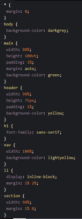
Now, we'll add some CSS for the elements on your page. These have the least amount of specificity and generally set up the margins, body styles, sections, footer, and other standardised parts of your design.
Go to the CSS portion of your code editor and create a new document, called Master.css and enter the following code.
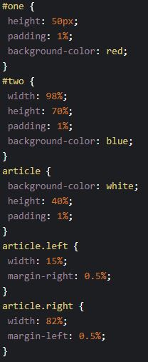
Save it, and click Run again. You should now see styles applied to some of your text but not all of it. That's because we want to add some styles that apply to elements directly by giving them class and ID styles.
A refresher:
| Selector | Syntax | When to use it |
|---|---|---|
| Class | element.Class | This is used when many elements on the page will be styled in the same way. For example, you may like to make a class for showing a product price in bold and blue-coloured text. That class would be applied to many products on the website. |
| ID | #element | This is used for a single element that must be rendered differently from other elements of the same type. There must be something unique about the element to make it styled differently than the default for that element, and it should be the only type of that element on the page requiring the unique change. |
| Bottom line: If you are describing a category of styles, use a class. If the style you want to use is a one-off, then use ID. | ||
Paste in the next code block just beneath your earlier text on the master.CSS document.
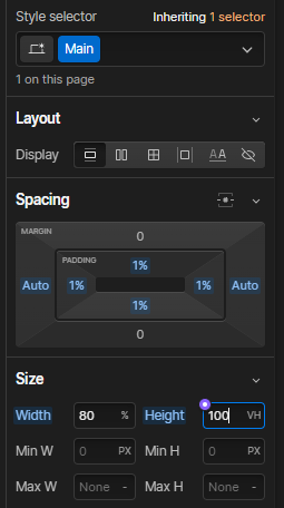
Now click Run again. Everything is there, but it's not aligned correctly, right? You need one more piece of CSS that will position the elements.
In the block of code for #two, add:
Display: flex;
It doesn't matter what order you add the properties for #two, but if you added it first, it would make that CSS block of code look like this:
#two {

     display: flex

     width: 98%;

     height: 70%;

     padding: 1%;

     background-color: blue;

}
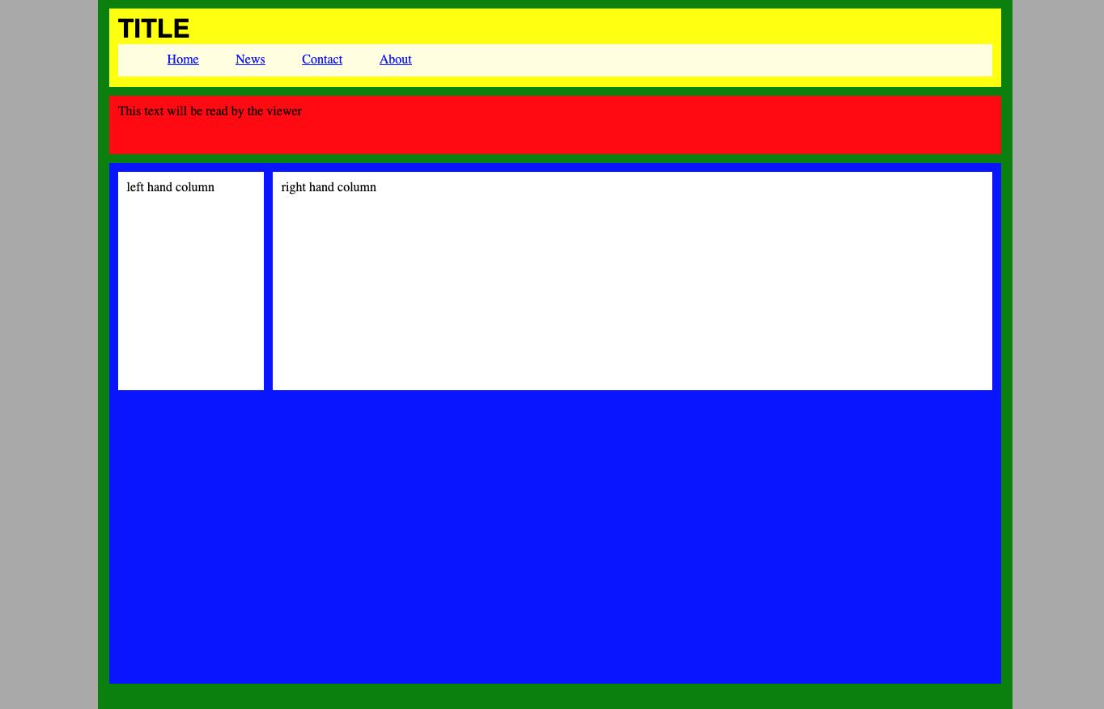
Now, Run it again. Voila! Expand the label below to see if yours matches ours. If not, go back and check your syntax. There is likely a typo. You might be able to see the error using the debug feature.
Finally, go in and change colours and text. See if you can make the columns different sizes. This is a learning activity, so don't get too involved with the looks of it; just pick it apart and have a play.
Congratulations, webmaster!
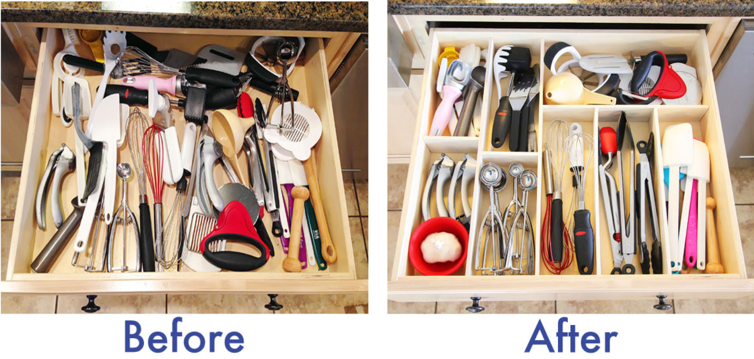
Dan has a funny way of talking about web design. He says website pages have things inside things, which have things inside those things, and things inside those things, too. Get it? Websites are the Russian dolls of content hierarchy.
The image above is an analogy for the wireframing process. Each kitchen tool needs to be in its own container so it is displayed in a meaningful way, and people who want to find something can do so easily. Some of the utensils are made up of smaller parts or hold other parts as well.
A web developer may end up with a structure like this, where the indentation for each row indicates that it is a child of the parent container. A child is an element that sits inside another (parent) container. A child becomes a parent container to a child of its own when you put something inside it. HTML elements, such as Body, H1, P, etc., are not containers and, therefore, cannot be parents.
| Wireframe component | Element | Holds |
|---|---|---|
| HTML Body element | Body | Page size, web fonts, margins, background |
| Header element | Section Div: Header | Main logo, search, contact info |
| Main section | Section Div: Container | All content between the header and footer |
| Hero section | Section Div: Container | Call to action, image sliders, product/service intro |
| Primary, Secondary, Sidebar | Div: Content | Specified content containers |
| Heading 1, content 1 | Container: Primary | Left column of styled text, links, images |
| Heading 2, content 2 | Container: Secondary | Middle column of styled text, links, images |
| Related links | Container: Sidebar | Narrow right column of styled text, links, images |
| HTML Footer element | Footer | Social media, contact, sitemap |
Wireframe example
Open each of the labels below to see how wireframes show content in their containers as children and parents.


Important
Before continuing, please head over to Design Principles and Tools > Website Development > Webflow and do the tutorial and activities. When you are done, return here to have some fun with your new skills.
Novice Activity – Get to know Webflow
🕔 15-30 minutes
Now that you have a bit of understanding of HTML and CSS, we're going to teach you how to build a website without using anything more than an understanding of how they work.
Getting started
- From the Webflow dashboard, click the blue button [+ New Site].
- Select the BLANK option to start with a clean slate.
- Name your site
- Look at the output from the previous activity. You should have various coloured blocks, with text indicating what sort of content each would hold if it were ready to display content. Consider this a wireframe for a website. As a reminder, a wireframe is a basic outline of the site without specific text or images. Rather, it shows structure, sizing, placement, navigation, and visual style.
- Your wireframe shows you the structure of your site. Drag in containers and Divs from the left side of the Webflow interface, and use the right side to style the elements you just added. (Imagine doing this without a wireframe. It would feel like driving blind as you set up a structure on the fly without any planning. )
<< Elements on left.
Styles on right. >>
Helpful hints:
- Webflow doesn't use HTML tags for footers and headers, so you'll simply choose containers and Divs and give them descriptive titles and appropriate styles.
- Most of the elements you add will be Divs that you can name and style. The structure options Webflow provides are simply Divs that have already had positioning properties preloaded, which can make it quick to set up a page.
- Don't forget to add style properties to the BODY element.
- In the screenshot above, remember that the MAIN element is simply a Div named MAIN that holds other Divs.
Showing off Activity – Build a responsive website
🕔 2 or 3 days in 3-4 hour sessions per day
Here's your chance to create a website from the ground up. You'll combine all of the skills and techniques for Design and Web Development that you have been learning and practising and put them together with your new understanding of how web pages are conceived, planned for, and built to create a website to sell the App you created in the previous course, Interaction Design.
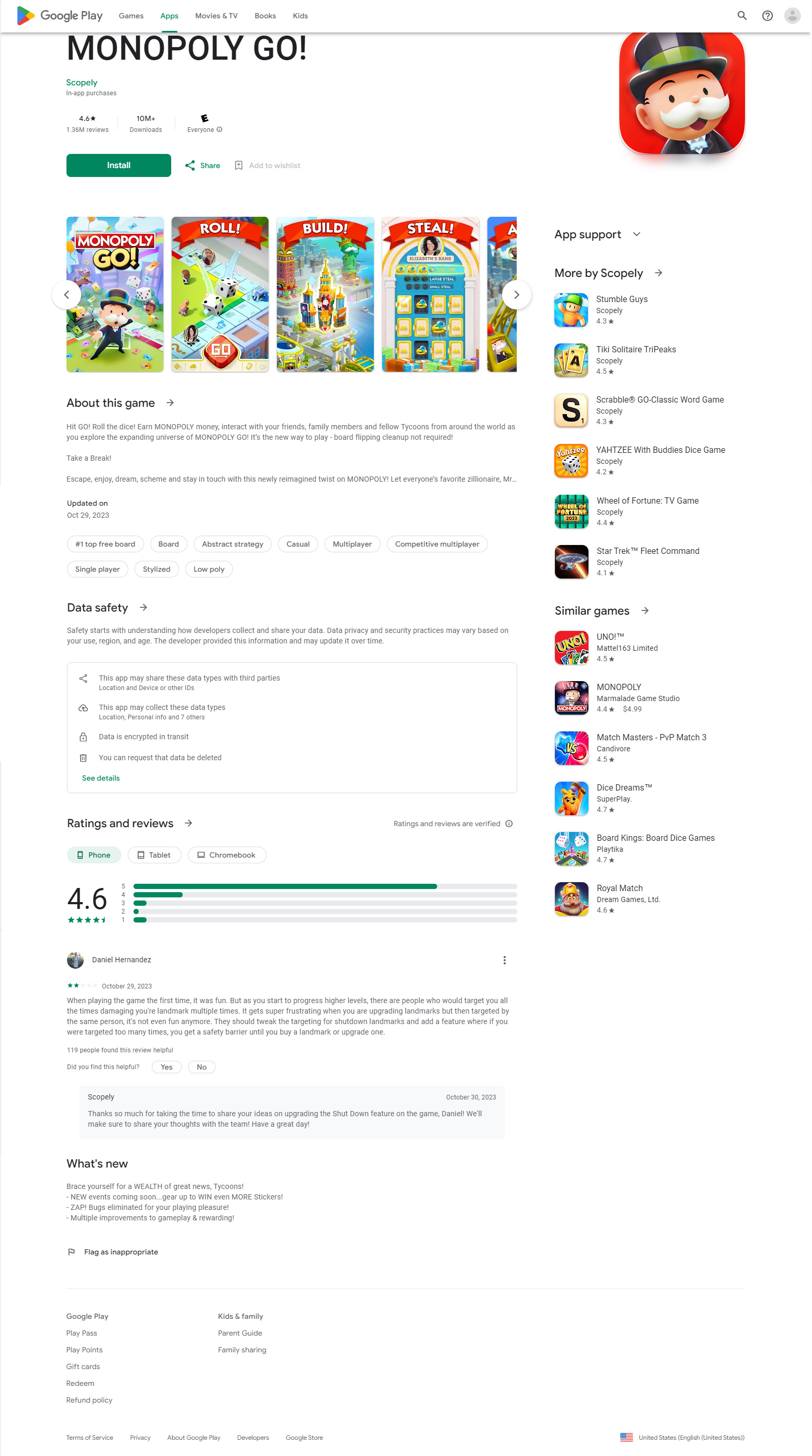
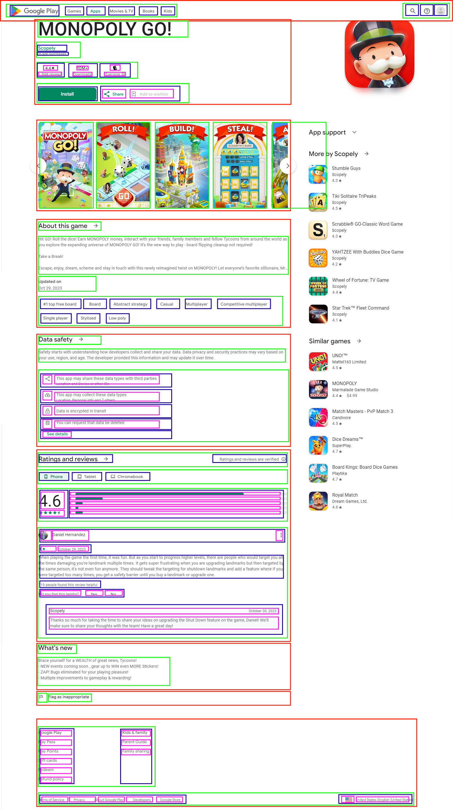
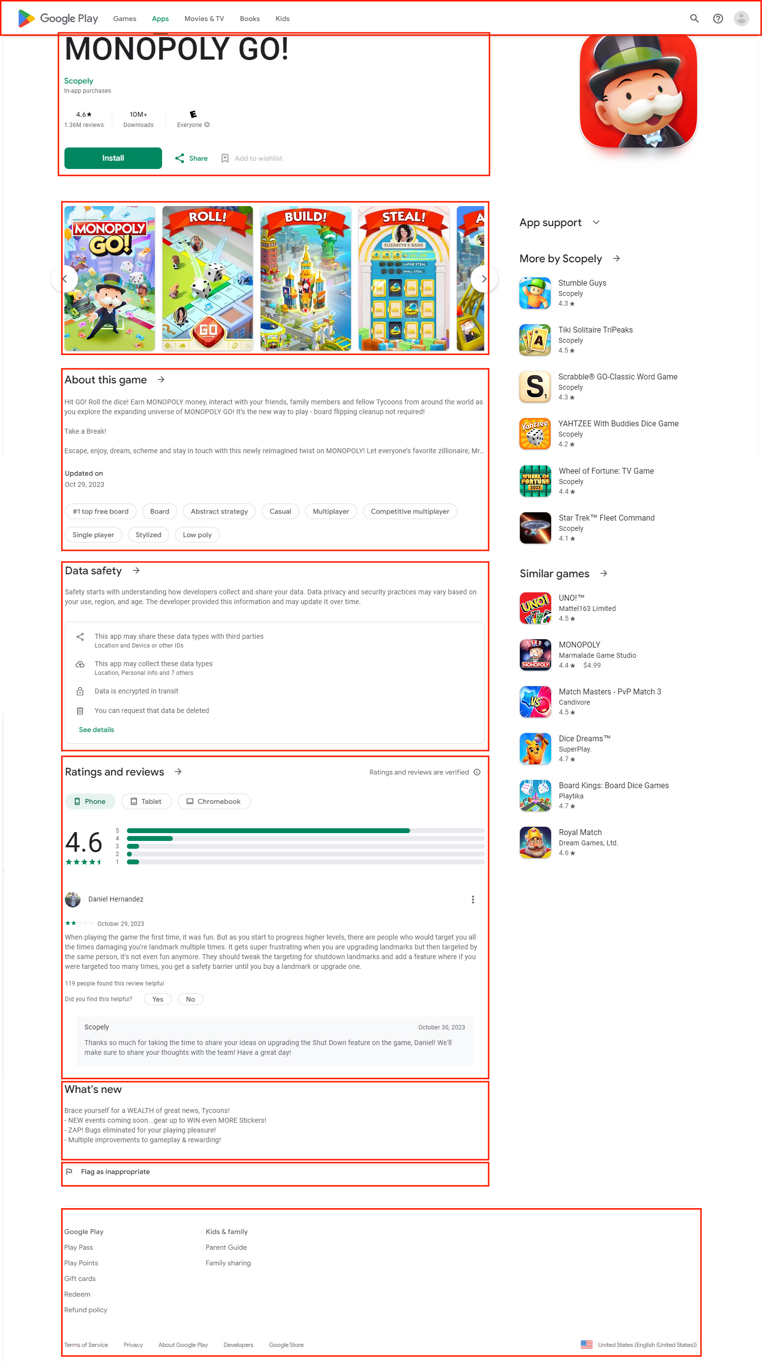
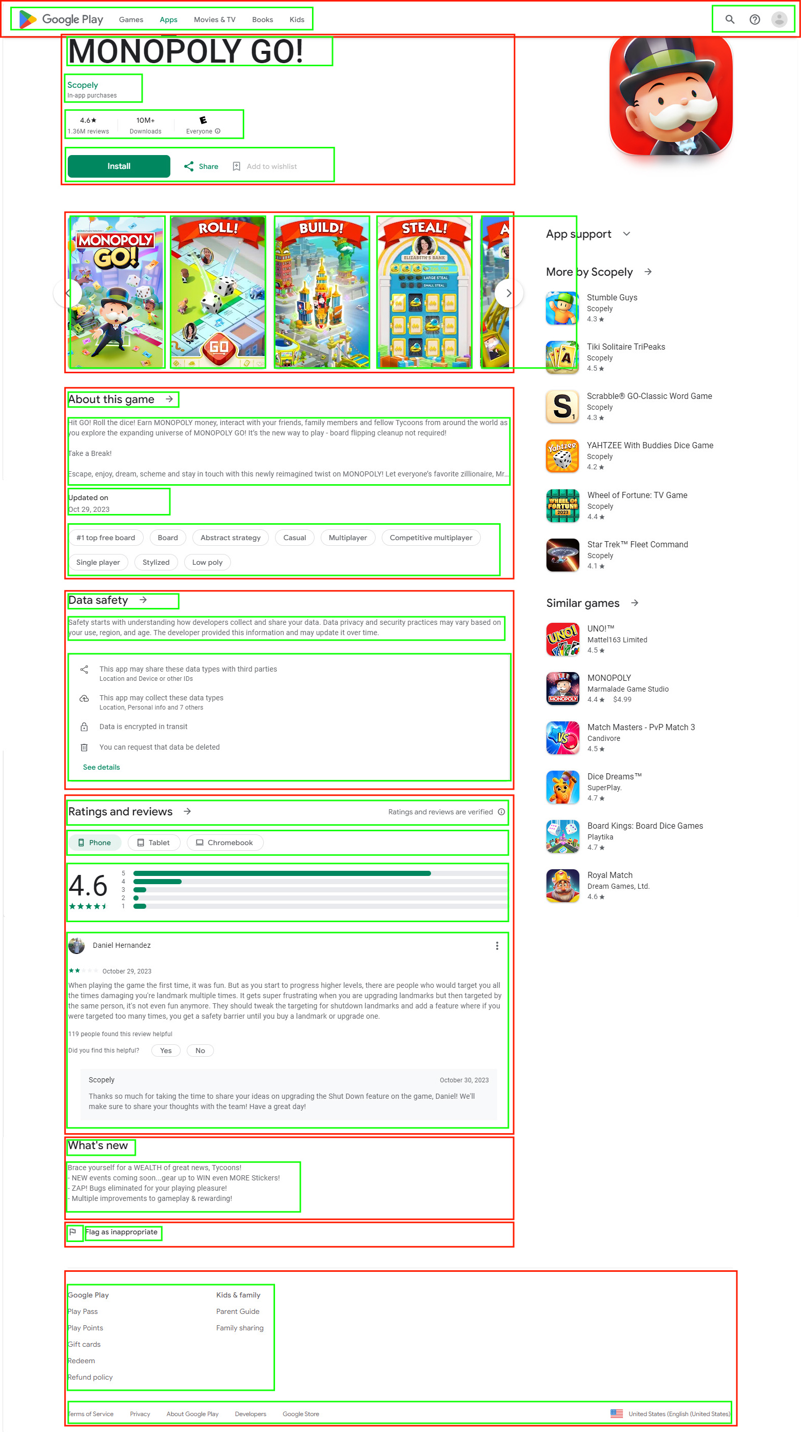
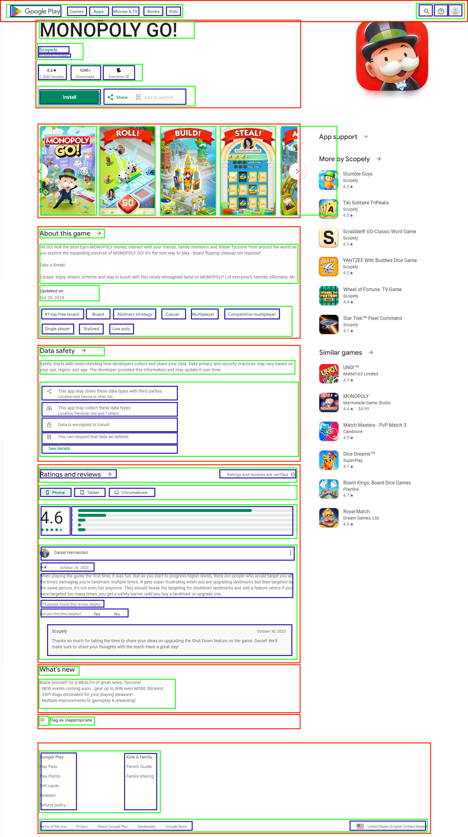
For this activity, build a responsive website to sell the App you have just made. Users need to understand immediately that the purpose of the site is to sell this single app. Your design must reflect a similar look and feel to online app stores like the Play Store, or Apple's App Store. While on those sites, use the page inspector to identify a structure and/or the sections of the site. The screenshots of Monopoly GO! in the previous section show you a wireframe you can use as inspiration to plan your own.
Note: For this activity, you are required to seek feedback from others at two points in the process. You'll need to plan out a schedule for this activity, leaving at least a few days to get feedback via a Google survey you will create for the purpose.
Getting Started
Task 1: Create a new project in Webflow and save your homepage in the root folder as index.html.
Task 2: Plan the site.
Please include at least a:
- homepage with a hero section, user reviews, call to action
- product page describing your app with screenshots, platform requirements, price, etc.
- purchasing page with mock-ups of the purchasing experience and a purchase confirmation message
- 'Contact Us' page with a contact form.
Task 3: Create a visual wireframe for your website.
Task 4: Sketch design options for a logo, icons, buttons, and a visual look and feel.
- Task 4A: Seek feedback as a part of that process.
Conduct A/B user testing for your logos and colour scheme, buttons, and icons. Provide at least two choices of themes so your reviewers can pick one and give you feedback.- Use Google Forms to create a survey.
- Check out our example: A/B Testing Survey.
- Consider questions that will provide answers that have meaning to you, such as which colour palette makes you feel more energised. Avoid questions that won't give you useful answers, such as 'What do you think of this colour?'
- Another way to conduct A/B testing is to create two surveys, each with one set of themed elements, and ask questions about what they see in front of them. By asking the right questions, you can compare the answers and gain insight into how the reviewers felt about the designs when they don't have anything to compare them to.
- Send the link to everyone you want to participate.
- When you have received responses, read and analyse them. Note that you can view the responses in a chart like this:
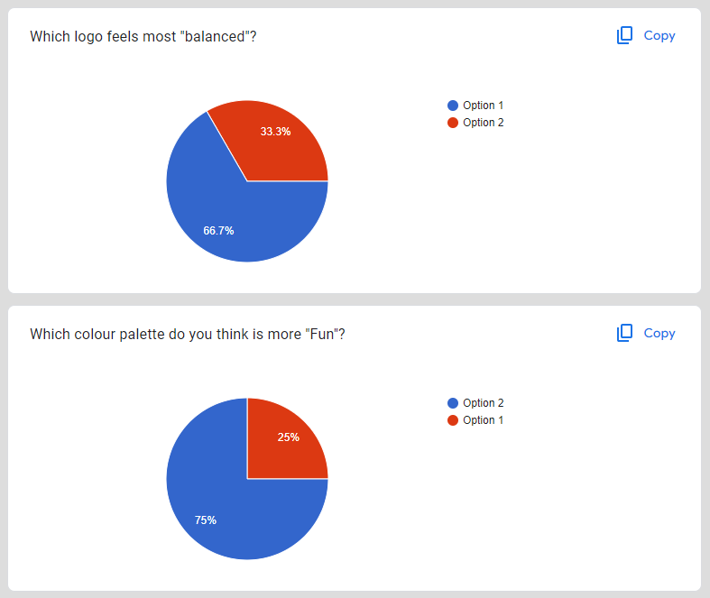
- Pick a thematic direction based on that feedback and march on with the project.
Task 5: Create/complete the logo, colour scheme, background images, font types, etc.
Task 6: Develop your wireframe into a working website, making links active, and adding images and backgrounds, headings and paragraphs.
Remember:
- to make it responsive:
- use flex options, and check that they are on the parent element if you are struggling
- edit the website in the mobile and laptop device views.
- use consistency with buttons, text, headings, and icons.
Task 7: Conduct user testing for the usability of your website by providing Use Cases to people that will provide you with valuable feedback.
To do this:
- Task 7A: Make another Google Form to use as a survey.
- Give users specific questions to answer about your app, such as "What is the age rating?" and "What button enables you to send us a message?"
- Give users tasks to accomplish, such as "Enter the name of the 3rd reviewer on the homepage." or "Find out the price and enter it here:"
- Send it to the people you want feedback from and analyse the responses.
- Task 8: Alter your design based on the feedback to come up with your final design. Publish your new website. Congratulations!
Forum Post
Edit your original Forum post for the App and add the link to the website for selling it.
- Answer these questions when posting your website URL
- Did you create a timeline to complete this project? If so, how did you do against it?
- How did you feel about asking for feedback from people?
- How did you feel about analysing the feedback responses?
- Did you understand the purpose of this activity?
- Do you feel proud of the work you submitted?
- Anything else you would like to share with the tutor and your peers about this activity?
Tino pai! We hope you are proud of your work.
After submitting this assignment, it's time to take the assessment for this course. Good luck with your work. We hope you enjoy the process of building your website!