
In this topic we will cover:
- Web conventions
- Responsive design
- Media queries
- Image optimisation
- Validation
- User testing.
What are they?
We know how to navigate the web because of the similarities between websites. Using standard design conventions gives users confidence in your site and makes it easier for them to achieve their goals. Conventions make websites usable.
When you apply conventions, you can make design decisions quickly with good results that benefit the user experience.
Jakob Nielsen defines three levels of standardisation for web design.
- 'Standard: 80% or more of websites use the same design approach. Users strongly expect standard elements to work a certain way when they visit a new site because that's how things always work.
- Convention: 50–79% of websites use the same design approach. With a convention, users expect elements to work a certain way when they visit a new site because that's how things usually work.
- Confusion: with these elements, no single design approach dominates, and even the most popular approach is used by at most 49% of websites. For such design elements, users don't know what to expect when they visit a new site.’ 7
Standard design elements include the placement of the logo in the upper left corner of the page, a search box on the homepage, and breadcrumbs listed horizontally.
Convention design elements include using the label “site map” for the site map, changing the colour of visited links, and placement of shopping cart links in the upper right corner of the page.
The so-called "confusion" level includes design elements that are done in so many ways that no single approach dominates. This includes:
- where the main navigation scheme is located
- placement of the search feature, the sign-in process, and placement of “help”.
Standard design elements lead to a better user experience
When websites have been designed using standard design elements, users know what features to expect and what these features look like. They can locate features easily and operate them to achieve their goals easily.
Users spend less time trying to figure out what unknown design elements mean. They do not miss important features, and there are no nasty surprises when something does not work as expected.
Websites that use standard design elements are usable and learnable. Users feel empowered and gain a sense of mastery of the website – they achieve their goals and are satisfied.
Common web conventions

Layout
Logos are placed at the top left of the page and indicate exactly what site the user is on. Often, the logo is a link to the home page.
- Primary navigation is organised horizontally across the top middle area of the page.
- The main content is in the middle of the page.
- A sidebar is located on the left side of the page for navigation and related content. Although blogs tend to have the sidebar on the right.
- A footer at the bottom of the page contains links to privacy policies, copyright information, contact pages, sitemap, etc.
Navigation
The horizontal menu at the top of the page is for primary navigation. Vertical sidebar menus can also be used for main navigation although most sites will use this for the secondary navigation.
Links to contact pages and user accounts appear as small text links at the top right.
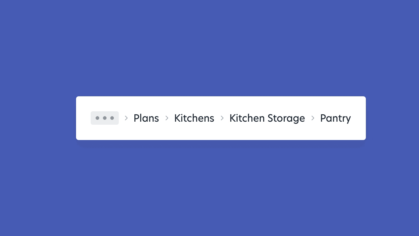
Breadcrumb navigation almost always appears directly above the main content area.
Links to sitemaps are included in the footer.
Links and buttons
Hyperlinks are formatted as underlined, blue text and turn purple once visited.
Buttons look pressable. Conventional web buttons may be rounded and coloured with a text effect or bevel to indicate interaction.

Hover states for links and buttons, and the change in the pointer to a “Mickey Mouse” hand are also signs that something will happen when a user clicks.
Other
Popular fonts are repeated from site to site because of their readability. Web-safe fonts have been widely adopted across operating systems.
The magnifying glass next to an input field indicates search, even if no words or text indicates ‘search’.
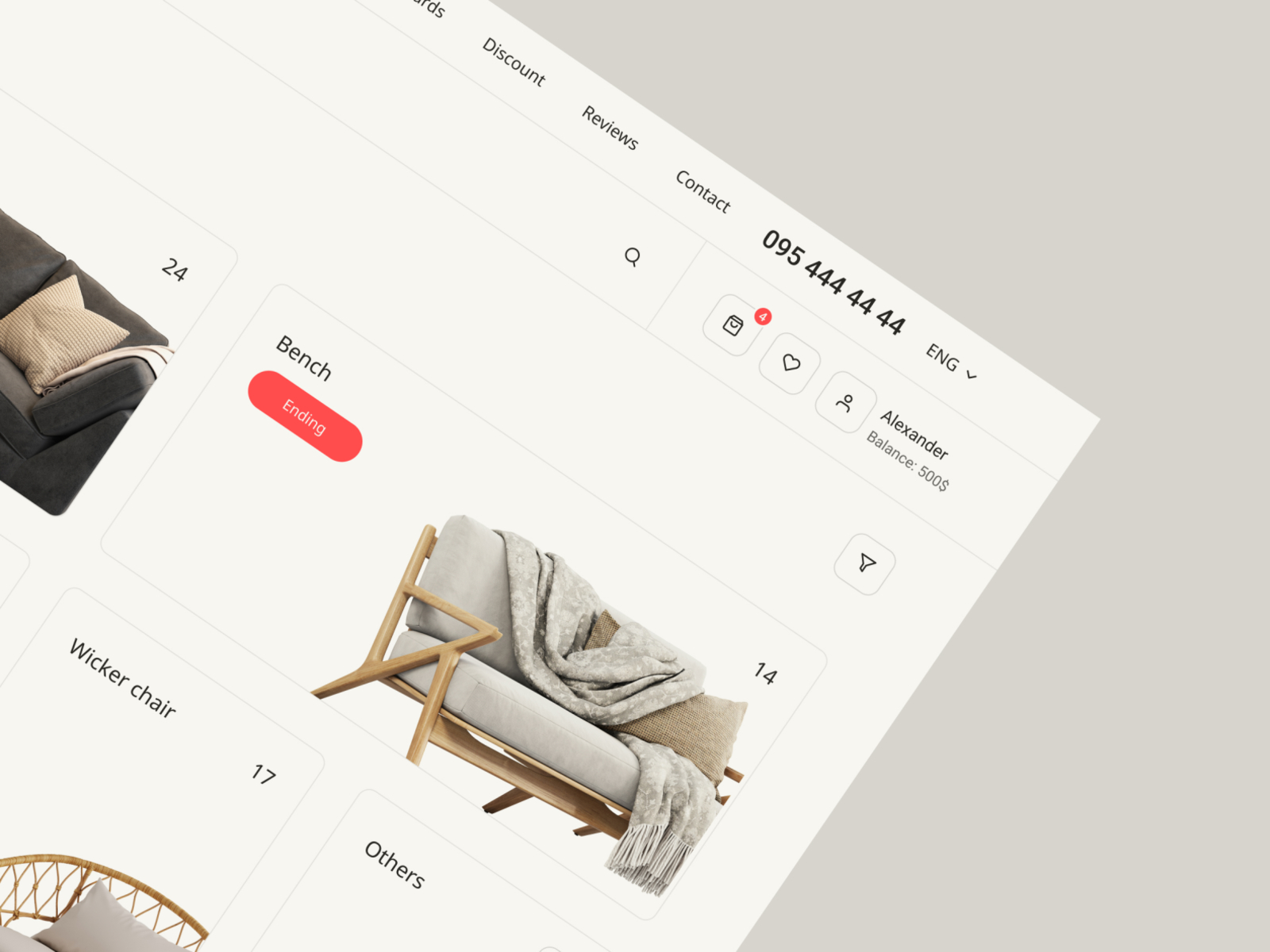
A shopping cart or basket indicates the checkout process.
“Home”, “Contact”, and “About” are standard naming conventions, and users expect most websites to have these three pages.
In this activity, you will identify how websites use web conventions to achieve usability.
Your task
Review 3 websites of your choice. Create a table to compare the websites and record your answers to the following questions.
- Where does the site logo sit?
- Where is the primary navigation positioned?
- How many other levels of navigation are present? Where are they positioned?
- What links are in the top right of the site?
- What type of content is in the footer?
- What pages do the sites have in common?
- Is there a search bar? How is this indicated?
- Are there any links and/or buttons? How are these indicated in various states (default, hover, click, and visited?)
- Are there any other aspects that are similar?
Share your analysis in the forum.

Design that always looks good, regardless of device
Today, Responsive Web Design (RWD) is a given. Mobile is not a trend, nor is it the future – it is the present. Statcounter reported that in 2021, 55% of page views globally were on mobile, compared to 42.3% on desktop and 2.7% on tablet. Looking at trends over the last ten years, we can predict that mobile market share will continue to grow and desktop decline. Tablet market share has continued to slowly decline from its peak of 6.3% in 2014.8
For optimal experience, all websites should be designed and developed to be responsive for all screen sizes. It is best practice and much easier to design for the smallest screen first. Adding content is much easier than taking content out or fitting it into a smaller space.
Responsive versus adaptive
Responsive design is fluid. It adapts to the size of the screen, regardless of the target device. Responsive design is achieved using CSS media queries to change styles based on the target device. HTML and CSS automatically resize, hide, shrink, or enlarge, a website, making it look good on all devices.

Adaptive design uses static layouts based on breakpoints that do not respond once they are initially loaded. The screen size is detected, and the corresponding layout is loaded. This means multiple fixed layouts need to be designed.
Should you design responsive or adaptive?
Adaptive design is useful when you are retrofitting an existing site to make it mobile-friendly. Start with the lowest resolution viewport and work up, so that you are not stuck in a position of trying to squash content into a small size.
Most new sites are designed to be responsive. Responsive offers less control than adaptive but is more efficient to create and maintain. With responsive design, you design with all layouts in mind. Start with a mid-resolution and use media queries to adjust for low and high resolutions.9
Screen resolution
There is a huge variety of screen resolutions in use today. The following graph shows the breakdown of screen resolution stats worldwide for 2021, reported by Statcounter.
Microsoft (2021) recommend designing for a few key width categories (breakpoints.)10
- Small (less than 640px)
- Medium (641px to 1007px)
- Large (1008px and greater.)
| Size class | Small | Medium | Large |
|---|---|---|---|
| Breakpoints | Up to 640px | 641 - 1007px | 1008px and up |
| Typical screen size | 4" to 6"; 20" to 65" | 7" to 12" | 13" and up |
| Devices | Phones, TVs | Tablets | PCs, Laptops, Surface Hubs |
| Window sizes | 320x569 360x640 480x854 |
960x540 | 1024x640 1366x768 1920x1080 |
Note: Designing for TV is similar to designing for a phone due to its effective pixels. When the screen is viewed from a distance, the TVs 1080px appear more like a 540px monitor.
Achieving responsiveness
The viewport
The viewport is the area of a web page that is visible to the user. The viewport varies with the device and will be smaller on a mobile phone than on a computer screen.
Before the rise of tablets and mobile phones, web pages were designed only for computer screens. Web pages commonly had a static design and a fixed size. With the shift to accessing the Internet using tablets and mobile phones, fixed-size web pages were too large to fit the viewport. To remedy this, browsers on those devices scaled down the entire web page to fit the screen.
It was a quick fix and by no means perfect.
Setting the viewport
HTML5 introduced a method so web designers could take control over the viewport, using the <meta> tag. This allowed designers to set viewport parameters such as height and width as well as viewport scale and resolution.
You should include the following <meta> viewport element in all your web pages. This gives the browser instructions on controlling the page's dimensions and scale.
When starting a new document, under the tag, include a <meta> (metadata) tag stating the default viewport of that HTML.
The width=device-width part sets the width of the page to follow the screen-width of the device (which will vary depending on the device).
The initial-scale=1.0 part sets the initial zoom level when the page is first loaded by the browser.
Compare these two images of a web page – One without the viewport <meta> tag, and the same web page with the viewport <meta> tag.

Watch the video for a quick recap on setting the viewport to achieve responsive design.
Size content to the viewport
Users are accustomed to scrolling websites vertically but not horizontally. So, if the user is forced to scroll horizontally or zoom out to see the whole web page, it results in a poor user experience.
W3Schools set out the following rules for viewports:
- Do not use large fixed width elements. For example, if an image is displayed at a width wider than the viewport, it can cause the viewport to scroll horizontally. Adjust this content to fit within the width of the viewport.
- Do not let the content rely on a particular viewport width to render well. CSS pixels' screen dimensions and width vary widely between devices, so content should not rely on a particular viewport width to render well.
- Use CSS media queries to apply different styling for small and large screens. Setting large absolute CSS widths for page elements will cause the element to be too wide for the viewport on a smaller device. Instead, consider using relative width values, such as
width: 100%. Be careful of using large absolute positioning values. It may cause the element to fall outside the viewport on small devices.11
Grid-view
A grid view means that the page is divided into columns. This makes it easier to place elements on the page.
A responsive grid-view often has 12 columns and a total width of 100%. It will shrink and expand as you resize the browser window.
To build a responsive grid-view, check that all HTML elements have box-sizing property set to border-box. This means that the total width and height of the elements will include the padding and border. In your CSS, add:
100% divided by 12 columns equals 8.33%. So, to make a responsive grid-view with 12 columns, each column will be 8.33%. Make one class for each column, class="col" and a number to define how many columns the section spans.
CSS:
We will make these columns float to the left with a padding of 15px.
CSS:
Wrap each row with a <div> making sure the number of columns inside each row adds to 12.
HTML:
The columns inside a row are floating, so they are taken out of the flow of the page. Other elements are placed as if columns did not exist. Add a style that clears the flow to stop this.
CSS:

A media query allows us to target not only certain device classes but to actually inspect the physical characteristics of the device rendering our work.(Ethan Marcotte, 2010).
A media query uses the @media rule to apply different styles for different media types/devices. A block of properties will only be applied if a certain condition is true.
It is not necessary to write media queries for every possible screen resolution. To keep things simple target four groups:
- Smaller than or equal to
768px(smartphones) - Larger than
768px(small devices, tablets) - Larger than
992px(medium devices) - Larger than
1200px(large devices).
Consider the following example. If the browser window is 768px or smaller, the background colour will be lightgreen.
Media queries can work with various conditions, such as:
- Width and height of the viewport
- Width and height of the device
- Orientation (is the tablet/phone in landscape or portrait mode?)
- Resolution.
Breakpoints
CSS syntax
Consider the following:
@media not|only mediatype and (mediafeature and|or|not mediafeature) {
CSS-Code;
}
not: Thenotkeyword excludes whatever is inside that media query.only: Theonlykeyword prevents older browsers that do not support media queries with media features from applying the specified styles. It has no effect on modern browsers.and: Theandkeyword combines a media feature with a media type or other media features.
They are all optional. However, if you use not or only, you must also specify a media type which is usually "screen" for web viewing.
Why use media queries?
Media queries can help with responsive design. We can add a breakpoint - CSS breakpoints are points where the website content responds according to the device width, allowing you to show the best possible layout to the user. CSS breakpoints are also called media query breakpoints, as they are used with media queries where certain parts of the design will behave differently on each side of the breakpoint.
There are two approaches to follow when deciding on breakpoints:
- Breakpoints based on device
- Breakpoints based on content
Deciding breakpoints based on different devices sounds like a good idea, but in reality, we already have enough devices to worry about, and going back to your CSS and adding a new breakpoint when a new device comes out is time-consuming.
The ideal option for deciding on breakpoints is based on your site's content. This method allows you to add breakpoints where your content needs a layout adjustment. This will make your media query a lot simpler and more manageable.
What specific breakpoints should you use?
You need to target desktop, tablet, and mobile-only sizes. You can check some popular frameworks to get an idea of what approach to follow.
Each one has different breakpoints, but they have a mobile-first approach in common. Mobile-first means designing for mobile before designing for desktop or any other device (This will make the page display faster on smaller devices). This means that we must make some changes to our CSS.
You can also have different stylesheets for different media, like this:
Instead of changing styles when the width gets smaller, we should change the design when the width gets larger. This will make our design Mobile First.
You can use these breakpoints as a starting point, or you can come up with your own.
Media query examples
We use media queries:
- if we want to hide or show elements based on the screen size (hiding a huge header image on mobile)
- changing the navigation (to a burger menu for mobile) or
- if the browser window is resized smaller than the size stated (eg 600px or smaller in the example), the content can adjust accordingly.
A good way to start with media queries is to change the background-color.
In this example, we can see that when the screen gets is from 0-600px wide, the background will be lightblue, over 600px, it will take on the background-color from the body colour stated in the CSS:
Create a responsive navigation menu:
(displayed horizontally on large screens and vertically on small screens):
Hide elements with media queries:
Another common use of media queries is to hide elements on different screen sizes:
Change font size with media queries
You can also use media queries to change the font-size of an element on different screen sizes:

When adding images to our site, we need the HTML text to indicate that this is an image, using the <img> tag.
However, the image tag always needs to have the src (this tells the browser where to find the images) and alt (this is alternative text, this text that tells users what the content of the image is if it does not load or the link is broken.
It is also helpful for SEO purposes and accessibility - for screen readers especially.
Image optimisation is the act of decreasing the file size without losing quality. The goal is to reduce the amount of data a user has to download to get the content they are looking for faster.
You can optimise your images in the creation phase (such as using the right “Export” options in Photoshop) or directly on your website.
One of the most common factors slowing down sites is images. Even if your website is running on the best server, images can be the performance downfall. Using image optimisation best practices will keep your file size small and your load time fast, creating a better experience for your site visitors.
For most website owners, the only three image file formats that matter are JPG, PNG, and GIF. Choosing the right file type plays an important role in image optimisation.
To keep things simple:
- JPG for photos or images with lots of colours
- PNG for simple images or when you need transparent images
- GIF for animated images only
JPG images work best for showing off complex colour photographs on your site, as they allow for a higher-quality image with a smaller file size. This file type will probably work for most images you want to use on your site (unless you want your images with a transparent background).
JPG uses lossy and lossless optimisation. You can adjust the quality level to balance quality and file size.
Photoshop File > Export > Save for Web (Legacy). You can choose different presets as well as a range of settings that will control the image size and quality.
If you do not have a lot of colour in your image (like flat illustrations or icons), or want it to be transparent, it is recommended to export it as a PNG file. Make sure you have the right image dimensions and look for the option to save as PNG-24 (or 8, if there is no quality loss).
PNG produces higher-quality images but also has a larger file size. It was created as a lossless image format, although it can also be lossy.
Photoshop File > Export > Save for Web (Legacy). You can choose the type of PNG format (8 or 24 bits), size, transparency and many other settings to reduce your image size.

The third most common image format for the web are GIFs. They only support 256 colours, so we need to be selective with this file type. GIF (.gif) images are lower quality than JPEG images and are used for more simplistic images, such as icons and decorative images - and of course animated images.
GIF only uses 256 colours. It is the best choice for animated images. It uses lossless compression.
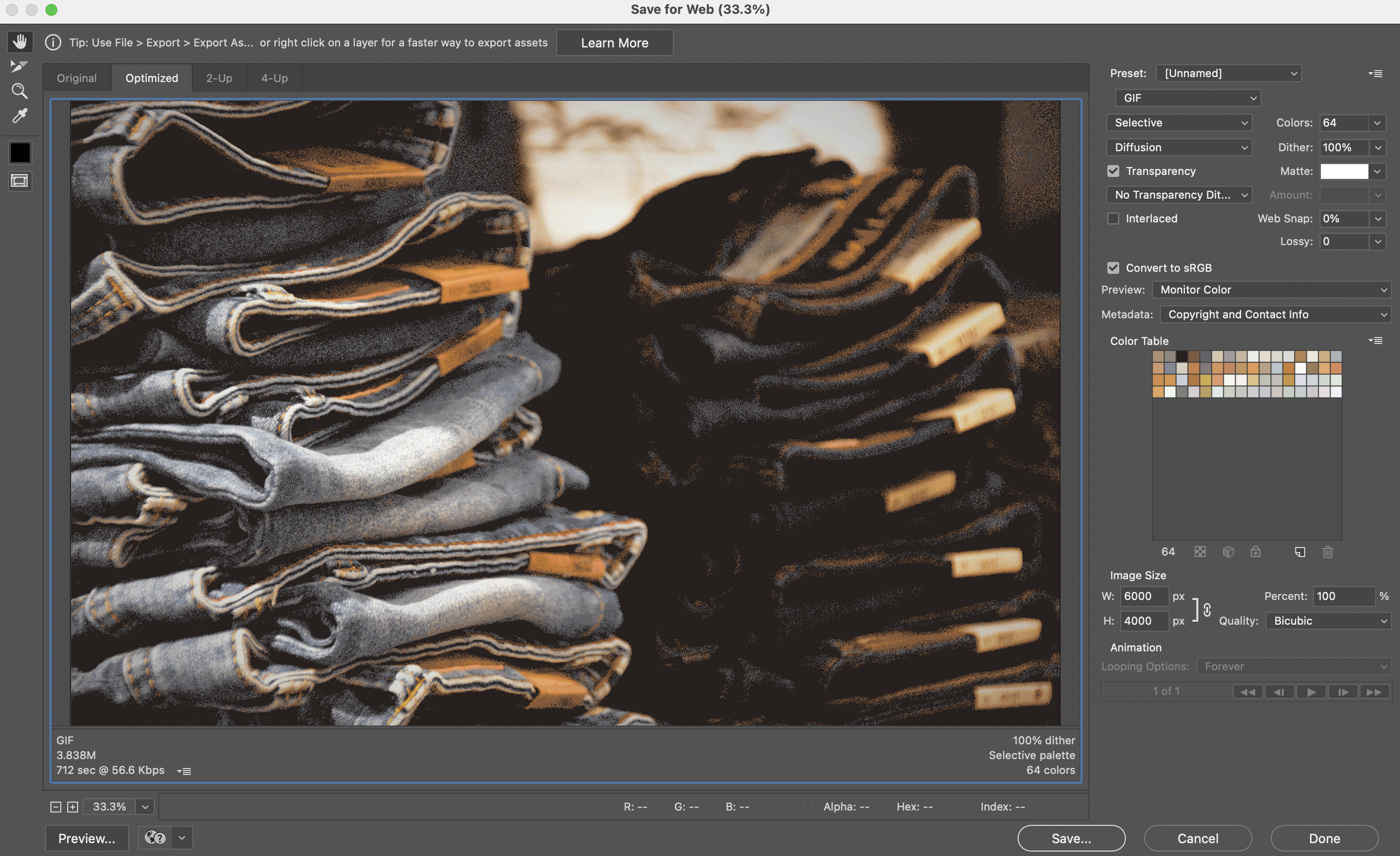
Photoshop File > Export > Save for Web (Legacy). You probably will not create an animated GIF in Photoshop, but here you can adjust settings like the number of colours, transparency, and turn on the animation loop.
Resizing images
When creating a responsive design, we need to use a combination of pixels and a relative unit like em/rem. This is especially important for users who need to adjust the zoom of their browser window (low vision) so that their text size also responds based on their zoom level.
One of the easiest ways to optimise images for the web is to resize them before you upload them to your site. By cropping your images before uploading, you will decrease the file size, which will help your site load just a little bit faster and save your disk space for even more images. There are also online tools to help you bulk resize your images.
Compressing images
High compression (low quality) JPG – 68 KB kinsta.com/blog/optimize-images-for-web/
This process will help you reduce the file size without losing noticeable image quality. There are two main types of compression: lossy and lossless.
- Lossless compression will maintain the same level of quality before and after the compression.
- Lossy compression will discard some elements of the photo, but typically in a way that the human eye will not notice.
It is best to experiment with your compression techniques to see what works best for each image or format: other software and some online tools to help you compress your images like TinyPNG.
Best practices
- Save your images in the proper dimensions
- Use lossy compression where possible
- Experiment to find the best settings for each format
- Use GIF if you need animation. (but compress your animated GIFs)
- Use PNG if you need high detail and high resolutions
- Use JPG for general photos and screenshots
- Use web fonts instead of placing text within images – they look better when scaled and take less space
- Save images as “optimised for web” in tools such as Adobe Photoshop.
Validators
Using standards-compliant HTML increases the likelihood that all web browsers and assistive technologies will correctly handle your content. If your code contains errors or tags that are not part of the HTML specification, screen readers and other assistive technologies might fail when trying to render the content for users. Even pages that seem to look fine in a web browser might have unseen problems for assistive technology users.
There are many reasons to validate your HTML:
- Validating mark-up can help in your debugging efforts if your web page exhibits unexpected problems.
- Valid mark-up provides a better cross-browser, cross-platform experience and gives you maximum control over how your page is displayed.
- Valid mark-up will help with future compatibility as it will have the best chance of being backward-compatible with new technologies.
- Properly formed HTML renders faster than HTML with errors. This means less load on servers and client browsers.
- A site that validates using proper HTML is a sign of professionalism.13
The application of coding best practices will affect the results of your validation checks. Ask yourself if you are doing the following things:
Files
- Keep good file hygiene
- Use lowercase and no spacing for filenames
- Do not use full stops as spaces
- Use hyphens, underscore, or camelCase structure for file naming.
Coding
- Code in lowercase
- Use appropriate indentation
- Use correct nesting
- Adding comments if required
- Keep your code clean.
Once you have completed your code, you can upload them to one of the links provided below. Validators are excellent tools used to check syntax errors. You can easily copy and paste your code to have it checked. Start to use validators to check for syntax errors in your code.

At the beginning of your project, you will conduct user testing to find out if the product you are developing will be of use to potential customers.
Usability testing, on the other hand, is testing how your potential customers respond to your product. This is user behaviour.
So how do you conduct usability testing?
According to Nielsen Norman, a leading UX research group. Usability testing is best done with a small number of study participants, so that you have time and budget to test more design iterations of the user interface. The ideal number of participants involved is five.
Here is the reasoning behind it explained in the next video.
It is advisable to do small iterations often and conduct more usability testing with small groups of participants. That sums up both qualitative and quantitative usability testing. There are also additional factors that can improve the ROI or Return of Investment of these tests.
These factors are:
- the facilitator’s observational skills
- the design team’s speed when generating the next design iteration
Listen to Jakob Nielsen’s explanation of this topic in the next video.
So how do you gather information from these test results?
You will have errors or problems that need to be addressed. Watch the tips in the next video for info foraging.
User Testing
Choose a website and answer the questions provided. Once complete, share your analysis in the forum.
Questions list:
- What do you think the primary purpose of the site is?
- What is the first impression you got when you entered the website?
- What is the first thing you wanted to do from the home/landing page?
- When you explored the site, did the menu and any other navigation buttons make sense? Did they take you where you expected? Why/why not?
- When you explored the site, was the content what you expected to find on each page? Why/why not?
- Does the design use web convention best practices? Why/why not?
Set yourself 3 specific tasks to achieve on the website.
Specific task instruction 1:
- How many clicks did it take?
- On a scale 1 – 5 was completing the task frustrating (1) or easy (5)?
- Why did you select this rating?
Specific task instruction 2:
- How many clicks did it take?
- On a scale 1 – 5 was completing the task frustrating (1) or easy (5)?
- Why did you select this rating?
Specific task instruction 3:
- How many clicks did it take?
- On a scale 1 – 5 was completing the task frustrating (1) or easy (5)?
- Why did you select this rating?
In this topic, we learned about web conventions. Using standard design conventions gives users confidence in your site and makes it easier to achieve their goals. Conventions make websites usable.
Common web conventions include:
- Layout - placement of primary navigation, main content, sidebar, and footer.
- Navigation - primary navigation, links to contact pages and user accounts, breadcrumb navigation, and links to sitemaps in the footer.
- Hyperlink and button formatting.
- Web safe fonts.
- Common signifiers such as a magnifying glass for search and a shopping cart or basket for checkout.
- Including "Home", "Contact", and "About" as standard pages that users expect websites to have.
We also covered responsive design and the importance of designing mobile first. We considered the difference between responsive and adaptive design.
- Responsive design is fluid. It adapts to the size of the screen, regardless of the target device. Responsive design is achieved using CSS media queries to change styles based on the target device.
- Adaptive design uses static layouts based on breakpoints that do not respond once they are initially loaded. The screen size is detected, and the corresponding layout is loaded.
Media queries are helpful in creating responsive websites. A media query uses the @media rule to apply different styles for different media types/devices. A block of properties will only be applied if a certain condition is true. It is not necessary to write media queries for all possible screen resolutions, instead group them into the following:
- Smaller than or equal to 768px (smartphones)
- Larger than 768px (small devices, tablets)
- Larger than 992px (medium devices)
- Larger than 1200px (large devices).
We covered image optimisation with the goal of reducing the amount of data a user has to download to get the content they are looking for faster. We covered how to compress images and best practices.
We reviewed validation and why it is important to validate your HTML including:
- To make debugging easier.
- To provide a better cross-browser, cross-platform experience.
- To assist with future compatibility.
- To allow for quicker rendering.
You can use validators such as the HTML Validator and CSS Prefixer to check for syntax errors in your code.
Finally, we reviewed usability testing.
Knowledge check
Additional resources
Here are some links to help you learn more about this topic.
It is expected that you should complete 12 hours (FT) or 6 hours (PT) of student-directed learning each week. These resources will make up part of your own student-directed learning hours.