In this topic we will cover the following:
- Logo, identity, and brand
- Logo evolutions
- Principles of effective logo design
- Logo usage guidelines
- Tips on designing your first logo.
The terms logo, identity, and brand are often used interchangeably by people not familiar with graphic design.
However, there are some important distinctions that we need to be aware of.
Logo
A logo is a graphic symbol. It can be an abstract mark, a typographic composition, a pictorial icon, or a combination of text and shapes.
It is a recognisable element that is used to identify a company and its products or services.
Great logos are memorable. They are often well balanced and easily linked to the company they represent.
From What is Branding?, by Mojo Media Labs, 2021
Identity
An identity includes the logo and all other visual and identifiable elements that are used to represent a company. This includes typefaces and how they are used, colours and palettes, images and video treatments, sounds, supplementary icons, phrases and taglines. Any other perceivable elements that help identify the company.
Often these elements are documented in a company’s identity or brand guidelines.
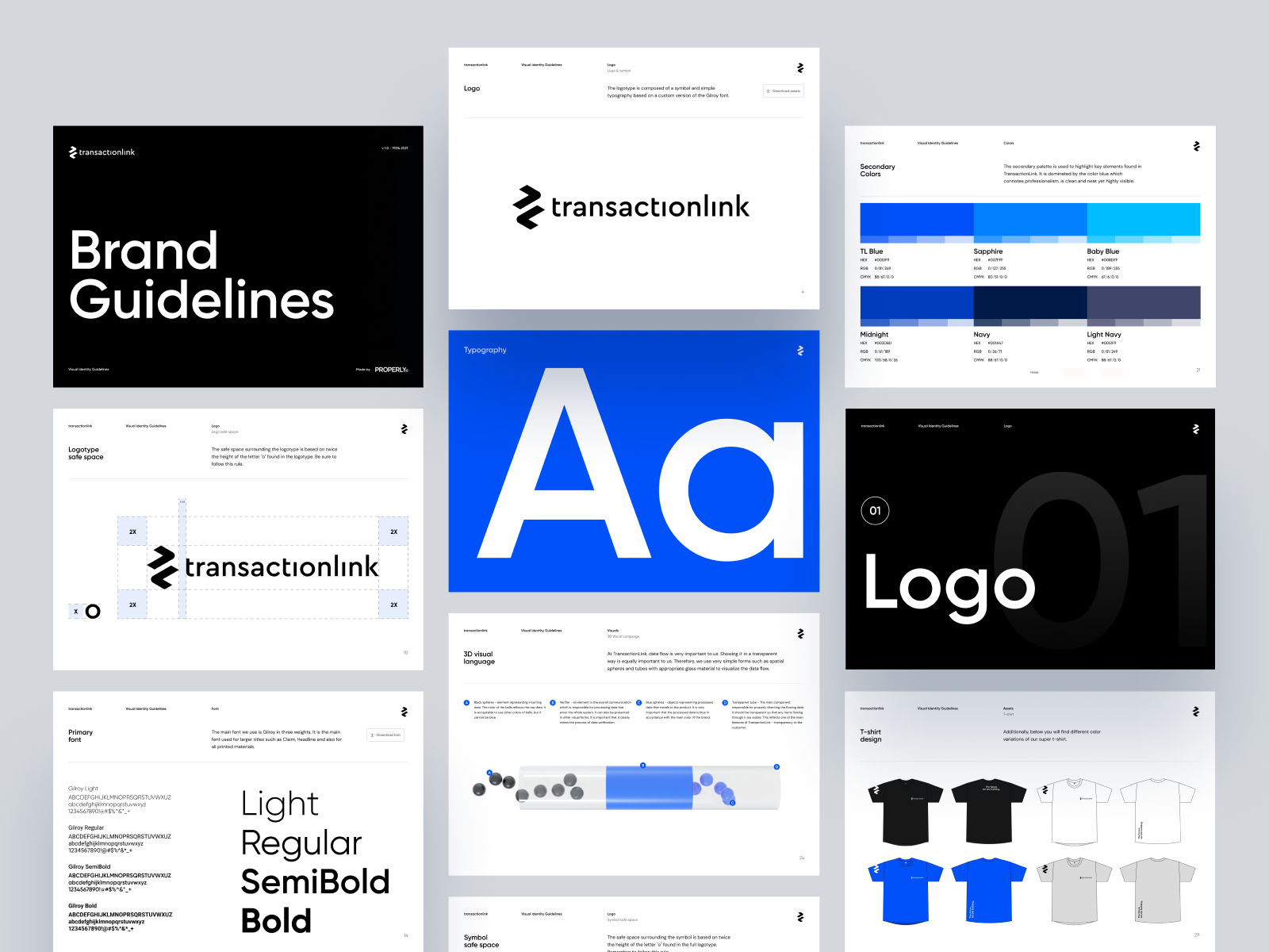
From TransactionLink Brandbook, © Damien Denis
These guidelines include information on how to use the logo, colours, and typography in a way that is consistent with the brand.
Brand
A brand encompasses the identity and other subjective ideas. It may include how people feel about the company, the company’s tone of voice and personality, the experiences people have interacting with the company, the company’s marketplace positioning and differentiation, and the company’s story, origin, and history.

Logo, identity, and brand in practice
How do these three elements apply in practice? We have picked two brands that are consistently voted in the top ten of New Zealand’s most trusted brands – Whittaker's and Ryman Healthcare.
Whittaker’s
J.H. Whittaker & Sons, Ltd is a confectionery manufacturer specialising in palm oil-free chocolate and based in Porirua, New Zealand since 1896.
Logo
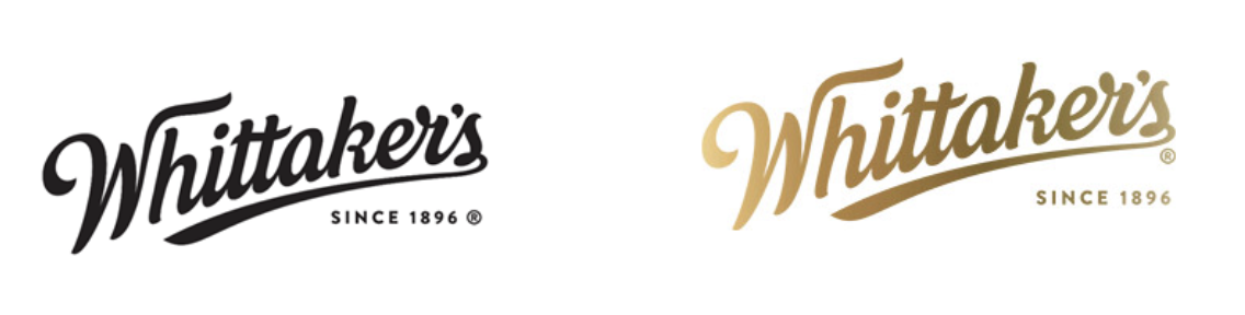
Whittaker’s logos, © J.H. Whittaker and Sons, Ltd.
Whittaker’s logo is a typographic composition logo. It belongs to the italic-script font family. The logo works well in black and white as well as in its gold gradient iconic colour. The type has been customised to have its letter ‘W’ and ‘s’ serifs extending at the end as well as joining the ‘t’ crossbars together.
Identity
Whittaker’s position themselves as a luxury indulgence at a competitive price point. How is the identity built around the logo?

Whittaker's advertisement, © J.H. Whittaker and Sons, Ltd.
The primary colour palette of gold is supported by a secondary colour palette to distinguish its chocolate series.
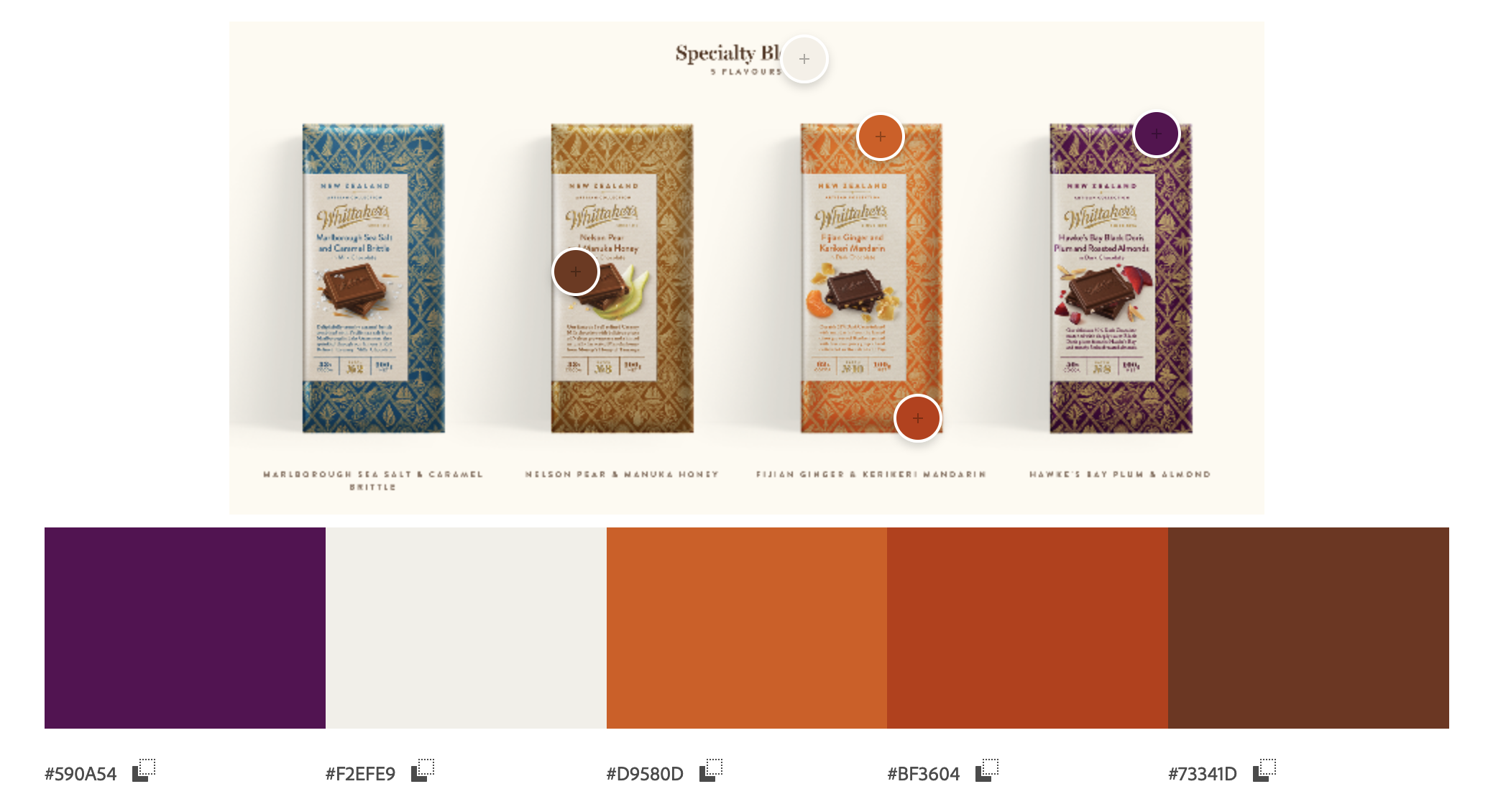
Whittaker's speciality blocks, © J.H. Whittaker and Sons, Ltd.
The logo’s script font is paired with thick, bold serif font for each flavour of its classic block varieties. For the artisan series, a thin serif font is used with longer, descriptive names of the flavours and origins.
Gold is used prominently as patterns in the background as part of their artisan packaging.

Whittaker's products, © J.H. Whittaker and Sons, Ltd.
Brand
Whittaker’s are a longstanding family-owned business and show commitment to quality and fair-trade sourcing practices.
‘Chocolate has been a passion for the Whittaker family since J.H. Whittaker made his first bar in 1896. Four generations and 125 years later, the family continues to live by the belief that best is always better. That’s why they insist on using only the finest ingredients, the very best methods, and the most precise machinery for their beans-to-bar chocolate – and they’re committed to doing it in their one and only factory in Porirua, New Zealand...
For years Whittaker’s has focused on making ‘Good Honest Chocolate’. The year ahead is no different for the family-owned-and-run business. Whittaker’s continues to support iconic Kiwi charities, invest in facility advancements, work towards its goal of 100% sustainable packaging by 2025 with its recently launched compostable Peanut Slab wrapper trial, and strives to nurture direct relationships with cocoa farmers and their communities.’ (Trusted Brands 2021)
Here's a snapshot of customer testimonials:
Doesn't compromise on quality or size.Male, 30-49, Hawkes Bay
Brilliant flavours. Always premium and uses best ingredients!Male, 30-49, Otago
New Zealand owned and operated.Female, 50+, Wellington
Ryman Healthcare
Ryman Healthcare Limited is a New Zealand retirement village and rest home operator. They operate 36 villages around New Zealand and were founded in Canterbury in 1984.
Logo
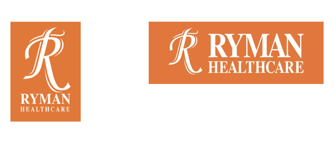
Ryman Healthcare logos, © Ryman Healthcare
The logo for Ryman Healthcare features a typographic composition with the letter ‘R’ as the main lettermark complemented by the wordmark ‘Ryman Healthcare’.
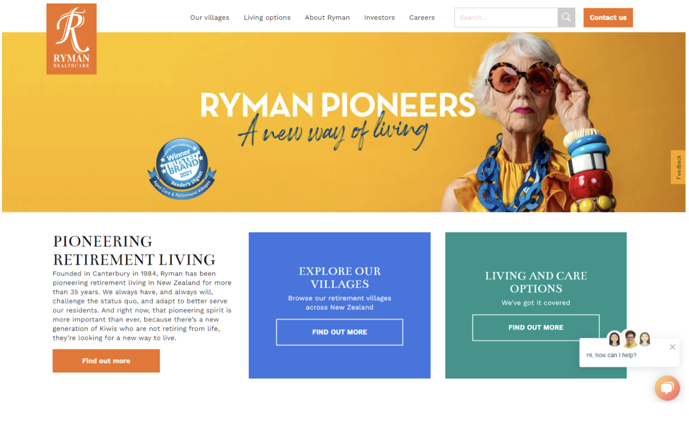
Ryman Healthcare recently updated their branding to reflect the positive, vibrant, and exciting prospect there is to retirement living. This is expressed in the bright orange colour against its white typographic logo.
Identity
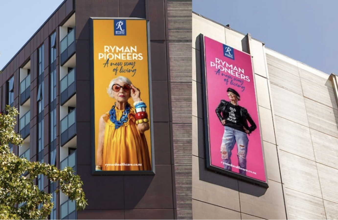
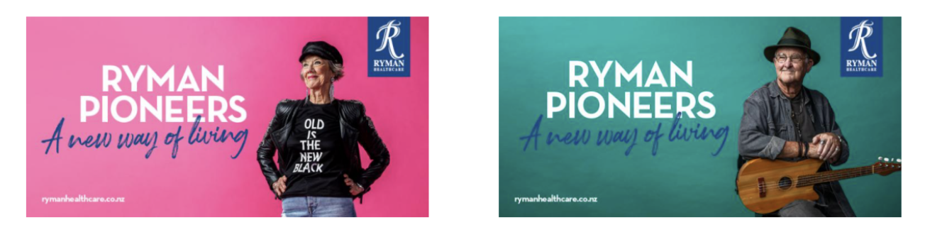
Ryman Pioneer's advertising campaign by VMLY&R New Zealand, © Ryman Healthcare
Ryman Pioneer's advertising campaign by VMLY&R New Zealand, © Ryman Healthcare
Ryman Pioneer's advertising campaign by VMLY&R New Zealand, © Ryman Healthcare
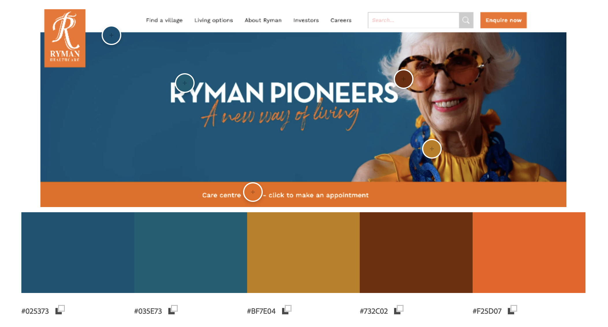
The brand identity for Ryman Healthcare is driven by the bright orange logo.
The high-key, strong complementary colours exude active energy, sassy personality, and bold attitude.
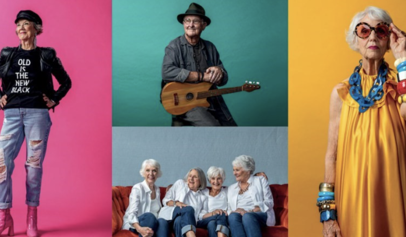
Ryman Pioneer's advertising campaign by VMLY&R New Zealand, © Ryman Healthcare
Ryman Pioneer's advertising campaign by VMLY&R New Zealand, © Ryman Healthcare
The typographic combination of modern sans-serif font and a cursive handwritten font paints a contemporary living option for the Ryman pioneers (seniors).
Brand
The advertising campaign challenges societal beliefs of what retirement experiences are all about.
‘Since Ryman Healthcare was created in 1984, more than 30,000 people have lived and laughed in its beautiful, purpose built villages.
While Ryman is pioneering a new way of living in retirement, its residents are pioneering what it means to live life to the full. Like the trailblazers they’re named after – Rita Angus, Sir Edmund Hillary, Possum Bourne – Ryman villages are home to residents who have been pioneering all their lives: they fought for freedom on foreign soils, achieved significant social change, built thriving communities, and contributed to the development of the technology age. Continuing to live their lives with passion and purpose, they are embracing the ‘lock and leave’ traveller lifestyle, learning new skills to broaden their minds, and rediscovering passions and pastimes that were lost when responsibilities took over.’ (Trusted Brands 2021)
Here's a snapshot of customer testimonials:
They looked after my mother with compassion and care.Male, 50+, Bay of Plenty
I live in a Ryman Retirement Village and am VERY HAPPY here. They look after their occupants more than would ever be expected, whether you are in an independent unit, a serviced apartment or in one of the hospital wings.Female, 50+, Canterbury
We were impressed with their level of care.Female, 50+, Northland
Logos and brands evolve over time. Starbucks and Airbnb have strong, well-recognised logos. But it was not always smooth sailing.
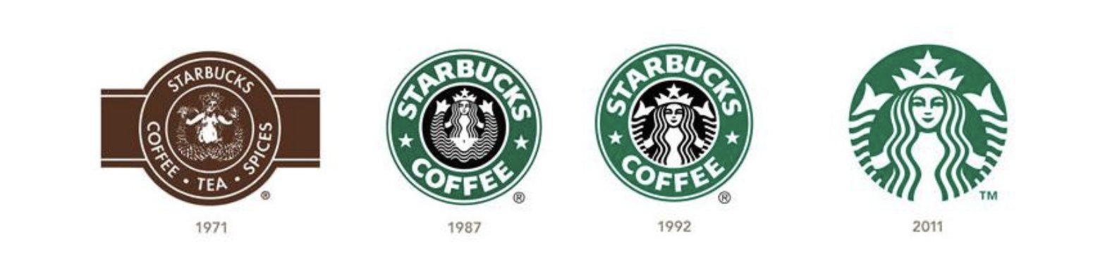
Logo History: the Evolution of Starbucks, © Starbucks
Starbucks
This internationally recognised coffee brand, originally founded in 1971, has an interesting nautical theme embedded in its logo history.
The company was originally going to be named Pequod after the fictional whaling ship that appears in Herman Melville’s Moby Dick. It was decided that Pequod was not a strong enough name and the company settled on Starbuck who was the ship's first mate.
The first Starbucks logo featured an illustration of a twin-tailed mermaid surrounded by text on a rich brown background, reminiscent of dark coffee.
In Greek mythology mermaids or sirens were creatures that would lure sailors to crash their ships into rocks or small islands. The Starbucks logo was intended to lure customers in with the promise of great coffee.
The logo was redesigned in 1987. Terry Heckler, the artist responsible for the redesign, incorporated green to represent the company’s new direction which included nearly doubling the number of stores between 1987 and 1988. The hand-rendered illustration style was replaced with a clean vector style, and the updated logo was more symmetrical.
The next update for the logo was in 1992, the same year Starbucks completed its initial public offering (IPO).
The illustration was simplified further and cropped.
In 2008 Starbucks attempted to leverage some nostalgia by reimagining their original logo. This may have been to appeal to the growing hipster movement whose values include anti-materialism, and an affinity for vintage and recycled products. The redesign was not successful.
The latest iteration of the logo was introduced in 2011 and is still in use today. The two-tone black and green were dropped in favour of an all-green design that focuses on the mermaid by removing the Starbucks Coffee text.
By now the brand was so recognisable that there was no need to include the name and the company offers far more than just coffee, so the inclusion of the text became irrelevant.
Airbnb
Founded in 2007 as Air Beds and Breakfast, the original logo used a friendly rounded font, and a vibrant cyan and magenta colour scheme with the tagline “A friend, not a front desk”.
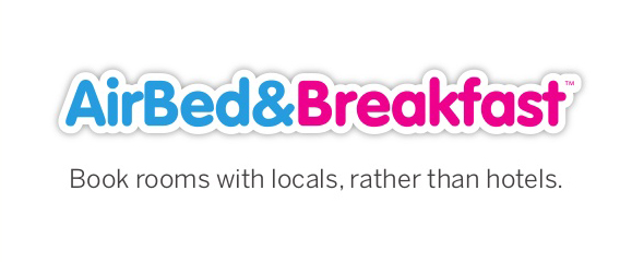
Original 'AirBed & Breakfast' logo, © Airbnb, Inc.
In 2008 the company simplified the name to Airbnb and started using a bold cursive logotype in blue outline. “air” was separated from “bnb” by a subtle overlap, helping with readability. The lowercase lettering helped to convey a feeling of friendship and welcoming, while the blue felt reliable and professional.
![]()
Original 'Airbnb' logo, © Airbnb, Inc.
As presented in the following three postcard images, the typeface in the 2008 logo was like that found on many “Wish you were here” style postcards. With large, weighted font, tight kerning, and overlapping strokes or shadows applied.

The Bélo
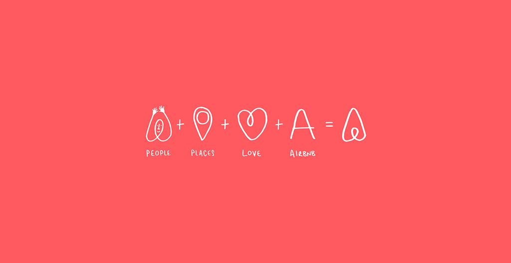
The most recent iteration of the Airbnb logo was created in 2014 and incorporated a symbol Airbnb dubbed the “Bélo” in reference to their “Belong anywhere” philosophy, and the name “airbnb” in a lowercase sans serif font, Cereal (Font in Logo, n.d.).
The shape in the centre is like that of a location or places icon. The overall shape clearly reads as a capital ‘A’ but also an inverted heart.
Airbnb logo story, © Airbnb, Inc.
Watch the following video to learn about the Airbnb rebrand.
The Bélo symbol was created to represent the elements that are important to Airbnb – People, place, love, together with Airbnb.
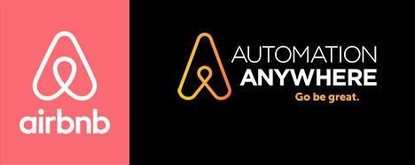
The new logo generated a bit of controversy when some online commenters expressed that they thought the bélo symbol resembles human anatomy, while others commented on its similarity to the logo for Automation Anywhere.

An effective logo is distinctive, appropriate, practical, graphic, simple in form, and conveys an intended message.
In its simplest form, a logo is there to identify. To do this effectively, it must follow the basic principles of logo design.

Simple
A simple logo design allows for easy recognition and allows the logo to be versatile and memorable. Effective logos feature something unexpected or unique without being overdrawn.
Memorable
An effective logo design should be memorable, and this is achieved by having a simple yet appropriate logo.
Timeless
An effective logo should be timeless – It will endure the ages. Will the logo still be effective in 10, 20, 50 years? Trends come and go. Where your brand identity is concerned, longevity is key. Do not follow the pack. Stand out.
Versatile
An effective logo should be able to work across a variety of mediums and applications. The logo should be functional. For this reason, a logo should be designed in vector format, to ensure that it can be scaled to any size. It should work both in horizontal and vertical formats.
Appropriate
A professional logo should be fit for purpose and appropriate for the audience. What is suitable for an accounting firm is not suitable for a kindergarten (Marianne, 2016).
When you design a logo, you need to also develop a set of guidelines for its use. If you are using a clients existing logo you should ask if they have a set of guidelines for you to follow.
These guidelines help keep branding consistent across different media and formats.
- Mandatory background colour.
- Minimum space between logo and other content.
- Minimum size that logo can be used.
- Colour specifications. For example, Pantone colours and/or CMYK/RGB values.
- Things that you cannot do with the logo such as, cropping, distortion, rotation, applying embellishments or effects, or using the logo within a sentence in place of the written name of the brand.
- Black and white, or spot colour variations of the logo and conditions for their use.
A great logo looks simple, effortless, and easy to produce. However, for beginners the task of logo design can be challenging.
Start away from your computer
It is easy to jump to using software straightaway. But starting the development process away from your computer will allow you to explore as many possibilities as possible and consider ideas you would not have considered at first.
Interpret the design brief
Answer all the questions pertaining to a business or service you are designing for. This will help shape the direction of your design.
Use idea generation techniques
Use mind-mapping and brainstorming to generate keywords. Choose the final two or three keywords as a theme.
Develop thumbnail concepts on paper
Thumbnail concepts are quick sketches, not quite as small as a thumbnail but small enough that several different ideas can be quickly drawn on a single page.
The idea of thumbnail sketches is to provide just enough detail to explain an idea. They can be supported with short design notes to clarify any ideas that are not obvious from the sketches alone.
Start with black and white
If it looks good in black and white, it will be easier to apply colour variations to it.
Get feedback
Seek feedback from your friends or family for your top three concepts. Consider the pros and cons, and choose one final design.
Turn your concept into a digital file
Use your pencil sketch as a base image. You can refine the design by using a fineliner on a tracing paper or take a photo of it or scan the sketch. This can be used as the base image.
Use vector illustration software, like Adobe Illustrator, to draw the logo. A vector file will ensure your logo is scalable and not resolution dependent. You can create variations based on the final design.
In this activity, you will use what you have just learned about logo design to create two simple logos.
Logo simplification: Less is more
Your task
Simplify the following images down to their most simple form. Produce three iterations of each image/logo, reducing the amount of detail in each successive step. The final logo should use only solid back and white, without shading or tinting.


Things to consider
Sometimes less is more. It does not mean the logo is not interesting or clever.
- What else can you remove and still communicate what the image is?
- Would the symbol still be recognisable at a much smaller size?
- Does your logo need to show the whole image? Or can you show only part of the image to still capture the subject?
- Is it still recognisable in black and white?
- Is this the image’s most simple form? Was there more you could have removed?
Share your logos in the forum.
A company’s identity includes a logo, an identity, and a brand.
A logo is a graphic symbol that is recognisable and memorable. It is easily linked to the company it represents. Identity includes the logo and all other visual and identifiable elements that are used to represent the company. A brand includes the logo, identity, and includes intangible things like how people feel about the company, the company's personality, and narrative. These elements are documented in brand or identity guidelines. Logo usage guidelines help ensure your logo is always applied consistently.
We considered two case studies, Whittaker’s and Ryman Healthcare, and how their logo, identity, and brand work together. And looked at the evolution of Starbucks’ and Airbnb’s logos.
An effective logo design is simple, memorable, timeless, versatile, and appropriate.
Additional resources
Here are some links to help you learn more about this topic.
It is expected that you should complete 12 hours (FT) or 6 hours (PT) of student-directed learning each week. These resources will make up part of your own student-directed learning hours.
- What is a brand?
- Simplicity: the key to building a successful brand
- How not to redesign your brand logo
- 5 tips for a memorable logo
- Logo design and histories
- Logo design trends
- Logo design tutorials
- Business card design
- 7 logos simplified
- Pantone colour of the year
- WATCH virtual tour of Pantone manufacturer