In this topic we will cover the following:
- What is drawing?
- Traditional illustration – Woodcutting, lithography, metal etchings, pencil
- Digital illustration techniques – Raster and vector.
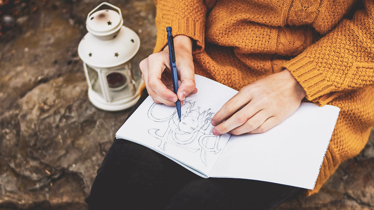
Drawing is a form of creative expressions through mark making.
Drawing is associated with engaging the right hemisphere of the brain which is also known as the creative or spatial perception side. It is often a direct translation of what a person sees through their observation.
Drawing can come in the form of:
- Gesture, contour, or line drawing
- Negative spaces drawing
- Perspective drawing
- Shading drawing
- Gestalt drawing.
Practising drawing has proven to enhance the creative problem-solving ability as well as the ability to connect disparate subjects into a theme.
Gesture, line or blind contour drawing
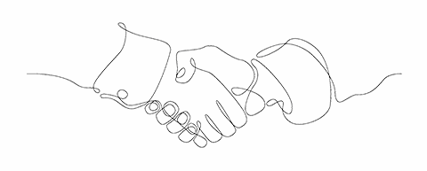
Gesture, line, or blind contour drawing is drawing with minimal reference to the page.
It is a process of letting your eyes trace and follow the contour of the subject or object as you glide your pencil on the page the whole time, without lifting it up.
The following is an example of how gesture drawing can be applied commercially as a branding identity. The Imperial is a co-working space in Christchurch, New Zealand.
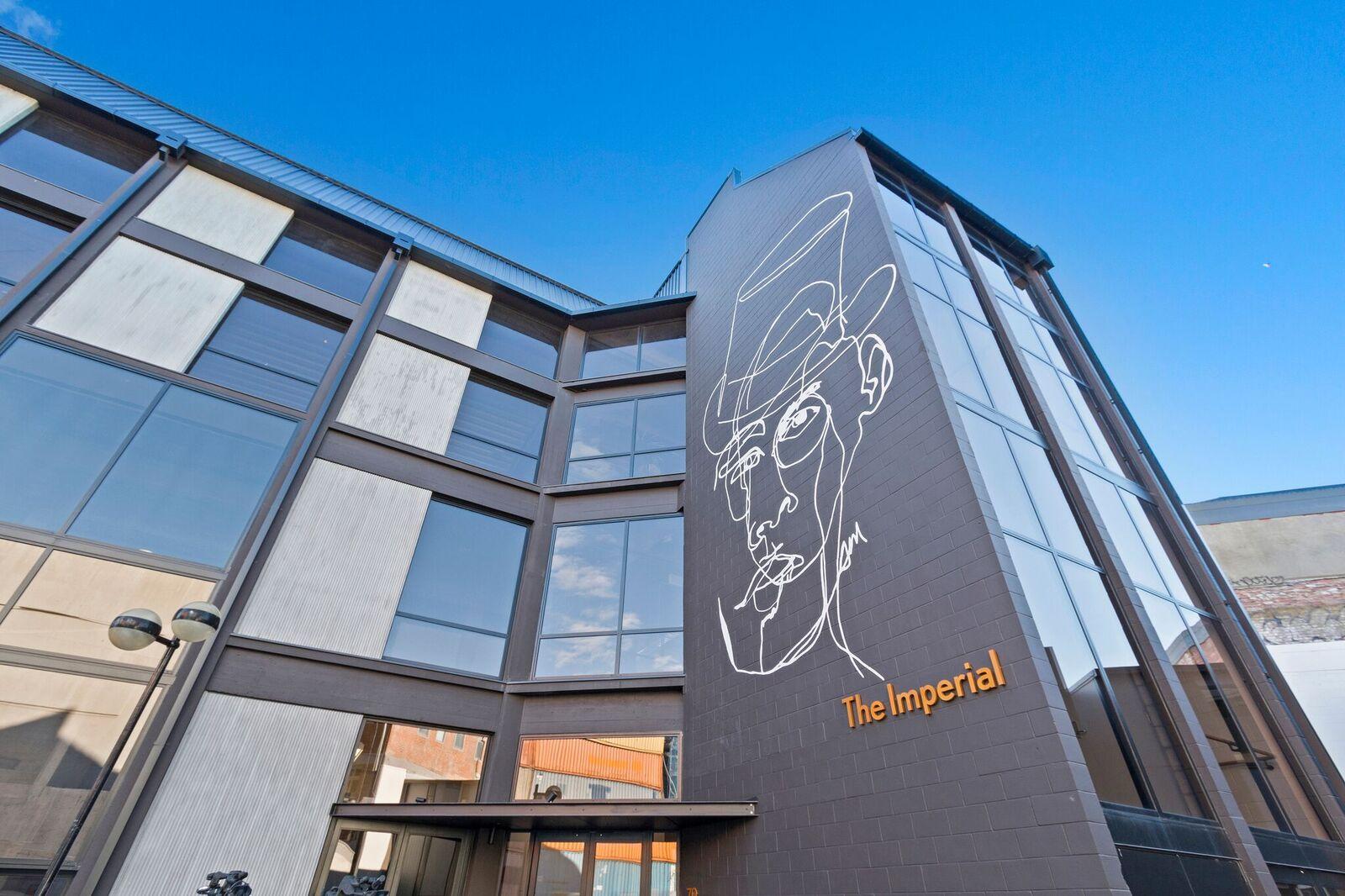
From Imperial Building Christchurch, n.d., © sharedspace.co.nz/
Negative spaces drawing
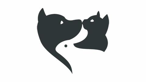
Negative spaces drawing is drawing the spaces that surrounds and occupies an object or subject.
The object or subject is considered the positive space or foreground, and the background is the negative space. Blocks of white (paper or canvas) and black are applied to separate and create a distinction between the foreground and the background.
The following logo example utilizes negative spaces as part of it's design.

Perspective drawing
Perspective drawing is drawing the spaces and relationships created by the vanishing points and horizon line.
There are three types of perspective drawing based on the vanishing points:
- One point perspective
- Two points perspective
- Three points perspective.
The vanishing points also relate to the three types of horizon line:
- Eye level
- High horizon or above the eye level
- Low horizon or below the eye level.
Shading drawing
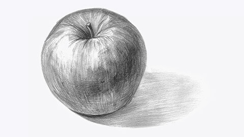
Shading drawing is sculpting an object or subject to represent its three-dimensional values by plotting the areas of lights and shadows.
Objects or subjects around us can be seen by our eyes when there is light reflected on them. If we observe the object carefully and shift our thinking pattern, we are able to see which area has the most and the least light. We will also see that colours translate into a tonal gradation, from white, to light grey, dark grey and eventually pitch black.
Gestalt drawing
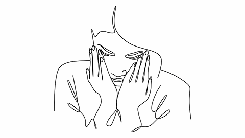
Gestalt drawing is drawing using a combination of techniques to represent the object or subject in its entirety.
Engage the right brain
It is important to switch to engage the right brain fully. Train the mind to not name the object we are drawing. For example, when drawing portraits, not to name the eye or the nose, but instead notice the different qualities of line, spaces, relationships, lights, and shadows that forms the shapes of the face.
But what if I cannot draw?
Everyone can draw in their own unique way.
It is the opinion given about the drawing that shapes the thought of whether someone can or cannot draw. Adults were once children who loved to draw, but at some point, they were told that their drawings were not good enough.
So, do I have to be good at drawing to be a good designer? The answer is NO.
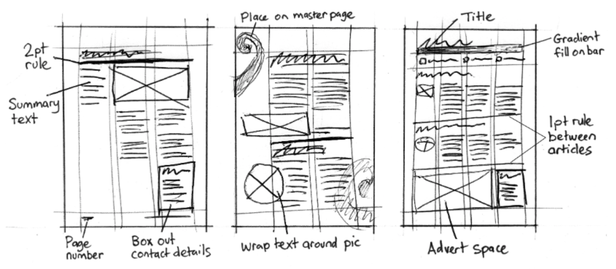
However, it is essential and helpful to be able to convey your concepts using these drawing conventions in design;
- Squiggly lines can indicate larger text, for example, headlines.
- Simple repeating lines can be used to represent lines of text or body text.
- Crossed boxes or grey shaded shapes can be used to indicate the positioning of images.
- Horizontal and vertical lines can be drawn to indicate document grid lines (margins, columns, etc).
Keeping a visual diary
If you do not have a visual diary already, go out and buy one today. A hard back, A4 spiral bound, with plain white pages can usually be found in any stationery shop.
Once you get a hold of a visual diary, be conscious of designs that surround you in your everyday environment. Consider the design of a menu when you visit a restaurant, signage as you walk along a street, or advertisements in a magazine that stand out.
Learning from good design
You should be constantly identifying and collecting examples of good design.
Ask yourself questions such as:
- “What makes this design so great?”
- “What do I not like about it?”
- “How did the designer achieve the results?”
Write your answers and thoughts down in the visual diary. Not only does this engage your thought processes, but you will find your notes useful for inspiration later if you are stuck for ideas. And as always, if you are ever bored, get drawing. Exercise those finger muscles, develop hand-eye coordination and most importantly, have fun.
You can practice doing the following as a warmup and create patterns in your diary:
- Short and long straight lines
- Squiggles and wavy lines
- Shapes such as circles, squares, triangles.
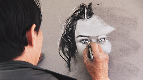
Illustration is the art of creating images with a purpose other than simply expressing one's aesthetic and self-expression.
Illustrations are useful for more than just visual expression:
- Add depth to words
- Tell stories
- Illustrate a topic.
Based on the technique used, illustration is divided into two groups:
- Traditional illustration
- Digital illustration.
Illustration has existed since people started sketching small stick figures on cave walls. Illustration remains an important mode of communication and expression.
Woodcutting illustrations
Woodcut is a type of relief printing and is the earliest method used in fine art printmaking.
This is one of the oldest techniques of illustration. It was popular during the Middle Ages and gained prominence after the invention of the printing press. The artist's design or sketch is drawn or painted on a piece of wood (typically beechwood), and the unaffected portions are carved away, creating a raised picture that is subsequently inked.
Woodcut prints are made by pressing an inked image into a chosen media (typically paper). Separate wood blocks are necessary if colour is applied. Have a look at the follow video that explains the woodcarving process.
Lithography illustrations
Lithography is a printing technique that involves working a greasy substance into the image parts of a flat stone or metal plate so that the ink adheres to them, while the non-image areas are made ink-repellent.
Grease and water do not mix, which makes this printing method possible. A greasy media, such as a particularly greasy ink called tusche, crayons, pencils, lacquer, or synthetic materials, is used to apply the picture on a grainy surface (traditionally stone but today usually aluminium).
It is also possible to use photochemical or transfer methods. The surface is subsequently coated with a solution of gum arabic and nitric acid, resulting in water-receptive non-printing areas and grease-receptive image areas. The printing surface is kept moist so that an oil-based ink roller can be run over it, with the ink sticking exclusively to the grease-receptive image area.
After that, paper is pressed against the surface and the plate is run through a press. Have a look at the following video showing the printing process of lithography.
Metal etchings
In traditional pure etching, a metal plate (typically copper, zinc, or steel) is covered with a waxy ground that resists acid. The artist uses a pointed etching needle to scratch away the ground where he or she wants a line to appear in the finished piece, exposing the bare metal. The plate is then dipped in an acid bath, where the acid "bites" into the exposed metal, leaving lines sunk into the plate.
The plate is subsequently cleansed of any leftover ground. The plate is first inked all over, then wiped clean, leaving only the ink in the etched lines. The plate, along with a sheet of paper and the ink, is then run through a high-pressure printing press. You can watch the whole process in the following video.
Pencil illustration
The pencil illustration is one of the most popular and accessible types of illustration.
It is a rich material that lets you make delicate shadows and transitions as well as sharp, precise lines. Illustrators sometimes like to keep the pencil sketch loose and write with a pencil before finishing the illustration with another medium. This illustration style is known for its precision and attention to detail, as well as its ability to contrast objects.
Even though pencil illustration is monochromatic, it is still possible to create detailed work by applying a single colour with variable hues on a plain surface to draw detailed work. To create technical drawings or diagrams, fine lines with varied properties and densities are utilised in conjunction with dots. In the following video the artist explains their drawing process while they are working.
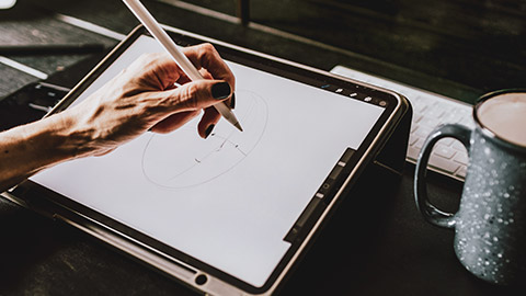
With improvements in technology and the growing relevance of illustration in a variety of sectors, illustration techniques have expanded to include a wide range of options and styles.
Existing applications, such as Photoshop, Illustrator, Inkscape, and others, can now be used to create various illustration styles. If you're a conventional artist wishing to branch out into modern or digital approaches, or simply want to brush up on your skills, this should be enough to get started.
There are two main types of digital illustration:
- Freehand Digital Illustration
- Vector Graphics.
Raster versus vector images
Image files are divided into two categories – Raster and vector.
Raster images use pixel-based software, a camera, or a scanner to generate images. They frequently used on the web and are more common in general. File formats typically used are JPEG, PNG, and GIF.
Vector graphics on the other hand are math-defined shapes made with vector software and are less popular. They are utilised in:
- CAD - Computer Aided Drawing for example in architecture and engineering
- 3D modelling and animation
- Graphic design.
Vector graphics are also useful for processes like engraving, etching, and cut stencils that reproduce an image onto an object.
Watch the video for a quick overview about the difference between rasters and vectors.
Raster illustrations
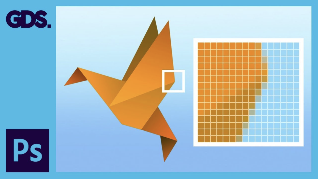
A raster illustration is a computer graphic image made up of pixels arranged on a static grid.
A pixel is a tiny, solid-colour square made up of colours formed by subpixels of RGB (red, green, blue) light. A static grid is an invisible square pattern in the background where pixel(s) are arranged.
Every brush stroke adds pixels along the brush path when you use the brush tool to create a digital illustration—the number of pixels depends on the size of the Photoshop document and the radius of the brush you are using. The lens converts reflected light into small, coloured pixels that combine to make a realistic digital image while capturing a photo or filming a movie.
Raster images are resolution-dependent because each pixel is assigned to a grid space.
The number of pixels in raster images is fixed, so they cannot be resized without distortion. Given that there is greater possibility for colour blending when viewed from a distance, the image with more pixels has a higher quality (or resolution). At the same time, less pixels implies that when an image is scaled, it will appear little or ‘pixelate' since there aren't enough pixels to produce smooth shading.
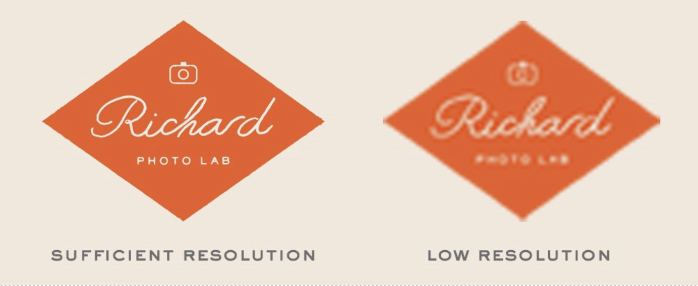
From Everything You Need To Know About Film Grain and Pixelation, © Richard Photo Lab, n.d.,
Adobe Photoshop and GIMP are two raster-editing apps that designers use when creating graphics. Raster programmes can be used to create a website, an app, an icon, a banner ad, or any other electronic design.
Because of the amount of colour information they can carry, raster pictures are great for showing the subtleties of colour gradients and shading—for example, when retouching photographs or creating photorealistic graphics.
One of the most significant drawbacks of a raster image is its inability to be resized without causing jaggies or other distortions.
Vector illustrations
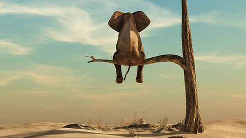
Vector graphics are mathematical calculations that produce lines and shapes by connecting points. Vector graphics may be zoomed and scaled to a specific size without pixilation.
When designing a vector illustration, artists make sure that each point is represented on coordinate axes in order to determine the path's orientation.
Vector illustrations are available in:
- EPS
- and SVG formats.
Artists can also define outlines more clearly and effectively. Vector illustrations are perfect for online illustrations, branding, and other similar projects because they have less flow or gradation.
Designers can quickly and simply generate vector drawings using native features in programmes like Adobe Illustrator. The calculations are performed by the computer.
Visuals are geometric in nature and resolution independent—you can scale up or down a vector image without affecting image quality because there are no pixels. When the size or position of the object changes, the computer simply recalculates the equations.
Unlike raster images, vector images can be scaled to any size without sacrificing quality.
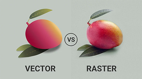
From Vector vs Raster Graphics: What’s the Difference? © Graphic Wallet n.d.,
Imitate an illustration
In the industry you could be asked to copy a particular design or illustration style.
This activity will give you the knowledge of how to observe and analyse a style and figure out how to recreate it.
Scenario
You are working as a freelance illustrator. One of your clients wants you to create an illustrated poster in a particular style from a photograph, but first they want to see proof that you can achieve the specified style. They have requested that you create an illustrated poster of a photograph in this style.
Your task
You are to:
- Choose an illustration style and the photograph you will be recreating in this style.
- Analyse the style and figure out how it could be achieved.
- Discuss your analysis.
- Create a rough concept.
- Save a colour palette.
- Create the vector poster.
- Get feedback from your client (family, friend or actual client).
In this topic we looked at what defines drawing and introduced various drawing techniques including;
- Gesture, blind contour, or line
- Negative spaces
- Perspective
- Shading
- Gestalt.
Illustration differs from drawing in that it is not limited to expressing one’s own aesthetic and self-expression, but adding depth to words, to tell stories, or illustrate a topic.
Traditional illustration techniques include woodcutting, lithography, metal etchings, and pencil.
Digital illustrations include raster and vector images.
Raster illustrations are computer graphic images made up of pixels arranged on a static grid. The shading and colour gradient on a raster image is more detailed than that of a vector, but raster images do not scale well and can look pixelated.
On the other hand, because vector graphics are mathematical calculations, they can be scaled without pixelation.
Additional resources
Here are some links to help you learn more about this topic.
It is expected that you should complete 12 hours (FT) or 6 hours (PT) of student-directed learning each week. These resources will make up part of your own student-directed learning hours.
Illustration
- Top 10 graphic design trends Isometry
- Amazing Art Deco style illustrations
- Illustrations on Pinterest
- Getting Started With Vector Illustration
- Appearance panel secrets
- Amazing Vector Art Tutorials
- Add depth to your vector art
High-resolution textures
