In this topic we will cover the following:
- Denotation
- Connotation
- Images in advertising
- Preparing your files for image-making.
We use the term Image Making to discuss the process of image creation and the analysis of their meaning. Image making can be particularly important in advertising where an image will often need to convey a specific message.
An image’s message can be discussed using the terms denotation and connotation.
Denotation refers to the literal interpretation of an image. What is in the image, what is happening in the image.

Consider the image presented. We may be able to assign some meaning already however looking at it from a denotative perspective we can describe the image as:
“A senior person isolated over the grey background. Their face appears joyful, with their grey hair and beard creating a circle frame around their face.”
As you can see the detonation of the image does not assign or describe any possible meaning in the image. Have a go at a coming up with a denotative description of the following image.
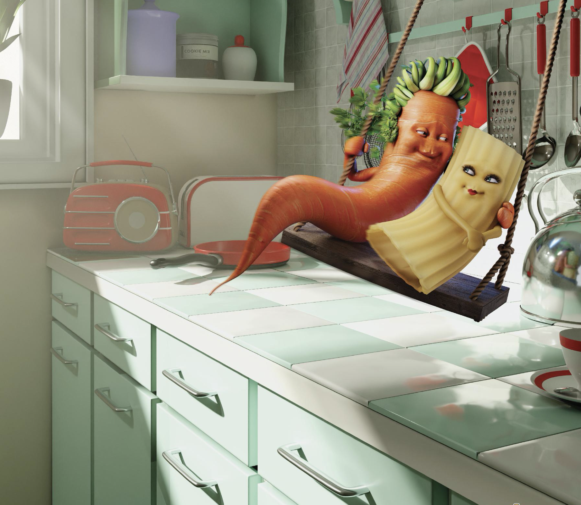
From The Perfect Match by Ogilvy, 2020
Perhaps you came up with something like this...
“The image is computer generated and shows an anthropomorphic carrot and a pasta piece sitting on a swing. The two characters are looking into each other's eyes and smiling at each other. The carrot has one arm around the pasta. The swing is set in a kitchen with light entering from a window.”
Connotation refers to the layers of meaning that may be present in the image. It is why certain elements are included and why certain things are happening.
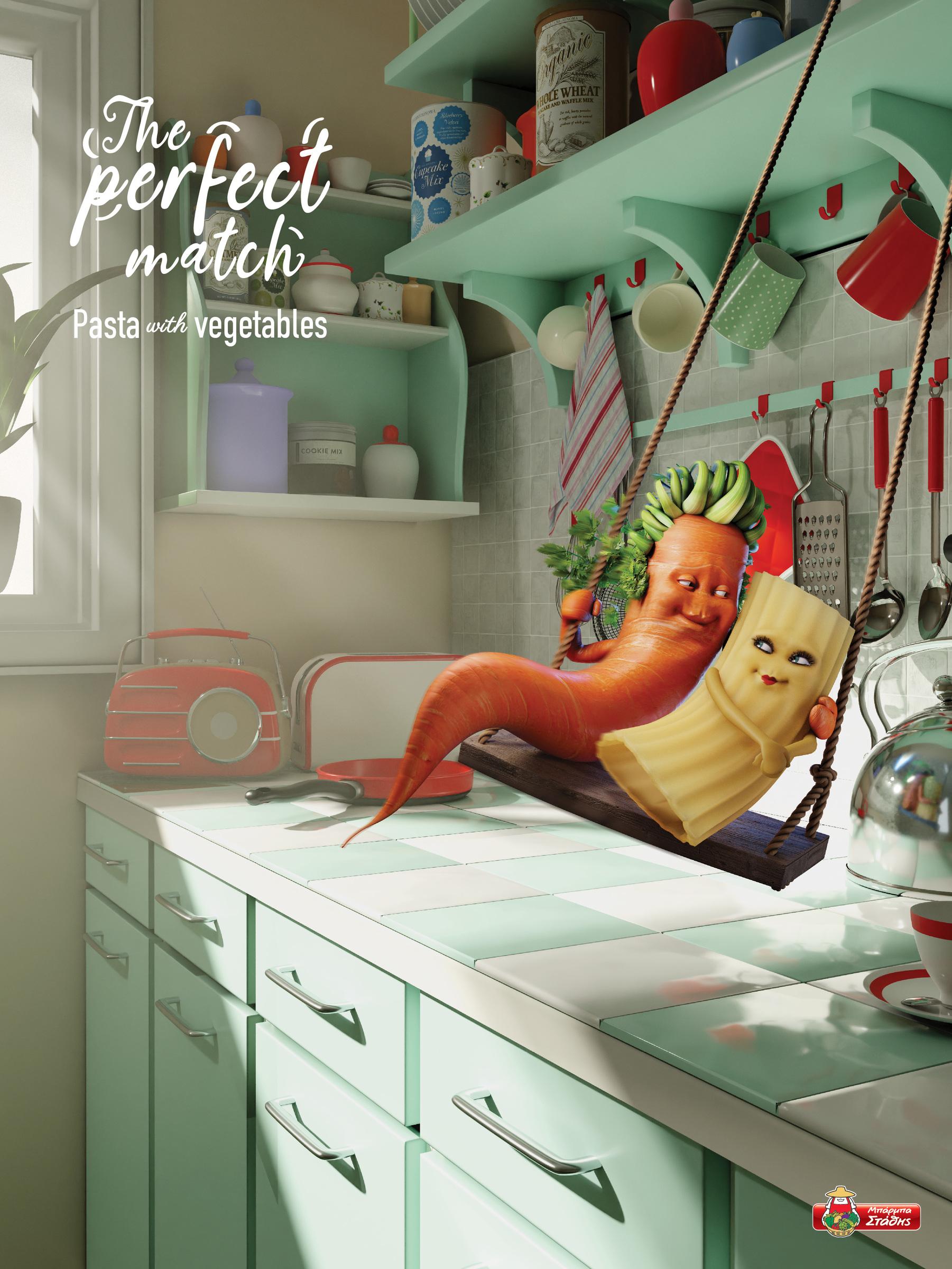
Take a second look at the image of a carrot and pasta piece.
- Why would the characters be on a swing together?
- Maybe because they are friends?
- The way they are looking at each other and smiling might indicate that they are in love.
- The light coming through the window makes the scene look more romantic than platonic.
The image appears to depict a perfect moment, of a happily matched couple.
This interpretation fits perfectly with the image when we see it in the context of the ad it was created for.
What about the image with the senior man? What do you think the connotations of that image are? Here it is again.
A picture is worth a thousand words.
Advertising and marketing professionals try to convey elements of a brand, a product, and a relatable story in a very short time. Using images to capture the attention of a viewer is often more effective than a headline or slogan on its own.
Images used in advertising often show exaggerated or hyperbolic scenes or scenarios. They often use visual metaphors to convey their messages.
This ad for a common cold relief medication called Sudafed.
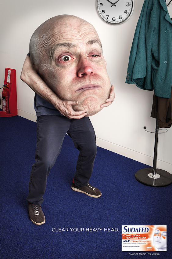
From Sudafed by Andy Smith Creative, n.d.
The over exaggerated head, captures the attention of the viewer. Having the image of the medication below clearly indicates that it will relieve this head cold feeling.
Uruguay radio station Océano FM uses these images, with the tagline “Music drives you”.
Océano FM: Music Drives You, From Music Drives You by Amen 2021
The images are from the perspective of the back seat. Looking forward you would normally see the reflection of the driver in the rear-view mirror. These images have superimposed images of famous artists with the connotation that they are in the driver seat, fulfilling the promise of the tag line.

You are likely to be working with photographs or scanned visuals to achieve your desired result.
- These photographs and scanned visuals are raster graphics (also known as bitmap).
- They are composed of a grid of pixels (tiny, coloured squares or rectangles).
- The resolution (density of the pixels) determines the amount of definition in the graphic.
High resolution files are required to achieve good results in print. However, high resolution images can result in large file sizes. Learn to find the balance by compromising between image quality (resolution) and file size.
Top tips for prepping your files
Get organised
Name your file clearly and save it in a dedicated project folder.
Always save a copy of your original photos unedited. And create additional copies for you to do separate edits.
Save and keep your working Photoshop files with layers intact. Even after you are happy with the exported image, you might want to revisit it at a later date.
Use your own images
Where possible, take your own photos or check your digital photo album. If you are scanning original visuals, choose higher ppi for better image quality.
If you cannot use your own images, look into CC (creative commons) images. Take note of attribution required and copyright.
Choose medium to large size images if you need to download images. You can change the settings in Google search for size and copyright options. You can scale down raster images but not scale up without the images becoming blurry and pixelated.
| Medium | Resolution | Details |
|---|---|---|
| Web | 72dpi | Images intended for the web only need to have a resolution of 72 dpi (dots per inch), which is the maximum resolution of monitors |
| 300dpi | Images intended for print need to have a resolution of 300 dpi as the printing process allows for much greater detail |
Best resolution for web graphics
72 ppi (or sometimes 96 ppi) is often said to be the optimum resolution for web graphics.
In reality, web browsers completely ignore resolution and only consider the overall pixel dimensions of a graphic. However, 72–100 ppi is a good reference to use when scanning or designing web graphics. The actual resolution of a monitor varies depends on its physical size and its display settings.
Best resolution for print graphics
300 ppi is the optimum resolution for colour and greyscale graphics.
Many people make the mistake of thinking that a higher resolution file is always going to produce better quality results.
You can often get reasonable results printing at a lower resolution, for example 200 ppi. Going higher than 300 ppi will only result in larger, slower files with no discernible improvements in quality.
Printing at resolutions lower than 150 ppi will cause noticeable pixelation (jagged edges) and is unprofessional. The exception is jobs such as billboards or large signage that will only be viewed at a distance.
For purely black and white graphics (no greyscale) 600 ppi is a more suitable resolution as printers can print black-only graphics sharper than grey or colour graphics.
Set your file for its final output
Web or mobile
Original files designed for branding identity, need to be set up in the RGB colour mode. This ensures the best colour representation when displayed on screen (additive colour mode). Designing graphics in RGB and as a vector will help you to repurpose and create different versions for various output formats.
The following is an example of a graphic title designed for the movie Catch Me If You Can (2002).
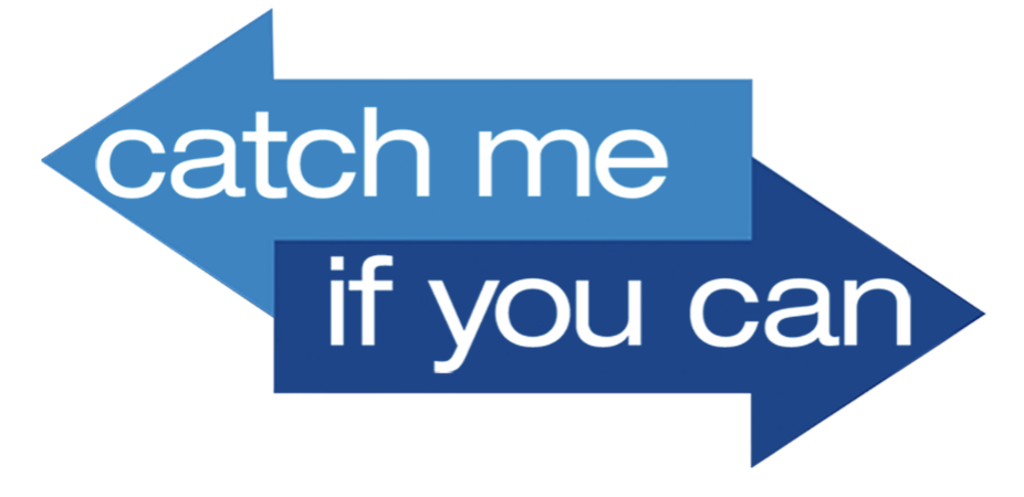
From Catch me if you can title by Nexus Productions Add a Dog, 2002
Are you designing branding identity that is used on printed material? This includes business cards, stationery, merchandise, or larger items such as vehicle wraps, posters and billboards. If so, check if the document colour mode is CMYK.
The following is a poster made for the movie Catch Me If You Can (2002).
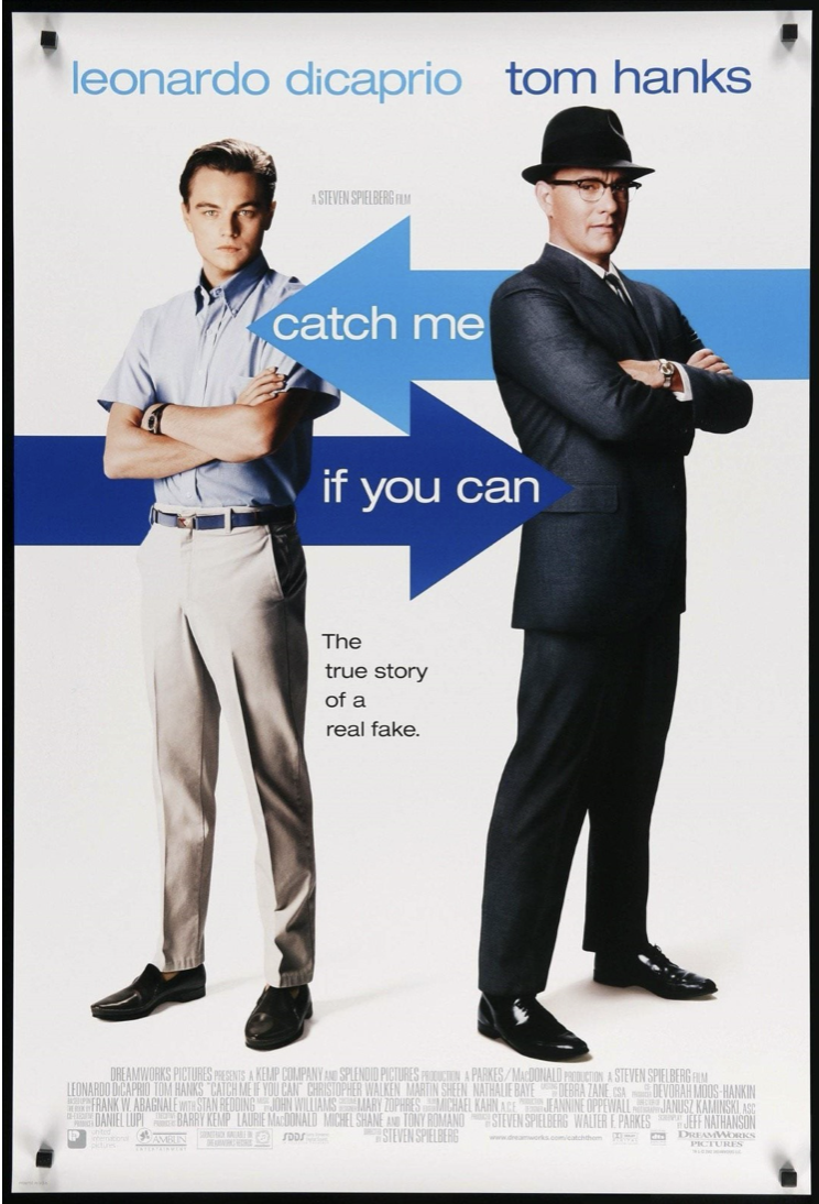
Movie poster for 'Catch Me If You Can', 2002, © Storyteller Distribution Co., LLC
Large screen
Designing for large screen needs to be setup in the RGB colour mode. You also need to check with the client what is the largest screen display they are expected to have the graphics displayed on. For example, choosing a preset Film and Video size in Adobe Photoshop for HDTV 1080P will provide you with 1920 x1080 px screen size and a 72 ppi screen resolution.
You might be designing motion graphics title sequences. For example, the opening title in the movie Catch Me If You Can (2002), designed by French production studios Kuntzel and Deygas from Nexus Productions and Add a Dog.
Image creation can be denotative or connotative.
- Denotation is a literal reading of an image.
- Connotation is a layered interpretation of what an image represents and the story it tells.
Images are used in advertising and marketing to quickly convey a brand, product, or story. Images are often exaggerated or hyperbolic and contain visual metaphors to convey their messages.
Prepare your files for image making by getting organised, using your own images (or sourcing appropriately attributed images), and selecting the best resolution for the medium.