
In this topic we will cover the following:
- Desktop
- Mobile
- Large interactive display
- Navigating the user interface.
The technology we use heavily relies on a Graphical User Interface (GUI). As part of the human-computer interaction, a GUI acts as an intermediary product that connects a human's intended action with the computer's operating system. These computer operating systems power devices such as smartphones, tablets, laptop or desktop personal computers, large interactive displays, navigation systems and many more.
Designing a user interface for any device starts with the same standards and good user experience elements. However, each device is used in different contexts and therefore, as a designer, adjusting your design to enhance each experience is necessary.
There are different technologies employed to make responsive designs. Responsive designs are scalable designs that adapt accordingly to the screen size. Windows relies on its Universal Windows Page App to automatically adjust UI elements. The elements will be legible and easy to interact with no matter what devices or screen sizes they are displayed on. Apple iMac Operating System on the other hand uses the Auto Layout feature to dynamically adapt to its different devices and screen sizes. Both systems use EPX or Effective Physical Pixels, also called ep or px.
As you have seen in the preceding video, Doug Engelbart, an early computer and internet pioneer, paved the way for many technological advancements in the world of GUI. He pioneered the ability to type in a set of commands in the early models of computers back in the 1960s. Back then, the command-line interface allowed interaction to access services to the operating systems.
Since the invention of WIMP – Windows, Icons, Menus, and Pointers in the 1970s and popularised by Apple Macintosh products in the 1980s; users can use the 'mouse' and GUI as a direct manipulation tool. The early iconography of the GUI was mimicking the physical world by using skeuomorphism to bridge familiarity to the digital world.
The UI design for desktop devices was primarily driven by research run by software giants such as Microsoft and Apple. The term user experience (UX) design was coined by Don Norman, the first UX architect at Apple. UX design has since shaped the basis and practices for designing modern user interfaces.
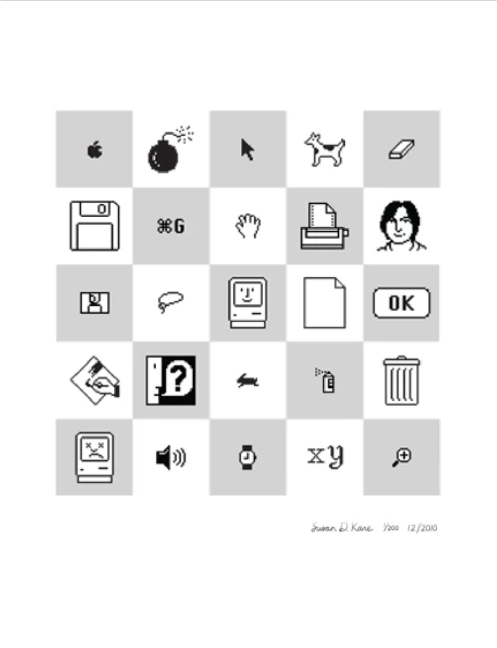
One of the first graphic artists with Apple, Susan Kare, made a significant contribution to the GUI design language and iconography that was highly emulated in the years to come. The following image showcases Susan's iconic graphic work as a printed collectible available from the website.
Jakob Nielsen, a leading researcher on UX from the NN Group, has devised a general rule of thumb or heuristics for UI design. Jackob’s Ten Usability Heuristics were first written in 1994 and have since been updated to reflect the change in language. The ten rules have remained true and relevant. The following is a poster made available for your design reference. Jakob's Ten Usability Heuristics PDF.
In addition to the above heuristics or guidelines, the main operating systems have developed their own design guidelines which can be found on these pages:
- Microsoft Windows - Introduction to Windows app design
- Apple - Human Interface Guideline
- Android - Design for Android

Mobile will ultimately be the way you provision most of your services.
The way I like to put it is, the answer should always be mobile-first.
You should always put your best team and your best app on your mobile app.
Eric Schmidt, 2010 CEO of Google
There are multiple reasons why responsive design needs to be approached with a mobile first strategy.
The first reason being the screen real estate of mobile devices is more limited than a tablet or desktop screen. If you can fit the bare essentials onto a small screen, placing additional elements on a tablet and desktop can be tackled accordingly. Quantity is another good reason to design mobile first. According to Statista, there were 3.5 billion mobile users in 2020. That is about half of the world’s population, a large share of the device market preferences.
Looking at the interface on mobile devices, the conduit of a keyboard and a mouse is replaced by direct manipulation of the GUI. Users can use the tip of their fingers to interact with the icons and perform the desired actions. Finger movements such as swiping, tapping, pinching, and dragging transport users into the digital world. Smartphones, tablets, laptops, and smartwatches allow users on the move to access information on the go. There are also built-in smartphone technologies such as GPS, Bluetooth, gyroscopes, accelerometres, speakers, cameras, microphones. Designers can incorporate these additional technologies into design to create a rich user experience.
- GPS - Global positioning system. Example of use includes Google Map positioning and direction system.
- Bluetooth - Short range wireless transfer technology. Example of use includes wireless headsets.
- Gyroscopes - A device used for measuring or maintaining orientation and angular velocity. Example of use includes the capability for motion gaming such as the steering wheel feature when driving a vehicle.
- Accelerometres - A device used to detect the orientation of the phone. Example of use includes the steps counter as part of a fitness app.
Considerations

These are some of the considerations you should make when designing a mobile first interface.

- Least Accurate
Edges, corners - Most Accurate
Center
Understanding your users
Your users are just as varied as the seven billion and growing human population. Although you fall into the category of a specific age bracket, remember that you are not designing only for yourself. So, make sure to apply user research methods and personas.
Context of use
The location of the user and the time of usage are essential in understanding the motivations of mobile users. Designers can utilise location-based services using the built-in GPS and prioritise the most helpful and searchable features first, such as opening hours for stores and availability of appointments.
Finger dexterity
The model and brand of the mobile device will affect how the users interact with their fingers, in particular the thumb. Strategic placement of buttons and key actionable links need to be within reach of the thumb and not cause strain. A single-column layout is advocated to mimic familiar platforms and navigation.

Content priority
Position the key content in the centre and navigation buttons at the bottom of the screen. Doing this will avoid the thumb or fingers blocking key navigation features. This adaptation is based on the commonly used F scanning method on desktop devices, where users will scan horizontally twice from the top and move downwards vertically.
Micro interactions
The gestures made with the users' fingers as they interact with the UI will require feedback on the screen. It is important to apply the principles in the laws of physics and the laws of motion when providing interaction feedback. For example, adjust the speed of the image movement as it exits the screen to the pressure and speed of the finger swiping movement.

Phone handling preferences
- 75% of users touch the screen only with one thumb.
- Fewer than 50% of users hold their phones with one hand.
- 36% of users cradle their phone, using their second hand for both greater reach and stability.
- 10% of users hold their phone in one hand and tap with a finger of the other hand.


Incremental display
Reveal the necessary information when and where it is needed. Do not overwhelm users with multiple information at once. Show them what they want and provide the options to seek further information.
The magic number 44
Human fingers come in different sizes and shapes, affecting the touch zone within the interface design. 44 by 44 pixels is the magic number to remember when designing interactive controls. This dimension allows users sufficient space to hit controls easily and act as a reminder to build dead space between controls to help avoid user error.
Case study: LinkedIn
One of the features of LinkedIn is the ability to invite others to connect with you. When an invitation is sent, the invited user is prompted with an option to accept or decline. On a smaller mobile phone screen, the positioning of the buttons is very close together. The invited user might be mistaken for accepting or rejecting the invite because (X) was placed first on the right.

Invitation action buttons for accepting (V) and rejecting (X) at very close proximity

Designing for large interactive displays at home and in public spaces has its unique features and challenges. Unlike desktop and mobile devices, which strive to bring users into the digital world, designers of large interactive technologies look to bring the digital space into the physical space we are occupying.
Large interactive displays in public spaces can serve different purposes depending on what the organisation wishes to do. Shopping centres and transportation hubs can use this as a wayfinding method. The display is usually strategically placed at prominent points within the space, such as the entrance or centre of the building.
Exhibition displays
Galleries and museums also utilise large interactive displays in informative and engaging ways.
Te Papa Museum in Wellington leads in innovative ways to entertain and inform its visitors. They have developed a Design Language System, a web-based guideline for those working with them to produce digital content. The system is divided into three helpful sections; foundations, principles, and patterns.
This system helps in-house designers and contractors to maintain a cohesive and consistent delivery throughout their displays.
A successful collaboration between Te Papa Museum and a local digital experience agency, Octave, can be seen in the ‘Te Taiao Nature’ exhibition.
Game consoles
As you can see in the previous video, game titles utilise sensors, haptic feedback, as well as augmented, virtual, and mixed reality (AR, VR, MR). Users no longer passively use their fingers to interact with the device’s interface.
The interface responds and reacts to natural human movements such as:
- head tilting,
- hand thrusting,
- arm swinging,
- body twisting,
- and foot thumping.
Virtual reality (VR), augmented reality (AR), mixed reality (MR)

Virtual reality (VR), augmented reality (AR) and mixed reality (MR) are extended variations of digital experiences.These technologies look at pushing the boundaries between the physical and digital worlds. Virtual reality products block the viewers' range of view and replace it with digital environments. Mainstream products include headsets such as Oculus Rift, HTC Vive and Sony PlayStation VR.
Augmented reality or AR technologies can be found embedded into popular social media platforms such as Instagram and Snapchat. It started as an entertaining way for users to interact online, where you can find examples seen on profile pictures with filters integrated seamlessly. The AR technology also allows the users to move and experience seeing the filters as they move about. Retailers and other organisations have since picked up and expanded the technology to engage with their audiences.
Mixed reality technologies blend the physical and digital world to create new environments and visualisations. Both VR and AR technologies can be found alongside to create a mixed reality experience. Microsoft Hololens is an example of this product that allows hologram projections into the users' surroundings.
Users can interact and manipulate digital interfaces and 3D objects within the digital environment. This technology has benefited a wide sector and is especially notable for its contribution in remote engineering repair support, educational training for high-risk spaces or situations such as manufacturing, health, outer space and many more.

Looking for information on the internet and arriving on a page is like being dropped off in a foreign city. You do not have a clear sense of direction yet and where you are in relation to the destination. If you could spot a wayfinding sign within view, it will assist you with where you are heading next.
A good website navigation system is just like this. It will assist the user in finding relevant information and encourage them to take subsequent actions. It provides assurance and clear options.
To assist our users with the best navigational experience, we need to consider the following components.
- Current locator: This is an indication to show users where they are in relation to the overall site. Are you able to see a coloured tab when you choose a specific page?
- Navigation method: This is to know the options available within the site. Where can you go and how you can get there.
- Trace route: This is to trace back to the pages you have visited within the site. You will be able to find the link to the homepage.
- Search: The best features to support findability and discoverability. Findability is a measure of how easily can users find content or functionality that they assume present in a website. Discoverability is a measure of how users encounter new content or functionality that they were not aware of previously. For example, the search functionality allows users to access specific information quickly and the magnifying glass icon is often used alongside a dedicated search box.

- Browser
- Contextual Navigation
- Main Navigation
- Secondary Navigation
- Bread Crumb
- In Content Navigation
- Footer
A navigation system can grow into a complex system, but in general it can be categorised into two systems.
- Primary or main navigation system - the main system.
- Secondary navigation system - the supporting system.
The primary/main navigation systems can be broken down into the following:
- Global navigation system.
- Local navigation system.
- Contextual/ hierarchical navigation system.
Whereas the secondary/supporting navigation system may consist of some or all of the following:
- Search features - for example, a search box area or a magnifying glass icon.
- Trace route - for example, breadcrumb link.
- Current locator - for example, coloured tab to differentiate where you are within the site.
- In content navigation - for example, hyperlink to an article within the site.
- A header and a footer - the top and bottom area of the page.
- A chatbot.
- Back to top button.
A navigation system for one site will not be suitable for all other sites. Each site will need to be assessed and a bespoke solution tailored to provide the best user experience. Let us look at some examples from existing websites.
Global navigation system
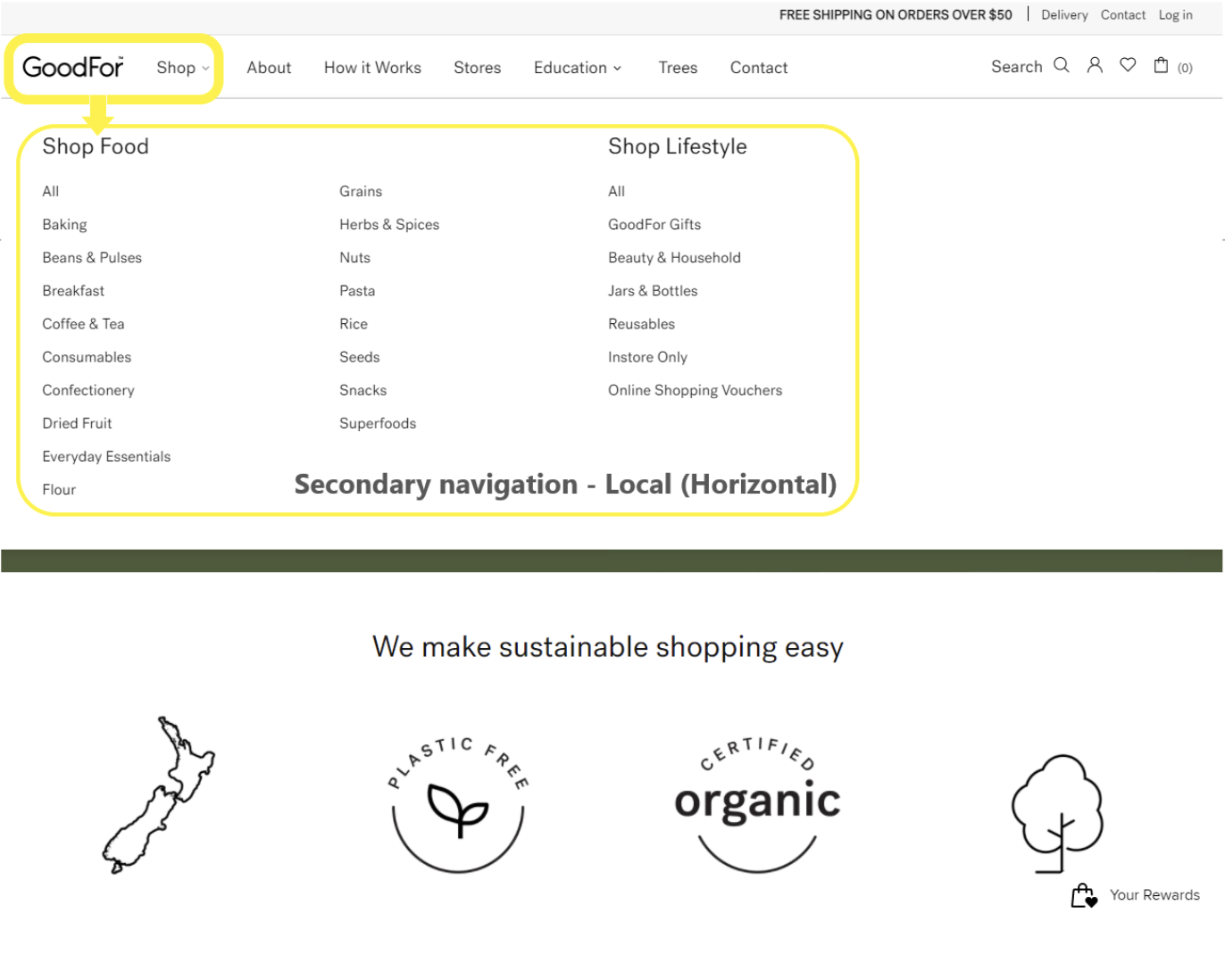
A global navigation system is available on each page of a menu-based interface. It is usually placed at the top of the page and allows access to the main or top pages. There will be search bars, dropdown menus, and a logo that links to the homepage. As users move through the site's various pages, the global navigation will remain constant and replicated as it was on the homepage.
The following are examples of global and local navigation systems from a wholefood retail store GoodFor.
As users arrive on the landing page, the main global navigation options are presented on the header. Users can choose from ‘Shop, About, How it Works, Stores, Education, Trees, and Contact.’
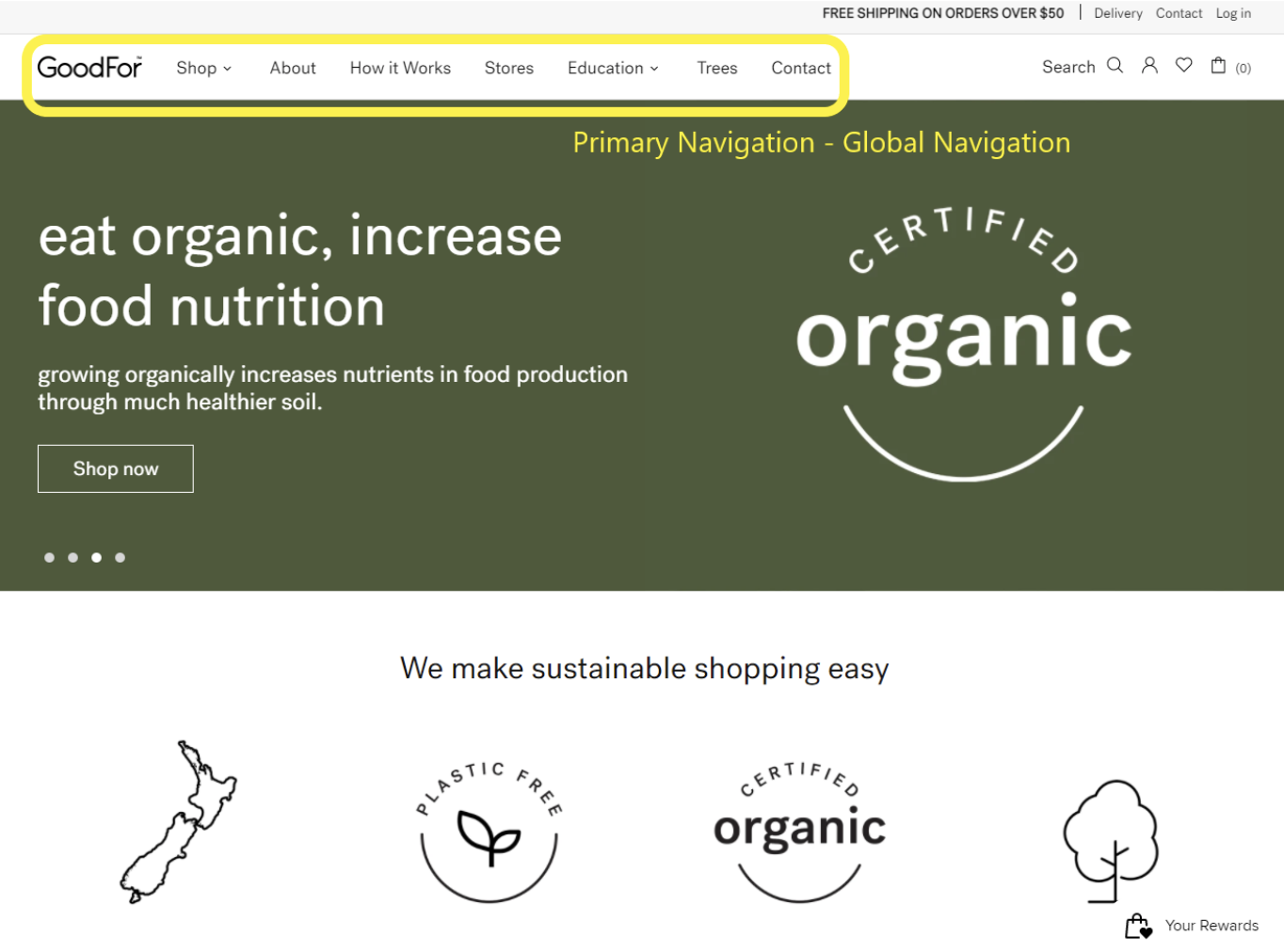
As users hover over a main global option a secondary local navigation system expands horizontally. For example, when users hover over ‘Shop,’ local navigation reveals product categories alphabetically. Additional categories are provided under ‘Shop Food’ and ‘Shop Lifestyle.’
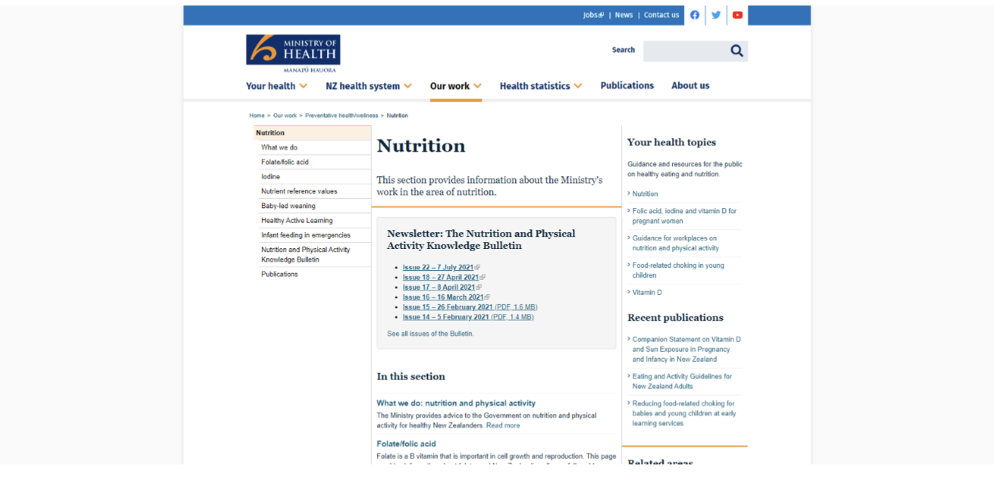
Local navigation systems
Local navigation refers to internal links that are included within the contents of the web pages themselves. There will be links that refer to in-depth or additional information for the contents mentioned. For example, the Ministry of Health website has links to newsletters, health topics, and recent publications on their Nutrition page. The hyperlinks take users to different articles and pages within the website.
Contextual and hierarchical navigation
Hierarchical navigation adapts to the user's selection of the main menus, depending on the page's context. An excellent example of this can be found on more extensive content based websites, such as news sites with broad and specific news categories.
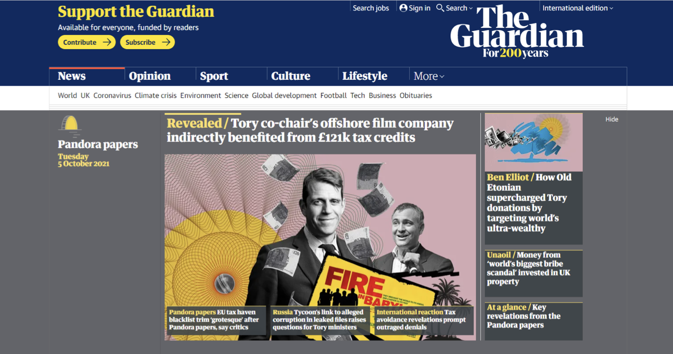
Consider the below example from The Guardian to illustrate the contextual and hierarchical navigation systems.
The primary (global) navigation shows six main topics.
- News
- Opinion
- Sport
- Culture
- Lifestyle
- More
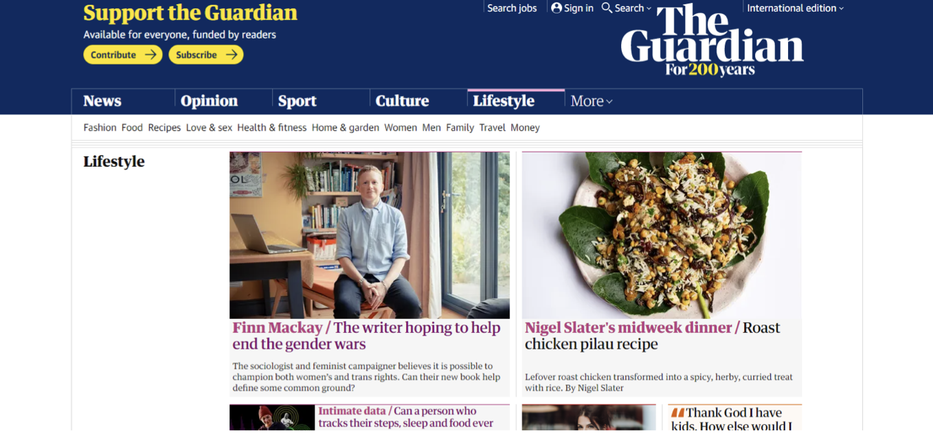
The following image shows what happens when the ‘Lifestyle’ category is chosen.
Contextual navigation specifying lifestyle subtopics such as fashion, food, and travel replaces what was the primary navigation earlier.
Breadcrumb trails
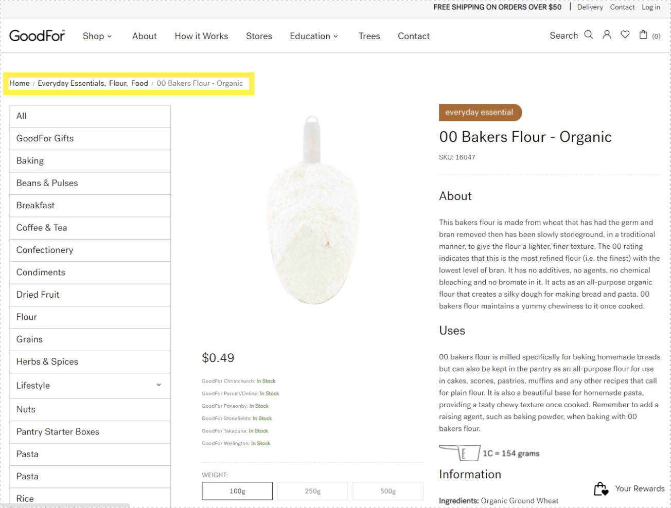
In the screen capture below, a user is looking for a product on the grocery retailer GoodFor website. The user can navigate where they are within the site by looking at the breadcrumb trail (highlighted in the yellow box). The trail shows the category and the previous pages before arriving at the product page. Home > Everyday Essentials, Flour, Food > 00 Bakers Flour – Organic.
Comparing navigation systems
Your task is to compare two sites with a similar goal of financial education for the community. Saver Plus page -The Smith Family Australia and Saving and Investing page - Sorted New Zealand.
View the screenshots of the following images to view the two sites.
In reference to the navigation system, pay attention to the following:
- Search features
- Trace route
- Current locator
- Header
- Unique feature(s).
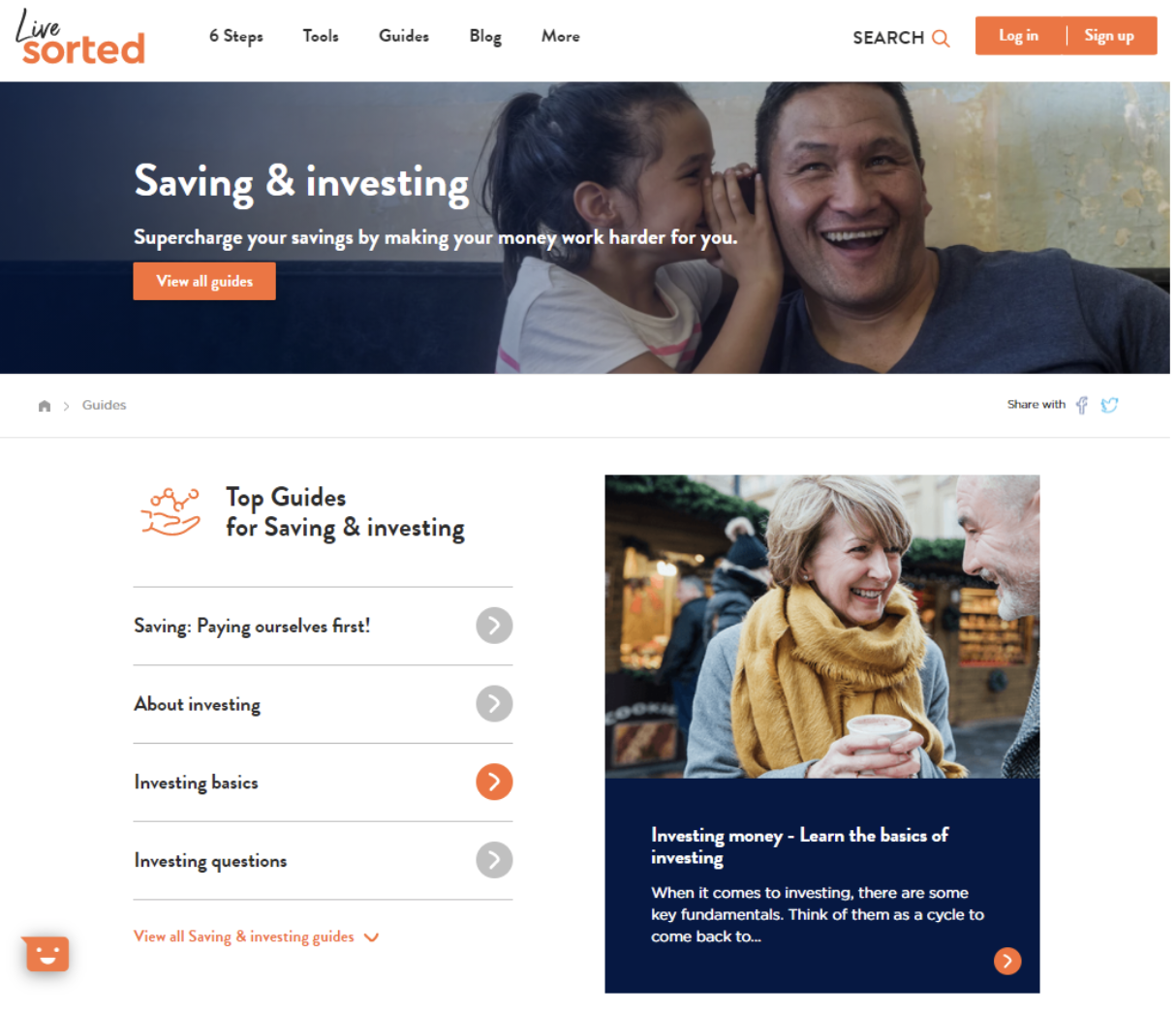
Image 1 - Saver Plus
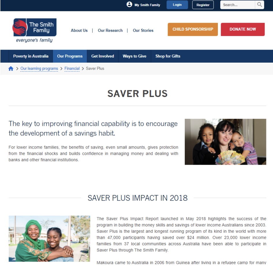
Image 2 - Sorted
Did you manage to find the following navigation systems on the two sites?
- Search features
- Trace route
- Current locator
- Header
- Unique feature(s).
Let us check your answers against the following table.
| These are the correct answers |
Saver Plus page - The Smith Family Australia |
Saving and Investing page - Sorted New Zealand |
|---|---|---|
| Search features | Search box enclosed in a rectangle. | The word SEARCH plus a magnifying glass icon is used for the site’s search feature. |
| Trace route | Breadcrumb placed under contextual navigation. | Breadcrumb placed under header. |
| Current locator | Colour change - Light blue tab for ‘Our Programme.’ | No obvious current locator, user will need to hover back to the navigation bar. |
| Header | Smaller header area occupied by the primary and secondary navigation. | Prominent image of father and daughter, with the page topic occupying the header area. |
| Unique feature(s) | Sponsorship / Donate button. | A chatbot. |
Now that you have identified the different navigation systems, consider including a SWOT analysis.
SWOT analysis is an acronym of the following (Strengths, Weaknesses, Opportunities, Threats).
- Strengths of the page design
- Weaknesses of the page design
- Opportunities to improve the page
- Threats that can be caused when ignoring the suggested improvements
The three main device categories we have covered are desktop, mobile, and large interactive displays.
In terms of applications and websites, it is recommended to design for mobile devices first, such as mobile phones and laptops. Considerations such as the context of use, finger dexterity, minimum pixel size for touch area, content priority, micro-interactions, and incremental display will assist you with designing better mobile experiences.
Large interactive displays are integrated into our daily life and can be found in wayfinding systems, exhibition displays as well as AR, VR technology.
Finally, user interfaces can be navigated using the global, local, or contextual and hierarchical navigation systems.
Check your knowledge of devices by answering the following questions.
Additional resources
Here are some links to help you learn more about this topic.
It is expected that you should complete 12 hours (FT) or 6 hours (PT) of student-directed learning each week. These resources will make up part of your own student-directed learning hours.
- Best practices for mobile form design
- Comprehensive guide to mobile app design
- Dieter Rams: 10 timeless commandments for good design
- Shneiderman's 8 golden rules will help you design better interfaces
- The grid system: Building a solid design layout
- Leveraging mental models in UX design
- Designing for Android
- Design for Apple platforms
What is I.O.T
- WATCH Designing for the IoT
- The increasing role of testing in IoT, NZ tech day presentation
- WATCH IoT explained in 6 minutes
I.O.T examples