In this topic we will cover the following:
- The five elements of user experience
- Advantages and disadvantages of existing user interfaces.
In order to design successful products and services, we must know about our users and customers. These are the elements of user experience.
We investigate their habits and needs, what drives them as consumers, and research, map, and plan customer experiences to increase user satisfaction through functionality and usability.

Jesse James Garret, a leading user experience thinker, elaborates on the process and distinguishes it into five stages. The five elements of user experience are part of an iterative process, and the elements act as stages that can be revisited or explored at any time.
- Strategy
Business objectives, user needs, technical constraints - Scope
Content requirements, feature requirements - Structure
Information architecture, UX design - Skeleton
Interface and navigation design, information design - Surface
Visual design
Strategy

The strategy layer is the starting point. Just with any given project, determining a set of goals is crucial. The set of goals will need to address user needs and business objectives. The following are questions to help devise a solid strategy.
- Priority - What is the target or focus area to concentrate on?
- Challenges - What is product trying to solve? Are there any obstacles to overcome?
- Blue sky thinking - What are the desired results that you want to achieve? Is there an ideal goal to attain? How might we help users to achieve a goal?
- Objectives - How can you determine the set of activities and methods to support the overall strategy?
- Values - Does the organisation have a set of values they uphold? Is there a clear mission and vision in place?
Scope

The next layer is scope. Once a solid strategy is in place, specific decisions about the type of product are made. In this stage, you decide on the site's functionalities and define the content elements required.
Who handles the scope?
- Project managers.
- Product managers.
- Business leads.
Purpose
The purpose of the scope/requirement gathering stage is to:
- Let everyone's voice be heard.
- Publicly prioritise the requests.
- Define the scope based on existing resources, time, and budget.
- Get input from all stakeholders (build a bridge between business stakeholders and users).
Ideation methods
Ideation sessions enable a range of discussions for various types of outcomes.
- Solution ideation – general solution decision, new product, service, or feature addition.
- Functional ideation – features users can use and types of products (mobile, web-based, etc.)
- Design and UI ideation – deciding on the overall design direction.
- Marketing and positioning ideation – point of difference to market availability.
Questions to ask
- What is the deadline date?
- Who is the audience?
- What are the quantitative and qualitative business goals?
- Do you have content available, or does it need to be produced?
- Are there similar products out there?
- What do you like or dislike about them?
Deliverables
Deliverables are tangible items that the project team is expected to deliver. The scope set outs what deliverables the project team will deliver and sets timeframes. Deliverables usually include the following:
- Requirements.
- Personas.
- Empathy maps.
- User stories.
- Competitor analysis.
- Task analysis. An action user must take to accomplish a goal.
- Feature prioritisation. What is the most important feature to include?
- Feature analysis. Component of a product that allows for certain actions. How a user accomplishes a task.
Structure
The middle layer is structure. The structure is where the organisation of the content is structured, and the interactivity and site functionality are mapped out. The following information architecture methodologies can be applied.
Latch
Five ways for organising information - Location, Alphabet, Time, Category, Hierarchy. For example, the Yellow pages site categorises its pages using the LATCH method.
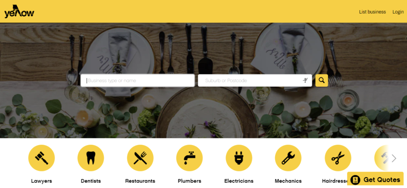
Picture from Yellowpages homepage 2021.
Taxonomy
The act of distributing things into classes or categories of the same type. For example, a plant conservation website would group its list of plants based on their taxonomy.
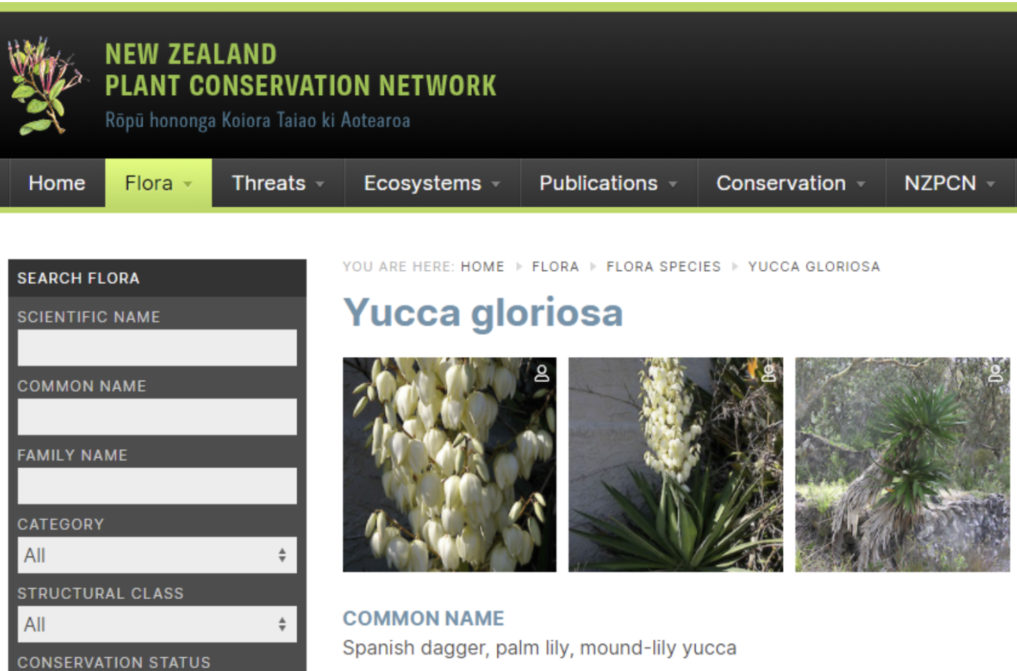
Picture from NZ Plant Conservation Network homepage 2021.
Skeleton

The penultimate layer is the skeleton, also known as a wireframe. The skeleton is where the layout of the product is designed. The process includes deciding which information is presented and the interface's design, such as the input controls, navigational, and informational elements. Some of the navigation system considerations include:
- Usage priority: How much will users rely on this navigation component? For example, will users primarily navigate the site using local navigation? Or are they likely to rely on related links?
- Placement: On what pages should the information be present? Where should content be placed within the page layout grid?
- Pattern: Which navigation design pattern best supports findability and discoverability?
Surface

Finally, the top layer is the surface. This is what the end-product looks like. Users can view and interact with this product. They can fully experience and immerse themselves in the product, whether it is an application, a website, or a software system.
The focus of this stage is on the UI and design elements such as:
- Colours
- Layouts
- Graphic design
- Typography.
The process is iterative. Meaning the cycle could repeat and overlap until a minimum viable product is achieved.

Case study: LinkedIn
LinkedIn is currently the number one online professional networking platform. LinkedIn was launched in 2003 and has continuously updated its interface. It is available as both web-based and mobile applications. We will have a look at some of the advantages and disadvantages of using the different interfaces.
LinkedIn users can:
- Create a professional online profile that replaces a paper-based resume.
- Apply for jobs online through company-specific advertisements.
- Connect and follow other users or groups, or companies to create a network of connections.
- Curate topics of interest that will be posted in their daily feed.
- Post content and interact with other's posts through likes, comments, and shares.
The following is a profile page of a user on LinkedIn. The page is viewed on a desktop computer in a standard size window. We will look at some advantages and disadvantages of the existing user interfaces.
Advantages
- Navigation is placed on the top left corner populated with the global navigation icons plus a label. It follows the standard layout that is familiar within western culture.
- Advertising is kept to a minimum with a bold one-line hyperlink underneath the main nav bar on the second tier.
- Editable areas. Upon logging in, the interface indicates to the user-editable areas using the pencil icon.
- CTA. Call-to-action prompts suggestions on ways to improve profile visibility or ways to advertise for additional staff.

Disadvantages
The following analysis is based on screenshots taken from an iPhone SE on a LinkedIn app.
Screenshot 1 and 2 shows how the interface and user experience is impacted by the limited screen real estate on a smaller model of an iPhone. Screenshot 1 shows the five actions that users can do.
- Share profile in a message
- Share via
- Give kudos
- Request a recommendation
- Recommend.
Screenshot 2 shows more actions that appeared hidden in screenshot 1. There were no indicators shown on the first screen the more actions existed. It was only after swiping up that the additional actions are shown. Additional options shown: Following, remove connection, report/block.


The five elements of UX are based on Jesse James Garret’s theory and consist of strategy, scope, structure, skeleton, and surface layer. Each element is a building block for the next and when done accordingly, will provide the best user experience.
It is good practice to start observing the experience you have when using websites and mobile applications. It is inevitable that you will find both advantages and disadvantages when performing tasks within existing user interfaces.
Check your knowledge of elements of user experience by answering the questions below.
Additional resources
Here are some links to help you learn more about this topic.
It is expected that you should complete 12 hours (FT) or 6 hours (PT) of student-directed learning each week. These resources will make up part of your own student-directed learning hours.
- Usability.gov - User interface design
- MindSea - Design patterns moving beyond convention
- Interactive design principles
- Principle of consistency and standards in user interface design
- Material design - Introduction
- Material design - Responsive layout grid
- Material design - States
- Nng - Icon usability
- How to use colours in UI design
- UI goodies
- Dashboard design user experience guidelines