
In this topic we will cover the following:
- Form design
- Guidelines for good user experience
- Error recovery.
What are forms?
Forms are an integral tool for achieving user and business goals. In UI design they are everywhere!
Forms allow businesses to collect user information for extending their user experience beyond the first visit. Think about any new website you visit and how often a lightbox pops up asking for your email to subscribe to the newsletter and get 10% off your first purchase.

Forms allow users to send critical data to a server like login information, searching for content, or posting a status update. Every time a user completes a checkout process in e-commerce or signs up to a newsletter, they are using forms.
Despite forms being absolutely critical to achieving user and business goals, many users dislike using and filling out forms. Forms are perceived as an interruption and a roadblock on a desirable user journey, even if they are a necessity to reach user goals.
People exit a form and leave a website or mobile app for the following reasons.
- They keep getting an error in a form.
- They do not want to register.
- They do not want to give unnecessary information.
A good UX/UI designer will aim to make this inconvenience as usable as possible to minimise users exiting the website or app. Layout and behaviour of forms are critical for good UI design.
Prioritise scannability
Users scan web pages rather than reading them carefully from top to bottom. Even when filling out forms - though their creators might hope for full attention - the same rules apply.
Allowing for efficient, effective scanning is crucial to limiting errors or missed fields. This is especially true when the form is intended to be filled in only once per person and data accuracy is critical such as in address forms in e-commerce or sign-up forms.
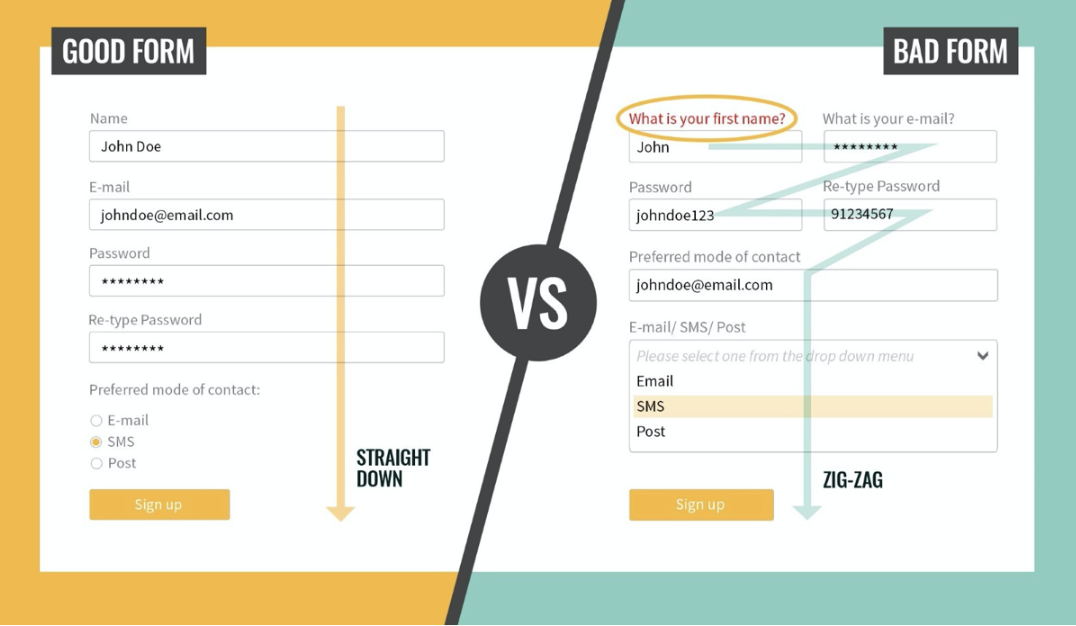
From Top Common Mistakes UI/UX Designers Make by D Vulaj, 2019, https://blog.prototypr.io/top-common-mistakes-ui-ux-designers-make-6e13bd891e84, © Medium
Clear instructions
We need to provide users with clear instructions when they are required to input information into a form. For example, state the format required for phone numbers.
You can help users to provide correct formatting by coding particular keyboards to different input fields. For example, using a dial pad keyboard for a cellphone number instead of a full QWERTY keyboard. Use breakers for credit card numbers so users can easily trace where they missed a number.

Constant errors will result in users abandoning a form. It is best to try and stop errors before they happen. To minimise errors, clearly identify:
- What task a user needs to complete.
- What information a user can include and exclude.
- If there are problems with the data and how to fix it before the user submits.
Limit typing
With more people using small screens, anything that can be done to prevent unnecessary typing will improve user satisfaction and decrease error rates. Only ask for information you actually need.
When there is a long data field that is required, enable autofill or in the case of addresses, use an address lookup (also called address validation or verification.) Filling out an address is often the most irritating part of any online sign-up form with multiple fields, long names, and repeated information. By using address lookups users can enter an address fully in 10 taps as opposed to around 50 taps to enter it manually.
New Zealand Post APIs (application programming interface) make it quick for users to enter their address, but also verify the address is correct. This ensures data integrity and allows for accurate shipping costs to be displayed and charged at checkout.
Remember these guidelines when creating forms to ensure the best user experience possible.
- Keep it simple
- Clarity
- Single column and group
- Label location
- Hints
- Primary call to action
- Field lengths
- Explain input fields.
Keep it simple
Only include what fields are necessary. Try to avoid using optional fields.
Clarity
Use clear and consistent language and layouts.
Single column and group
Use white space to group or separate elements visually.
If your form asks about different topics, section it into separate groups of fields and name the groups accordingly.
If the form is long, you can break it down into steps and have one step per page. For example, in e-commerce the checkout form will often be split into steps: shopping cart, shipping information, payment, review.
Label location
Top-aligned labels result in the shortest completion times due to the reduced amount of eye movement needed.

Although left-aligned labels produce the slowest completion time, this style improves comprehension when the data requests are less commonly understood.

Hints
Placeholder text (also known as hint text), is deceptively unhelpful. Including the label as placeholder causes it to disappear once the user clicks into the field, meaning they can no longer view it. This causes strain on short-term memory and increases the chances of error.
In some cases, placeholder text is designed to be lighter in color than regular text, which may alleviate the issue. However, this can create a contrast problem because light gray text on white typically fails to meet the universally accepted guidelines for web accessibility as they cannot often be picked up by screen readers or those with visual impairments.

Primary calls to action
Make the weight of the primary call to action stand out more than the secondary one. This helps reduce errors and it is easy to access by keyboard.
English readers read left to right. We want the user to end on the desired action. Because of this, put the primary action on the right and the secondary action on the left.

Field lengths
The relative size of a field acts as a visual cue to how much detail is required. If your form requires a 4-digit number, design for that size.
Imagine if the security number field was as big as the rest of the fields? This would easily create doubts and cause confusion.

Explain input fields
It is important to explain what you require from the user from the start. This prevents errors and reduces the completion time.

Better forms
Clearly, layout and visual organisation are critical to creating good forms and a positive user experience. Watch the following video for a summary on creating better forms through visual organisation.
Errors on forms are one of the key reasons users will leave a website or app. Let us look at errors in more detail.
Forms are an annoying, albeit necessary, roadblock in a perfect user journey. Users look for an opportunity to jump ship and leave a site or app as soon as possible because as consumers we operate under the logic that if it is in the public sphere and available to us - it should work perfectly. This is especially true when working in web-based fields. Often our users forget that a human designed the form or interface, not a machine and we make mistakes often.
Errors in forms are inevitable. It is the role of designers to make this process as recoverable as possible so that when an error does occur, the user gives the form another chance.
Error messages should:
- State what just happened.
- Explain what the next step or action is.
- Not contain technical jargon.
Follow these guidelines when creating error messages to increase the chances of users continuing with the form despite errors.
- Inline error messages
- Forgive mistakes
- Progress steppers
- Be specific to the user’s task
- Remember accessibility
- Choose your assets wisely.
Inline error messages
Inline validation gives real-time feedback as users complete the form. Use lightweight and direct success messages (green checkmarks) and error messages (red triangles and text) next to the input fields.

Forgive mistakes
No matter how good a user interface is, users will make mistakes. There are approaches designers can utilise to allow users to recover from errors, or even better to prevent errors. One such approach is called forgiveness.
Good feedback with suggested actions for error recovery or even error prevention will create a better overall user experience.
Use the following phrases when providing feedback in this manner.
- Undo
- Did you mean…
- Are you sure?
You can also use auto saves and auto suggests.
Progress steppers
Steppers display progress through a sequence of logical and numbered steps. They may also be used for navigation.
Steppers may display a transient feedback message after a step is saved. This reduces users’ cognitive load or effort for each task so they can complete the forms with clarity and accuracy.

There are two types of steppers.
- Editable steps - allow users to return later to edit a step.
- Non-editable steps - should be used when users cannot edit a step later or when step editing poses a distraction risk to form completion.
Be specific to the user’s task
Customise your copy to the actual error. It can be confusing when a message does not clearly say what went wrong. That is when the user quits the process and goes somewhere else.
A more positive experience is to be told the specific problem and given a way to correct the issue. Guidance keeps users engaged and willing to make the corrections because it is a direct action of what they can do instead of a guessing game.

Remember accessibility
Take for example the standard error message in the first image. It takes visual cues of red to indicate to us that we have made a mistake. However, the second image is what the same message looks to someone who has colour blindness. Although it is different, the core visual cues and contrast are severely diminished. Remember to use the colour blindness proof setup in photoshop or the accessibility tools in Adobe Color Wheel.

Choose your assets wisely
Use icons to establish errors in line with the field to add another layer of clarity. Make informed and critical choices around your colour schemes, typography, and graphic assets to allow for accessibility.

Forms are an integral part of UI design. They allow users to send critical data to a server such as login information, complete checkout processes on e-commerce sites, and signup to newsletters.
Despite forms being critical to achieving user and business goals, many users dislike forms. They are perceived as an interruption and a roadblock. When users become frustrated with forms, they are likely to exit the form and leave the website or app. A good UX/UI designer will aim to make this inconvenience as usable as possible.
Forms can be improved by prioritising scannability, providing clear instructions, limiting typing, and allowing for error recovery.
Error messages should:
- State what just happened.
- Explain what the next step or action is.
- Not contain technical jargon.
Check your knowledge of forms by answering the following questions.
Additional resources
Here are some links to help you learn more about this topic.
It is expected that you should complete 12 hours (FT) or 6 hours (PT) of student-directed learning each week. These resources will make up part of your own student-directed learning hours.