In this lesson you'll learn where to find useful fonts and how to install them onto your computer. Then, how to use the Type tools in Photoshop, so you can use all those exciting new fonts you just installed! We'll also continue our exploration of colour and how to use it effectively in your design process.
Here's a selection of websites where you can download free and paid fonts for use in your design projects:
Dafont: https://www.dafont.com/
Dafont provide a large selection of free fonts across a variety of styles/ If you like a font and find yourself using it in a commercial project, you can make a donation to the font creator through the website.
My Fonts: https://www.myfonts.com/WhatTheFont/
My Fonts offer a useful tool for identifying fonts – a great time saver if you need to match your typography with existing branding or documents. They also offer a wide selection of free and paid fonts.
Google Fonts: https://fonts.google.com
Google offers a growing library of free, professional fonts. The ability to integrate Google fonts into websites has lead to many of these being widely used and well recognised – both on the web and in print.
Adobe Fonts: https://fonts.adobe.com/
Adobe offers a large library of professionally designed fonts, including many traditional, well used classics. If you have an Adobe Creative Cloud subscription, you will be able to access the full library of fonts – be aware though that if your subscription ends, you will lose access to any Adobe fonts you have been using. Or, you can sign up for a free Adobe ID to access their basic library of 1,000 fonts.
Here's how to install fonts on Mac and Windows systems:
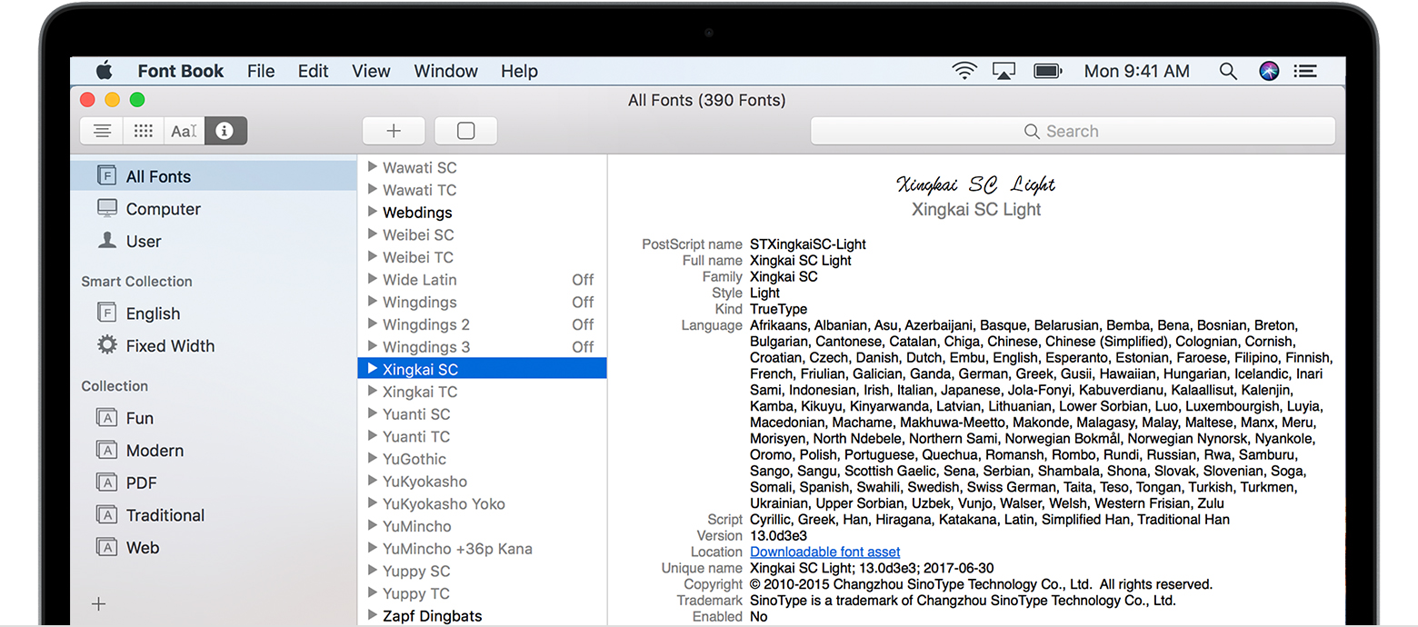
How to install and remove fonts on your Mac
Your Mac comes with many built-in fonts, and you can download and install more from Apple and other sources. If you don't want a font to appear in your apps, you can disable or remove it.
Install fonts
Double-click the font in the Finder, then click Install Font in the font preview window that opens. After your Mac validates the font and opens the Font Book app, the font is installed and available for use.
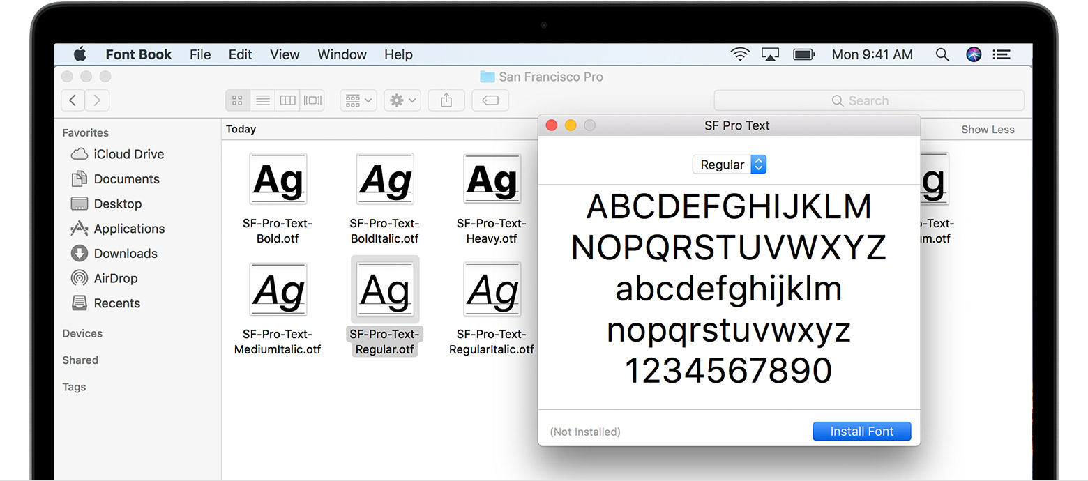
You can use Font Book preferences to set the default install location, which determines whether the fonts you add are available to other user accounts on your Mac.
Fonts that appear dimmed in Font Book are either disabled ("Off"), or are additional fonts available for download from Apple. To download the font, select it and choose Edit > Download.
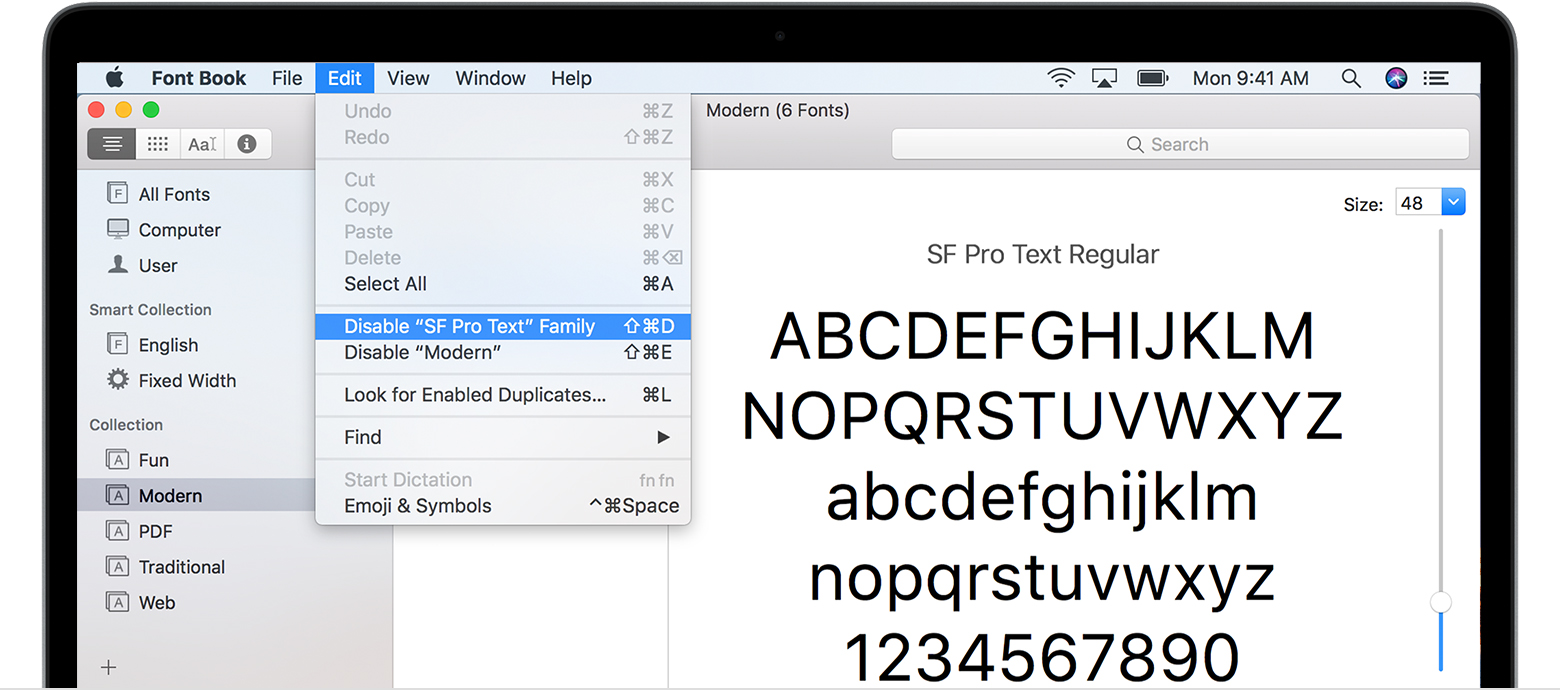
Disable fonts
You can disable any font that isn't required by your Mac. Select the font in Font Book, then choose Edit > Disable. The font remains installed, but no longer appears in the font menus of your apps. Fonts that are disabled show ”Off” next to the font name in Font Book.
Remove fonts
You can remove any font that isn't required by your Mac. Select the font in Font Book, then choose File > Remove. Font Book moves the font to the Trash.
Learn more
macOS supports TrueType (.ttf), Variable TrueType (.ttf), TrueType Collection (.ttc), OpenType (.otf), and OpenType Collection (.ttc) fonts. macOS Mojave adds support for OpenType-SVG fonts.
Legacy suitcase TrueType fonts and PostScript Type 1 LWFN fonts might work but aren't recommended.
How to install fonts on Windows
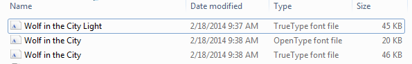
Download the font files. These often come compressed in .zip folders. In one .zip folder, you might find several variations on the same font, such as “light” and “heavy.” A .zip folder usually looks like this:
![]()
If the font files are zipped, unzip them by right-clicking the .zip folder and then clicking Extract. Now you'll see the available TrueType and OpenType font files:
Right-click the fonts you want, and click Install.
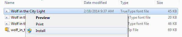
If you're prompted to allow the program to make changes to your computer, and if you trust the source of the font, click Yes.
We have discussed how colour theory can describe individual colours and how they are being created and represented. Another important aspect of colour theory is explaining how colours can work together.
These relationships are referred to as 'colour harmonies'. We can use colour harmony rules to create aesthetically pleasing palettes to use in our designs. Colour harmonies are usually referred to using Newton's traditional colour wheel; however, the rules still work when applied to other colour wheels with alternative primary colours.
Analogous

Analogous colours sit next to each other on the colour wheel. Their relationship is often very easy on the eyes and creates a comfortable and calming feeling within a piece of design. Analogous palettes often appear in nature--think autumn leaves and bush walks.

An easy way to make your design work appear harmonious is to implement an analogous colour palette. They work well with both muted and vibrant hues.

Complementary

Complementary colours sit opposite each other on the colour wheel. Their relationship is defined by high contrast, and when used at full saturation, their appearance can be visually jarring and appear to vibrate.
Complementary colours create a high energy, impactful and striking design. Yet, be careful using complementary colours with text because it can make it difficult to read (see the example below of orange text on the cyan background).


Above, the poster for the movie Godzilla vs. Kong (2021) uses a complementary palette. The contrasting colours emphasise the energy and danger, while conveying that the characters may have something in common.
Split complementary

A split complementary colour palette is similar to a complementary palette; however, instead of using colours opposite each other on the colour wheel, this palette uses colours on either side of the complementary colour.
Split complementary colour palettes have similar high contrast to complementary palettes, but with less jarring and visual tension.
A split complementary colour palette can be an excellent choice for new designers, as they are often much easier to implement.

Take a look at this animated ad for Tide using a split complementary colour palette.
There are other colour harmonies that you may wish to explore using the Adobe colour website here.

Finding colour harmonies
Colour harmonies are everywhere. We see them in the colour scheme of building, the paint jobs on cars and the clothing people wear.
Your task is to photograph a space, place, person or product, then extract its colours and describe their relationship.
You might consider photographing:
- your room
- a car
- your favourite pair of shoes
- a garden you like to visit.
You can sample colours from your image using the eyedropper tool in either Adobe Photoshop or Adobe Illustrator, or by uploading an image to color.adobe.com.
Using canva.com or any of the Adobe software, create a single page that includes your photograph, your extracted colours, and which colour harmony you have identified.
Share your work in the forum.
Take a look at the following 2 examples:


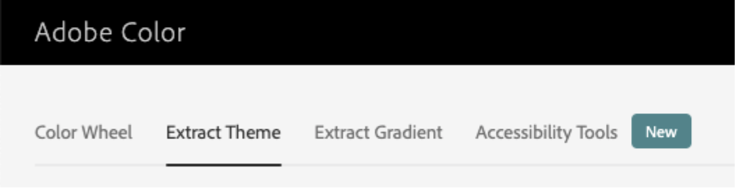
One exciting feature of color.adobe.com/ is extracting a colour palette from an existing piece of design and analysing it based on colour harmony rules.
Follow the instructions below, to explore with your own colour palette.
Select extract theme from the set of tabs at the top of the screen.
Then drag an image or a piece of design work to the centre of the window.
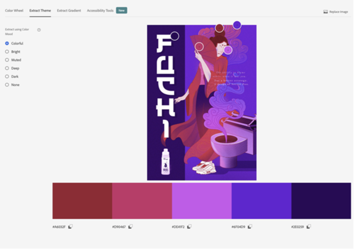
With Colorful selected on the left, the site will find the most vibrant version of the hues in the image.
Now switch back to Color Wheel in the tabs to see how the colours are arranged on the colour wheel.
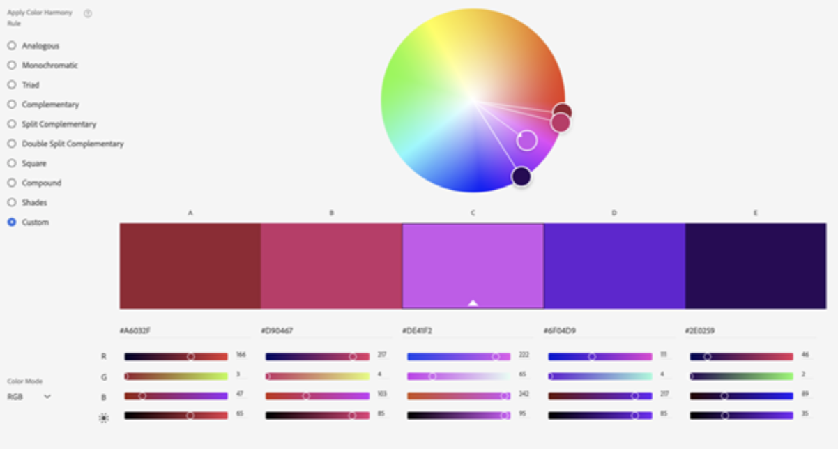
We can see here that this example is strongly analogous.
Continue practising using different images, and exploring with different colours.
![]() Use a combination of colour theory, the colour picker, and the type, brush and shape tools that were covered throughout the last two topics to create a harmonious colour scheme.
Use a combination of colour theory, the colour picker, and the type, brush and shape tools that were covered throughout the last two topics to create a harmonious colour scheme.
File - New - Print Preset - A4
Post your activity document to the Digital Image Practicals forum for discussion and feedback!