Adobe Illustrator
Adobe Illustrator is a graphics software that allows designers to create things such as:
- logos
- icons
- illustrations
- packaging
- billboards
- Web designs and more
You can turn shapes into logos and icons as well as create different typography styles; or even give drawing freehand a try once you become confident.
Illustrator is vector-based which ensures your artwork stays clear even when you scale it up or down.
Image files are divided into two categories – raster and vector.
- Adobe Photoshop works primarily with raster images.
- Adobe Illustrator is used to produce vector graphics.
Raster graphics
Raster images are created by pixel-based software (like Photoshop), a camera, or a scanner. They are frequently used on the web and are more common in general. File formats typically used are JPEG, PNG, and GIF.
Raster graphics are made up lots of tiny pixels. A pixel is a solid-colour square made up of colours formed by subpixels of RGB (red, green, blue) light. When you zoom in, you can see the individual pixels, and the image becomes fuzzy or has jagged edges – also called jaggies.
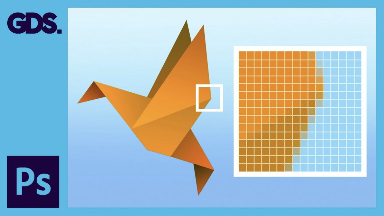
Raster images are resolution-dependent because each pixel is assigned to a grid space.
The number of pixels in raster images is fixed, so they cannot be resized without distortion. Given that there is greater possibility for colour blending when viewed from a distance, the image with more pixels has a higher quality (or resolution). At the same time, less pixels implies that when an image is scaled, it will appear little or ‘pixelate' since there aren't enough pixels to produce smooth shading.
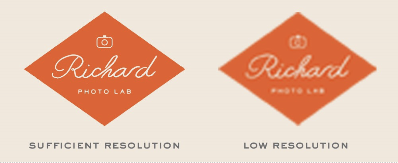
From Everything You Need To Know About Film Grain and Pixelation, © Richard Photo Lab, n.d.,
Adobe Photoshop and GIMP are two raster-editing apps that designers use when creating graphics. Because of the amount of colour information they can carry, raster pictures are great for showing the subtleties of colour gradients and shading—for example, when retouching photographs or creating photorealistic graphics.
One of the most significant drawbacks of a raster image is its inability to be resized without causing jaggies or other distortions.
Vector graphics
Vector graphics on the other hand are math-defined shapes made with vector software. They are utilised in:
- CAD - Computer Aided Drawing for example in architecture and engineering
- 3D modelling and animation
- Graphic design
Vector graphics are also useful for processes like engraving, etching, and cut stencils that reproduce an image onto an object.
Vector graphics are mathematical calculations that produce lines and shapes by connecting points. Visuals are geometric in nature and resolution independent—you can scale up or down a vector image without affecting image quality because there are no pixels. When the size or position of the object changes, the computer simply recalculates the equations.
Vector file formats are typically:
- EPS
- and SVG formats.
Unlike raster images, vector images can be scaled to any size without sacrificing quality.

From Vector vs Raster Graphics: What’s the Difference? © Graphic Wallet n.d.,
Artboards can be different sizes and orientations, be arranged however you like, and overlap. The current artboard that you are working on is the active artboard.
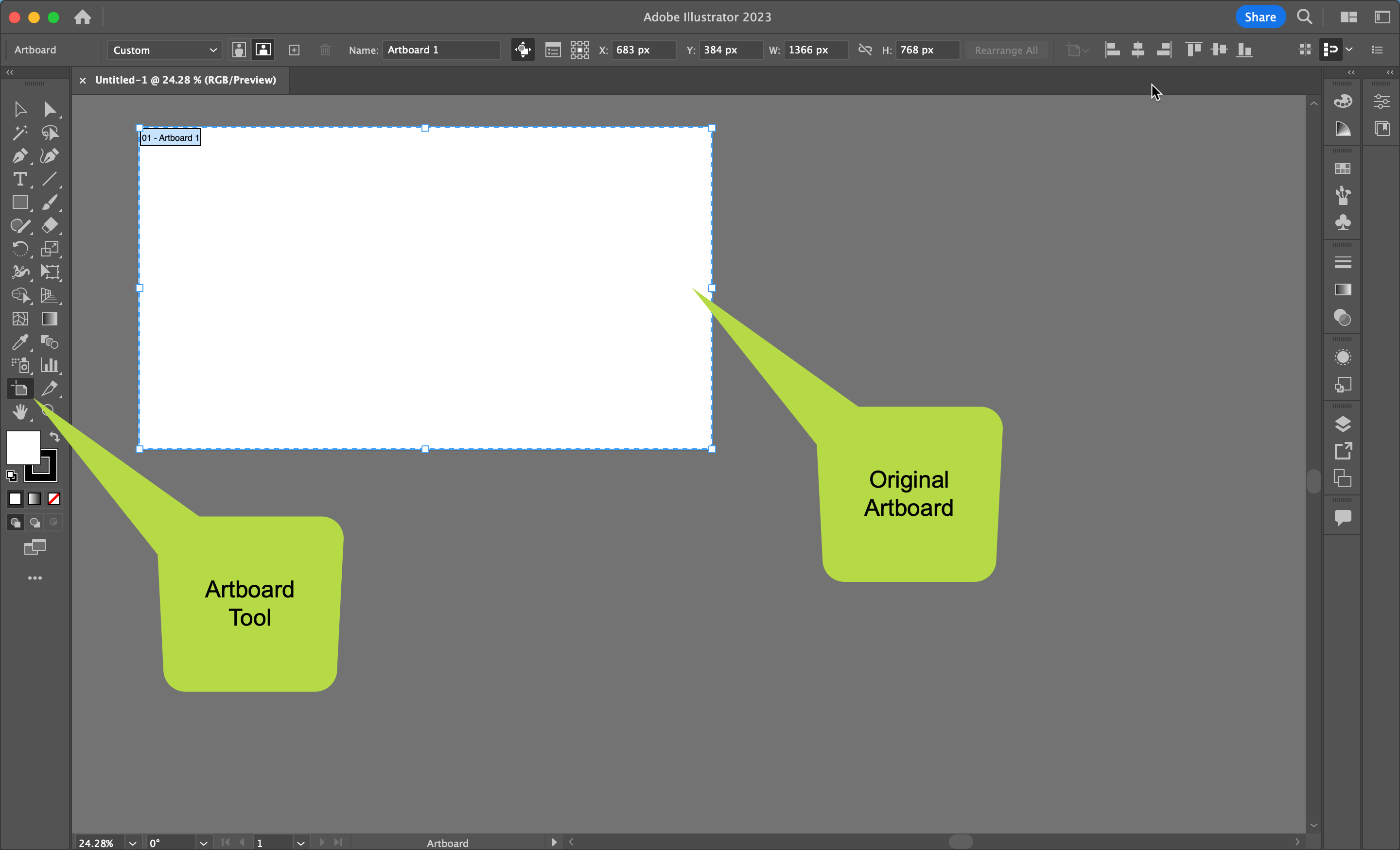 When you create a new document it will add a new artboard. There is also an Artboard Tool that allows you to make multiple artboards, all in one document.
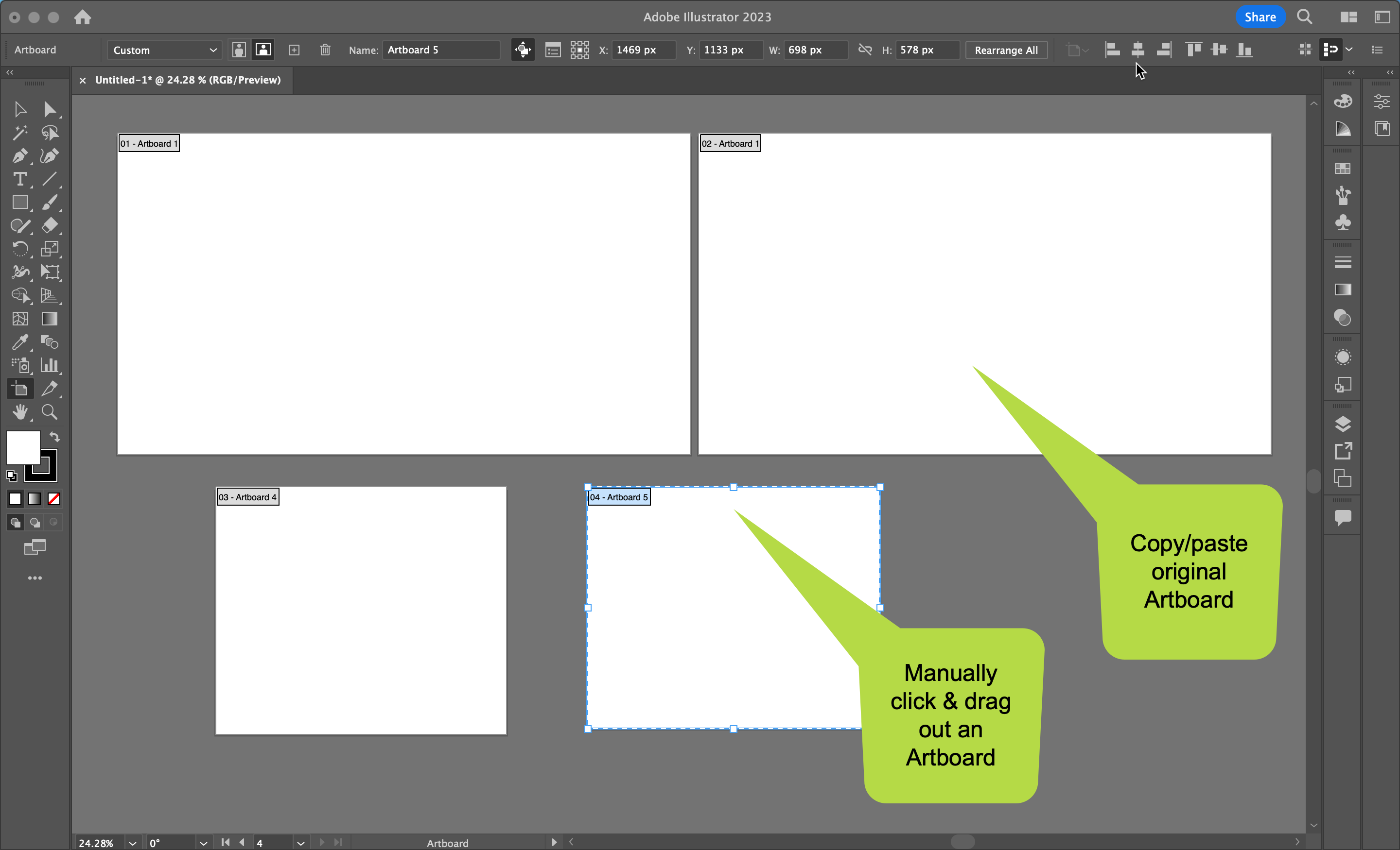 To make new artboards, either copy and paste, command c - command v (Mac), control c - control v (Windows). Alternatively, click and manually drag out an artboard to any size. You can make as many artboards as you want.
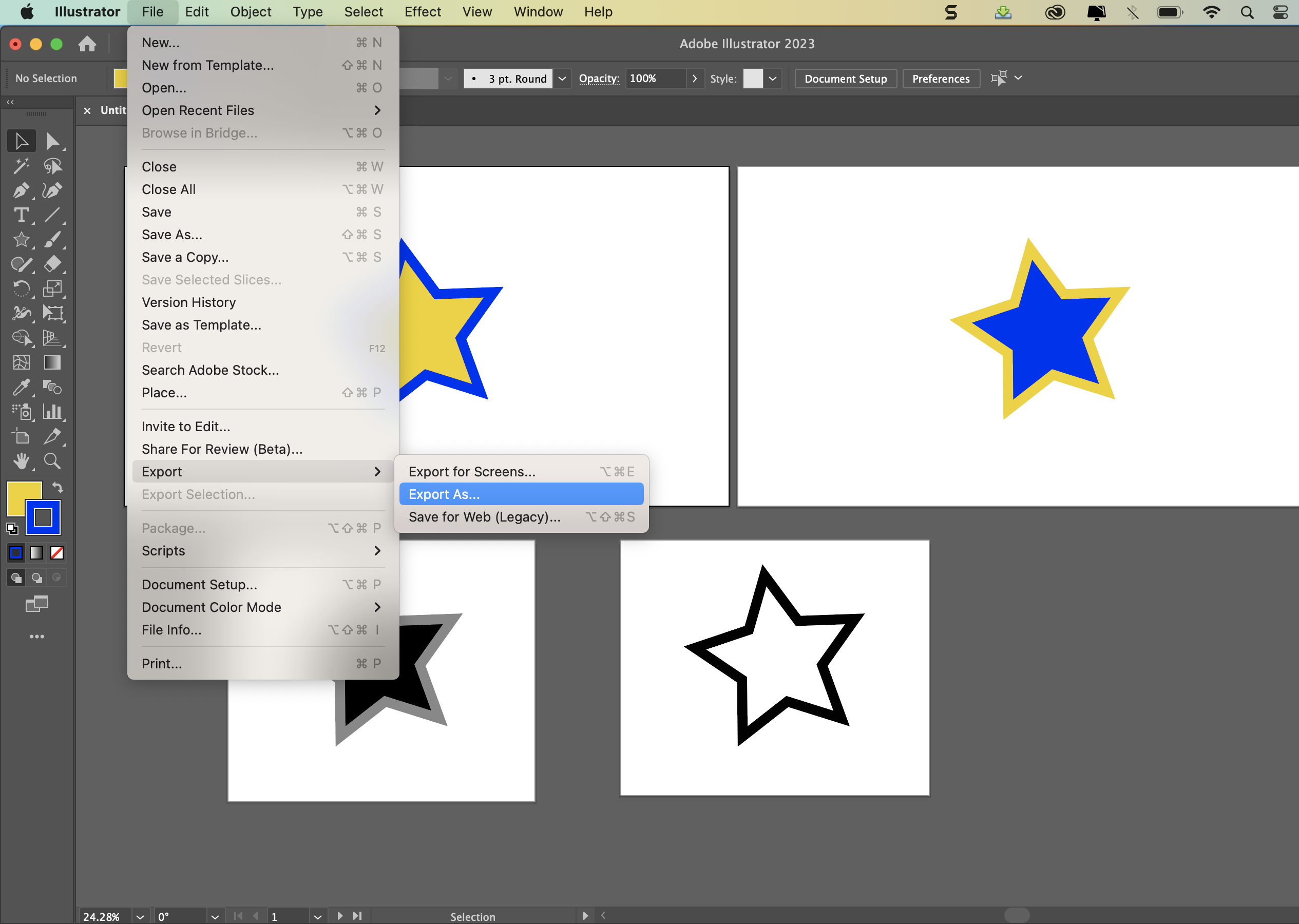 To export multiple artboards, go to File - Export - Export As...
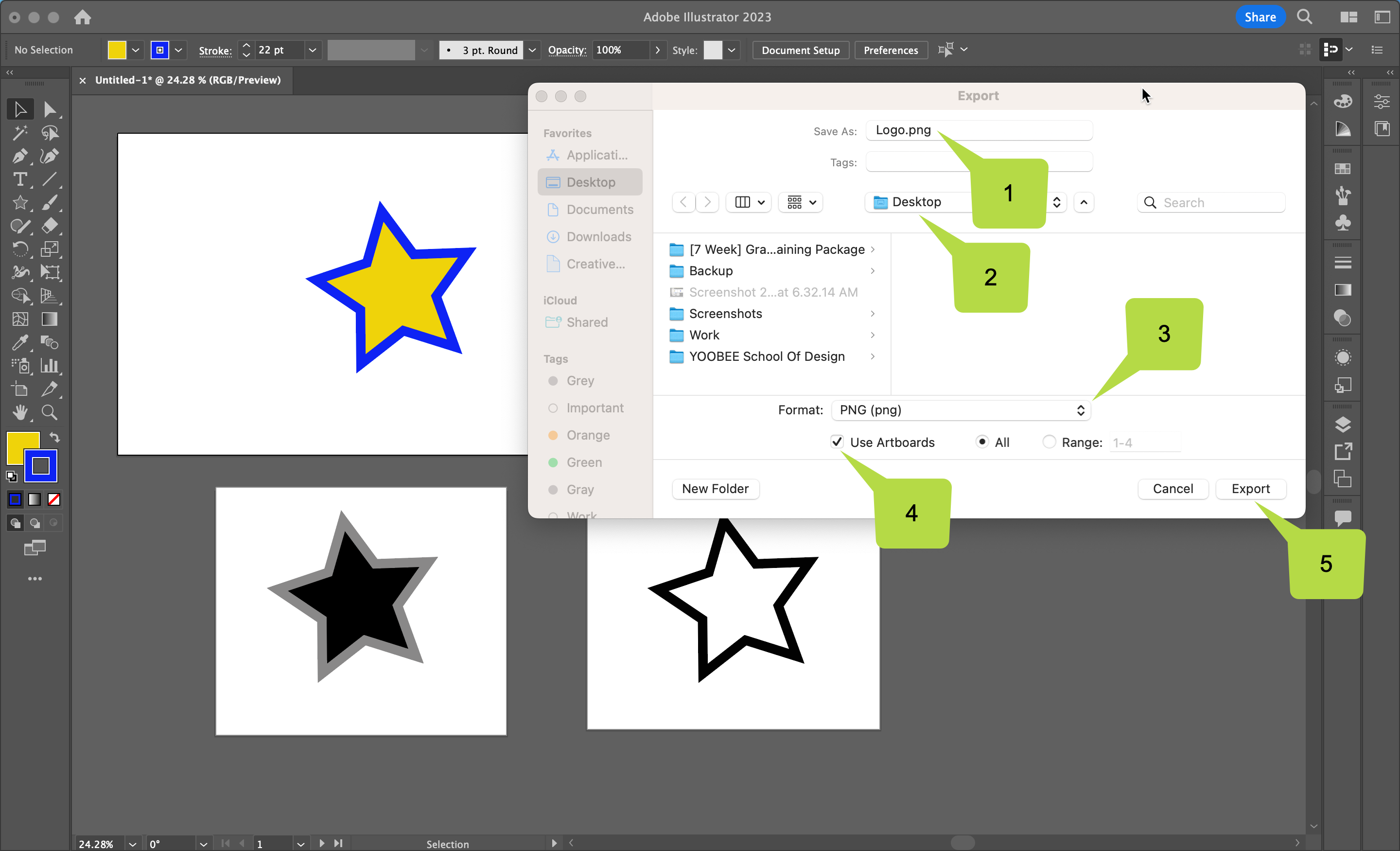
- Choose a file name.
- Choose where to save it.
- Pick a file format.
- Tick Use Artboards. Tip: You can choose to either export 'All' artboards or a 'Range'.
- Export.
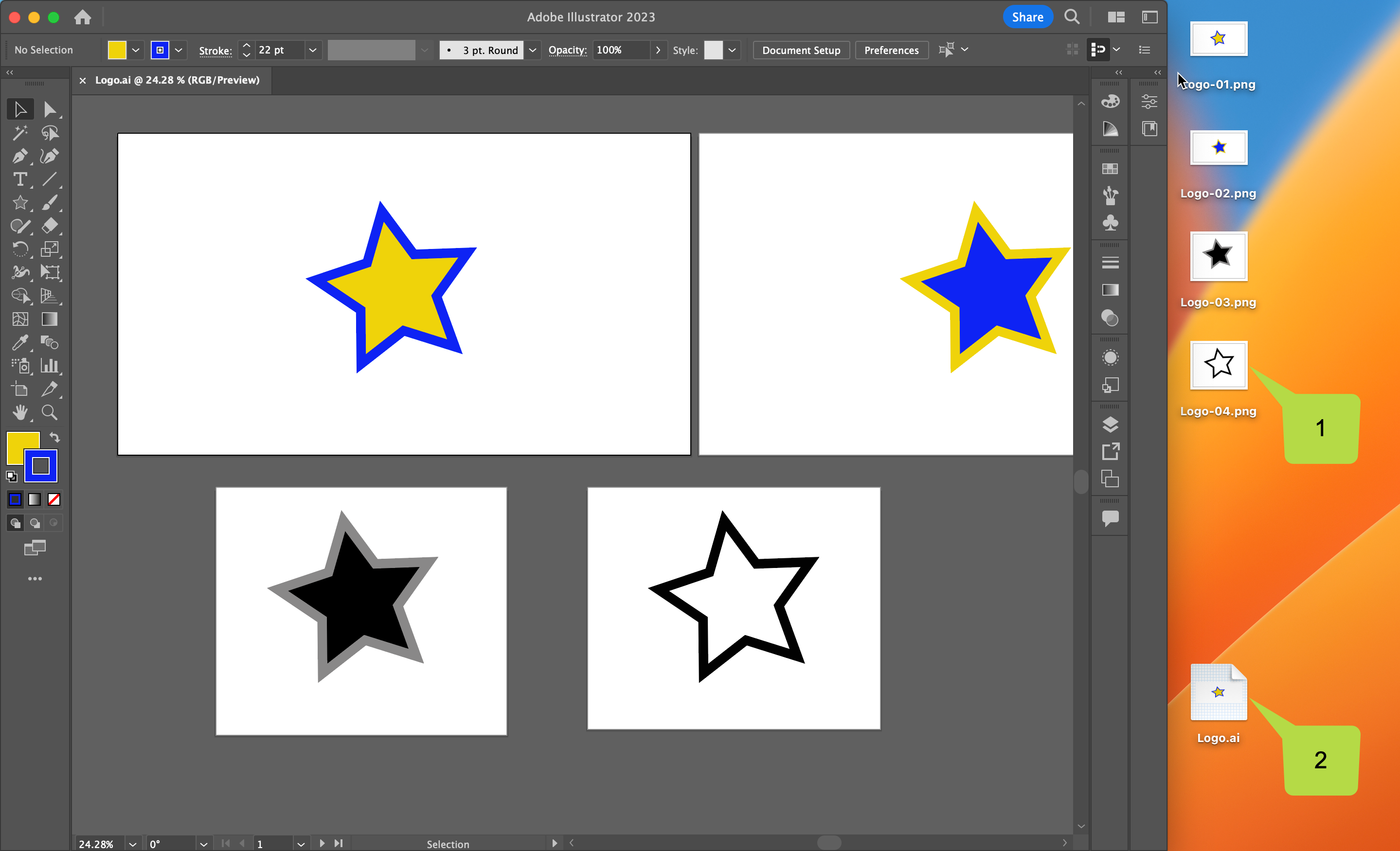
- All artboards are exported as separate files.
- This is great because it means that you don't have to create multiple Adobe Illustrator ai files!
Your brief is to plan & produce a vector logo using Adobe Illustrator, and reproduce
it “in situ” in two different settings in Adobe Photoshop.
The logo will represent a fictitious company or organisation, or it can be for an event
(real or imagined), a band, or to promote yourself as a designer. You need to produce
a colour and a greyscale and/or black & white version. The logo needs to be readable
down to below 30mm in size. Although some logos are just a symbol (eg. Nike) and
some just text (eg. IBM) your logo is required to contain a symbol and text.
The Design Process:
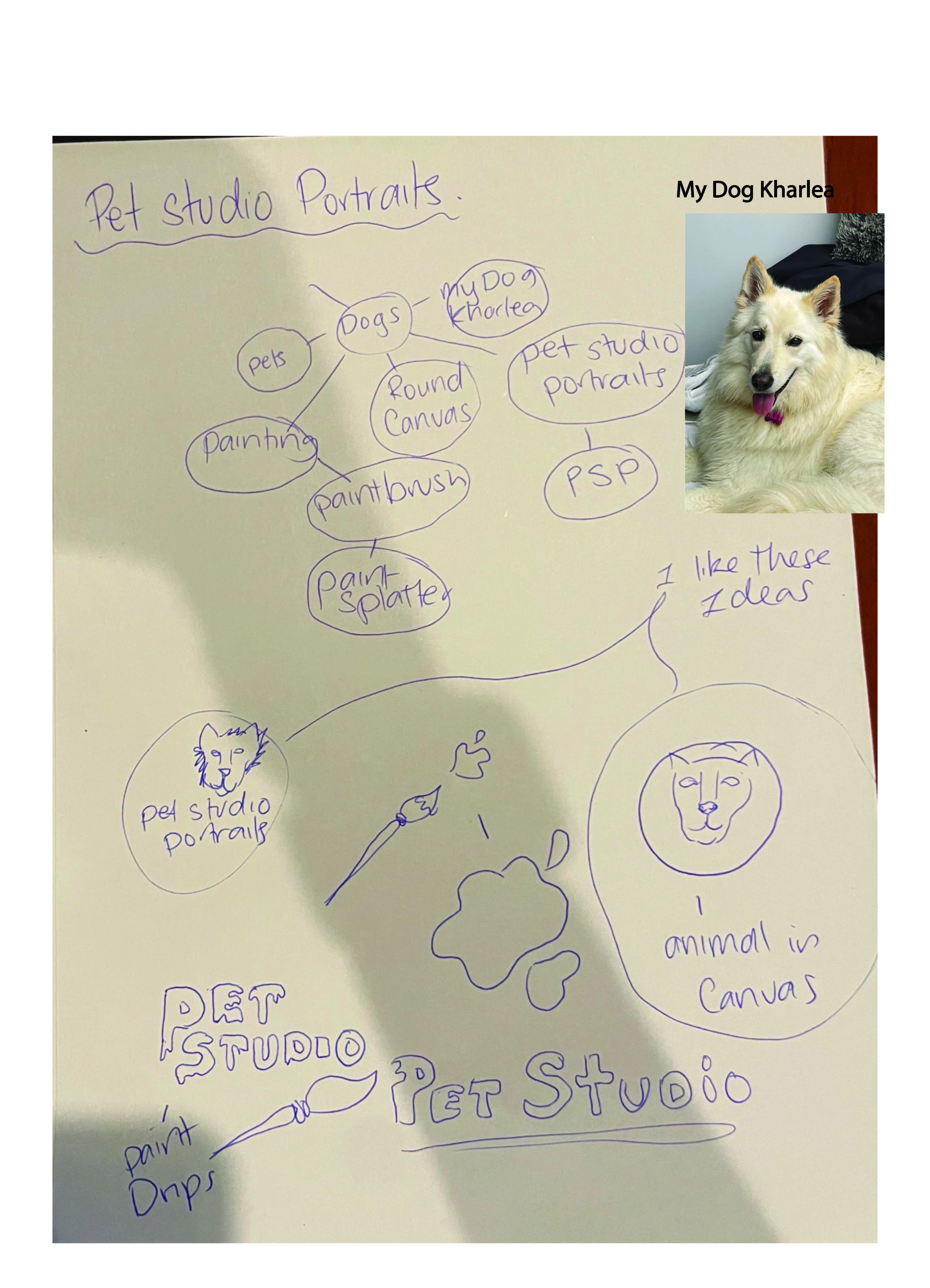
- Start by taking photos of existing logos or use the Internet, books and/or magazines to find examples that you like.
- Analyse each example, evaluating how successful you think they are. Sketch at least four different logo concepts. These first concept drawings can be quite rough and quite small – “thumbnail sketches” – to get the ideas out of your head and onto paper. Although four thumbnails is the minimum, you are encouraged to keep going until all your ideas are down on paper!
- Choose which of your concepts you think is the most effective (your tutor and/or classmates may help you here when you post to the forum) and refine this concept sketch further, but more carefully. Perhaps indicate colours and how it would work in just black & white – something you could show to a client in a meeting before committing time (and their money) to computer work.
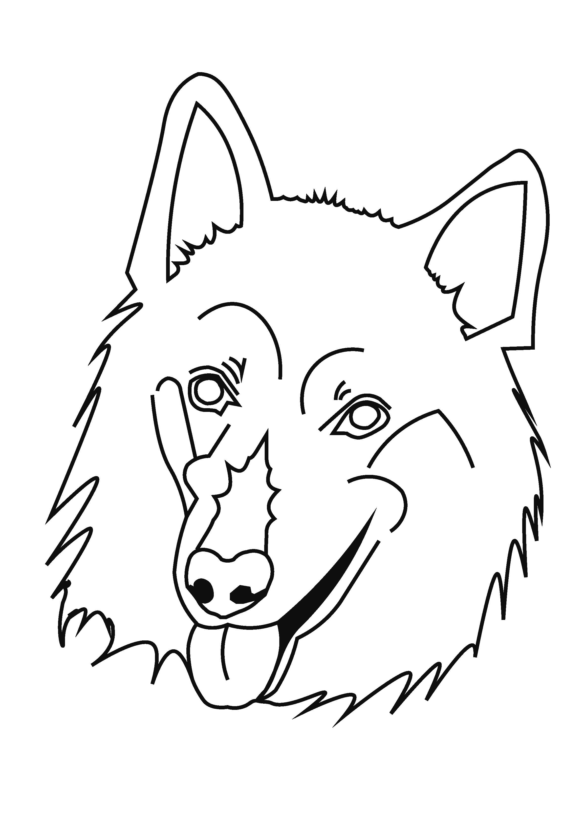
- Scan or photograph your finished concept rough and place it in Adobe Illustrator.
- Create digital versions of your chosen design, using whatever tools/techniques are appropriate to your design.
- Repeatedly print (if able) your logo out – in different sizes – as you further refine your solution and evaluate its success in terms of craftsmanship of construction, readability and clarity of interpretation.
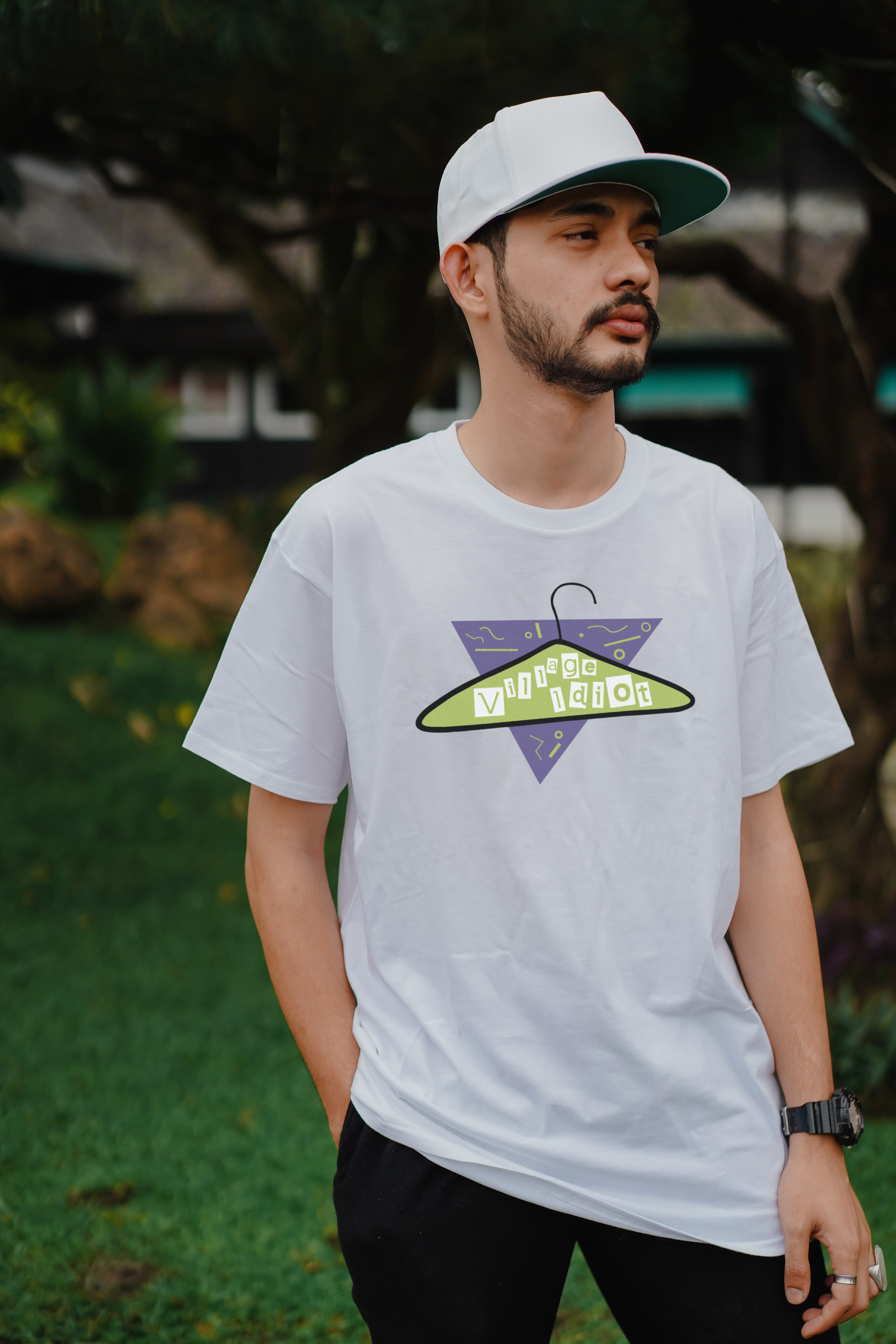
- Lastly, take the logo into Adobe Photoshop and superimpose on appropriate photos you have found of a building and a van. If you have chosen a band logo (for example), a large corporate headquarters style of building will be inappropriate. Instead you may put the logo on a cap or tee-shirt.
Use these questions to help you get started:
- What business / organisation / entity are you designing for?
- Is the style of your logo modern or traditional?
- Is the style of your logo simple or complex?
- What does your logo need to say about its subject?
- What feeling or message should it communicate?
- Who is the target market for your logo? Who are the main viewers?
- What typeface will you use? Make sure you can read the text.
- Where will your logo be used?
Upload your project document to the Assessment page for discussion and feedback!
Student Examples
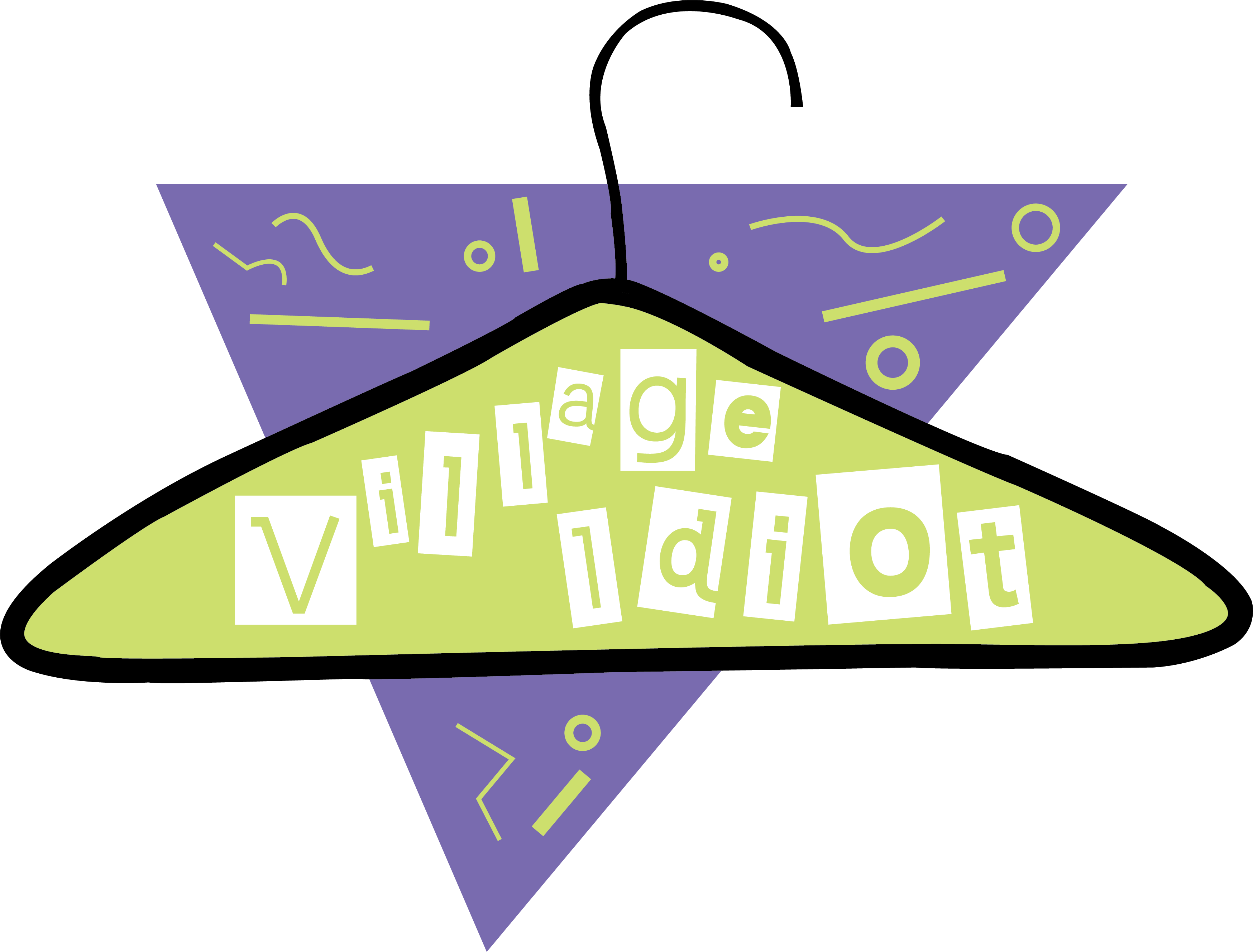
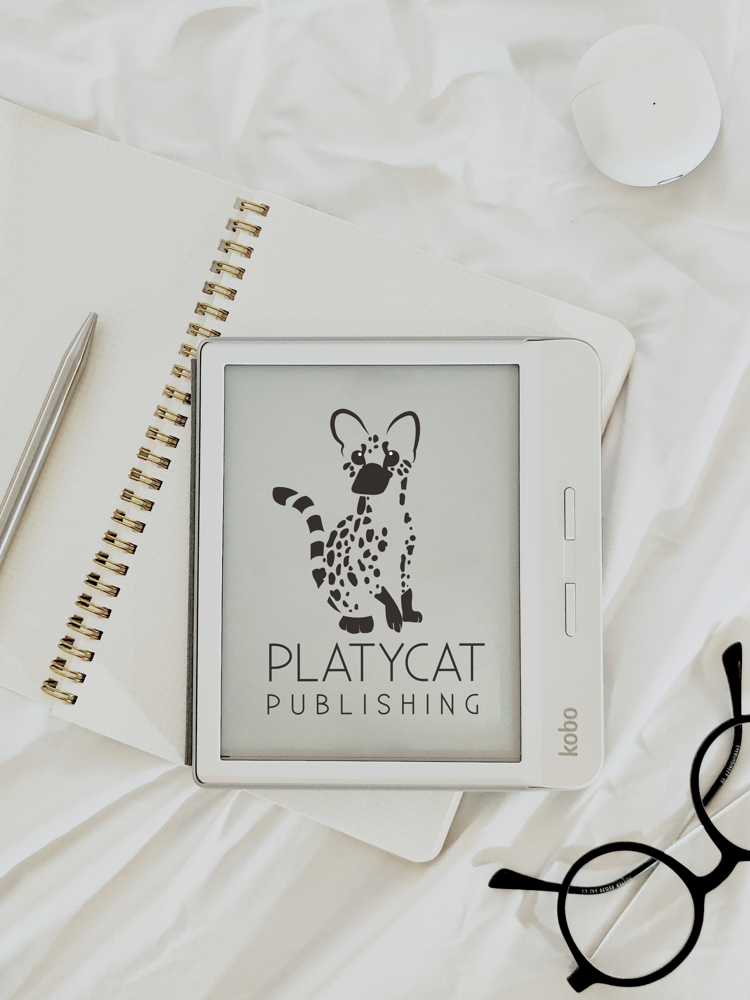
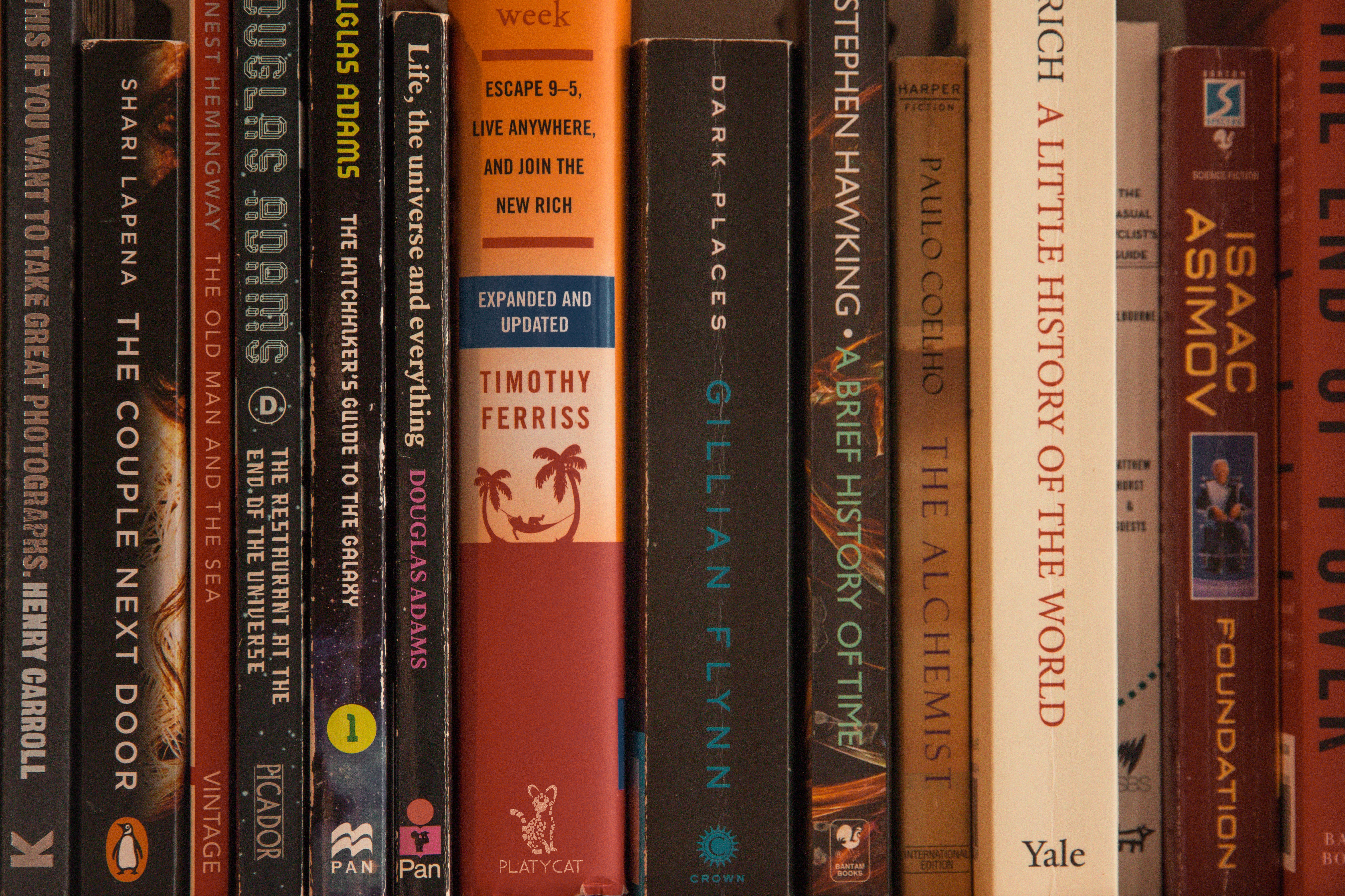
Example 1
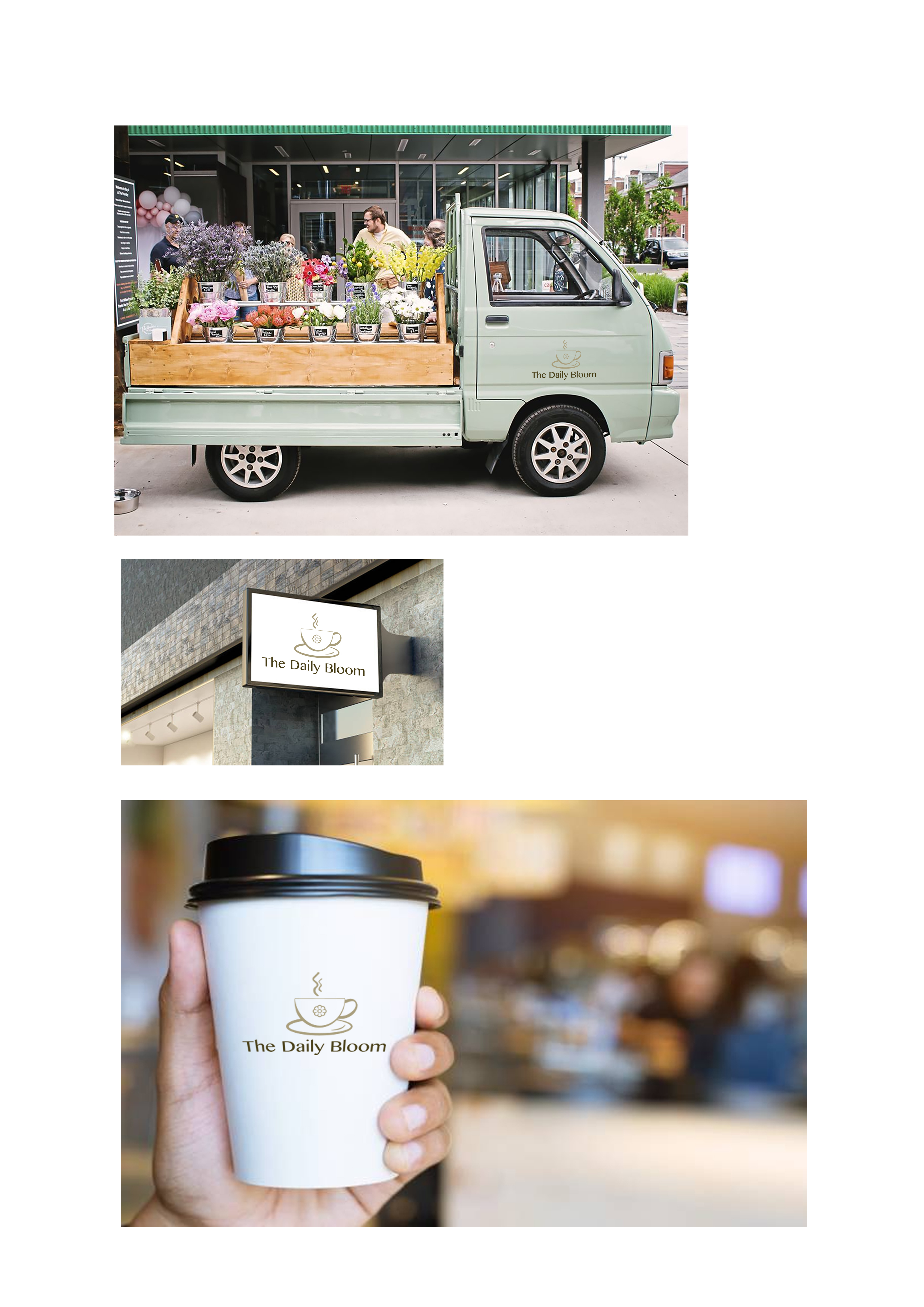
Example 2
Example 3

Example 4