Design and testing is a crucial part of developing a UX solution.
After completing your research and gathering your user's information, you begin designing the solution.
In this topic, we will cover the tools of developing and testing a solution. Including:
- Lo-fi prototyping
- Hi-fi protoyping
- Wireframes
- Mockups
- Prototype
- Collaboration tools
To begin, let’s clarify the difference between wireframes, mockups and prototypes.
"Confusing wireframes with prototypes is like assuming an architectural blueprint and a display house, are the same thing." 1
Wireframes, mockups and prototypes represent the different stages of a design flow.
| Wireframe | typically a low-fidelity way to present a product. It outlines the structure and layouts in a basic visual representation. A wireframe expresses design ideas while including all the important parts. A wireframe becomes a channel that helps teams understand their projects. |
|---|---|
| Mockup | typically a type of high-fidelity static design diagram. Mockups demonstrate information frames and statically present content and functions. It is a graphic representation of a prototype without functions and interactivity. It helps provide a picture of how a finished product will be. |
| Prototype | is very close to the finished product. A prototype is used to simulate processes and test user interactions. Early prototyping saves development costs and time. This ensures the work of back-end product development will not be done in vain.2 |
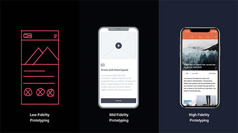
Most prototypes, wireframes and mockups are categorised based on fidelity.

Fidelity refers to how closely your prototype or mockup closely matches the look and feel of the final system. Typically, a prototype is low-fidelity (Lo-fi) or high-fidelity (hi-fi).
Fidelity can vary in the areas of:
| Low-fidelity (Lo-Fi) Prototype | High-fidelity (Hi-Fi) Prototype | |
|---|---|---|
| Interactivity | ||
| Clickable links and menus | No: Targets do not work. | Yes: Many or all are clickable |
| Automatic response to user’s actions | No: Screens are presented to the user in real-time by a person playing “the computer”. | Yes: Links in the prototype are made to work via a prototyping tool example: InVision, PowerPoint. |
| Visuals | ||
| Realistic visual hierarchy, a priority of screen elements, and screen | No: Only some or none of the visual attributes of the final live system are captured (for example, a black and white sketch or wireframe, schematic representation of images and graphics, a single sheet of paper for several screenfuls of information). Spacing and element prioritisation may or may not be preserved. | Yes: Graphics, spacing and layout look like a live system (even if the prototype is presented on paper). |
| Content and navigation hierarchy | ||
| Content | No: The prototype includes only a summary of the content or a stand-in for product images. | Yes: The prototype includes all the content that would appear in the final design (for example, full articles, product description text and images).3 |

Wireframes clarify and define website features.
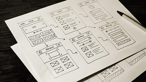
A wireframe is where the website's visual layout begins to take shape. Using information gathered from the client in the research phase, start designing the layout using a wireframe. Pencil and paper are surprisingly helpful during this phase, although many tools are online to aid as well.4
A wireframe indicates key content and functions required on a page. Different teams will reference the approved wireframe during development.
Key wireframes are typically created for both mobile and desktop devices. They indicate how the structure and function are meant to adapt to different screen resolutions.
Wireframes:
- Can be a quick rough sketch or created using specialised software
- Bring together structure, layout, navigation, and hierarchy
- Sometimes called skeletons
- Designed with a 12 column grid
Lo-Fi wireframes
Low-fi wireframes are presented in the most basic way. This means they are:
- static (not interactive)
- created without scale or grid
- typically greyscale
- drawn with pencil and paper
- include basic images and block shapes.
Low-fi wireframes lack of detail means that there are no distractions. The designer can focus on deciding navigation, mapping the user flow and layout.
The benefits of using a low-fi wireframe:
- Low-fi takes little time, meaning you can spend more time on your design.
- During the test, making changes to your drawing takes hardly any time. Especially if you used pencil and paper.
- It allows people to feel more comfortable to suggest changes.
- It reminds stakeholders that it is not a final product yet.
- Allow designers to have multiple product concepts.
- Allows you to focus on the user experience rather than the visual design.
Crazy Eight
Crazy eight is a core design sprint method. The intention is to produce multiple wireframes in 8 minutes.
The crazy eight method is best used during the idea stage. The important part of this method is to test your idea with real users. This is the best way to find out a solution.
How to do a crazy eight method
| Resources | A3 paper Markers and coloured pens Coloured dot sticks A facilitator |
|---|---|
| Time | 8 minutes – 1 minute each sketch |
| Task | Participants need to sketch 8 drawings in 8 minutes (1 minute each drawing) |
| Instructions |
|
| End result | The chosen favourite designs can be refined, made into prototypes, go to stakeholders for research, or further explored by the group. |
How to create a low-fi wireframe
Simply put? With a pencil and paper.
Sketching a low-fi wireframe is the simplest method. However, this can not be useful if you have teams working remotely that would need to have access and input into these sketches.
Thankful there are a bunch of online templates that you can use and your remote team can have access to.
Some of the free online templates are:
- Lucidchart
- In Vission
- Just in Mind
- Blokk Wireframe Kit
- Apple Watch Wireframe Kit
- Bones IOS Wireframe Kit
- Dribble
Hi-fi wireframes
Hi-fi wireframes are more costly and take longer. They closely resemble the final product with functionality, graphic design, and content included. Most common type is digital prototypes built with prototyping tools such as Adobe XD. Confident coders can create hi-fi prototypes using code. These are called native or coded prototypes. Essentially a fully functioning sandbox. Forces developers/designers to work within the confines of the system that the final product will actually be released in.
Hi-fi wireframes can include navigation systems, contact information, sizing of text and footers. The way is already paved with your low-fi wireframe. This step is the evolution of your low-fi design to add in more detail.
Top wireframe tools:
When creating a wireframe, consideration needs to be made whether this will be across a desktop, mobile or both.
There are three major differences between desktop and mobile:
- Interaction
- Behaviour
- Size
How to design wireframes
The skill of creating effective wireframes is not so much in the detail but in the calculated components. Before beginning wireframes, a designer needs to go through the business requirements, research and planning phase.
Let us explore the key materials you will need.
- The project requirements.
- A list of the inventory.
- User research.
- Map out information architecture and basic navigation patterns.
- Sketch your ideas on paper.
These essential materials need to be continuously looked over to ensure that the wireframe you are creating is user-centred and as close to the requirements as possible.
Now that you have all the materials you will need, let us go through the wireframe steps.
- Wireframe the UI of each screen.
- Add basic visual design.
- Add in your real-time content or lorem ipsum.
- Add in fluid navigation.
- Add in interaction.
The way to decide things from wireframes is through validation. After designing a wireframe, it is important to step back into the user's perspective. Revisit your progress and design through their lens.

Unlike a wireframe, a mockup looks like the finished product, but it lacks the functionality or interactivity of a prototype. The mockup conveys the aesthetics of a website. A mockup adds in all the features the wireframe missed, such as a website's colours, fonts, imagery, layout.
Since wireframes are usually greyscaled, a mock-up helps you make final decisions regarding:
- Colour schemes
- Visual style
- Font
- Imagery
- Typography.
Mockups do require you to use a mockup tool. Here are some top ones:
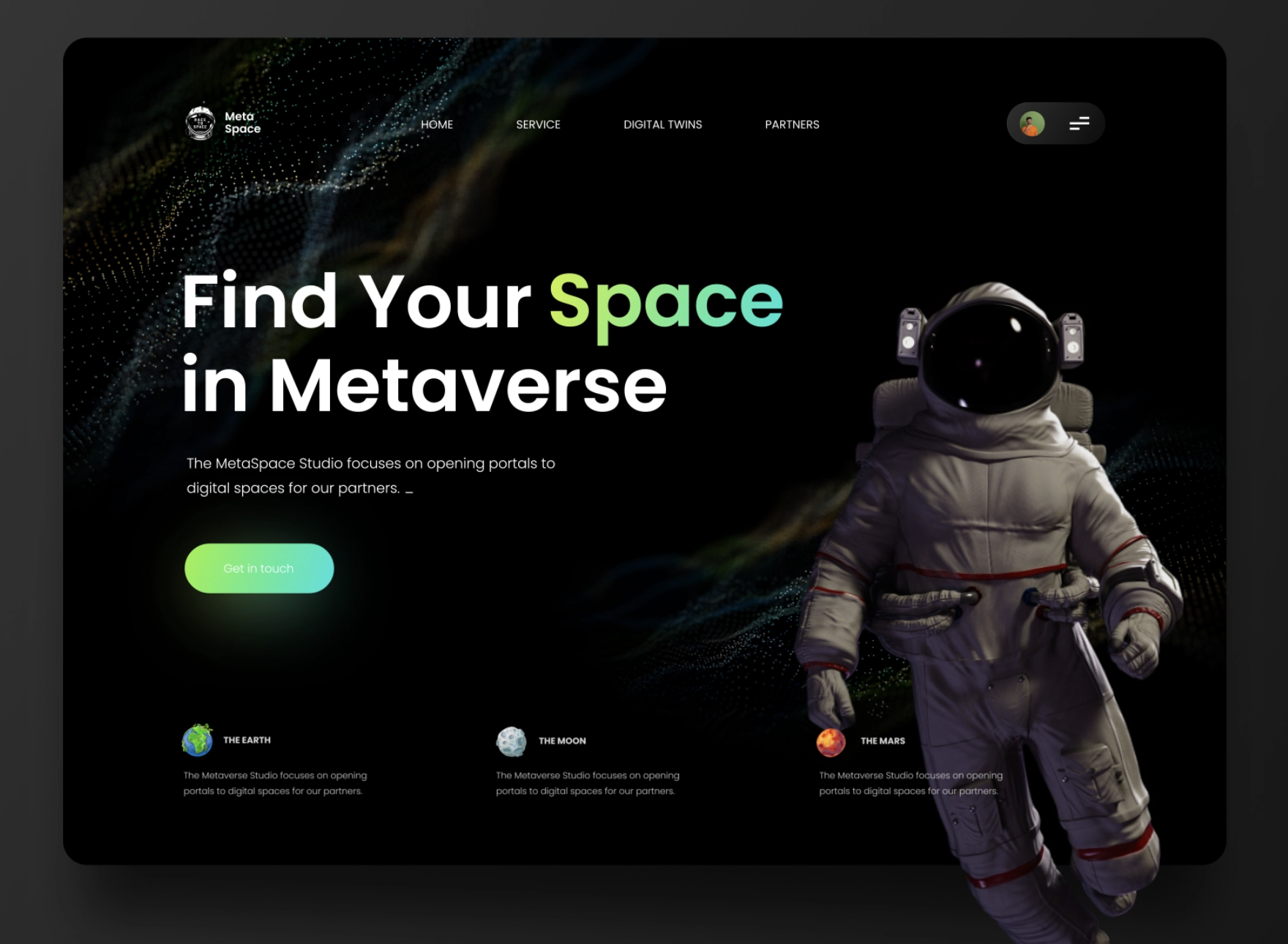
Dribbble is great for inspiration on any UX design idea. It features the work of many creative people to spark ideas. Below are some examples.
Watch the video below to learn how to build mockups with Adobe and other tools.

A prototype is a hi-fi representation of the final product. It is meant to stimulate user interaction.
Prototypes are clickable, allowing a user to experience the interface.
The difference between a prototype and a final product is that the back end is usually not completed in a prototype. The prototype is nearly a face.
At the beginning of the design phase, your focus was on the users' needs. Along the way, teams could have lost sight of this. Prototypes main intention is to analyse if your solution services the users needs.
Similarly to wireframes, prototypes can vary from lo-fi to hi-fi.
Key takeaways for prototypes:
- Test user interaction
- Test user flow
- Test user experience
- Have a clear goal for testing
- Test early and often
- Allow test participants to contribute ideas
- Test with the right people
- Be neutral when presenting your ideas
- Evaluate if the solution meets the users needs.
Here are a few questions to ask during the evaluation:
- Do the users like the visual design?
- Is there something that looks strange or confusing?
- Does anything distract you or get in your way?5
Prototype tools that you can explore:
Watch the video below to learn how to create prototypes in Adobe.
Testing should not be included only at the end of the design stage. Testing should be done at the:
- Wireframe stage
- Mockup stage
- Prototype stage
As seen in the wireframe section, the best method is iterative. This method is based on testing feedback and results from users at different design stages. The iterative process was created as an alternative to the Waterfall approach.
A successful UX designer begins this testing at the beginning of the design process. This limits the chance of spending resources on a design prototype to receive feedback that it does not solve the problem.
With the iterative approach, you can create, test, analyse and refine ideas quickly at any phase of the design process.
The process of designers exploring and validating assumptions through ideation, prototyping, testing, analysing and refining is called rapid prototyping or spiral prototyping.
Iterative design process steps:
- Empathise
This is the user research section. As we have already explored, we ask the questions and plan out the personas and user journeys to understand and empathise with the user. - Define
This part of the process is where you document and define the project brief. You spend time defining the business requirements while also including the users' journey and user information.Ideate Here is where you start to generate ideas. This is where you can include the low-fi wireframes and crazy eight tasks. Sketching, creating a design specification or system is all included. - Prototype
Once you have generated ideas, you can review them against the needs of the user, the project brief and the business requirements.
Once you have streamlined these ideas, they can become prototypes.
The prototype phase goes through what we have discussed.
Wireframe > Mockup > Prototype
Every step has a level of user testing to keep refining your solution. - Test
This step is the final step before creating a fully functional solution. This test phase takes it back to users to identify if the solution was solved. Once this is successful, your solution will go into development, adding all the back-end connections fully functional.
This process is not linear. As a designer, you will go through steps 1-4 at every step of the design process.
Example of the design process
For an example of the design process in action. Take a look at Paige Russell's prototyping and testing journey HERE.

Design stage
Instructions
The Grove in Auckland, a top-rated restaurant, has approached you with a customer problem. Recent research found that the most time-consuming part of a customer's experience is splitting the bill between the meat-eaters food from the vegetarians.
The owner believes that this process adds unnecessary time to a customer's experience and staff.
You have been asked to design an app that will help eliminate this problem.
Your task is to:
- Create a wireframe of your design and post it in the forum. Add value to someone else's design.
- From the comments your peers have made, create your mockup.
- Review the requirements and the comments your peers have made before moving on to creating a prototype.
- Document each of these steps in a portfolio such as Canva.

