Adobe Illustrator is another core piece of software that will be used throughout the programme. It is a fundamental element of the Adobe Creative Cloud Suite and a vital app for designing dynamic, eye-catching animations and web content.
Before we launch Illustrator, we want you to learn some common notions about design.
Creative design elements and principles
Design can be approached as a communication tool between the creator and the audience. In this context, there are techniques we use to persuade our audience to like what we create. We want the work to appeal to them.
Since the design elements and principles we'll cover apply to Animation, Film, and Design/Web, we've put all the learning content in one place — the course Design Principles and Tools.
Important
As we've said, artists use the elements and principles of design to provide them with approaches and techniques to communicate to the audience.
We expect you to return to the following sections regularly as you work through this programme because applying these principles will differ based on which media you are applying them to. Keeping them fresh in your mind with review until they become second nature will help you create designs that resonate with people.
Try and apply the design principles to the practical activities you will be doing to learn the Adobe Creative Cloud suite of tools. We're starting with Adobe Illustrator.
If you haven't done this already, it's time to go through all of the tutorials and activities in the following topics in Design Principles and Tools:
- Elements of Design
- Principles of Design
- Composition
And then also do the following:
- Illustrator Tutorials (This is the first time we're assigning this.)
When you are done, return here and think about how you will apply the notions you just learned to the activities and content in this course.
Refreshing your memory, let's recap the difference between Photoshop and Illustrator. Complete the following activity by selecting Photoshop or Illustrator as the best software to complete the job. (Note: you can do all things with both, but we're looking for the broad strokes of how the tools are usually used.)
Did you complete the tutorials? Tino pai. Next up, the real fun begins, and you get to practise your new skills. Karawhiua! Go for it!
Let's start our practice session with simple drawing exercises to get going with the core tools of Illustrator.
Novice Activity – Composition and Principles
🕔 About an hour
Download this file and open it in Illustrator.
Have you opened it? When you have, start working on these tasks.
Task 1: There are instructions (screenshotted below) for you on an artboard in the file you downloaded above. Three shapes and several artboards (boxes) with titles are provided. Play with each of the shapes below and modify the line, shape, and colour. Add any design elements you like to help understand the impact on the shape and composition. Leave one version of each shape unmodified for task 2.
This instruction will appear on an artboard on the downloaded document:
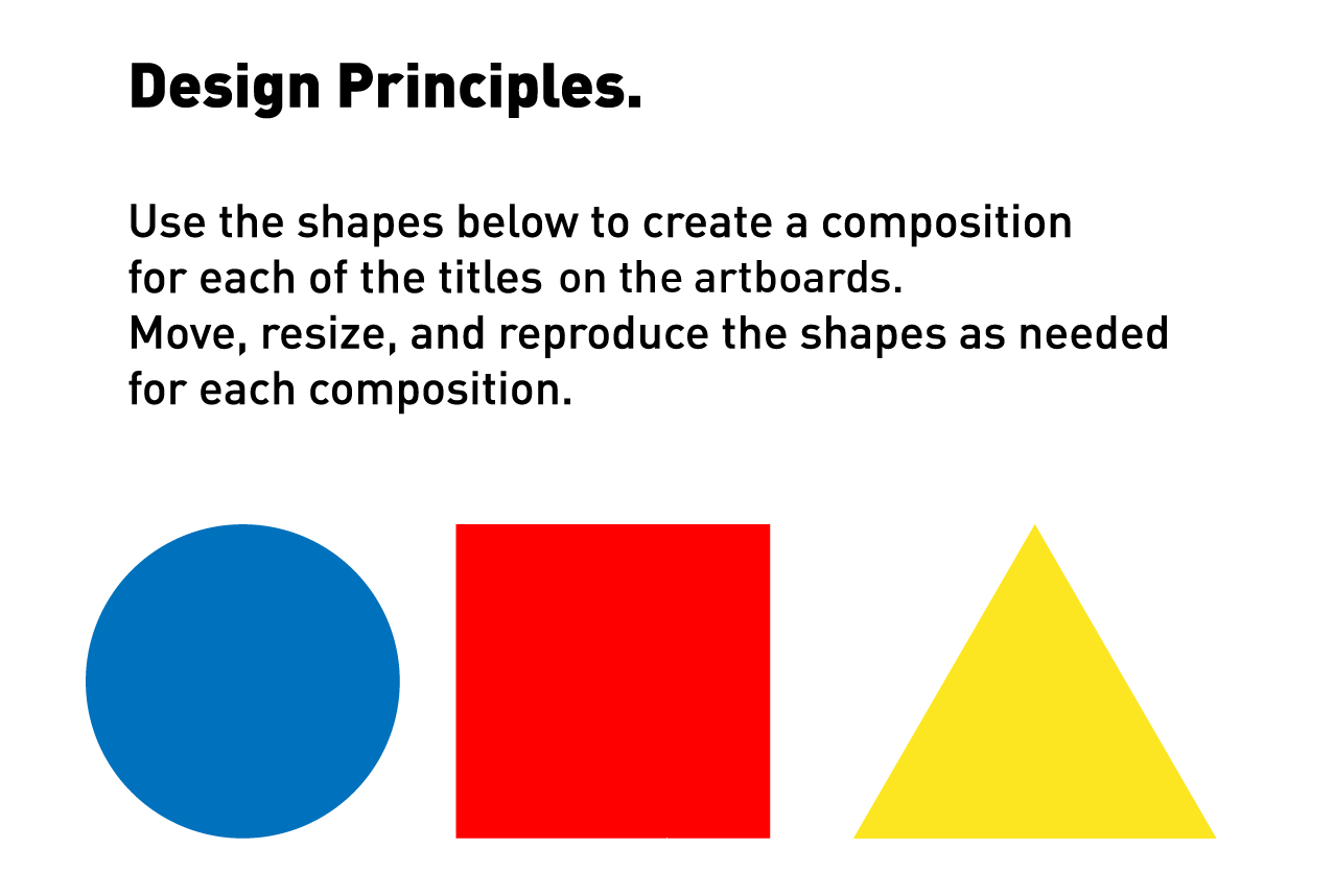
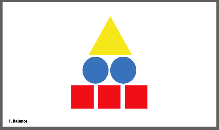
Task 2: Now look at the elements of design in relation to the title of the box they sit in (balance, repetition, movement, etc.). For example, you may like to arrange the shapes this way to describe what "balance" means in a composition. There are no correct or incorrect answers here! If it appears in balance to you, and you can describe that to another person if you had to, then you are doing great!
Newbie Activity – Sports Logos
🕔 About an hour
The purpose of the following exercises is to demonstrate how some complex shapes can be made by transforming simple shapes. You will be able to trace over the top of the existing logo so you can learn how to achieve the design.
These Adobe tutorials will help you complete this activity:
Download this file and open it in Illustrator.
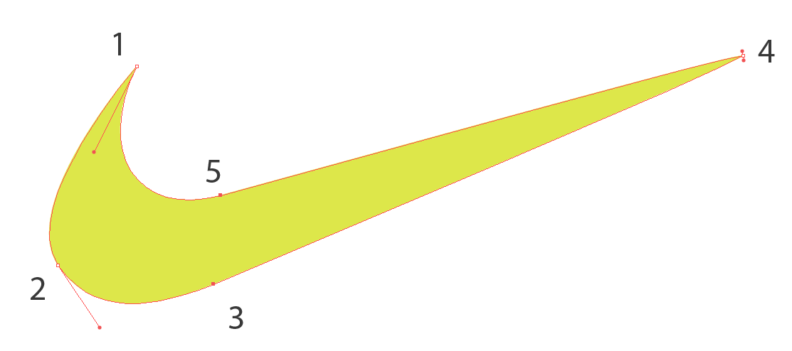
Task 1: Use the pen tool to recreate the Nike swoosh
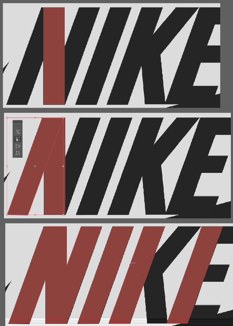
Task 2: Use the shape/free transform & pen tools to recreate the Nike word mark.
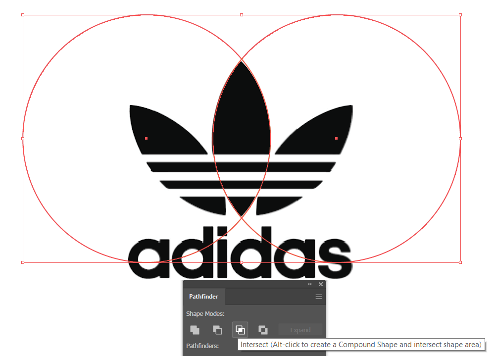
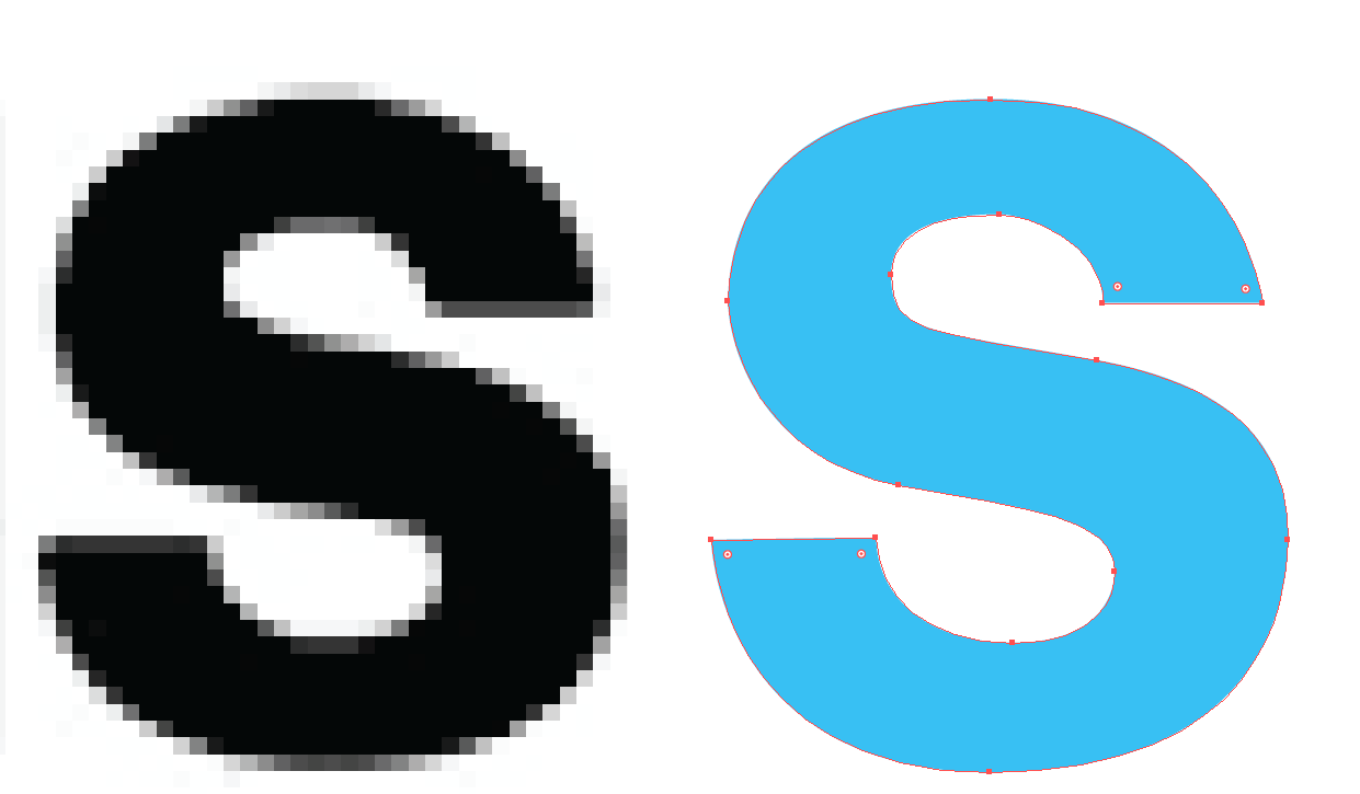
Task 3: Use shape and Pathfinder to do the Adidas logo. The S is pretty tricky.
Once you have done that, or if you want some extra support, expand the labels below to get some hints, or to see how we would do the task. Note, that we've overlaid the instructions onto the logos so you can see the process to get to the final design.
Make a single rectangle. Duplicate it (alt + select + drag). Free-transform to skew it.
1. Start with two overlapping circles and use the Pathfinder.
2. Use a similar process for the other leaves.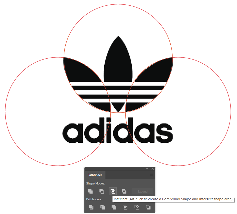
3. Use Pathfinder again to subtract three rectangles from the leaves.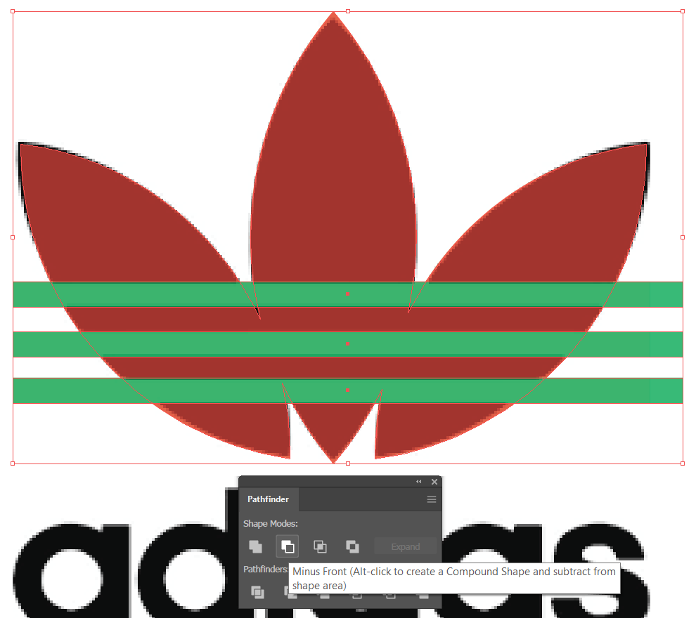
4. Join the three leaves together with the Pathfinder.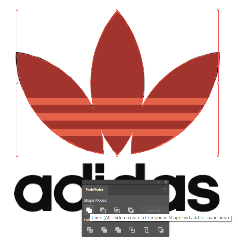
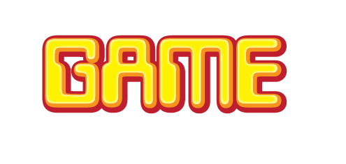
This image can be used to show which shapes to start with to create the letters that create the word.

We said the S was tricky... Rather than trying to combine shapes, this letter is probably easier to recreate with the pen tool, as shown here:
Practising Activity – Kandinksy
🕔 1 to 4 hours (at least an hour, but you don't have to complete the work unless you want.)
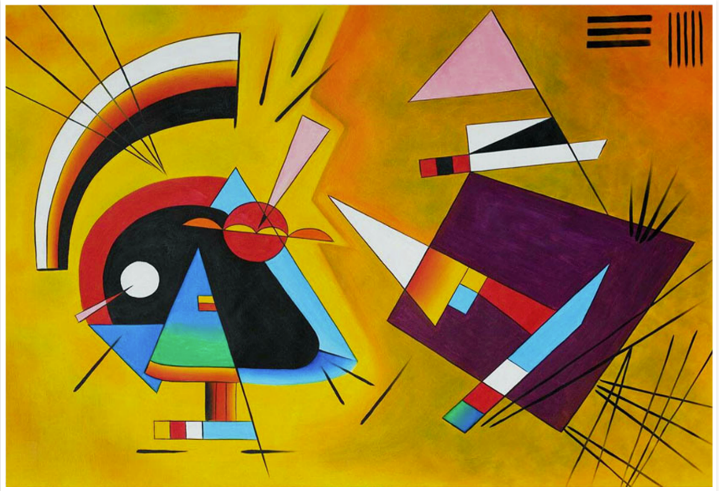
For this activity, we'll provide you with a work of art, "Black and Violet" by the artist Wassily Kandinsky, and ask you to recreate it to the best of your ability. Right-click the image below, download it, and then open it in Illustrator to get started.
To complete this activity, you may like to watch the following Adobe tutorials:
For now, just use these four tools: shapes, pen, lines/strokes, and gradients.
Black and Violet:
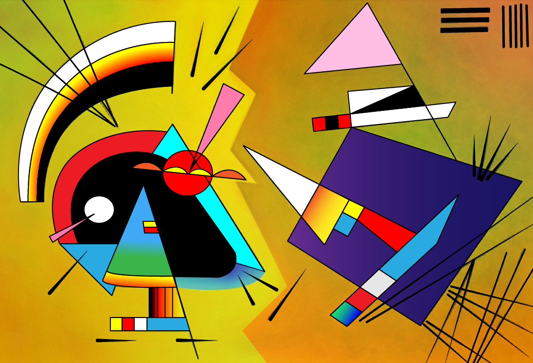
Now that you have completed the activity, watch and see how Dan does it.
Forum Post
Are you feeling inspired? Excited? Overwhelmed? Share!
Post your image in this Forum. Feel free to discuss how this activity went for you. After you post, take a look at the posts of your peers and provide any constructive feedback you may have — in a kind way.

Having a deep understanding of how the layers function works in Adobe products is vital to the development process. This activity provides you with an opportunity to examine and analyse the complex layer structure of Micky Mouse as he motors around on a somewhat surprised-looking scooter.
Novice Activity — Micky Moto
- Download the MickyMoto file and open it in Illustrator.
- Looking at the Layer Palette: take note of the order, naming conventions, and grouping.
Newbie Skills Activity — Revise your Introduction presentation
🕔 Less than an hour
- Now that you have studied Micky Moto, open the Who I Am presentation in Photoshop you created earlier in this module.
- Using your deeper knowledge of layering, see if you can improve the structure, grouping, and naming conventions of this file.
- Head over to the Forum for your Introduction and upload a revision along with some reflections about what changed and why.
- Instructions for revision are included in the first post of the activity: Instructions for posting activities.
Tracing
Most of us learned to draw by tracing our favourite cartoons as kids. Good artists never stop learning! You may be surprised that professionals use tracing, too! The final design may not show any traces of the tracing, but artists may trace a design to model a cool technique they fancy.
Newbie Activity – Trace a character
🕔 1 - 2 hours
Moving on from layers, we'll look at how to recreate a character by tracing the lines.
Task 1: Right-click and Save the file for Spongebob or Batman, or find a simple character of your choice.
 |
 |
Task 2: Open Illustrator and create an A4 document, then place/paste the image in. Then, you can trace over the top to recreate the image. You may like to create a swatch palette while you are doing it so you can reproduce it with accurate colours.
Let's spend some hands-on time with character creation again. We'll focus on a simple rabbit to start and then move into a more challenging activity where you can create a cartoon YOU!
Character Creation - The Bunny
Practising Activity - Build a bunny
🕔 About an hour
Animating a character can be a little more complicated than animating a box or a ball; however, the same principles apply, and we need to start by creating a character to animate.
We can use Adobe Illustrator to create our character. When creating this bunny, it is very important to use a separate layer for each element you want to animate.
Start by using the tools you have been practising to make the shapes below.

With these shapes, we’ve created a very simple rabbit, with each element having its own layer.

Save your character as an Illustrator file. We will come back to it later in another Adobe tool, Animate.
Practising Activity - Funko POP! yourself
🕔 About two hours
Create a Funko POP! version of yourself! Often designers have a distinctive look that people can recognise and identify as that particular creator. The Funko POP! brand is a good example of that.
Instructions:
Task 1: Create a Funko POP! stylised caricature of yourself! If you are not familiar with these products, do some online research and take a close look at what makes these designs distinctive.
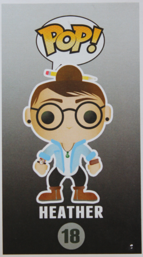
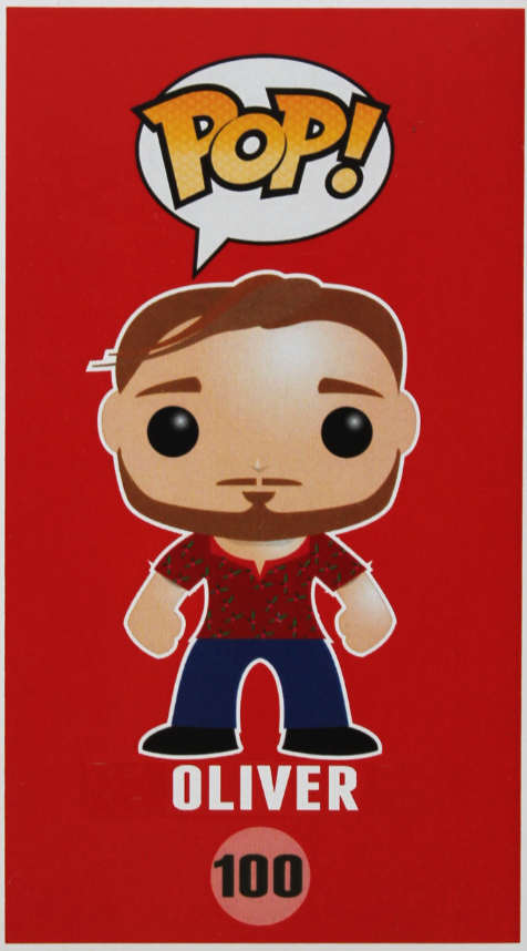
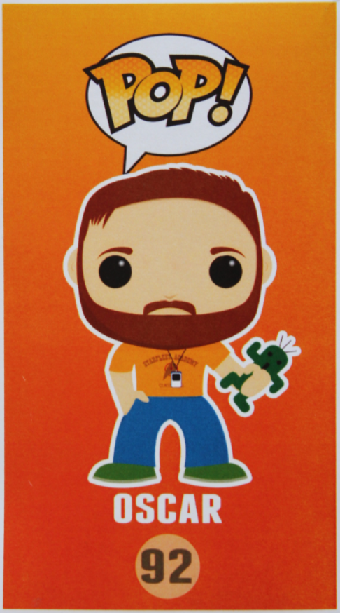
Here are three examples of artists who have done this activity already.
Meet Heather, Oliver, and Oscar:
 |
 |
 |
Use this file to get started.
Tips:
- Get started by sketching out a few different concepts of your caricature before deciding on one to expand.
- Use the tools in Illustrator that you have been practising, such as pen, brush, shapes and pathfinder.
Task 2: Create one or two additional styles of your caricature. Does your caricature play a sport? Do they wear a uniform? Do they need a Doctor's coat and PPE? Going to a wedding? This is the beginning of your learning how to give characters personas. In this case, you are the persona and thinking about how you can use clothing and props to communicate a character's style.
Task 3: A little more - make layers in anticipation of animation
Use the Pathfinder tool in Illustrator to split your POP-vinyl character into separate parts that can be animated.
- Give your layers meaningful names.
- Don't forget to save your file with a name and in a location you won't forget. We're going to return to your POP! caricature and animate it a little later in this course.

Are you struggling to see where the layers go? Here is another template that shows which layers are needed to animate your POP! caricature later: Layered-Pop-Character-Template
Remember earlier when we discovered that typefaces speak to us while we read the words they represent?
Typography techniques
Important
Before starting these activities, please ensure you have completed the following tutorial:
Design Principles and Tools > Illustrator > Type tool.
Novice Activity - The personalities of typefaces
🕔 Less than an hour
- Create an artboard in Illustrator that contains ten lines of very different typefaces.
- Practice using lorem ipsum for the text.
- If you like using that, and it is very useful when showing project stakeholders your composition (as an early draft) without the reviewers getting caught up in the words they see, use this trick to turn on the option of adding Placeholder Text in Illustrator.
- Practice using lorem ipsum for the text.
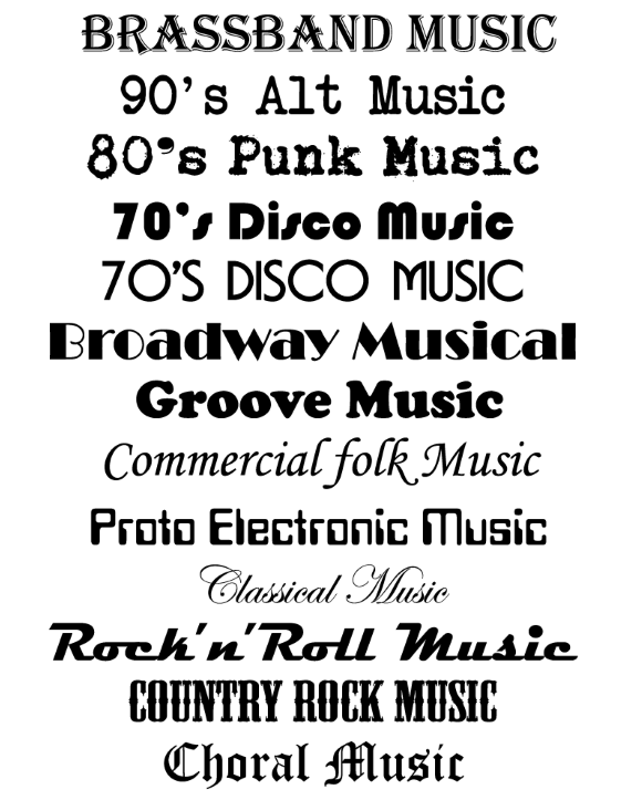
- Go through each typeface and change "lorem ipsum..." to a type of music genre that suits that text. There are no right or wrong answers here. You are describing how these typefaces speak to you at this point.
After you have done that, take a look at our example.
Newbie Activity - Your World Cloud
🕔 1 - 2 hours
Pick a typeface and colour that represents your personality. Create an A4 Landscape canvas and use that typeface and colour to put your name in the middle of the page.
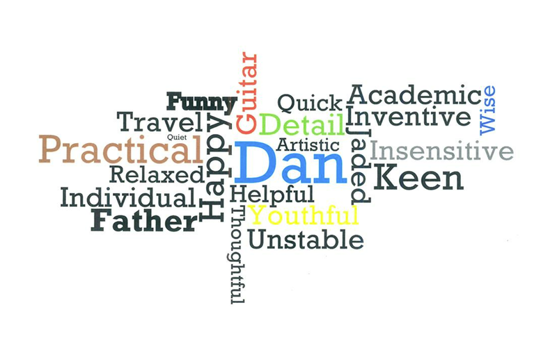
Referring back to the mind-mapping activity, create a word cloud that explains or expresses your personality using only colour, size, space, and positioning to add emphasis and feelings to words. Take a look at the example from our course tutor, Dan.
Each typeface has a personality, but using the tools of our trade, we can make that personality even more distinct. Now, we'll teach you how to add personality and flair to typefaces.
Styling text
Styling text can be easier than you might think.
Creating typeface styles in Illustrator
Once you have something to use as a model and an understanding of some simple techniques in Adobe Illustrator, you should be able to create professional-looking results.
Newbie Activity - Styling typeface in Illustrator and Photoshop
🕔 1 - 2 hours
| Type out the word | 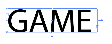 |
| Select a suitable typeface | 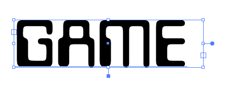 |
Create Outlines:
|
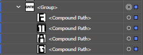 |
Make a compound path:
|
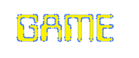 |
| Offset path: From the Object menu > Path select Offset Path |
 |
Creating typeface styles in Photoshop
We'll start with the word COMPUTER and add:
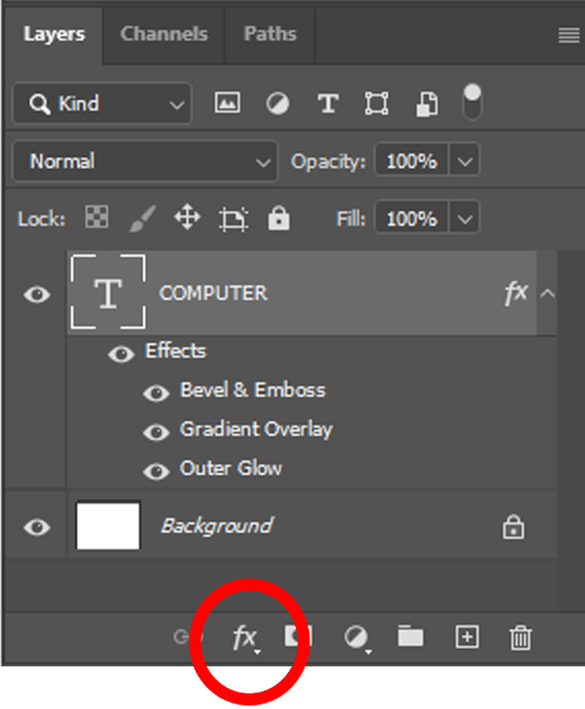 |
 |
| Gradient Overlay |  |
| Bevel & Emboss |  |
| Outer Glow |  |
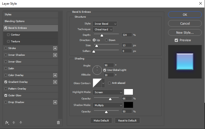
Here is the interface for the options for the Bevel & Emboss Layer Style (double-click the layer style to access these options.)
Showing off Activity – Business Wall Art
🕔 2 - 4 hours (or more if you are having fun!)
Scenario: You have been asked to design a poster for a small, independent, plucky accounting firm. They want their employees to feel welcome, nurtured, and inspired to do their best work.
Task 1
Create three small posters (A4) for each of the statements below. Use the tools we've learned in this section, such as typeface, colour, size, and style, to create your compositions.
- Inspire yourself, inspire others.
- Embrace change, welcome growth.
- Every obstacle is an opportunity to overcome.
Task 2 - Forum post
Export your work in a web-friendly format such as .jpg or.png and upload it to the Forum. Look at the work of your peers, and place positive comments for any work that is particularly inspiring to you.