Design principles are guidelines to follow when designing graphics and compositions.
Design principles are essential to designers as they provide guidance that extends well beyond most people’s mental models of design. They help establish a structure made up of rules and considerations to ensure the message being conveyed is as effective as possible.
Digital principles are not a definitive roadmap from A to B like you would find in a set of standard operating procedures. Instead, they work more like a compass, pointing in the right direction and providing guidance about how you develop your design piece.
When used successfully, these design principles can transform designs, enhance usability, influence perception and increase appeal - as well as convey various messages to their users.
Remember, these principles will support you in completing your assessment within this course. While working through these, please reflect on where these have been used in everyday life (e.g. movies, road signs, advertisements and logos) and how all principles work together to make the piece effective.
Hierarchy is the control of visual information in an arrangement or presentation to imply importance. Hierarchy influences the order in which the human eye perceives what it sees.
Typically, visual elements with the highest contrast are noticed first.
Using hierarchy, we can control how a viewer engages with information to ensure that information is navigated and digested in the way it is intended, e.g. where we want the eye to look first, second, third and so on.
Establishing a clear visual hierarchy is important because it holds a design together. Used effectively, hierarchy can make a complex message simple.
These are embedded through all design pieces; you may have understood the meaning behind the design and may have overlooked that the main principle used is hierarchy.
Have you ever seen a movie cover and noticed that the main character was always the biggest or the first in their lineup? The designers would intentionally create a hierarchy to demonstrate the most important characters to their least important. These designers have effectively utilised the hierarchy principle to show their users who the main character is at a glance.

Task: Can you think of a movie poster that embodies and reflects the hierarchy principle? Do a Google Image search on "movie posters" and study the results to see if you can find other examples of the element of hierarchy that communicates information about the movie.

Contrast occurs when two elements on a page are different.
For example, it could be:
- different colours between the text and the background colour
- a heading set in a big, bold, grungy font
- the difference between a large graphic and a small graphic
- a rough texture combined with a smooth texture.
One of the main reasons to use contrast in your designs, whether for print or web, is to grab attention and create order.
Not only is a page more attractive when contrast is used but the purpose and organisation of the document are much clearer, balanced and eye-catching. For example, heavy black type provides a good contrast to lighter body text. This principle can be easily discovered in advertisements, websites and logos.
The famous adverts for the iPod expertly used contrast to focus the viewer's attention on the music player. The ads featured a silhouetted character on a brightly coloured background. The iPod and earphones appear in white and stand out clearly against the silhouettes and coloured backgrounds.

Look at the other examples below. Can you identify where they have used contrast? What message were they trying to send to their audience?

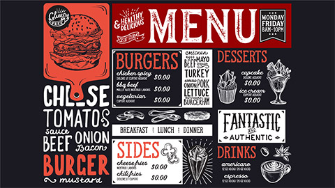
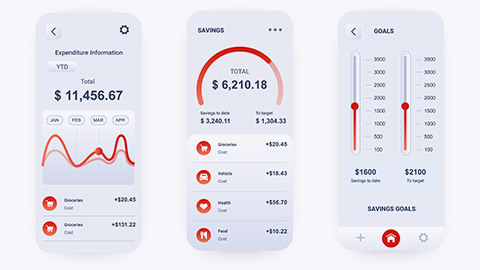
Alignment is a design principle that refers to lining up text or graphics on a page. It is used so all visual elements line up in composition. Alignment is used everywhere we look - think about the last time you read a menu at a restaurant or entered a website to see their products. They have used alignment to ensure their visual elements are in line with their text to create a balance and structure to their design piece.
In design, we use alignment to:
- organise elements
- group elements
- create balance
- create structure
- create connections between elements
- create a sharp and clear outcome.

Eye flow (or flow) is about movement and direction and leading the eye from one part of a composition to another in the direction you want it to move. You can create flow through visual cues such as arrows and lines to support the reader in understanding the order of where you want them to read.
Using the design principle of flow is essential as it leads the reader's eyes through a design: determine where you want them to look first, where their eyes should pause, and how long you want them to stay there.
These are typically demonstrated through presentations, advertisements, web pages and articles.
Unity refers to how well the elements of a design work together. Visual elements should have clear relationships with each other in a design. Unity also helps ensure concepts are being communicated in a clear, cohesive fashion.
For more information on the unity principle, check out the video below.
Let's see how much you remember! Take these two quizzes to help consolidate your learning.
Practising Activity - Revise your poster
🕔 1 - 2 hours
You have now had the opportunity to explore design principles, and you'll understand that the use of these design principles increases the power of the message in your artwork.
Let's revisit the design you created for the Edge Music Festival a little earlier.
Review and adjust your previous design by implementing the principles and elements you have just learned.
Forum Post
Add a revision (use the [Reply] function) into the Client poster Forum along with a brief explanation of the changes you made and your reasoning. Save your reply. Please be sure to provide supportive feedback for others. This feedback loop will help you see other design perspectives and learn how others see yours.
