Looking at this landscape, we can see that the composition feels well-balanced.
The principles of film are the rules that a filmmaker will follow to create a compelling and attractive composition. All designs have basic building blocks chosen to convey their message. How we place those items on the page determines the structure of our design, affects the overall readability of it, and determines how well our design communicates the desired message.
The principles of design govern placement and structure.
Balance
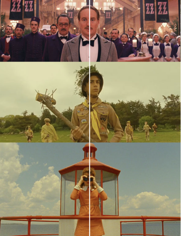
Balance and symmetry feel stable and aesthetically pleasing. This technique can be a powerful tool to convey a story regarding the character, revealing character traits and power dynamics, or they can create a place so perfectly symmetrical that the audience feels instantly overwhelmed.
Blocking the actor in a symmetrical shot can be a very effective way to lead the viewer to a certain feeling or emotion.
Take a look at this scene from The Shining, which is a good representation of a balanced shot. It's an effective tool for adding to the creep factor in this case!
Within a shot, there are three types of balance that can be portrayed. These are:
- Symmetrical
- Asymmetrical
- Radial Balance
Symmetrical

The film is visually equal throughout the film. What you have on one side of the frame, you also have on the other.
Asymmetrical

The film is visually unequal throughout the film. What you have on one side of the frame is different from the other side. However, the weight is evenly distributed to create a level of stability.
Radial Balance

Often in film, you see circles spiralling from the middle or like bike wheel spokes: lines extending out from a central point.
Alignment
Alignment is the process of identification with a character, group, or ideology when the audience watches a film. Filmmakers try to manipulate an audience’s point of view with form and content so the audience can relate and identify with the characters. Most films have this alignment happen in the first few scenes, and it helps shape the audience's understanding of the story.
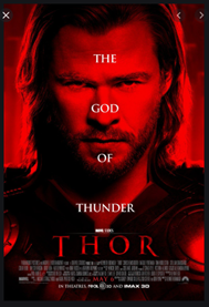
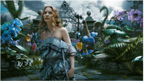
Emphasis
Emphasis is also called a 'focal point'. The character that is emphasised attracts the eyes of the audience. This occurs any time an element of a piece is given dominance by the film artist. In other words, the artist makes part of the work stand out to draw the viewer’s eye there first.
There are different methods by which emphasis can be achieved:
- Emphasis by contrast
- Emphasis by focal point
- Emphasis by placement
- Emphasis by colour
- Emphasis by movement
- Emphasis by difference.
Looking at the image below, how do you believe the filmmaker has achieved emphasis?
Proportion
This is the relationship between the sizes of objects or components in a film. The camera angle can manipulate a proportion. For example, if the camera angle was closer to a person's shoe and looked up at their body from this angle, the shoe could appear to look bigger than the person’s body.
Proportion in film creates perspective and is commonly used during sad scenes in film.

In the instance of a relationship of size, a comparison is made between the:
- height, width and depth of one element to that of another
- size of one area to the size of another area
- size of one element to the size of another element
- amount of space between two or more elements.
Movement
Movement is the path the viewer’s eye takes through the film, often to a focal area. It can be directed along lines, edges, shapes and colours. In the video, it is an actual movement that constantly changes from frame to frame.
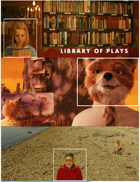
Pattern
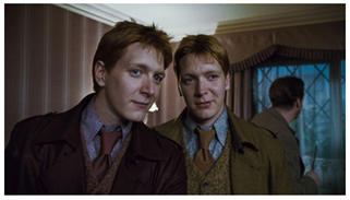
The above image is a great example of pattern. The two characters are different yet follow the same pattern to complement each other.
The pattern is achieved by the consistent repetition of any of the elements of art. This could be wallpaper in the background or square shapes repeating themselves in a music video.
Unity
Unity occurs when all of the elements of a piece combine to create balance, harmony and completeness. This can be done with similar colours or calming music and sounds. Another way to achieve unity is by repeating effects.
Great cinematography creates a sense of unity and rhythm between all its shots during the film. This also creates a consistent look and feel throughout the running time.
Ways that unity can be achieved through:
- consistent use of a film's colour palette
- specific camera filters
- a unique visual setting.
Contrast
Unique elements in a design should stand apart from one another. One way to do this is to use contrast. Good contrast in a design allows the viewer’s eye to flow naturally and occurs when two related elements are different. The greater the difference, the greater the contrast. Contrast adds variety to the total design and creates unity.
How can we achieve contrast?
Contrast occurs through the use of elements such as colour, tone, size, shape, value, direction and more.
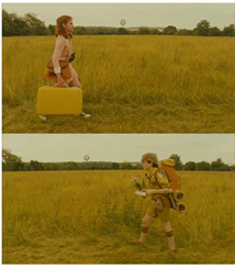
Composition is the act of combining parts or elements to form a whole. In film, 'composition' refers to the way elements of a scene are arranged in a camera frame.
If you simply make a beautiful shot without structure, your audience’s attention is going to scatter as they attempt to take everything in, while composition allows the audience to not just see something but to tell the audience something about what they are seeing, making it a part of the storytelling.
Composition does not need to be perfect or centre. It is about balance, order and symmetry.
The image below is not perfect, but it is balanced, it is layered, and it creates a story.
Techniques that assist with composition
The Rule of Thirds
This is where you divide the frame up into three parts, vertically and horizontally.
Comfortably fitting major elements onto these lines and intersections of the frame will create a decent composition. It is about positioning a character to show their relation to other elements in the scene.


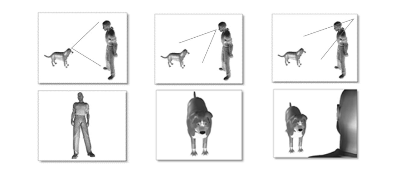
Point of View
Film-making uses point of view in two ways. The first is the point of view (POV) of the camera. Having a wider shot with the camera further away from the scene, an objective POV is created. By bringing the camera closer, typically using a handheld camera, a subjective POV can be achieved. The subjective POV is used to see what the character is seeing. Having a handheld camera allows the audience to feel as though they are the character.
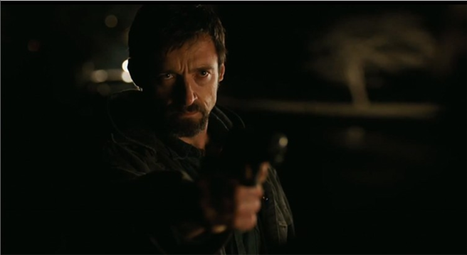
Light and dark
Remember how we learnt earlier that the first goal of composition is to direct your audience’s attention. A great way of doing this is through lighting contrast. By placing your subject in the brightest spot for the frame, you isolate them and guide the audience.
Lighting contrast has to be used appropriately. It should fit the theme and emotions that you are trying to communicate to your audience.
Typography is the style and appearance of words and includes the art or procedure of arranging type or processing data and printing from it.
In the context of film, when thinking of typography, we immediately go to the opening and closing titles. The opening credits are often the first clue you have to a film’s theme and tone, and typography is integral to that.
When considering the opening or closing credits for a film, the term typography covers the font, size, and colours, but it also dives deeper into finer details like the effects, how they appear on the screen and how they exit. What is behind the lettering - the background?
The opening sequence can provide an introduction to the main character's back story, motivations, concerns, or joys, for example, and provide a teaser into the obstacles or challenges that the character will face. Think about the opening sequences for James Bond 007 movies — they set up the mood, the character as a spy, and the stylish tone.
Below is an example of an excellent movie title sequence. Look at it. Reflect on how the typography and other effects made you feel. Do they draw you in? Spark emotion? Encourage you to stay and watch the film?
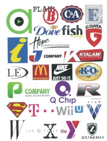
To help drive home the impact of typography, we'll spend a bit of time with logo design and give you a chance to have some fun with logos and type.
Logos are a distinctive part of most brands. You will be familiar with many of the major brand logos. A strong logo will embed itself into a viewer's consciousness and stay there as part of their visual vocabulary.
Novice Activity - The product alphabet
🕔 About two hours
Task 1: Collect as many logos or brand names as you can onto an A3 page using Photoshop or Illustrator.
Task 2: Try to put the logos into categories such as colour, shape, and mood.
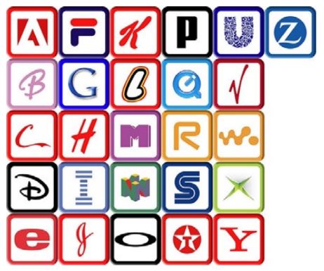
Task 3: Pick out specific letters from various logos to create an alphabet with a consistent theme or style. Challenge yourself to use only one letter from each logo.
Task 4: Spell out your name in a short sentence.
Task 5: Take a screenshot of your alphabet and the sentence you made so you can share it.
Forum Post
We hope you enjoyed this work with logos and brands. Don't forget to check in with yourself as you are working through the activities about how you feel while working on them. Upload your work to this Forum along with the answers to the following questions.
- What criteria did you use to determine which letters to use?
- Did you feel you understood the reason for this exercise?
- Do you feel you can now attach a mood or feeling to a typeface?
Things to remember:
- Legibility
- Identifiable letters
When you have posted your work, or if you just need a bit of inspiration, take a look at these student examples by clicking the label or (+) sign to expand it.
Well-designed logos have a more significant impact on consumers than we might even realise.
Now that you have created products think about movie logos again and have fun with the following activity.
The Movie Poster Alphabet Quiz
This (incomplete) alphabet comprises the first letter of a movie title used on at least one poster for these 2012 movies. Can you figure out the movies from just the first letter? Once you do, take an extra moment and consider why that font style may have been effective for that movie or not if you feel that way. It's a pretty hard task. Select Show Solution to find out the answers.
Advertising aims to influence the target audience, encourage purchasing decisions and create impact.
Marketing the movie
Once the film has been created, it is time to begin implementing your movie promotion plan. To make your film stand out from the crowd, you need a savvy marketing strategy.
Blockbuster movies, with a wealth of money carrying them, will be able to tap into specific businesses that assist with the marketing and advertising of their film.
The campaign for 2012's Deadpool was known to be edgy and effective. Deadpool signed up for Twitter and Tinder! According to this Twitter user, if you swiped right on Deadpool, you were taken to a page to buy movie tickets. Check out all the details - it certainly caught the attention of their intended target audience.
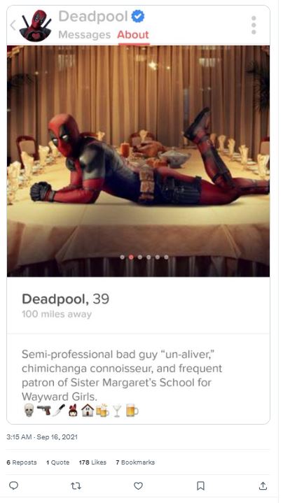
Source: Twitter user
For an independent film creator, MasterClass has provided the following points to assist with advertising your work:
- Create a hook-filled trailer.
- Roll out your marketing campaign on social media.
- Create a simple film website.
- Stage a public event.
- Build word-of-mouth.
The film industry needs to stick together, right? So, when thinking about the promotion of your film, you can talk to other filmmakers and tap into existing fan bases of film and television shows.
You will already have come across the term target audience, and we'll look into this more specifically around film shortly. To market a film effectively, you'll need to ensure that your marketing campaign is aimed at your target audience.
Showing off Activity — Logo Sting
🕔 4-6 hours
Source: Dribble.com
Content creators at all levels need to have some recognition. From big studios to YouTube channels, you will find logos and brand elements being used at the start, the end, and sometimes through a video. This animated logo has clues to the target audience, the mood, and the product.
Getting started:
- Use your own imagination to imagine the name of a production company. What typeface would you use to market the company's media releases? Why did you make that choice? Create a logo that reflects the style of your production company.
- Start with hand-drawn sketches only.
- Look at it again and identify how you can make your logo move. Which elements could you animate? Create a plan of action to animate the logo for 3-5 seconds.
- Simplify and stylise your sketch to refine it for animation.
- Use Illustrator to make a vector version of the logo with suitable layers to implement effective movement.
- Hint: image tracing is a good way to digitise your sketch.
- Use Adobe Animate to have the logo elements move.
Forum Post
Post your work to the Forum with answers to these questions:
- How do you feel about your output?
- Were you able to pull off the movement you had planned, or did you need to alter your plan once you started to develop the animation?
- What would you change about the output if you did it again?
- What did you learn about how to work with a typeface from doing this project?
Things to remember
- Keyframes
- Motion paths
- Beginning / Middle / End
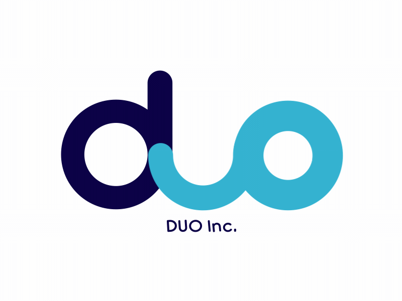
Here are examples of past students' work. Enjoy!