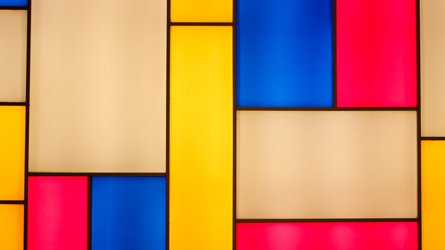
This wall is painted in a style made famous by Piet Mondrian, who is well known for the exquisite composition in his work.
When applying the following principles of design in painting, writing, design, film and music, you will be able to create a work of art that effectively communicates with your audience. It is also important to remember that there is more to creating a successful design than just the elements individually — it needs to be cohesive, all the elements working together. This is called composition, and it plays a vital role in how your work is viewed and experienced by your audience.
If you overlook this aspect, your whole artwork risks appearing poorly planned and may not have the desired impact. If you get this right, you achieve success in connecting the audience with the true intent of your creation.
Composition is the craft of placement — using the elements and principles of design, an artist can create a visually appealing design. Through composition, you will ensure all elements and principles are arranged and placed to shape a viewer's experience of the final design piece.
Composition is a big part of what makes a piece eye-catching, dynamic, menacing, or soothing.
Create a composition in your mind
In your head, create an image of a single tree, standing alone on the top of a barren hill, with gathering clouds on a grey day. Does that image give you a feeling of isolation and sadness? Now, picture a tree standing atop a grassy hill with green bushes and orange and red flowers. The scene is bathed in the golden rays of early morning sunshine. Does that image give you a different feeling? Composition matters.
Graphic design principles enhance how you visually communicate with other people. It's essential to ensure all elements within your design are composed effectively, as this will work toward finalising your design piece.
Great designs stand out in everyday people's minds and can affect their ability to make decisions and influence their choices—people like to associate with things that look good and make them feel good. Using the techniques of size, placement, shape, colour, etc., which we have taught you in this course, will support you in developing a great final product.
When designing a product, keep in mind that many people are not interested in reading a lengthy document describing a product but instead will usually prefer to look at an image that provides the same information and can be absorbed in a fraction of the time.
For example, have you ever watched a commercial and you were suddenly convinced you needed their vacuum cleaner/face wash/dish soap/lipstick? Maybe it was bigger, like a brand-new car or a vacation deal? We have all been there.
Marketers are clever when creating graphics as they work to provide a positive image of the product along with the elements and principles of design working in perfect composition.
Below are some popular graphic designs. Reflect on their design principles and elements and how they have used composition to make these designs effective and appealing to targeted audiences.


Photography helps you capture anything you feel is important to remember. One photograph is powerful enough not only to remind you of an event or detail but also to bring you right back to the feelings, sounds, and even smells of the moment.
This is why composition is important, as it makes a mediocre image strong. It can capture the essence of many feelings, including love, happiness, serenity and movements, without needing to use any typography.
Below are examples of guidelines you can use to help you achieve a more attractive composition within your photos. You may find that you already use these guidelines naturally; however, let us investigate further.
Framing
Framing shots allows you to control what information the viewer receives and how they interpret what they see. These two photos are examples of good framing—looking past and looking through other objects capture the main focus of the photo.


How can we use framing to tell a story?
Framing can be used to achieve many effects, including:
- creating mystery
- withholding information so that the audience speculates on what could be happening
- giving information about what is about to happen - what may come next
- point of view framing - this is when the photos are taken from the point of view of the character they are portraying.
Rule of thirds
The rule of thirds refers to a composition being roughly divided into three horizontally and/or vertically, and points of interest being placed along the third lines or where horizontal and vertical thirds intersect.
The idea is to place the important features of the scene along with one or more of the lines or where the lines intersect. We have a natural tendency to want to place the main subject in the middle; however, placing it off-centre using the rule of thirds will lead to a more attractive composition.
Looking at the photos below, where do you believe the rule of thirds has been applied?


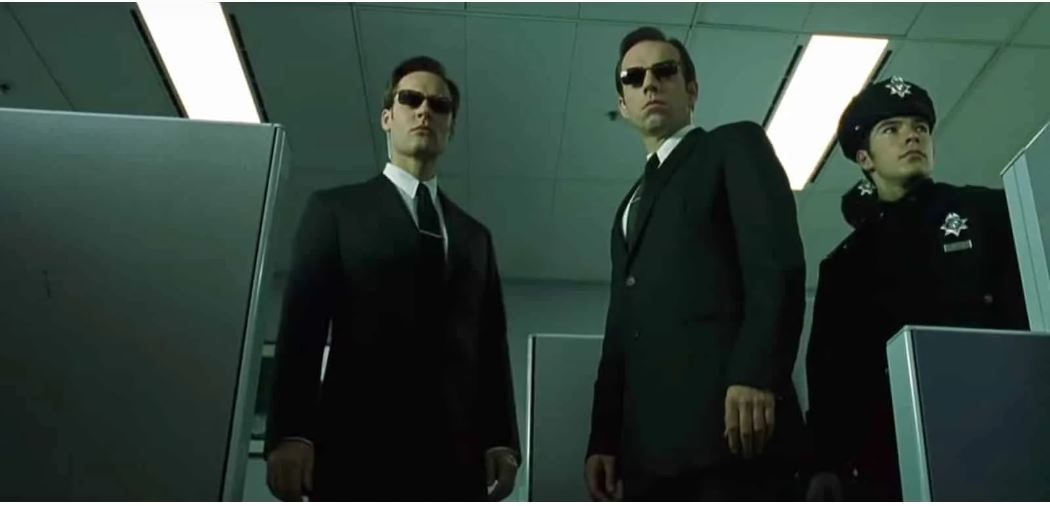
Eye-level
'Eye-level' shots refer to when the level of your camera is placed at the same height as the eyes of the characters in your frame.
These can vary across (a) extreme close-up eye level, (b) close-up eye level, (c) medium close-up eye level, (d) pan right shot, (e) tilt down pan right, etc.
Eye-level shots:
- dissolve the barrier between the viewer and the story
- help you empathise with the character and show them in a more vulnerable state - 'eyes are the gateway to the soul'
- humanise characters with a neutral camera angle
- simulate human vision and familiar composition.
Let's look at how eye-level shots are used to convey these various emotions and messages.
Extreme Close-up eye level

Medium shot

Medium close up low angle
Reflect on these pictures and ask yourself whether these eye-level shots evoke an emotion, feeling or idea from the characters. Do they help you empathise or understand the character?
By answering these questions, it is easy to understand why eye level is important in creating an effective composition.
Focal point
The 'focal point' is the part of the image that you want the viewer to focus on. A central focal point can seem very formal, whereas an asymmetrical focal point usually adds interest to the image.
The reason a focal point is important is that your eyes generally need to focus on one area within the shot. This will help your eyes find a point of interest to hold onto; without it, you may find people will simply glance at your shots with minimal interest before they move on.
Look at the photo below to see the focal point at the left of the photograph. It makes the photo much more interesting than if the subject was in the centre. It also follows the rule of thirds.

Depth of field
'Depth of field' is what happens in photography when you focus the camera on certain parts of an image:
- wide depth of field means that the image is in focus from foreground to background
- narrow depth of field means that only part of the image is in focus.
How does depth of field work?
If you are photographing a landscape scene, you will likely want all of that scene to be in sharp focus. This is called 'deep depth of field' and means that the whole scene is in focus.

At other times, you will want only a small portion of your overall image to be in focus. For example, in a close-up shot of a flower, you will want the flower to be in focus and everything else to be softly out of focus. This is called a 'narrow depth of field'.

Depth of field has become an important creative tool used to define subjects within a photograph.
Do you use depth of field as a compositional tool or not? If not, will you try it out?
Composition in film refers to the way elements of a scene are arranged in a camera frame. Visual elements are arranged to advance the story, reveal character and create emotion.
Through composition, you can instantly and intuitively clue the audience into the deeper meaning of the scene. It emphasises and conveys emotions or themes as well as denoting power and importance within each shot.
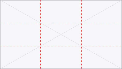
Similar to photography, it is important to use 'the rule of thirds', which applies to the process of composing film. The guideline proposes that an image should be divided into nine equal parts by two equally-spaced horizontal lines and two equally-spaced vertical lines. Compositional elements should be placed along these lines or their intersections to strengthen the composition.
To see this in action, watch the video below.
It is also important to consider the '180-Degree Rule'. This outlines the relationship between one character and another character or object within a scene.
An imaginary line called 'the axis' connects the characters by keeping the camera on one side of this axis for every shot in the scene.
To help you understand the 180-degree rule further, please watch the video below. (Please note this video contains minimal swearing.)
Illustrations are not limited to drawings, sketches, paintings and photography. They also relate to graphs, charts and other forms of visual representations.
Illustration shares similar composition techniques with photography, web design and graphic design as it emphasises the importance of utilising hierarchy, layout, scale, colour and contrast.

Composition is how design elements are put together, or aligned and arranged, to create a balanced and visually appealing web page.
Good composition creates an easy way for readers to navigate your website while strengthening the main message that you want to communicate. Applying basic concepts and techniques in composition are the building blocks to creating a beautiful and functional website.
Elements that need to be considered when developing your web design include hierarchy, size, scale, typography, colour, contrast and placement. Some are more important than others; however, they all play a vital role in designing a rhythm and flow for your website layout. They encourage readers to navigate clearly, identifying important information to help and guide them through the website.
Effective use of composition can make or break your animation because composition and layout are the first things an audience views, even before any movement takes place.
When creating your animation, it is important to consider the element of space. Space is the design element that we touched on earlier in this module.
To refresh your memory, space is used to organise negative and positive space within our animation - positive space being our character or object and negative space being the area around our character.
We must create a balance to ensure we give our character the right amount of negative space to function. Too much negative space creates an underwhelming feeling as your character becomes insignificant.
Zero negative space will leave the audience feeling overwhelmed as the character is in such an extreme close-up that they have no place to move around or settle into.