Most creative people will work in the commercial space at one point or another. A primary tool to work in that space is Adobe's InDesign. Let's start with a quick video about when and why to choose Adobe InDesign for a creative project.
Important
Before continuing with this section, please complete the tutorials in Design Principles and Tools > InDesign Tutorials. You need to know how to:
- setup a document
- use the text tool and linking text boxes
- add content
- use the drawing and shape tools
- impose a document
- work with a grid
- save and export (Share).
Commercial design involves understanding the target audience and making design choices that appeal to a specific persona. We've covered target audiences, so you'll have an idea of the kinds of attributes that designers need to consider in order to appeal to them.
Hopefully, you feel confident in Adobe InDesign and ready to move on. If not, pinpoint your challenges with that program and see if any of your peers can help. If you are really stuck, reach out to your tutor for support.
With the following few activities, we'll learn about some of the techniques used in commercial design to communicate to the target audience.
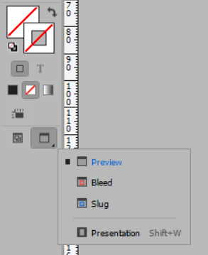
Preview mode
To complete these activities, you'll need to open files in InDesign. Some documents will open in "Preview" mode. Tap the [W] to toggle between view modes, or use the Preview tool in the toolbar as shown below.
Practising Activity – Hierarchy
🕔 Less than an hour
Task:
- Download the activity file, unzip it and open it in InDesign.
- Use it as a starting point and experiment with typography hierarchy.
- Change typefaces.
- Add pictures to create something like a newspaper article.
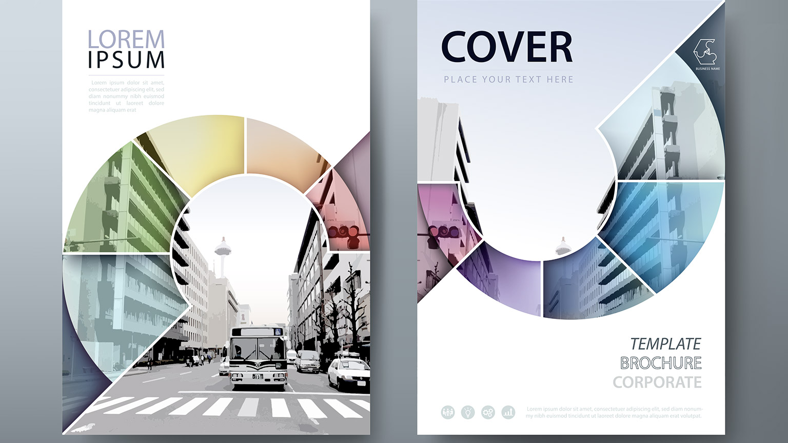
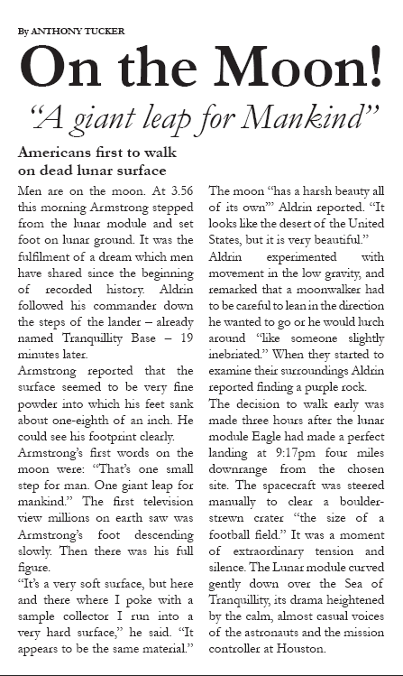
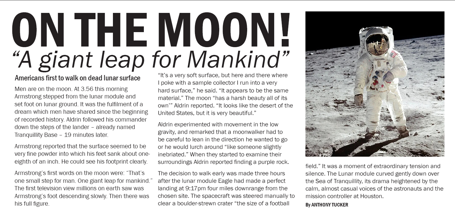
- Check out these examples of two different treatments of the same content.
|
|
 |
Practising Activity – 12 Steps
🕔 2 - 3 hours
- Download and extract the 12 step activity files.
- Open the files in Adobe InDesign.
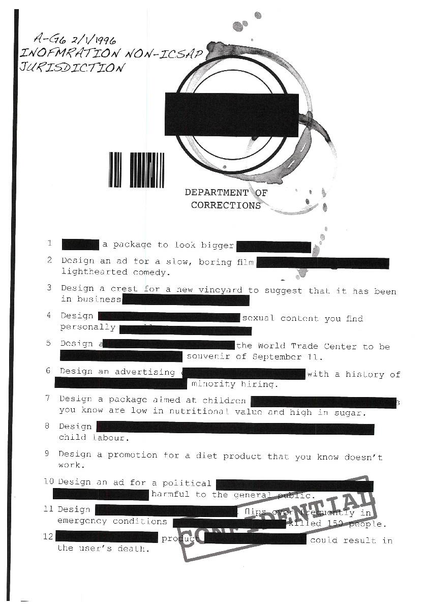
- Read through Milton Glaser's 12 Steps on the Road to Hell shown below, and reflect on how you feel about each of them. Do you agree? How might you manage a situation in which you were asked to do something that goes against your ethics?
- Format the content in the downloads into an attractive poster layout for a target audience of designers.
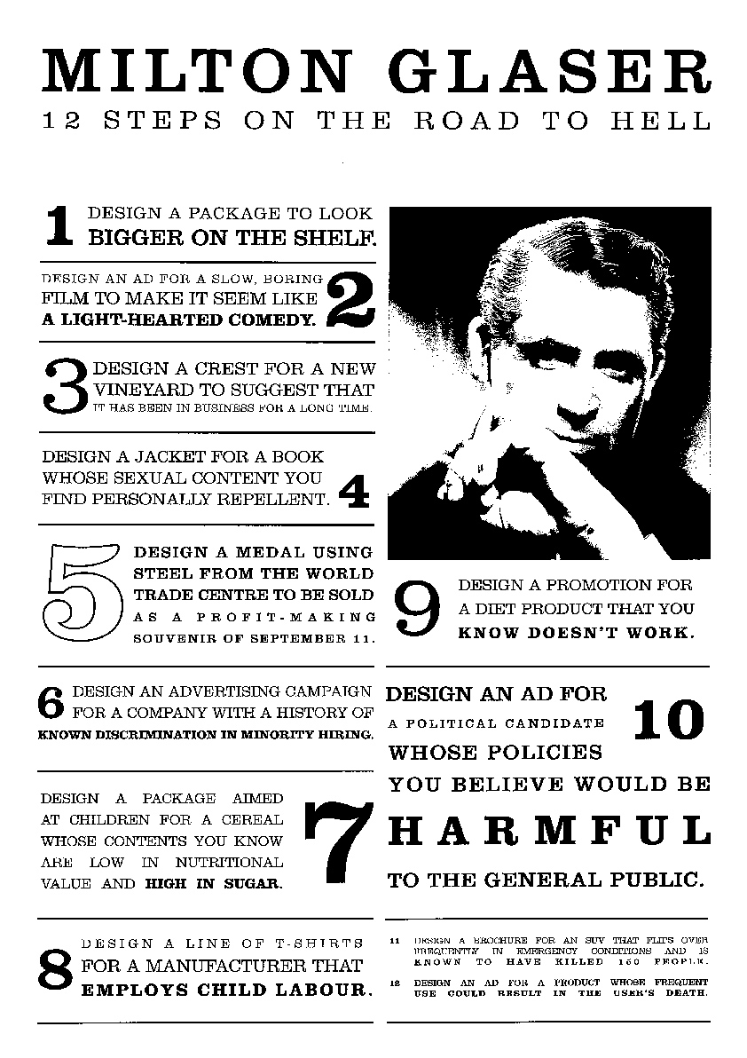
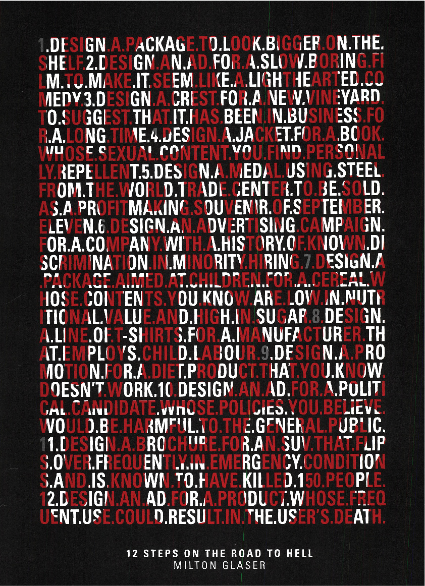
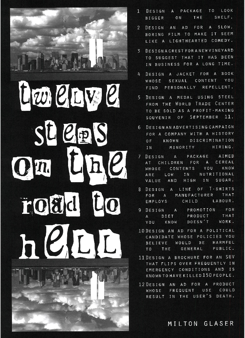
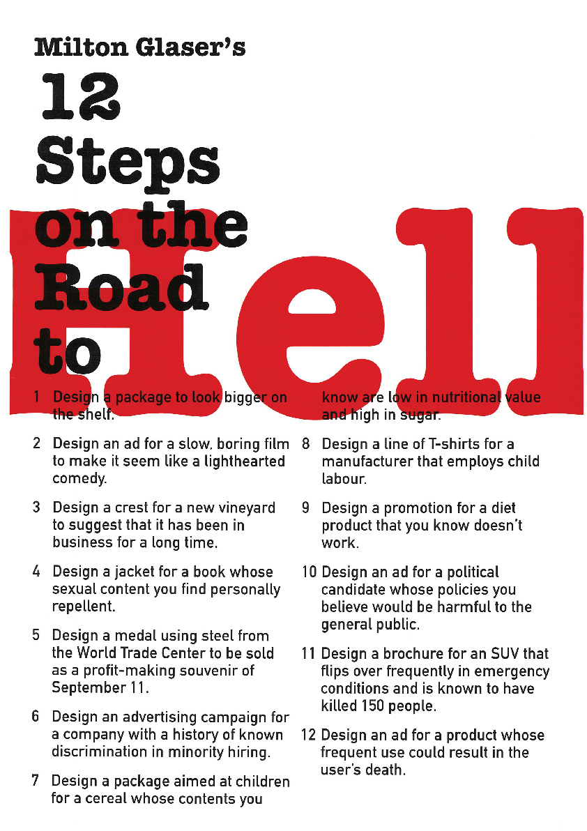
Milton Glaser's 12 Steps on the Graphic Designer's Road to Hell
Milton Glaserbending the truth can be a slippery slope for graphic designers.
The following is a list of choices and graphic designs that Milton Glaser, an American graphic designer, believes would leave him corrupted by making designs that are irresponsible to the public.
- Designing a package to look bigger on the shelf.
- Designing an ad for a slow, boring film to make it seem like a lighthearted comedy.
- Designing a crest for a new vineyard to suggest that it has been in business for a long time.
- Designing a jacket for a book whose sexual content you find personally repellent.
- Designing a medal using steel from the World Trade Center to be sold as a profit-making souvenir of September 11.
- Designing an advertising campaign for a company with a history of known discrimination in minority hiring.
- Designing a package aimed at children for a cereal whose contents you know are low in nutritional value and high in sugar.
- Designing a line of T-shirts for a manufacturer that employs child labour.
- Designing a promotion for a diet product that you know doesn’t work.
- Designing an ad for a political candidate whose policies you believe would be harmful to the general public.
- Designing a brochure for an SUV that flips over frequently in emergency conditions and is known to have killed 150 people.
- Designing an ad for a product whose frequent use could result in the user’s death.
This advert is vintage 1988 and came under fire for making an ad campaign that makes cigarettes attractive to a youthful target audience.
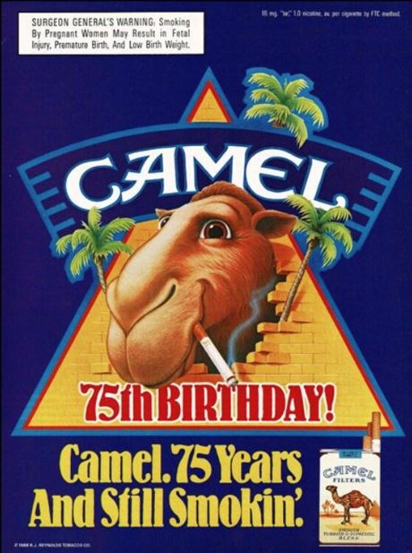
Source: Etsy user
When you are done, expand the label below to see how previous students interpreted the activity.
 |
 |
 |
 |
 |
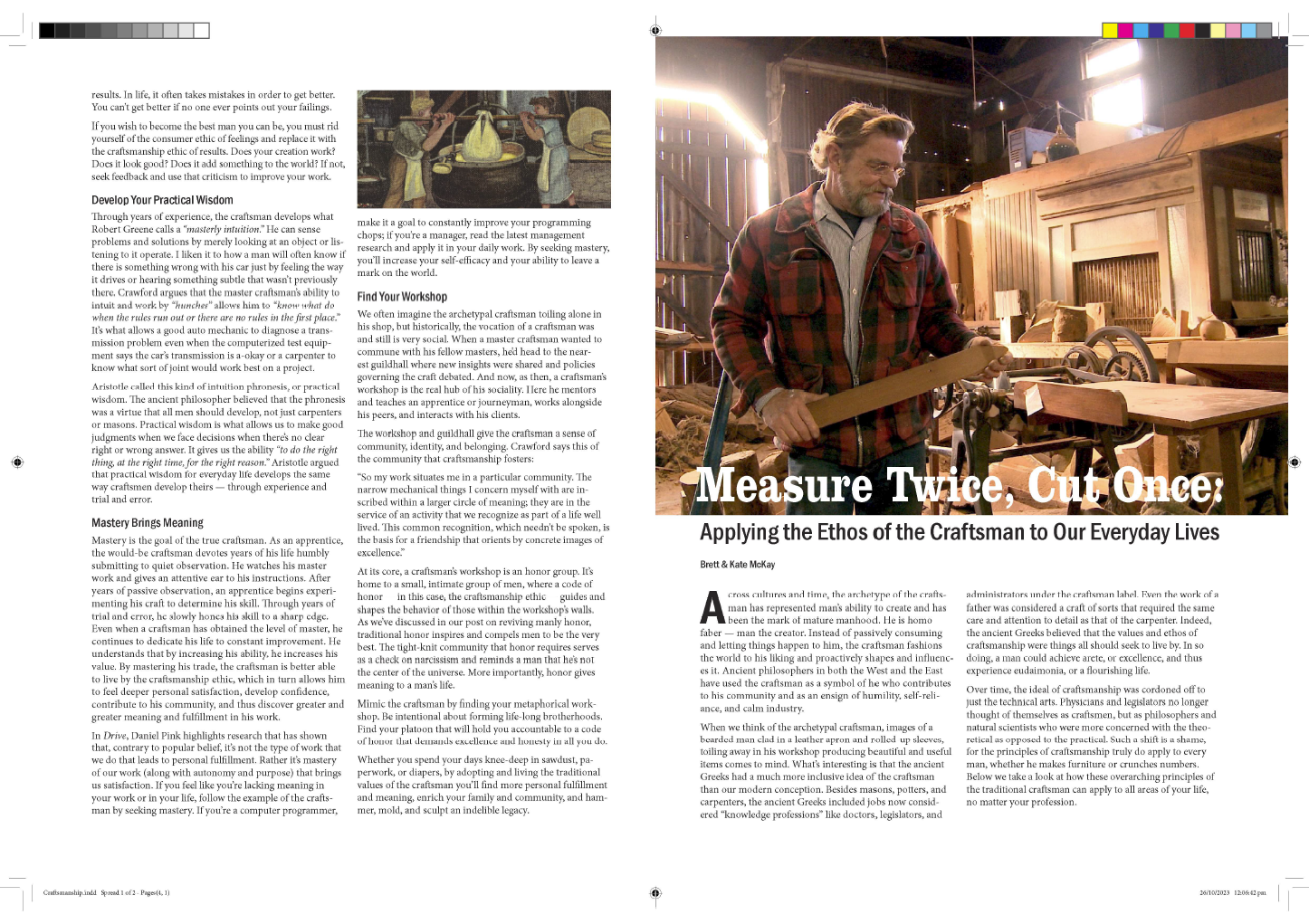
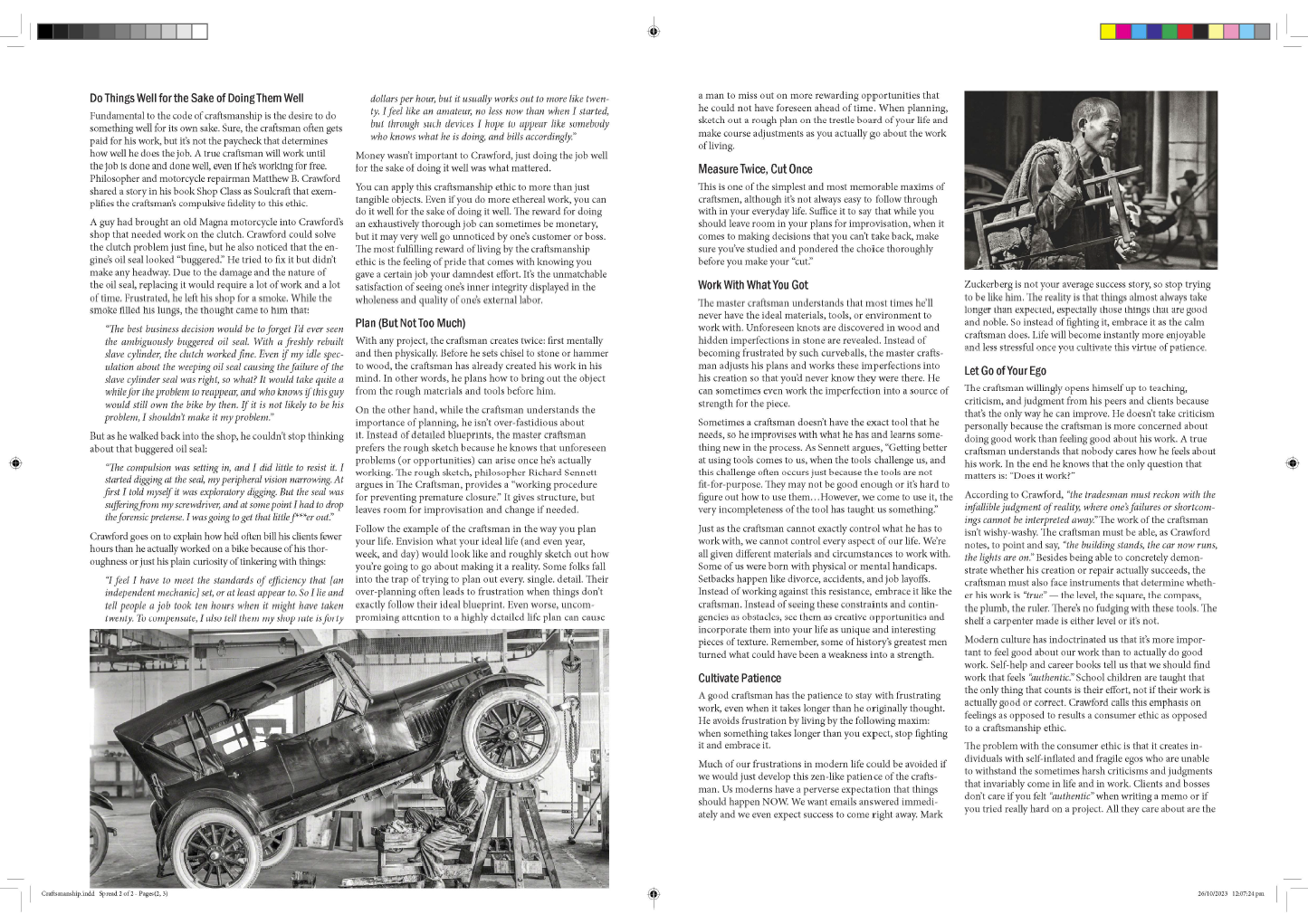
Craftsmanship
The term craftsmanship may conjure up images of people hunched over a wooden sculpture and carefully etching out a design, or perhaps a joiner that creates artful staircases, or even a jeweller who designs delicate yet bold diamond ring settings. But the idea of skillfully creating a work of art applies to all artists, whether using a computer or a chisel.
Oxford Learner's Dictionaries defines craftsmanship this way: the level of skill shown by somebody in making something beautiful with their hands.
Designing a magazine layout with various headings, images, callouts, fonts, and text choices takes craftsmanship to pull off successfully and create a dynamic and exciting spread.
InDesign for paragraph styles
Read this Adobe article, Basics of paragraph and character styles, and apply your knowledge to the following activity.
Watch one or both of the following two videos.:
- InDesign 2023 Paragraph Styles with Joe Allam | Adobe Live | (47m) This is a long but comprehensive video.
- InDesign How-To: Create Paragraph Styles Quickly | (3.5m) While this is useful, it's not as thorough.
Practising Activity – Four-page spread
🕔 2 - 3 hours
Imagine that you have been tasked with creating a magazine layout with the text and images you have been provided in the activity files. Before you get started, if you haven't already, be sure you review Design Principles and Tools > InDesign Tutorials > Grid layouts and imposing.
- Download the activity files and open them in InDesign.
- You'll need to set up at least some of the following styles:
- Heading
- Sub-headings
- Body Paragraph
- Caption
- Callout (Highlights information that stands separate from the body paragraph.)
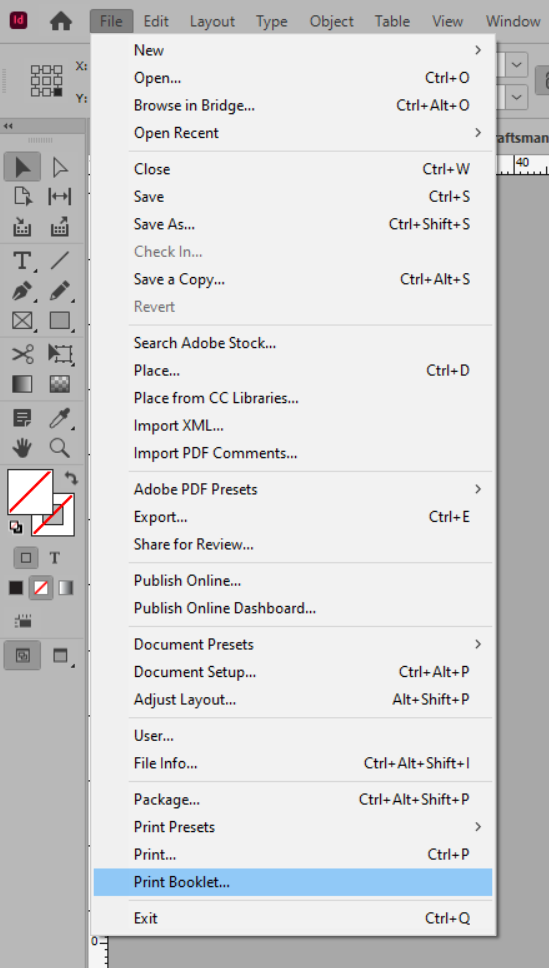
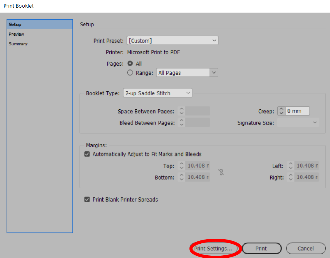
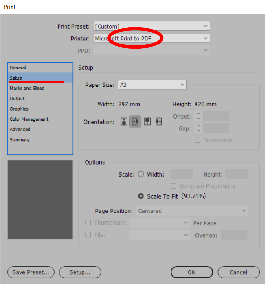
- See if you can set up the printer settings to export and print to a PDF. After you have tried it yourself, come back and compare your settings to ours by expanding the label below. Make any changes as appropriate to the settings so that the PDF shows the correct layout.
 |
 |
 |
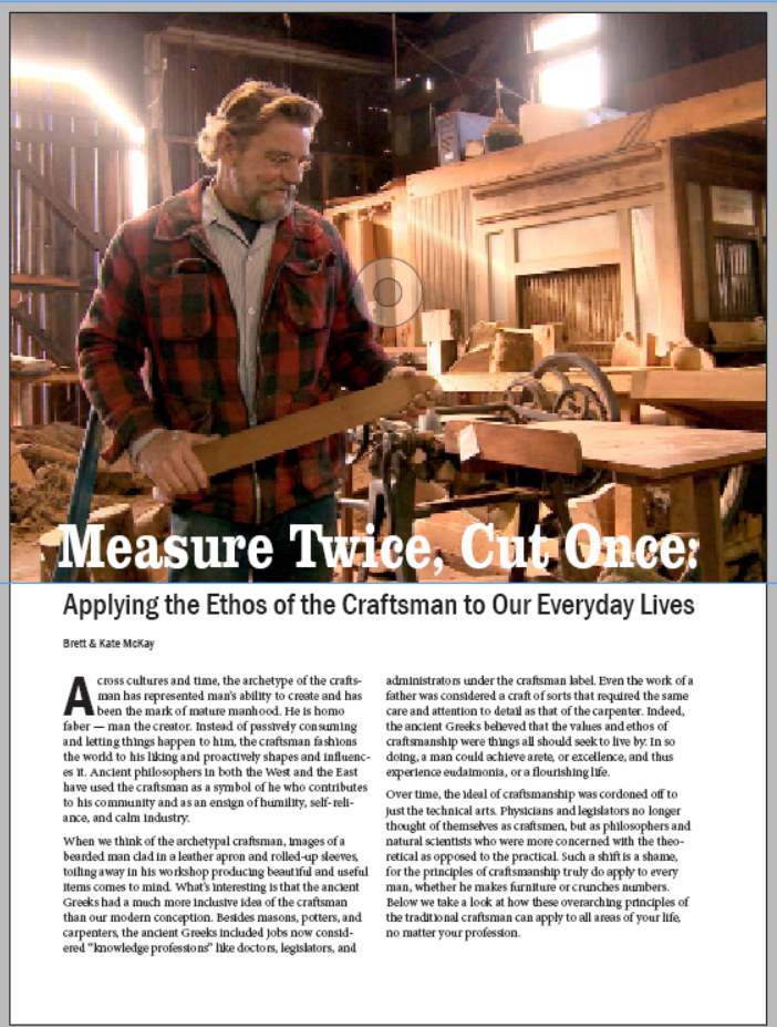
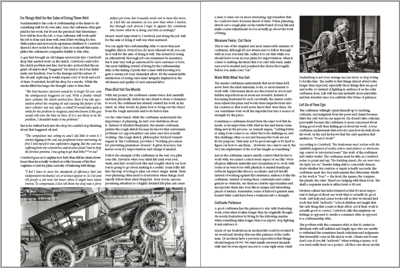
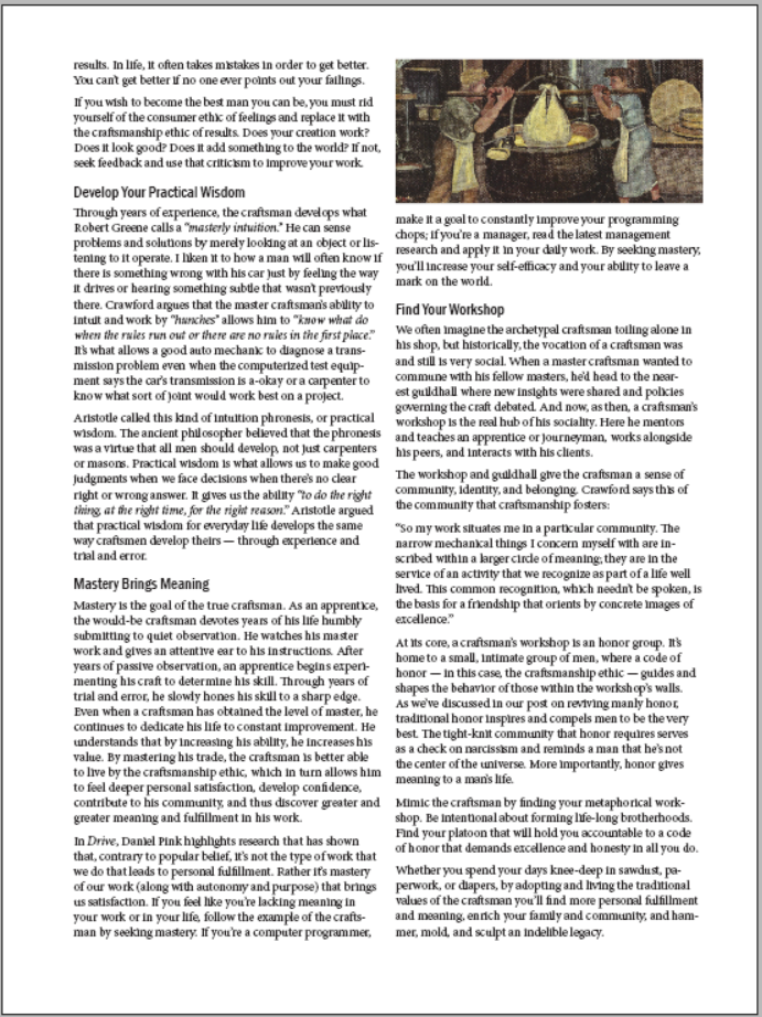
Dan's example FOUR-PAGE spread magazine layout
After you have worked with the files in InDesign, you should have what looks like an article imposed by the printer in the correct order. Click the labels for the following two examples to see the layout before and then after the printer settings have been set. Compare yours to ours and take note of any differences.
 |
|
 |
|
 |
|
After you set up the printing, you should see the next layout, where the first and last pages appear next to each other.
 |
 |
We have mentioned that it is very important to identify your target audience, so you use the right language when you 'speak' to them with your design. We'll start looking at some of the design decisions that others have made by breaking down the following advertisements into their constituent parts.
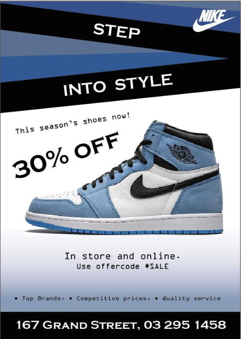
Newbie Activity – Advert Breakdown
🕔 Less than an hour
Download the following image (right-click and Save image as...) and open it in InDesign. Using arrows with comments, identify individual parts of the ad and any techniques you can see they have used. List the fonts you see, the colours, any gradients or layer styles, text justification, etc.
![]()
When you have done that, take a look at Dan's example by expanding the label below. Did you pick up the same things?
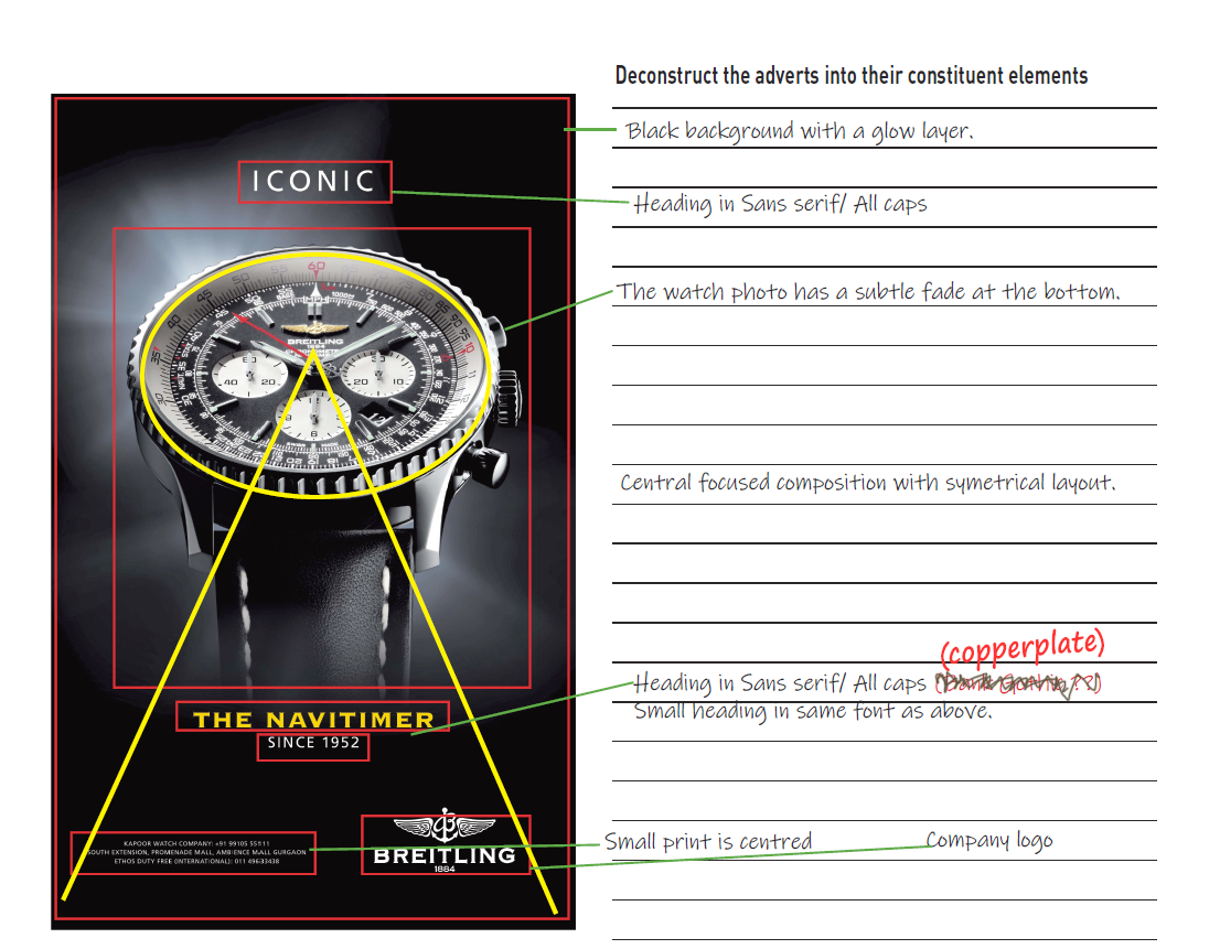
Now that you have an idea of what we are expecting download the following advertisement and do the same thing again.

Practising Activity — Targeted advert for shoes
🕔 2 hours or more if you are having fun
For this activity, you'll find your own assets and create an advertisement that is targeted to a specific audience, which will be selected randomly.
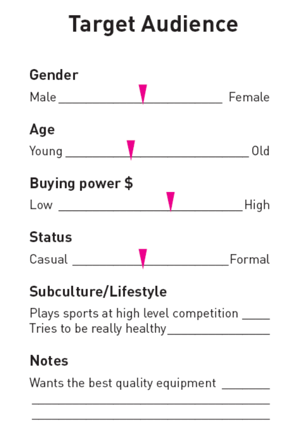
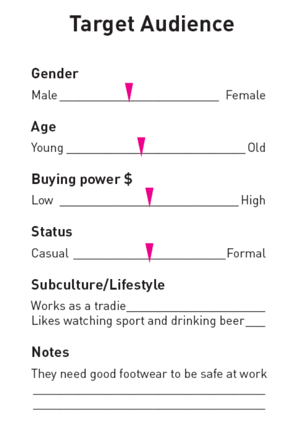
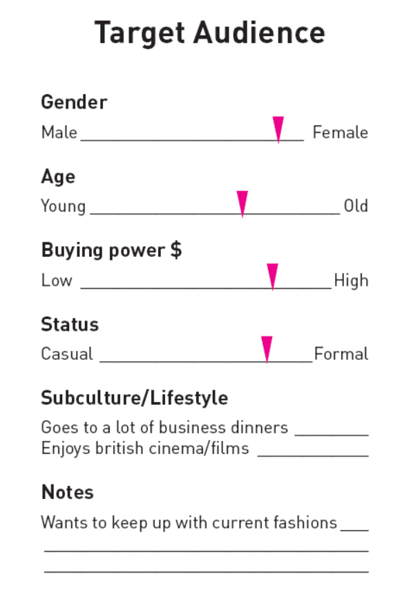
- When you are ready to start, pick one of the groups (A - D) below and then, using InDesign, create two targeted shoe advertisements — one for each of the target audience groups revealed when you expand the label.
- Study the information and start to form a picture of what would appeal to this 'group' of people.
- Notice that each trait is marked as a slider.
- If the pointer is directly in the middle of two traits, it means the people in that target audience represent both traits equally. For example, if the Gender slider sits equally between male and female, it means there are an equal number of males and females in the audience group.
-
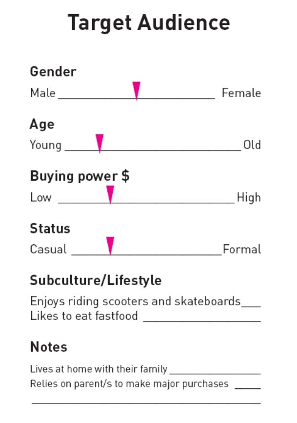
- For each target audience group, pick a shoe manufacturer like Nike, Sketchers, or Manolo Blahnik (try and match your audience's likely preferences to a shoe company that makes sense). Then, create a targeted shoe ad for each.
- Think about the constituent parts of the advertisement we broke down earlier in this course and try and apply strategic techniques to your work to help your audience find your designs so appealing they would likely want to purchase the shoes.
Forum Post
Share your work on the Forum. Post both shoe ads with an indication of which audience group you were targeting. Add your personal reflections about this activity to the post.
Previous student examples
Expand the label below to see designs from our previous students.
 |
 |
 |
|
As you know, magazines tend to be laid out in a series of grids. Designers can do a few things to keep the design interesting with images and callouts, but the main layout tends to be a symmetrical layout grid. In this activity, you'll need to mock up a magazine ad using the assets we supply.
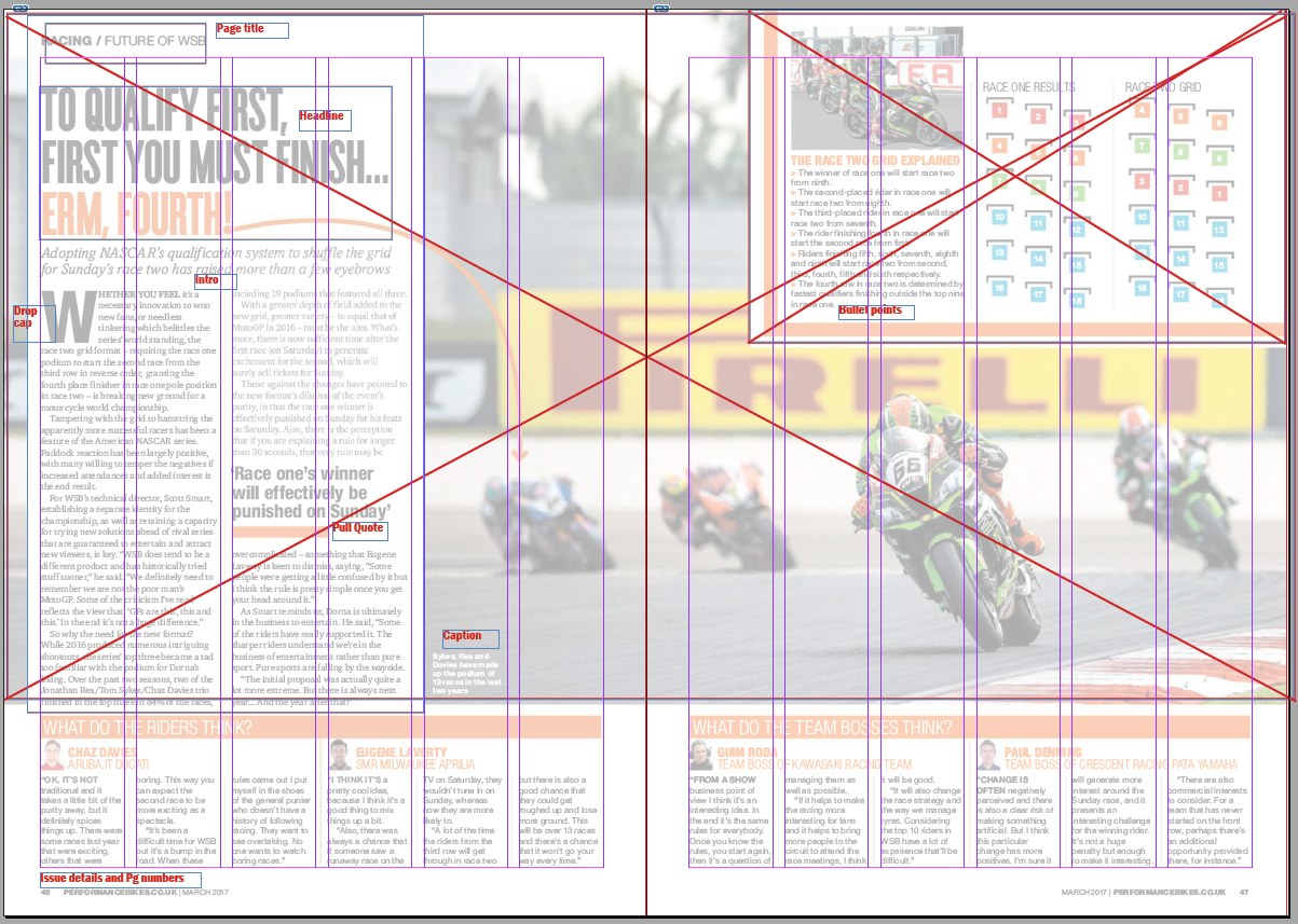
Practising Activity - The grid: margins and columns
🕔 Less than an hour
- Download, unzip and open the activity files in InDesign.
- Using margins and columns, try and reproduce the grid used in the example.
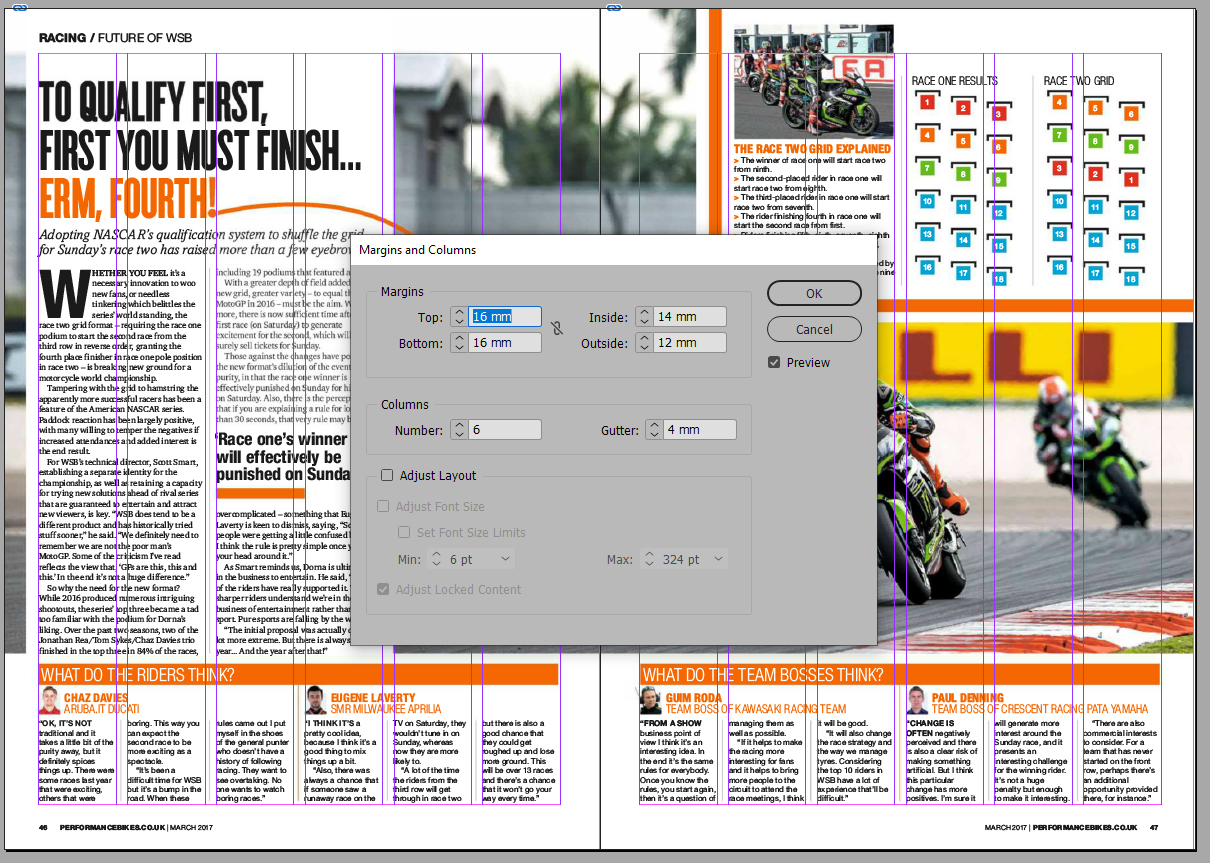
- Try to deconstruct the pages into their parts as a wireframe, eg:
- text boxes and paragraph styles
- photos
- other graphic elements (i.e., Orange boxes)
- page numbers, footers, headers
Showing off Activity — Magazine project
🕔 4 - 6 hours
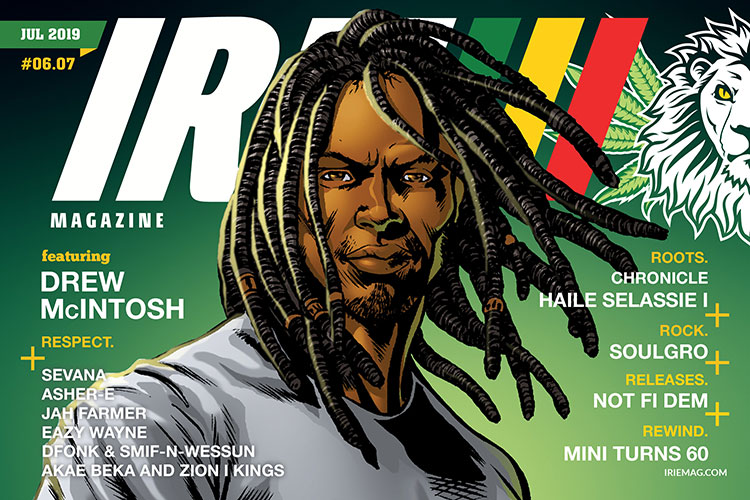
Source: Wikimedia Commons
Printed magazines are still a popular way to read information and look at pictures. People still subscribe to magazines, and looking back over a big collection is a great way to see changes in trends over time.
Task: Create a sample magazine to showcase a subject you are interested in. The sample is only four or eight pages and should look as commercially faithful as you can make it.
The magazine will need some specifics:
- The magazine needs to be A4 size with four specific pages at least:
- The cover, with issue date, price and EAN-13 barcode
- Pg.2 - Two smallish articles. 300–500 words each
- Pg.3 - A full-page article. 600–1000 words
- Back cover - A full-page advert for a relevant product for your audience
- Note: If you add eight pages or more, you may add a longer article and another advert
- Note: You are welcome to print your magazine. If so - be sure to source High-resolution images.
Getting started
- Choose a subject for the magazine topic.
- Source the articles you will lay out (don't include placeholder text in your final design, and note the author for copyright.)
- Source the images you will use to support the article's subject (try and use your own whenever possible; otherwise capture the copyright information.)
- Plan/source images and write your advertisement for the back cover.
- Research real magazines to get a better idea of how pages are laid out and what styles are used to get an effective typographic hierarchy and readability.
- Layout the text, images, captions, and adverts with good eyeflow.
- Start with a simple grid layout, e.g., six columns (which is a versatile option).
- Sketch up a few thumbnails to start as an inspiration before getting to the digital version.
- Export/Print as a PDF with the correct Print Booklet settings.
Forum Post
Post your work to the Forum along with your reflections about the activity. Look at the work of your peers and provide helpful feedback.
Now that you are about midway through this Design/Web course, you are encouraged to return to your work and update it based on any feedback received and repost with your notes about what you changed and why.
Things to remember:
- Credits for content
- Issue details on the cover
- Principles of design: hierarchy
- Storytelling and communication methods of persuasion
- Paragraph and heading styles
- Target audience
- Consistency and quality:
- Styles for paragraph, heading, caption text
- Spelling
- Capitalisation
- Eliminate widows and orphans
- Alignment
- Imposing and print booklet options
- Check that the:
- page sequencing is correct
- image quality will print well
- typeface is suitable and readable
- Check that the:
Congratulations - another Showing off Activity done. Think about how far you have come to be able to create a booklet in Adobe that looks professional. Ka pai!