Submitted by Julie.Paulin@e…
on Wed, 10/25/2023 - 11:55
Sub Topics
Interaction is at the heart of engaging your audience. They need to know how to get around your app, game, or website in a way that is intuitive and well-designed.
This module will include:
An Introduction to UX
Principles of Interaction Design
Game Design Elements
User Interface Design
Principles of Web Design
Basics of HTML and CSS.
Important
In this course, we'll explore game development! Given the complex planning necessary for game design, you'll need a robust tool to design and build interactive tools.
Before continuing this course, head over to Design Principles and Tools > Figma Tutorials and do all of the tutorials to get familiar with the tool.
When you are done, we'll take a step away from the actual tool and learn about interface experience design and development methodologies and processes. At the end of the course, you'll be asked to build your own game!
What is UX
User Experience Design (UX) is an iterative process concerned with all aspects of a product's development. It addresses how users experience a product, service or device and how they feel about it.
The goal of a UX designer is to help people and solve problems. They do this through an iterative, user-centred process that includes research and testing to understand the problem fully and to know if the solution solves the problem without introducing new ones.
Watch the following video for an explanation of 'UX design'.
We often talk about UX in relation to websites or apps, but it is important to understand that UX is not solely about the user interface. It incorporates elements of branding, design and usability with the goal of delighting users with highly functional and enjoyable interactions.
So if UX isn't the same as User Interface (UI), then what's UI?
User Interface design (UI) focuses solely on the parts of the design the user will use to move around the interaction. It includes positioning and placement, buttons, colours, a call to action, and the layout structure. It is used only for digital creations.
For digital products, the user interface is the software layer that users interact with to access the product’s features and data. Over the years, standardised patterns and paradigms have been introduced that are adopted and carried forward. As with fashion, certain visual aesthetics become popular and as technology improves, so does the ability to present interfaces in new and interesting ways.
User Interface trends
Skeuomorphism
Skeuomorphism is about making a visual link between digital interfaces and the real world. It helps the user understand what the interface does and how to use it. Both macOS and Windows have used elements of skeuomorphism in their operating systems. Consider the Recycle Bin or Trash Can — to inexperienced users, it is clear that this is where you would put things you no longer want. File and Folder icons still represent their physical equivalents.
Early versions of Apple’s iOS on iPhone, iPod touch and iPad had a highly skeuomorphic interface design. Apps were designed to appear like real objects using real-world textures and lighting effects. The Calendar and Notes apps were made to look like bound books, and the calculator app looked like a real calculator. Buttons and switches were often made to look and behave as if they were physical objects. An example of this in interactivity is when a button appears pressed when you click it.
It can be argued that skeuomorphism was necessary because, at the time, glass touch devices were new. Users would have been unfamiliar with the multi-touch capabilities of the products so creating interfaces that look and feel like real-world objects gave those products a level of affordance that was necessary for them to be understood.
Flat UI
Flat UI is almost the opposite of skeuomorphism. It does away with textures and shadows in favour of clean typography, simple shapes, colour, and grids.
Interfaces designed using flat UI principles don’t try to represent a physical equivalent or real-world object.
Microsoft is often credited with helping to popularise flat UI when it was used in its Windows Phone interface in 2010. Apple’s iOS7 release in 2013 also adopted principles of flat UI.
Reading
If you are interested in User Interface design, this opinion-based article is a good read and will help you consolidate your understanding of these terms: Affordance. Flat design. UI. You Aight?
Neumorphism
Modern implementations of Flat UI often use gradients, transparency and layering to separate elements and windows. Design systems like Material by Google and the Human Interface Guidelines by Apple often include notes on how to implement colour and layers of different types of information. In these cases, it is strongly implied that the elements are 'floating on top of each other', affecting the visibility of the elements below.
Neumorphism uses a visual style that makes elements appear to be extruded from the same surface. It keeps the simplified visual aesthetic that Flat UI introduced but cleverly introduces positive and negative shadow values to create the illusion of depth.
This trend is relatively new, surfacing in 2019 in the form of a post on dribble.com by designer Alexander Plyuto.
His concept for a banking app interface combined a stark white interface with pops of colour and subtle shadows to create an extruded effect. The style has elements of skeuomorphism without trying to represent real-world objects. With the gradients and glows; instead, it seems to try and represent objects that couldn’t exist.
Reflective question: Think about the interface or design trends that you have seen in apps or websites you use. Can you identify the techniques used now?
Analysing UX
User Experience design involves designing the user's entire experience, engaging and interacting with the design.
The following questions reflect on the UX of a creative product:
Is the navigation intuitive, or is it busy and confused?
Is the experience easy and smooth, or is it awkward and clunky?
Do users feel that they are getting things done, or are they flailing around hopelessly?
Is the app or website enjoyable to use?
UX designers develop and plan the app’s structure, functionality, organisation, and how its different components work together. Ideally, the UX designer will have created an app that is easy to navigate, looks great, and has useful functionality.
The term 'User Experience Design' (UX) was first introduced in 1995 by cognitive scientist Donald Norman. Joining Apple Computers in the early '90s as their User Experience Architect, he became the first person to have UX in their job title.
Watch this video to see an explanation by the godfather of UX.
Many people use UX and UI interchangeably, and they are wrong. Don't be one of them. Test your understanding of those differences by selecting the correct type of design for the task. Is it UX or UI?
User Experience covers all aspects of a user's interaction with a product, service or device. From initial awareness and purchasing, unboxing (in the case of physical products), and onboarding (first use and learning) to regular use.
Apple has been praised for attention to detail when it comes to product experiences — supported by advertising that hones in on creativity and simplicity. Product specs are rarely a part of an Apple ad, but when mentioned, they are usually contextualised to show why they are essential.
This simplicity is carried through to the in-store experience. Apple stores and product displays are clean and minimalist. Use the arrows below the images to progress through these three images of Apple user experiences.
1 of 12
Each of Apple's products is packaged in a straightforward white box. The boxes slide open without resistance, and the product is usually the first thing you see once open.
Apple's ability to apply its design philosophy consistently to all aspects of its users' product experience is one reason they have such strong brand loyalty.
Practising Activity - Product Experiences
🕔 About an hour
Before joining Apple, Donald Norman wrote a book titled, 'The Design of Everyday Things'. That book is now considered a significant resource for UX designers.
The six principles
In his book, Norman defines his six principles of interaction design:
Visibility
Feedback
Consistency
Constraints
Mapping
Affordance
1. Visibility
The more visible something is, the more likely it is that we will know about it and how to use it.
Applying this principle means thinking about what will be most important to the user and prioritising it. It may not be possible for everything to be visible at once, so establish a hierarchy and make it clear where to go next.
2. Feedback
Providing feedback is important! Users need to know that their action has been registered and something is happening.
There are lots of great ways to give feedback: changing colour, making a sound, vibrating, animation.
3. Consistency
Similar actions should have similar results. Your users will expect similar-looking elements on a page or screen to do a similar task or behave in a similar way.
Imagine if all the light switches in your house flicked in different directions to turn the lights on or if some of the switches were buttons. This is an example of inconsistency. Users learn how an interface works by applying what they already know about using similar interfaces and their experience using yours. Expectations are built up. If you change the behaviour of an element, your interface becomes confusing and challenging to navigate.
4. Constraints
Limit the number of possibilities to reduce confusion and clarify the intention. Presenting too many options can overwhelm users.
Implementing this principle is about reducing complexity. Do not force the user to make too many decisions or interact with too many elements.
Look at the way modern apps handle signing up. You are often only asked for an email address or name. During each stage in the process, you only need to provide the information necessary to continue.
This is the same for a lot of shopping sites. You very rarely enter all your information and payment details in one single screen. It is more likely to be broken down into stages.
5. Mapping
The controls of a product should have a clear relationship to its output.
This principle is about matching the controls to an outcome. The classic example of good mapping is often given as the arrangement of controls on a stovetop.
The position indicator below the clothing product image is another example of how mapping can aid the user. At a glance, the user can see that they are looking at the second of four images in that set.
This represents a design aspect of an object that suggests how it should be used — the design gives us a clue about how to interact with it. For example, when we see a doorknob, we assume that its circular appearance will allow us to rotate it to unlatch it and pull it to open it. We can assume a door without a handle opens inwards, requiring a push. Usually, there is a pad on the door to indicate where the push would be the most efficient. A door with a handle on it would entice you to pull and may even frustrate you to realise you actually needed to push it instead.
Look at the following example image.
The Norman Door
As mentioned in the earlier topic, UX doesn’t just apply to user interface design and a notable example of where bad UX results in a poor experience is the Norman Door.
Norman Doors are named after Donald Norman. Put simply, they are any door that is confusing or difficult to use. A door becomes a Norman Door when its affordance does not match what it is intended to do.
If you are interested or have ever pulled when you should push, watch this video, and then be on the lookout for the Norman Doors in your world.
This same principle applies to digital products and services like apps and websites. Elements and objects on the screen have affordance, and, as users, we instinctively know what to expect from them.
When we see a rounded corner object with a slight drop shadow, we recognise it as a button. We know it can be clicked. We might expect it to change slightly if we hover over it, and if we click it, we expect it to do something.
Let's see how much you remember with this quiz. Answer the three questions below.
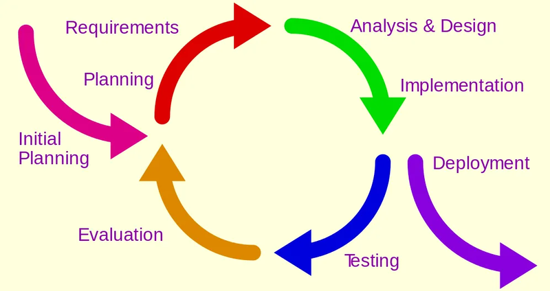
The cycle of iterative design
Imagine if an app development studio asked you to develop an app that allows people to communicate in a virtual room using avatars in real-time. After the scoping meeting, you went away for a month and developed a beautiful app that allows people to communicate asynchronously by leaving messages on a wall in a room. D'oh! You made a mistake. Mistakes do happen! You now have to go all the way back to the beginning of the process again to get it right. Had you shown your client your plans after research and ideation, or even after wireframing, you would have picked up the error and gotten on track much sooner.
The iterative design process saves time, aids in communication, and leads to a smooth design process with happy clients and no surprises at the end of a development cycle.
The process includes reviews and feedback every step of the way, even after deployment! The following graphic shows the cyclical nature of the iterative design process.
After deployment, you can use feedback from current users to define new requirements, plan for additional work, and work through the cycle again for each new feature change.
Design Thinking
Test your understanding of this important methodology with the following activity.
The User Experience
A UX Design process, as you might have guessed, prioritises the user. It relies on a thorough understanding of their needs and requirements, backed by regular testing and iteration. Their experience drives the ideating, planning, designing, and developing.
Methodologies
UX Design and User-Centred Design (UCD) are both Design Thinking methodologies that place the user at the centre and offer an approach to solving complex problems.
Empathise
Define
(Empathy and Journey Mapping)
Ideate
Prototype
Test
1. Empathise
This first stage is all about research and gaining an understanding of your users and the problems they do or may face.
During this stage, many techniques can be used to learn about the users, including:
Interviews: Asking specific questions to gain qualitative and quantitative data - often through one-on-one conversations.
Surveys: Great for quickly gathering user feedback about a product or idea.
Observation: Watching users interact with a product.
2. Define
During this stage, we want first to define our users. To do this, we often create multiple personas that represent the different types of users and the ways they interact with the problem.
A persona is a fictional representation of a person in your target audience. While a target audience may usually include an age range, types of employment, income range, etc., a persona is far more specific.
Personas will have a name and specific age, a photograph, a job, and a series of goals, frustrations and values that are important to them. They often contain quotes of things heard and said during the evidence-gathering. The creation of a persona must be supported by the evidence you have gathered. All of this helps us better understand the user.
We refer to the personas when creating our empathy maps and when we are ideating and designing. We ask, 'Will this work for my persona?' to keep the work focused on solving the right problems.
Personas help a product team find the answer to one of their most important questions, 'Who are we designing for?'
Rocket Farm Studios
Empathy mapping
An empathy map defines what users say, think, do, and feel in relation to the problem.
Watch the video below for more information on empathy maps.
Journey mapping
A journey map is often created to visualise how a user achieves their goal. It takes note of key points of interaction, how the user is feeling, and any pain points associated with the interaction.
Experience Map
This map documents the experiences of Jim and Pam, a couple who want to go on vacation. They both work and live together with their dog, Poncho. The map will be used to help Tripperz.com, a fake travel site, improve their travelling experience.
Decide where to go
Decide where to stay
Decide what to do
Decide how to get there
Decide what to do there
Find hotel
Find flights
Find things to do
Take time off work
Find a kennel for the dog
Get traveller's cheques
Purchase flight tickets
Purchase hotel rooms
Print receipts
Get itinerary
Put the dog in a kennel
Pack clothes, etc.
Organise house before leaving
Drive to airport
Get on plane
Check-in to hotel
Go out, have fun
Take photos
Eat fancy dinners
Return to airport
Fly home
Return to home
Get the dog from the kennel
Unpack
Upload photos
Talk to friends/family about the trip
Rate hotel/flight/vacation experience on websites
The example above maps the journey for the personas Jim and Pam with an online booking service as they plan, book and share their vacation.
There are lots of different ways to present a journey map. Take a look at some examples here.
Newbie Activity — create a journey map
🕔 Less than an hour
Think about the last product you purchased or a product you are planning to purchase. Use any of your design tools to create an infographic journey map for the experience. Your journey map should include:
key points of interaction
how you felt about each interaction
what was good
what could have been better.
Forum Post
Post your journey map to the Forum along with a description of your product.
3. Ideate
Now we come up with some ideas! We should have a good understanding of our users and the problems they face. This stage is about figuring out ways to solve the problem by coming up with possible solutions.
Whichever method you use, it is important to get all the ideas down. Some will be good; others will not be so good. Get everything down before you start eliminating them.
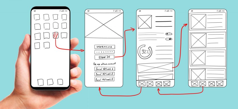
4. Prototype
At this stage, we begin to make our ideas into concepts we can test over several iterations, gaining refinements.
The process of developing a communication tool is one that has many stages and starts broadly by only showing functionality and features, then adding details and specifics to show visual feel and navigation requirements, and ultimately layering in the actual text, images, audio, and functionality until the prototype has morphed into a production version. The first few wireframes are referred to as Lo-fi with additional detail building to a Hi-fi version.
Each step provides just enough information but not too much to distract the reviewer (client, colleague, user tester, friend, Mum...) to gain useful information and make decisions as the project progresses. If you put images and text in too early in the process, it's easy to derail the entire feedback session with an image that doesn't hit the mark or text that people disagree about the wording. This is why people sometimes use Lorem Ipsem text, and abstractions/mood images, so people stay focused on the objective of the session.
Lo-fi
The initial wireframe starts with you jotting down the broad strokes that communicate the point of the app. Why does it exist? What will it do and how will a user interact with it at a bird's eye view? This is the back-of-the-envelope plan. It can be done on paper, in a tool designed to show flow charts, or directly in Figma.
Reflection question: Check in with your personal creative process. How you are drawn to plan a user interface? Are you wanting to reach for paper and pencil to start sketching big boxes with scribbles and a few notes? Or, do you want to use software with your mouse to bring your ideas out of your brain directly onto your computer screen?
Wireframes often pave the way to prototypes. The following quote references web design, but it could just as easily be referring to game or app development.
To break it down, website wireframes are low-fidelity, basic layout and structural guidelines of your web product’s layout and prototypes are an advanced wireframe with more visual detail and interaction.
JustInMind.com
To design a physical product, a prototype is a real-world representation of the product but only as proof of concept — it might not work yet or be made of the same material as the final design; it might even be a physical representation of a digital product called a paper prototype.
Whether it is digital or physical, there are many ways to prototype.
Paper prototyping
Paper prototyping is a great way to test unique or novel ideas. They are easy to make and avoid the distraction associated with finely rendered artwork. Using paper, pencils and sticky tape, each screen of an interaction can be mocked up and navigated by moving to the next card.
This video illustrates the process perfectly!
Hi-fi
As you develop your lo-fi wireframe, you will go through a series of reviews and changes. You may be surprised at how your reviewers interpret your work and use that insight to let their input change your plans to match their perceptions. ("It looks like my users keep looking at the top right when I ask them to exit the app, maybe I'll move it from the bottom right to that spot.")
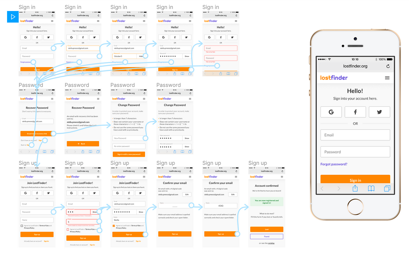
This lostfinder example of a wireframe isn't ready for deployment, but it is much further along in its development journey.
Remember
The purpose of your prototype is really one of communication and planning. You should be asking questions of people as you are working from the wireframe to the prototype and through to the design.
Do you know how to find...?
How does this colour make you feel?
Does this shape appear the way you were expecting?
Can you navigate easily?
Do you have any gut impressions?
5. Test
The truth is testing is happening all through the process. You should consult colleagues, clients, and stakeholders as you throughout the steps. The questions above for the prototype can be used throughout the process. You'll need to develop your list of questions and tasks for the people testing your work.
The final design will need to be thoroughly tested before delivery. Don't make your clients test your final design. They are not your testers! Many development teams have entire teams dedicated to breaking the app before it can be deployed!
Iterate and Repeat
User Experience Design relies on iteration to get to the best solution. Your testing stage will likely uncover some ideas that went well and some that were unsuccessful.
You are also likely to have learnt more about your users and better understood the problem.
Moving back to the earlier stages with this new information allows us to update our personas and empathy maps, generate new ideas and create more designs to test.
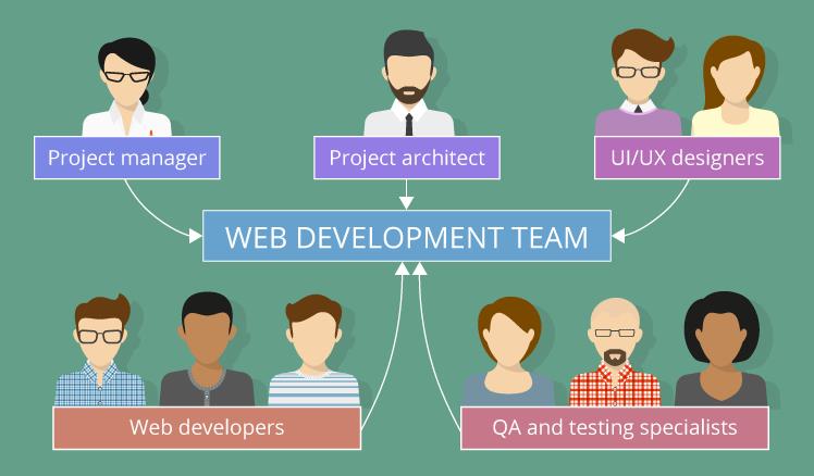
Meet the team
By now you'll know that the creative process is usually a collaborative one. From the iterative design cycle of checks and changes, designers are usually just one part of a larger development team.
Here is an example of a web development team:
What is a game?
Chris Crawford, the founder of the Game Developers Conference and who previously led Game Research at Atari, has written several books on interactive and game design. In his book, Chris Crawford on Game Design, he presents a hierarchy that describes games as a form of creative expression for interactive entertainment, including challenges and conflicts where participants can interact and affect each other’s performance.
Conflict does not have to be between two players. In a card game like Solitaire, the player competes against the game's rules. Video games often have enemies controlled by the computer to compete against.
Whether you are designing a dice, card, or video game, understanding game design elements will help you create a game that players will enjoy and want to continue playing.
Watch the following video. Are these tips new or familiar to you?
Space
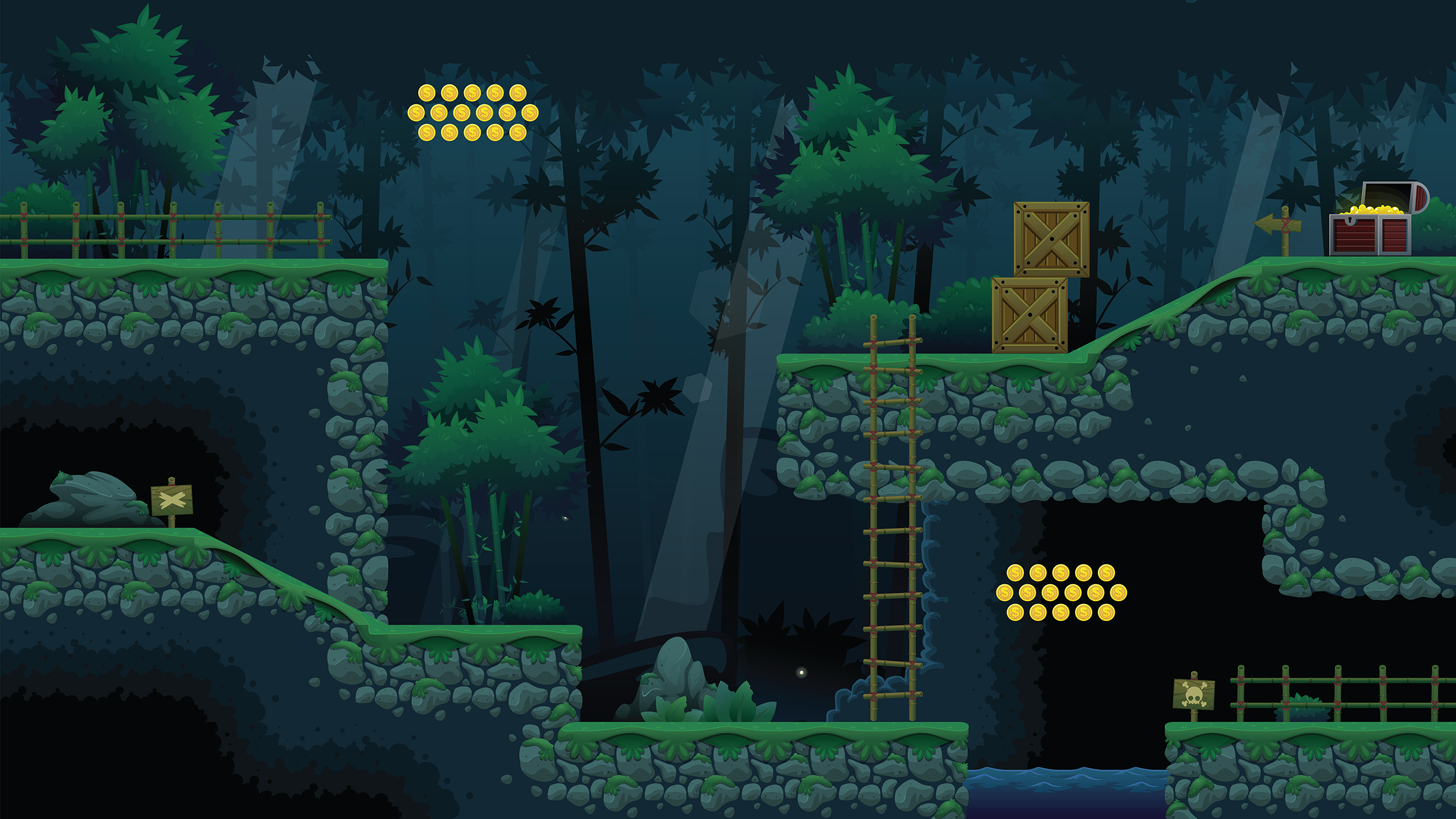
Space is the environment or location in which your game’s story will take place. Space will help players understand the story by offering clues in the art style with colour, texture and lighting. 'Space' may also involve sound and the presentation of components - where environment elements like buildings, trees, doors and items that can be interacted with (i.e. objects that can be picked up or collected) are placed.
Space helps define the types of interactions that will be possible in the game world.
When played on paper, the space for a game like Battleship (above) takes place in a 2-dimensional grid where each cell has an alphanumeric coordinate. The space implies that we will be able to select coordinates.
Playing Battleship online has the same rules and mechanics; however, the game space is more engaging with colour imagery and sound.
Components
'Components' are objects and items that exist in the game world. The player, pick-up items (like cards, weapons or power-ups, obstacles) and enemies are examples of components. Anything that the player might interact with can be considered a component.
Can you recognise the following components in the board game Monopoly?
Each player is represented on the board using one of the 12 game tokens
There are 16 Chance and Community Chest cards that can be drawn
Each property on the board has a Title Deed card that can be purchased and traded
There are 32 houses and 12 hotels that can also be purchased and placed on properties
Players advance based on a roll of two dice
There is one component we haven't mentioned. Can you guess what it is? Scroll below the photo to see if you are correct.
Did you remember that players are required to have money? The cash is broken into $1, $5, $10, $20, $50, $100, and $500 denominations.
Newbie Activity — Components of the game
🕔 About 30 minutes
Apply what we just did with Monopoly to a video game of your choice. Make a list of the components of the video game so you can see all of the necessary touchpoints in the game that require interactivity. Going through that process of reverse engineering the components from the final product will help you understand what goes into creating a wireframe or template of the final game design so players don't get stuck and the flow of play is smooth.
Mechanics
'Mechanics' are the actions and movements a player does in the game to achieve their goals. Games with interesting mechanics are often more engaging and quickly become popular.
Examples of mechanics:
Role-playing games - running, jumping, turning, acquiring tools, and how they work, game boosters.
Card games - shuffling and picking up cards, asking for a new card, or moving card positions.
Case Study - Braid gameplay engages users
The video game Braid is a puzzle-platformer initially released in 2008. Braid’s platforming mechanics are simple and familiar with running left and right, jumping, and interacting with switches. Braid gets interesting in the characters' ability to rewind time to reverse or avoid death. As the game progresses, new time-manipulating mechanics are introduced, and the complexity increases.
Watch the following video for an insight into the world of Braid.
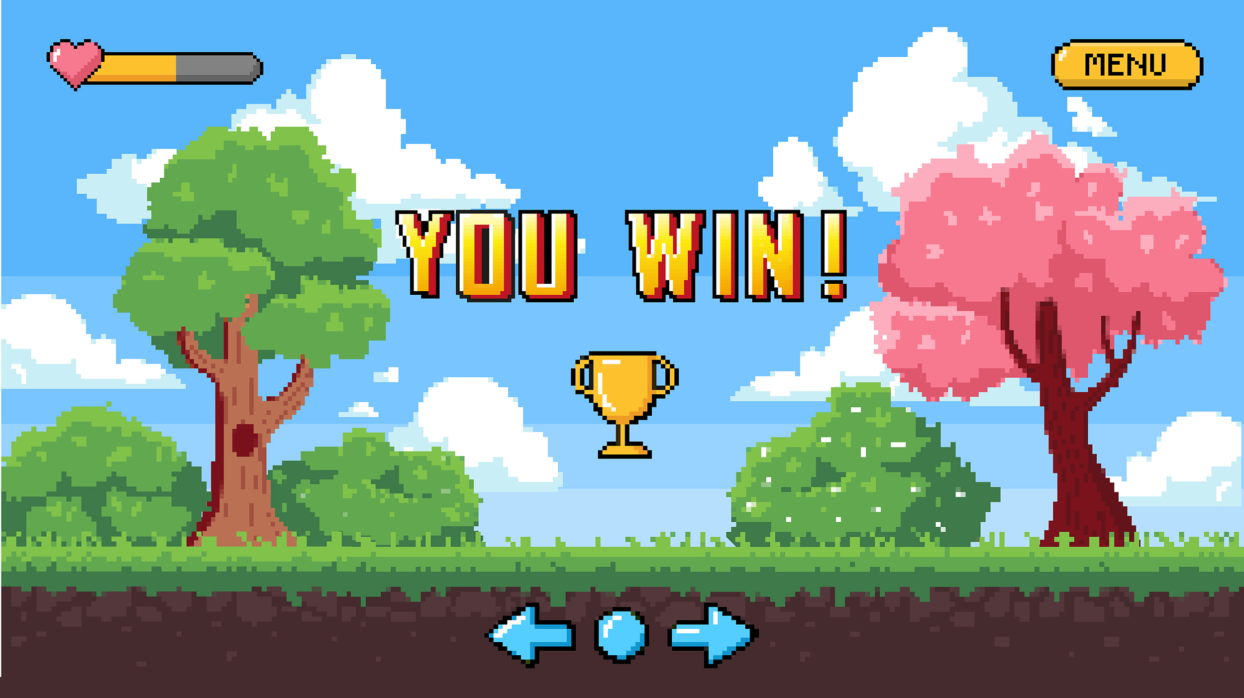
Goals
These are what the player is trying to achieve or obtain while playing the game, i.e., score points, rescue the princess, win the race, use all the cards, etc.
Examples of game goals
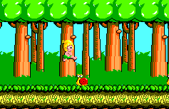
Wonder Boy (1986)
Like many platformers of its era, the game Wonder Boy from 1986 aims to rescue the character’s girlfriend by navigating a series of levels, platforms and enemies from left to right while collecting fruit to prevent the 'health meter' from running out.
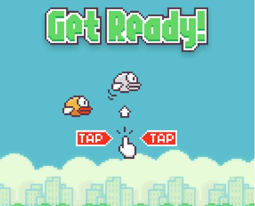
Flappy Bird (2013)
The game Flappy Bird, released in 2013, had an amazingly simple goal: to fly through as many gaps as possible. The combination of this simple goal and basic 'flap' mechanic made the game a hit on mobile devices in 2014.
Rules
Rules help players understand how to play the game. They also shape players' experience by defining what is and isn’t possible.
The rules for Pac-man are simple: eat all the dots and do not touch the ghosts.
Having extremely simple rules can be engaging for a specific target audience, but others may get bored. Knowing who you are designing a game for will help ensure you appropriately pitch the difficulty level to the target audience.
Practising Activity – NZ on Air Festival Finder
🕔 4 - 6 hours
Just a reminder that you will need to have taken the Figma Tutorials in Design Principles and Tools before continuing with the activity.
Scenario:
NZ on Air is launching a marketing campaign to promote New Zealand artists. A representative has approached you about creating an app that enables users to find music festivals.
You'll need to research the requirements, define the target audience and persona, and build a wireframe and a visual style for the app.
Getting Started:
Task 1: Prepare for a kick-off meeting
Research | Scope | Identify persona
To conduct research, you will need to come up with a list of questions to ask the Air NZ representative that will help you learn what you need to do (research) and to what level (scope) who will be using the app (persona) and how they will find it. Create a document with these questions as if you were going to conduct a Needs Analysis for the project.
Consideration: Since the client in this scenario is a government agency, you'll need to think the target audience is mainstream, conservative and accountable to boards of directors, or governmental regulations.
After you make your list, make sure you have these questions at least:
Who is the target audience?
In what ways will you be marketing to them? Social media? Events? Radio? News websites?
What does the app need to do? What features make the app specific or unique?
Sample answer: "To find festivals closest to the user; the ability to set other users as 'friends'; to see if those friends are attending an event; special deals for app users to get discounted ticket prices."
What keywords would you expect users to enter when looking for apps like this?
Sample answer: safe, fun, festival, Kiwi, NZ Artist, live music, music events.
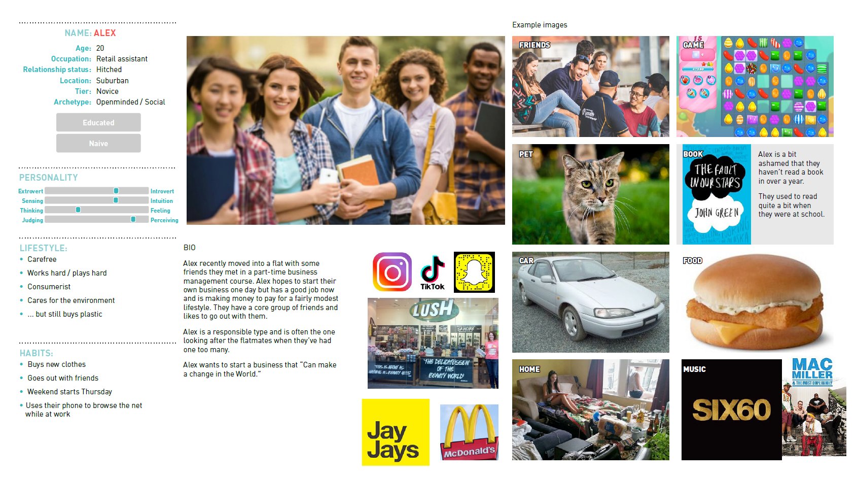
Task 2: Design a persona
Define a target audience and design a persona based on the answers to your research questions. (You'll need to make up the answers.) Create a visual document to describe your persona using text, colours, images, etc.
In case you lost it, here is the InDesign Character Study Template. Save it somewhere so you can pull it out whenever you want to create a persona.
Dan mocked up this example for you:
Task 3: Create a scoping document
This is a brief summary of the project, and normally, you would share this with the client. In a few paragraphs, describe exactly:
what the app needs to do, its purpose
who will be using the app
how they will find it.
Determine the level of features and functions required. A product's first viable (usable) version is often an MVP (Minimum Viable Product). This will be released to stakeholders and early adopters as a beta version. Using feedback from these users, the developers will release patches for updates and fixes until the final version of the product has been deployed.
Task 4: Develop a wireframe or prototype
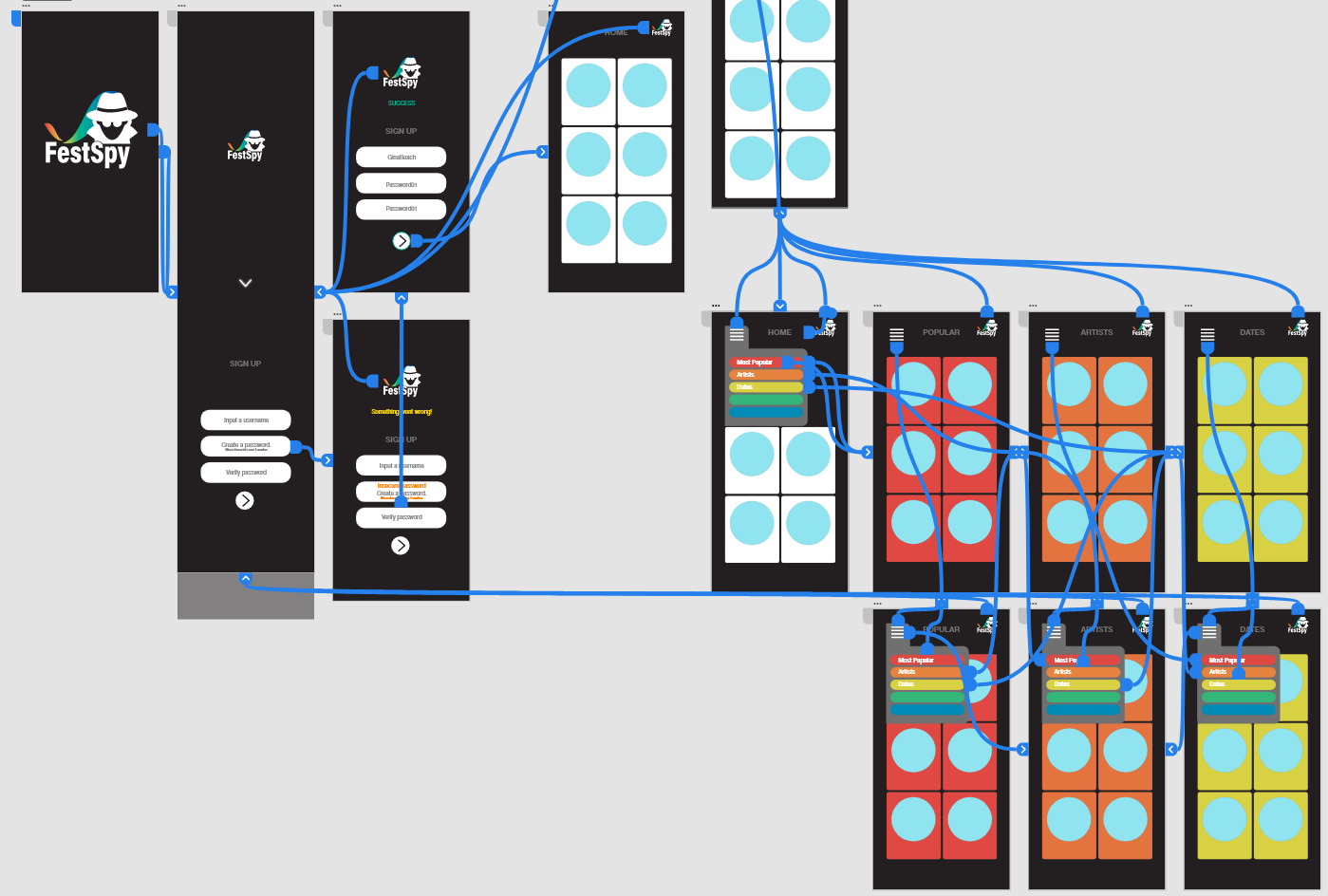
Using Figma, create a wireframe or prototype of the app using the NZ on Air logo (click to download a zip file with the logo) and fictional text as placeholders.
Example digital wireframes:
Forum Post
Post your work and reflections about this activity in a Forum post. We encourage you to collate your submission documents into an InDesign document for practice since you will need to do that for the assessment at the end of this course.
Please include:
Your kick-off meeting questions
Your persona
Your scoping document
Your wireframe/template.
Please review the work of others and place comments to provide supportive feedback.
Showing off Activity – Choose your own adventure game app
🕔 2 or 3 days in 3-4 hour sessions per day
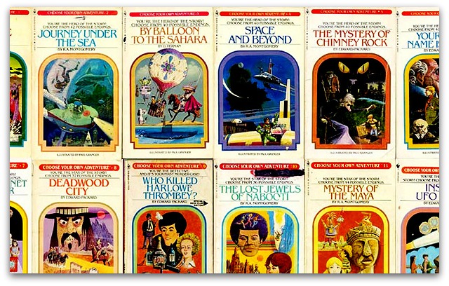
For this activity, you'll design a game that combines reading, interactivity, and game components. This activity is based on the line of books shown in the image above. They enable the reader to drive the story through the choices they make along the way.
About this activity: Consider group work
We've mentioned a few times that collaboration is crucial to creative development. For this project, feel free to reach out to other people taking the course with you and create a team for group work. You can allocate different parts of the project to different team members. We encourage this option, as it may reduce your workload and allow you to get even closer to the workflow of a project in the real world.
Each person in the team must submit all the materials and indicate their role in the project, outlining their contribution.
A project like this could take weeks or months to build, so for our purposes, you'll be creating a proof of concept rather than a fully-fledged working app.
Scenario
You work for a gaming company that has decided to build a Choose Your Own Adventure-style game app to sell to Sony to produce and distribute. This means that you'll need to get the project to a point where a few things are very clear, but the end product, the app itself, is not completed. You need to show enough functionality and design to convince Sony to purchase it without throwing valuable development time down the toilet if Sony won't fund development.
Getting Started
Craft a journey through a "Choose your own adventure" style game. To familiarise yourself with this type of mashup of a game and a book, read up on what exactly a gamebook format means at Wikipedia before continuing with this activity.
Task 1: Define your target audience and create a mood board.
Traditionally, these types of books appeal to 11-16 year olds. You can decide to define the audience and create a plot appropriate to them, or go the other way and create your plot and then determine who would likely want to purchase the app based on the content. Either way is good.
When you have determined your audience, create a mood board to show their preferences and style. Don't skip this step, as you will refer to it in the following Topic, Web Design.
Task 2: Sketch out a storyline with multiple pathways to reach the end.
Each story starts in the same place, and all of the flows (user choices) can point to the same ending, or you can plan for different endings.
(Note: you can switch Tasks 1 and 2 - based on whether you prefer to write for a target audience or write a story and determine who the audience for that story is likely to be.)
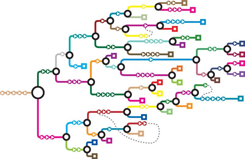
Task 3: Create a graph that defines the user's story flow options.
Include lines to connect the optional directions for the reader. In the graph shown here, all users start from the same point and are offered two distinct routes through the plot, with another decision point following that, and so on, until they reach the end of that flow/story. Looking at the image below, each square represents the end of a storyline. If this were a book, readers could go back to the beginning and make different choices until they have discovered all of the plotlines and possible endings.
Note: Remember that you need to keep to broad strokes only, don't spend time writing intricate details of the story - keep to a bird's eye view of the story and 'flows' through it.
Task 4: Design the Architecture, UX and UI.
You'll need to make the interface simple to understand and consistent throughout the entire user journey. Ensure you can communicate your plans, but again, don't spend too much time on the finer points. Not every moment in your app will need to be illustrated to communicate your ideas, but there must be key moments in the journey defined so the interaction is clearly illustrated. You need to give someone the feeling of playing your game with the smallest amount of material to evoke that feeling.
Task 5: Align the scope of the project with the resources you have to work with.
You'll need to determine exactly what users can do with the app.
To do this, break the app into smaller chunks of functionality and think about what resources it would take to achieve each feature. Then, categorise them into features that are Must-Haves (this would be the MVP) to make the app work and Nice-to-Haves, which make the product engaging and enticing. Ultimately, determine what features you will build into the prototype and which will be built out as a result of feedback during user testing of the prototype.
Some ideas of functions and features for you to categorise are:
Login and Sign up
Pick the next storyline flow
Return to the most recent flow option
End of story function options:
Return to the beginning?
Return to a specific spot?
Print the story? With images?
Share the story?
Messaging
Search
Additional customisation options:
Enter your name for the primary character
Enter the names of secondary characters
Design your own ending
Technical help and instructions
What else can you think of?
Reflection question: Do you have any apps that have features you love? Consider how What's App allows you to leave a video message when a video call goes unanswered. That's a feature that broadens the capabilities of the app.
Task 6: Go into Figma and build out a wireframe of your app.
Refer to the architecture you determined in Task 4. Add in some of the design elements so that you have a clear visual representation of your app.
Task 7: Make a list of assets.
You'll need to design and develop some audio and visual assets to use in the app development. Determine which of those you will do for the proof of concept. Make a timeline to achieve your goals.
Task 8: Create your priority assets and add them to the wireframe.
Use Photoshop and/or Illustrator. Consideran app logo, navigation symbols, icons, buttons, headings, etc. Remember only to create enough design assets to show others how the app will look and function.
Task 9: Get feedback on your work to this point.
Ask reviewers to respond to the concept, design, and features. To do this, you may like to set up a Google Survey on Google Forms. Ask specific questions so you get helpful answers. A question asking, "Do you like this design?" may get you a response like "Yes, it's good." Whereas a visual of the appropriate part of the app along with a question like "How would you go back to the last decision point and make a different choice?" will give you feedback you can use, particularly if the reviewer gets it wrong!
Task 10: Using the feedback you got, make design changes and add functionality to the wireframe.
This is the part where you link up pages to enable navigation. Only build as much as you have time to do and as little as you need to show how the user interacts with your app.
Task 11: Use the share button to get a link for your app:
Learn how to use the share/review feature built into Figma.
Task 12: Share and present
Create an InDesign document for presentation.
The document will be used to present your work in the forum. The document must be easy for you to navigate and show all of the work done for the project, including:
The target audience, mood board and persona
Designs such as logos, buttons, and visual elements that set up the look and feel
The flow draft
Include a link to the shared version of your Figma app.
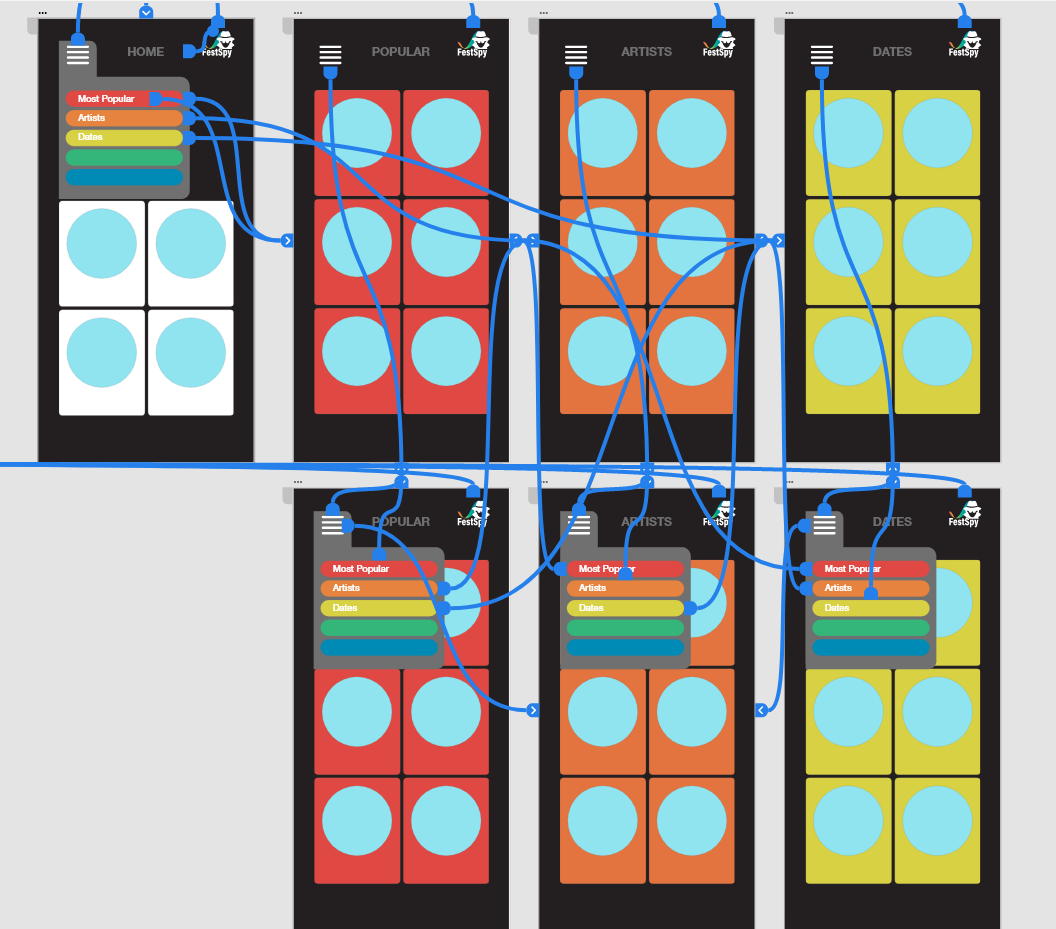
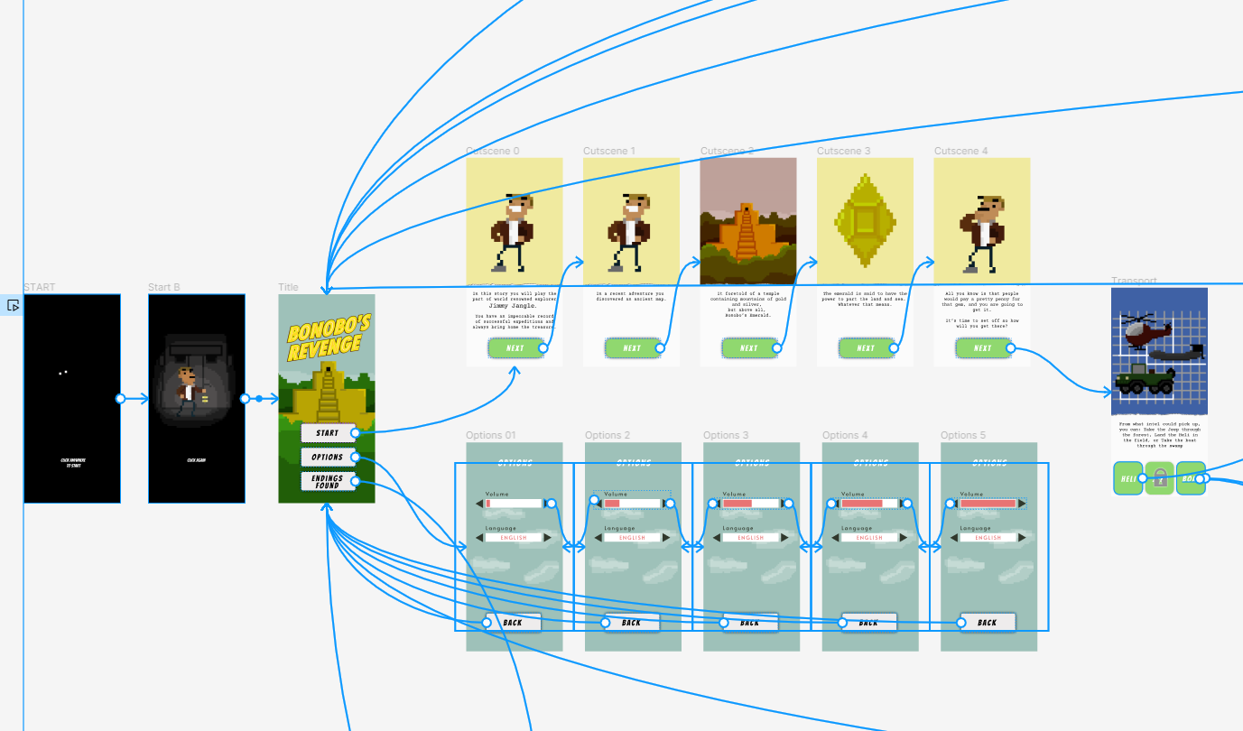
Want to see a former Yoobee student's hi-resolution prototype in Figma? Use this example for inspiration or just to get a sense of what you can do at this level.
This prototype provides a solid example of a version of the app on its journey to the final release. The student selected a few branches to develop as a representation of the full game.
You'll probably notice missing graphics and some gaps in the story, which is appropriate at this point in the design process.
Click the image to see it full size in a new browser tab.
When you finish the activity, it's time to share your work.
2. Forum Post: The 2-minute elevator pitch.
To do this:
A) Create a screen recording showing off your app. You'll need to record your screen and voice. You are welcome to use picture in picture to include yourself. Using your InDesign document as a run sheet, take 2-4 minutes to present the following:
introduce the project, and indicate if you worked in a team or on your own.
describe your defined target audience and persona. Show the mood board and persona.
oresent the visual feel of the app by showing the logo, icons, navigation, etc.
show the flow draft and the Figma-modified wireframe.
while presenting, click on the parts of the app that you have built out to show how the app would work.
explain the features you plan to do, and remember to indicate whether those features are considered Gold-standard or MVP for scoping purposes.
B) Create your student Forum post and attach your presentation, ensuring it is smaller than 950 MB.
Answer the following questions in the comment area:
Did you work alone or in a group?
Are you pleased with your choice, or would you have preferred to work differently? Why?
There were various parts of this assignment. Which part did you enjoy doing the most? (Target audience, persona, wireframing, developing assets, coding functionality...etc.)
Do you feel you have been introduced to the basic fundamentals of building an app?
Do you have any other reflections you would like to share?
Whakamanahau. You have done so well to complete this challenging activity. We hope you enjoyed the mahi.
STOP!
Before continuing to the next course on Web Design, please use the left navigation menu to scroll to the bottom of this course to get to the first assessment for Design/Web, Design Assessment - Matariki Event. Read the instructions carefully and submit your assessment, ensuing you have clicked all the way through the draft and final submissions.
After submission, continue on to Web Design. Your tutor will review the assessment and reach out if a resubmission appears necessary.