In this topic, we’ll:
- investigate five common principles of landscape design, which are effectively ‘rules’ or guidelines to follow to create well designed gardens
- introduce five elements of landscape design which are the components of your design that will help you stick to the principles.
The landscape design principles and elements provide a framework for producing a rational and engaging garden design.
By the end of this topic you’ll be able to:
- Identify gardens that do and do not adhere to the landscape design principles.
- Match landscape design elements with their definitions.
Like all other forms of design, landscape design is guided by overarching principles. Depending on who you speak to, what they are will vary. In this programme we cover the following landscape design principles:
- proportion and scale
- balance
- emphasis
- unity
- simplicity
Proportion and scale
A direct link with the architecture
Proportion refers to the general ratio or relationship between two objects. Something is said to be ‘in proportion’ when it fits in with its surroundings. In landscape design there must be a direct link to the architecture of the site. One key way to do this is ensure that the spaces (or garden ‘rooms’) we create and the features that form the garden design are in proportion to the house, other buildings, and other parts of the garden. Proportion is about ensuring all elements of the garden work together.
This post by Dave Marciniak gives a few good examples: Principles of Design: Proportion in the Landscape. Look closely at the pictures of the two pergolas – which one do you find more visually appealing?
The human scale
Scale relates to the size of objects compared to a known reference or a unit of measure, such as one metre.
Often though, we’ll use the ‘human scale’ as the basis for our designs. In other words, we’ll make sure that objects in the garden are easy for humans to interact with. We do this by using the average height of a person – or ideally the heights and abilities of the clients we are designing for – to guide our design.
For example:
- A solid fence that is intended to provide complete privacy will generally be 1.8m, or 1800mm, tall as this is a little taller than average height.
- Steps are commonly 300mm deep to account for the size of an average shoe.
- Raised garden beds should be designed to meet the needs of the client, such as their ability to bend or crouch, and how far they can reach across the bed when in their preferred gardening position.
Because proportion is a direct link with the architecture of the site, proportion and scale is the first principle we consider starting our design.
We need to be mindful of both the need to keep the garden in proportion with the house and to make sure the garden rooms are the right size for the intended purpose.

Garden Rooms
Garden rooms are defined (formed) by their floor, walls, and ceiling.
When we talk about the floor we are referring to the ground plane. This could be lawn, a deck, a paved area, groundcover plants, or a range of other landscaping materials.
By walls we mean physical or visual barriers such as hedges, fences, retaining walls, and shrubs.
Ceilings can be physical objects, such as a pergola or tree canopy, or implied, such as the branches of trees around the edge of the space projecting towards the middle. Even though they don’t touch in the middle, the brain recognises that there is a ceiling of sorts, enclosing the space.
Small, enclosed spaces create a sense of intimacy and quiet seclusion, while larger spaces create a sense of openness and movement.
Activity: Human Scale
Measure out, or find details online for, the items in the list below. Think about how much extra space is needed around the object. For example, an outdoor dining table to seat four people is 1400 x 1400mm plus 800-1000mm on each side to allow for the chairs to be pushed back when people need to get in or out gives an overall space requirement of between 3000 x 3000mm to 3400 x 3400mm.
Do the same for each of the following items:
- An outdoor dining table set to seat 8 people:
- square table
- rectangular table
- Two small chairs and a small side table
- A barbecue (BBQ) (make sure there is enough space for the cook to work)
- A kids playhouse
- A clotheslines (and enough extra space so that washing, like bed sheets, won’t come into contact with anything):
- rotary clothesline
- retractable clothesline
- fold-out clothesline
- A bike rack for four bikes and the space the bikes take up
- A car:
- with doors closed (as when driving along a driveway)
- with doors and boot open (as when parked up).
Use your measurements to cut out 1:100 shapes from cardboard or coloured paper. Write on each what it is and the dimensions, e.g. “Table setting for 4, 3x3m”.
These will come in handy when you start designing your garden so put them in an envelope, Ziplock bag, or clear file pouch, and put that in a safe place.
Tips for working with proportion and scale
When designing gardens:
- Think about what the plants will look like 10 years after planting.
- Trees should be drawn at their 10-year size, or if you can’t find that information go for 80% of their full spread.
- Regarding garden elements, if you’re not sure how chunky to make them, err on the side of too large, rather than too small.
- Intimate and sedentary spaces should have square or round proportions, unless they need extra space for people to move through.
Balance
Balance refers to the ‘visual weight’ of objects, and the sense of equilibrium created between positive and negative spaces either side of an imaginary line called a balance line. Visual weight refers to how strongly an object draws the viewer’s attention.
In design and art, positive space is the term given to areas that contain something. In landscape design this is usually planting.
Conversely, negative space refers to areas that are blank or open. In landscape design these will be the surfaces that people can walk on, such as lawns, decks, paved areas, driveways and paths.
We’re talking about balance as the second landscape design principle because it helps define the structure of the garden – in a sense it forms the ‘bones’ of the garden.
Symmetrical and asymmetrical balance
Balance can be achieved in two main ways through:
- symmetrical balance, which is also often referred to as ‘formal balance’
- asymmetrical balance, or ‘informal balance.’
Symmetrical balance is created where the positive and negative spaces are mirrored on either side of the balance line, which falls in the middle of the main axis. The formal gardens of the French and Italian renaissance used symmetrical design extensively.

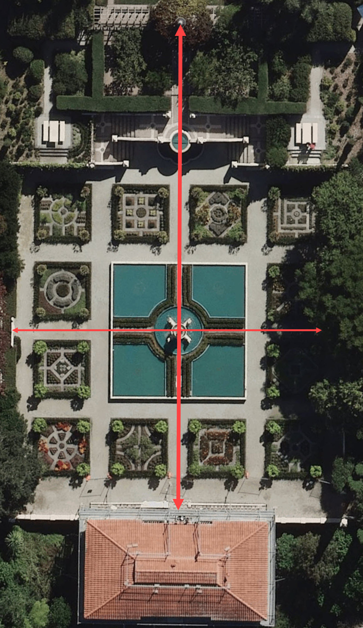
The Italian Renaissance Garden viewed from above shows symmetry on either side of the main axis (balance line – thick red line) and symmetry on either side of the secondary axis (thin red line). (Source: LINZ )
Asymmetrical balance is created where there is equilibrium between positive and negative space across the garden, which is created without the mirror effect seen in symmetrical designs. When viewed, asymmetrically balanced gardens ‘feel right.’
Activity: Asymmetric balance
Other types of balance
In addition to symmetrical and asymmetrical balance, we can also use:
- near symmetry (or hybrid balance)
- radial balance.
Reading
Garden Design Essentials: Balance
Article Summary: This article by Debra Prinzing gives a good explanation of all four types of balance and includes examples of each.
Pre-Read Question: Think about the words ‘symmetry’ and ‘radial’: what clues do these words give about what the design of the garden will look like? As you read the article how close was your guess?
Read the article (5 minutes)
Post-Read Task: Make notes about the key points in the article as this information may be useful for your own garden design.
Source: Houzz.com
Tips for working with balance
When designing gardens:
Even though symmetrically balanced designs are often simpler to design, consideration still needs to be given to how much positive and negative space is used overall.
If you aren’t sure if your design is balanced, trace over it and hatch the positive spaces. This will give you a rough sense of how much space is positive and how much is negative. Because different objects have different visual weights, this is only a rough approach, but it can be a useful way to check your thinking.
Emphasis
The third principle is emphasis.
Emphasis refers to garden elements that hold the viewer’s attention for longer than the surrounding garden and provide a place for the eye to rest. Emphasis can be created by a focal point or an area or emphasis. A focal point is a singular object, such as a gate whereas an area of emphasis is a wider area, such as a sunken garden.
As well as offering a place for the eyes to rest, these components create movement through a sense of curiosity. They encourage the viewer to get closer.
We consider emphasis after the structural principles (proportion, scale, and balance) because it is a practical way of determining how people move through and interact with the garden.
Activity: Focal point
For this activity, you are presented with two versions of the same garden, but one has a focal point. First, watch the video of the slider showing the two images. Then, use the next activity tool, in full-screen mode, to take your time and pay attention to your responses when imagining yourself switching between the two settings.
Video courtesy of Germinate Aotearoa Limited; kindly reproduced with permission.
This activity requires you to view it in full-screen mode. To do this, select the arrows at the bottom right of the activity. When you are done, select them again to return to this view.
Hopefully, your eye was drawn to the sculpture at the back of the garden. This is the power of a focal point.
Common focal points and areas of emphasis:
- gates or narrow passages through fences or hedges
- sunken gardens
- a striking tree, or group of trees
- sculptures, statues, and other works of art
- a bench or seat
- views of the surrounding landscape
- a patterned ground surface, which draws the eye to a point, such as the centre of a radially designed area of paving.
Tips for working with emphasis
When designing gardens:
- Focal points are often used to show the way to the front door of the house. Think of interesting potted plants, for instance.
- Equally, a deliberate lack of focal points can be used to discourage people from going to parts of the garden that aren’t meant to be seen by visitors, such as a utility area where rubbish bins are stored.
- Focal points are an effective way to encourage people to move from one garden room into another.

This rustic gate acts as a strong focal point, encouraging the visitor to explore what is on the other side.
Unity
Unity is about bringing the house and garden together so that nothing feels out of place. This is equally true for the relationship between the house and garden and the relationship between the garden rooms.
Unity is our fourth principle because it is mostly considered when the structure of, and movement through the garden has been determined and thought is being given to the design of each garden room.
Unity with the house
Creating unity between the house and garden can be achieved by:
Creating indoor-outdoor flow by:
- ensuring that the floor level inside and outside of external doors is at the same level to create a smooth transition
- using similar elements, such as the materials used inside the house, like furniture and decor, are reflected in the outdoor space
- incorporating views of the garden, and surrounding landscape from inside the house.
Bringing in desirable views of the surrounding area by framing those views is known as a borrowed landscape. Borrowed landscapes give the viewer’s eyes a place to rest, by providing a long view to ‘stare off into the distance,’ as opposed to the short views within the garden.

Pruning back the group of shrubs at the bottom centre of the image would improve this borrowed landscape of the nearby harbour.

Unity is used to good effect here. The colours of the house and fence are repeated in the landscaping materials used and the shapes and forms of landscape elements are in proportion with the house.
Unity across the garden
Unity within and between garden rooms can be created through:
- repetition of forms, lines, colour of materials, and the colour and texture of vegetation
- connections between garden rooms such as paths, boardwalks and stairs
- a common rhythm.
We’ll talk about what rhythm is later in this topic.
Tips for working with unity
When designing gardens:
- To unify the house and garden, make sure there is good indoor outdoor flow and locate garden rooms for socialising and entertaining close to the lounge and kitchen.
- To unify the whole garden, be consistent with the materials and plants you use. Some variation is acceptable but reuse enough elements that the whole design feels cohesive.
Activity: Unity in action
Simplicity
Our fifth and final principle is simplicity.
Simplicity is about limiting the materials and plant choices and reducing variation through considered restraint. Done well, simplicity makes the garden feel sophisticated.
Simplicity is closely linked to unity. The difference is that unity is about carefully adding details to provide a sense of harmony, simplicity is about cutting back the number and type of design elements. As fashion designer Tim Gunn puts it “use your editing eye.”
The County of Santa Clara Sustainable Landscape Management department puts it like this:
“Elements that do not provide improvement or impact on the design can be omitted. Prioritize what is important and what is not in order to keep the design clean, neat and uncluttered. A simple, well-defined design is one that will be easier to maintain and increase functionality.”
(The Seven Principles of Design)
It is the last principle because it takes place, for the most part, in the design refinement stage. Do this throughout the design process where possible but make a particular point of doing it before you finalise your design.

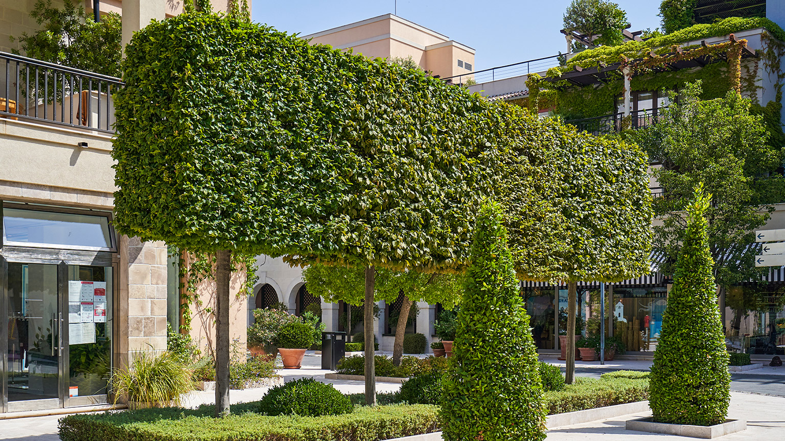
This garden demonstrates the principle of simplicity. The L-shape used to create the steps is repeated to create the bench seat on the top terrace. The handrail appears to be constructed from the same metal as the risers (vertical parts) of the steps and only four species of plants, other than the grass, have been used.
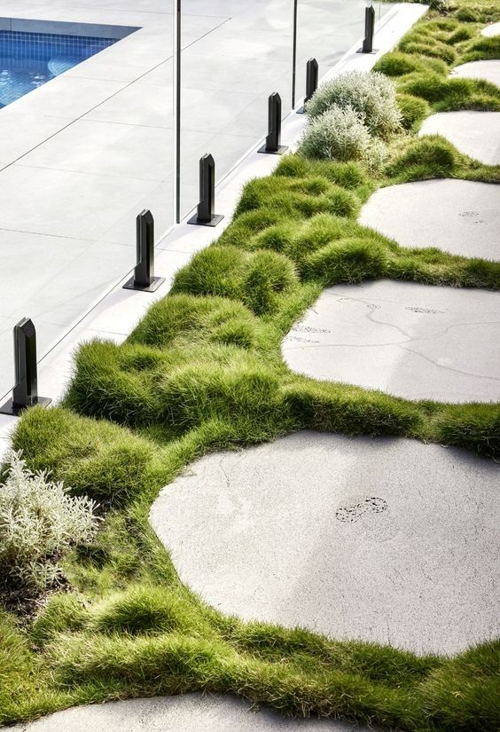
Simplicity is not limited to rectilinear design. This pathway of organic-shaped pavers demonstrates simplicity through the use of similar colour concrete to the adjacent paving, limited number of plant species, and the shape of the pavers are similar to the form of the plants. Photo by Alexandra Kovianova on Pinterest.
Tips for working with simplicity
When designing gardens:
- Each garden room should have a single function, in the same way that rooms of a house have a particular purpose.
- One shape should dominate each garden room, whether that is square, rectangle, circle, or organic shape.
- Each garden room should have an open centre (negative space).
Activity: Design principles reviewed
For each of the photos that follow, consider if the design adheres to the landscape design principles of: proportion and scale, balance (as seen from the position the photo was taken), emphasis, unity, and simplicity. Ask yourself “Which of the landscape design principles does this garden show to good effect?” Then expand the label beneath to view the comments.
Balance: Yes. The positive space formed by the planting on the right hand side is balanced by the mix of negative space (lawn) and small positive space (planting) on the left.
Emphasis: No. There is nowhere for the eye to rest.
Unity: No. There is a lack of a strong connection between the house and the garden. The timber archway to the left doesn’t match the materials of the house and there is a wide variety of plants with no apparent theme.
Simplicity: No. There is no sign that restraint has been used when laying out this garden or choosing the plants.
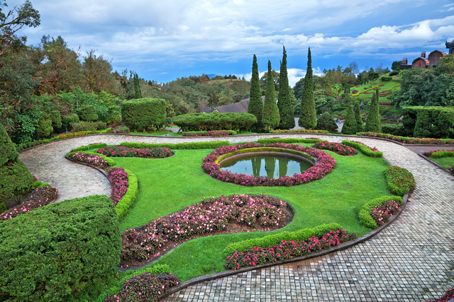
Balance: Yes. The plant masses appropriately balance the lawn and pathway.
Emphasis: Yes. The group of pyramidal conifers and the pond bearing their reflections is an effective area of emphasis.
Unity: Yes. The repeated use of organic shapes and forms works well to unify the garden.
Simplicity: Yes. Only one type of hard surface material is used in this garden room and plant choices have been limited to just a handful.
Balance: No. It feels like there is too much positive space (planting).
Emphasis: The one solitary tree may serve as a focal point, but this could be improved by removing the garden bed and treating this as a specimen tree in the lawn.
Unity: No. There is nothing that ties the garden to the house – no repeated use of materials, shapes or forms – nor does the planting seem cohesive from one garden bed to another. Adding an ‘open centre’ to this garden room and making garden beds rectilinear would better unify the garden and house.
Simplicity: No. The number of different plants used could be reduced to create a more professional design. Likewise opting for a true rectilinear design would simplify the forms of the garden.
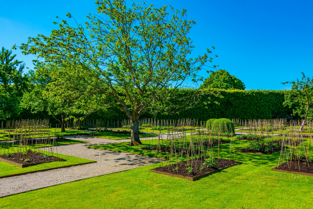
Balance: Yes. The many small garden beds and the pathway balance the negative space created by the lawn.
Emphasis: Yes. The trees and clipped shrubs serve as focal points.
Unity: Again, it is not possible to tell how well the garden unifies with the buildings. Unity within the garden is strong owing to the strong rectilinear design.
Simplicity: Yes, at a structural level. When summer arrives there will be a wide range of plants, but the structure of the garden relies on only a few different species. Only one material is used for hard surfacing and only one type of timber is used for the garden beds, and this is similar to the edging of the pathways.
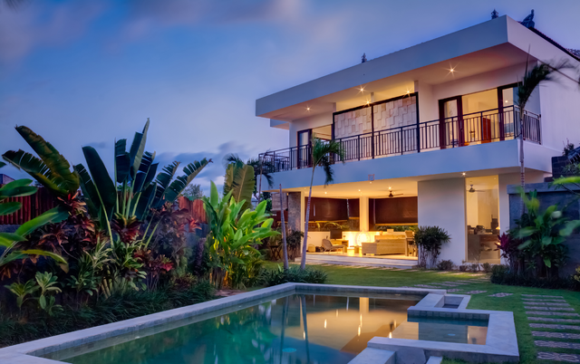
Balance: Yes. The negative space provided by the lawn and the water balances the positive space of the planting.
Emphasis: The pool serves as an effective focal point to draw in the eye and give it a place to rest.
Unity: Yes. Use of a tropical theme, which is well executed well, unifies the house and garden.
Simplicity: Yes. The plants used have an upright form and are repeated throughout the site. There is some variation in the hard landscaping, in the form of decorated pavers in the lawn, but this and the panelling on the first floor of the house speak to the tropical theme.
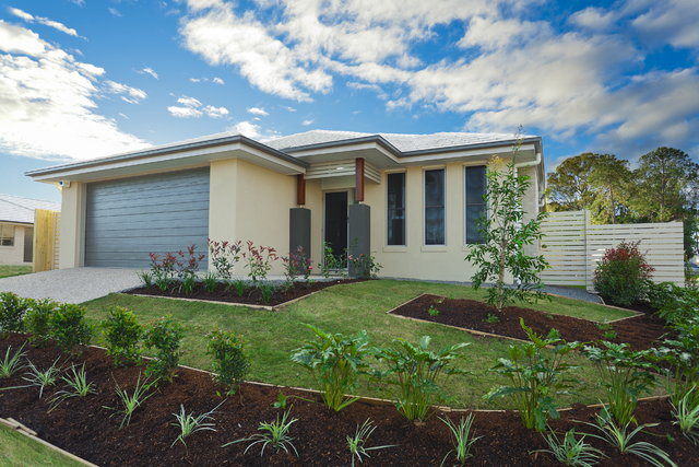
Balance: No. There is too much negative space, in the form of lawn and driveway, when compared to the positive space of the garden bed.
Emphasis: Possibly the foxtail palm, through the variation of the other plants, means it is not a strong focal point.
Unity: Somewhat. The use of fences and driveway concrete that match the colours of the house help create a sense of unity. However, the curvilinear form of the garden bed isn’t in keeping with the form of the house. One option would be to opt for an angular design to mimic the roof pitch.
Simplicity: No. There is too much variation of plant form, texture, and colour and variation in the shapes of different areas, such as the driveway and the garden bed.
Now that we have a basic understanding of the five principles of landscape design, we’re going to look at the tools we can use to design gardens that meet these principles. These tools are called landscape design elements.
Before we introduce the landscape design elements, it is important to clarify that:
- a design element is a tool or method to help us achieve the design principles, and that this is different to
- a garden element which is a feature or object in a garden, such as a tree, a garden bed, a lawn, a pergola and so on.
In this subtopic we’re focussing on design elements. If you think of the design principles as the overarching rules or guidelines to follow, then design elements can be thought of as the components of your design that will help you stick to the ‘rules.’
Like with design principles, different experts will promote different design elements. In this programme we cover the following landscape design elements:
- line
- shape
- form
- space
- rhythm
- texture
- colour.
In this module, we’ll focus on the first five elements. We’ll explore texture and colour later in the programme.
Line
Lines are the paths created by a point moving through space. Lines can be straight, curved, zigzag or multiple lines can intersect (cross).
Lines can express emotions, create shapes, add emphasis or encourage movement.
 |
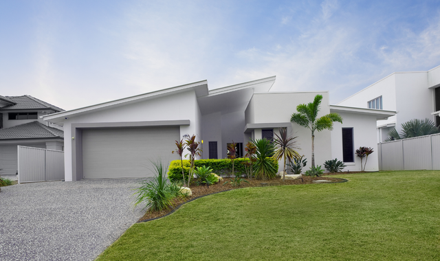
Curved lines: Lines that are curvilinear give a feeling of informality. |
 |
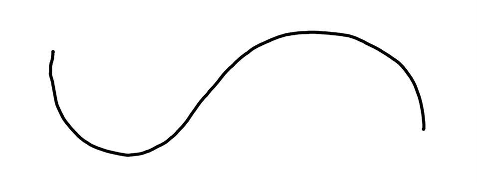
Arc lines: Lines that follow part of the circumference of a circle imply partial formality. |
 |
Straight lines: Lines that directly join to points create a feeling of formality. Different types of straight lines are described below. Horizontal lines: Lines that run parallel to the horizon, giving a sense of stability. |
 |
Vertical lines: Lines that run perpendicular to the horizon, creating a sense of height or strength. |
 |
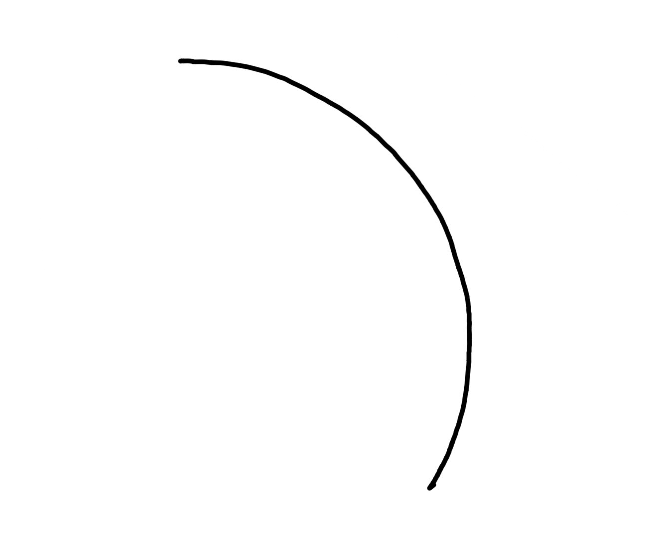
Diagonal lines: Lines that slant at an angle, adding dynamic energy to the composition. |
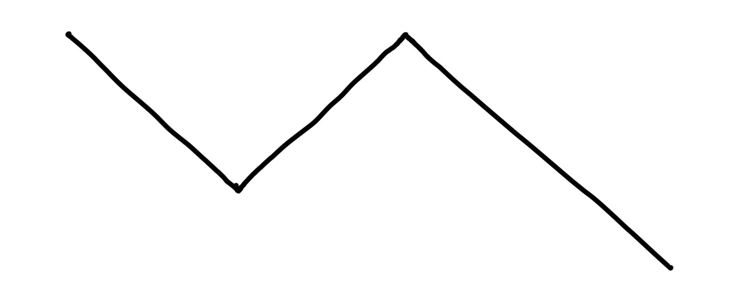 |
Zig-zag lines: Adds even more dynamism than diagonal lines. |
In western cultures, where text is commonly written from left to right, horizontal and diagonal lines draw (pull) the viewer’s eyes from the left to the right.
Lines can have any thickness. A thick line is more dominant than a thin line. You’ll remember from your site plan assessment that we used thicker lines to represent the more important parts of your drawing.
On a drawing, a line can represent a pathway, even though the pathway itself will be a shape (it will have width as well as length). Where the pathway is narrow and long, the viewer will interpret it as a line, which creates a sense of direction. On the other hand, where the path is wide and short, it will be interpreted as a shape rather than a line.
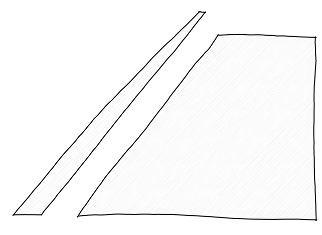
The rectangle on the left appears to be a line disappearing into the distance because it is narrow and long, while the one on the right is interpreted as a rectangle because it is comparatively wide and short.
As a design element, line is used extensively to unify the house and garden, such as repeating the horizontal lines of the weatherboards on a house to the design of a fence or the top edges of a clipped hedge.
And as mentioned above, line is used to define the pathways through the garden.
Shape
Where lines join together they can form shapes. Shapes are two-dimensional objects that stand out from the surrounding space due to their defined boundary.
Shapes are the basic building blocks of visual composition, and they can be categorised into two main types: geometric and organic.
Geometric shapes
Geometric shapes, such as squares, circles, triangles, and rectangles have clear, well-defined boundaries and are often symmetrical. Since geometric shapes are often associated with human-made objects, they can convey a sense of order, precision, and structure.
The most common two types of geometric shapes used in landscape design are:
- rectilinear – covering both squares and rectangles
- circular.
Organic shapes
Organic shapes are more irregular and freeform than geometric shapes, lacking strict boundaries and symmetry. They often resemble shapes found in nature and therefore evoke a more natural and fluid feeling.
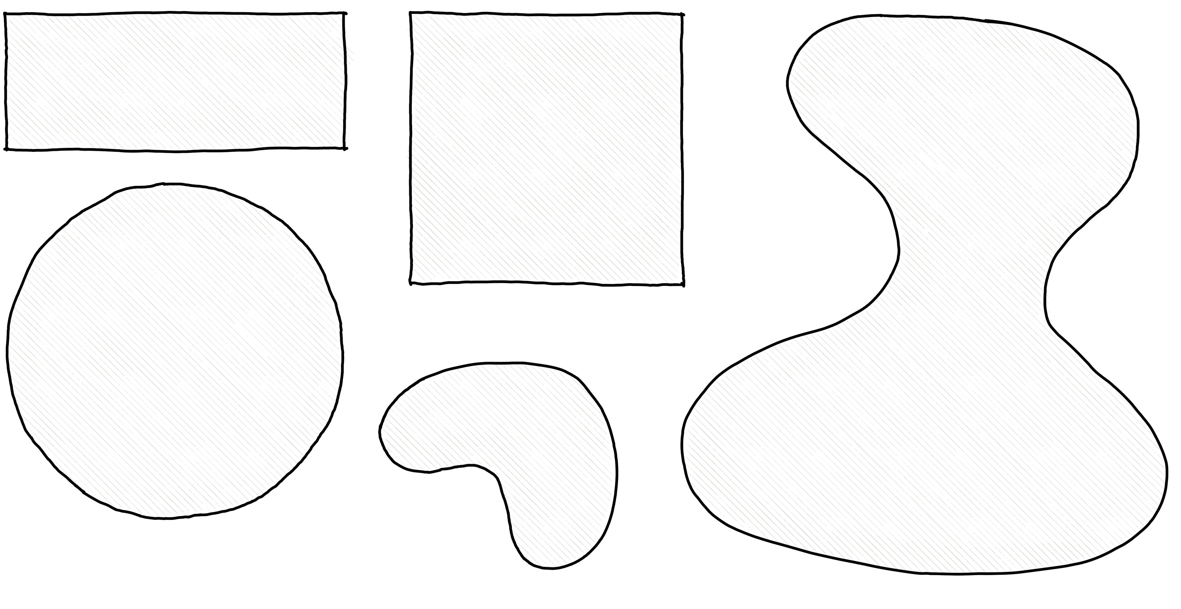
Geometric and organic shapes.
Complex shapes
Complex shapes can be formed by overlapping shapes. When using this approach, make sure to overlap the shapes significantly, to create a strong connection. Also avoid small left-over shapes and acute angles.
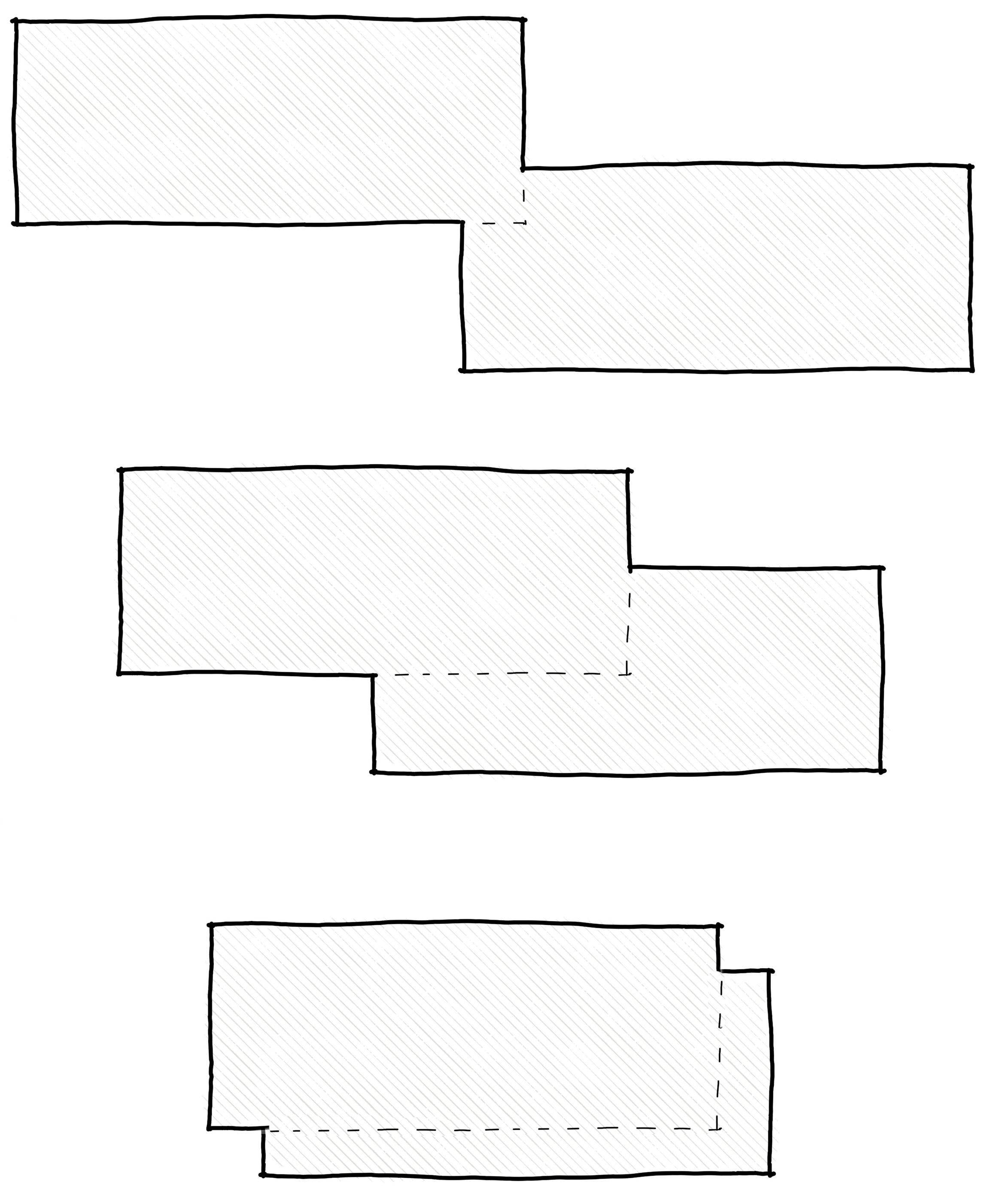
Two overlapping rectangles. Top: weak (not enough) overlap, middle: strong overlap; bottom: excessive (too much) overlap. The complex shape formed by the middle arrangement is interesting without being too loosely joined or too fiddly.
Shape is used commonly in landscape design in the horizontal plane by forming the ‘open centre’ of each garden room. It may also be used to unify the house and garden in a similar way to line. For instance matching the ratio of the width and height of a hedge to that of the nearest wall of the house.
Form
Unlike shapes, which are two-dimensional, forms are three-dimensional; they have a length, width, and depth, and therefore a volume. You can think of form as the structure and mass of an object, giving it a sense of solidity and occupying space in a three-dimensional way. In this definition, mass may refer to the visual weight of the object.
Common forms are cubes, spheres, cones and cylinders, but they can also be organic forms or complex geometric forms, made by joining other forms together.
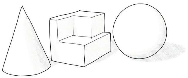
This cone, rectilinear shape and sphere are three separate forms.
Form is used commonly in landscape design in the selection of trees and shrubs – which we’ll go into later.
Form is used commonly in landscape design in the selection of trees and shrubs – which we’ll go into later.
Space
Where form is about the presence of an object, space more to do with absence.
Space refers to the area around, between, and within objects in a design. It's not just about the physical emptiness but also about how that emptiness is used and organised to create a sense of depth, perspective, and balance.
The open centre of a garden room is the space left over after the forms that have defined the space (the objects used to create the walls, floor, and ceiling) have been added. As we learned in the principle of balance, this is considered negative space.
Despite the name, positive space is best linked to the design element of form, rather than space.
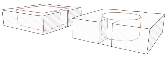
The negative space in these two garden rooms – one a 3D rectangle the other cylindrical – are the three-dimensional volumes that are left over once the forms, like hedges, have been created. The spaces are shown by the red dotted lines.
Rhythm
Rhythm involves the repetition of visual elements to create a sense of movement, pattern, or flow within a design. It's a bit like the beat, tempo, or pattern you might notice in music, but instead, it's expressed visually.
Rhythm is strongly linked to the principle of simplicity.
While rhythm incorporates repetition, this is only part of it. For rhythm to be effective there needs to be some variation. Imagine a song that had only a chorus and no verses; it would lose its appeal quickly.
When you’re working on your garden design, consider rhythm of movement as well as rhythm of visual elements. For instance, can you alter the speed at which people move through the garden to give a sense of ebb and flow?
One way to do this would be to incorporate a few winding, meandering paths as well as a number of shorter and more direct paths. Another way might be through close and then distant spacing of focal points.
Transitions as a form of rhythm
Transitions are the points where people move from one garden room to another. How we design these transitions will influence the mood of the garden users.
Some of the ways we can make transitions an interesting part of the garden experience are:
- using narrow gates or passages from one open space to another to create a feeling of compression and release
- changing the material of the ground surface, such as moving from a brick patio to an area of lawn
- creating a change of ground level, such as a set of stairs or a ramp taking us up or down to a new level.
Transitions can be used as a form of rhythm, by repeating the experience throughout the garden, with some variation to maintain interest.
When designing stairs, repetition is better than variation; keep the width and height of each stair the same, within a flight of stairs.
Watch the first five minutes of this tour through the Hamilton Gardens, which several examples of the feeling of compression and release as your transition from one garden room to the next: Hamilton Gardens New Zealand | Walk Tour. It’s a different video to the one we watched at this start of this module but is the same garden.
Activity: Landscape design principles and elements
In the next topic we’ll explain why we produce a garden design concept and what is involved.