Welcome to the Software Lab. In these topics, you will be provided with videos that explain how to use certain functions and tools of software. You will then be presented the opportunity to explore these tools and functions on your own while creating a masterpiece in an activity. Feel free to go at your own pace, pausing the videos when you need to and then trying out your newly learned skill in the software on your computer.
Welcome to Adobe Photoshop!
Who says beginners can't create really cool designs?
Throughout this software lab, we will guide you through various tutorials that will support you in developing the basic tools and techniques when using Photoshop.
We will explore the steps used to retouch and edit pictures, create composition and add effects to bring your image to life.
Beginning Photoshop
You will now have the opportunity to become familiar with the concept of Photoshop. Let us dive in and get started with the basic functions of opening files, re-setting workspaces and saving images.
You will also be guided through the navigation process along with shortcuts that include zooming in and out, moving around and viewing modes.
Check out the links below to get started.
- Get to know Photoshop
- Raster Vs Vector which will provide a description of each, and its relationship to size and quality
- Text Overlay
- Highlighting
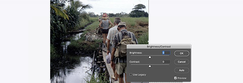
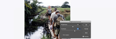
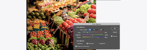
To get you started, let us begin with a little activity that will introduce you to basic editing within images. It will guide you through adjusting brightness, contrast and colour with the images you use within Photoshop.
You can download the activity file here.
Activity - Adjustment
- Adjustments are available from Image/Adjustments in the menu bar. Brightness and contrast adjustments will help make your images look less washed out.
- Colour balance can help compensate for unnatural colour casts.
- Levels will allow you to adjust both brightness and contrast by changing the black, white and midpoints of an image.
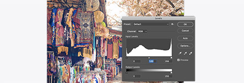
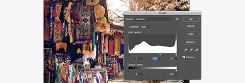
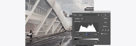
Using adjustment from the menu bar will only affect the layer you have selected, and it is a permanent change to your image.
It is often better to use layer adjustments as they are non-destructive and can be applied to all layers below them and masked. - Use the layer adjustment icon at the bottom of the layer panel to select the type of adjustment.
- Use the properties panel to make the adjustment.


How did you go with this activity? Are you ready to begin exploring Photoshop tools?
Layers
You have now had the opportunity to explore the basic functions of Photoshop which included navigation, opening and saving files, short cuts, screen capture and text overlay.
These are important functions to support you in manoeuvring through Adobe Photoshop.
Now that you have given them a try for yourself, you are ready to explore the Photoshop tools that help you create cool designs.
In the next video, we will begin to explore the use of layers within Photoshop and how they are used to compose multiple images. When adding layers, you can organise and manage your design in order to apply elements simultaneously.
It allows you to move, edit and work with specific parts of an image on one layer without affecting content on other layers.
It is extremely useful as you are able to modify and adapt images, add text and change colour without having it impact on your original image. This is good when you want to remove certain aspects of a design.
'Non-destructive editing' will also be touched upon. This process allows you to make edits to a photo on a separate layer so both the edited image and original are saved. This allows you to make changes without overwriting the original image, just in case you choose to revert back to the original.
Throughout this tutorial we will touch on:
- Image layers
- Adjustment layers
- Smart layers
- Blending modes
- Non-destructive editing.
Click here to watch the tutorial.
Once you have become familiar with the concept of layers, you can easily apply this in Photoshop.
Follow the steps below to help you apply layers to your design.
Activity - Layers
- Start by opening the stars.jpg file in Photoshop.
The file is a flattened jpeg image so we will see only one layer in our layer palette named 'Background'.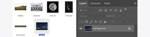
- Next, drag the field.psd file into the image window and drag the image to meet the bottom of the image window--press return to set its size.
(By default, images we drag into other images in Photoshop appear in the layers palette as 'smart layers'. We will look at these in more detail later.)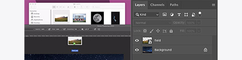
Next, we will add the house into the scene. - Open the house.psd in Photoshop.
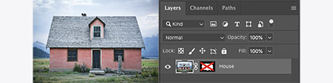
You will notice that the house currently has its original background and foreground. We only want the house.
If you look at the layers panel, you will see that a mask has already been created for this image. - Shift-Click the layer mask with the red cross through it.
(We will explore 'masking' in a later activity.)
You should now see the house with a transparent background.
We are going to drag the masked house layer into the image of the stars. To do this, we need to be able to see both images. - Select Window/Arrange/2-up Vertical from the menu bar.
This will display both of your open images side-by-side.
- Using the move tool, drag the house into the image of the stars.
You can close the house image without saving.
Our layer panel will now include the three layers in the order we see them.
Now let us get the moon into the image. - Use either of the techniques we have just tried to get the moon file into the scene.
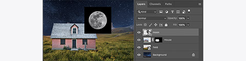
You will notice the moon currently has a black background and is sitting on top of the house.
First, we will need to move it back in the layer stack to sit between the stars and the field. - Drag the moon layer icon in the layer panel so it sits in the appropriate place.

- Use the move tool to position the moon where you would like it to be.
To get rid of the black square background, a mask would be a good option and we will cover how to do that later on.
In this case, we will be using a 'blending' mode. - With the moon layer active, click the drop-down menu where it says Normal.
Select a blending mode that you think works best (lighter colour).
- Use the same technique to get the smoke into the image.
Now let us put our rock wall into the foreground.
Remember to position it correctly in the layer stack.
You should have something that looks a bit like this: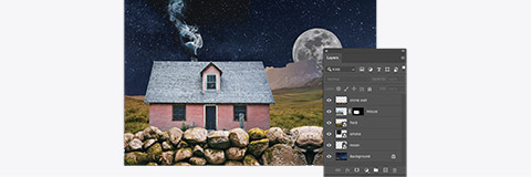
The field layer in our scene looks a little warm to be at night.
We will use an adjustment layer to try and correct this. - Select colour balance from the adjustment layer button at the bottom of the layer panel.

Above the Layer panel is the Properties panel. -
Use the colour balance sliders to make the scene cooler (blue tone).
The adjustment layer will affect all layers below it in the late stack so make sure it's positioned just above the field layer to stop it affecting the moon and sky. -
Hold option and click between the adjustment layer and the field layer to apply layer clipping.

-
Repeat the steps to apply another adjustment layer to make the field darker.


Now that you have had the opportunity to apply layers within Photoshop, let's try another activity where you will be guided to blend modes together. This is useful when you want to have images overlap with each other to form one image.
Activity - Blending modes
'Blending modes' will change the way layers affect the layers below them. We can use blending modes to create interesting effects, double exposures and apply textures.
Blending modes can in some instances eliminate the need to mask out a white or black background.
Let's get started!
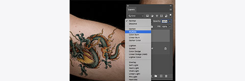
- Open the tattoo.psd file, scale and rotate the dragon graphics to position it over the arm.
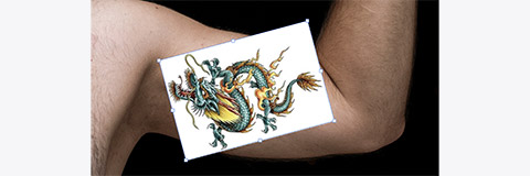
- Now change the blending mode for the layer to Multiply. This will make the white areas transparent and the rest of the image will appear to be part of the skin.
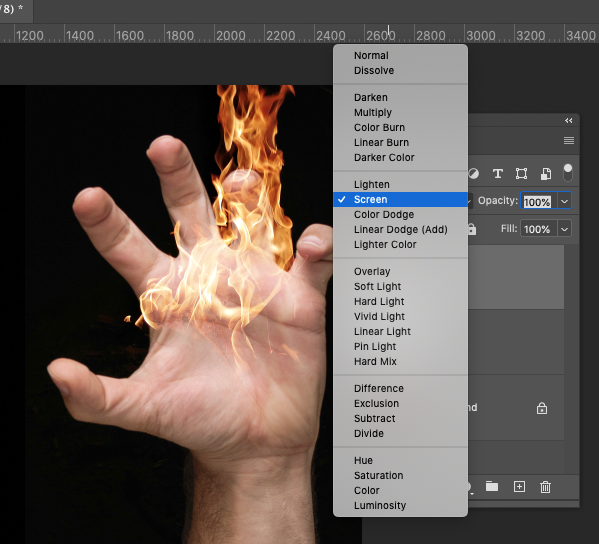
- Add the fire.jpg image to the tattoo image. Change position so the fire covers the hand.
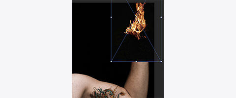
- Now set the blending mode for the fire to Screen. Screen is the opposite of multiply.


Next, open the blending modes.psd file and experiment with the different modes and circles provided.

Brushes
How did you go with creating layers within Photoshop? Are you ready to explore the basics of 'brush tools'?
Watch the tutorial below as we guide you through the basic use of brush tools, which is a primary painting tool within Photoshop.
The brush tool works as a drawing tool to apply colour, size, patterns and shapes. (It can also be used as a healing tool to remove blemish, duplicate elements and clone objects or images; however, this will be touched on within Software Lab 2.)
Within this video, we will focus on the basic Photoshop brush tool techniques which are useful for beginners to get started in developing their skills within Photoshop.
Topics that will be covered include:
- What is the brush tool in Photoshop?
- Tools that use brushes
- Selecting and modifying brushes
- Loading downloaded brushes
- Creating your own brushes.
Click here to use this video as a guide. Feel free to pause and make notes as you will need these instructions to help you complete the following activity.
Activity - Brushes
We often default to using the soft round brush in Photoshop; however, there are lots of interesting things we can do by creating our own brushes.
Any image or selection can be made into a brush in Photoshop.
A brush in Photoshop is essentially a greyscale representation of where the paint or ink will be applied. Black is 100% ink coverage, white is no coverage.
- First, change the colour mode of the cloud image to grayscale.

- Invert the colours so the cloud is dark and the background is light (Command + I).
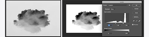
- Use the levels to make the background pure white and increase the density of the black in the cloud.
Now that the image is ready to become a brush, we need to define it as one. -
Select Define Brush preset from the edit menu. Give your brush a name and click OK.


The brush will now be accessible in the Brush and Brush Settings panels.
Selecting the brush in the Brush Settings panel will allow you to use it to stamp or stroke using the foreground colour.

To make the brush more interesting and appear more cloud-like, we start by increasing the spacing.
-
Increase the spacing to about 50%.
-
Tick and select Shape Dynamics on the left and increase size jitter to 100%. Change control to pen pressure.
(The pen pressure setting usually applies when using a drawing tablet like a Wacom Intuos or Cintiq. We’ll be simulating this later in this tutorial.) -
Set angle jitter to 100%.
-
Tick and select Scattering on the left and increase scattering to 30%.
-
Set count to 2. Save this new brush with all its settings by clicking the + icon in the bottom right corner of the brush settings panel.
The brush preview should look like a long cloud that is tapered at each end.

We will now use this brush to re-create this image.

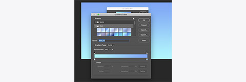
- Start by creating a document 5000 x 2500px.
- Add a gradient fill layer using blues to create the sky.
- Create a new empty layer above the sky and select it.
- Use the free-form pen tool to draw your initials (try to use a single stroke).
- In the path panel, right-click the work path and select Stroke Path.
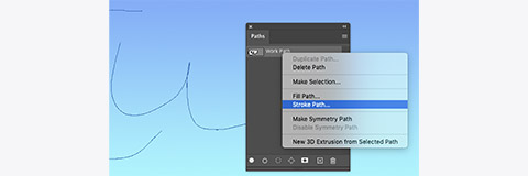
- Select Brush and Simulate Pressure before clicking OK.

If the stroke is too thick or thin, undo and adjust the size of the brush before using Stroke Path again.


Working with colour
Now it is time to combine our brush tool techniques with the use of colour.
Working with colours is something you must learn to do effectively in Photoshop as the opportunities for transforming designs are endless. Click here to learn more about how you can use colour within Photoshop.
This tutorial will cover aspects of colour picking, background vs foreground colour, the use of eye dropper, swatches and gradients.
All of these elements will be explored and will support you in further developing basic Photoshop skills.
Activity - Colour
Colour can be applied to an image in many different ways. One common way is using the brush tool and selecting foreground colours.

- Clicking the foreground colour in the toolbar will open a colour picker.
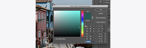
You can use the hue cube and slider to select any colour you like. - Clicking on an open image will sample a colour from a point in the image.
The Eyedropper Tool allows you to sample a foreground colour without opening the colour picker.
- With the brush tool selected > hold 'I' to temporarily enable the eyedropper > single-click to sample a colour > release 'I' to return to the brush tool.


Colour sampled from an image can be used in any other image you have opened. Let us give this a try!
- Open these two images side-by-side.
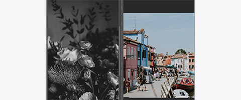
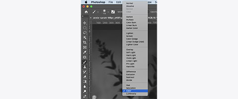
- Select the brush tool and change the blending mode to colour in the options bar.
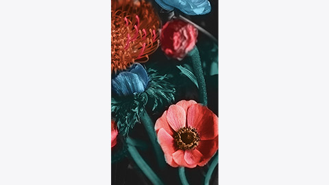
- Hold 'I' and sample a red from the image on the right.
- Paint the petals of one of the flowers.
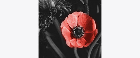
- Repeat the process to colour the rest of the image.


Type tools
It is not recommended to use Photoshop for laying out text in a brochure or magazine. Being a raster image editing programme, if you are trying to create a normal body styled text, you run the risk of having your type look soft or pixelated.
Creating unique and interesting typography compositions or manipulating an image to include text is where Photoshop really shines.
Many of the text controls in Photoshop will be familiar across other software programmes.
Click here to learn more about how you can design with text.
Let's jump right in to make a couple of different wooden signs.
Activity - Type tools
- Start by opening the wooden background file.

- Select the Horizontal Type Tool from the toolbar.
With the type tool selected, you will see the options bar now contains settings for typefaces, type size and alignment.
The default will probably be Myriad Pro, Regular, 24pt left-aligned.
We will need a much bigger and bolder font to use on our sign. -
Use the typeface dropdowns to select a heavy bold font and set the type size to around 90pt. (We will be changing this later to make our text fit.) Click the centre align icon.
-
Do a single-click somewhere in the middle of the third board.
You should see some highlighted placeholder text.
-
Type your name or any word that you think would look good etched into a wooden sign. We will be using 'FREE BBQ'.
-
Click on the text layer or click away from the text to finish typing.
Within the text layer, select the properties panel which will display settings for your text. -
Adjust the size, leading and tracking to make the text fit your boards.
See if you can get each line to fit nicely on a board (you may need to use the move tool).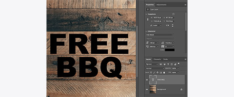
-
Change the colour of the text using the colour option in the properties panel.
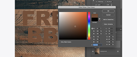
Sample a light wood colour from the image by clicking on the image outside the colour picker. Then click OK. -
Change the blending mode for the text layer to Multiple to make the text appear to be branded onto the wood.
If you think the text looks too dark, just use the text colour option again and pick a lighter colour.
This helps make the text feel like a part of the image rather than slapped on top.
We can make it look even better by using layer styles. -
Double-click on the text layer, slightly to the right of the layers name to open the Layers Styles window.
-
Select Bevel and Emboss to activate it.
Set the style to Inner Bevel, set the direction to down, adjust the highlight opacity to 0% and the shadow opacity to 100%.
The effect should make the text appear to have depth like it has been pressed into the wood. You should experiment with other layer style settings to see if you can create some other effects.


Now let us try something using similar techniques.
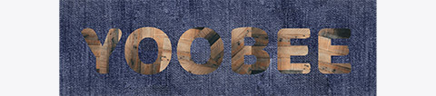
- Start by making a text layer with your name in a bold font that nicely fits the page.
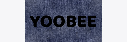
- Next, bring in the wood texture file and position it to cover the first letter.

- Copy the layer so that each letter is cover by its own layer.

- Resize and rotate each wood layer so there is a bit more variation between each letter.
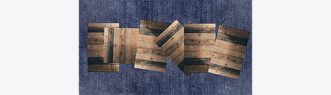
- Select all the wood layers and press command + E. This will merge all the selected layers into one layer.

- Now option click between the wood layer and text layer to apply layer clipping.
Your text should look new like it is made of wood. -
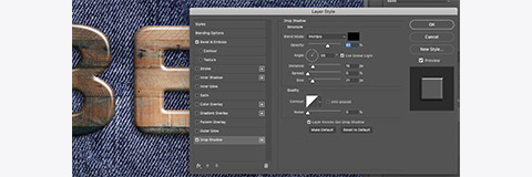
- Now use layer styles on the text layer to add some depth, use the settings shown below.
The angle and attitude are important here.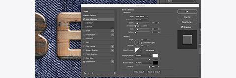
- Adding a drop shadow will help lift the text off the background.
 Using this technique, you can put anything inside your text.


Keep exploring to see what other designs you can come up with.