Welcome to the Software Lab.
In these topics, you will be provided with videos that explain how to use certain functions and tools of software.
You will then be presented the opportunity to explore these tools and functions on your own while creating a masterpiece in an activity.
Feel free to go at your own pace, pausing the videos when you need to, and then trying out your newly learnt skill in the software on your computer.
Adobe Illustrator
Adobe Illustrator is a graphics software that allows designers to create things such as:
- logos
- icons
- illustrations
- packaging
- billboards
- Web designs and more.
You can turn shapes into logos and icons as well as create different typography styles; or even give drawing freehand a try once you become confident.
Illustrator is vector-based which ensures your artwork stays clear even when you scale it up or down.
If you would like to refresh your memory, click here to review the differences between vector and raster graphics in Software Lab 1.
The main concepts that will be covered throughout this Lab include:
- Introduction
- Vector images
- How shapes, line tools, selection tools, colour fills, strokes, colour swatches and gradients are used within Illustrator
- Text and text manipulation and Illustration
- Pen tool (which will cover an overlap of both Photoshop and Illustrator)
- Pathfinder tool.
We will begin by introducing you to Illustrator, followed by guiding you through the basic techniques that will be used to help you achieve a creative and awesome design.
Click here to take a tour that will guide you through the Illustrator workspace and learn how you can open and save your images.
Once you have had a look through the tutorial and are familiar with Illustrator, you are free to attempt the following activities.
Shapes, line tools, selection tools, colour fills, strokes, colour swatches and gradients
Activity - Selection, shapes, strokes and pathfinder
Illustrator shapes can be drawn using the click and drag technique or by single-clicking an artboard and defining its exact dimensions.
The option you see will vary depending on the shape you have selected to make.

Each shape will have these basic properties.

There are 2 basic selection tools in Illustrator:
- Selection – for selecting, moving and manipulation whole shapes or objects
- Direct Selection – for selecting a single anchor point, line or subset of a shape.
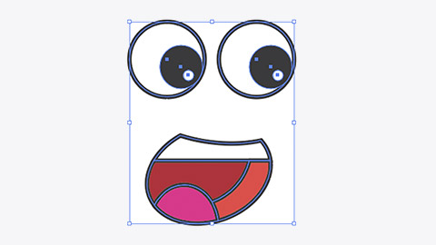
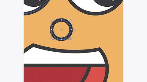
- Try to draw an eye like the one shown below. It is made of 3 circles:
- The large outer circle has a white fill and a thick dark stroke.
- The middle circle has a dark fill and no stroke.
- The small circle has a white fill and no stroke.
- Position the circles so the eyes are looking in the same direction.
- Use the selection tool to select the circles you’ve just made and group them by going to Object/Group in the menu bar.
Grouped objects will select and move together when dragged when using the selection tool. - Select both eyes and position them above the mouth.
- Use the rectangle to draw a box over the mouth and eyes that will become the image body or face.
The box will appear on top of the eyes and mouth.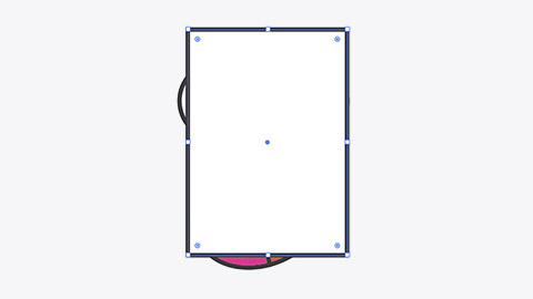
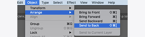
- Move the box to the bottom of the object stack by going to Object/Arrange/Send to Back.
- With the box selected, give it a warm fill colour and use the corner radius point to round the corners.
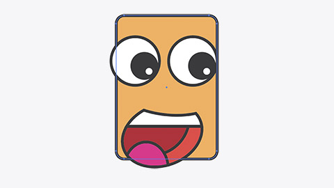
Not bad. Now let’s give it a nose. - Draw a small circle between the eyes and the mouth.
- With the circle selected – use the scissor tool and single-click the anchor points on the left then right. Press delete twice to remove the bottom half of the circle.
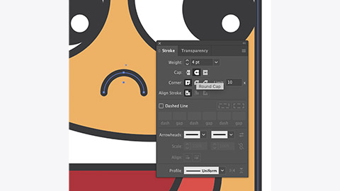
The blunt ends of the stroke look a little harsh. We can soften them by adding rounded end caps. - Open the Stroke panel and select Show Options from the panel menu.
- With the nose stroke selected, click Round Cap from the Stroke panel.


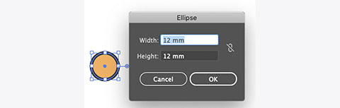
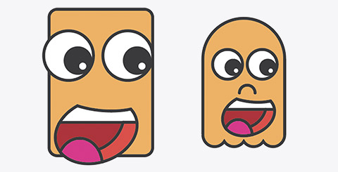
Let’s make a more interesting body by combining some shapes.
- Start by doing a single-click with the Ellipse tool to create a circle, that is 12mm x 12mm.
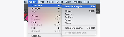
- With the circle selected, go to Object/Transform/Transform each.
- Set Move/Horizontal to 10mm and click Copy.
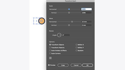
- Select Object/Transform/Transform Again to repeat the copy. Repeat until you have four overlapping circles.
- Open the Pathfinder panel and with all the circles selected, click the Unite button.
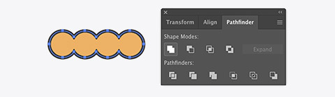
- Deselect the circles and use the rectangle tool to draw a rectangle starting from the left anchor point of the circle and extending up about 60mm.
- Use Pathfinder again to join the two shapes together.
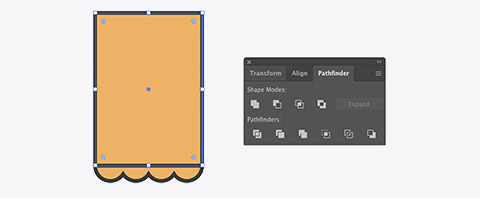
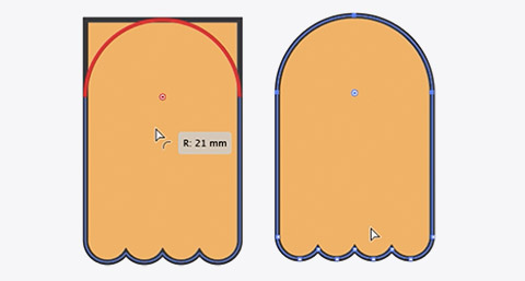
- Use Direct selection to select the top 2 points of the new shape.

- Use the corner radius to fully round the top.
- Use the selection tool while holding Option to drag a copy to the mouth to the new body.
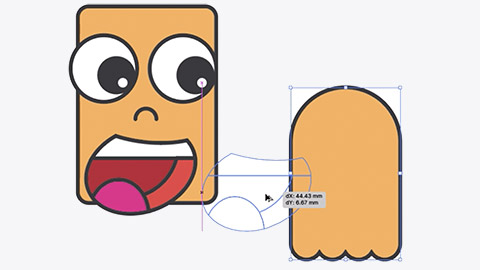
- You’ll have to use Object/Arrange from the menu bar to bring the mouth to the front. Repeat for the eyes and nose. Resize the element to fit the body.


Activity - Colour, swatches, and gradients
Illustrator has numerous tools for working with colour.
The Swatches panel lets us save and use colours. The Color panel lets us create new colours. The Color Guide panel gives us access to Tints, Shades and other complementary, analogous or colours from another harmony rule.

Sometimes our 2D artwork can look a little flat. Gradients help give a design depth by allowing 2 or more colours to flow into each other.
- Create a simple box, give it a fill colour. Open the swatches and gradient panels.
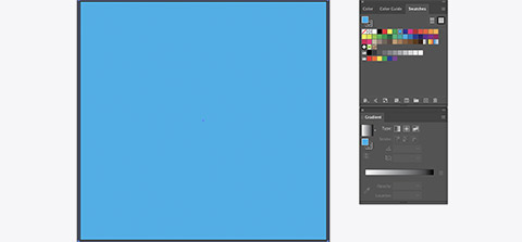
The default gradient is a white to black gradient. - Apply the default gradient by selecting the box, then clicking the gradient thumbnail in the gradient panel.
- Change the colours in the gradient by double-clicking the colour point on the gradient slider.
You can select colours from swatches, mix a new colour, or sample a colour using the eyedropper. - You can add more colour to the gradient by clicking just below the gradient slider, or by dragging colours from the swatch panel on to the gradient slider.
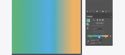
- The Edit Gradient button allows you to move, redraw and rotate your gradient inside the box.
- There are 3 types of gradient available in the panel which include Linear, Radial and Freeform.
Radial is basically the same as linear except it’s circular. - With the box selected, click the Freeform button.
- You can change the colour and move any of the four corner points to create any space gradient you like. You can add points by clicking and deleting points by selecting them and pressing delete.
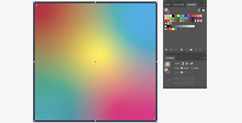
- Use gradients to make the image provided more interesting.


Activity - Type Illustrator
There are 2 main Type tools in Illustrator:
- Type Tool – for creating horizontal, point or area type
- Type on a Path Tool – for creating type that follows curves or goes around objects.
Point type is created when we do a single-click on a document. Point type is usually a single line of text that can be resized and transformed using the corner anchor point.
- Start by single-clicking on the artboard with the image, with the type tool.
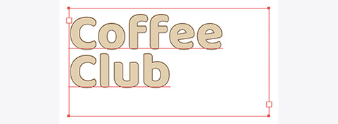
A short line of placeholder text will be created, we can replace this by typing. - Type the heading 'Coffee Club'.
You may find the text hard to see because of its size and colour.
With the text object selected, the Character Panel options and Properties should be visible on the right side of the screen.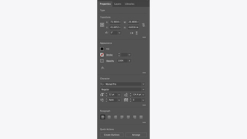
- Use the fill colour, and type options to choose a bold typeface, size and colour combination that make the type legible.
You can also use the anchor point to resize the type. Hold shift while resizing to prevent distortion.
You could try using the eyedropper tool while the type object is selected to sample colours from the image into the type.
You may want to add a stroke to help improve legibility.
Typing in point type mode, the text will continue horizontally forever. We can use returns to create line breaks but the type isn’t constrained by any bounding box.
-
Double-click the Area Type node, the circle on a stick, on the left-hand side of the bounding box.
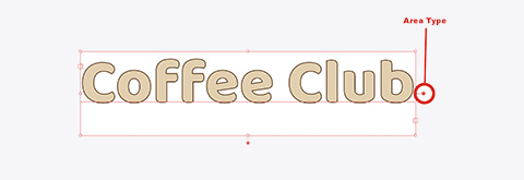
This converts the type to area type. Area type is constrained by its bounding box. Resizing the bounding box in area type mode will make the text move inside to fit the size of the box. -
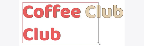
Resize the box to get the text on 2 lines then adjust to get the lines closer together.
Double-clicking the Area Type node again will return the text to Point Type mode. -
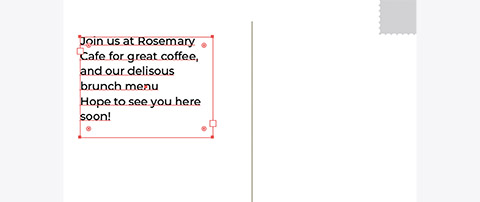
Create an Area Type box by dragging a box with the type tool on the artboard on the right.
-
Use a combination of typefaces, sizes and colours to make the text more interesting.
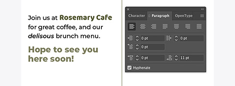
The paragraph panel is available from Window/Type/Paragraph. You can use this to create space after a paragraph/return.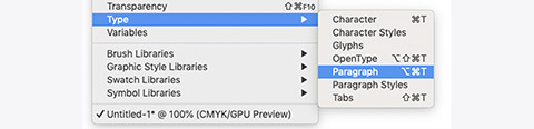


To use type on a path, we first need a path for the type to go on. A path can be any line that is part of a shape or stroke.
- Create a circle anywhere on a page. It doesn’t need a fill or stroke colour.
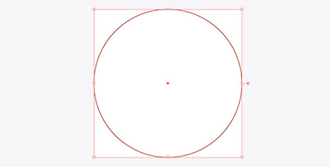
- With the type on a path tool selected, click on the left-hand edge of the circle.
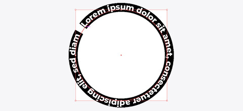
Placeholder text will appear starting at the point you clicked.
This can be replaced by typing and the same typeface and colour controls will apply.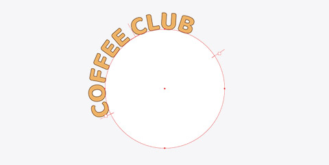
You can adjust the start and endpoints of the text by moving the square with the line through it.


Activity - Pen tool
The pen tool is used to create lines and shapes using straight lines and bezier curves. A bezier curve has at least 2 points and at least 1 handle that indicates the direction and amount of curvature between the points.
Points with no handles will start or finish with a straight line. Select the pen tool and set the fill colour to none and the stroke to black, 2pts.
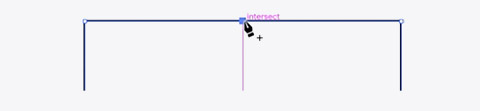
- With the pen tool selected, make a single-click on the top point at the boot end of the car. Then move the cursor towards the point to the right.
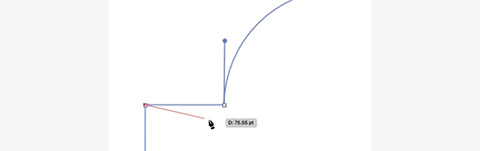
- Complete the first line by single-clicking the point that meets the curved line.
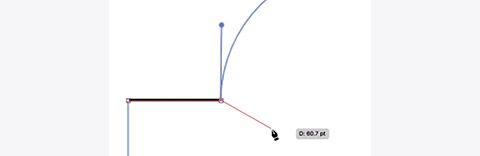
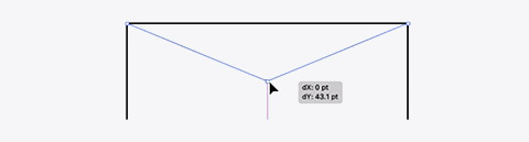
- Now hold option to temporarily enable the Anchor Point tool and you can click and drag a handle straight up. Release the mouse button, then the option key.
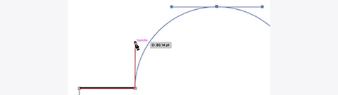
- Move the cursor to the point at the apex of the curve. This time click and drag to the right to make an anchor point and two parallel handles.
Parallel handles make smooth transitions between points.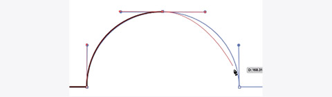
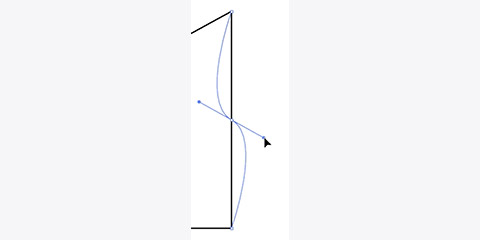
- Repeat the previous step by clicking and dragging down on the next point.

You will notice that if you move the cursor towards the next point, the curve is pulling down, when we really want it to be straight. - Hold option and single-click the previous point to remove the bottom handle before clicking the next point.

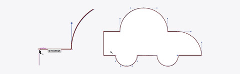
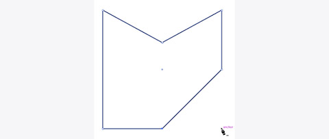
- Keep going until the whole car has been completed.
- Click on the starting point to create a closed shape.


The pen tool can also be used to add points and manipulate other shapes.
- With any shape or path selected. Do a single-click with the pen tool on the path to add a new anchor point.
- Hold Command to click and drag a point into a new position.
- Hold Option to create handles.
- Click an existing anchor point to remove it.
- Option-clicking and existing anchor point will remove its handles.
 You can use the pen tool to create interesting shapes for type on a path.
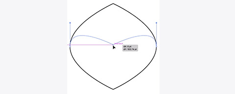


Final activity - Poster
Put some of the techniques above together to create this simple poster.

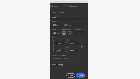
- Create a new A3 document (297mm x 420mm).
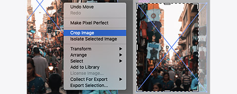
- Drag the market image into the new document and resize it to the height of the document (remembering to hold shift to stop it distorting).
- Right-click the image and select Crop Image to trim the image to fit the document.
- Create a gradient from dark blue to transparent in a rectangle that sits on top of the image.
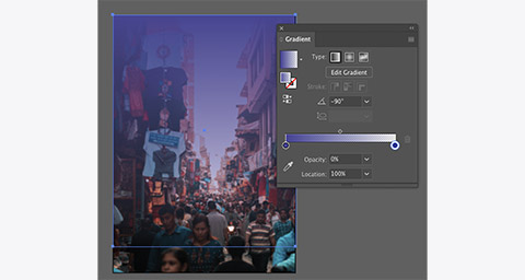
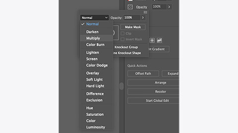
- Change the blending mode for the box by clicking Opacity in the properties panel.
- In the layer panel, click the lock icon for Layer 1, then click the New Layer button at the bottom of the layer panel.

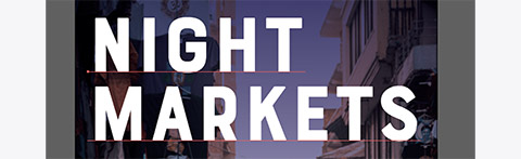
- Use the type tool to create the title text.
- Drag the galaxy image and position it over the text.
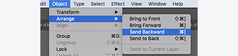
- Move the galaxy image behind the text using Object/Arrange/Send Backward.
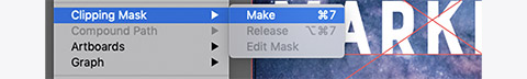
- Select both the text and the galaxy image. Then go to Clipping Mask/Make from Object in the menu bar.
- With the text selected, set a 2pt white stroke.
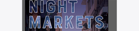
- Create a circle that covers the ‘T’ in NIGHT and use the Text on a Path tool to create the 'FREE ENTRY' text.

- Use the Type tool to create the other text.

- Open the noodles.ai file and copy and paste the noodle graphic into the poster.
Resize and change its colour.