At the beginning of this course, you were introduced to the concept of UX Experience. To develop a deeper understanding of User Experience it is important to consider the core components of UX, and the role each of these components play in user experience.
In this section you will be introduced to the five core components of UX.
The five essential or core components of UX are:
- Information Architecture
- Interaction Design
- Usability
- Visual Design
- Prototyping
We will consider each of these components in depth, before moving on to look at the UX Design Process.
Information Architecture (IA) centres around the organisation, structure, and labelling of content in the digital space and how it all fits together, so that users can easily find the information they need and complete tasks. “When it comes to the User Experience it’s not the technical infrastructure of information that we’re interested in nor are we interested in how the systems that we use to hold the data store that data; what we are interested in is how that data is presented to the user.”1 IA deals with things such as the classification and hierarchy of content, the labelling and tagging of the content, navigation around the content, and searching for content – it connects users to the content they are looking for.
Watch - What is Information Architecture? (17:20 minutes)
In this video, you will be introduced to the concepts within Information Architecture and how it connects to UX Design. Take notes as you watch and try and apply these principles to the Eats and Treats Forum Task.
Check out the following additional resources on Information Architecture:
- Klancar, P. (November 23, 2021) An Excellent Beginner’s Guide to Information Architecture. Career Foundary
- Lindberg, O. (February 7, 2020) Information Architecture: The Intersection of Users, Content and Context. Adobe XD Ideas
- Interaction Design Foundation (2020) What is Information Architecture?
- Babich, N. (November 24, 2020) The Beginner’s Guide to Information Architecture in UX Adobe XD Ideas
Interaction Design deals with the ways in which users interact or engage with the website or application. Siang (2020) states that “Interaction design can be understood in simple (but not simplified) terms: it is the design of the interaction between users and products. Most often when people talk about interaction design, the products tend to be software products like apps or websites. The goal of interaction design is to create products that enable the user to achieve their objective(s) in the best way possible.”2

Interaction design involves five dimensions to create a dialogue between users and the application or system. Those dimensions are:
- Words: text should convey the right amount of information, be meaningful, and be simple to understand.
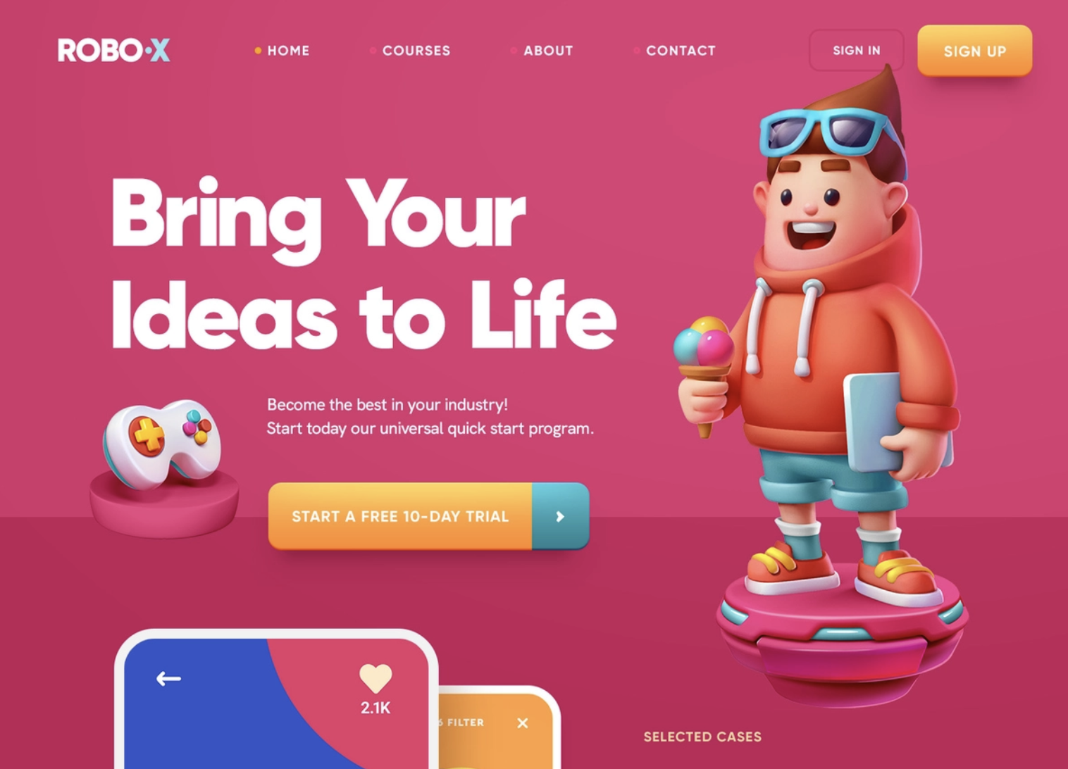
Website/3D illustration, © copyright Mike Creative Mints
- Visual Representations: This dimension includes typography, icons and other graphics users interact with. Visual representations can supplement or replace words for the communication of information. As an example, think about the layout, and features of the task ribbon on MS Word as you type an assignment.
- Physical Objects or Space: this refers to ways or mediums in which users are interacting with the application or product. For example, on what kind of devices are you reading this information right now? Where are you reading this?
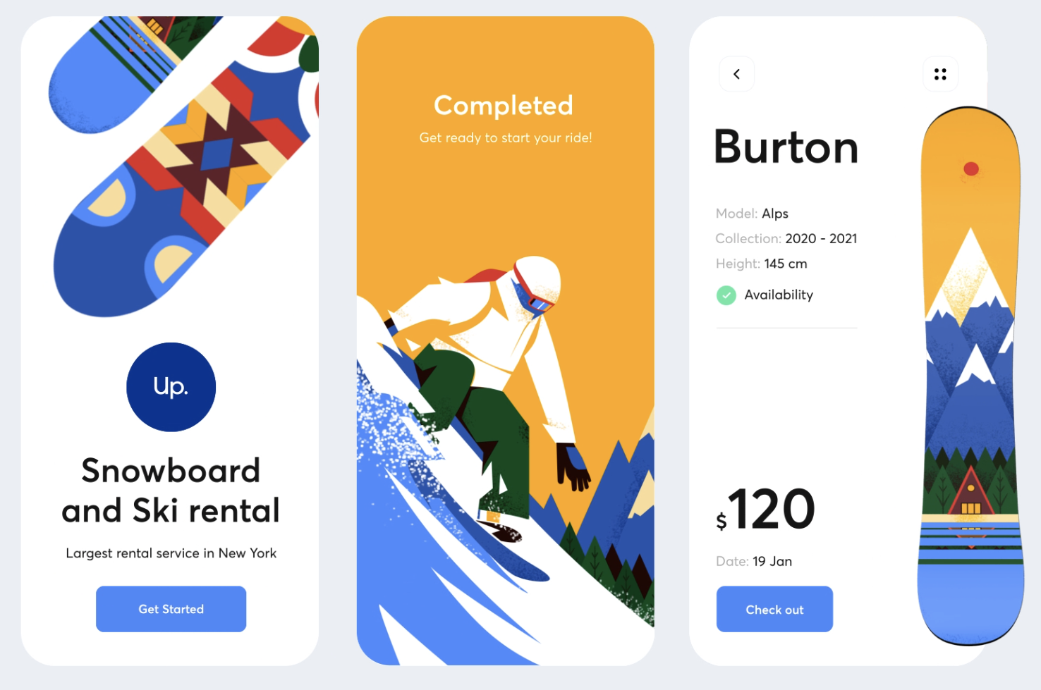
Up - design for mobile app, © copyright Outcrowd
- Time: “While this dimension sounds a little abstract, it mostly refers to media that changes with time (animation, videos, sounds). Motion and sounds play a crucial role in giving visual and audio feedback to users’ interactions. Also of concern is the amount of time a user spends interacting with the product: can users track their progress, or resume their interaction some time later?” (Siang. 2020.)
- Behaviour: this dimension considers both how users can perform actions or complete tasks, as well the way in which the application or product reacts to user inputs and provides feedback.
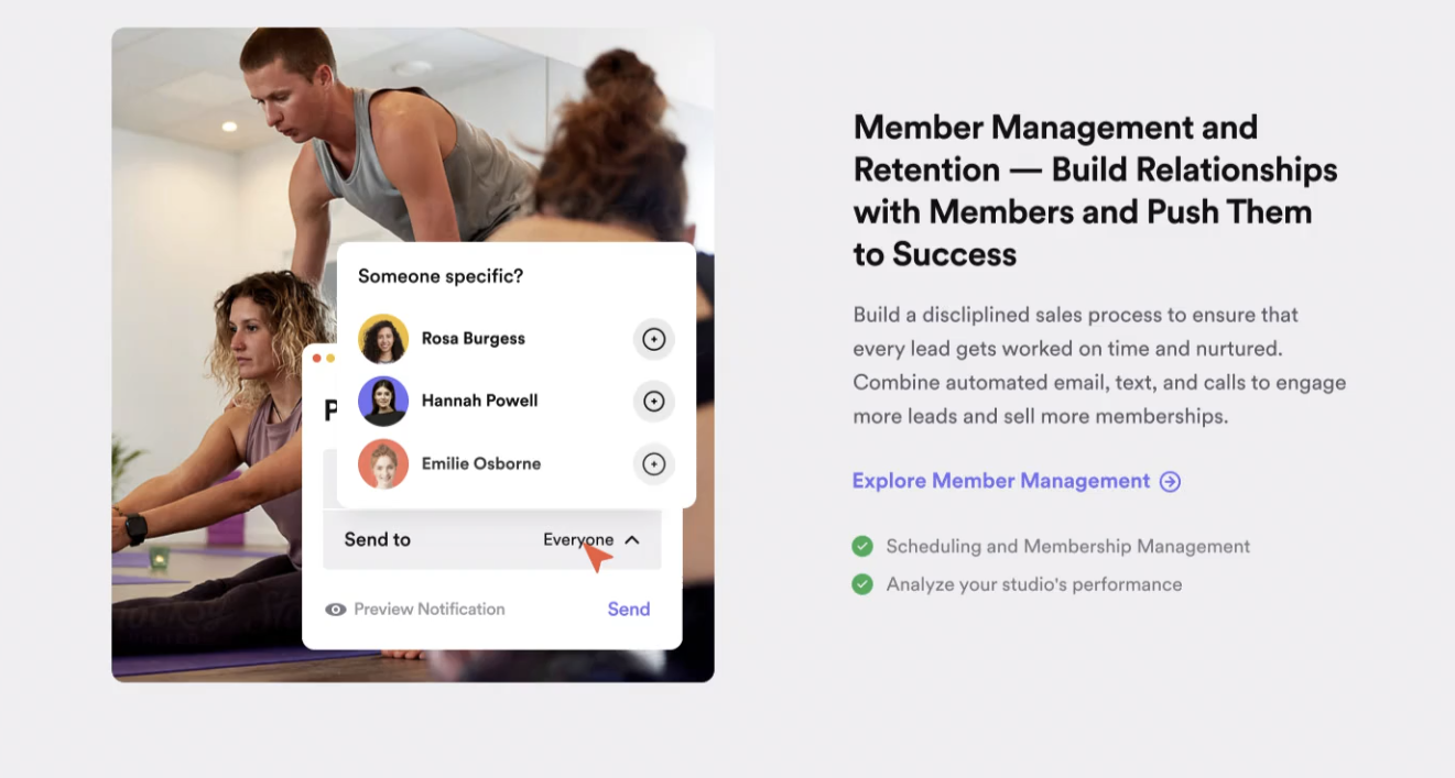
Glofox website is live!, © copyright Balkan Brothers
Basic HTML/CSS/JS elements of interaction design
Here is a quick refresher of the parts of an interface that are actually tools for you to communicate to the user about navigational direction, instruction, and the look and feel of your website, which represents branding and visual impact.
Text
The words on the page are the most obvious and direct form of communication with the user and provide:
- instruction
- navigation
- information
- search engine optimisation (SEO).
One of the many ways that search engines get results is that their robots 'read' the text on a page to point searchers to those pages that have the precise terms in the content, ensuring relevancy.
Images
"Images" refer to illustrations and photographs. They are used to:
- provide visual elements such as dividers and backgrounds
- make eye-catching or branded navigational elements such as buttons or links to other content
- Note: the logo is often an image, rather than styled text, so be aware that search engines won't be able to 'read' the text in an image — so there is a trade-off between design and SEO. Search engines will 'read' the image name in the script, so be descriptive when naming them.
- provide context and information for content such as a banner across the top of a web page that is unique to each section
- represent a small version or "thumbnail" of a larger version of the image or as a link to video content. The tiles on the YouTube homepage are examples of thumbnails representing the content that follows when you select it.
Image types (i.e. .jpg and .png) have evolved over time. The developer resources for Mozilla provide clear information about the types of images used today and historically.
Links
Links (not to be confused with the HTML <link> tag) can sometimes be called "anchor tags". By enclosing a location in an A tag, the user will open that location when the enclosed content is selected. If the target content is on the same page, they can be referred to as 'jump' links, and you simply set a point on the page with an ID, which acts as an anchor for the A tag to point to from another point in the page. Jump links are often used for FAQ pages, where there is a list of questions at the top, that jump to the appropriate answer further down the page. They save the user from having to scroll endlessly.
Buttons
A button is a navigation item that is not attached to a menu. It's essentially an element that has been styled in a certain way to let the user know it's interactive and navigational. The button will have text describing what happens when selected, such as 'submit' or 'next'. It is often designed to appear as if the user literally pressed the button down when it is selected.
A button can be used as a 'call to action' (CTA) – such as "Check out today's deals!" which informs the user exactly where the design team wants them to go.
Form elements
A form allows users to enter information that is transmitted to a server and passed to whomever or whatever needs it (i.e., a mailing list database or webmaster). Form input types include:
- text (a single line input, or a large 'text area' supplying an input area for multiple lines)
- numbers (limit users to enter numbers for a post code field for example)
- radio buttons for a single selection from a list
- checkboxes for multiple selections from a list
- drop down list selection (select and option)
The names of the fields are called labels. Labels, fields, and submission are fully customisable in terms of functionality, size, style, input expectations and requirements. W3 has a great interactive tutorial.
Carousel/Gallery
This is a function that displays a group of images or even video content and generally allows the user to navigate to the previous and next items. They are frequently used on homepages to display marketing messages. The Warehouse uses one to display products they want you to see immediately on load.
Modal/Lightbox
This is a window that pops up on top of the page content. Usually it dims the page the user is viewing behind it so the focus is the window alone. The user needs to interact with it to dismiss it and view the main content again. Modal windows are often used to encourage people to sign up for an organisation's mailing list but can be used for anything that requires the user's complete attention.
Map
You can easily embed a Google Map into your project using coordinates and a special piece of code, called an API, provided by Google. Find the code and practice at W3 schools.
Date/Time pickers
This Jquery (a library of JavaScript snippets) solution allows web developers to easily insert a function that lets users select a date, time, or special range of dates. Learn how it works on JqueryScipt.net
Further information
For further information on Interaction Design, take some time to view the following resources, as well as undertaking your own research.
- Interaction Design Foundation (n.d.) Interaction Design
- Babich, N. (October 16. 2019) What is Interaction Design & How Does it Compare to UX? Adobe XD Ideas
- Teo Yu Siang (2020) What is Interaction Design? Interaction Design Foundation
You have already encountered the concept of usability as a principle of UX design. Usability can be, not surprisingly, described as the parameters through which you judge whether or not your product is easy to use.

Usability is enhanced when five key factors are met. Those five factors are:
- Learnability: How fast users can understand the basic functions of your product.
- Efficiency: Is the entire process efficient or time-saving?
- Memorability: Is a repeat user able to come back to the product and remember its basic functions?
- Errors: Are there any errors made by users? Can these errors be negated?
- Satisfaction: How would you rate the satisfaction level of users?
The way your product looks has an impact on how users experience them. Visual design centers on how a product looks. Colours, fonts, images, illustrations, icons, and other graphics are some of the building blocks of visual design. Good visual design enhances a user’s experience, keeping its users engaged while they navigate and use the product. It also builds a positive and consistent brand image and communicates the right information to its users.
Check out these resources on Visual Design for some further information and good examples of visual design.
- Gordon, K. (March 1, 2020) 5 Principles of Visual Design in UX. Nielsen Norman Group
- Babich, N (April 7, 2020) The Role of Visual Design In User Experience. Adobe XD Ideas
- Mesibov, M. (November 17, 2015) How Visual Design Makes for Great UX. UX Booth
Definitions
A prototype is ‘a simulation of the final product. [it is...] an interactive mockup that can have any degree of fidelity. The main purpose of building prototypes is to test whether or not the flow of the product is smooth and consistent’ (Banerjee 2014). Prototyping is the iterative process of producing prototypes.
The prototyping process starts with user or task flows, sketching, and creating wireframes to generate ideas and test layout and navigation. As the design process progresses, you build prototypes that are more detailed with every iteration and have a greater level of fidelity. Each prototype moves you closer to the final product.
Fidelity is the level of design and functionality of a prototype. Prototypes can be low-fidelity (lo-fi) such as hand-drawn sketches and paper prototypes or high-fidelity (hi-fi) rendered and polished layouts and mockups on software.

Iteration
‘Where failure is inevitable, prototyping allows us to fail faster. When combined with an effective feedback and collaboration workflow, it provides the additional eyes that help identify flaws and turn them into improvement opportunities... Prototyping is a preventative workflow that reminds us that ideas are disposable. It saves us a ton of time in long run, and helps us fix issues before they become too expensive. We shouldn’t think of prototyping as a waste of time, but rather a method of identifying and discarding the ideas that simply aren’t going to work’ (InVision n.d.)

Prototyping is an iterative process. Iteration is when a process is repeated, inching closer and closer to the end-goal. The end point of each step is the start of the next step.
Prototyping in an iterative manner is beneficial because:
- It is far more affordable to redesign prototypes compared to the cost (and time) associated with redevelopment of a launched UI.
- Prototypes are effective tools to communicate ideas between designers, developers, users, and other stakeholders in the first stages of the user-centered design process.
- Prototypes can be used to complete user testing. Designers can observe the human interaction with user interfaces even before these interfaces are designed and developed. This ensures you launch a successful product, rather than a bug-riddled one that deters potential users.
- gives the customer a complete idea of how the final product will look
- streamlines the design process, enabling you to focus on important interface elements and abandon elements that hinder usability
- provides a way of evaluating the technical feasibility of the product and highlight physical, technical or financial obstacles or constraints.
In theory, you could start prototyping at any level of fidelity and iterate from that point. However, due to the costs – both monetary and time – associated with prototyping, it is recommended to start with lo-fi prototypes and progress through to medium fidelity clickable wireframes, and finally to hi-fi digital prototypes. At each stage, there should be testing and redesign to ensure concepts are valuable and improved.
Prototyping in an iterative manner allows you to test design ideas before creating more detailed prototypes and finally launching a product. It is essential that thorough testing happens throughout the prototyping process and at each iteration. Discard ideas that are not working and improve the design as you observe and learn more about how the user interacts with the design. User testing is the best way to find out if the users’ needs will be met. There is a significant difference between having a good idea and having a product that users actually want to use.
Low-fidelity Prototypes
Static images including sketches, wireframes, and flow diagrams are great for idea generation and initial testing. They are an important part of the prototyping process. However, they lack interactivity so can only take us so far in the process. Once you have completed user or task flows and wireframing, you can begin building low-fidelity (lo-fi) prototypes to really get a sense of how an interface and the user experience works.
Lo-fi prototypes usually resemble wireframes but with an added interactive component. The focus still tends to be on general layout and navigation without much consideration given to graphical design elements.
Lo-fi prototypes share the following characteristics:
- Minimal visual design.
- Content is not included in entirety, only the bare minimum to convey meaning.
- Interactivity can be simulated by a real person “playing” the computer or by connected wireframes using tools such as Adobe XD.
The most common examples of lo-fi prototypes are paper prototypes and clickable wireframes.
Paper prototypes
Paper prototypes are created using paper, pens/markers, scissors, tape, glue, post-it notes, and the like. A person plays the role of the computer, switching the sketches depending on what the test user selects. State changes of buttons, icons, keyboards, pop-up boxes, and input fields can all be represented with paper cutouts that the human “computer” places on the paper interface. Watch the following two videos to see paper prototypes in action.

Watch - Mobile Application Design-Paper Prototype (1:16 minutes)
In this first video, the paper prototype has a paper device with a cutout screen. The pages that a user goes through to complete the task are drawn on one long piece of paper that is pulled through the screen from right to left. Additional pieces of paper are used to show overlays such as the keyboard.
Watch - Low fidelity prototype testing of the EE app (2:52 minutes)
this second video, the group have used colour and small pieces of paper to represent different elements of the interface. A person plays the computer and adds different elements depending on what the tester does. The human computer is able to mimick interactivity and functionality.
Benefits
Benefits of paper prototypes include:
| Speed | Quick to produce and change. This allows for rapid iteration, experimentation, and problem solving. It is quick and easy to cut out (or erase and redraw) elements and move them around. |
| Cost | Paper prototypes are cheap to produce. |
| Creativity | Ideas are not constrained by a platform’s limitations or rules. Due to low investment of time and money in producing the prototype, there is less attachment and bad ideas are more readily dismissed. Ideas are more important than the tools used to create them. |
| Collaboration | The physical nature of paper prototyping lends itself to a collaborative environment. Anyone can contribute ideas as a lesser skill set is required than when creating a hi-fi prototype. |
| Feedback | Feedback focuses on ideas and functionality instead of product aesthetics. |
| Documentation | Paper prototypes can be used as reference material with notes and revisions written on the prototype or attached. |
Disadvantages
Paper prototypes can be unrealistic and require test users and stakeholders to imagine how the paper prototype represents a final digital product. It can be hard, or impossible, to convey complex animations and transitions. These two factors mean that testing can be inaccurate.
Depending on the complexity of the paper prototype, it may take a longer time to create than a simple clickable wireframe in dedicated prototyping tools. It is also necessary to have more people involved in testing: someone to play the computer, a facilitator, an observer, and the test user.
With all the above in mind, it is recommended to only use paper prototyping in the early stages of design.
The people factor
As a tool for testing with actual users and getting user feedback, lo-fi paper prototypes give us lots of actionable feedback.
We get to observe the way users work through our product. When we test using paper prototypes, we create realistic and clear scenarios or tasks for users to perform. We set a brief outline of what they need to do but they need to do their own problem solving in order to indicate to us whether it is usable or not. If they keep making mistakes that tells us that our interface is not learnable or intuitive.
When preparing to present or test paper prototypes, rehearse thoroughly so you know what every click and swipe does. While a human is playing the computer, you still want to try to give a smooth user experience.
Since these prototypes are lo-fi outputs, our testers are more likely to give us critical feedback on our product as they are not concerned that designers are hugely invested in the design.
Clickable wireframes
Clickable wireframes have higher fidelity than paper prototyping but still less than digital. Often, they are classified as medium fidelity and bridge the two.
Static wireframes are linked together by creating triggers. When a user interacts with a trigger, the next wireframe appears mimicking the expected flow. They generally have limited interactivity depending on which program is used to create it.

Clickable wireframes do not often look like finished products. They lack content and graphic design elements. However, they remove the requirement to have people play the computer and facilitate which means the test user can interact more freely with the prototype. There is also the benefit that you likely already have digital wireframes created by this stage, which you can use to make the process more efficient.
Watch - Quisq-Mobile Application design: final design prototype (1:16 minutes)
The following video demonstrates a clickable wireframe prototype.
High-fidelity Prototypes
Once you have completed testing using low or medium fidelity prototypes, and are confident in your design, you can begin building high-fidelity (hi-fi) prototypes. Hi-fi prototypes are more costly and take longer to create than lo-fi prototypes but offer a better representation of the final product.
Hi-fi prototypes bear a close resemblance to the final product with functionality, graphic design, and content included. Hi-fi prototypes are often used in testing with real users or to get final stakeholder approval. High functionality and visual design of hi-fi prototypes give stakeholders an accurate representation of the final product and get them excited about the product.
Hi-fi prototypes include digital prototypes created using prototyping tools such as Adobe XD and InVision, as well as native prototypes.
Hi-fi prototypes share the following characteristics:
- Detailed visual design which looks like a real website or app.
- Content is the same (or similar to) how it will be in the final design.
- Highly realistic interactions and functionality.
Digital prototypes
The most common type of hi-fi prototyping is creating digital prototypes. Digital prototypes are created in prototyping tools such as Adobe XD, UXPin, and InVision. There are a huge number of prototyping tools on the market, which is growing constantly. Read about the Interaction Design Foundation article on the 10 Best Prototyping Tools for UX Designers for an overview of the most popular tools on the market today.
Digital prototypes are realistic enough to accurately test most interface elements and to present to stakeholders for design approval.
Figma is a great prototyping tool that helps designers and developers build digital products. It allows them to edit, comment, and review designs and code in a collaborative manner.
To see how you can use Figma to bring ideas to life click here to access their resources and lessons.
For more information watch the following video.
Benefits
Prototyping tools allow designers to create responsive prototypes that work on a variety of devices.
Often you can build wireframes and lo-fi prototypes in the same prototyping tools that you use for digital prototypes. This makes it easy to progress with efficiency through the prototyping process.
User testing is easier and more accurate because:
- It is not necessary to explain the prototype so the designer can focus on observation.
- Realistic interactions and functionality so the prototype is more comparable to the final product than earlier prototypes.
- The user requires fewer explanations, is interrupted less, and behaves more naturally.
If you want a hi-fi, computerised interface, digital prototypes are faster than native prototyping which may require code. Speed varies between prototyping tools, but most have user-friendly interfaces and features like interactive elements or drag-and-drop.
Watch the following videos for a brief introduction to digital prototyping tools.
In this first video, you can see how you can use Adobe XD to design, prototype, preview, and share.
In this second video, you can see how you can create prototypes in InVision including preview and collaboration tools.
Native or coded prototypes
Designers that are confident coders may create hi-fi prototypes using code. These prototypes are fairly close to what would be released as the final product, for example, a fully functioning sandbox.

Native prototypes force designers to work within the confines of the system the final product will be released in. This may limit creativity, but it does produce a realistic build. The code may provide a good foundation for the final product, saving time and money later, but it is still likely to be only to a prototype standard. The goal should not be to create reusable code. You can learn more about native coding in the following video.
The following resources will extend your knowledge about prototypes and help with the development of prototypes in your workshop sessions. Your tutors will also direct you to appropriate sources.
- Interaction Development Foundation (n.d.) Prototyping.
- Adobe XD Ideas Prototyping – this link will take you to a range of resources on Prototyping
In your practice sessions you will be introduced to a number of prototyping tools and have the opportunity to use them.
It is now time to create lo-fi and hi-fi prototypes for a website you would like to redesign.
- Paper prototype
- Clickable wireframe prototype
- Digital prototype.
1. Paper prototype
Draw 2 or 3 different sketches on your visual diary/paper of the website you would like to redesign, incorporating the pain points identified in the research and use cases identified, having in mind the target audience group.
Your sketch must include the following:
- home section
- about section
- contact section
- section to showcase the products/services
2. Low fidelity Prototype (Lofi / wireframes) in Figma
Choose appropriate frames in Figma to create wireframes with black and white placeholders for the sketch you found appealing to users.
3. High fidelity Prototype (Hifi / interactive) in Figma
Create interactive mobile, tablet and desktop versions for the wireframes with actual text, images, colors, shapes and icons. Add click events appropriately to enable user to move from one page to another.
When creating visual designs, you must consider:
- Creating a clear visual hierarchy
- Defining functional regions of a page
- Structured content
- A consistent and unified design
- Building page elements around imagary
- Consider appropriate colour combinations
- Use a variety of design techniques (layout, pattern, texture, colours).
Share your prototypes in the Eats and Treats Forum. Discuss any strengths and weaknesses of the interface you noticed while producing the prototypes.