In this section of the course, you will be introduced to various concepts of design that will support the development of the user experience. These topics are very pertinent for the design of websites in particular.

The Interactive Design Foundation (2010) states that “Visual design aims to improve a design’s/product’s aesthetic appeal and usability with suitable images, typography, space, layout and color. Visual design is about more than aesthetics. Designers place elements carefully to create interfaces that optimize user experience and drive conversion.”1
Topics we will cover include the elements of visual design, typography, colour theory, and a consideration of motion design.
The principles of design are rules a designer follows to create a compelling and attractive composition. Fundamental design principles can include emphasis, balance, alignment, contrast, repetition, proportion, movement and white space.
We will cover nine of these principles in more depth.
Contrast
Contrast relates to the amount of visual difference between elements in a composition.
Too little contrast in a design can look dull and uninviting, and individual elements may be harder to distinguish.
Too much contrast can create a harsh, unnatural or chaotic appearance.
Aim to create an adequate amount of contrast to complement the brief’s requirements and each element in a design.
Text in a design usually requires strong contrast to ensure legibility. Be particularly careful when placing text on top of colour (mentioned in the Colour Theory topic above), texture or a background image, as it may require special treatment to provide adequate contrast. Try using stroked outlines, drop shadows or glows.
Headings and subheadings should have a stronger contrast than the body text to help structure a document.
You can use strong contrast selectively to emphasise or focus a viewer’s eye towards a particular element that you want to be noticed first.
Tonal contrast
Tonal contrast is the darkness or lightness of an area. Sharp changes between dark and light colours create dramatic contrast, while a transition using intermediate tones creates softness with less contrast.
Tones can be digitally manipulated in Adobe Photoshop with adjustment features such as Brightness/Contrast, Levels or Curves within an image.

When you are placing text over an image, consider the tone of the overall area. You may need to use white or light coloured text if the tonal area of the image is too dark.
Colour contrast
Careful application of colour can improve contrast. Remember, colours opposite each other on the colour wheel are complementary and have the most contrast.
(Consider revisiting the Colour Theory topic for advice on selecting colours.)

Size contrast
Differences in size create higher contrast between elements. This applies to the size and weight of text, the size of images and objects and the weight of strokes.
Style contrast
Use styles of typography, illustration and photography to emphasise contrast. Consider juxtaposing elements, highlighting their differences.
Repetition
Repeating design elements throughout a composition helps to improve the consistency and unity within the design.
Logos, typefaces and colours are examples of elements that should be repeated when designing a cohesive identity for a brand.
Finding a consistent and relatable graphic indicating the start or end of an article in a magazine or website is another example of effective repetition.
Warning: Be careful not to overdo it. Too much repetition can become monotonous!
You can use repetition to create elements in a design by combining elements into patterns or textures.
Alignment
Alignment is about connections. Assets you place should have a visual connection to something else in a composition. Alignment is one way to organise assets visually. Assets in your design can be aligned in a variety of ways, depending on your design requirements.
We often associate alignment with text. Text is often more legible when left-aligned because it creates a consistent starting point for each line of type. We see left-aligned text in books, magazines and on the web.
Other elements in a composition can also be aligned to the left, helping to connect them visually.
Centring elements can help with symmetry. However, components that do not conform to the alignment can look out of place. Greeting cards and wedding invitations commonly use centred text. Centring creates inconsistent start and endpoints and can make reading a more extended section of text more difficult. For these reasons, centred text should be used sparingly.
A connection can be made both horizontally and vertically, and the choice of alignment will depend on other design decisions and principles.
To ensure that alignment is precise, you can use tabs, guides, grids and alignment features available in all the Adobe software components.
If you are designing on paper, use a pencil and ruler to lay down some temporary guidelines.
Proximity
Closely related design elements should be grouped near each other. This is to establish clear visual units and relationships. Avoid scattering related elements around a layout unless they are visually connected by some other means.
Aspects of proximity you may have unconsciously recognised include:
- captions should be placed near the graphic they relate to
- subheadings should be spaced closer to the paragraph they relate to than the previous unrelated paragraph
- elements within a logo should be close together so they form a single compact unit.
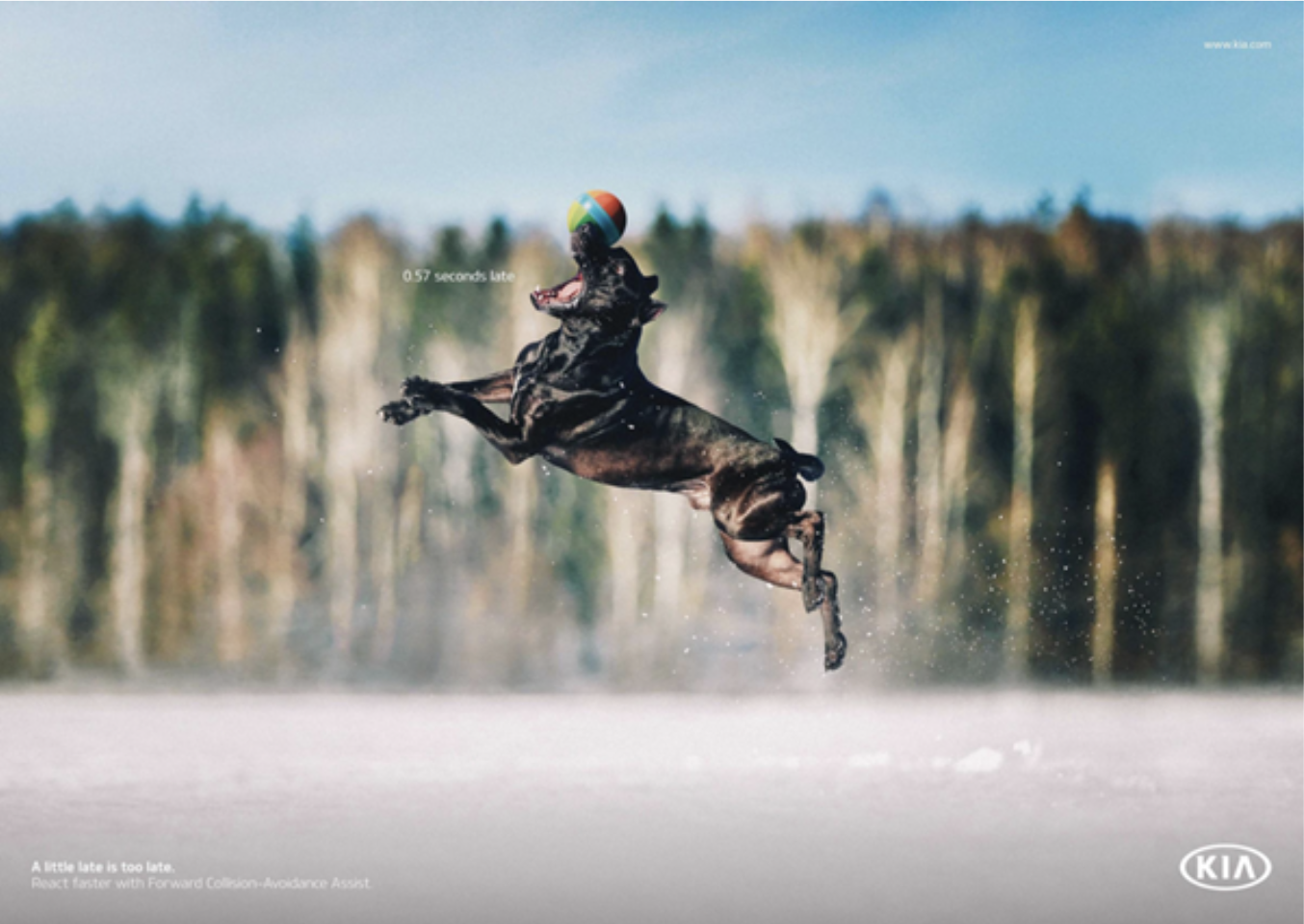
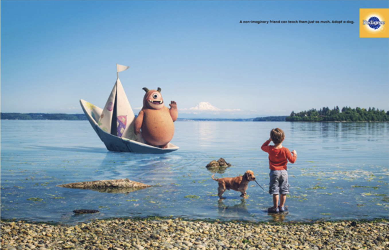
Proximity is about creating and reinforcing the relationships between elements. The closer together they are, the stronger their relationship. (Note the proximity of the caption next to the dog's attempted catch in the image above.)
Balance and symmetry
We naturally prefer things to balance and can subconsciously feel uncomfortable or tense if something is out of balance. This applies to the layout of elements in a design.
Balance is achieved by careful placement of elements next to each other and with the weight of each component distributed evenly. The components' size, shape, colour and tone determine their weight in a layout.
Symmetrical balance
Symmetrical balance is achieved when elements are placed evenly about a central axis of a composition to create a mirror image of the elements’ overall shapes and spacing.
This formal, symmetrical balance is straightforward to achieve and is a good choice if you want your design to imply dignity, strength and dependability.
However, it can also be considered boring, old fashioned and predictable.
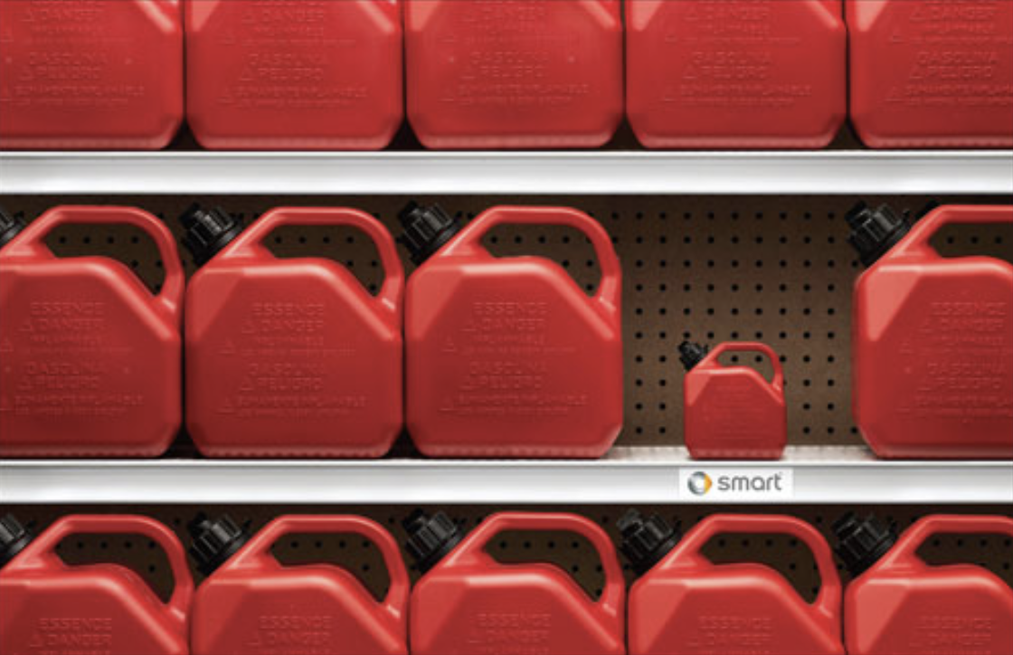
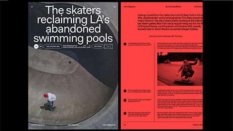
Asymmetrical balance
Asymmetrical balance can create more dynamic layouts.
However, it is not as simple to achieve.
Considering the effective ‘weight’ of elements–solid filled or coloured features will have more effective weight. Smaller unfilled or greyscale objects have less.
Use multiple, or more, minor details to balance a more significant single element (see the image below).
Note: Images generally have more weight than a similar-sized block of text.
Radial balance
With radial balance, elements radiate out from a centre point in a circular arrangement. Components can be evenly spaced and sized for a more formal symmetrical radial balance or be asymmetrically arranged for less formal results.
Hierarchy
Hierarchy in a composition is achieved when there is a clear order of importance. You can create a hierarchy by distinguishing elements using contrast, size, shape, style, colour, movement, or a numbered sequence.
In documents containing text, hierarchy is created using styles for headings, subheadings and body text.
On a poster, the main graphic might be used to attract the initial attention of a passer-by who will then see the title text, followed by the smaller details.

Larger documents might be broken up into chapters and sections. Large technical documents often have each heading, subheading, or paragraph(s) numbered sequentially (e.g. 2.39) for quick cross-referencing.
Movement
Movement can be used to convey energy, even with a static page.
Angling text forward, using lines and applying motion blur are all ways to show movement in a static document. Consider the path the viewer’s eye will follow. Does the movement match the motion?

Depth
On a 2-dimensional surface, the illusion of depth and distance between elements can be simulated and manipulated in a variety of ways.
We can imply objects and elements have a 3-dimensional form and volume by projecting isometric (30°/60°) or oblique (45°) faces.
Longer projected faces imply taller or larger objects.
Photographing objects from an angle helps to convey their volume.
Perspective
The further away an object is in our vision, the smaller it appears. We can use this principle with one, two or three vanishing points.
One-point perspective
Used when viewing something face-on. A single vanishing point with and all parallel lines converge at this point. Elements get smaller as they get closer to the vanishing point.


Two-point perspective
Two vanishing points are used and lines on each facing side of an object go towards a different vanishing point.

Three-point perspective
This is the most true-to-life method of drawing perspective. It uses a third vanishing point for converging vertical lines. It only really becomes useful for a very tall object, such as a skyscraper. It is difficult to apply and is primarily used in illustration and drawing.

Lighting, shading and shadows
Brighter objects or elements tend to feel closer. Using gradients and shading on components can help to imply they have a 3-dimensional form.

We expect physical objects to cast shadows, and the qualities of a shadow tell us how big and how close to a surface an object is. Drop shadows, if applied effectively, can provide depth to an otherwise flat design.

Design 'elements' are fundamental to all design. Designers use the elements to create images, convey mood, draw the eye in a particular direction, or evoke emotions. These elements include point, line, shape, texture, colour, space, pattern and many more.
The information below will cover 5 of these elements.
Point
A point is the simplest design element — typically a dot or a small object marking position. A single point can focus attention on a position, such as a location on a map. When multiple points are used, the brain creates connections between the points, forming lines or shapes.

Line
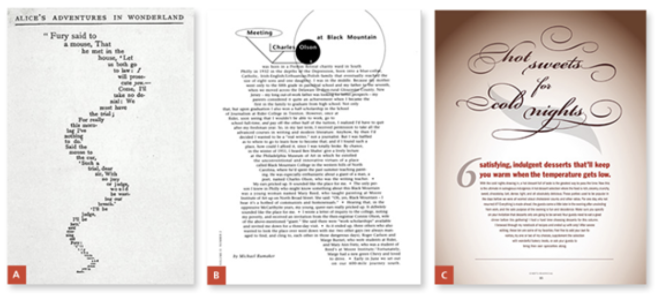
A line can be more than a continuous thin mark. A better definition for a 'line' is 'anything that connects 2 points'.
A line does not necessarily need to be continuous or solid, it can be anything that the eye can follow between points:
- several small objects arranged to form a line
- a ‘line of text’ is a line
- a small, consistent gap between 2 shapes could even form a line.
Lines are a powerful design element that can be used effectively for many different purposes. For example, lines can:
- direct a reader’s eye
- connect information
- separate information
- highlight information
- define forms (shapes or 3-dimensional objects)
- create a pattern or rhythm when repeated
- imply movement
- suggest moods and emotions
- create a sense of perspective/depth
- represent data (e.g. barcodes, graph lines).
Qualities of line
Lines don’t have to be consistent, continuous or straight. They can be applied in various formats to express different concepts, emotions, styles etc. For example:
- jagged, straight lines could be used to suggest energy, excitement, violence etc.
- smooth, flowing curves create a soft, gently flowing, tranquil feeling
- a dashed line might suggest that something should be cut out
- curvy lines have an organic, natural association
- fine, straight lines might suggest precision.
Always consider the possible associations when using lines, so you don’t confuse or mix emotions. For example, using jagged or vertical lines in the logo for an airline might, on a subliminal level, suggest turbulence and danger.

Shape
A shape does not necessarily have to be filled with a solid colour or defined by an outline. The distinct form of a shape can be defined in a variety of ways.
Different categories of shapes include:
- geometric: triangles, rectangles, circles, polygons etc.
- natural/realistic: closely representing any natural or manufactured forms
- stylised: based on natural or geometric forms but with modified attributes
- random: without any conscious reference to any natural or geometric forms.
Shape can be used as an influential element in design. It can:
- attract attention to your design or the elements within it
- make a design more interesting
- symbolise an idea
- tie elements together in a design
- guide the eye around a layout.


Information that surrounds us is almost always presented to us in rectangles as this is the most practical and economical shape to work with. Books, newspapers, magazines, television, computer screens, mobile devices, photos, billboards, calendars, menus, letters and envelopes are all usually a rectangular format. This can make rectangular-shaped information look rather monotonous.
If you are working within a rectangular format, think about the shapes of elements in your design. What can you do to make the content more attractive or usable?
Tips for incorporating shape into your design
- Try flowing-text within a text box that is an interesting or relevant shape to the article. The use of the justify text alignment option will help the text to fill the shape precisely without a ragged edge. Keep to simple shapes to avoid text breaking up.
- Liven up a boring rectangular block of text by placing graphics inside or around the edges of the text frame with text wrapping applied to them.
- Create an attractive shaped negative space within rectangular media with the use of shaped borders.
- Clear-cut a subject in a photograph so that it is isolated from the photo’s rectangular background.
- Place images within interestingly shaped content boxes. Cropping a photo into a long, thin rectangular shape can also be an exciting variation to a standard (3:2 or 4:3) photograph format.
- Try dividing an image geometrically into segments and then move the pieces apart slightly or apply different effects to distinguish each segment.
- Using careful composition and arrangement of the subject when taking photos can make photos much more powerful. The eye responds particularly well to strong geometric relationships between objects in a photograph, even when they may not be so obvious.
Space
A common error when laying out a document is thinking that every space needs to be filled. You should be aiming to create space, not to fill it. A common phrase to sum this up is ‘less is more’.
Space is a vital element required to separate information in a layout. People can scan, absorb and process information more efficiently when it is presented clearly in separate chunks.
If the information is surrounded by clutter, the brain has to work harder to filter out the excess information to find out what is important.
A reader will be drawn subconsciously toward those elements in a layout that have plenty of space surrounding them.
The term ‘space’ does not necessarily mean an empty area of white space. It may be filled with a colour or a simple background texture.
If you give someone a page of text that fills an entire sheet of paper from edge to edge, they may agonise over having to read it. However, consider if you presented the same amount of text laid out over 2 pages. This would allow for generous margins, more space between lines of text, and allow room for pictures. The reader will find it easier to read the 2 pages than the single page with the same amount of text.
Texture
All surfaces have a specific visual appearance or a tactile quality. You are surrounded by many different textures in your everyday life.
Look at the following examples of textures that can be used throughout your designs.
- Natural: Surfaces that occur naturally (e.g. tree bark, leaves, rock, water ripples, sand, fingerprints, skin, fur).
- Man-made: Manufactured surfaces (e.g. fabric, paper, printed text, bricks, metal, plastic, tiles, glass).
- Imperfections: Added (random) textures (e.g. scratches, tears, cracks, rust, splotches, stains, effects of weather).
Many of these textures are 'tactile' (meaning that you can touch and feel them). Adding visual textures to elements in your designs adds a certain quality that will often make your work a lot more interesting than boring, flat, plain areas of colour.
Best Practices
Download this best practice document provided by YooBee to help with your design process.
Activity - Knowledge Check
You were introduced to typography earlier in this module. Typography is one of the most important aspects of good design, and “involves the use of typefaces and the organization of those typefaces to create readable, usable and ideally, user-friendly interfaces or experiences. Effective typography enhances UX, optimizes usability, catches users’ attention and has the potential to increase conversion rates”.6
Watch - Typography for Developers Tutorial - Full Course (2:04 minutes)
freeCodeCamp (www.freecodecamp.org) is an organisation that provides an online learning web platform, community forums and other services that provide learning in web development. One of tutorial available is the video ‘Typography for Developers’. Please be aware it is just over 2 hours in length but is a comprehensive presentation typography. The video is timestamped so you can watch the relevant sections as you wish.

“Colour [sic] is one of the most powerful tools for visual communication. It can influence our emotions, our mood, and our behaviour. That’s why it’s so important for product designers to select colours carefully.”7
In this section we will engage in an exploration of the use of colour in UX design.
You may remember at primary school learning about colours and finding great joy discovering that when you mixed colours together you got a new colour! What are the primary and secondary colours?
Colour theory helps us understand why some colours look good together and others don’t? It influences your clothing choices and combinations even.
Watch - Colour Theory basics (6:58 minutes)
Check out the video “Colour Theory Basics” for an explanation of colour theory, the colour wheel, colour harmonies and how to choose colours that work well together. This is one of the keys to the use of colour in UX design.
The following on-line articles are an example of the resources that are available on the use of colour in UX design. You are also encouraged, as always, to do your own independent research.
- Fanguy, W. (November 3, 2020) What is Color Theory? Meaning & Fundamentals. Adobe. (Check out the other resources available at Adobe XD Ideas as well)
- Interactive Design Foundation (n.d.) Color Theory.
In this final video you are introduced to some tips for ‘perfect’ colour in UX design. The presenter states:
“Maybe you’ve followed all the colour harmony and colour theory tutorials to a tee and generated a complementary colour palette, but you notice that the colours don’t seem to match very well, perhaps they look harsh or a bit muddy and unprofessional and you don’t really know why. The part that's often missing is understanding tone, tint, shade, and temperature. What I discovered is that on digital screens, there is a formula and safe range of Saturation and Brightness that will result in a perfect palette for each category every time.”
Watch- Super Pratical guide to colour theory, colour models and perfect colour palettes (24:08 minutes)
Watch the video and discover the ‘secret'. Does 'the secret' work for you?
Spiderman Movie landing page concept, © copyright Minh Pham
The human eye is drawn to movement. “Motion is essential part of the language that designers use to communicate with users. It is used to describe spatial relationships between states and functionality of individual elements. Thoughtful motion in design can enhance the user’s experience.”8 Motion enhances the usability of UX in many ways, but can easily create the opposite effect, therefore a diligent use of motion is important. Motion can drive user attention, be used to confirm actions, and brings delight to the UX experience. “Motion-based design elements can be seen in a variety of forms, including transitions, animations and even moving textures that mimic 3D depth.”9
For further information on motion design check out the following links. Remember that these are just a taste of the breadth of information available and you should engage in your own independent research to support your learning and develop your skills in motion design.
- Babich, N. (2016) Motion in UX Design.
- Rues, J. (2018) The Importance of Motion for UX Design
- Babich, N, (2020) Animation Principles for Designers.
Watch - How to make your designs move in adobe (26:24 minutes)
In this entertaining and informative video, Joey Korenman provides an overview of motion design, as well as a consideration of using Adobe After Effects in your workflow. Adobe After Effects is an industry-leading motion graphics and visual effects software platform.