In this course you have learnt about aspects of UX design. The principles and practices of UX design are designed to guide and influence the way you approach web design and development, but in order build that great looking website you will need to learn and gain fluency in several new languages.
Now you will start learning about the process of building a web page. You will be provided instruction on HTML, CSS, JavaScript, and the relationships between them. One of the analogies that is helpful to describe those relationships is to compare them to the parts of a house.
Languages of website development
All websites are built using three languages. These three each have different roles to play in front-end web development.
Front-end web development is the creation of what your users will see and experience when they visit your website, it’s all about the user experience (UX). Whereas back-end development is all about what makes the website function including the collection and storage of data.
-
HTML (HyperText Markup Language) like an architect, it houses the structure and navigation and indicates all text and images for the website. It's the house that all of the code sits inside.
-
CSS (Cascading Style Sheets) like an artist, it styles the content; it handles the appearance or presentation of the website, including colours, font styles, and display conditions. It enables you to apply one set of appearance instructions across a multitude of web pages instead of having to apply the instructions page by page or element by element. It provides the interior decorating scheme inside the house.
-
JavaScript like a wizard, it makes the content elements functional and dynamic; it organises the functionality and behaviour of the website, for example, the animations and pop-ups. It makes the lights and appliances functional.
Required Software
There are many software (desktop and cloud-based) applications that you will use in your website design and build. Yoobee recommends the following applications to use during your studies.
Trello
Trello is a web-based, Kanban-style, list-making application. It is free to set up an account and is recommended for your project planning and tracking. You will use this application for planning your projects.
Figma
Figma is a vector graphic editor that focuses on use in user interface and user experience design. It allows for collaboration and contribution from team members. You will use this application for prototyping.
Google Forms
Google Forms is a free web-based survey tool that you will use to undertake user research. You will use Google Forms for user surveys
You will need to set up a Google account if you haven’t already done so.
Atom Editor
Atom Editor is a free and open-source text and source code editor for macOS, Linux, and Microsoft Windows. You will use Atom for writing the code to build your website
To download and install Atom, head to their site and follow the instructions. A wealth of support information is also available on the Atom website
If you have any issues with the software setup consult the documentation available through the link above, contact your course tutor.
Hello, Hola, Kia Ora!
There are 195 countries in the world and approximately 6500 languages. Now, let’s add another language to that list, known as Hyper Text Mark-up Language or HTML.
HTML is one of the web languages that has been widely adopted and is supported by all modern browsers, offering a consistent viewing experience across platforms and devices. HTML5 is the latest version of the HTML standard.
What is HTML?
A monospaced font is used to format any code examples in the learning materials, to differentiate it from other content:
<p>This is an example of a piece of code.</p>
HTML is a method of simply using plain text to tell a web browser how to display text, graphics and other multimedia content.
The web standards group update the list of deprecated (no longer useful) codes regularly, the code snippets listed here have been checked and will be updated should there be any changes applied.
A good analogy of a mark-up language is of a journalist and the editor.
The journalist writes a story, and the editor uses a red pen and 'marks up' all the text that needs attention. A hashtag # might be drawn between two words that are attached together to indicate insert a space here. The journalist receives the story back and can make sense of the editor’s notes, because in the publishing world there is a set of rules for such text editing.
HTML works in much the same way.
Web page content is placed in a text document and then 'marked up' with special codes. A web browser interprets the codes, then format and display the page content.
Where an editor might use a red pen, HTML uses a set of angle-brackets <>.
Anything inside the angle-brackets is interpreted as HTML markup code. Anything outside is text content. The markup code tells the text how to behave, and voilà, a web page is created. The following is a simple example of some HTML:
<p>The deep blue sea.</p>
An HTML document is simply a plain text file, so it does not matter which application you use as long as it can export a plain text file.
There are 3 application types that you could use:
- a basic text editor or word processor
- web design application
- dedicated code editor.
Read on to learn how the 3 applications differ.
Basic text editor or word processor
Basic text editors are free software with a simple learning curve. However, there are no assistance or special features provided and no feature to quickly preview your webpages.
Examples of basic text editors include:
- Notepad (Windows)
- TextEdit (Mac)
- MS Word.
It is your choice whether you use Windows, Mac or Linux. The screen captures and code snippets using CodePen may look different from what you see in your browser. Certain features of HTML and CSS can differ to varying degrees depending on the browser (and its version), the operating system or the device used. It is recommended that you also have access to multiple browsers, operating systems and devices for testing.
Web design application or CMS
Web design applications (such as Webflow, Squarespace or Wix among many others) are available online.
These web design services have a minimal learning curve, with simple drag-and-drop features. Although, it might seem like the easier option to start with, learning to do hand-coding using a basic code editor or an online code editor will prove to be more beneficial in the long run.
Having a background in hand-coding will build a better understanding of the limitations these services have as well as the possible options you can explore in developing bespoke websites.
Dedicated code editor

In addition to the basic code editor and web design applications, there are also applications dedicated to code editing with features to assist you with entering code quickly and accurately.
These online code editors will colour-code different parts of your code automatically to make tags, attributes and text content easier to distinguish and can help you to identify errors such as missing end tags. It can also do quick previewing and has built-in FTP to upload and maintain sites.
These text editors are perfect for editing code documents because they offer syntax highlighting and code completion features, helping to speed up the development process.
Examples of dedicated code editors already installed as part of a Mac or Windows OS include:
- BBEdit (Mac)
- Notepad++ (Win)
- Atom
- Sublime text.
There are also Integrated Development Environment such as Replit that allows you to build your project online.
You can also use an online code editor such as CodePen*.
*You will use CodePen as part of your learning experience in this online course. You will be able to edit the code live and see the web preview as you go along.
To start an HTML document, there are a few minimum requirements you need to include. Each of the elements shown here, such as DOCTYPE, will be explained in another section. The code below is called HTML boilerplate—a template containing the minimum requirements we can use to start making a page.
<!DOCTYPE html>
<html>

<head>
  <meta charset="utf-8">
  <title>My Website</title>
  <link href="stylesheet.css" rel="stylesheet">
</head>

<body>
  My first webpage.
</body>

</html>
Now, below is what it looks like on CodePen. On the left are the codes that keep it running in the background and the web preview on the right is showing what was written inside the <body></body> tags.
All of the CodePen examples included in this topic are editable. That means you can play with the codes, make changes and see how it will preview in the browser. And don't worry, you won't break anything! Give it a go and try typing your name within the <body></body> tags.
Why is there so much code needed to display a single sentence?
This is the set-up for the language of the web—in this instance, it’s HTML5.
Think of it as the way our brain processes information and then sends it through the nervous system before moving our muscles to vocalise what we’d like to say.
HTML5 is used by web developers across the world to develop websites that can be viewed by audiences worldwide.
'Syntax' refers to the structure of a programming language. 'Semantics' refers to the meanings of words.
Syntax works together with semantics.
If we know both the syntax and the semantics of any programming language, we can easily write the code required.
When you get to grips with HTML and move on to other dynamic languages such as JavaScript and PHP, you will want to know the peculiarities of the syntax and semantics of those languages.
Syntax used in this topic
Because HTML5 is backward-compatible with previous versions of HTML which have less-strict syntax, there are some aspects (such as the use of capitals or lowercase) that can vary greatly, but are still be acceptable for HTML5.
This guide will provide examples largely using the XHTML syntax for consistency.
Due to its current prevalence on the web, you may find other sources of HTML5 on the web that may differ slightly — just remember that with HTML5 there is not necessarily a right or wrong way. It is really a matter of personal preference or organisation decision. The key is to be consistent.
Elements and tags

- Element
- Attribute
- Value
- Attribute
- Value
- Attribute
- Value
The first part of the HTML syntax we will look at is its elements.
These are basically labels that are used to identify and structure various parts of a webpage. Most elements in an HTML document have a start tag and an end tag.
These tags are surrounded by angle-brackets <>.
Certain letters or words are used for the different elements.
For example, the letter <b> is short for 'bold'. To make the word 'Whitcoulls' appear in a bold typeface, we can put a pair of ‘b’s inside angle-brackets and wrap these around the word:
Why the need for the angle-brackets?
Well, think about it: if we simply put a couple of ‘b’s around the words without the angle-brackets, how would the browser know what was text and what was markup?
The angle-brackets allow browsers to differentiate markup from content. Anything beginning with a left angle-bracket '<' and ending with a right angle-bracket '>' is understood as markup.
Anything else is considered content.
Some examples of element tags are:
<p>marks a block of text as a paragraph<em>marks text to be emphasised<img>inserts an image
Notice how they are often based on English words and are fairly easy to remember.
It is how they are used on the page that is the hardest part of HTML. Several rules for tags and tag-pairs are explained below.
Tags
We use tags to add meaning to the content we are putting into our documents.
Tags in an HTML document are used to represent elements. Each tag can include a number of attributes that provide more information about the element and change the way the element is displayed.

- Start or Opening tag
- End or Closing tag
- An attribute and its value
- Enclosed text content
Along with the tags we looked at above, here are some of the common tags you will see in most HTML documents.
Tag-pairs
Just like the pair, B1 and B2 from Banana in Pyjamas, most elements markup content by surrounding it with a tag-pair: a Start tag and an End tag.
An End tag is simply the same as the Start tag except that it has a forward slash (/) after the first angle-bracket, for example:
<p>This is an example.</p>
Attributes and values
Attributes provide additional information regarding the content of the document and are paired with specific values, enclosed in quote marks. For example:
- Element
- Attribute
- Value
- Attribute
- Value
- Attribute
- Value
In this example, the <img> element has the following attributes:
src(source)width- and
height
each with values to specify the source image’s:
- file name (
mypic.jpg) - width size (
200px) - and height size (
150px).
In HTML, you are only required to enclose attribute values in quote marks (") if they contain spaces or certain characters; for example = ' or >.
However, for consistency’s sake and due to common practice, it is best to always use them.

Nesting elements
Additional elements may be contained within other elements. Take a look at the following example which will markup a paragraph with 'very important' emphasised.
The order of the end tags is very important.
Each End tag must correspond to the last Start tag, for example, if </p> and then </em> was used in this example, 'very important' will not be emphasised.
Remember this little tip:
F I T N E T.
First In, Then, NEsting Twin.
That means that the first tag you use should be the last tag you close, and the nesting elements should go in between; for example:
<!-- First tag opens -->
<p>

  <!-- Nested tag opens -->
  <em>

    First in. Then nesting twin.

  <!-- Nested tag closes -->
  </em>

<!-- First tag closes -->
</p>
Failure to nest tags properly causes invalid codes and potentially browser display problems.
A related problem is the failure to close tags, which can cause big problems throughout your page.
Understanding HTML elements, and the way Start and End tags work, is a very important part of the HTML syntax. Many issues can be resolved by correcting the order in which a pair of tags exists, or adding a missing End tag etc.
Void elements
There are several standalone elements known as 'void elements' that are not permitted to contain content (except for attributes within the Start tag) and must not have an End tag.
For example, the element used to insert an image has a single tag.
<img src="_____">
The image is simply inserted, there is no need for a Start-End tag-pair. This example applies when you create your code on TextEdit or Notepad and save your 'my-picture.jpg' image file into the root folder.
<img src="my-picture.jpg">
Activity - Hello World
- Go to W3C Schools Try It sandbox
- Note the boilerplate code
- Change the heading to Hello World!
- Change the paragraph text to anything you want.
- Looking at the example code above, change some text to have emphasis, it will appear italic.
- Add bolding to the emphasised text.
The next topic will help you start to understand what to look for when the output isn't as expected or you get errors.
Debugging and Troubleshooting your code

Sometimes, our code doesn’t work the way we want it to.
There are a few reasons this can happen and certain errors that we may make, so it is good to keep an eye out for errors as you are coding — it is easier to pick them up at the moment they happen than try to read through all of your code to find out what has gone wrong.
Some things to consistently check are that you have:
- opened and closed your tags properly
- used the right tags for the right elements
- used the right attributes and values for the tag
- saved your HTML and CSS files
- refreshed your browser
- kept in mind that how your site looks in other browsers can vary
- linked images and websites properly.
The exact method for creating a new document will depend on the application that you have chosen to use.
Generally, choose File > New to start a new blank document if you are using Notepad or TextEdit. In some applications, you may be requested to specify additional options (e.g. you may have to specify that you want to create an HTML5 document).
Let’s begin! You are going to add, DOC HyMeTi LiHeBo to your first template:
- DOCTYPE declaration
- HTML element
- Meta or character set encoding type
- Title element
- Link element
- Head element
- Body element.
Adding essential code in detail
DOCTYPE declaration
To start your page, it is recommended that you add some information to tell the browser exactly what type of code you will be using. This tells the browser that it is looking at an HTML5 document. Type the following case-sensitive text carefully (if it has not already been created for you), ensuring that you use the same uppercase letters:
<!DOCTYPE html>
Adding the HTML element
Next, add <html></html> tags. Within this element, it is recommended that you specify the document’s language. We’ll specify English "en" here.
<!DOCTYPE html>

<html lang="en"></html>
Everything else in your document should be inserted between these (except for the DOCTYPE which always comes first).
Adding the head element
The next line opens a ‘head’ section with the <head> tag. The head section of an HTML document contains important information used by the browser, that is not displayed in the browser window. The head section is closed a few lines down with </head>.
<!DOCTYPE html>

<html lang="en">

<head></head>

</html>
Declaring the meta/character set encoding type
Characters are described using one of many types of encoding systems, depending on the operating system and the language used. To ensure the browser displays all characters precisely, it is best practice to declare the encoding type used.
To simplify matters, Unicode UTF-8 encoding type is recommended as almost every character in every major language can be contained in this type of encoding. The meta tag is used to define other metadata for the page. This can help with search engine optimisation (SEO).
Add the following <meta> tag between the <head></head> tags. A closing </meta> tag is not required.
<!DOCTYPE html>

<html lang="en">

<head>
  <meta charset="utf-8">
</head>

</html>
Adding the title
The <title> tag-pair defines the title of the page and is displayed as the window or tab name in your browser (see the screen capture below the HTML coding example).
<!DOCTYPE html>

<html lang="en">

<head>
  <meta charset="utf-8">
  <title>My Website</title>
</head>

...

</html>

- The website's title
Adding a link element
The link element defines the location of a CSS stylesheet to be used. (We will look at this in more detail further into the module.)
The link tag can also be used to define the location of specific fonts or a favicon icon.
<!DOCTYPE html>

<html lang="en">

<head>
  <meta charset="utf-8">
  <title>My Website</title>
  <link href="stylesheet.css" rel="stylesheet">
</head>

</html>
Adding the body element
The final essential element to add is a <body> element.
Everything that falls between <body></body> tags is displayed in the browser.
This is where our headings <h1></h1>, paragraphs <p></p>, images <img> and links <a></a> go.
Place them after <head></head> but before </html>.
For example:
And that’s your HTML Boilerplate template completed!
A note on Indentation
Whenever we nest an HTML tag inside another tag, we indent the inner tag so that the overall tag hierarchy is clear. Take a look at the following example of well-structured indents. The <p> tags are not indented, but anything inside them is. Since the <ol> tags are inside the <p> tag, they get indented, and since the <li> tags are inside the <ol> tags, they are indented further.
<p>3 Mobile Operating Systems:</p>
<p>
    <ol>
       <li>Android (Google)</li>
       <li>iOS (Apple)</li>
       <li>Bada (Samsung)</li>
    </ol>
</p>
To indent tags correctly, you should have the opening and closing tags on the same level and indent any content inside them.
Check out the examples below for incorrect and correct indenting. Notice how on the right, in the second example, the text/content is indented inside the <p>, and then the </p> is on the same level as the opening tag? This is how easy it is to do, and it makes it much easier to tell what’s inside of what!
<!-- Not indented correctly -->
<div>
<p>
Lorem ipsum dolor sit amet,
minim veniam, quis aliquip
exercitation ullamco laboris.
</p>
</div>

<!-- Indented correctly -->
<div>
  <p>
    Lorem ipsum dolor sit amet,
    minim veniam, quis aliquip
    exercitation ullamco laboris.
  </p>
</div>
Note: Indention also applies to your curly brace nests '{ }' when you begin to program JavaScript, PHP or any other script language. So code indention is a good practice to begin straight away.
Indenting exceptions
There are some elements that we don’t indent for one reason or another:
<h1>Title of the heading</h1>
Note: We don’t indent <h1> and other heading tags because they’re short, but it would be fine if you want to indent heading tags.
<title>Page title</title>
Note: Again, we don’t indent <title> tags because they’re short.
<ul>
  <li>Lorem</li>
  <li>Ipsum</li>
  <li>Dolor</li>
</ul>
Note: We don’t indent <li></li> tags because: the contents are usually short, we’re more concerned about the <ul></ul> tags, and because it can lengthen the overall code. That said, if you want to indent <li></li> tags, feel free.
Inline elements — you never indent inline elements. Treat them like text/content. Here are some examples:
- Link:
<a> - Span:
<span> - Image:
<img />
And their code snippets:
<a href="youtube.com">Click this entire sentence to visit YouTube.</a><span class="redBold">This would show up as red and bold text.</span><img src="..//image.jpg" />

You will see the term ‘root’ folder (or ‘root’ directory) a lot in this module.
This refers to:
All files or folders for the same project must be in the same 'root/project/home' folder.
Remember:
- keep consistent and clear file management
- delete things you don't need
- use lowercase file names.
The most common structure we'll have on any website project we create is:
- A main folder (with specific name) that contains:
- 1 x index HTML file
- 3 folders to contain images, style files and script files.
Don't use spaces or special characters in file or folder names and stick to lowercase. This is because many computers, particularly web servers, are case-sensitive.
Browsers, web servers and programming languages do not handle spaces the same way. It's better to separate words with dashes, rather than underscores:
- my-file.html (using dash - )
instead of:
- my_file.html (using underscore _ )
For these reasons, it is best to get into the habit of creating your folder and file names in lowercase, with no spaces and with words separated by dashes — at least until you're confident in what you're doing.
Create a Project Folder
Folder structure

└── project/
    ├── css/
    ├── img/
    ├── js/
    └── index.html
index.html
This file will generally contain your homepage content; i.e. the text and images that people see when they first go to your site. Using your text editor, create a new file called 'index.html' and save it just inside your test-site folder.
img folder
This folder will contain all the images that you use on your site. Create a folder called 'images', inside your test-site folder.
css folder
This folder will contain the CSS code used to style your content (e.g. setting text and background colours). Create a folder called 'styles', inside your test-site folder.
js folder
This folder will contain all the JavaScript code used to add interactive functionality to your site (e.g. buttons that load data when clicked). Create a folder called 'scripts', inside your test-site folder.
Consider making the page a default page
If the page is to be the default (home) page for the website, then it is a good idea to set the file name as 'index.html'.
The benefit of doing this is that visitors will have a shorter URL to type as they will only have to enter the domain name; e.g. www.mydomain.com instead of www.mydomain.com/mypage.html.
If you are using TextEdit or Notepad, the file should be saved using the Text only/Plain text file format. This is usually an option found in the Save As dialogue box.
Choose the correct text encoding type
The encoding type should match what you declared in the HTML; e.g. Unicode/UTF-8. This will generally be found in either the Save As dialogue box or in the application’s Preferences.
Add an .html or .htm extension
The extension used is .html or .htm—it generally doesn’t matter which you choose, as long as you are consistent.
Some text editors may try to add their own .txt extension on top of the extension that you provide in the file name; e.g. filename.html.txt. This problem is not always apparent in Windows because by default, the operating system is set to hide extensions. It is recommended that you turn off this option:
- In a Windows Explorer window, choose Organize > Folder and search options, or in Windows choose Tools > Folder Options.
- Click the View tab in the dialogue box that is displayed.
- Scroll down the Advanced settings list to find Hide extensions for known file types, deselect this option.
- Close the dialogue box.
Version Control
Your script will go through numerous iterations and it is crucial to be able to revert to a previous version for troubleshooting purposes. YouBee has provided this best practice document to help you.
By default, any file with an .htm or .html extension will open in your default web browser simply by double-clicking the file.
If you find that this default has been changed by a web design application or if you have several browsers that you want to test the file in, you will need to use the File > Open File command in the browser.
Another quick method is to right-click on the file and choose Open With and then select the browser application of your choice.
Test with at least two web browsers
It is recommended that you test your webpages simultaneously in at least 2 different browsers as you build them. This is because one browser may be less tolerant of errors than another, or may completely format your correct code differently.
This will provide you with an early warning to fix errors or to find an alternative, more compatible coding solution. Safari and Chrome share the same 'Webkit' engine so they will have similar results. If you are using these, choose another option such as Firefox or Internet Explorer.
The following image shows the browser and the developer view (click F12) on Windows Internet Explorer.

You can also inspect the code in Chrome, Safari, and Firefox by right-clicking on any webpage and selecting Inspect. It's an important tool, so you will be reminded of it later in the course.

Opening a webpage file for editing
A typical way of working is to leave your code open in the background while you check the progress in a web browser so that you don’t have to continually re-open it.
However, if you have closed the file and need to re-edit it, then you’ll need to use the File > Open command in the editor unless you’ve associated the .htm/.html file type with that editor.
Another quick method is to right-click on the file and choose Open With and select the editor application.
A typical webpage will usually consist of more than just plain paragraphs of text — it will contain text formatted and organised using headings, subheadings, lists, hyperlinks etc.
HTML has a large range of elements that are used to markup content so that the browser or other web technologies understand what the content is meant to be.
In the past, web designers relied on these elements for styling; however, since the addition of CSS for styling, the use of HTML elements should only be used explicitly to markup content semantically (meaning that the elements used should meaningfully describe the content).
For example, if you wanted to set a paragraph in a larger bolder font, you should not use the <h3> (heading 3) tag to achieve this, as this would suggest that the paragraph was a very long third-level subheading.
Instead, it should be marked up as a paragraph using a <p> tag and left for CSS to style it as bold. Semantic HTML markup is particularly important for enhancing web page accessibility.
Text markup elements
Headings and subheadings
There are 6 levels of heading elements that can be used to define a hierarchy of headings and subheadings in your document.
<h1> being the top level (and by default the largest and boldest) and <h6> the lowest level.
An example of it in use is provided below. You go ahead and change the content and the heading levels to see the difference.
By default, the actual size and font style used depends on the browser and how it has been configured by the user.
Paragraph tag
The paragraph tag <p> is used to indicate paragraphs by adding line spacing between each paragraph. For example:
Line break tag
You may have noticed from doing the previous exercises that any line breaks you added using the Return/Enter key are ignored. Text will run-on, only wrapping to a new line when it hits the end of the browser. In HTML, you must use special tags to tell the browser where you intend to have a line break.
Whenever you want to force a line break (i.e. without creating a new paragraph with extra spacing), use the line break tag <br>. Take a look at this example:
Adding extra spaces
In addition to browsers ignoring your Returns, you may have noticed that if you try adding multiple spaces (using the Spacebar) or tabs, that only a single space is displayed.
The following is an example of it in use:
Again, you must use a special code to indicate any extra spaces, otherwise they will be ignored.
Type (non-breaking space) at any point of your document where you need a space. You can repeat it as many times as you need. It can also be used whenever you want a pair of words to always stay together without being split by word wrapping.
Debugging activity
The following CodePen example has intentional code errors in it. Look through the codes and answer the following 3 questions.

Text styling
Bold text
Graphics title for The Bold and The Beautiful, 2021, © BBL Distribution, Inc.
Apply the <b> tag when you want to draw attention to a span of text (by default in a bold typeface) without implying an alternative voice or mood. For example, to highlight keywords, or perhaps the leading paragraph of an article:
Italic text
Use an <i> tag when you want to stylistically use an italic typeface.
For example, it could be used to highlight technical terminology, a quote, a thought, etc.:
Strong and emphasised text
The <b> and <i> tags should not be used for suggesting importance or for changing the tone of voice while reading; i.e. reading the text louder or with more emphasis.
If this is your intention, you should use the <strong> and <em> tags instead, for example:
Visually, they usually have the same default styling as <b> and <i> tags in browsers (although some browsers may display slightly differently).
The advantage of these tags is that some page readers for the visually impaired can alter their electronic voice to read words more strongly (louder) or emphasise words (perhaps in a different tone or pace).
Highlighting text
The <mark> tag can be used to highlight a span of text that you intend to draw special attention to; e.g. specific clauses in a contract or text matching a search query. By default, text will be styled using a yellow highlighted background. For example:
Marking inserted and deleted text
The <ins> and <del> tags can be used to mark changes that have been made to a document. By default, the inserted text is styled using underlining and deleted text has a strike through it:
Small text
The <small> tag can be used to markup text that should appear smaller and less significant—perhaps the fine print of a special offer:
Superscript and subscript
The superscript tag <sup> is used to create a smaller number or letter that is raised, while the subscript tag <sub> creates a smaller number but lowers the position:
Preformatted text
The preformatted text tag <pre> allows you to add content and retain all spaces and returns without the need to use or <br> etc. to force formatting. This can be useful for displaying programming code or perhaps a visually-formatted poem. For example:
Traditionally, a monospaced font such as Courier is used to display preformatted text, with the advantage of consistency of letter spacing. However, browser preferences do affect what font is used and some browsers now do not use a monospaced font by default.
You’ll learn how to specifically choose a font with the help of CSS styles.
Quote text
If you are quoting a block of text, the <blockquote> tag can be used to distinguish the quoted text from other text on the page by indenting it from both sides.
An optional cite attribute can be used to cite a URL source for the quote; however, no browser makes use of it, though search engines do apparently make use of it.
If you want to make a quote within a paragraph of non-quoted text, you can use the <q> tag. Most browsers will surround the text with curly quote marks “ ”, for example:
Abbreviations
If you have a document full of confusing abbreviations or acronyms, you can help your users out by providing expanded definitions that 'pop-up' when the user hovers over them. Try hovering above this abbreviated term:
Some browsers (such as Firefox) will highlight the word to indicate that a definition is available. Other browsers may only offer partial support or none at all.
Machine-readable times, dates and durations
There are many ways that we can write times, dates and durations with different formats or word substitutes and with different degrees of precision.
This can cause problems for computers to automatically read—perhaps for indexing or for translating times into a local time. So HTML5 adds a new <time> element that you can use to add a standardised machine-readable time and/or date in addition to your human-readable preference.
Date, times and durations are included in a <time> element as a datetime attribute value, along with the human-readable equivalent:
<time datetime="machine date/time/duration">human equivalent</time>
For example:
Summary: Inserting special characters
You may have just asked yourself the question, How did the browser read to be a space and not literally something like ‘wealth ’? (with nbsp being the abbreviation for National Bank Savings Programme, for instance).
In HTML, there are 3 characters, known as 'escape sequences', that are reserved for special instructions that cannot be directly used as content. These characters are:
< > &
- The < and > symbols tell the browser that what is contained is an instruction element.
- The & is reserved for the purpose of specifying special character entities that cannot otherwise be displayed directly using HTML (such as < and >, or extra spaces) and is also used for specifying special characters that are not directly accessible on a keyboard.
Some of the character entities used to insert some common symbols within your page content are:
<< lesser than>> greater than&& ampersand¢¢ cent££ pound¥¥ yen©© copyright™™ trademark®® registered trademark÷÷ divide×× multiply
Inserting other special characters from any language
There are hundreds of other special characters you can use. Visit the Web Standards Project for complete charts.
Unicode character codes
Unicode encoding (UTF-8) allows for characters in virtually every language—so many that they need to be specified by a hex-decimal code using � where the 0000 is substituted by the Unicode. Note: For non-European characters, viewers must have appropriate fonts installed. You can look up Character Code Charts at the unicode website.
Writing code comments
It is often useful to write comments in your HTML code to remind you or other web developers about the purpose of a particular block of code.
Anything between
<!-- and -->
will be ignored by web browsers; e.g.:
<!-- This is a code comment and will not be displayed by the browser. -->
It can also be used to temporarily disable (or 'comment out') content for testing purposes.
<!-- <p>This content has been commented out.</p> -->
Lists are a great way to group related items together or to provide information in stages or steps. HTML includes both ordered and unordered lists.
Ordered lists
An ordered list will usually have a number or letter associated with each item on the list, and an unordered list will often include a bullet or other symbol before each item.
Each item of the list will be surrounded by <li></li> tags (list item) and the entire list enclosed with <ol></ol> tags (ordered list) or <ul></ul> tags (unordered list) tags.
Here is an example of an ordered list:
Unordered and Nested lists
You can create a list within a list by simply adding a new <ol> or <ul> element inside of a <li> element, for example:
Because HTML documents only contain text, images can only be included by providing a path to their location. We can use the <img> tag to define the location of the image, and its alt text.
The <img> tag is an example of a self-closing tag, meaning it doesn’t require a closing slash (/).
The src attribute defines the location of the image file. This can be a relative or absolute path.
Enhancing webpages with images
Almost all webpages include images to enhance their appearance.
Even though fast broadband internet connections are now commonplace, it is still important to use correctly optimised graphics saved in either JPEG, GIF or PNG format.
Check that your files have no spaces or capitals in the file names and have suitable extensions (e.g. .jpg, .gif or .png). They should be copied to your wwwroot folder — perhaps in an ‘images’ folder to keep the files tidy.
Finding suitable images
Having images on your websites will make all the difference in the world.
You can edit and optimise your image for the web on image editor applications such as Adobe Photoshop. The following link provides you with a tutorial aimed at beginners and will show you how to resize your image.
So, where can you get images from?
Here are a few ways you can start with your collection of images:
- Your phone and online photo album: You can save the images on an image folder with a clear naming convention and link any image to this folder.
- Using online stock photo websites like shutterstock.com or unsplash.com: For example, search ‘gadgets’ on unsplash.com and it will provide you with options to save the web address of one of these images, you need to right-click and choose ‘Copy image address’. You now have this url as the image address,
"https://images.unsplash.com/photo-1515940175183-6798529cb860?ixlib=rb-1.2.1&ixid=MnwxMjA3fDB8MHxzZWFyY2h8N3x8Z2FkZ2V0c3xlbnwwfHwwfHw%3D&auto=format&fit=crop&w=500&q=60"
and can insert this into your src code.
Inserting an image
Images are inserted inline with other text on a page. Use the <img> element and attributes:
src
The src attribute is an essential attribute. It specifies the location of the source image file in relation to the webpage file. In this example, the browser will look for a file named "my-picture.jpg" inside a folder called 'images'.
width/height
style="width: 500px; height: 600px;"
The width and height attributes tell the web browser how much space to allocate in the layout. This prevents other items on the pages (e.g. text) from being delayed or unexpected shuffling of the layout when the image has fully downloaded.
You can find out the image’s width and height using a graphics program or by using the file's info.
- In Mac OS X: right-click the file and choose Get Info.
- In Windows: right-click the file and choose Properties and then click the Details tab (or the Summary tab if using Windows XP).
Use a graphics application (e.g. Adobe Photoshop) to do any image resizing tasks.
alt
The alt attribute allows alternative text to be displayed in place of images that are not displayed due to a broken link or by preference (some users on slow connections may choose not to download images). Also, it allows page readers for the visually-impaired to describe the images on the page.
title
If you use the title attribute, you can have extra information pop-up as a tooltip whenever a visitor hovers over the image.
Using images in place of text
You may want to consider replacing important headings or titles in your document with graphic versions created using a graphics application. That way you have more control and can use any font or special typographic treatments that may not be possible in HTML.
Of course, the downside of doing this will be slower download times, so keep them to a minimum.
It is especially important that you use an alt attribute containing the text you are replacing. This will help with accessibility and will provide a text alternative if the image fails to be displayed.
Using background images
Background images should only be inserted using CSS.
Grouping images and text using a <figure> element
A new HTML5 <figure> element can be used to group together one or more images with text captures using <figcaption>. For example:
Creating image links
A common purpose for using an image as a link is for navigation buttons or when creating thumbnail images that display a larger image when clicked. The method is the same as creating a text link, except you enclose an <img> element between the <a> tags:
<a href="home.html">
  <img alt="Home button" height="40" src="images/home-button.jpg" title="Click to return to the homepage." width="80">
</a>
You can recreate this code on a new TextEdit or Notepad file, just ensure that you have at least 2 pages:
- a home.html file
- another page (i.e. about.html or services.html) where you can place the above file to link back to the home.html page.
Linking thumbnails to full-sized images
If you are creating a web photo gallery, you may want to display smaller thumbnail images of your photos on an index page and invite viewers to click on the thumbnails of images that they want to view at full size. You do this simply by linking to the full-sized image. For example:
<a href="full-size.jpg">
  <img alt="Thumbnail picture" height="50" src="images/thumbnail.jpg" width="100">
</a>
You can recreate this code on a new TextEdit or Notepad file; just ensure that you have at least 2 images in your root folder:
- a
"full-size.jpg"(full-size image) - a
"thumbnail.jpg"(small/thumbnail image of fullsize.jpg).
If you are unsure how to resize am image, revisit this tutorial.
Relative vs. absolute paths
An understanding of the difference between relative and absolute paths is essential for web developers. These tricky differences can make troubleshooting your code much easier.
Relative
Relative paths define the location of a file, relative to the file being read.
For example, if an image tag:
<img alt="A ginger cat" src="cat.jpg">
appears in an HTML document named index.html, the file cat.jpg will be in the same folder as the HTML file.
If the src was written as:
src="images/cat.jpg"
then we would expect the file to be in a folder named 'images' — in the same folder as the HTML file.
Using "../" in a path means 'look in the folder above this one'.
For example:
src="../images/cat.jpg"
points to a folder named 'images', one level above the one the HTML file is in.
Using a forward slash '/' on its own refers to the root of the directory, the topmost directory.
Traditionally, the root directory contains the first page of a website, an HTML file named 'index.html'. Web servers are usually configured to display this file first.
Absolute
Absolute paths provide the full URL location of the file. For example, the following image provides the location of an image on the unsplash.com server.
We need to use absolute paths when linking to files that are on a different server or outside of the current network.
Tables allow you to organise information clearly into columns and rows, similar to a spreadsheet.
These columns and rows can be lined, coloured or formatted to visually organise information so that a reader can quickly find the data they need.
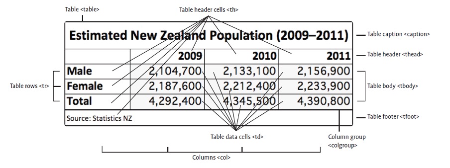
The anatomy of an HTML table
Before you begin building tables, it is a good idea to get an overview of the components of a table and the HTML elements used to define them.
Creating a table
Table elements
Tables are made up of cells, arranged in rows and columns.
- All components of a table are enclosed within a
<table>element. - Table rows are added using
<tr>elements. - Table headings are added using
<th>elements. - Table cell data is inserted using
<td>elements.
For basic table constructions, columns do not need to be explicitly defined as they are automatically created to contain the maximum number of <td> elements within any table row.
Empty cells
You should always specify a table data cell even if you do not intend to fill it with any content, simply leave it empty. For example:
<td></td>
Table captions
The <caption> element can be used within the table to add a title at the top of a table.
Table headers cells
To distinguish a cell that is a label or heading for a row or column you, should specify it using a table header element <th> instead of <td>
Spanning cells
You can merge two or more cells to form a single larger cell.

The colspan and rowspan attributes are used with a value equal to the number of columns (vertical) or rows (horizontal) you want a cell to occupy. Often, it is a good idea to sketch out a complex table on paper to avoid confusion as you’ll need to remember to omit any cells that have been merged. For example:
A form element is useful for collecting data and input from a user. We see them on login screens, address collection pages, and surveys.
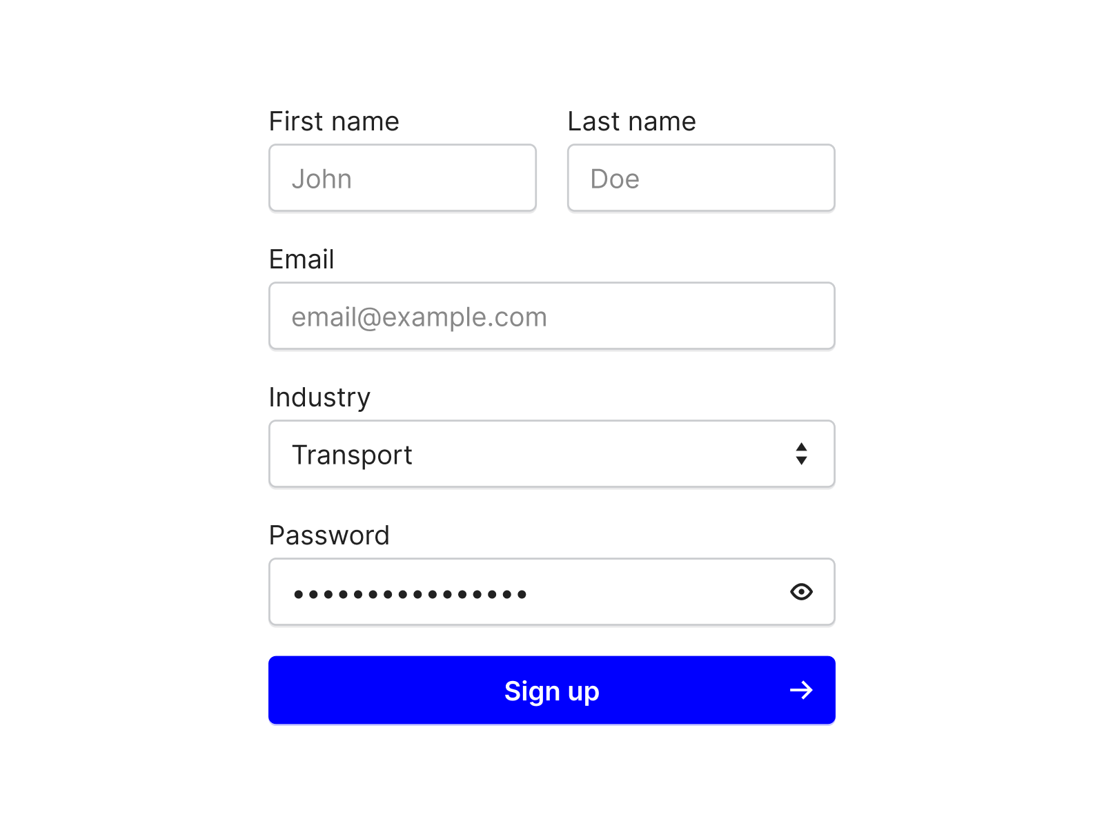
A form is created using the <form></form> tags.
We create input elements inside the form tags using the <input> tag.
Each input tag is given a type attribute to define what type of input it is:
| Type | Description |
|---|---|
<input type="text"> |
Displays a single-line text input field |
<input type="radio"> |
Displays a radio button (for selecting one of many choices) |
<input type="checkbox"> |
Displays a checkbox (for selecting zero or more of many choices) |
<input type="submit"> |
Displays a submit button (for submitting the form) |
Each input is also given a unique id attribute, making it easier to select the data in javascript and PHP when the form is submitted.
Here is an example of a basic form.
Text input
For text inputs, a placeholder can be added to provide additional instruction.
<input id="fname" placeholder="your firstname" type="text">
Radio Buttons
Radio buttons are used when we want users to select one option from a limited number of choices.
We use the same name attribute value to group the options together, and the value attribute to define what data will be submitted by the form.
The label elements used above provide way of indicating what each radio button represents.
Checkboxes
Checkboxes are used when we want the user to be able to select one or more options from a limited number of choices.
The name attribute for checkboxes can be unique.
Submit
The submit element is used to display a button for submitting the form.
The value attribute can be used to change the text displayed on the button.
Form attributes
Action
Form data is usually sent to be processed by a server when the user clicks submit. The action attribute is used to define where to send the data.
<form action="/action_page.php">
In our later examples we will use <form action="javascript:void(0);"> to prevent our page from reloading.
Onsubmit
The event attribute onsubmit can be used to define a javascript function to execute before the form's action is started, making it possible to use javascript to validate the values in the form.
<form onsubmit="myFunction()">
Drop-downs
Another option for user input is to create a drop-down using select element.
Summary: Adding document structure
HTML5 adds several new structural elements to allow developers to build webpages with an enhanced 'semantic' (meaningful) document structure that will help make the content more accessible and compatible with future web and mobile device innovations.
With previous versions of (X)HTML, the heading elements could be used to define a simple hierarchy of the document’s main content, but if you wanted to organise your document into other blocks of content (e.g. sections, sidebars, navigation areas, footers, etc.), then a generic div or division <div> element had to be used.

The problem with <div> elements is that they have no specific purpose—they can contain anything!
Individual <div> elements can, however, be given an identifier name (id or class) to allow them to be targeted for individual positioning and styling using CSS.
Summary: What are semantic elements?
Semantics = the study of the meanings of words and phrases in language.
Semantic elements are elements with a meaning clearly describing their meaning to both the browser and the developer.
Examples of non-semantic elements are <div> and <span>, which tell us nothing about their content.
This is how the older versions of HTML defined the different parts of a webpage and it made writing code and styling elements a lot more complicated.
Examples of semantic elements are <form>, <table> and <img>, specifying clear descriptions of the elements.
The div element
Some content that you may want to markup (to allow formatting or positioning using CSS) may have no appropriate HTML element that it semantically matches. In these situations, you can use: <div>
They are typically given a class or id attribute to allow CSS to target them.

Use the division <div> elements to markup a block of content that might require special treatment. For example:
The body element
You’ve been using the <body> element from the very beginning. It creates the top-level section of a document within which all document content is contained.
The h1-h6 heading elements
The heading elements provide a heading to a section and create additional sections and subsections. Headings are an important way to add hierarchy to a document and provide context to the information to be displayed.
HTML has 6 levels of heading — <h1> is the biggest, <h6> is the smallest. It is important that headings are used appropriately and in the correct order. You wouldn't use an <h2> under an <h3>.
It is important to understand how headings elements (<h1> to <h6>), when used within the sectioning elements, affect the document outline and how subsections are formed. The following rules apply to all sectioning elements, including the new ones that you’ll be introduced to just ahead:
- If no heading element is used within a section element, it will be listed as an 'Untitled section' in the document outline.
- The first heading element used within a structural element becomes that section’s title in the document outline, no matter what heading level (1–6) is used.
- When additional heading elements are used within the same section, there are 2 possible outcomes:
- if it has a higher level number (1–6) than the previous heading element, a new subsection will be created using the title of that heading element
- if it has the same or a lower level number (1–6) than the previous heading element, a new section will be created (at the same level) using the title of that heading element.
The nav element
The <nav> element should be used to contain a group of site navigation features such as links, buttons, menus, search fields etc.
- It is best to use a
<nav>element for just the major navigation area on your website. If you have secondary navigation links in a footer using another<nav>element, this is not necessary. Also, never use it for individual hyperlinks contained within content. - A
<nav>element can be nested within another structural element such as a<header>,<footer>or an<aside>(as in the example below), if desired.
The header element
A <header> element can group several elements that combine together as a header for the page. For example, it could contain a page heading or website mast complete with graphics and perhaps navigation links to other pages.
The <header> element has a special power! If the <body> element does not directly contain a heading element (<h1> to <h6>), the <header> element’s heading will be used to name the top-level section in the document outline.
The footer element
A <footer> element can group several pieces of auxiliary information that would normally appear at the end of a section (either the entire page or individual sections/articles); e.g. footnotes, copyright information, contact details, terms and conditions, secondary navigation links etc.
Hyperlink
One of the key technologies that enables multi-page websites is 'hyperlinking'.
A hyperlink enables clickable words, menus, images or buttons for users to use to go to other pages, rather than have them type in a new URL each time.
Creating text links
The most common type of hyperlink is the text link. By default, text links are highlighted in some way (e.g. coloured blue and underlined) to indicate to the user that the text is clickable. The exact style of links can be changed using CSS styles.
The anchor <a> tag is used to define hyperlinks:
<a href="index.html">Back to home</a>
The href attribute tells the browser which page to link to. Links need to be enclosed within quote marks " and may be absolute paths or relative paths.

Absolute links
Absolute links are links that, no matter where they are placed, are very clear and absolute about where they are linking to.
An analogy would be your postal address — it specifies exactly where you live, and makes sense to any postal office anywhere in the world. It leaves no room for error.
An absolute link typically starts with http:// and goes on to specify the whole web address. They are typically used when linking to other websites.
Relative links
Relative links are relative to the current page location and are typically used when referring to pages within the same site.
An analogy would be 'I live next door to the bakery'. Although there may only be one bakery in town, this address is relative to a given town. It could be any one of thousands of towns.
To link to a page within a folder, we write the folder name and follow it with a forward slash (/). This means 'inside this folder'. For example, if you want to make a reference to the page called 'history.html' that is inside a folder called 'company', you would use:
<a href="company/history.html">Click here to see our company history</a>
To access the parent directory, we use 2 dots and a forward slash (../). This means 'reverse out of this folder'.
For example, to make a link back to the index.html page from the history.html page (that resides inside the 'company' folder), you would use:
<a href="../index.html">Click here for the home page</a>
When the forward slash (/) is used to begin a hyperlink reference, the browser assumes that the path starts from the root directory (the wwwroot folder, or the main folder that houses the entire website). For example, the 2 links you just saw could both be written as:
<a href="/company/history.html">Click here to see our company history</a>

<a href="/index.html">Click here for the home page</a>
As the web server will automatically give you the default page when you link to any folder, that last link could technically (though it is not best practice) be written simply as:
<a href="/">Click here for the home page</a>
Targeting links to different browser windows or tabs
When a visitor clicks on a link, by default, the linked page is opened in the same browser window or tab.
Opening link in a new window
There will be times when you will want the link to open in a new window so that the viewer does not lose their place on the original page. This can be easily achieved by adding the target="_blank" attribute within the <a> element. For example:
<a href="contact.html" target="_blank">Click for contact details</a>
Opening link in a new tab
Alternatively, you can specify a window name (without the preceding underscore) so that multiple links can open in that same new window by adding target="pop-up" for each link that is clicked. For example:
<a href="contact.html" target="pop-up">Click for contact details</a>
Within the content on a page, you can place special references known as 'anchors'.
These can be linked internally (within the same page) or externally (from another page). They are useful if you have long webpages with lots of information as it will scroll the page to the exact location of the information. Often, an anchor is placed at the top of the document to provide handy To the top links to aid navigation.
Examples for using anchor tags are provided below.
Links to other pages are created using anchor tags <a></a>
The href attribute is used to define where the link will go and the text between the opening and closing tags defines what the link will say.
Use relative paths for link access to other pages of your website or pages on the same server or absolute paths for pages on other websites.
<a href="https://www.google.com/">Visit Google</a>
Creating an anchor
The <a> tag is used again, but this time without the href attribute:
<a name="contact info"><h2>Contact details</h2></a>
Linking to an anchor
To make a link to an anchor on the same page, use #anchorname as the link:
<a href="#contact">Click here for contact details</a>
To link to an anchor on an external page, simply add #anchorname to the end of the link without any spaces:
<a href="information.html#contact">Click here for contact details</a>
Creating an email link
When a viewer clicks on an email link their default email application will automatically open with the correct address entered into a new email message window.
The only difference when creating the email link is that it uses the mailto: protocol instead of http://:
<a href="mailto:support@theschool.ac.nz">Click here for support</a>
Instructions:
Scenario - You have been hired by a primary school to build a basic webpage using HTML. Your page will need:
- a title
- a header
- a list (ordered/unordered)
- paragraph content that has at least three different styles. All three can be applied to the same text or used one at a time.
- an image
- a hyperlink.
Some ideas for your webpage could be:
- a list of equipment that the staff can book out
- a list of Wi-Fi connections that staff, students and guests can login to.
Share a screen capture of your script and the resulting webpage in the forum. If you are already familiar with CSS, you may add a stylesheet but it is not necessary for this activity.
CSS is the acronym for 'Cascading Style Sheets'.
CSS is an extension of HTML that is used to specify how webpage elements should be styled and positioned.
Before CSS was introduced, web designers had to add styling attributes to every instance of an element that they wanted to style differently from the browser defaults.
Also, the positioning of content on the page in a non-linear fashion would require a number of workaround techniques (hacks) often using elements inappropriate for the content, leaving a messy document structure and potential accessibility issues.
These sets of rules can also be specified for different output types. For example, you might decide that all links will be presented as normal text when printed since they are not clickable after being printed and that any background colours can be removed to save toner/ink and improve readability.
Advantages of using CSS
- Can save time and effort when applying styling to content, especially for large websites.
- Saves even more time and effort if changes need to be made. A simple change to the style sheet can instantly update the styling of every webpage throughout a website. Imagine if you were managing a website with thousands of articles and it was decided that a new corporate colour should be used for each of the headings. If the colour information had been individually applied to each heading, it might take a long time to update the entire site, but with CSS it would take seconds to make this massive change.
- Styling code does not need to be replicated; this reduces document sizes, therefore reducing the data usage and time required to send webpage data over the internet.
- Presentation is separate from the content, allowing for the content to be easily repurposed or displayed differently on different devices.
- Styles let you control the text in ways that are out of reach of HTML tags, such as line spacing (leading), colour, font styles—among many other properties.
Disadvantage of using CSS
- Applying formatting remotely from the content can be a difficult concept to get used to and may seem to over-complicate the process, especially when creating simple pages.
Marking up the page content with HTML elements
The primary way for CSS to target content for styling is by targeting the element applied to the content.
The default browser styling for any element can be modified or completely overridden by CSS. It is important that you have marked up your content thoroughly with semantic elements.
Remember to structure your content using appropriate sectioning tags; e.g. <nav>, <section>, <aside>, etc.
As a last resort, apply <div> and <span> elements to any content that cannot be targeted by a semantic element.
Summary: Naming elements using 'id' and 'class' attributes
CSS will typically target elements globally, meaning every element that matches a CSS selector will have the same styling rules applied.
Sometimes you will want to exclusively target a specific instance of an element, or a group of elements’ instances containing content that needs to be styled separately. To do this, you can name elements using an 'id' or a 'class' attribute. <div> and <span> elements will typically require naming.
Applying id attributes
An id will specify a unique name for an instance of an element. No other element can share the same id. It can be added to most elements’ Start tags. Add a # to an element such as a <p>; e.g.: #para1 { color: red; text-align: center; }
Here is the next simple application of CSS style using id attributes on 3 different <p> paragraph tags:
Note: It is best to use lowercase letters and numbers with no spaces or punctuation when providing id and class name values.
Applying classes
A 'class' is much like an id, except the same class label can be applied to multiple items to form a group of items that can be formatted identically.
You could solely use class attributes in place of id attributes; however, an id does have advantages over a class, such as automatically becoming an anchor for linking to and they can be easily accessed by JavaScript.
An item can have both a class and individual id applied if necessary; e.g. we use class="center" for <h1> and <p>:
The example below "The anatomy of CSS" shows the correct syntax for an element in an external or embedded style sheet.

- Selector
- Declaration
- Declaration
- Property
- Value
- Property
- Value
A 'CSS rule' consists of:
- a
selectorthat specifies what content will be targeted - followed by one or more
declarationsthat define how the content will be styled or positioned - declarations are enclosed in curly brackets
{}
Defining selectors
There are a few ways of defining a selector or selectors:
- A specific element in the style is to be applied to; e.g. all
<p>or paragraph elements style are targeted:p { declaration; } - An id is specified using a hash
#symbol immediately before the name:#id { declaration; }Note: An id name cannot start with a number. - A class is specified using a period
.symbol immediately before the name:.class { declaration; } - Specific elements belonging to a class or id can be targeted by the following syntax:
h1.news {
  declaration;
}
div#top-story {
  declaration;
}
These are the basic selectors that you will be using most often.
Grouping selectors
To minimise the code, it is better to 'group' elements with the same style definitions. To group selectors, separate each selector with a comma. This example will show headings 2, 3, and 4 in bolded, orange type.
h2,
h3,
h4 {
  color: orange;
  font-weight: bold;
}
Defining a declaration
In the previous examples, we have seen that every selector is to be accompanied by a declaration.
So, what does a 'declaration' consists of?
A CSS declaration consists of a property followed by a value separated by a colon : and ending with a semicolon ;
property: value;
If the property you have chosen is color, then you need to define what value is the color going to be:
property: value;
color: green;
Technically speaking, you don’t need to end a declaration with a semicolon ; if the rule only contains one declaration.
However, it is a good habit to always add one because if you forget it, your rule will break if you add any additional declarations.
The semicolon in this case, ends the value statement or it can also separate multiple declarations in a rule:
p {
  color: green;
  font-size: 12px;
  font-weight: bold;
}
This guide combines declarations on a single line (as shown above) but for extra clarity, individual declarations are often written on separate lines:
h2,
h3,
h4 {
  color: orange;
  font-weight: bold;
}
Note: There is no space between the property value and the unit.
Let’s look at how a CSS style sheet can be applied to our basic scones recipe page.
Note how all the contents of our <p> or paragraph tags have now become orange and in bold. Take note of the other elements that have been styled by the CSS.
Applying styles
CSS stylesheets can be applied as an:
- inline CSS style(s)
- internal or embedded CSS
- external CSS document.
Applying inline styles
Inline styles can be added directly inside elements by adding the style="" attribute.
They do not require selectors or curly brackets:
<h1 style="text-align: center; color: red;">
Advantages: Useful for quick, one-off formatting requirements and can override other CSS styles.
Disadvantages: Styling is not separated from content. Can be messy and time-consuming to edit.
Applying embedded styles
An embedded stylesheet is usually placed within the <head> element of a webpage, for example:
<head>
  <meta charset="utf-8">
  <title>Embedded style</title>
  <style type="text/css">
    h1 {
      color: red;
      text-align: center;
    }
    p {
      font-style: italic;
    }
  </style>
</head>
Notice the addition of <style type="text/css"> and the “My Recipe” heading is now in the center [note the US/coding spelling] and in red, following the selector { declaration; }
h1 {
  color: red;
  text-align: center;
}
And all the <p> tags are now in italics, following the declaration,
p {
  font-style: italic;
}
Advantages: Keeps the CSS handy within the HTML document but separate from the content.
Disadvantages: Styles cannot be shared with other documents.
Applying external styles
External style sheets are created as separate plain text files and are referenced using the <link> relationship tag. It also enables you to change the look of an entire website by changing just one file!
Each page must include a reference to the external style sheet file inside the <link> element. The <link> element goes inside the <head> section, replace the my-style.css with your filename.
<head>
  <link href="my-style.css" rel="stylesheet" type="text/css">
</head>
Advantages: Global (or site-wide) changes are possible. Alternative style sheets can be created for different media (e.g. print, handheld).
Disadvantages: Can be a little disorientating and be an extra hassle if used for very simple webpages.
Multiple style sheets
If some properties have been defined for the same selector (element) in different style sheets, the value from the last-read style sheet will be used.
The order of style sheets matters
If you have an external style sheet for the <h1> element that defines the following:
h1 {
  color: purple;
}
and an internal style sheet that defines the following:
h1 {
  color: green;
}
After the link
If the internal style is defined after the <link> to the external style sheet, the <h1> elements will be 'green'.
Before the link
However, if the internal style is defined before the <link> to the external style sheet, the <h1> elements will be 'purple'.
An inline style has the highest priority.
It will override a style defined:
- inside the
<head>tag - in an external style sheet
- in a browser default value.
Applying alternative style sheets
These days, webpages are accessed on mobile devices first, followed by computer screens.
You can offer multiple variations of style sheets for the same webpage that are optimised for specific devices.
On handheld devices, provide a layout that makes reading and navigation on mobile devices easy.
According to the Mozilla Developer site, there are 3 specific types of output that you can choose to support:
all(suitable for all devices)print(intended for paged material and documents viewed on a screen in Print Preview mode)screen(intended primarily for screens).
To offer any of these options, you must create separate style sheet files and links to them that include the media="" attribute. For example:
<link href="css/screen-styles.css" media="screen" rel="stylesheet" type="text/css">
<link href="css/handheld-styles.css" media="handheld" rel="stylesheet" type="text/css">
As addressed earlier in this module, the 'C' in CSS is for Cascading.
This refers to the cascade principle used by browsers to determine which style to apply to an element when there is more than one styling rule that could be applied. The cascade takes into account 3 main factors: inheritance, location and specificity.
Inheritance
An element will inherit (take on) many of the style properties that are applied to a parent or ancestor element. For example, consider the following CSS rule applied to the <body> element:
body {
  color: red;
}
The colour [remember the US spelling 'color' is used in coding] property will also be passed down to all other elements in the document (since all page content is nested within the <body> element) unless another style rule overrides this inherited property.
Location
As you’ve seen by now, CSS rules can be written in a combination of different locations. If there are conflicting styles in different locations, an inline style will win (overriding embedded and external styles), followed by an embedded style (overriding any external styles).
Specificity
'Specificity' refers to how specifically a rule has been defined.
The rule with the highest specificity wins even if the other rule is located in a winning location.
There is a technical calculation to determine complex conflicts, but essentially you just need to keep in mind the following order:
- An inline style is most specific as it is directly applied to the element
- An
#idin the rule offers the next highest level - Followed by a
.class(or pseudo-class selector) - and finally an element (or pseudo-element).
Multiple elements or classes used in a selector can also increase specificity (e.g. article p will override p).
Box model
Each HTML element takes space on the page as if it were a box. Boxes can be embedded completely inside another box, many boxes can be inside one box, and boxes can be placed alongside each other, or above and below.
The CSS box model is essentially a box that wraps around every HTML element. It consists of margins, borders, padding and the content itself:

The box model is very important to understand because an insufficient understanding can often be the culprit of positioning inconsistencies. If you struggle with how to manage the space all around your elements, you may like to learn more at W3 Schools—box model.
Float
The float property is used for positioning and formatting content; e.g. to let an image float left to the text in a container.
The float property can have one of the following values:
left- the element floats to the left of its containerright- the element floats to the right of its containernone- the element does not float (will be displayed just where it occurs in the text). This is the default.
The float property can be used to wrap text around images.
Clear
The clear property specifies:
- what elements can float beside the cleared element
- and on which side.
The clear property can have one of the following values:
none- allows floating elements on both sides. This is the default.left- no floating elements allowed on the left sideright- no floating elements allowed on the right sideboth- no floating elements allowed on either the left or the right sides.
The most common way to use the clear property is after you have used a float property on an element.
When clearing floats, you should match the clear to the float; i.e. if an element is floated to the left, then you should clear to the left. Your floated element will continue to float, but the cleared element will appear below it on the webpage.
CSS comments
You should get in the habit of using 'comments' to explain your code – this can help when you, or anyone else, edit the code in the future. As with HTML comments, CSS comments do not display in browsers.
CSS comments start with /* and end with */ and can span multiple lines.
/* This is a comment and will not be displayed by the browser. */
CSS Reset
To remove the styles of user agents (chrome, firefox, safari), so that it does not interfere with your own styles, use the following in the beginning of the css/style.css file.
* {
  margin: 0;
  padding: 0;
  box-sizing: border-box;
  list-style: none;
  text-decoration: none;
}
Grid (Rows and Columns)
When you need to display more than one block item in a row, you can divide the block elements into columns by percentage. Then automatically, it will adapt to different responsive breakpoints. However, you may have to write media queries for extreme smaller or larger size. Some developers find the CSS Grid very useful as it affords a large amount of control over the spacing and responsiveness of elements. Head back to W3 Schools and ensure you understand the overall concept of rows and columns and how to work with them.
Note: You need to clear the column divisions before the next section of the website is displayed, otherwise, this width size will continue and your style for the rest of the web elements will be affected. To clear the column divisions, use the following css code.
.row ::after {
  clear: both; /* be it left or right , it will clear all floats */
  display: table;
  content: "";
}
Responsive Websites: Where the grid system comes into its own
Have you noticed a website looks different if you look at it on your phone, tablet, or desktop? The menu might disappear and become a hamburger menu (meatball menu), the images resize appropriately and some decorative elements might not even be shown on the mobile version at all.
Vitaly Friedman, on Smashingmagazine.com, describes responsive web development this way: "Responsive Web design is the approach that suggests that design and development should respond to the user’s behavior and environment based on screen size, platform and orientation." (Source: Smashingmagazine.com, updated August 11, 2018.)
Read through this tutorial onfreeCodeCamp about responsive web design to learn what tools and techniques you can use to maintain control of your web page's display on any device.
Bootstrap is one of the most popular CSS Frameworks for developing responsive and 'mobile-first' websites and is an excellent tool for saving time and adding impressive functionality with relative ease.
Width and height
By default, the content of an element will simply flow across the full width of the browser’s window and its height will vary depending on how much content there is.
So you initially have little control over the layout of a page.
Fortunately, CSS makes it easy for you to specify the width and height of each element.
Use the width property with either:
- a size value (including units)
- a percentage value (a percentage of the parent element’s width—if the element is not nested within another element that has a width specified, this will be a percentage of the browser window width).
Use the height property with:
- a size value (including units)—percentage values are not supported, so:
article {
  height: 400px;
  width: 20%;
}
By default, the auto value is applied to the width and height if it is not specified.
Here are a few points about styling images:
- To centre an image, change its display to block and set margin to auto.
- To get a good quality image, define at least width or height, but not both. If width or height is not defined, the image will appear out of proportion to the window.
- Choose the right size image. Using a small image for a banner will pixelate the appearance.
Specifying minimum and maximum sizes
CSS can be used to restrict the auto-sizing to minimum and maximum width and height values.
Use the following properties (with size values):
min-widthmax-widthmin-heightmax-height
For example:
img {
  max-width: 768px;
}
Responsive image example
Setting the Viewport
<!-- The meta tag -->
<meta content="width=device-width, initial-scale=1.0" name="viewport">
The meta tag above can be added to all of your webpages to make them adjust to a client's screen. Your page will then be capable of being responsive once this tag has been added.
Note: Take a moment now to copy the above code for future reference.
Using the width property
Using CSS, you can set the img element's max-width property to 100 per cent, the image will then respond to the element's parent container.
Note: Take a moment now to copy the code below for future use.
img {
  height: auto;
  max-width: 100%;
}
Activity - Centering an image
Practice setting an image to display in the centre of the screen.
- Download an image you will use for this activity.
- Using either boilerplate HTML with an inline stylesheet, or use one of your previous webpage projects
- Create a new class called "logo"
- Use these CSS selectors to display your image in the centre of the screen
- display
- margin
- width
- height
If you struggled with that, download this text document containing a code snippet that you can copy and paste into your code editor.
The color property can be used to set the foreground colour used by elements (e.g. to colour text etc.).
In addition, you’ll see the same colour values used for this property in many other properties, such as background-color.
Note: The US spelling of color is essential in the coding.
There are several ways to specify colour:
- using a predefined colour name:
color: teal; - using a hexadecimal value:
color: #008080; - specifying RGB (Red, Green and Blue) values or percentages:
color: rgb(0, 128, 128);
color: rgb(0%, 50%, 50%);
- specifying HSL (Hue, Saturation and Lightness) values (using degrees 0-360 and percentages):
color: hsl(0, 25%, 100%);
Hexadecimal, RGB and HSL values can often be found in colour pickers of graphics programs or charts can be found online. The following are the basic predefined colours that you can specify in HTML. (They are not case-sensitive.)
There are 130 additional colours. Visit MDN Web Docs for the full list.
You’ll find colour pickers in graphics applications, as well as online tools like workwithcolor.com or coolors.co, to help with colour values.
Translucent colours
Translucent colours can be specified using an alpha value between 0 (transparent) and 1 (opaque) using rgba() or hsla() colour values; e.g.:
color: rgba(0%, 50%, 50%, 0.25);
color: rgba(0, 128, 128, 0.5);
color: hsla(180, 25%, 100%, 0.75);
Opacity
The opacity property lets you adjust the overall translucency of an entire element (including any backgrounds, borders and content).
If you just want to target a specific part of an element, then you should colour that element using an rgba() or hsla() colour value.
Opacity is set using a value between 0 (transparent) and 1 (opaque), such as:
article#ghost-story {
  opacity: 0.75;
}
If you apply a background colour to an element containing text, you will notice that the text runs flush to the edge of the element’s container. Often, you will want to add a bit of extra space (a margin) around the text so that the text sits more ‘comfortably’ inside the bounds of the element’s container.
This is known as 'padding'.
Use the padding property followed by:
- a single value (for equal padding all around); e.g.:
p {
  padding: 24px;
}
- 2 values (
top/bottomandleft/right) - 4 individual values (for
top,right,bottom, andleftpadding in clockwise); e.g.:p { padding: 24px 40px 40px 24px; }
Note: Percentages of the parent element can also be used.
The element on the left has no padding applied and the text looks ‘cramped’.
The element on the right has unequal padding (24px 40px 40px 24px) as indicated by the values.
Margins
Margins add transparent space between the outside of an element and surrounding elements or the edges of the browser.
Use the margin property followed by either:
- a single value (for equal margins all around), for example:
p {
  margin: 24px;
}
- 2 values (
top/bottomandleft/right) - 4 individual values (for
top,right,bottomandleftmargins in clockwise), for example:p { margin: 24px 24px 40px 24px;; }
Alternatively, margin-top, margin-right, margin-bottom, or margin-left properties can be used with a single value or percentage.
Note: Percentages of the parent element can also be used.
Centring elements using auto margins
If you have an element that is a fixed width, you can centre it in the browser window or the containing <div> element by specifying auto margin sizes for the left and right values.
For example:
div#quote {
  width: 200px;
  margin: 24px auto;
}
The elements on the top row merge together as no margins are specified.
The bottom elements are separated by margins. Note that an automatic margin has been made between the top elements and the browser edge. This is a default in many browsers and can be removed by specifying margin: 0 on the <body> element.
Borders of many different styles, colours and widths can be applied to an element.
Border width
To specify the thickness, use the border-width property followed by a size value. For example:
p {
  border-width: 2px;
}
Border color
To specify the border color, use the border-color property followed by a colour value. For example:
p {
  border-color: red;
}
Border style
Use the border-style property with one of the following style values:
soliddottedgrooveinsetoutsetridgedasheddouble
For example:
p {
  border-style: double;
}
Combining border properties
To save time and extra code, you can combine all of the values from each of the properties covered above using the border property. For example:
p {
  border: 2px red double;
}
Note: You can also use border-top, border-right, border-bottom, and border-left properties to specify different values for different sides of the element.
Using single-sided borders to create dividing lines
Being able to apply borders to only one side of an element is useful for creating dividing lines. For example, applying a thin left border to <div> container elements that are positioned horizontally will create column rules.
Single borders are also an alternative way of creating horizontal rules.
Using images for borders
The CSS3 border-image property lets you create customised borders by using an image.
The image must be designed so that it can be divided easily into 9 slices. The 4 corner slices are used in the corners of the border and the outer middle slices will be repeated along the top, bottom, left and right sides of the border.
You are required to use special vendor-specific properties for now. Fortunately, there is an interactive tool that you can use to preview and generate the required CSS.
Applying colours or images to backgrounds can not only be used to enhance pages, but they can also be useful to help you clearly see how structural elements are working when you are learning to apply CSS for sizing and positioning content.
Individual backgrounds can be applied to the entire page (by specifying the body element) and/or to individual elements on the page. Elements that do not have a background specified will be transparent and any underlying backgrounds will show through.
Background colour
Use the background-color property followed by a color value (you can use any of the colour value types covered previously). Here are some examples:
body {
  background-color: aqua;
}
#main {
  background-color: #0ff;
}
Background images
An image can be used instead of, or in addition to, a colour. Use the background-image property with a value of url() with the file name and location of the image inserted between the brackets. For example:
body {
  background-image: url("background.gif");
}
Repeating a background image
A background-image with a large file size can slow the loading of a web page, so it is common to use smaller images that can be downloaded quickly and repeated (tiled) to fill a larger area.
A repeated image does not need to be a square tile—interesting effects can be created using thin horizontal slivers of an image.
Use the background-repeat property with either:
repeat(to repeat the image both horizontally and vertically—most browsers use this by default if nothing is specified)repeat-x(horizontally only)repeat-y(vertically only)no-repeat
For example:
body {
  background-image: url("background.gif");
  background-repeat: repeat-y;
}
Background position
By default, a background image will be placed in the top left corner (and repeated).
You can offset the initial location using the background-position property and specifying the distance from the left and top using pixel measurements or percentages (of the area).
Alternatively, the following values can be specified: left, center, or right (for the horizontal) and top, center or bottom (for the vertical).
For example:
body {
  background-image: url("background.gif");
  background-position: 20px top;
}
In this example, the starting point of the background image will be 20px from the left and aligned to the element’s top edge.
Background size
The background-size property can be used to set the size of a background image.
Ideally, as with any image, you should use an image editor for optimised size and quality.
However, if you are creating a 'flexible layout' (to be addressed later), it can be a cool effect to see the background scale along with the elements. These properties have good native browser support for 2 keyword values:
background-size: cover;
cover - scales in proportion to fit the entire element area, but may clip a portion of the image.
background-size: contain;
contain - fits the whole image, but may not fill the entire element.
Combining background properties
To save time and extra coding, you can combine all of the values from each of the background properties just described using the background property. For example:
article {
  background: #f0f url("background.gif") no-repeat center top;
}
Note: Values are separated by a space only and can be in any order.
Adding multiple backgrounds
You can add multiple backgrounds by separating property values for each background property using a comma (,).
Multiple backgrounds are very useful when you want to overlay background images that have transparency (without it, the backgrounds would just cover others).
They can also be effective when you want to position multiple smaller background images around different sides of the element and leave the middle area plain—this reduces the overall file size of the background and allows for flexible layout. For example:
article {
  background:
    url("background-1.gif") left top repeat,
    url("background-2.jpg") left top no-repeat,
    url("background-3.png") right bottom no-repeat;
}
This could also be written as separate properties, such as in this example:
article {
  background-image:
    url("background-1.gif"),
    url("background-2.jpg"),
    url("background-3.png");
  background-position:
    left top,
    left top,
    right bottom;
  background-repeat:
    repeat,
    no-repeat,
    no-repeat;
}
Note: The first background will be layered at the bottom and any extra backgrounds will be layered on top. Take care to maintain the same value order for each property.
Background gradient fills
Gradient fills use a gradation of colours to fill the background.
.simple-gradient {
  background: linear-gradient(darkgreen, lightgreen);
}
Using the Ultimate CSS Gradient Generator
Fortunately, Colorzilla offers a fantastic interactive tool that will automatically generate for you all of the bloated CSS code currently required to implement gradients with cross-browser support. All you need to do is pick a preset, customise it using the controls and then copy and paste the CSS that is automatically generated.
Summary:Box shadows
The box-shadow property will add a drop shadow effect to an element’s box. This effect will instantly add some depth to a flat webpage.
Note: Text shadows are covered in the next topic.
Use the following syntax:
box-shadow: 5px 5px 15px 2px #444;
5px - Horizontal offset
5px - Vertical offset
15px - Blur radius
2px - Spread distance
#444 - Color
Note: You can also add the inset value at the start if you want to reverse the effect. Further, you can add multiple shadows by separating the groups of values by a comma (,). This can help create glowing effects, embosses etc.
Rounded corners
The border-radius property lets you add rounded corners to an element.
Note: Despite its name, you do not need to apply a border to use this property.
To apply equal radius values to each corner, use:
border-radius: 45px;
To apply different values to each corner to create interesting effects, use:
border-radius: 45px 0px 90px 0px;
Note: The order of the values is: top-left, top-right, bottom-right, bottom-left.
You can also use the following properties to target individual corners:
border-top-left-radiusborder-top-right-radiusborder-bottom-right-radiusborder-bottom-left-radius
Elliptical corners can be specified by using a forward slash (/) to separate horizontal and vertical radius values; e.g.:
border-radius: 45px / 90px;
Display and visibility
There are properties and values that affect how an element appears on a page:
display: none;
Will hide the element and collapse the space that the element occupied. This is useful for creating expanding/collapsing menus with JavaScript.display: inline;
Will display the element inline (without starting a new line). For example: if applied to<div>elements, they can be displayed side by side without using float. Horizontal lists are also possible using inline.display: block;
Will display the element block-level (starting on a new line). For example: if applied to<img>elements, images will be cleared of text to the left and right.display: hidden;
Is useful for hiding an element without collapsing the space around it.display: visible;
Will make the element visible again.
CSS text formatting properties
To obtain a solid understanding of styling text, read the Mozilla developer notes about the fundamentals of styling text.
CSS text styling properties:
- color
- font-family
- font-size
- font-weight
- line-height
- text-align
- text-transform
- text-decoration
Have a play and get to know each of those properties, and their values on W3 Schools:
Applying 'web-safe' fonts
You can instantly enhance the look of a webpage by specifying fonts (different from the boring browser defaults) to use for the various text-based elements in your website.
But before you get stuck in and start trying out all the different fonts you have installed on your computer, you must first be aware that visitors to your site will not be able to display a font if it is not also installed in their system (unless it has been made available for the browser to download).
So, first, we’ll look at how to limit your choice of fonts to those that are standard on most systems.
Use the font-family property followed by the name of the font.
If the font’s name contains more than one word then you must enclose it in quote marks; for example:
h1 {
  font-family: "Arial Black";
}
As font names are not always identical between different operating systems, it is best to provide alternative fonts that can be used.
For example, the Mac OS font Palatino is called "Palatino Linotype" in Windows. On systems that do not have this font at all, you can also specify the type of generic font equivalent to use (e.g. serif).
p {
  font-family: Palatino, "Palatino Linotype", serif;
}
The table below displays 'web-safe' fonts. If you want to use one of these fonts, specify all of the font names across the same row in the table.
| Windows font | Mac font | Generic font |
|---|---|---|
| Arial | Arial | sans-serif |
| Arial Black | Arial Black | sans-serif |
| Comic Sans MS | Comic Sans MS | cursive |
| Courier New | Courier New, Courier | monospace |
| Georgia | Georgia | serif |
| Impact | Impact, Charcoal | sans-serif |
| Lucida Console | Monaco | monospace |
| Lucida Sans Unicode | Lucida Grande | sans-serif |
| Palatino Linotype | Palatino | serif |
| Tahoma | Geneva | sans-serif |
| Times New Roman | Times | serif |
| Trebuchet MS | Trebuchet MS, Helvetica | sans-serif |
| Verdana | Verdana, Geneva | sans-serif |
| MS Sans Serif | Geneva | sans-serif |
| MS Serif | New York | serif |
Styling icons as text
While icons are images, Font Awesome is a tool that handles icons as text. This gives web developers most of the styling options they have for text, such as font-size and colour. It's very useful for offering high-quality icons on every device. You need to download their kit to be able to use it in your projects.
Using other web fonts
Using @font-face
Browsers have, for a long time, supported the @font-face selector which allows you to define and provide a link to a web font stored on your server (if you are licenced to distribute it) or from a free or commercial online font library.
The CSS is fairly straightforward. First, you define the name you want to call the font and set its source location; for example:
@font-face {
  font-family: MyFont;
  src: url("/fonts/MyFont.otf");
}
Note: If you have multiple fonts to define, simply add additional @font-face rules (don’t try to combine them within the same @font-face rule).
Afterward, you can apply your font like any other; for example:
h1 {
  font-family: MyFont;
}
Seems simple enough right? Unfortunately, there have been 2 major issues preventing web fonts to be easily used.
Web font format support
The first hurdle to overcome is browser support of web font formats.
Browsers have been slow to support a universal web font format. Although support has improved, there are still challenges with the current support status of the latest browsers:
- Embedded OpenType (.eot) - supported by Internet Explorer only
- TrueType/OpenType (.ttf/.otf) - Long supported by most browsers, although only partially supported in Internet Explorer
- Web Open Font Format (.woff) - supported in recent versions of Chrome, Firefox, Internet Explorer and Safari.
While you can specify additional sources to provide alternative fonts, this can cause problems, especially for IE and a complex workaround is required.
Licencing issues
The second hurdle has to do with licencing issues.
Many fonts, whether free or paid for, usually have licencing agreements that prevent you from distributing (from your own server) or converting the font to different font formats.
Using online web font providers
The easiest way to overcome these issues is to use fonts provided by an online service that offers multiple-browser support, often by detecting the browser and then serving up the font in the most suitable format for each visitor to your site.
Of the numerous providers, many aim to sell you fonts — either per font or as a subscription to a font library. However, they often offer a small range of fonts for you to try for free or provide a free limited trial.
Do a search for the latest providers, also check out the following:
Each provider offers instructions telling you how to add their fonts to your site.
Applying italics
Use the following to italicise a font:
font-style: italic;
Applying bold weight
Use the following to display a font in bold:
font-weight: bold;
Alternatively, you can use the values: bolder or lighter to specify a relative weight.
Font size
There are a few different ways to specify font size:
- Exact size using pixels (
px):
font-size: 18px;
- Keyword -
xx-small,x-small,small,medium,large,x-large,xx-large:
font-size: small;
- Relative size (to body or parent element =
1emor100%)
font-size: 1.5em;
font-size: 150%;
Using an exact pixel size provides you with precise control over your page design; however, this may prevent some users from changing the text size in their browser. Some browsers interpret keyword sizes differently--for example, some regard 'small' as the base font, while others use 'medium'.
16px is the default body size in most browsers.
Relative sizes will be based around this if any parent element that the text is contained in has no font-size specified.
Line height
Line height (also known as 'leading' or 'line spacing') is the amount of space between lines of text. Increasing this from the default value can improve readability and make your page look more stylish. It can be specified as a percentage of the font size or as an exact pixel value. For example:
line-height: 150%;
line-height: 20px;
Increasing the default line height can enhance the appearance of text as it makes it ‘lighter’ to read.
In this example, much larger line spacing coupled with the combined bold and italic styles gives the first paragraph more importance.
Combining font values
To reduce the amount of CSS code, you can set the font-style, font-weight, font-size, line-height and font-family together using the font property. For example:
font: italic bolder 18px / 22px Tahoma, Geneva, sans-serif;
font: 85% Arial, sans-serif;
Note:
- The
font-sizeandfont-familyvalues must always be specified and placed at the end. - The
font-styleandfont-weightproperties are optional and can be in any order, each one separated by a space only, or can be omitted. - The
line-heightis optional and is specified directly after thefont-size, separated by a forward slash (/).
Additional text formatting
As you have seen, all of the CSS values covered can be combined using the font property.
The remaining formatting options must be added as separate property: value; pairs, separated by semi-colons (;) and placed within the curly brackets {}; for example:
h1 {
  color: teal;
  font: 85% Arial, sans-serif;
  text-align: center;
}
For clarity, it is also good practice to lay out your CSS code as follows:
h1 {
  color: teal;
  font: 85% Arial, sans-serif;
  text-align: center;
}
Buttons are one of the ways the developer communicates shorthand for "click me, I do something useful."
They are such a common interface tool that CSS has properties that target styling buttons easily. Use the tutorial and sandbox at W3 Schools to learn how you can work with buttons. Take special note of the properties shown here, but go a bit further if you want and check out some of the more advanced behaviours CSS provides.
Buttons contain the following properties:
Visual
- background-color
- border
- width
- colour
- padding
- text-decoration
- text-align
- font-size
- box-shadow
- border-radius
- display
Behavioural
- button:hover
- transition-duration
- opacity (appear greyed out)
- cursor (when set to not-allowed, the user cannot interact with it.)
Many of the properties covered in the CSS Formatting and CSS Layers sections earlier in this module can be applied to tables, rows, columns and cells. For example:
- font styling and colour
- text alignment
- width and height
- margins
- borders
- padding
- backgrounds (colours and images)
- float
- vertical alignment.
Understanding table borders
Borders are perhaps the trickiest part of a table to style with CSS so this is where we’ll cover how it all works.
The HTML attribute border="1" places a 1px border around the entire table (except for the caption) and around every cell. It is the equivalent of:
table,
td,
th {
  border: 1px solid;
}
To provide better styling control, you should remove it so that you can apply different border styles to the table <td> and <th> elements individually. For example, if you use:
table {
  border: 2px solid;
}
--this will just add a thick border around the entire table. Now, if you add:
td,
th {
  border: 1px solid;
}
--this will add thin borders around the cells.
If you have empty elements that you do not want to have a border (or fill) applied, add the following to the table element:
empty-cells: hide;
If you wanted to adjust the spacing between the cells, you can add the following CSS property to the table element:
border-spacing: 5px;
It's an interesting effect, but it doesn’t look quite like the single borders you would see in an Excel spreadsheet. To fix this, remove the previous property and apply the following property to the table element:
border-collapse: collapse;
This collapses any double borders into a single border and is the standard styling that you’d expect to see.
Adding padding
It is well worth adding some padding to <td>, <th> and <caption> elements to give the information some space to improve legibility.
Alternating row or column background colours
In large tables, using alternating colours for the rows or columns can help guide the eye, to stop it from jumping between rows or columns.
The following can be used to tint the background of every odd-numbered <tr> in the <tbody>:
tbody tr:nth-child(odd) {
  background-color: #ddd;
}
If column tracking is more important, use:
tbody tr:nth-child(even) {
  background-color: #ddd;
}
Here is a snippet--take note of the <style></style> tag pair to add our CSS into the mix.
CSS Questions
Answer these three questions to make sure you understand some key concepts.
As a reminder, a website can be compared to a house: HTML is the frame and architecture (it organises and presents elements of a webpage); CSS is the look (how the house is decorated and styled); and JavaScript is the moving pieces (what you interact with — electricity, water and gas, and appliances). When you want to use the 'washing machine', JavaScript performs the function when someone activates it by turning it on.
JavaScript (JS) is the most-used programming language in the world. JS is one of the three core languages of web development. What are the other two?
The three core languages:
-
HTML (Content)
Nouns
<p></p>means 'paragraph'.
-
CSS (Presentation)
Adjectives
p { color: red; }means 'the paragraph text is red'.
-
JS (Dynamic effects/programming)
Verbs
p.hide();means 'hide the paragraph'.
Watch - html, css, javascript explained (3:58 minutes)
If you are struggling to understand how HTML, CSS and JS all work together, take a look at the following video for help before moving on.
JavaScript (JS) is a front-end scripting language that is lightweight, cross-platform, object-oriented, and has no basic structure like HTML or other programming languages.
Note: Very little JavaScript and jQuery is required to help you complete your assessment to a good standard so this course will provide only what is needed at this level. Use one of the resources provided at the end of the module if you would like a deeper dive.
What you need to know:
- Accessing an HTML element
- Using variables
- Changing styles
- Hiding and showing or toggling elements
- Basic calculations
- Using a third-party service, i.e., shopping cart or booking system
Some small bites about JS:
- Lightweight: not using much memory, simple syntax.
- Cross-platform: language can be used on many devices and systems.
- Event handler functions are triggered when events take place on the browser. (For example, onMouseOver is an event that occurs when the user hovers their mouse over an element.)
- console.log() function displays the value of a variable or results on the browser’s console. It is good to keep the dev tool Inspect opened to see the console on the browser.
Activity: The very useful browser console
Take a moment, and look at the console on your browser now. The instructions below refer to Chrome, but if you use a different browser or would like to know more you can read How to Inspect Web Page Elements:
- Right-click on the webpage and select Inspect.
- Note the code is now displayed on part of your screen.
- Click the small icon on the top left
- Hover your mouse over any element on the webpage, such as a heading
- Note the pop-up provides all of the code that has been applied to the element, either by inheritance or targets
- Click :hov under Styles and see the CSS for all of the events that occur when a user hovers over an element.
JS Libraries and frameworks
There are many JavaScript libraries and frameworks (such as jQuery or AngularJS) that help developers build complex apps more easily. All are based on JS.
JS is what makes modern web development possible through:
- dynamic effects
- interactions and logic.
Anatomy

- Object (where)
- Method
- Action
- Paramater (which/content)
JavaScript (JS) example
<script type="text/javascript">
  console.log("Hello, world!");
  alert("Hello, world!");
</script>
JavaScript syntax/tags
Each Javascript statement ends with semicolon just like css property rules.
Single line comments can be written using // and multiline comments are written using /* …*/
JavaScript can be implemented using JavaScript statements that are placed within <script></script> tags in a webpage.
You can place the <script></script> tags, containing your JavaScript, anywhere within your webpage, but it is normally recommended that you should link it to an external JS sheet in the <head> tags.
The <script> tag alerts the browser program to start interpreting all the text between these tags as a script. A simple syntax of your JavaScript will appear as follows:
<script type="text/javascript">
  Your JavaScript goes here...
</script>
'Data types' are used to classify one particular type of data in programming languages. For instance, a number and a string of characters are different types of data that will be treated differently by JS.
var is the keyword that is used to declare a variable. It is not required, and the use of that keyword will impact the scope of the variable because var declarations are processed before any code is executed, declaring a variable anywhere in the code is equivalent to declaring it at the top. Data type is also not required to be declared — from the value of the variable, JS will identify the data type.
That said, it is important to know about data types because the specific data type affects the values you can assign to it and what you can do to it. This is to say, to be able to do operations with variables in JS, it is important to understand the data type of any given variable whether you have defined it, or JavaScript has inferred it based on the value.
The following are the basic types of data used in JS.
Strings
A 'string' is a sequence of one or more characters (letters, numbers, symbols). Strings are useful in that they represent textual data.
In JS, strings exist within either single quotes ' or double quotes ", so to create a string, enclose a sequence of characters in quotes:
var singleQuotes = 'This is a string in single quotes.';
var doubleQuotes = "This is a string in double quotes.";
You can choose to use either single quotes or double quotes, but whichever you decide on, you should remain consistent within a program.
The program Hello, World! demonstrates how a string can be used in computer programming, as the characters that make up the phrase 'Hello, World!' in the alert() below are a string:
<!DOCTYPE html>
<html>

<head>
  <script type="text/javascript">
    function greet() {
      alert("Hello, world!");
    };
  </script>
</head>

<body>
  <button onclick="greet()">Click me</button>
</body>

</html>
As with other data types, we can store strings in variables:
var hw = "Hello, world!";
And display the string in the alert() by calling the variable:
<!DOCTYPE html>
<html>

<head>
  <script type="text/javascript">
    var hw = "Hello, world!";

    function greet() {
      alert(hw);
    };
  </script>
</head>

<body>
  <button onclick="greet()">Click me</button>
</body>

</html>
Strings are important for communicating information to the user, and for the user to communicate information back to the program.
Booleans
The Boolean data type can be one of two values — either true or false. Booleans are used to represent the truth values that are associated with the logic branch of mathematics, which informs algorithms in computer science.
Many operations in maths give us answers that evaluate to either true or false:
- greater than:
400 > 200; // => true
1 > 4; // => false
- less than:
200 < 300; // => true
4 < 3; // => false
- equal to:
4 == 4; // => true
600 == 400; // => false
As with other data types, we can store a Boolean value in a variable:
var myBoolean = 5 > 7; // => false
Since 5 is not greater than 7, the variable myBoolean has the value of false.
As you write more programs in JS, you will become more familiar with how Booleans work and how different functions and operations evaluating to either true or false can change the course of the program.
Arrays
An 'array' can hold multiple values within a single variable. This means that you can contain a list of values within an array and iterate through them.
Each item or value that is inside an array is called an element. You can refer to the elements of an array by using an index number.
Just as strings are defined as characters between quotes, arrays are defined by having values between square brackets ([]).
An array of strings, for example, looks like this:
var seaAnimals = ["shark", "cuttlefish", "clownfish", "eel"];
If we call the variable sea animal, we’ll receive the following output:
["shark", "cuttlefish", "clownfish", "eel"];
Arrays are a very flexible data type as they are mutable in that they can have element values added, removed and changed.
Objects
The JS 'object' data type can contain many values as key: value; pairs. These pairs provide a useful way to store and access data. The object literal syntax is made up of key: value; pairs separated by colons with curly braces on either side ({}).
Typically used to hold data that are related, such as the information contained in an ID, a JS 'object literal' looks like this, with whitespaces between properties:
var jessica = {
  firstName: "jessica",
  lastName: "smith",
  color: "red",
  location: "sand"
};
Alternatively, and especially for object literals with a high number of key: value; pairs, we can write this data type on multiple lines, with a whitespace after each colon:
var jessica = { firstName: "jessica", lastName: "smith", color: "red", location: "sand" };
The object variable 'jessica' in each of the examples above has 4 properties: firstName, lastName, color, and location. These are each passed values separated by colons.
Check your knowledge
Answer these three questions about programming and scripting.
Summary: Activity - Enhance a basic webpage using CSS and JavaScript
Instructions:
Using the basic HTML page you have created in the previous topic, enhance the experience by adding a few of the following:
background-color,background-image,- pop-up message
- other functionalities using CSS and JavaScript.
Share a screen capture of your enhanced webpage and code in the forum.
How JS targets an HTML element
To target an HTML element in JS for manipulation you will use one of the three basic selector tags:
- the element tag - examples: H1, P, IMG
- creating and assigning a class - example: .logo
- creating and assigning an ID - example: #userFirstName
Note: While ID and Class can be used to target or access an HTML element, each has specific uses. For individual items that you only plan to use once, ID is more appropriate and specific. For elements that are used multiple times, create a class to target the instances.
Change the value of an HTML element
If you want to get and/or set the value of an HTML element, use innerHTML. The syntax allows you to indicate which tag to access. For example, if you want to display a user's name, you would ask them to type it in, and then using JS target the input and use it for the output in a sentence such as "Hi, Wendy." In that case, your innerHTML (the part that sits between the tags) is "Hi, Wendy".
In order to leave a place in the code for the name the user will enter, you can use a variable, or put in a placeholder, and then 'set' the new name when the user has entered it. If you would like more information about this, you can take the tutorial JavaScript: innerHTML.
Examples
getElement(s)By...
document.getElementsByTag(‘section’).innerHTML= “New Section”; /
*There could be more than one section tag, and this code targets all sections.
It is good to avoid using tag selector for this purpose.*/
document.getElementsByClassName(‘myContainer’).innerHTML= “New Container”; /
*There will likely be more than one element having the same class name,
so this code targets all elements that have been assigned that class name.*/
document.getElementById(‘total’).innerHTML= ‘<p> class="myTotal">NZ$</p> +35.40;
//Use of id is specific to an element because id cannot be duplicated
and it refers to a single, unique element.
Assign the content of an element to a variablevar price=document.getElementById(‘total’).innerHTML;
Assign the value of a form element to a variablevar username=document.getElementById(‘username’).value;
Setting a dynamic property of css to an HTML element
Example 1: document.getElementById(‘logo’).style.width=40px;
Example 2: document.getElementById(‘modal’).style.display=‘none’;
jQuery
Refer to the jQuery API.
Get jQuery CDN — a method to include jQuery into a website without actually downloading and keeping it in the website's folder.
The Document object Model (DOM), represents a web page and the element that make up its content as objects.

The DOM provides a set of functions we can use in Javascript, to create select and manipulate elements on a webpage.
For example, the following line of javascript will select the body element with the document and add the background style of "blue".
// Change the background color to blue.
document.body.style.background = "blue";
Watch - javascript dom tutorial ( 5:03 minutes)
This video covers, querying the DOM using the getElementById() method.
Have a look at the following example that applies styles and innerHTML to the boxes when the change button is pressed.
One common use of javascript is to validate form data before it is passed to a server.
In javascript, we can use the getElementById() method to select unique elements and test their values against certain criteria.
The example below uses the getElementById() method to store the objects "drink" and "name". It then tests the value attribute stored in "drink" to see if it matches "fruit juice". If there is a match the first alert message is displayed. If there is no match the second alert message is displayed.
We use the double equals (==) to test if two values are the same. We can test if values are not equal using !=, or we can use > or < for greater than or less than.
To test if a person is over the age of 21, you could use an if statement like the following:
if (age >= 21)
Third-party services
In addition to a world of resources out there to help extend your learning, there are also third-party tools and services you can use to achieve a dynamic, functional, professional website. There is no singular best choice, it depends on skills, budget, and scope for you to pick the best service for your need. Here is a short list to get you started:
eCommerce:
Booking Systems:
Marketing/Mailing List Management
Additional Learning Resources
You have been introduced to three languages that work together, and enable you to create engaging, purposeful websites. Thankfully there is a wealth of resources available to support your learning and development. Some of those resources are posted below.
Take your time to work through the following online resources to develop your knowledge about HTML and your website development skills:
Online Resources:
There are many websites that provide opportunities to learn about website development, and coding in HTML, CSS and Javascript. These sites provide free content, as well as additional content behind a paywall (which you are under no obligation to purchase).
HTML
- W3Schools HTML Tutorial
- Tutorialspoint Learn HTML
- CodeAcademy has both free and paid courses on HTML development, plus the opportunity to work on projects and challenges.
HTML Cheat Sheets
- HTML Cheat Sheet (PDF)
- HTML Cheat Sheet (PDF) from cheat-sheets.org (PDF)
- Digital.com
CSS
JavaScript
- W3Schools Javascript Tutorial
- Tutorialspoint Learn Javascript
- And check out Code Academy for JavaScript as well
HTML|CSS|JavaScript
- HTML Cheat Sheets covers all three languages
- YOOBEE Best Practice for Web Coding
Video Tutorials:
YouTube can be a great source of content, and when it comes to programming in HTML there are many enthusiastic presenters who wish to share their knowledge with you. You have already watched some of these videos as you have worked your way through this module. However here you will find links to a number of playlists that you will find very useful as you complete your assessments and develop your skills as a programmer:
- freeCodeCamp have a course on learning HTML and CSS from scratch Click on here to access the course on YouTube
- Caleb Curry is a young programmer and developer who is sharing his knowledge online. Check out his channel on YouTube. To get started here is a link to his playlist on Javascript Programming. Click here to get started
You are encouraged to keep your learning going by doing your own research and making use of the many activities, videos and websites dedicated to website development that are available online.
Activity - Check your knowledge
The quiz below will test some of the basic ideas and syntax that you have just been exposed to. Take it as many times as you like until you are confident with all of the answers before moving on to the final activity and assessment.
If you find that you need to write a proposal to bid on a website app, you may find these documents helpful.
YOOBEE Guide: Website/App Proposal Guide
YOOBEE Best Practice Document: Website/App Proposal
Now... try and consolidate your UX knowledge by reviewing your Eats and Treats Forum Task and applying it to your Assessment task!
Here is a chance to show off your new skills!
Employing the use of HTML, CSS and JS, create a multi-page website for a fictitious company. Use imagery, language, and design principles to lure people into engaging or purchasing from you. Ensure the site has:
- A navigation bar
- A login/sign up form
- A styled button
- A shopping cart*
OR - Appt. booking system*
- Behaves responsively
*You do not need to create the functionality for these to work. You can create tooltips that explain how you expect it to work. For those of you that are feeling confident, feel free to sign up for a trial of a booking or shopping cart service, or code in the shopping cart functionality from Stripe. If any of the code you use is not your own, you must use comments to indicate that.