Mobile devices are a ubiquitous part of life today. Worldwide usage statistics reflect this. Oberlo (2021) and TechJury (2022) provide the following statistics to illustrate the dominance of mobile devices:
- In 2021, there were 6.4 billion smartphone users. The number of users increased by nearly 74% in a five-year period.
- The average US adult spends around 3 hours and 43 minutes on their phone. This is more time than is spent watching television as a comparison.
- The average internet user checks their phone 58 times a day.
- Nearly 70% of people who have a mobile device use them for online shopping, with 60% of shoppers indicating that the ability to shop via mobile is an important factor in choosing brands.
- Just under 55% of web traffic worldwide is mobile data traffic.
- In the US 70% of time spent using digital media is on smartphones. For example, over 70% of YouTube traffic originates from a mobile device.
- In 2019 there were 204 billion apps downloaded.
- Samsung is the most popular phone brand in the world. Apple has a significant market share in some countries.
In this topic we will consider the design and creation of applications for mobile devices. You will be taken through the design and development process, considering the differences between the two dominant operating systems - iOS (Apple) and Android, and how this understanding will inform app design features such as layout and navigation.
What is Mobile App Design?
Simply put, mobile app design is the task of designing mobile applications. Mobile apps have a wide variety of uses and purposes, however, regardless of the app's purpose the unifying factors are the need for optimal usability, accessibility, engagement, and the overall user experience. The concern of app design, therefore, is to address all these factors.
In the first module CS101 you were introduced to the UX design process in general, so you will find a lot of similarities to that process in the design of mobile apps.
When referring to mobile app design we are talking about the creation of the visual elements of the application - this includes both the design of the user interface (UI) and user experience (UX). This is the overall style of the app, which includes the colour scheme, font selection, screen layout and the types of buttons and widgets the user will use.
In the previous topic, you discovered that where the terms “app development” and “app design” are used interchangeably, they are not the same. The relationship between the two concepts was explored, but for clarity let’s explore the differences one more time. Alvin from Moblieapps.com (April 8, 2020) writes:
- Mobile app development includes the entire process of creating an app, while the app design portion is part of the app development process that makes the app look and feel good.
- To develop an app, you need an idea, decide on the platform (Android, iOS, or both) to develop your app on, and then design your app. You would typically create a prototype design in the early stages of app development. This prototype will become a reference for the final development work that is performed in the app development tool of your choice.
The revenue generated from mobile apps is close to $200 billion dollars annually and growing in line with mobile device technology development. When thinking about mobile app design and development the statistics are quite damning. For example, approximately 24% of apps are used only once and over half of the apps downloaded are deleted within the first month. Invision (2022) cites the following statistics:

These statistics speak volumes and should be kept in mind when designing your apps. You don’t want to be among the negative statistics do you!
For the remainder of this topic, you will be introduced to some of the fundamentals of mobile app and mobile web design.

The world of mobile can seem quite confusing and knowing what to design and develop presents some challenges. Clearbridge Mobile (2020) assert that “one of the major decisions enterprises face early on in the mobile app development process is building a native app, web app, or a hybrid of the two. This decision not only influences the overall design of a mobile product but also impacts how users interact with your specific product.”
Therefore it is important to make a decision at the outset of the project - the concept or planning phase - to avoid delays later in the project.
With so many options the question is "which is right for you?", and that will depend largely on your requirements, but Boag (Feb 4, 2013) suggests that “a good starting point is to ask whether users are primarily completing a task or accessing information”.
One of the ways to optimise user experience is to first understand the big differences between web design and mobile design. Let’s have a quick look at these differences before we continue (Invision, 2022 & Ellis, 2018)
| Web Design | Mobile Design | |
|---|---|---|
| Screen Size | Desktop screens are large which gives more opportunity to add features. Screen Size affects design, especially navigation. Supports fixed navigation bars which aid discoverability. |
Mobile screens are generally small. Conservation of space is necessary. “Two interesting trends arose from this obstacle: minimalism and the hamburger menu. Both were so successful, that they seeped into desktop design as well, where they’re stylistic choices rather than necessities. |
| Interaction | Desktop apps make full use of cursors. This includes text appearing when the cursor hovers over an image, or animations can be triggered by a cursor click. |
Interaction on mobiles is through gestures. “You can’t hover or roll over on mobile apps, but you have an infinite slate of gestures literally at your fingertips. Swiping, shaking, or good ol’ fashioned poking bring a whole new set of opportunities to apps (and they make them more fun).” Think dating apps like Tinder ...swipe left or swipe right – your choice! |
| Content Organisation | A traditional multi-column format is often used for desktop applications. This offers a lot of flexibility for layout design and positioning text. |
Long scrolling is the preference for mobile, conserving space and combined with the use of gestures makes for an enjoyable experience. |
| Functionality |
People tend to use desktop applications for longer, more involved tasks. Ellis states “one reason: mobile screens limit the number of functions available at once. That’s one reason why Adobe opted for a hybrid Photoshop Mix app instead of porting all of Photoshop to mobile. |
Mobile applications lack functionality but have more ingenious and experimental functions to attract users. Often used in short bursts of entertainment. “Mobile design is at the forefront of technology and offers tons of exclusive features that desktop just can’t do.” (Ellis, 2018). Things like augmented and virtual reality, and the use of accelerometers and gyro sensors are examples of the experiences provided by mobile devices.+ |
The team at Invision (2022) also makes mention of transitions, stating that “mobile applications support animations much better than websites do; in fact, some screen transitions are readily available for developers to implement.”
One final point to remember is that graphics in the SVG format are not supported in mobile app design. Invison state that “performance is a huge concern when it comes to mobile apps. While vector file formats need to be calculated, PNG files are embedded into the app and loaded on the loading screen. Because PNG files are not resolution-independent vector formats like SVG files, we need to export image assets in a variety of resolutions to cater to the various HDPI and retina devices on the market. Luckily, screen design tools allow designers to hand off assets in all resolutions.”
Now, let’s take some time to look at the differences between the responsive website, mobile apps and web apps, and consider what are the features of the hybrid child theme of the two Responsive websites.
- A responsive website is designed to adjust its layout and content to best fit the screen size of the device it is being viewed on. This means that a responsive website will look different when viewed on a phone than it does on a desktop computer.
- A mobile app is a software application designed specifically for use on a mobile device, such as a smartphone or tablet. Mobile apps are downloaded and installed on the device and can be used offline.
- A web app is a software application that is accessed via the internet using a web browser. Web apps are typically designed to be used on all devices, including mobile devices.
A responsive website is one that is designed to respond to the user’s device and screen size. This means that the website will resize itself to fit the user’s device, whether it is a desktop computer, a laptop, a tablet, or a smartphone. A responsive website will also typically use a responsive design, which is a design that is flexible and can adapt to different screen sizes. A hybrid child theme is a WordPress theme that uses a responsive design and is also compatible with a parent theme. This means that the child theme can be used with any WordPress theme, including those that are not responsive.

Apple and Android have their own set of rules and recommendations that outline how best to approach design. In the next few sections, we will explore the design philosophies promulgated by Apple and Android, and ideas and principles that fall out of these philosophies applied to navigation, information architecture, gestures, patterns, components and user interface design.
Here are some links to some important readings that you will find yourself referring back to time and time again. Both of these documents provide comprehensive details about the UX design for the respective operating systems and should be referred to when you embark on designing any app. The content provided in this topic will only briefly touch on each aspect of design. The other very important reason for regularly consulting these documents is that the guidelines are updated regularly in line with the new iterations of the operating systems.
Read about Apple’s Human Interface Guidelines and Android’s Design Guidelines. Additionally, in the following videos you will find some quick overviews of each of these design guidelines. Keep in mind that the content of this video will present an overview of the design guidelines for Apple and Android as the time of the video and some things may have changed since then.
Android:
Android vs Apple
- Android uses Java while Apple uses Objective-C.
- Android is open source while Apple is closed source.
- Android is more customizable than Apple.
- Android has a larger app market than Apple.
- Android is typically cheaper than Apple.
- Android devices are often easier to root than Apple devices.
- Android has a more open file system than Apple.
Apple:
Apple vs Android
- Development language - iOS apps are written in Objective-C or Swift, while Android apps are written in Java.
- IDE - iOS apps are developed in Xcode, while Android apps are developed in Android Studio.
- Interface elements - iOS apps use Cocoa Touch UI elements, while Android apps use Material Design UI elements.
- Screen size - iOS apps are designed for the iPhone screen size, while Android apps can be designed for a variety of screen sizes.
- Hardware support - iOS apps can use the full range of iPhone hardware features, while Android apps can only use a limited set of hardware features.
- App store approval - iOS apps must be approved by Apple before they can be published on the App Store, while Android apps do not need to be approved before they can be published on the Google Play store.
- Licensing - iOS apps can only be distributed through the App Store, while Android apps can be distributed through a variety of channels.
A design philosophy is a set of principles that establishes a value system about design: what is believed to be a good design and is accompanied by a set of practices that lays out how these principles should be implemented with specific guidelines for design execution. This includes everything from interface essentials, like navigation bars, views, and controls, to visual design standards and interactive behaviour patterns.
Whilst both Apple and Google have their own philosophies regarding mobile design, Steve Jobs is often credited with being a key figure in “creating the dominant design philosophy for the digital age” (Uizard, Aug 16, 2021). It is important to note that design philosophies (and associated guidelines) are not just dedicated to mobile design but also to the web app and web design in general
For more information on why a design philosophy is needed and who it is for take some time to read the blog post by Uizard (2021). What is a Design Philosophy (And How to Create One).
Apple's Design Philosophy
Apple’s design philosophy is very well articulated in their Human Interface Guidelines. It is known as Flat Design, a design trend that uses simple two-dimensional elements and bright colours. It was “originally developed for responsive design, where a website’s content scales smoothly depending on the device’s screen size. With the use of simple shapes and minimal textures, flat design ensures that responsive designs work well and load fast (especially important since mobile devices have slower internet speeds). By reducing the amount of visual noise (in the form of textures and shadows), flat design provides users with a streamlined and more optimal user experience.” (Interaction Design Foundation, n.d.). Read IDF’s overview for an introduction to flat design.
The image below is an example of a flat design.
Whilst Apple hasn’t really adopted the ‘flat design’ to describe their design philosophy it does reflect the tenets of this approach to design. Instead, there is an emphasis on three primary themes that are presented to differentiate Apple iOS from other platforms (Apple Inc., 2022a). They are:
- Clarity: Throughout the system, text is legible at every size, icons are precise and lucid, adornments are subtle and appropriate, and a sharpened focus on functionality motivates the design. Negative space, colour, fonts, graphics, and interface elements subtly highlight important content and convey interactivity.
- Deference: Fluid motion and a crisp, beautiful interface help people understand and interact with content while never competing with it. Content typically fills the entire screen, while translucency and blurring often hint at more. Minimal use of bezels, gradients, and drop shadows keep the interface light and airy while ensuring that content is paramount.
- Depth: Distinct visual layers and realistic motion convey hierarchy, impart vitality, and facilitate understanding. Touch and discoverability heighten delight and enable access to functionality and additional content without losing context. Transitions provide a sense of depth as you navigate through content.
In summary, you have a philosophy that promotes the following things:
- Legible, clear text
- Precise icons and labels
- A focus on content
- Fluid motion graphics
- The use of drop shadows is discouraged (although interestingly it was Apple that first introduced drop shadows)
Watch a video from Apple outlining some essential design principles, and then help join the dots by watching Jerry Woo Hu’s (2020) two-part series below for a good description of the evolution of Apple’s design philosophy.
Apple Design Part 1: Skeuomorphism
Apple Design Part 2: Beyond Flat
There is a wealth of information and resources about flat design and Apple’s approach to mobile design. You are encouraged to consult the Apple Developer website resources on Design. There you will find some excellent resources and tools to support your learning.
Also, check out Hornor’s (2015) blog post 25 Incredible Examples of Flat Design for some great examples.
Google's Design Philosophy (Android)
Material Design is a design language developed by Google in 2014. The most recent release is Material Design 3.
It “is an adaptable system of guidelines, components, and tools that support the best practices of user interface design. Backed by open-source code, Material Design streamlines collaboration between designers and developers, and helps teams quickly build beautiful products.”
It is seen as a hyper-personalized approach to designing custom appearances for apps and other interfaces that adapt to users and is described as a comprehensive guide for visual, motion, and interaction design across platforms and devices.
Android design principles “were developed by and for the Android User Experience Team to user’s best interests in mind. Consider them as you apply your own creativity and design thinking. Deviate with purpose” (Design Principles FTW, 2022) There 17 design principles which are:
- Delight me in surprising ways. This principle encourages you to provide experiences that bring joy. Well-timed sound effects, carefully placed animations, and subtle yet powerful effects are examples of this principle in action.
- Real objects are more fun than buttons and menus. “Allow people to directly touch and manipulate objects in your app. It reduces the cognitive effort needed to perform a task while making it more emotionally satisfying.”
- Let me make it mine. This principle guides developers to create apps that not only have “sensible, beautiful defaults”, but also allows the user to customise the app so that doesn't hinder primary functions and task.
- Get to know me. Google/Android encourages developers to learn user’s preferences over time, and adapt/modify things with respect to this principle
- Keep it brief. Use short phrases with simple words.
- Pictures are faster than words. “Consider using pictures to explain ideas. They get people's attention and can be much more efficient than words.”
- Decide for me but let me have the final say. The idea is that too many choices and decision points make users unhappy, so this principle guides developers to make the decisions for the user but allows final choices to be made by the user. Make an undo function available where needed.
- Only show what I need when I need it. “Break tasks and information into small, digestible chunks. Hide options that aren't essential at the moment, and teach people as they go.” This helps to prevent users from getting overwhelmed and frustrated.
- I should always know where I am. “Make places in your app look distinct and use transitions to show relationships among screens. Provide feedback on tasks in progress.”
- Never lose my stuff. “Save what people took time to create and let them access it from anywhere. Remember settings, personal touches, and creations across phones, tablets, and computers. It makes upgrading the easiest thing in the world.”
- If it looks the same, it should act the same. “Help people discern functional differences by making them visually distinct rather than subtle. Avoid modes, which are places that look similar but act differently on the same input.”
- Only interrupt me if it's important. Interruptions can be frustrating and create a negative user experience.
- Give me tricks that work everywhere. “People feel great when they figure things out for themselves. Make your app easier to learn by leveraging visual patterns and muscle memory from other Android apps. For example, the swipe gesture may be a good navigational shortcut.”
- It's not my fault. “Be gentle in how you prompt people to make corrections. They want to feel smart when they use your app. If something goes wrong, give clear recovery instructions but spare them the technical details. If you can fix it behind the scenes, even better.”
- Sprinkle encouragement. “Break complex tasks into smaller steps that can be easily accomplished. Give feedback on actions, even if it's just a subtle glow.”
- Do the heavy lifting for me. “Make novices feel like experts by enabling them to do things they never thought they could. For example, shortcuts that combine multiple photo effects can make amateur photographs look amazing in only a few steps.”
- Make important things fast. “Not all actions are equal. Decide what's most important in your app and make it easy to find and fast to use, like the shutter button in a camera, or the pause button in a music player.” (All quotations are attributed to Design Principles FTW, 2022)
In the video clip below Roeber and Garb (2013) from the Android Design Team talk about the meaning and research behind the design principles and use examples to illustrate their presentation. The presentation is a little dated but the principles presented are consistent with contemporary Android design thinking.
Having explored and considered the design philosophies of Apple and Google, we move on to consider the various aspects of mobile UX design. Where appropriate the differences between the approaches of Apple and Google to these aspects of UX design will be explored.
Information architecture (IA) refers to the ways in which content is labelled and organised to enhance findability and usability. The content is akin to the books in a library, and the IA is the library cataloguing system.
Bowers (2020) states that in “a mobile-first world, information architecture is inextricably linked to mobile navigation patterns and design best practices. By applying information architecture principles to mobile sites and apps, designers infuse content with the much-needed structure and help users accomplish their goals with ease.”
The primary concern of IA is two-fold. Firstly it is concerned with the identification and definition of both content and functionality, and secondly to determine how the different pieces of content relate to each other. IA establishes order to the mobile interface. The IA is invisible; mobile interfaces reference IA but IA doesn’t appear with the user interface as a component of the design.
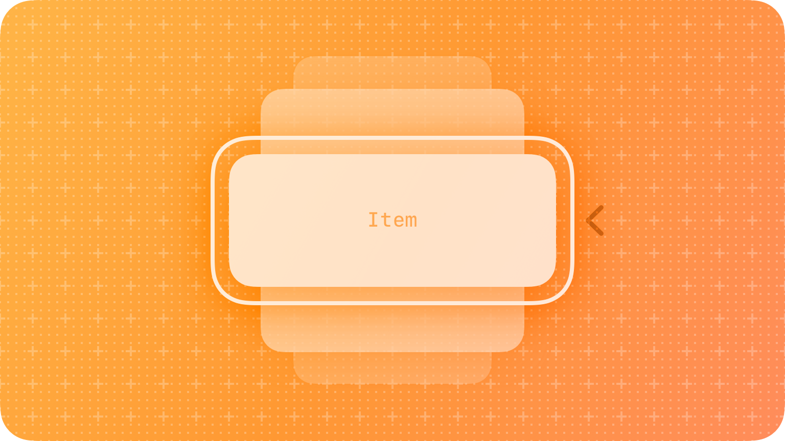
Bowers presents 8 principles regarding mobile architecture. They are presented below in the image slider:
Pikover (2018) likens IA to a blueprint “a visual representation of the product’s infrastructure, features, and hierarchy”, He goes to say that “The level of detail is up to the designer, so IA may also include navigation, application functions and behaviours, content, and flows. There is no set limit to the size or shape of IA; nevertheless, it should encompass the generalized structure of the product so anyone (theoretically) should be able to read it and understand how the product works.”
Designing Information Architecture
The key to building great IA lies in (1.) understanding how your app actually works from the perspective of the user, and (2.)how to organize content into a readable, legible format that is intuitive and easy to follow. Designing the IA is a bit like drawing a flowchart. Using shapes and connecting them with lines in a way that is organised into a single process.
Pikover identifies two major requirements for building the information architecture. Firstly the organisation of the IA through “a visual hierarchy (that is, a hierarchy of features, functions, and behaviour)” and, secondly, the creation of “a legend for displaying different types of features, interactions, and flows.”
It is a little bit old now but the Information Architecture Plan for the Duke University library website clearly shows how content would be organised (Aery, 2013)
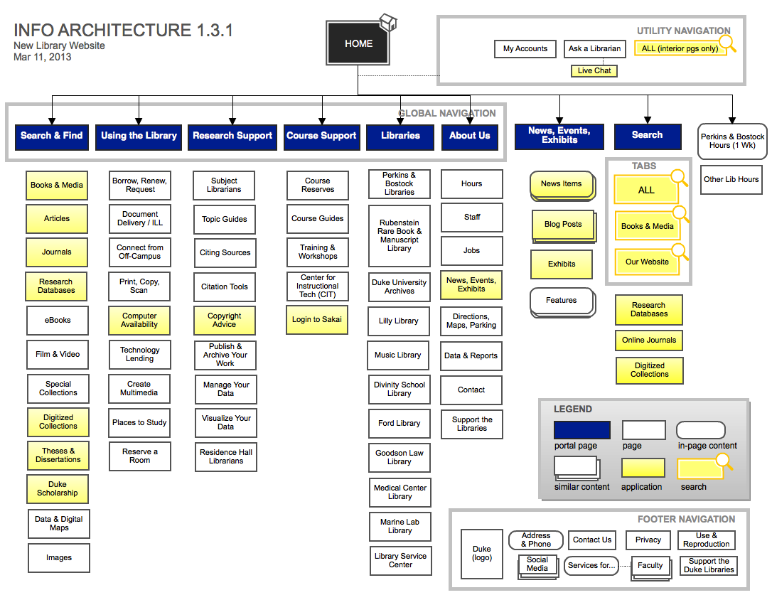
Whilst the image is of a website IA the principles and ideas are similar for mobile IA design. It is suggested that you read Pikover’s blog “The Comprehensive Guide to Information Architecture” for a concise overview of information architecture.
The outgrowth of information architecture is navigation, so it is appropriate to move our focus in the section to mobile navigation.
Navigation grows out of Information Architecture. As Bowers points out information architecture supports mobile navigation and together IA and navigation have a significant impact on mobile design.
The aim of navigation is simply to help users find the information and functionality they want quickly, easily, and intuitively. Sarah McClanahan from Apple (2022b) states that when “apps have great navigation, it’s often unnoticed because people are able to focus on the content and the experience. Navigation involves teaching people how things behave, where things belong, and how things work in your app. The goal of navigation is to provide enough of a foundation of familiarity so that people can easily discover your content and interact with your app”
So, when creating a mobile app navigation design, you should be making sure it is clear and intuitive. Fireart (March 31, 2021) asserts that “convenient navigation has paramount importance from the usability perspective” and provides the following tips for designing good navigation. They are
- Make the navigation understandable
- Make sure it’s easy to read
- Create a clear visual hierarchy
- Select the right icons and labels
- Place important actions at the top
For an explanation of each of these points, read Fireart’s blog and also see some examples of great navigation.
You have previously been introduced to Bower’s article on Information Architecture. In the article, he also presents a great infographic on mobile navigation patterns. These patterns are important to keep in mind as you plan the IA and navigation of your apps. Keep in mind that some of these patterns may be better supported by either Apple or Android.
Before looking at ideas about navigation design promulgated by Apple and Google/Android consider and compare these quotes and think about the intentions for design that might lie behind these statements.
“Organize your app’s structure according to the content and tasks you want users to see. Focus attention on important destinations by displaying them in tabs or in the side navigation and de-emphasize inessential content by displaying it in less prominent locations.” Google (n.d.)
“People tend to be unaware of the navigation experience in an app unless it doesn’t meet their expectations. Your job is to implement navigation in a way that supports the structure and purpose of your app without calling attention to itself.” Apple (2022a)

Apple Navigation
Apple talk about ‘wayfinding’ in reference to navigation. In the previous sections, you were directed to watch a video entitled “Essential Design Principles”. In that presentation, the concept of wayfinding was introduced (7.39- 10.59 mins). Take note of the questions asked, and features of navigation that are central to Apple experience.
For Apple navigation is considered in their Human Interface Guideline under two primary sections: Accessibility and Components/Navigation and Search.
Accessibility covers are a range of factors and you are encouraged to “design with accessibility in mind. Accessibility is not just about making information available to people with disabilities — it’s about making information available to everyone, regardless of their capabilities or situation. Designing your app with accessibility in mind means prioritizing simplicity and permeability and examining every design decision to ensure that it doesn’t exclude people who have different abilities or interact with their devices in different ways.” (Apple, 2022a) You can intuit from this statement that good navigation promotes accessibility.
In the Components section of the guide, you will find the best practices for using navigation bars, search fields, sidebars, and tab bars to achieve great navigation in your Apple app design. You will note that the Human Interface Guidelines that there are other aspects of navigation not mentioned here as they are not features of iOS or iPadOS (the guidelines cover all Apple operating systems).
Apple Navigation Components
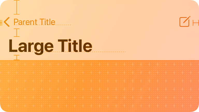
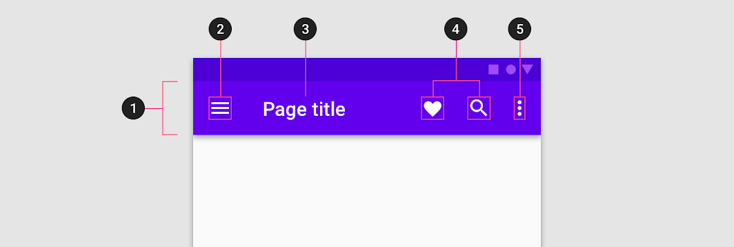
Navigation Bars
“A navigation bar also provides a natural place to display a screen’s title — helping people orient themselves in your app or game — and it can include controls that affect the screen’s content.”. The best practice tenets espoused for navigation bars are:
- Use the title area to describe the current screen if it provides useful context.
- Write a concise screen title.
- Consider temporarily hiding the navigation bar to provide a more immersive experience.
- Use the standard back button.
- Make sure buttons that use text labels have enough room.
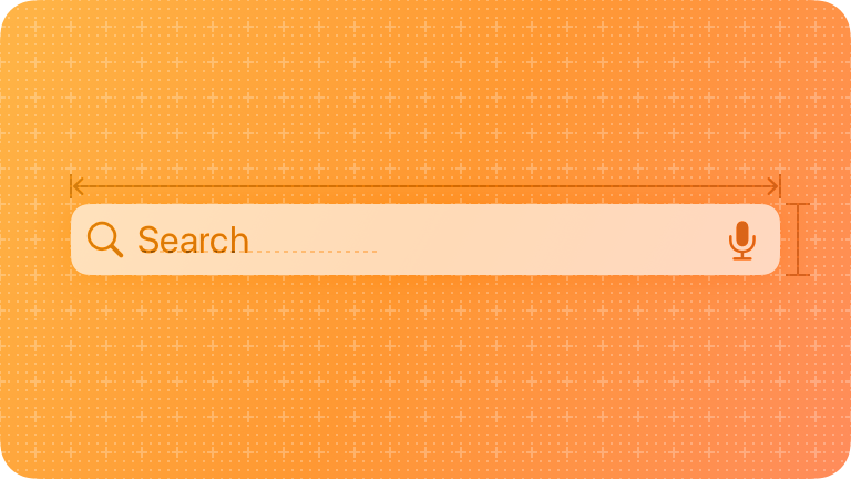
Search Fields
“A search field lets people search a collection of content for specific terms they enter.” It is an editable text field. The best practice tenets for search fields are:
- Consider providing hints to help guide searching.
- Consider providing helpful shortcuts and other content near a search field.
- Start the search at an appropriate time.
- Include a Clear button.
- Take privacy into consideration before displaying search history.
- Favor improving search results over including a scope bar.
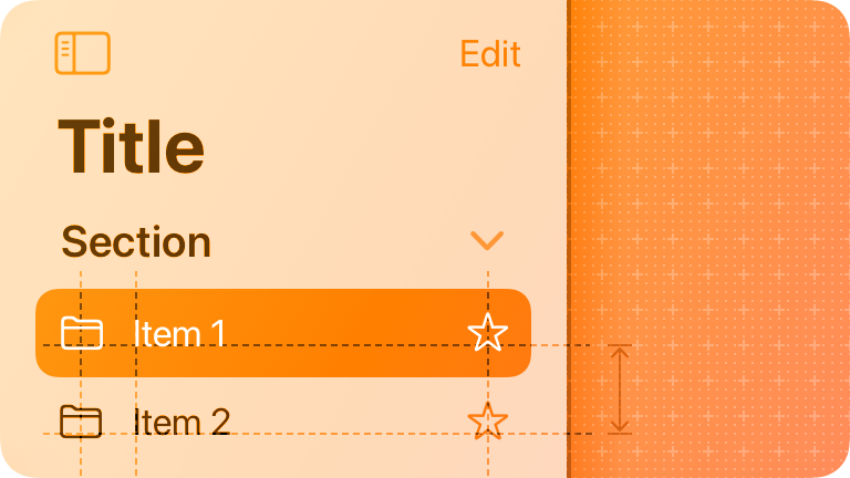
Sidebars
Sidebars provide access to top-level collections of content and support app navigation. “The term sidebar refers to a list of top-level app areas and collections, almost always displayed in the primary pane of a split view. When people choose an item in a sidebar, the split view displays the item’s details in a secondary pane or — if the item contains a list — the secondary pane presents the list and a tertiary pane presents the details.” The best practice points for sidebars are as follows:
- Use a sidebar to enable quick navigation to key areas of your app or top-level collections of content, like folders and playlists.
- When possible, let people customize the contents of a sidebar.
- Consider letting people hide the sidebar.
- In general, show no more than two levels of hierarchy in a sidebar
- If you need to include two levels of hierarchy in a sidebar, use succinct, descriptive labels to title each group.
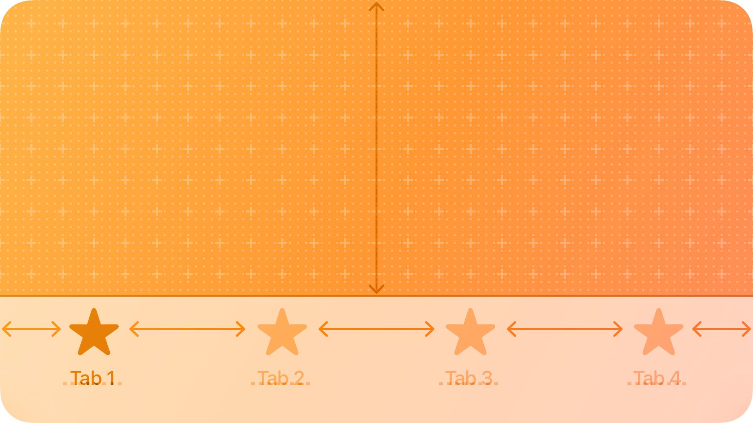
Tab Bars
“Tab bars help people understand the different types of information or functionality that a view provides. They also let people quickly switch between sections of the view while preserving the current navigation state within each section.” They use bar items in order to move between panes of content in the same view that are mutually exclusive. Best practices for using tab bars are:
- Use a tab bar only to enable navigation, not to help people perform actions.
- Make sure the tab bar is visible when people navigate to different areas in your app.
- Use the minimum number of tabs required to help people navigate your app.
- Keep tabs visible even when their content is unavailable.
- Use concrete nouns or verbs as tab titles.
- Be cautious of overcrowding tabs with functionality.
You can find further details on Apple navigation components in their Human Interface Guide.
In addition, the video presentation by Sarah McClanahan, a designer with Apple is particularly good. In she provides some practical advice, tips, guidance and best practice on how to improve your iOS navigation design. Click on the link to watch Explore navigation design for iOS.

Android Navigation
Whilst it is not mandatory to use Android’s Jetpack Navigation component, they present a number of principles of navigation that should be used.
When using Jetpack you will find that it “helps you implement navigation, from simple button clicks to more complex patterns, such as app bars and the navigation drawer. The Navigation component also ensures a consistent and predictable user experience by adhering to an established set of principles.” (Google Developers, 2021)
Let’s take a few minutes to consider the principles of navigation presented in the Android Developers Guide:
Fixed Start Destination
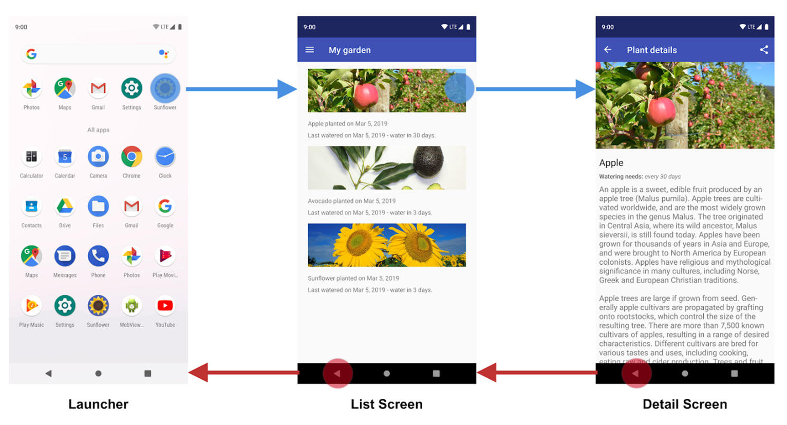
Every app has a fixed start destination. “This is the first screen the user sees when they launch your app from the launcher. This destination is also the last screen the user sees when they return to the launcher after pressing the Back button.” (Googles Developers, 2021). The image below illustrates this principle.
In the image, the List screen is the app start destination. “When launching the Sunflower app from the launcher, the first screen that a user sees is the List Screen, the list of plants in their garden. This is also the last screen they see before exiting the app. If they press the Back button from the list screen, they navigate back to the launcher.” (Googles Developers, 2021)
Navigation state is represented as a stack of destinations
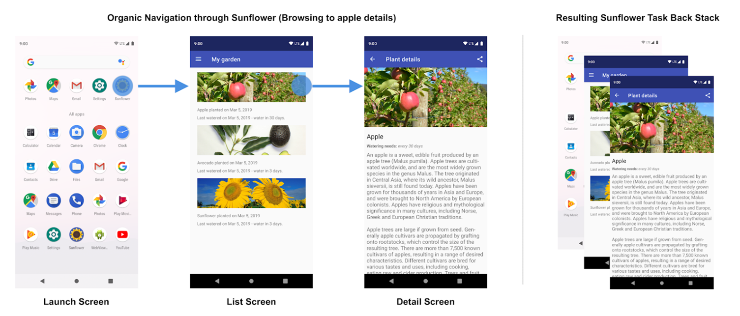
When your app is first launched, a new task is created for the user, and app displays its start destination. This becomes the base destination of what is known as the back stack and is the basis for your app’s navigation state. The top of the stack is the current screen, and the previous destinations in the stack represent the history of where you've been. The back stack always has the start destination of the app at the bottom of the stack.
Operations that change the back stack always operate on the top of the stack, either by pushing a new destination onto the top of the stack or popping the top-most destination off the stack. Navigating to a destination pushes that destination on top of the stack.
The Navigation component manages all of your back stack ordering for you, though you can also choose to manage the back stack yourself.
Up and Back are identical within your app's task
“The Back button appears in the system navigation bar at the bottom of the screen and is used to navigate in reverse-chronological order through the history of screens the user has recently worked with. When you press the Back button, the current destination is popped off the top of the back stack, and you then navigate to the previous destination.
The Up button appears in the app bar at the top of the screen. Within your app's task, the Up and Back buttons behave identically.”
The Up button never exits your app
The Up button doesn’t exit the app, so if the user is at the start destination the Up button is not present.
The Back button, however, is shown and does exit the app.
“When your app is launched using a deep link on another app's task, Up transitions users back to your app’s task and through a simulated back stack and not to the app that triggered the deep link. The Back button, however, does take you back to the other app.”
Deep linking simulates manual navigation
“Whether deep linking or manually navigating to a specific destination, you can use the Up button to navigate through destinations back to the start destination.
When deep linking to a destination within your app’s task, any existing back stack for your app’s task is removed and replaced with the deep-linked back stack.
Using the Sunflower app again as an example, let’s assume that the user had previously launched the app from the launcher screen and navigated to the detail screen for an apple. Looking at the Recents screen would indicate that a task exists with the top most screen being the detail screen for the Apple.”

Cousins (2015) starts her blog by stating “gestures are the new clicks. Every app, game or tool you open on your phone must include a swipe, tap or pinch to function. These gestures are the secret to making great mobile apps work. And there’s a lot that goes into it.”
Gestures are any physical movement by the user to activate a specific action within the design. They are primarily hand movements, but gestures include actions such as shaking, tilting or other actions that make use of a device’s accelerometer. They make for fast, fluid, and delightful user experience. Bank (2014) cites a study by Mauney that “shows us that gestures might be more intuitive than we once thought.”
When developing apps you need to be mindful of user expectations and the ability for gesture-based interaction as not every user will be as familiar with gestures as others. However, most of the common gestures have standardized behaviours and you should make use of them as much as possible.
The bank goes on to point out that whilst the research suggests that the use of gesture-based controls comes naturally to us, regardless of culture and experience the reasons for using gestures has more practical reasons. He cites the following factors:
- Less Clutter: As if the size limitations on mobile devices weren’t bad enough, the common lack of a keyboard means often the UI control panel is squeezed onto the screen, sacrificing valuable content space. But the more an app/site relies on gesture controls, the less buttons on-screen, and thus more content.
- More Fun: While this may not seem like a practical factor in making a business decision, the fact is people will choose a fun app/site over a slightly more useful one.
- More Potential: Every corner of mouse pointing-and-clicking has pretty much been explored by now, and it’s rare to see something new with it these days. However, gesture controls are still very new and exciting, and can be interpreted in many more ways. With a little ingenuity and imagination, you can create something no one’s ever done before. If you have doubts about this, just look at the diversity of touch-based video game
The most common gestures are tap, double tap, drag, pinch/spread, press, flick, rotate and combinations of these. Villamor, Willis & Wroblewski (201o) have produced a freely available Touch Gesture Reference Guide and the following graphic which describes the core, or common gestures.
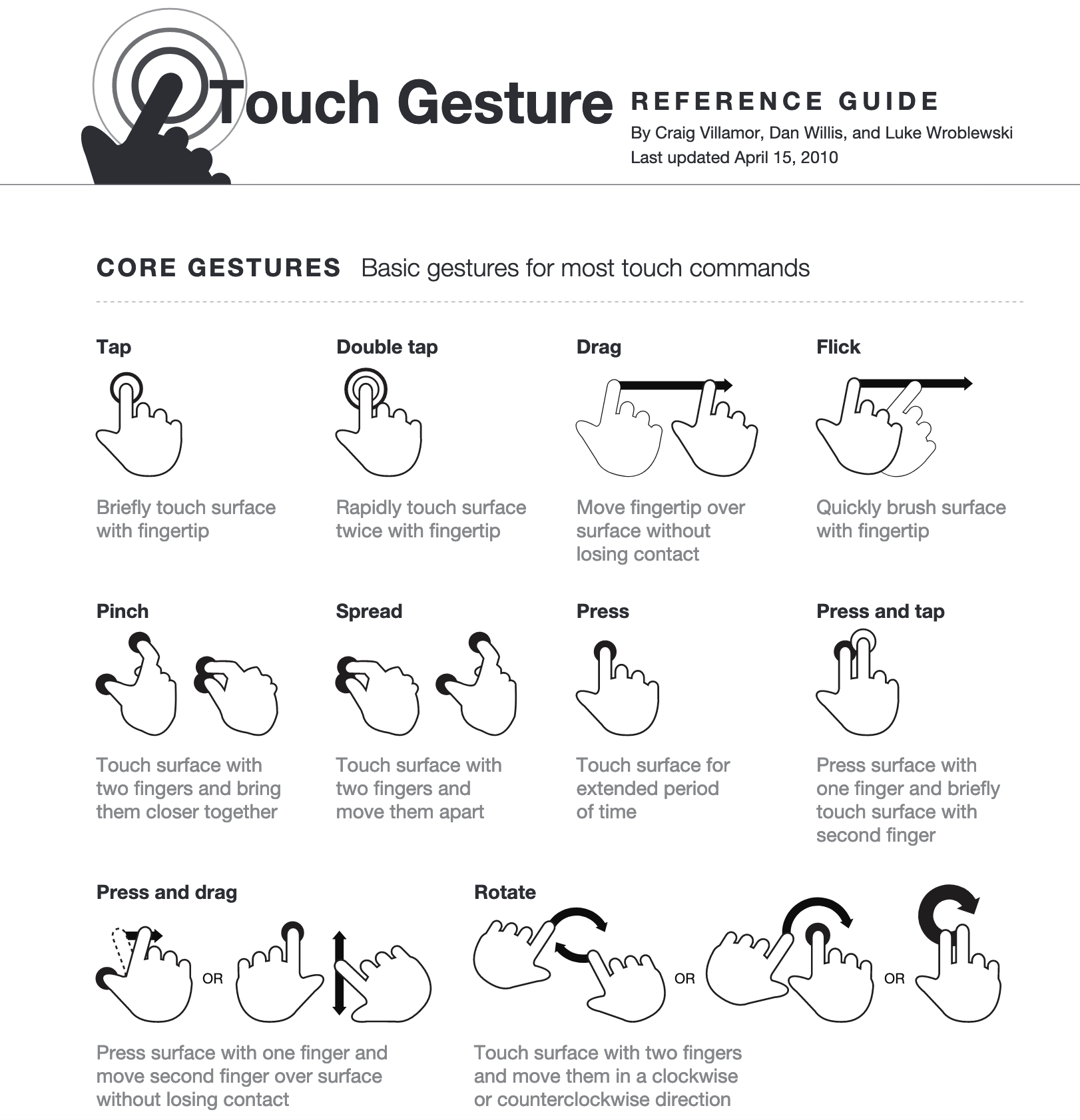
Gestures on Apple Devices
For Apple gestures are “a key way for people to interact with their touchscreen devices, eliciting a close personal connection with content and enhancing the sense of directly manipulating onscreen objects
The standard gestures used on Apple devices are shown below:
| Gesture | iOS | iPadOS | WatchOS | Standard Action |
|---|---|---|---|---|
| Tap | X | X | X | Activate a control. Select an item |
| Swipe | X | X | X | Reveal actions and controls. Dismiss views. Scroll |
| Pan (UIKit)/Drag (SwiftUI) | X | X | X | Move a UI element |
| Pinch (UIKit)/Magnification (SwiftUI) | X | X | - | Zoom view. Magnify content |
| Long press | X | X | X | Reveal additional controls/functionality |
| Rotation | X | X | - | Rotate selected item |
| Edge swipe | X | X | X | Navigate. reveal controls, information or system experiences |
| Double tap | X | X | - | Zoom in. Zoom out |
| 3-finger swipe | X | X | - | Initiate undo (swipe left), initiate redo (swipe right) |
| 4-finger swipe | - | X | - | Switch between apps |
| 3-finger pinch | X | X | - | Copy selected text (pinch in), paste selected text (pinch out) |
Apple espouses the following best practices for gestures:
- In general, respond to gestures in ways that are consistent with other apps.
- Define custom gestures only when necessary.
- Make sure gestures apply to the appropriate content.
- Handle gestures as responsively as possible.
- Enable shortcut gestures to supplement standard gestures, not to replace them.
- Avoid interfering with systemwide screen-edge gestures.
- On iOS and iPadOS Consider enabling simultaneous recognition of multiple gestures if it enhances the experience.
Further information about Apple gestures can be found in their Human Interface Guidelines.
Gestures on Android Devices
Android (Google 2022) simply state “Gestures let users interact with screen elements using touch” and help users to perform any task intuitively and rapidly. They place gestures into three categories:
- Navigation Gestures
- Action Gestures
- Transform Gestures.
Navigational Gestures are the ones that assist the user to move around the device or app easily and intuitively. They act as a supplement to the other input methods like buttons and other navigation components.
Navigation gestures include tap, scroll and pan, drag, swipe and pinch. Action gestures are used to perform actions or provide shortcuts for completing different actions. These actions gestures are tap, long press and swipe.
Transform gestures are used to change the attributes of elements – size, position and orientation.
Common transformation gestures are double-tap, pinch, compound gestures and pick up and move gestures (e.g. changing the position of app icons on your phone screen)
You can view short videos of all these gestures in action.
In summary you can see that regardless of the platform and mobile operating system the use of gestures is ubiquitous and generalised (with some exceptions). This means that if you decide to change from Apple to Android or vice versa you should find that you are able to use the new device easily and intuitively without too much difficulty. Read the article How to implement gestures into your mobile design by Cousins (2015) for a succinct overview of gestures and some comparative illustrations.
System-defined components are features of mobile design that provide a familiar and consistent experience regardless of the mobile device or type of app being used. Think of them as the interactive building blocks which you will use the create a user interface that provides a superior user experience.
The variety of components available for mobile design can be placed into a number of different categories. You won’t necessarily use all the available components, rather you will pick and choose those components that support your application, and various screens and features of the app. Note that Apple’s Human Interface Guidelines categorise components on the basis of their purpose whereas the Material Design of Android categorizes them according to the component type. The table below places the two design strategies side by side for comparison.
| Apple human interface guidelines 2022 | Android material design 3.0 |
|---|---|
| Content | Buttons |
| Layout and organisation | Bottom app bar |
| Menu and actions | Top app bar |
| Navigation and search | Cards |
| Presentation | Chips |
| Selection and input | Dialogs |
| Status | Navigation bar |
| System experiences | Navigation drawer |
| Navigation rail | |
| Switch | |
| Text fields | |
| Widgets |
Let’s take some time to briefly explore the detail of each of these component categories, starting with Apple’s guidelines.
Apple Components
As you have learnt Apple have grouped their components according to its purpose. Within each category, there are several components of different types.
Content
These components manage image, text and web views. See the table below for a breakdown of these component types.
|
Image Views |
Text Views |
Web Views |
|
| Content Description |
An image view displays a single image or in some cases, an animated sequence of images on a transparent or opaque background. An image view can contain rich image data in various formats, like PNG, JPEG, and PDF. Within an image view, you can stretch scale, and size to fit, or pin the image to a specific location. Image views are typically not interactive. |
A text view displays multiline, styled text content, which can optionally be editable. Text views can be any height and enable scrolling when the content extends outside of the view. By default, content within a text view is aligned to the leading edge and uses the system label colour. In iOS or iPadOS, if a text view is editable, a keyboard appears when people select the view. |
A web view loads and displays rich web content, such as embedded HTML and websites, directly within your app. |
| Best Practice Tips |
|
|
|

Source: All images and text taken from Apple (2022) Human Interface Guidelines.
For further details about Content components click on the following links:
Layout and Organisation
These components deal with the ways in which content can be viewed, ordered, revealed and hidden. There are 10 component types in this category, they are:
- Boxes
- Collections
- Column views
- Disclosure controls
- Labels
- Lists and tables
Details of each of these components can be found in the series of images below.
|
Boxes |
Collections |
Column Views |
|
| Component Description |
A box creates a visually distinct group of logically related information and components. By default, a box uses a visible border or background colour to separate its contents from the rest of the interface. A box can also include a title. |
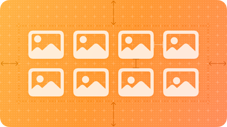
A collection manages an ordered set of content and presents it in a customisable and highly visual layout. Generally speaking, collections are ideal for showing image-based content. |
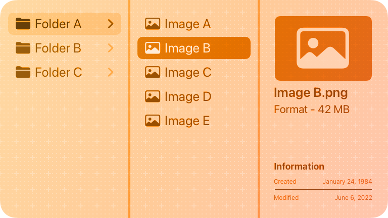
A column view- also called a browser, lets people view and navigate a data hierarchy using a series of vertical columns. Each column represents one level of the hierarchy and contains horizontal rows of data items. |
| Best Practice Tips |
|
|
|
For further details about Layout and Organisation components click on the following links:
- Layout & Organisation Components: Boxes
- Layout & Organisation Components: Collections
- Layout & Organisation Components: Column Views
|
Disclosure Controls |
Labels |
Lists AND Tables |
|
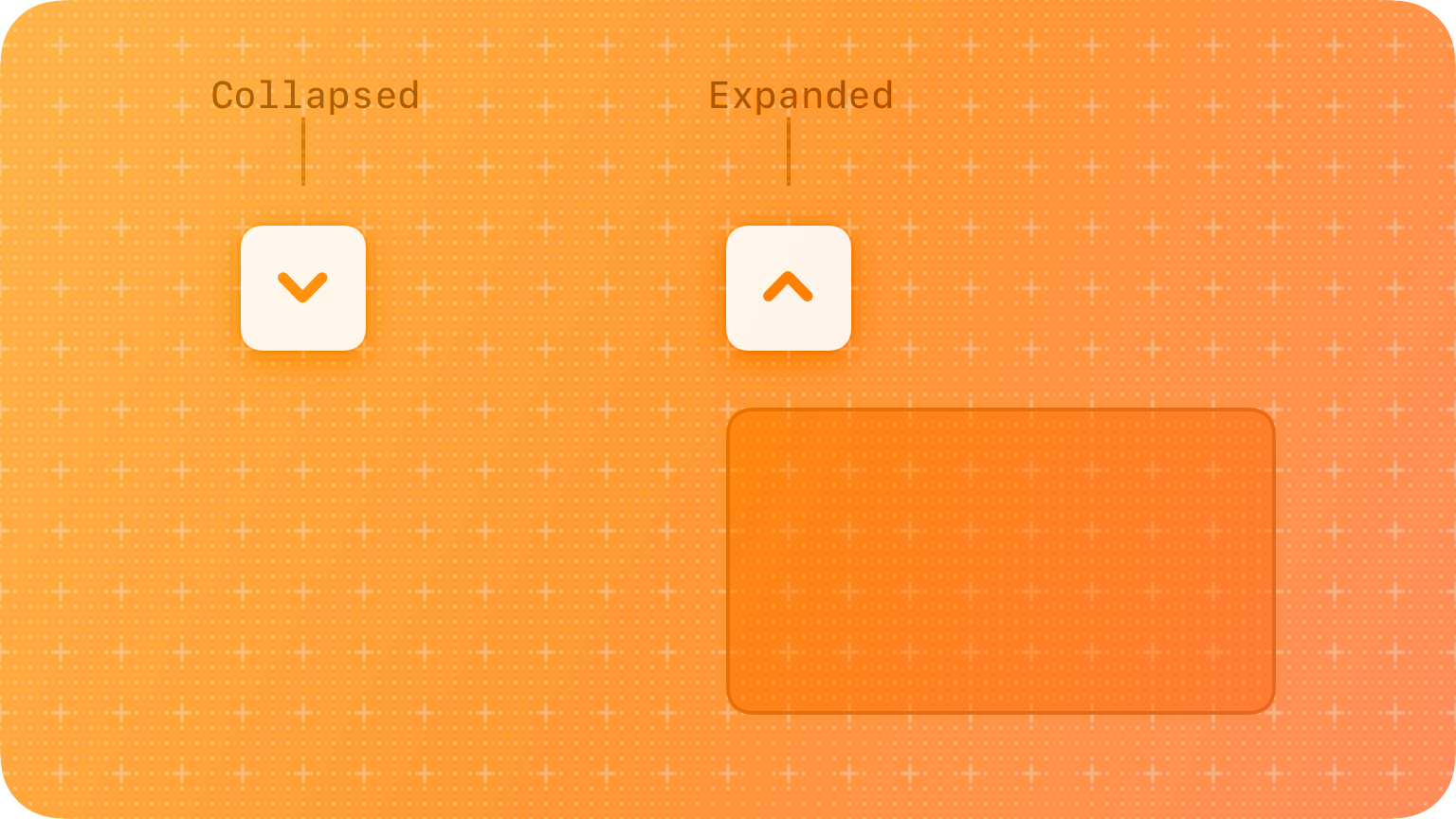
| Component Description | Disclosure controls reveal and hide information and functionality related to specific controls or views. |
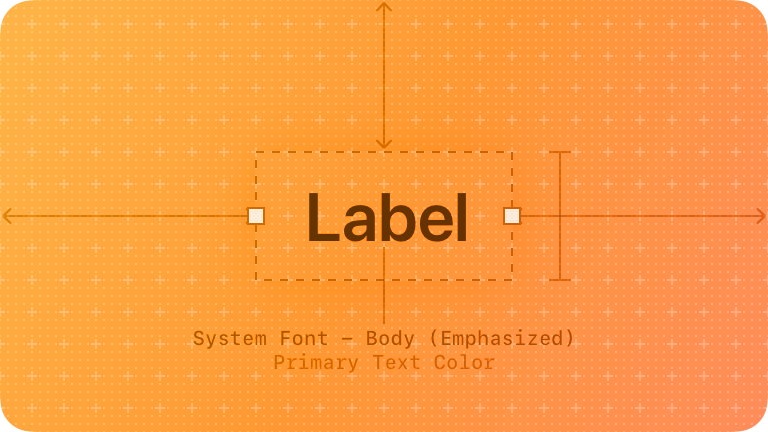
A label is a static piece of text that people can read and often copy, but not edit. Labels display text throughout the interface, in buttons, menu items, and views, helping people understand the current context and what they can do next. The term label refers to uneditable text that can appear in various places. |
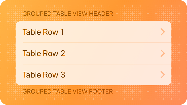
Lists and tables present data in one or more columns or rows. A table or list can represent data that are organised in groups or hierarchies, and it can enable user interactions like selecting, adding, deleting, and reordering. |
| Best Practice Tips |
Use a disclosure control to hide details until they're relevant. |
|
|
Source: All images and text taken from Apple (2022) Human Interface Guidelines.
For further details about Layout & Organisation components click on the following links:
- Layout & Organisation Components: Disclosure Controls
- Layout & Organisation Components: Labels
- Layout & Organisation Components: Lists & Tables
Menus and Actions
These components deal with the ways in which content can be ordered, categorized and changed. The component types in this category are:
- Activity views
- Buttons
- Context menus
- Edit menus
- Pop-up buttons
- Toolbars
Details of each of these components can be found in the images below.
|
Activity Views |
Buttons |
Context Menus |
|
| Component Description |
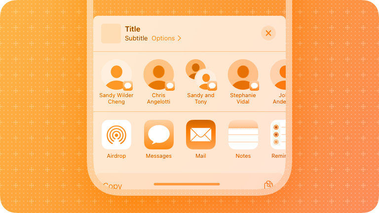
An activity view, often called a shared shoot, presents a range of tasks that people can perform in the current context. Activity views present sharing activities like messaging and actions like Copy and Print, in addition to quick access to frequently used apps. |
Buttons initiate an instantaneous action. Versatile and highly customisable, buttons give people simple, familiar ways to do tasks in your app. Buttons combine three attributes to clearly communicate their function:
|
A context menu provides access to functionality that is directly related to an onscreen item, without cluttering the interface. |
| Best Practice Tips |
|
|
|
Source: All images and text taken from Apple (2022) Human Interface Guidelines.
For further details about Menu & Actions components click on the following links:
- Menu & Actions Components: Activity views
- Menu & Actions Components: Buttons
- Menu & Actions Components: Context menus.
|
Edit Menus |
|
|
|
| Component Description |
Edit menus let people make changes to selected content in the current view, in addition to offering related commands like Copy, Select, Translate, and sometimes Find. In addition to text, and edit menu's commands can apply to many types of selectable content, such as images, files, and objects like contact cards, charts or map locations. |
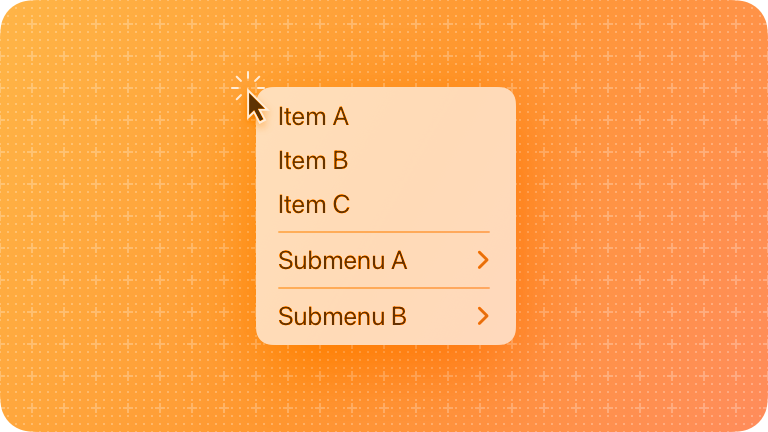
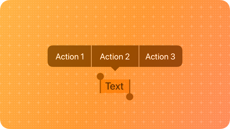
A menu reveals its options when people interact with it, making it a space-efficient way to present commands in your app or game. Menus are ubiquitous throughout the interface, so most people already know how to use the. Different menu types:
|
A pop-up button displays a menu of mutually exclusive options. After people choose an item from a pop-up button's menu, the menu closes, and the button can update its content to indicate the current selection. |
| Best Practice Tips |
|
|
Source: All images and text taken from Apple (2022) Human Interface Guidelines.
For further details about Menu Action components click on the following links:
- Menu Actions Components: Edit Menus
- Menu Actions Components: Menus
- Menu Actions Components: Pop-up Buttons
|
Pull-down Buttons |
Toolbars |
|
| Component Description | A pull-down button displays a menu of items or actions that directly relate to the button's purpose. | A toolbar provides convenient access to frequently used commands and controls that perform actions relevant to the current view. |
| Best Practice Tips |
|
|
Source: All images and text taken from Apple (2022) Human Interface Guidelines
For further details about Menu & Actions components click on the following links:
- Menu & Actions Components: Pull-down Buttons
- Menu & Actions Components: Toolbars.
Navigation and Search Components
Navigation and search components deal with the ways in which users find their way around the app and find the information that they need. There are 4 component types in this category are they are:
- Navigation bars
- Search fields
- Sidebars
- Tab bars
Details of each of these components can be found below.
|
Navigation Bars |
Search Fields |
|
| Component Description |
A navigation bar appears at the top of an app screen, enabling navigation through a hierarchy of content. A navigation bar also provides a natural place to display a screen's title, helping people orient themselves in your app or game, and it can include controls that affect the screen's content. |
The Search field lets people search a collection of content for specific terms they enter. A search field is an editable text field that often displays a Search button, a Clear button, and optional placeholder text. |
| Best Practice Tips |
|
|
Source: All images and text taken from Apple (2022) Human Interface Guidelines.
For further details about Content components click on the following links:
- Navigation and search Components: Navigation Bars
- Navigation and search Components: Search Fields.
|
Sidebars |
Tab Bars |
|
| Component Description |
A sidebar enables app navigation and provides quick access to top-level collections of content in your app or game. The term sidebar refers to a list of top-level app areas and collections, almost always displayed in the primary pane of a split view. |
Tab bars use bar items to navigate between mutually exclusive panes of content in the same view. Tab bars help people understand the different types of information or functionality that a view provides. They also let people quickly switch between sections of the view while preserving the current navigation state within each section. |
| Best Practice Tips |
|
|
Source: All images and text taken from Apple (2022) Human Interface Guidelines.
For further details about Content components click on the following links:
Presentation Components
This group of components related to how content ‘appears’ or looks in the app to the user. There are 7 component types in this category are they are:
- Action sheets
- Alerts
- Page controls
- Popovers
- Scroll views
- Sheets
- Windows
|
Action Sheets |
Alerts |
Page Controls |
|
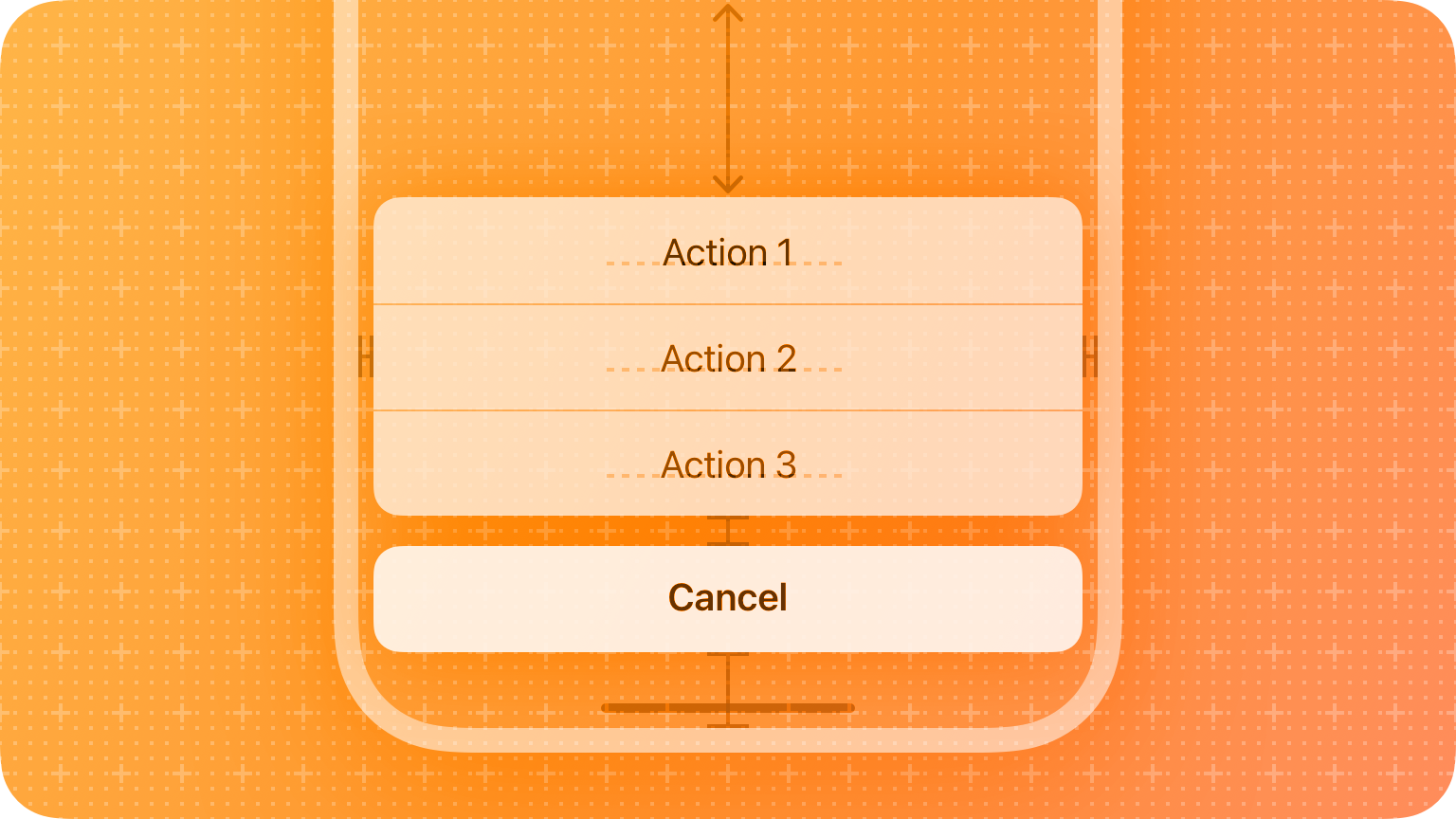
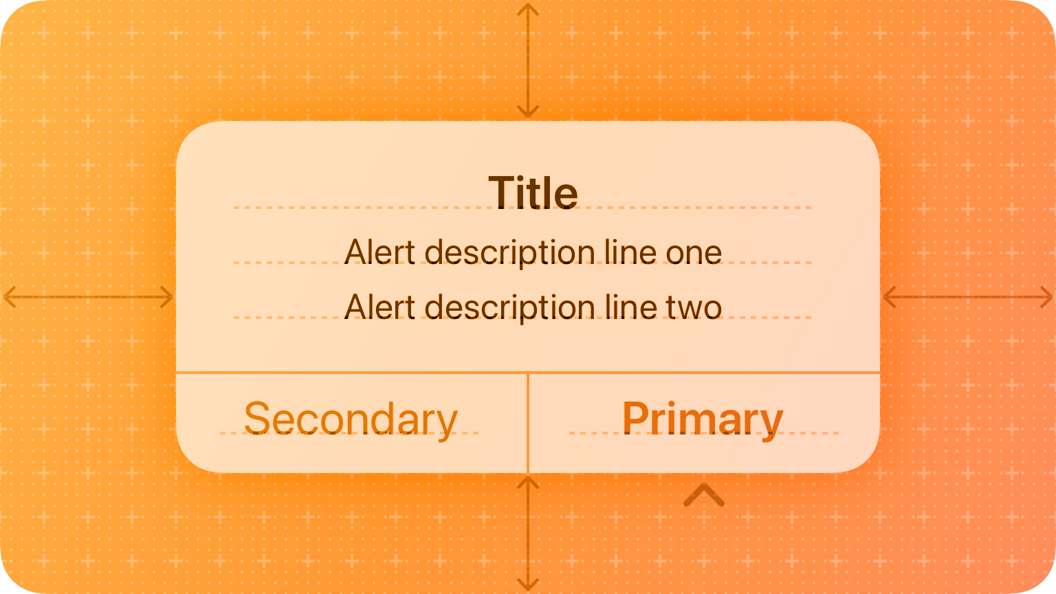
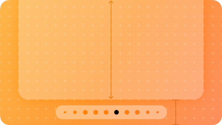
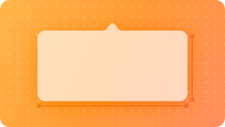
| Component Description | An action sheet is a modal view that presents choices related to an action people initiate. | An alert gives people critical information they need right away. For example, an alert can tell people about a problem, warn them when their action might destroy data, and give them an opportunity to confirm a purchase or another important action they initiated. | A page control displays a row of indicator images, each of which represents a page in a flat list. Page controls appear as a series of small indicator dots by default, representing the available pages. A solid dot denotes the current page. Visually, these dots are always equidistant and are clipped if too many appear onscreen. |
| Best Practice Tips |
|
|
|
Source: All images and text taken from Apple (2022) Human Interface Guidelines.
For further details about Content components click on the following links:
- Presentation Components: Popovers
- Presentation Components: Scroll Views
- Presentation Components: Sheets.
|
Popovers |
Scroll View |
Sheets |
|
| Component Description | A popover is a transient view that appears above other content onscreen when people click or tap control or interactive area. |
A scroll view lets people view content that is larger than the view's boundaries by moving the content horizontally or vertically. The scroll view itself has no appearance, but it can display a translucent scroll bar or indicator that provides additional information about the action. |
A sheet helps people perform a scoped task that's closely related to their current context. |
| Best Practice Tips |
|
|
|
Source: All images and text taken from Apple (2022) Human Interface Guidelines
For further details about Content components click on the following links:
- Presentation Components: Popovers
- Presentation Components: Scroll Views
- Presentation Components: Sheets
|
Windows |
|
| Component Description | A window contains the views and components that present the user interface of your app or game. |
| Best Practice Tips |
|
Source: All images and text taken from Apple (2022) Human Interface Guidelines.
Selection and Input Components
This group of components related to content layout and associated features. The component types in this category are:
- Colour Wells
- Onscreen Keyboards
- Pickers
- Segmented Controls
- Sliders
- Steppers
- Text Fields
- Toggles
|
|
|
|
|
| Component Description |
A colour well lets people adjust the colour of text, shapes, guides, and other onscreen elements. A colour well displays a colour picker when people tap or click it. This colour picker can be the system-provided one or a custom interface that you design. |
An on-screen keyboard can provide a specific set of keys that are optimised for the current task. The iOS, iPadOS and tvOS, the system provides various types of onscreen keyboards people can use to enter data. |
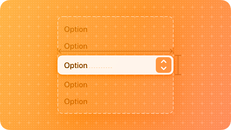
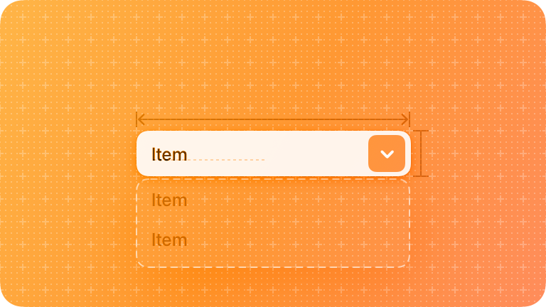
A picker displays one or more scrollable lists of distinct values that people can choose from. Pickers help people enter information by letting them choose single or multipart values. Date pickers specifically offer additional ways to choose values, like selecting a day in a calendar view or entering dates and times using a numeric keypad. |
| Best Practice Tips |
|
|
|
Source: All images and text taken from Apple (2022) Huma Interface Guidelines
For further details about these Selection & Input components click on the following links:
- Selection & Input Components: Colour Wells
- Selection & Input Components: Onscreen Keyboards
- Selection & Input Components: Pickers
|
Segment controls |
Sliders |
|
| Component Description |
A segmented control is a linear set of two or more segments, each of which functions as a button. A segmented control can enable a single choice or multiple choices. |
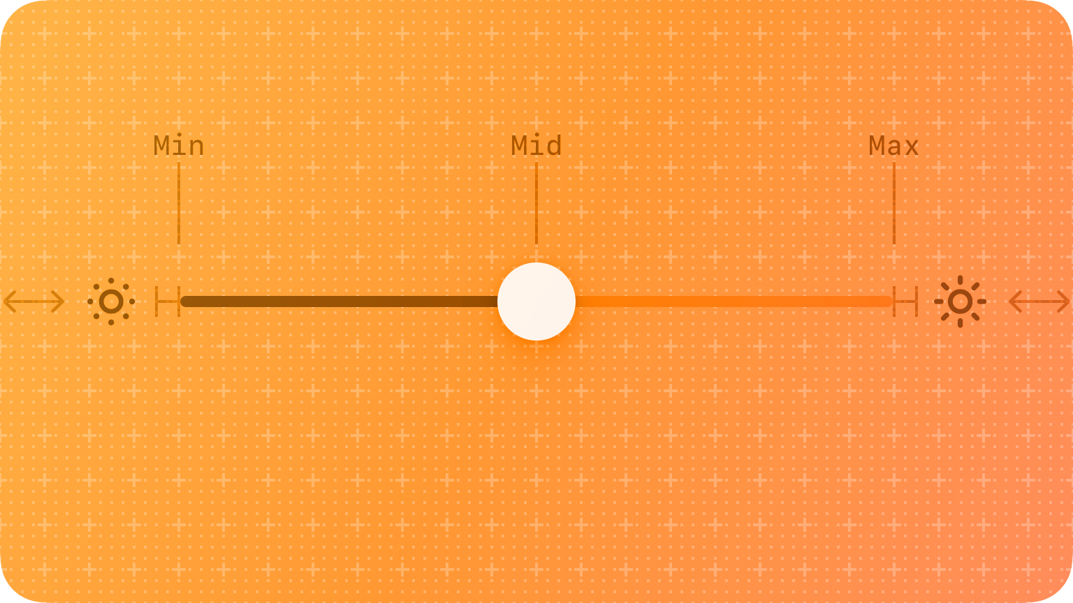
A slider is a horizontal track with a control, called a thumb, that people can adjust between a minimum and maximum value. |
| Best Practice Tips |
|
|
Source: All images and text taken from Apple (2022) Human Interface Guidelines.
For further details about these Selection & Input components click on the following links:
- Selection Input Components: Segmented Controls
- Selection Input Components: Sliders
|
Steppers |
Text Fields |
Toggles |
|
| Component Description |
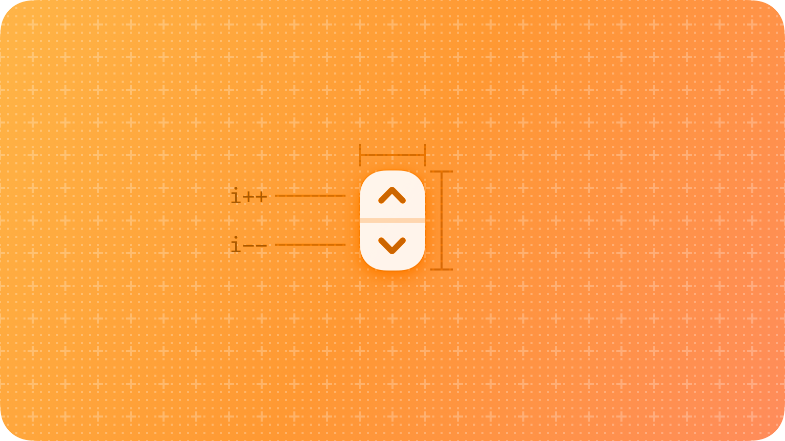
A stepper is a two-segment control that people use to increase or decrease an incremental value. A stepper sits next to a field that displays its current value because the stepper itself doesn't display a value. |
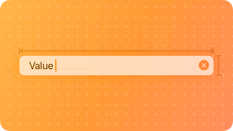
A text field is a rectangular area in which people enter or edit small, specific pieces of text. |
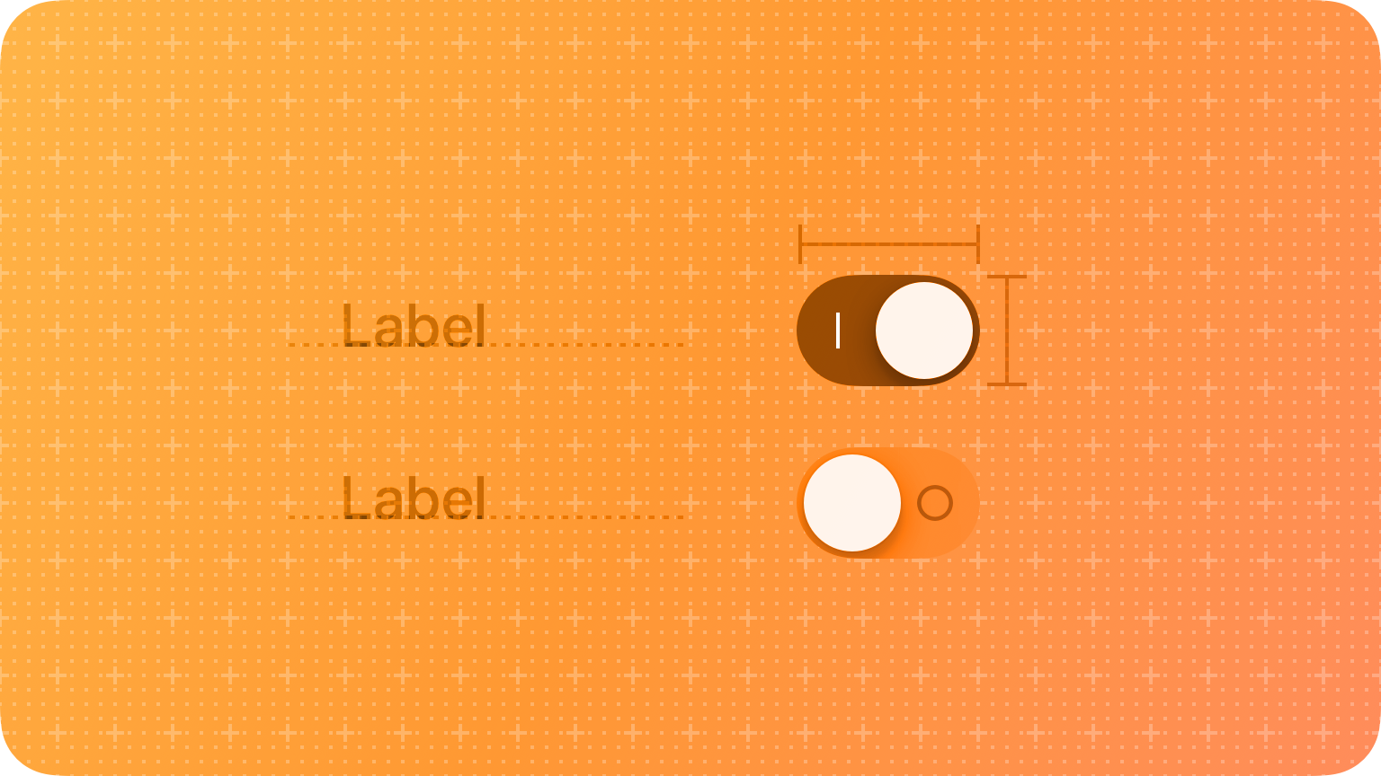
A toggle lets people choose between a pair of opposing states, like on and off, using a different appearance to indicate each state. Different platforms can support various toggle styles. |
| Best Practice Tips |
|
|
|
Source: All images and text taken from Apple (2022). Human Interface Guidelines
Two additional component categories related to the status of the app and ‘system experiences. Go to the relevant sections in the Human Interface Guide to read about them. You can click on any of the links provided above to get to the list of components to view.
Android Components
These material components are “interactive building blocks for creating a user interface.” (Google LLC). As you have learned these components are categorized based on type rather than purpose.
In this section on material design components, you will be introduced to a number of components in brevity, but links will be provided to all the components in the design guide for your reference.
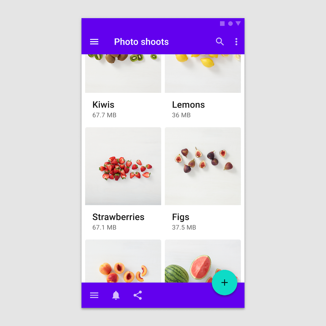
App Bars
There are two types of app bars in Material design – top and bottom. The position of the app bar determines its purpose of it.
Bottom app bars are used to display navigation and key actions. They provide “access to a bottom navigation drawer and up to four actions, including the floating action button.” The Material Design guidelines provide the following direction regarding the use of the bottom app bar:
- They are only used on mobile devices.
- Should be used to provide access to a bottom navigation drawer, and
- Should only be used on screens with two to five actions.
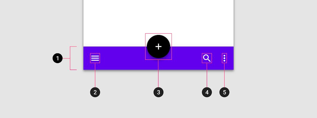
“Bottom app bars can contain actions that apply to the context of the current screen. They include a navigation menu control on the far left and a floating action button (when one is present). If included in a bottom app bar, an overflow menu control is placed at the end of other actions.” (Google 2022).
This is shown in the image below. Take note of the positions of the features of the app bar:
- Container
- Navigation draw control
- Floating action button (FAB)
- Action icon
- Overflow menu control.
Read in-depth about the bottom app bar, including specifications and guidelines for theming.
Top app bar - this bar is used to provide content and actions that are related to the current screen, such as branding, screen titles, navigation and other actions. Read more detailed information about the top app bar and its use in the material.
The recommended placement of elements in a top app bar for left-to-right languages like English is:
- Place navigation on the far left
- Place any titles to the right of the navigation
- Place contextual actions to the right of navigation
- Place an overflow menu (if used) to the far right.
For right-to-left languages like Mandarin, Cantonese or Arabic, placement positions should be flipped.
The image below shows the top app bar with the relevant features marked:
- Container
- Navigation icon – this is optional
- Screen or page title – optional
- Action items – optional
- Overflow menu for additional actions – this is also optional.
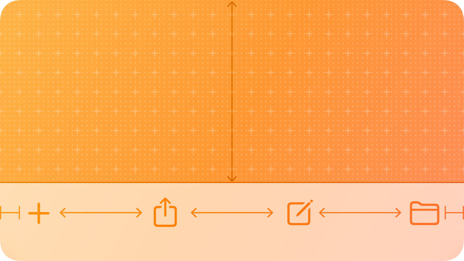
Floating Action Button (FAB)
The Floating Action Button is used to perform the most common, or primary action on the screen. “It appears in front of all screen content, typically as a circular shape with an icon in its centre. FABs come in three types: regular, mini, and extended.”. You should only use a FAB if it is appropriate as it may not be the most suitable way to present the primary action of the screen. Constructive actions like sharing, creating or exploring uses for the FAB
In the example below the FAB is represented by the circle with a plus sign in the bottom right of the screen. This will create a new email in the app represented.

The Material Design guidelines specify that a floating action button “can trigger an action either on the current screen, or it can perform an action that creates a new screen.” This action is important or constructive like creating an email, marking a favourite image, sharing an image, or starting a new process. The guidelines discourage the use of the FAB for minor actions or destructive actions like archiving or trashing items.
Read more for an in-depth look at the floating actions.
Buttons
Buttons are used to identify or communicate actions that can be taken by the user. They are found throughout the application and UI. They should indicate that they can trigger an action and often come with an appropriate prompt, be outlined, contained or toggled. The image below illustrates this.
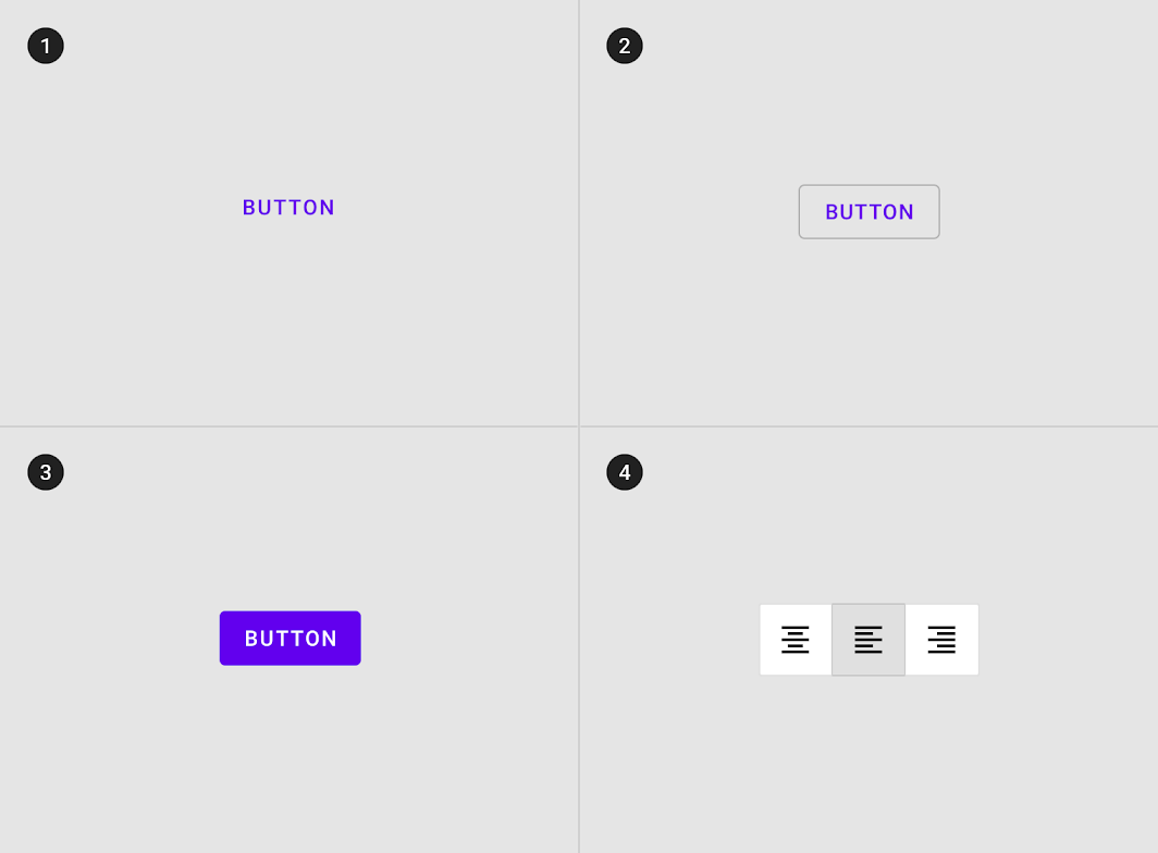
The legend to this image in the design guide provides the following information about these buttons.
- Text button (low emphasis) - Text buttons are typically used for less important actions.
- Outlined Button (medium emphasis) – These buttons are used for more emphasis than text buttons due to the stroke
- Contained button (high emphasis) - Have more emphasis, as they use a colour fill and shadow.
- Toggle button - Toggle buttons are used to group a set of actions using layout and spacing. They’re used less often than other button types.
Read more for comprehensive information about the anatomy of buttons, a style guide, details about button hierarchy and placement, button behaviour and other button features.
Cards
Cards are surfaces that display content and actions on a single topic.
They should be easy to scan for relevant and actionable information. Elements, like text and images, should be placed on them in a way that clearly indicates hierarchy. A card can also stand alone, without relying on surrounding elements for context. They cannot merge with another card or divide into multiple cards.
Each card is made up of content blocks. All of the blocks, as a whole, are related to a single subject or destination. Content can receive different levels of emphasis, depending on its level of hierarchy.
Below is an example of a card with clear visible boundaries. Various actions can be placed on a card, including gestures. A good example previously used can be found in dating apps like Tinder. The card contains a dating profile, and the gesture associated with the selection or rejection of that profile – swipe left or swipe right.
Read more from the design guide page for Cards.
Checkboxes
You will use a checkbox if you want users to select one or more options from a list, as well as other selective activities. Checkboxes are a very familiar feature, having been taken from paper-based forms and activities. They are one of several controls that are used for selection – radio buttons and switches are other selection controls in the design guide. The choice of selection control is guided by what task you wish users to perform, and details of preferences for use can be found in the design guide. An example of checkboxes being used in an app for meal planning is shown below.
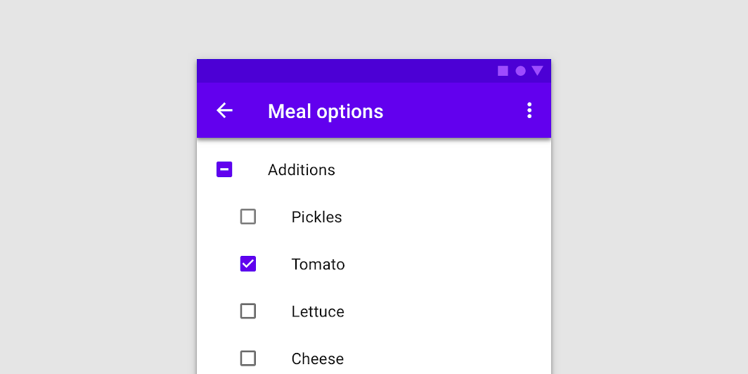
Read more from the Material Design guidelines for checkboxes.
Text Fields

Entering a new contact into your mobile device is a great example of the use of text fields. They are fields that allow users to directly enter textual information in the app or UI. A form like a contact sheet above is a typical use of text fields.
Read more about the use of text fields, the styling and design of fields and protocols for implementing text fields in your build.
Chips
“Chips allow users to enter information, make selections, filter content, or trigger actions. While buttons are expected to appear consistently and with familiar calls to action, chips should appear dynamically as a group of multiple interactive elements.” The types of chips available in the design guide are:
- Input chips
- Choice chips
- Filter chips, and
- Action chips.
They are used to represent information that is complex in a compact manner. User input is verified and converted into chips for display. Have you ever noticed suggested responses coming up when you are replying to a text message? That is an example of chips.
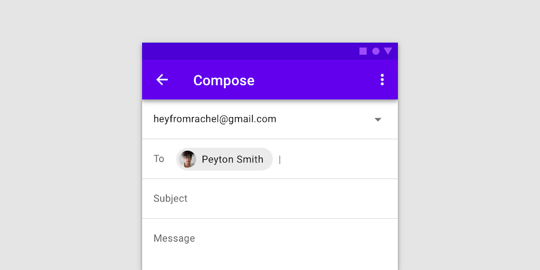
In the image below you will see contact details added to the email being composed. Whilst the chip only provides the name of the person the message is being sent to it contains all the required information for the app to send the message to the nominated person.
Read more about the types of chips identified earlier, the specs and theming of chips in app design.
There are more components in the design guide to familiarise yourself with. They include dialogues, date and time pickers, dividers, sliders, snack bars and tabs. All the components can be found on the Components homepage in the Material Design Guide. The design of each component is discussed along with an additional tab with instructions for the implementation of the identified component in your app build.
Final Comments
The design of the mobile app is well supported with guidelines for the two major operating systems that are regularly updated and improved. Additionally, both Apple and Google make freely available a well of resources that include development kits to assist you. As a designer and developer, you need to make yourself fully aware of these design guidelines and associated resources in order to design and build high-quality apps that people want to download and use. These guidelines are the key to your app not becoming one of the negative statistics that were introduced at the beginning of this topic.
Figma is a collaborative interface design tool used primarily for web design, app design, and UI/UX design. It's popular among designers and design teams for its real-time collaboration features, allowing multiple users to work on a design project simultaneously. Figma operates in the cloud, enabling users to access their designs from any device with an internet connection and making it easy to share and collaborate on projects with team members or clients. It offers features such as vector drawing tools, prototyping capabilities, version history, and a robust library of design assets. Figma has gained popularity for its versatility, ease of use, and focus on collaboration, making it a go-to tool for many design professionals.
Designing mobile UX in Figma
Designing mobile UX apps in Figma typically involves several key steps. Here's a general outline:
Define Your Goals and Target Audience:
- Understand the purpose of your app and the needs of your target audience.
- Define the key features and functionalities your app will offer.
Research and Ideation:
- Conduct user research to gather insights into your target users' preferences, behaviors, and pain points.
- Brainstorm ideas and concepts for your app's design, considering usability, accessibility, and visual appeal.
Wireframing:
- Create low-fidelity wireframes to outline the basic layout and structure of your app's screens.
- Focus on arranging elements such as buttons, navigation bars, and content blocks to establish the flow of the app.
UI Design:
- Develop high-fidelity UI designs based on your wireframes, incorporating visual elements such as colors, typography, icons, and imagery.
- Ensure consistency in design elements across screens to maintain a cohesive user experience.
Prototyping:
- Use Figma's prototyping features to create interactive prototypes of your app.
- Define interactions, transitions, and animations to simulate how users will navigate and interact with the app.
- Test the prototype to gather feedback and identify areas for improvement.
Iterate and Refine:
- Gather feedback from stakeholders, users, and usability testing sessions.
- Iterate on your designs based on feedback, making adjustments to improve usability, accessibility, and overall user experience.
- Continue refining your designs until you achieve the desired level of usability and satisfaction.
Handoff and Collaboration:
- Use Figma's collaboration features to share your designs with developers, stakeholders, and other team members.
- Provide detailed design specifications and assets to facilitate the development process.
- Collaborate with developers to ensure a smooth transition from design to implementation.
Testing and Validation:
- Conduct usability testing with real users to validate the effectiveness of your design.
- Gather feedback and data to identify any usability issues or areas for improvement.
- Make necessary adjustments to your designs based on testing results.
Finalize and Launch:
- Prepare final design assets and documentation for handoff to development.
- Ensure all design assets are organized and accessible for implementation.
- Work closely with developers during the implementation phase to address any design-related issues.
- Launch your app and continue monitoring user feedback to inform future updates and iterations.
By following these steps and leveraging Figma's features, you can effectively design mobile UX apps that are both visually appealing and user-friendly.
Mobile app design template in Figma
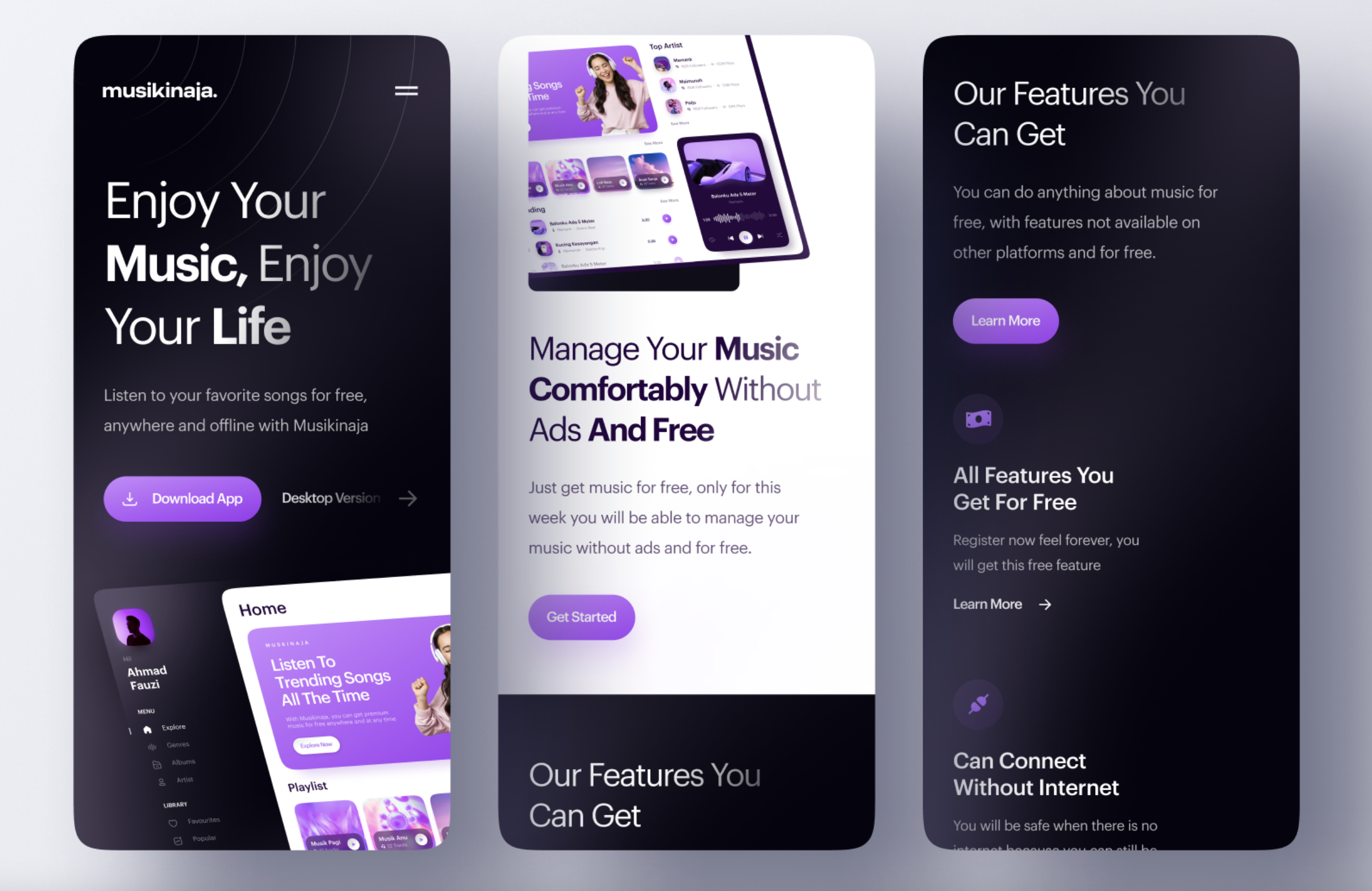
Figma has a range of mobile app designs that you can use for your mobile application.
Click here to find the templates - Mobile app design templates in Figma
Useful blogs and videos on designing mobile apps in Figma
Here are some interesting blogs on how to design a mobile app in Figma for those just starting out:
- https://www.cprime.com/resources/blog/how-to-create-your-first-ui-design-app-in-figma/
- https://merge.rocks/blog/how-to-design-a-mobile-app-in-figma-a-short-guide-for-those-just-starting-out.
FIGMA Video Tutorials
There are plenty of YouTube videos on how to design mobile apps in Figma, but the following two videos are elaborate and very useful for those who are just starting.
Watch- Figma Mobile App Design Tutorial (46:30 minutes)
Use the Figma video tutorial to learn how to design a Modern Mobile App in Figma.
Watch- Designing an App in Figma - A Step-by-Step Guide for Beginners (54:49 minutes)
Learn how you can design your own apps in Figma with this step-by-step tutorial designed for complete beginners! Figma is a free web-based design tool used by professionals and indie devs to create app designs, prototypes and mockups: https://cwc.to/figma