Welcome to UX and AI
In this topic we will be looking at Artificial Intelligence (AI) or intelligent technology from the User Experience (UX) perspective.
When designing the UX, what do we need to consider as we work with intelligent technology?
This topic will cover:
- An introduction to AI UX
- AI UX principles
- Design goals for AI enabled mobile apps
- AI enabled UI
- Voice User Interfaces
- Mobile app personalisation
- An AI UX case study
Before we get stuck into the topic, have a quick look at this fun video – Building smarter games with machine learning (Google Cloud Tech, 2020), where Dale shows us a little game she designed using machine learning (AI).
UX of AI or AI UX
Let’s begin by defining these terms.
UX – User Experience
What is important, is not what the app looks like to you or how many bells and whistles it has, it is the entire experience a user has, from the moment they first hear about it, to searching for it, reading about it, installing it, opening it, doing things with it, closing it, and returning to it. It needs to be an experience they would be happy to repeat.
UX designers use psychology models to create experiences that enable users to effectively and efficiently interact with things in their world – in a meaningful and relevant way.
Watch What is User Experience (UX) Design? (Interaction Design Foundation – IxDF, 2022) to learn more about the history of this field.
AI – Artificial Intelligence
Artificial intelligence is when computers show intelligence that would normally only be expected from humans. The computer learns by collecting more information, enabling it to improve it’s knowledge and intelligence.
AI is important because it allows computers to do work that would normally be performed by a human - quicker and cheaper. AI is adding more automation to our lives and making some tasks safer and easier. Just think of AI that allows a driver to ask their phone for directions to the closest gas station. There are several benefits to AI in this situation – using voice, means the driver can keep their hands on the wheel, the maps use your current location to search for the closest gas station, and then will route you the quickest way based on live traffic information coming from other driver’s phones in the area. Take a moment to think about how you would have found the closest gas station in an unfamiliar area after realising your tank is almost empty, fifteen years ago?
Watch AI keeps Amazon warehouses humming (Amazon News, 2019) to see an example of how extensively AI is being used and trusted already.
So what is the relationship between AI and UX?
If you want to design an app that uses AI (often called an AI-enabled app), you will need to put a big emphasis on UX for it to be successful.
We know that AI is when technology/computers seem to be thinking, learning, and making decisions - behaviour that we would normally see in humans. Because this is all still quite new, it means we are expecting our users to make a big leap in accepting and using this tech. If our users understand how the AI in the app is working, it will help to bridge that gap, so, communication is key. For example, a message like “Other users who watched “Begin again”, also watched “La La Land”, would you like to see it now?” is better than “we think you will like La La Land”. It removes that scary feeling that the app is reading your mind or listening to your conversations.
You’re sitting at your computer working when a loud, frustrated groan comes from your colleague at the next desk… “Haven’t these people ever used their own app!!??”. This dissatisfaction with an app happens far too often and usually ends in app abandonment.
It’s not enough to just get the product to market, there are many goals we need to achieve to ensure our product and users stay around for the long haul. Here are just a few of them. We need to make the AI:
- intuitive
- trustworthy
- transparent
- enjoyable to use
- add value.
A certain amount of responsibility comes with working in the AI field right now. The whole future of AI-enabled apps and intelligent technology relies heavily on user experience (UX), therefore designers must take UX seriously. The future of AI depends on you and your work.
Our AI-enabled technologies must be designed with our users at the centre to have the best outcome. Watch The relationship between artificial intelligence and user experience (NNGroup, 2021) to hear this explained more fully.

There are many excellent principles and guidelines you could and should follow when designing AI-enabled apps.
We will highlight three main principles here and then you can learn more by watching some videos we will share with you shortly.
- Context
- Interaction
- Trust.
Just as length, width, and height measurements multiply together to create a 3D cube, if you remain focused on these three principles while you design for AI, your product will come to life and be solid and full.

Context
Looking at your product and each of its features as parts of a bigger picture. Learn who your users are, and what their goals might be in using the app and each function or feature. Understand what competitors they might be comparing your app to. Look beyond your app and your users to the external world, what changes might be happening in the industry?
Consider performing a SWOT test to discover the strengths, weaknesses, opportunities and threats your app might face. Strengths and weaknesses are internal factors which you can control, whereas opportunities and threats are external factors which you cannot control but which you can plan for – to make the most of opportunities and to reduce the negative impact of threats. For example, there could be legislative changes that affect your app, or there might be a new market opening – how could you tap into it?
Those working on AI-enabled products need to understand the big picture of its output –
- what the output means
- how the output compares to objectives
- how the output compares to user expectations.
Interaction
Users need and want to know what their app is doing. Rather than the app just doing what it can, it is better for the app to make suggestions and to ask permission before taking any actions that might have an impact. AI-enabled apps can engage with the user in many ways – through the interface, text, or email, or push notifications.
All interactions should be communication-focused to ensure a positive user experience.
Trust
We need our users to always trust us and our app. We can’t lose that trust, or we will lose customers.
So how do we earn it in the first place? We ensure that we have communicated honestly from the beginning, about what our app can do and what it can’t do. We want our app to perform the task our user wants it to perform quickly and easily, and without any unexpected surprises.
A user’s perception of our product is the sum-total of all the experiences they have had with our app. Every little experience counts. Using the app yourself, can go a long way to working out these issues early on.
We need to ensure that our app delivers the value we promised. Design all experiences to engender trust. We are trying to provide a solution to our users’ needs, we are not looking for them to meet our needs. Keep that in mind and remember to see your role as one of service to your users.
In artificial intelligence tech, the differentiator for success is the user experience.
Dr Daria Loi from Intel Labs conducted an extensive research project on AI UX and produced a short video series covering each of the ten guidelines that came out of her research. Note that her research focused mostly on home assistance products, however, these ten guidelines can be applied across the board in the world of AI UX. They are:
- Ethics and brand trust
- Minimise intrusion
- Design socially trusted and trustworthy platforms
- Make machines help humans
- Design helper usages
- Serendipitous design
- Empower people to achieve unique goals
- Create diverse education tools
- Design onboarding mechanisms that grow and evolve
- Create families of products.
First, watch An Introduction (Intel Software, 2018) [2:25], which will touch on her research and introduce the series, and then we’ll share with you a selection of the short videos to view.
Ethics and brand trust
Daria begins by sharing the first guideline which is Ethics and Brand Trust (Intel Software, 2018). She talks about the importance of making a stand from the beginning about who you are as a company and what you stand for. You need to earn credibility and keep it. In 2015 Volkswagon were found to have altered their car computers to display better (falsified) emissions information. Not only did that cost them a lot in damages, but they lost a lot of existing and potential customers, who will never trust their brand again. You can’t afford to do this sort of damage to your brand by lying to your customers.
Minimise intrusion
There are a growing number of users out there who won’t even complete installation and set up of an app if they are asked for too much personal information – information that the company has no business collecting or storing. This sort of thing could have a severe impact on take up, especially if there are similar apps who don’t ask for this information. Hear what Daria has to say about Minimising Intrusion (Intel Software, 2018) [3:59].
Design socially trusted and trustworthy platforms
Daria talks about the severity of earning and keeping users’ trust by implementing sound and stringent security features and communicating this all clearly and transparently to the users.
Make machines help humans
Ensure the app is always working to the instructions of humans, to help them, but not to control or take over.
For example, most search engines, when they find no results will return something like “Sorry, no results were found”. However, some search engines return a list of completely unrelated content/products instead. This kind of behaviour is extremely off-putting for most users.
Optimise your search function and ensure it is always easy to find. Use a standard search icon, like a magnifying glass, to keep your app intuitive, and help humans.
Design helper usages
Daria explains what she calls helper usages. They are all functions of the app designed to help the user to do something, which has a high ROI (return on investment). These are the functions you want to prioritise development of and release first.
Serendipitous design
Serendipity is when you stumble across something unexpected but pleasant that you weren’t looking for or expecting. Daria explains how users of AI-enabled technology want predictability and consistency, but also they want to have positive surprises about functions that can enrich their lives or experience.
Empower people to achieve unique goals
Daria shares about the need for people to feel connected, and how our applications can either help with that or hinder that. Users also want to feel unique, and AI is a great tool to help make the user experience unique for every person.
Create diverse education tools
Daria recommends that intelligent systems should provide hands-on learning through trials, demos/tutorial videos, and interactive demos because we all learn in different ways, and we are all looking to learn different things. Make it bite-sized, so users don’t have to listen to 10 minutes of demo about something they are not interested in to get to the part that is relevant to them. Once again, this is treating our users like the individual, unique people they are.
Design Onboarding Mechanisms that Grow and Evolve
Another important guideline is to Design Onboarding Mechanisms that Grow and Evolve (Intel Software, 2018) [2:31]. Daira explains in the video that designing the onboarding process to be incremental can help avoid cognitive overload, and as a result, this helps with user retention.
You may also want to read App Onboarding: 10 Apps With the Best User Onboarding Flows (Kurzweg, 2021), to learn some great ideas from some of the best already out there.
Create families of products
The final guideline that came from Intel’s research into AI UX was all about why you should design your apps/products as parts of a whole, complex system from the start, so that when/if you begin to add more apps/products, they should work together and share information. This should help your different products to connect to each other seamlessly.
If you would like to explore any of the other videos in the series, visit Daria’s AI UX playlist.

Design goals for AI-enabled mobile apps
In her blog article How to achieve UI UX design goals for AI-enabled mobile apps, Sharma (2019) describes what goals designers should focus on while designing AI-enabled apps.
- Set clear design goals
- Discover and manage user expectations
- Make the UI intuitive and interactive
- Design for forgiveness [or flexibility] for better retention
- Keep the user’s privacy and security at the forefront
- Maintain a balance between user interest and AI capabilities.
In her article, she discusses the relationship between the app’s primary goal and it’s AI capabilities.
The primary goal of Spotify is to allow users to listen to music, and this is the primary reason users download and use the app. The app’s “AI capabilities enhance the experience and thus add more value to the primary goal by taking an intuitive approach”. Therefore, “when working on UI and UX design, [the] mobile app designer must ensure that there is no conflict between the primary goal of the app and what AI has to offer.”.
AI roles activity
In order to complete this activity, you will need to:
- Read through AI is the new UI | Canonic.
- Find, list, and research 5 AI-enabled mobile apps.
Write up a word document to record your research findings (you will not need to submit this):
- Record the AI elements in each app
- Under each element:
- note the type of role it plays, using the types outlined in the report
- write how you think the AI element is helping to meet the primary goal of the app
- is there an intuitive way for the user to accomplish their goal, if the AI has got it wrong?
- highlight any elements which you think might be:
- conflicting with the primary goal of the app, explain why
- not protecting the user’s privacy and security.
Use of AI in the mobile app
Janelle Shane (2019) gave a great TED talk in called ‘The danger of AI is weirder than you think’. In the talk she explains that the true danger of AI is not like the movies portray it – that robots will one day decide to stop taking commands and take over the world, rather, the true danger is simply that they will do what we ask them to do (rather than what we want them to do). There is a lot more to working with AI than we think, and we need to be prepared to invest time and effort into teaching our AI to operate the way we want it to.
Some ways you can add AI to a mobile app:
- Use it to optimise your search process
- Integrate audio or video recognition
- Learn behaviour patterns of users so you can serve them better and/or provide them with content they might be more interested im
- Create an intelligent and friendly digital assistant.

AI-enabled user interfaces (UI)
If you want to use AI in your app, you will need a user interface.
The user interface is the place where interactions between humans and computers are translated for each other.

AI-enabled UI activity
For this H5P activity, you will need to read How to design for AI-enabled UI (van Esch, 2018) and then complete the following quiz questions to check your knowledge. Van Esch (2018) shares valuable insights from working on AI-enabled user interfaces and highlights four main principles with examples, some of which you have seen already, but she has some more great information and points to follow, focused more on the UI.
Voice user interfaces (VUIs)
Voice user interfaces (VUIs) are where the interaction between humans and computers is made by voice.
VUIs are becoming more and more popular, with the likes of voice assistants such as Amazon Alexa, Amazon Echo, and Google assistant. Some products don’t have a keyboard or screen at all, such as Amazon Alexa or Echo (which take the form of speakers with built-in microphones), so they rely 100% on their voice function, whereas others such as Google Assistant or Google maps has a keyboard/screen interface as well as the VUI, which helps with errors/corrections.
Voice assistants are designed to:
- aid or assist the user with their goal
- be a single point of vocal “contact” for many other sources. For example, Google assistant can put appointments in your calendar, answer your questions using the information on the web, set reminders and alarms, and send text messages, all using your voice.
The primary benefit of a VUI is that it allows the intelligent technology to be used in a hands-free, eyes-free way, making it safer to use when the user needs to keep their hands and eye focused elsewhere, such as for driving or while cooking. Such is the case for Google maps. If you are already driving, just hit the microphone and say “take me to the nearest McDonalds”, and voila, the app starts talking you through which turns to make to get where you want to go.
As a result of being eyes and hand-free, it is really important that:
- the VUI tells users what it can and can’t do
- the VUI gives speech feedback “alright, I’m taking you to McDonald's Te Rapa, you should arrive in 7 minutes. Turn left in 300m.”
- the VUI tells users how to perform actions
- the VUI is optimised to not provide too much information at a time, so users don’t get confused or overwhelmed.
As far as terminology, sometimes VUI and voice assistant are used interchangeably, however, a voice assistant is a type of voice user interface, but a voice user interface is not always a voice assistant. It could have another purpose, such as Spotify’s 2019 development allowing USA users to say “play now” at the end of an advert, to automatically play the playlist or podcast advertised – a thing called voice-activated advertising. This is an interface, not an assistant.
Command and control vs Conversational
When designing for voice, there are two main types of interactions:
- Command and control When the user asks the VUI to perform an action, where further dialogue is not expected
- a single turn. For example, “Alexa, turn the volume down to 4”. This is a single-turn interaction, which doesn’t even require confirmation because the act of turning the volume down is confirmation in itself. Usually requires a wake-up command and gives some kind of indication when it is ready and listening for your command, typically a light or sound. - Conversational Any interaction that is expected to have more than one “turn.” The VUI and the user take turns in the conversation.
Conversational markers
Keep it sounding conversational by using conversation markers, for example, include a greeting, give confirmations, updates, acknowledgements, feedback and sign-off. But also, know when to stop!
Example without conversational markers:
VUI: How long did you run this morning?
User: 25 minutes.
VUI: How much water have you drunk today?
User: 3 glasses.
VUI: Goodbye.
Example with conversational markers:
VUI: Good evening. I’d like to ask you a few questions about your day. First, did you manage to go for a run this morning?
User: Yes.
VUI: Well done. How long did you run?
User: 25 minutes.
VUI: Excellent. And how many glasses of water did you drink today?
User: 3 glasses.
VUI: That’s good. That’s it for now. Talk to you again tomorrow. Goodbye.
As you can see, the second conversation was a lot more friendly and natural.
Context chaining
An especially important part of conversational interactions is the need for context chaining. The VUI needs to remember the previous interaction in case the user prefers to it or decides to continue the conversation.
Here is an example of the absence of context chaining:
User: Who was the first Prime Minister of New Zealand?
Google assistant: According to Wikipedia, most commonly, Henry Sewell...
User: When was he born?
Google Assistant: Jacinda Ardern was born 26 July 1980.
Designing for continuity of conversations and interactions is critical, we don’t want users hitting dead ends.
Here is an example where context chaining works well. The VUI remembers the previous conversation turns:
User: When was Abraham Lincoln born?
Google assistant: 12 February 1809. According to Encyclopaedia Brittanica…
User: Where was he born?
Google assistant: Hodgenville, Kentucky. According to Encyclopaedia Brittanica…
User: What’s the best place to eat there?
Google Assistant: Here are the listings for the best restaurants near Hodgenville, Kentucky.
Plan for errors
Always plan for how to deal with errors. If the answer was not heard or the speech was not understood, the VUI needs to respond in a polite way.
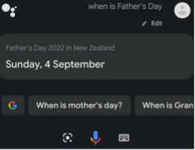
Visual feedback
Where the VUI has a screen, always use visual feedback. Print on the screen what’s happening in the conversation. This feedback can increase user confidence in learning and using the product.
For example,
User: When is Father’s Day?
Google Assistant: Father’s Day 2022 in New Zealand is on Sunday, 4 September.
VUI - key design concepts
- Provide confirmation strategies (so users know they have been understood)
- Choose conversationally or command & control style
- Plan for error handling (not if, but when)
- Plan for ambiguous queries from users
- Create context-chaining to help prevent dead ends
To complete this H5P activities, you will need to:
1. Read what Goossens has to say about Designing a VUI – Voice User Interface (Goossens, n.d.) to get more familiar with what is possible with VUIs and how to implement a VUI.
2. Answer the questions that follow.

Designing for VUI – a case study
Maud de Boer was a student on an Ironhack bootcamp when she was challenged to incorporate voice assistance into the Zoom app.
Read Case study: Integrating voice assistance to the Zoom app (de Boer, 2020) to hear her story and then return here to unpack some of the steps and tools she used in further detail.

Step One – Get to know the user
In this step Maud covered these three tasks:
- Discovery of the zoom app
- Discovery about the desired feature – voice activation/assistance
- Guerrilla research to understand users and their pain points
What is Guerrilla Research?
It's all too common for projects to run out of time or money and sadly user research is normally the first thing to go. This is where Gerrilla Research comes in. It is the method of user research used by those who have limited time and budget. It is the MVP of research, because it is not really acceptable to not to any user research.
The word guerrilla refers to the use of unconventional tactics. So, go for it, you have limited time and limited money, use some creativity and do some fast, cheap, and effective research anyway.

There are 4 Fs to conducting Guerrilla research effectively:
Focused
The more specific your research goals, the better. And remember to focus on the problem, not on the solution that you think is right.
Fast
One well-known method of Guerrilla research is to randomly interview members of the public. You can still do this, but if you boil down your long survery to a quick, pointed, few questions you might able to find some way to do this online or via email to an existing user-base. You will get more responses if users know beforehand that there are only a few questions.
Frugal
This is the method to use when the budget is tight, but you still need to validate your assumtptions about the user and their needs.
Feedback
If you don’t conduct user research, you’ll miss out on all the valuable feedback that could be gained from potential users.
For her Guerrilla Research, Maud chose a single, focused overarching question – Who uses zoom for mobile? And why? She interviewed three random zoom users, resulting in:
- findings about who uses zoom mobile - Why? How? What for?
- findings based on their experience and usage of voice assistance.

Step Two - Brainstorming potential concepts
A commonly used brainstorming technique used in the UX design field is called Crazy Eights.
- Each member of the team has a board divided into 8 squares.
- Team members have 8 minutes to sketch an idea into each box on their board. It can be a bit frantic but that's why it's called crazy eights. The goal is to be pushed beyond your normal ideas to grab the crazy out-there ideas, which are often the ones we really need to capture.
- Each team member gets a chance to present their crazy eight ideas to the team.
- The team gets to vote on all the ideas which usually brings a select few to the foreground. These ones can then be taken to the prototyping phase.
Maud’s crazy eights brainstorming led to the discovery and refining of ideas until she ended up with the three functions she wanted to introduce through VUI to zoom:
- Set up meetings with contacts
- Set reminders for Zoom meetings
- Send out invites to invitees.
Here is a free online Crazy Eights template board you can use on your next project.
Step Three – The user and their problem
There are two parts to this step:
- Identify the problem
- Identify a persona
As you saw in the article, identifying the problem is more general – it can help to break it down into a problem statement, hypothesis statement and jobs to be done statement.
To bring it all to life, and to be able to relate to her users better, Maud created a persona (fake user) to help her design towards meeting his needs. If there were more problems identified, you may need multiple personas to reflect these different needs.
Step Four - Defining the Minimum Viable Product (MVP)
From Step two and three you should now have some ideas. It can help to further cut these down by using the MOSCOW method. Draw up a board and split it into 4 boxes:
- Must have
- Should have
- Could have
- Won’t have
Together, they spell MOSCOW. Using this method helps to prioritise your ideas, so you know what you should be focusing your time and energy on.
Step Five – Lo-fi prototype and testing
There are two parts to this step:
- Extrapolate chosen ideas into rough drawings (wireframes) of what the various screens might look like
- Testing
See the drawings Maud made of her planned screens. Creating drawings at this early stage helps the project team to get on the same page with the design ideas.
Use testing to check:
- if you have all the screens needed, including all the buttons?
- the flow? Add in connections where needed between functions, screens, and buttons.
- there are no dead ends.
- if the screens intuitive.
Now you have a lot more detail to your ideas, you are ready to start mocking up hi-fi prototypes.
Step Six – Hi-fi prototype and usability testing
Now, transfer those napkin drawings into hi-fi wireframes, to show what the screens would like in real life in the user’s hands. Maud used Figma, which is a great free UI design tool used for prototyping – a vector graphics editor. You might want to use that – youtube has plenty of Figma tutorials if you need them.
Once you have some wireframes ready, try them out on a user group to get some valuable feedback. Use that feedback to improve your plans and wireframes before performing a final test.

Mobile app personalisation: when user interface meets artificial intelligence
Just imagine using a dating app that you couldn’t personalise. That’s just wrong on so many levels. And that would be the same for so many other apps. Can you imagine spotify without personalisation – without liking songs, without blocking songs, without creating your own playlists, without liking artists or genres, without it remembering the music you enjoy and making great recommnedations of other artists you might enjoy?
It’s no longer enough just to address the user by their first name when they open your app, users now expect each experience with your product to be tailor made to their own wants and needs, even the first time they use it, and also, across channels.
It’s not enough to provide opportunities for users to customise settings either. Personalisation is like customisation on steroids. It should be as automatic as possible, and is one of the main roles of AI in an app.
In his article Mobile app personalization: when UI meets AI to elevate CX, Hande (2020) suggests the following list of guidelines to help you deliver quality customer experiences (CXs) through personalisation of your mobile app.
- Build a solid foundation of and on user data
- Personalise the app home screen on the first-time launch
- Tailor-make the app navigation experience
- Personalise the search experience
- Showcase real-time AI-led predictive recommendations
- Re-order product or content categories for greater context
- Create an in-app personalised storefront or playlist
- Deploy live contextual recommendations via in-app messages
- Personalise your recommendations across other channels
Learning from users’ preferences and behaviour to help provide a personalised customer experience, can produce the following benefits:
- Improved app user experience
- Improved retention
- Higher customer engagement
- Increased customer loyalty
- Better conversion rates
- More users
- Better ratings.
The two main approaches to personalisation are:
Contextual and behavioural.
Contextual
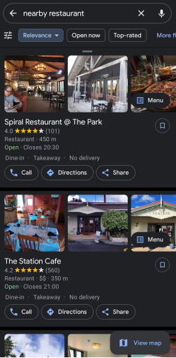
Personalisation features are based on user’s context, such as: location, time, demographics. For example, if the user asked for nearby restaurants, it will recommend:
- something close
- something that is open currently
- cheaper or more casual options if the app knows the user is in the 18-20 year old age range.
Note that the user should be able to see these preferences and override them if they want to. In the image above, the user can apply various filters to help narrow down to something that suits them in the moment.

Behavioural
With behavioural, personalisation is based on what the AI has learned about the user’s behaviour and preferences.
Once you watch a few cat videos online, you will notice that your recommendation list/feed is now filled with cat videos. Also, if you are often searching for sneakers, it’s pretty likely the app won’t be recommending high heels to you.
This approach is the one most social media and streaming services use for their recommendation engines. Here are a few more examples:
- Instagram has an explore tab, where you can view others’ posts from outside of your list of follows. Here you see what’s trending, however it is highly customised to your preferences as well as those of your followers or people you follow.
- On your favourite news app, the newsfeed is always personalised to content that will be more relevant and of more interest to you, based on your previous history – which articles you will read, how much time you spend on which pages etc.
- Facebook sends push notifications to your phone when a friend makes a post or story, but restricts this to the friends you are most likely to interact with, thereby creating a notification you are more likely to click on.
In the image above, you will see the typical “Because you watched…” section. All the other categories may also list their content in an order based on your behaviour, so the “Aotearoa’s must-see TV” section on your friend’s app may have different content or content in a different order.

Mobile app personalisation at Starbucks – a case study
Personalisation was an important part of Starbucks’ marketing strategy long before they released their mobile app. They were the first coffee shop to address all their customers by name. They were known for greeting each customer, asking for their first name, and writing it on the cup. When a takeaway coffee was ready, the staff member would call out the person’s name so they could collect their coffee. They were well known for knowing their regular customers by name.
With the introduction of the mobile app, personalisation with first name greetings was just the very start.
One of their main aims was to be able to help users accomplish their main goal – order and pay for a coffee – in a more satisfactory way.
- Faster
- less time in queues
- less fussing with payments.
But they also wanted to do it with the same warm, personal greeting and connection that customers would get when they come in-store and order through a barista.
Watch Starbucks—creating a personalized Web and Assistant experience | Centered Ep 6 (Google Design, 2019) to learn about how Starbucks has used personalisation in the design of their mobile app and how they implemented a VUI using Google Assistant.
The Starbucks mobile app is well-recognised for being one of the most personalised mobile apps out there. Read Starbucks: Using Big Data, Analytics and Artificial Intelligence to Boost Performance (Marr, 2018) to learn about the data and AI behind the Starbucks app.
Using both a contextual and behavioural approach, Starbucks can get the most out of each interaction through their app. They can offer a discount on a user’s favourite coffee by a push notification when they walk within 100m of a store, then users can pay through the app, and pick it up when they get to the store.
Further reading – further case studies
Noticed lately how the menu boards in many fast-food restaurants don’t seem to show much of the menu? App users can view the full menu and a list of app-only discounts/offers. What’s more is that users can order (from anywhere) and pay through many of these apps too, which means they don’t have to stand in the queue, just like with Starbucks. Users order before they leave home or the shops, click ‘Check In’ when they’re 5 mins away, and pick up their order on arrival.
Using AI, these apps can also recommend add-ons, based on previous purchases or the weather.
To finish this topic, read or listen to Designing a local shopping discovery app — a UX case study (Gupta, 2019), where Tushar Gupta takes us through the UX design process for a traveller’s mobile app including research, wireframes, and debrief.
Further case studies:
- Google Home- UI-UX case study
- CNN mobile app Case Study
- BBC News mobile app Case Study
- Duolingo app Case Study
- Spotify mobile app Case Study
- Spotify vs Apple music mobile app Case Study
- Nike Mobile app personalisation
- Airbnb Mobile app personalisation
Mobile app personalisation activity
In a Word document, identify 3 apps on your smartphone that use personalisations, and answer the following questions about each one:
- Note down each personalisation you can identify, dig deep.
- Record what approach each personalisation uses (behavioural or contextual).
- Make notes about the design & layout/workflow/data used to create the personalisation.
- How could it be improved, or do you have any other personalisation ideas you think should be implemented?
- Comment on how you feel as a user seeing that personalisation.
- Which app does personalisations better? Why?
The addition of AI personalisations to a mobile app can have a significant impact, do not underestimate it. Remember though the responsibility that comes with using AI, as we discussed at the beginning of the topic, as an emerging technology, it’s future relies on those using it taking great care and respect for it and the privacy and security of app users.