Different types of graphs and charts
One of the most valuable features of spreadsheet applications is the ability to produce graphs and charts quickly and effectively, allowing for data analysis at a glance.
The terms ‘chart’ and ‘graph’ are often used interchangeably, but there are some distinct differences between the two. A chart is any pictorial representation of data. This can be in the form of tables, images or diagrams. On the other hand, a graph is a visual representation of mathematical data along y and x-axes. Both charts and graphs are available in Excel in different forms, which you can use to present your data.
Different types of graphs and charts represent the data in different ways. Some can be more effective than others depending on the use of the data being presented. In general, the people who will be analysing the data will know which types of graphs and charts are most effective for the presentation of their data. If the type of graph or chart is not specified and you are uncertain of how to present a particular set of data, you should confer with your supervisor and ask which type to produce.
Excel has a variety of graphs and chart options you can use to present your data. Here are some common types that are used in business:
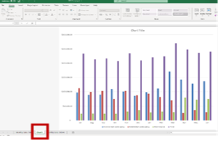
Column
A column chart uses vertical bars to track the differences in the value of the specific data that you assign. This is useful for showing data changes over a period or for illustrating comparisons among items.

In the example, you can see that the monthly sales for the ACT, NSW and QLD branches of a company are compared. You can quickly see from the graph how each branch performed for the month compared to other branches.
Line

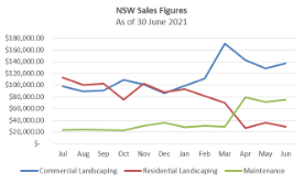
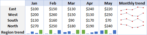
A line graph shows how the quantitative value of certain items changes over time. Data points are first plotted in the X and Y axes, after which a line is drawn to connect all data points. This is ideally used to show trends over time.
Look at the following line graph as an example. If your company wants to track sales growth in the three markets of NSW, QLD and SA, you can use a line graph to see which showed the most growth over time.
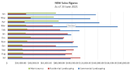
Bar

A bar graph is like a column graph in that it is also used for illustrating comparisons among items. The difference is that a bar graph is oriented horizontally.
This horizontal orientation is more useful when your X-axis has longer incremented between data, and so your graph will tend to extend horizontally.
In the example, you can see that the sales figures vary significantly from below $50,000.00 up to above $200,000.00. In this case, it is better to use a bar graph so that the resulting image extends horizontally instead of vertically.
Pie

A Pie chart is used to show the percentage relationship of components that add together to make a whole. This is useful when you want to break down a general data figure into its component parts.
For example, if you have a figure for total lunch sales, you can break this down further to see which particular food items contributed more than others to your lunch sales.
Area

A Pie chart is used to show the percentage relationship of components that add together to make a whole. This is useful when you want to break down a general data figure into its component parts.
For example, if you have a figure for total lunch sales, you can break this down further to see which particular food items contributed more than others to your lunch sales.
Doughnut
Like a pie chart, a doughnut chart is useful for showing the percentage relationship of components. The difference is that a doughnut chart can show more than one data series.

In the example, each quarter is represented by a colour. The outer circle of the chart shows the sales for 2006 while the inner circle shows sales for 2005. With the use of a doughnut chart, you can easily see how the sales numbers changed for each quarter from 2005 to 2006.
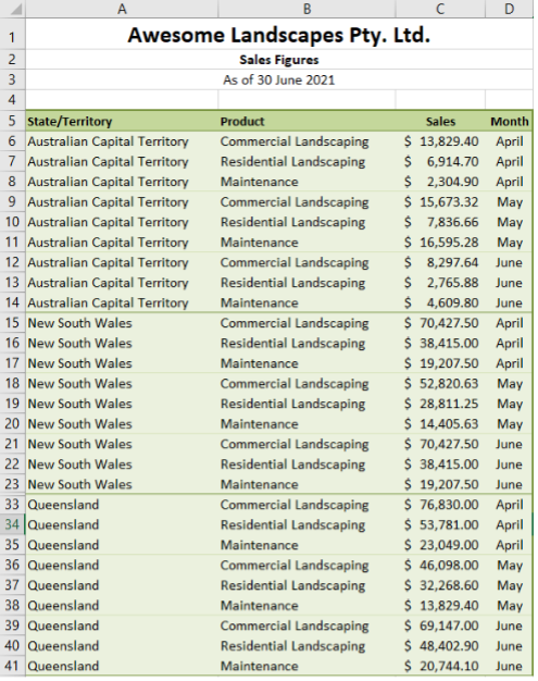
Pivot Table
A pivot table allows you to extract and isolate specific data from your spreadsheet and organise them so that they are easier to understand. This is useful when you have large data sets that present a lot of information. Viewing them from a single spreadsheet might be overwhelming. By using a pivot table, you can focus on which specific part of the data you want to present.
For example, take a look at the following two tables. The first image shows raw data entered into Excel. The second image is a pivot table created from the raw data. By using a pivot table, you can now present the sales summary in relation to the state/territory, service and or month.
Remember that graphs and charts are graphical materials that will often be used to present data to people outside your organisation. Always follow the organisational style guide so that all outputs you produce are consistent with other presentation materials and the branding of your organisation.
For example, if you were to produce a pie chart for Aussie Tool sheds, it would be best to use the specific colours mentioned in the Aussie Tool sheds style guide.
If you are going to follow this colour scheme, make sure that it is consistently used across all spreadsheets and graphs/charts for your presentation.
The following 14-minute video tutorial explains how to insert, adjust and improve a chart and how to create combination charts.
Manipulating Spreadsheet Data for Charts and Graphs
At this point, you already have an idea of what type of chart or graph will be best for your spreadsheet data. Before creating the actual chart/graph, you must first ensure that your spreadsheet is in a form that Excel can translate into a chart/graph.
From the preceding examples, you know that Excel generates your chart/graph based on your selection of data. It is important that your data is clear and logical so that it will also be accurately represented in your chosen chart/graph style.
To do this, take note of the use of each type of chart and graph. Specifically, note what data is needed and not needed in generating the graphic.
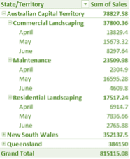
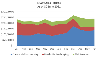
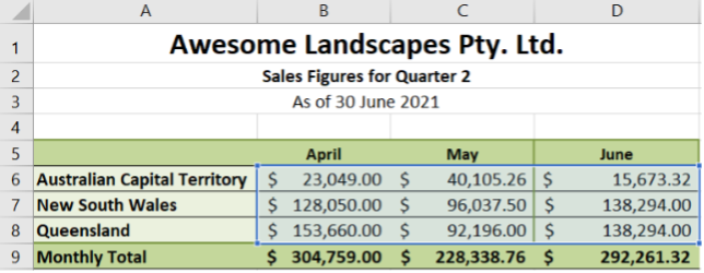
As an example, suppose your supervisor requires you to make an area graph showing the growth in monthly sales for the three branches for quarter two of 2021. You have the sales figures for Aussie Tool sheds for the month of June 2021. Will you be able to make an area graph from the data you have? The answer is no. This is because you only have the sales figures for one month of quarter two.
To make the required area graph, you also need the sales figures for April and May. Once you have the figures for the three months, you need to combine these into one table and use that as the basis for the area graph. You also need to remove unnecessary data before making the graph. In this case, you do not need the quarterly totals and grand total for the year, as you are only required to plot monthly growth. You also do not need the individual sales figures for commercial landscaping, residential landscaping and maintenance.
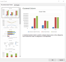
Your final table, which can be used for the area graph, should look like the following image. The resulting area graph can be found below the table.
Check your understanding
Click on the dots to answer all three (3) quiz questions:

So far you have learned the basic types of charts/graphs you can use to represent your spreadsheet data. Note that the types discussed are the most common ones used in business applications. Excel has other types of graphics that you can explore based on your presentation requirements.
You also learned that the type of chart/graph that you will use would depend on what data you have in your spreadsheet and what data you want to highlight in your presentation. In some cases, you need to make adjustments to your spreadsheet data to fit your presentation requirements.
To create a chart/graph in Excel, these are the general steps you have to follow:
- For ease in naming the series in your chart, you may opt to include the row/column header in your selection before inserting the chart. By doing so, Excel will use these headers as series labels.
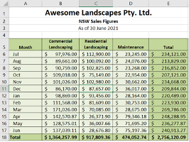
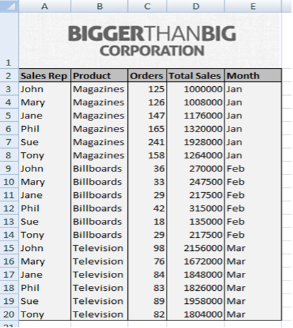
- For some charts, you may need to take different or additional steps. Refer to the data in the following image as an example to be used in making the succeeding charts and graphs.
Column Chart
Excel has a keyboard shortcut associated with a column chart. Once your data is selected, press [F11] to create a simple column chart. Excel will then open a new worksheet containing your column chart.
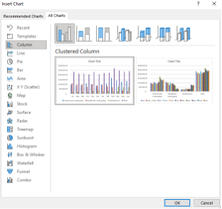
Alternatively, you can also make a column chart by going to the ‘All Charts’ tab of the ‘Insert Chart’ dialogue box and selecting ‘Column’. Here you will have options for different types of Column Charts.
Line Graph
To create a line graph, select the data on your spreadsheet and go to the ‘All Charts’ tab of the ‘Insert Chart’ dialogue box. Click ‘Line’ on the side panel, and you will see the different types of line graphs you can create as well as a preview of each type.
Bar Graph
Creating a bar graph follows a similar process. In the ‘Insert Chart’ dialogue box, click on ‘Bar’ on the side panel, and you will see the different types of line graphs you can create as well as a preview of each type.
A sparkline is a tiny chart in a worksheet cell that provides a visual representation of data. Use sparklines to show trends in a series of values, such as seasonal increases or decreases, economic cycles, or to highlight maximum and minimum values. Position a sparkline near its data for greatest impact.
The following 5-minute video explains how to create and modify sparklines in Excel 2013:
Pie Chart/Doughnut Chart
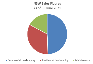
The pie and doughnut charts show a percentage relationship. You must first determine what part of your data needs to be presented in a pie chart. For example, in the Aussie Tool sheds data, a pie chart can be used in showing what portion of total sales came from commercial landscaping, residential landscaping and maintenance, respectively.
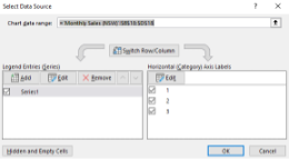
To do this, select the total values for each and go to the ‘Insert Chart’ dialogue box. Select ‘Pie’ and click OK. Input the Chart Title. To label the parts, click on the chart and go to ‘Select Data’ under the ‘Chart Design’ tab. Under ‘Horizontal (Category) Axis Labels’, click the ‘Edit’ button. Excel will prompt you to select an axis label range. Select the cells containing the header titles. In the example, these are cells B5 to D5. After clicking OK, your pie chart will now show the correct labels.
In Excel, you can find the doughnut chart listed as a subtype of the pie chart.
Area Graph
To create an area graph, select the data on your spreadsheet and go to the ‘All Charts’ tab of the ‘Insert Chart’ dialogue box. Click ‘Area’ on the side panel, and you will see the different types of area graphs you can create as well as a preview of each type.
Pivot Tables
Pivot tables are another way to quickly and easily summarise large amounts of data, with labels and titles to help clarify the data.
For this example, take a look at the following data from the Bigger than Big Corporation.
To create a pivot table for this data, you need to:
- Open the spreadsheet
- Save the file to your desktop.
- Select 'Insert from the ribbon'.
- Select 'Pivot Table'
- Select 'Table/Range' and choose where you want the Pivot Table to be placed.
- From the PivotChart Fields Payne on the left, select which fields to include.
This produces the following pivot table:
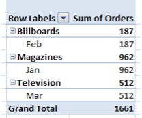
You can now start to manipulate the fields to better suit our purpose.
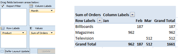
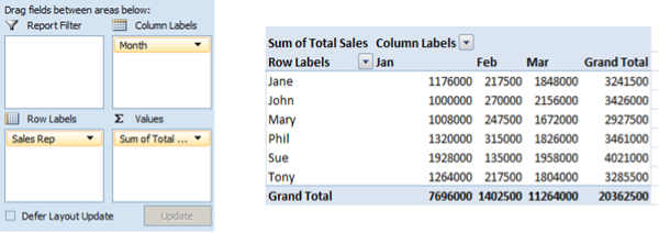
If you drag the Month field up to the Column Labels section of the pivot table task pane, you get the following table, which summarises the number of orders placed for each product in each month:
Similarly, you can create a pivot table that summarises the number of sales made by each salesperson per month simply by changing the fields around.
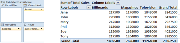
Or show sales by product simply by replacing the Month field with the Product field.
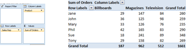
Or view the number of orders each salesperson received for each product.
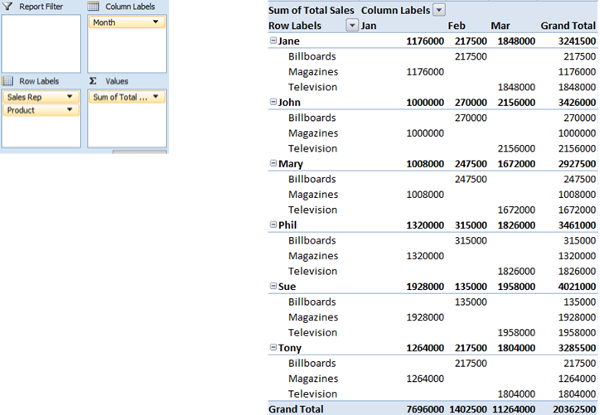
You can also view the sales for each salesperson by product per month.
The following 4-minute video explains some of the different chart types and how to customise them.
example
- Select the cells containing the data that you want to graph.
- Go to the ‘Charts’ group of the ‘Insert’ tab and click on the arrow in the lower right corner. This will open the ‘Insert Chart’ dialogue box.
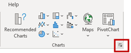
- Excel will present you with recommended charts as well as previews of these charts based on the data you selected. Select the type of chart/graph you want and click OK.
- Your chart will appear on the same sheet. Rename your chart by double-clicking on ‘Chart Title’, which is the default text for charts created in Excel.
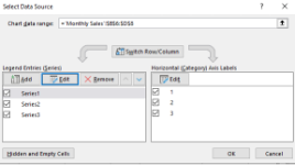
- Notice that your figures are labelled as ‘Series 1’, ‘Series 2’ and ‘Series 3’ by default. To change this, select your chart. The ‘Chart Design’ tab should now appear on the ribbon. Click on ‘Select Data’.
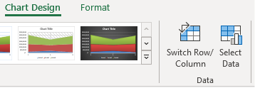
- In the ‘Select Data Source’ dialogue box, under ‘Legend Entries (Series)’, click on ‘Edit’. The series values will be displayed to help you identify which figure you are naming. Enter the new series name. Do this for all series in your chart.
- Go to the ‘Insert’ tab on the Ribbon and click on ‘Pivot Table’.
- Select the range of data - in this case, select A2:E20.
- Select where you want the Pivot Table to go in your workbook. This will open the Pivot Table task pane.
- Create the Pivot Table by placing fields of data into the Column Labels, Row Labels, and Sum Data sections.
- The sections in which you add fields determine the layout of the pivot table. Selecting Product then Month places these into the Row Labels section.
- Selecting Orders places it into the Sum Values section.
Practice Example
Download the Bigger than Big Corporation Data spreadsheet.
Work through the Bigger than Big Corporation pivot table using the example above to reinforce your understanding of pivot tables.

As we have moved through this module, we have looked at the functions and the features of Microsoft Excel.
Let’s have a look at the Save, Print and View options for the graph.
Print a view
- On the View tab, in the Task Views or Resource Views group, choose the view that you want to print.
- Choose File > Print.
- To look over the view or to make adjustments before printing, view the right side of the page. To see the actual size of the view as it will be printed, click anywhere in the print preview area.
- Choose Print to print the view.
If a predefined view does not meet your exact needs, you can apply different tables or filters or change the way tasks, resources, or assignments are grouped or sorted.
Optimise a view for printing
To make printing as efficient as possible, you can specify the options that you want. For example, you can print a range of pages (defined by page numbers or dates), suppress blank pages, and print multiple copies.
- On the View tab, in the Task Views or Resource Views group, choose the view that you want to print.
Tip: To print a summary or high-level view of your project, filter your view first by showing summary tasks or a specific outline level. You can also select the Timeline view for an attractive view to print quickly and easily. - Choose File > Print.
- At the top of the page, specify the number of copies to print.
Tip: Specify additional settings for the printer by choosing Printer Properties. Typically, you can change the paper type, colour, and other common printer settings, but the type of settings will vary depending upon the type of printer you are using. - Under Settings, specify how much of the project you want to print.
You can specify any level of detail that you want, from specific dates to the whole project.
You can also specify whether the project should be printed with a landscape orientation (which is oriented horizontally) or portrait orientation (which is oriented vertically). - Choose Print.
Note: If the information on the last page (or column of pages) ends 3 inches or less from the left edge of the page, then the view's timescale is scaled down to fit on the previous page (or column of pages). If the information is more than 3 inches from the left edge of the page, the view is scaled up to fill the current page (or column of pages).
Add a header, footer, or legend to a view
The following procedures apply equally, whether you are modifying a header, footer, or legend.
- Choose File > Print > Page Setup.
- On the Header, Footer, or Legend tab, select the Left, Center, or Right tab.
- In the text box, type or paste the text, add the document or project information, or insert or paste a graphic.
You can create multiple-line headers, footers, and legends. At the end of the first line of text or information, press ENTER. To add lines after a picture, select the picture, place the cursor after the picture, and then press ENTER. Headers can have up to five lines of information. Footers and legends can have up to three lines.
- To add page numbers to the header, footer, or legend, choose Insert Page Number, Insert Total Page Count, or both.
- To add the current date or time to the header, footer, or legend, choose Insert Current Date, Insert Current Time, or both.
- To add the file name to the header, footer, or legend, choose Insert File Name.
- To add a graphic to the header, footer, or legend, choose Insert Picture.
- To format preset information, select the ampersand (&), or select the text that you want to format, choose Format Text Font, and then select the formatting options that you want for the header, footer, or legend.
- To add project-specific information, select the information that you want in the General and Project fields boxes, and then choose Add for each entry.
Notes:
- The header and footer that you set will appear on every page. You cannot specify that they appear differently on the first page versus subsequent pages, appear differently on odd or even pages, or appear differently on individual pages.
- You can resize a graphic after you add it to a header, footer, or legend by selecting the graphic and dragging its border. To move the graphic, select it and drag it to another location. You cannot crop a graphic.
Print a basic report
This section does not discuss how to print visual reports in Project. Because visual reports are created in Excel and Visio, use these programs to print visual reports.
- On the Report tab, in the View Reports group, choose the arrow below any report type and then choose More Reports.
- In the Reports dialogue box, select a report, select the type of report, and choose Select again. A preview of the printed report will appear.
- Choose File > Print to choose settings and print your report.
Check your understanding
Designated Timelines Using Gantt Chart
A great tool that can be created in Excel to help you to stay in control of timelines and project/ task outcomes is the Gantt Chart.
A lot of the new Project Management software that is currently out in the market is based on the method of the Gantt Chart. For example, some software that you may have heard of include:
- Asana
- Monday.com
- Smartsheet
- Nifty
- Workfront
And the list goes on.
The following 10-minute video explains what a Gantt chart is.
A Gantt chart, commonly used in project management, is one of the most popular and useful ways of showing activities (tasks or events) displayed against time. On the left of the chart is a list of the activities and along the top is a suitable time scale. Each activity is represented by a bar; the position and length of the bar reflect the start date, duration and end date of the activity. This allows you to see at a glance:
- What the various activities are
- When each activity begins and ends
- How long each activity is scheduled to last
- Where activities overlap with other activities, and by how much
- The start and end date of the whole project
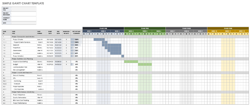
What are the components of a Gannt Chart?

- Dates. One of the main components of a Gantt chart, the dates allow project managers to see not only when the entire project will begin and end but also when each task will take place. These are displayed along the top of the chart.
- Tasks. Large projects always consist of a large number of sub-tasks. A Gantt chart helps project managers keep track of all of the sub-tasks in a project, so nothing is forgotten or delayed. Tasks are listed down the left side.
- Bars. Once the sub-tasks have been listed, bars are used to show the time frame in which each task should be completed. This helps ensure that every sub-task is done on schedule so the entire project will be completed on time.
- Milestones. Milestones are those tasks that are instrumental to a project's completion and success. Unlike the minor details, which also have to be done, completing a milestone offers a sense of satisfaction and forward motion. On a Gantt chart, milestones are displayed as diamonds (or, sometimes, a different shape) at the end of a particular taskbar.
- Arrows. While some of your tasks can be done at any time, others must be completed before or after another sub-task can begin or end. These dependencies are indicated by small arrows between the taskbars on a Gantt chart.
- Taskbars. While many sub-tasks can be completed fairly quickly, there will be plenty of times when you will want to see at a glance exactly how your project is coming along. Progress is shown by shading the taskbars to represent the portion of each task that has already been completed.
- Vertical Line Marker. Another way to monitor your project's progress, a vertical line marker that indicates the current date on the chart. It helps you manage your time effectively as you can see at a glance how much you have left to do and if you are on track to complete the project on time.
- Task ID. In today's fast-paced business world, you likely have several tasks going on at the same time. Including the task ID on the Gantt chart helps everyone involved to quickly identify the task you are talking about.
- Resources. While not every Gantt chart lists the names of the people who will be working on it, if your project will be completed by a number of individuals, listing names and the tasks that are assigned to them can be incredibly helpful. Identifying and assigning resources to each task helps you effectively manage people, tools, and skills to complete each project on time.
Your CBSA supervisor has asked you to provide a breakdown of the length of time monies have been outstanding for each account.
Download the following CBSA Aged Debtors Excel file and practice exercise instructions to complete this exercise:
After you have completed the practice exercise, you can check your answer here.