In this topic we’ll build on what you learned about the principles of design in the last module, and we turn our attention to:
- Applying design principles to create eye-catching presentations
- Aspects of accessible design
- The basics of website content creation
By the end of this topic you’ll be able to:
- Prepare copy for a publication
- Create presentations using existing templates
- Edit presentation templates to reflect an organisation's branding
- Make basic edits to websites
In the context of writing and publishing, copy refers to the text or written content that is prepared for publication or distribution. It can include everything from articles, advertisements, and marketing materials to website content, newsletters, and social media posts.
Preparing copy for a publication, such as a newsletter, involves creating a well-organised, clear, and concise draft that is handed over to designers for formatting. The goal is to ensure that the content is polished and easy for the design team to work with, allowing them to focus on the visual aspects without needing to make significant edits to the text.
When preparing copy, make sure you understand the objective of the publication, such as an article or post. For instance, is the purpose to share information, promote a product or service, or reach out and engage with potential customers? Consider who the readers are and tailor the language and content to their interests and needs.
Where appropriate, structure the copy, using text styles consistently to indicate headings, subheadings, and body text:
- Headline: Create a strong, attention-grabbing headline that encapsulates the main theme or purpose. For a newsletter, think of the type of headlines you read in the paper or on a news website.
- Subheadings: Use subheadings to break up the text into sections, making it easier for readers to navigate the content.
- Introduction: Write a brief introduction that sets the tone and provides an overview of what’s to come.
- Body text: Organise the main content into clear sections. Each section should focus on a specific topic or message.
- Conclusion: End with a conclusion or call to action that leaves the reader with a clear takeaway or next step.
When using text styles, it can save time if you are copying text from another source, to paste it in your document without the source formatting. Instructions on how to do this are below.
- Using Keyboard Shortcuts:
- Microsoft Word or Google Docs: Paste without formatting by pressing Ctrl + Shift + V. This will paste the text while removing any original formatting.
- Using the Paste Special Option:
- Microsoft Word:
- Copy the text you want to paste.
- Go to the location where you want to paste the text.
- Click on the “Home” tab.
- Click the small arrow under the “Paste” button.
- Select “Paste Special.”
- Choose “Unformatted Text” and click “OK.”
- Microsoft Word:
- Using the Right-Click Menu:
- Microsoft Word or Google Docs:
- Copy the text you want to paste.
- Right-click where you want to paste the text.
- Choose “Paste Special” and then select “Unformatted Text.”
- Microsoft Word or Google Docs:
- Using Keyboard Shortcuts:
- Microsoft Word or Google Docs: Paste without formatting by pressing Command + Shift + Option + V. This will paste the text while removing any original formatting.
- Using the Edit Menu:
- Microsoft Word:
- Copy the text you want to paste.
- Go to the location where you want to paste the text.
- Click on the “Edit” menu at the top.
- Choose “Paste and Match Style” or “Paste Without Formatting.”
- Microsoft Word:
- Using the Right-Click Menu:
- Google Docs:
- Copy the text you want to paste.
- Right-click where you want to paste the text.
- Select “Paste without formatting” from the context menu.
- Google Docs:
Whether you are using text styles or not, you should be consistent with the fonts and formats that you use so that the copy is clear to the person you are handing it over to.
Text styles for headings are used to create a table of contents. A table of contents can be useful in documents that are several pages long to help viewers navigate the document. This is more common in professional writing documents such as user guides and reports. Table of contents will be covered later in the programme.
As covered in the previous module, with professional writing, make sure to use correct grammar, punctuation, and spelling. Proofread your writing carefully before sending it out. It is a good idea to have a colleague conduct a peer review.
Though it isn’t often the case with other types of professional writing, copy usually has a page or word count or limit assigned. This is because the article or advertisement has a certain amount of space allowed for the final format. Make sure you keep to these counts or limits.
We covered inserting images into a document in the previous module. When producing copy that includes images, you will need to provide the image as a separate file as well. This is to ensure that the quality of the image stays intact.
The designers may provide you with specific requirements for the file type and size of images – for example, images that are too small can look blurry when enlarged, or may not print well. Follow the designers' instructions when providing images for a better final product. We will cover image quality further later in this topic.
Presentations typically consist of a series of slides that combine text, images, graphs, charts, and multimedia elements to communicate information clearly and effectively. They are used in various settings, such as business meetings, educational sessions, conferences, and training programmes. While presentations can convey information on their own, their primary purpose is to support a speaker's message, making it easier for the audience to understand and retain the information. Well-designed slides can help highlight key points, illustrate complex ideas, and engage the audience visually.
Keep in mind these best practices when creating presentations:
- Simplicity: Keep slides uncluttered, with minimal text and clear visuals.
- Consistency: Use a consistent design theme, font, and colour scheme throughout the presentation.
- Visuals: Incorporate relevant images, charts, and graphs to break up text and make the content more engaging.
- Readability: Ensure that text is large enough to be read from a distance, with sufficient contrast against the background.
- Focus: Each slide should convey a single idea or concept to avoid overwhelming the audience.
- Bullets and numbering: Break text into bullet points rather than large paragraphs to make content more digestible and easier to read.
Accessible design
Accessible design in presentations ensures that all audience members, including those with visual impairments or colour blindness, can engage with and understand the content.
Font
Use clean, sans-serif fonts which are generally easier to read on screens. This is more important for body text than header text. In both cases, avoid overly decorative fonts that can be difficult to decipher.
|
Serif |
Sans-serif |
Screenshot showing guide lines appearing when attempting to move a text box in a Microsoft PowerPoint template slide.
A sans-serif font is a type of font that doesn't have the small "feet" or strokes at the ends of letters that serif fonts have. Sans is French for “without.” Common sans-serif fonts include Arial, Helvetica, and Calibri.
Ensure that the font size is large enough to be read by all audience members, especially those sitting at the back of the room or viewing on smaller screens. A minimum of 24-point font is recommended for body text, with larger sizes (32-point or higher) for headings.
Contrast

Contrast refers to the difference in brightness or colour between two elements, like the text and the background of a slide. Good contrast makes the text easy to read, while poor contrast can make it difficult to distinguish the text from the background.
High contrast ensures that everyone, including people with visual impairments or colour blindness, can easily read the text. For example, black text on a white background has high contrast and is very readable, while light grey text on a white background has low contrast and can be hard to read.
You can achieve good contrast by using dark text on a light background or light text on a dark background. Avoid using colours that are similar in brightness or hue. For example, dark blue text on a black background might be hard to read because the colours are too close in darkness.
You should also ensure that the presentation is accessible to those with colour blindness or visual impairments by avoiding the use of colour as the sole method for conveying information. For example, if you're creating a chart, don't rely solely on different colours to distinguish between data sets. Instead, you could use different patterns or shapes in addition to colour, such as stripes or dots, and include clear labels so that everyone can easily differentiate the information.
Examples of high and low contrast text and backgrounds
There is more information about accessible design later in this topic.
Using presentation templates
Templates offer a cohesive design with consistent fonts, colours, and layouts across all slides. They save time by providing a ready-made structure, allowing you to focus on content rather than design.
Google Slides and Microsoft PowerPoint provide presentation templates. Your organisation may have its own templates which feature their branding – check first and use these templates if this is the case.
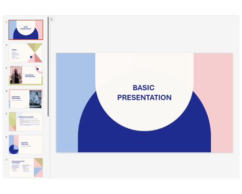
When you use a template from Google Slides or Microsoft PowerPoint, there will be several slide layouts to choose from. These layouts are usually designed for a specific purpose, such as a title slide, section header, slide with image and text.
Alignment
Alignment in presentations refers to how text, images, and other elements are positioned relative to each other and to the slide margins. Proper alignment helps create a visually appealing and professional presentation.
Slide margins refer to the blank spaces around the edges of a slide that help frame the content within it. They ensure that text, images, and other elements are not too close to the edge, enhancing readability and creating a balanced, professional appearance.
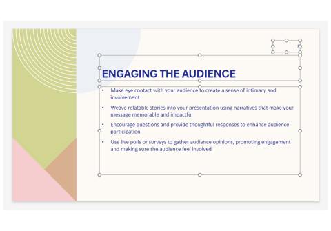
Screenshot showing a Microsoft PowerPoint template slide with text boxes selected.
When moving an object, such as a text box, in either Google Slides or Microsoft PowerPoint, guide lines will appear to help you with the alignment.
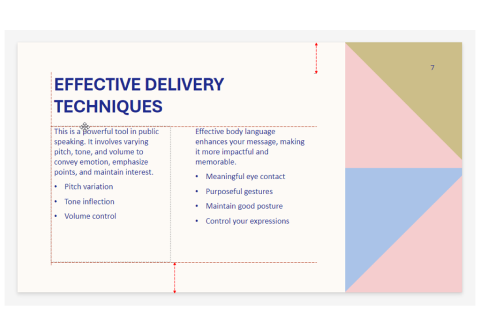
Screenshot showing guide lines appearing when attempting to move a text box in a Microsoft PowerPoint template slide.
Try to keep to the template layout where possible as it should already be well aligned. If you need to change the layout, do so with the guidance above in mind.
Editing presentation templates
If your organisation doesn’t have a template, you can edit one of the templates provided by the presentation software to better reflect your organisation. If your organisation has a brand guide, refer to this.
A brand guide is a document that outlines the rules and guidelines for ensuring that the brand is presented consistently across all forms of communication and marketing.
At a minimum, a brand guide usually includes:
- The different formats and colours of a logo and how they should be used.
- Colours and shades for the general visual theme and how they should be used.
- Fonts and styles to be used for headings and body text.
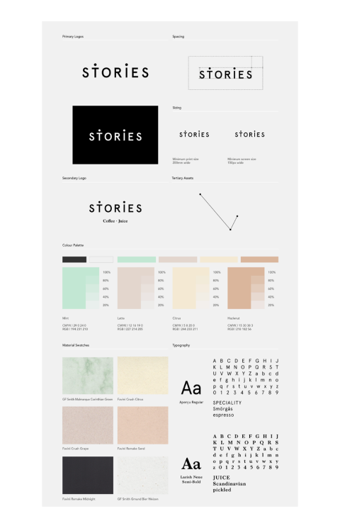
Simple brand guide example (Passport Design Bureau, 2016)
Adding a logo
When adding a logo to a presentation consider the following:
- Logos are typically featured on the title slide and sometimes placed on every slide. If placing a logo on every slide, make sure you are consistent with where it is placed, this is usually done in a corner of each slide, such as the top-right or bottom-left. It is a good idea to add the logo (and other elements you want repeated) in the master slide rather than on each individual slide.
- Ensure the logo is large enough to be recognisable but not so large that it distracts from the content.
- Maintain adequate spacing (margins) around the logo to avoid crowding it with other elements. A brand guide will often indicate minimum margins for a logo.
Logos are often provided in either JPEG (JPG) or PNG file formats. The key difference between them is that a PNG allows for transparency while a JPG doesn’t. Note that while PNG provides the option for transparency, it may not always have the feature applied.

Comparison of JPG (left) and PNG with transparency applied (right) (Pixels Ink, 2015)
When you have a coloured background, it looks more professional to use a PNG with transparency. If you do not have access to this type of file, place the logo on a white background.
When placing a logo on a coloured background, consider the contrast between the logo and the background colours. The brand guide may contain requirements or suggestions related to the use of the logo on white and coloured backgrounds.
Font variation
Font variation refers to the different styles and weights within a font family, such as bold, italic, regular, and light.
| Font Style | Sample Text |
|---|---|
| Calibri Light | The quick brown fox jumps over the lazy dog |
| Calibri Light Italic | The quick brown fox jumps over the lazy dog |
| Calibri Regular | The quick brown fox jumps over the lazy dog |
| Calibri Italic | The quick brown fox jumps over the lazy dog |
| Calibri Bold | The quick brown fox jumps over the lazy dog |
| Calibri Bold Italic | The quick brown fox jumps over the lazy dog |
Calibri font family (Monotype, no date)
You can use font variation within body text, for example:
- Using bold to place heavy emphasis on a particular word or phrase.
- Using italic to place light emphasis on a particular word or phrase.
Use this sparingly, as needed, for the most important parts of a message. Avoid using bold and italic at the same time on body text as it can make it harder to read and overly emphasised.
Font variation can also be used to establish a visual hierarchy. A common example is where a bold variation is used for the heading text, while the regular variation is used for the body text.
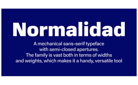
Normalidad font variations used for heading text and body text. (Ilya Ruderman, no date)
Refer to a brand guide where possible for how to use fonts. In some cases, a brand guide might instruct you to use a particular font for headings and another for body text.
Avoid using too many font types or variations for visual hierarchy. One for body text and another one or two for headings (depending on whether you have one or two levels of headings) is enough for a presentation. Use these consistently throughout the presentation to avoid confusing the audience.
Custom colours
To ensure that the correct brand colours are used in your presentation you will need to create custom colours.
In both Google Slides and Microsoft PowerPoint, you can enter HEX or RGB codes to apply custom colours to text, shapes, or backgrounds, allowing for precise colour matching. A brand guide should provide either HEX or RGB codes or both for each of the brand colours. You may also see CMYK codes, these are used for printing.
RGB stands for Red Green Blue. An RGB code is a set of three numbers, each ranging from 0 to 255. Each number controls how much red, green, and blue light is mixed to create the colour. An RGB code usually looks like this: RGB 255, 87, 51.
A HEX code is a six-character code preceded by a # symbol. A HEX code usually looks like this: #FF5733.
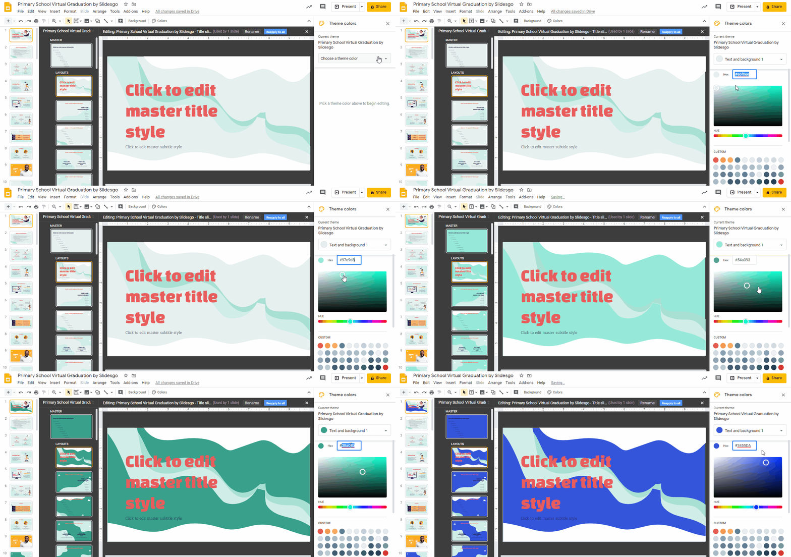
Screenshot showing HEX and RGB custom colour options in Google Slides.
The image above is similar to the custom colour options in Microsoft PowerPoint.
To apply custom colours in either software:
- Select the object (text, shape, or background) you want to change.
- Open the colour options for that object (text colour, fill colour, etc.)
- Select custom
- Type in either the HEX or RGB code
- Click OK
If you do not have colour codes available, then you can use the eyedropper tool to select a colour on your screen. Refer to the relevant guide below.
This video guide shows you how to use the eyedropper tool in Google Slides.
Website platforms
Content Management Systems (CMS) and block builders make it easier to edit websites. CMS platforms like WordPress and Drupal allow users to easily create and manage website content without technical expertise. Block builders, such as Weebly and Wix, further simplify the process by enabling drag-and-drop customisation of page layouts.
Let’s take a look at some of the pros and cons of CMS platforms.
| Type | Pros | Cons |
|---|
|
|
|
|
SEO and UX
Search engine optimisation (SEO) involves optimising a website to improve its visibility in search engine results, making it easier for users to find the site. This includes optimising content, keywords, and site structure to rank higher on search engines like Google.
User experience (UX) focuses on the overall experience a user has when interacting with a website or app. It involves designing the site to be intuitive, accessible, and enjoyable to use, ensuring that users can easily find what they need and have a positive interaction with the site.
Both SEO and UX are crucial for a website's success, as good SEO drives traffic to the site, and strong UX ensures visitors stay and engage. There are specialists that work in both of these areas, though you may be asked to perform tasks that contribute to improvements in these areas. It is good to understand these terms as they will pop up as you learn about editing websites.
Website structure
Website structure refers to how a website's content is organised and how the different pages, posts, and elements are interconnected. A well-organised structure makes it easier for users to navigate the site and contributes to the effectiveness of SEO.
Watch this video until 1:32 to get an introduction to 4 common types of website structures.
Here are the key aspects of website structure:
- Central hub: The homepage is typically the main entry point of a website and acts as the central hub. It often provides an overview of what the site offers, featuring key sections or links to important pages.
- Navigation: The homepage usually contains the main navigation menu, leading to other sections of the website. It may also feature banners, call-to-action buttons, and summaries of recent or important content.
- Static content: Pages are used for content that doesn’t change frequently, such as "About," "Contact," "Products," and "Privacy Policy." They provide essential information that remains consistent over time.
- Hierarchy: Pages can be organised hierarchically, with parent and child pages. For example, "Products" might be a parent page with child pages like "Clothing," "Shoes," and "Accessories."
- Key elements: Pages often include elements like headings, paragraphs, images, and embedded media. They may also have forms (such as contact forms), maps, and other interactive elements.
- Dynamic content: Posts are typically used for content that is updated regularly, such as blog entries, news articles, or updates. Unlike pages, posts are often time-sensitive and are displayed in reverse chronological order (newest shown first).
- Categories and tags: Posts are usually organised using categories and tags. Categories are broader groupings (for example, “Fashion News”), while tags are more specific descriptors (for example, “Seasonal trends”). This helps users find related content easily and improves site navigation.
- Archives: Posts are often archived by date (monthly or yearly), which allows visitors to browse older content.
- Logical flow: The structure of content should guide users through the site logically, helping them find the information they need quickly. This involves a clear hierarchy, with headings, subheadings, and content blocks arranged in order of importance.
- Modular design: Many websites use a modular design approach, where content is divided into blocks or sections.
- Call-to-action: These guide users to take specific actions, like signing up for a newsletter, contacting the company, or making a purchase. These should be strategically placed throughout the site.
- Primary navigation: The primary navigation menu is usually located at the top of the site and includes links to the most important pages or sections, such as "Home," "About," "Products," and "Contact."
- Secondary navigation: Secondary (also known as auxiliary menus) might appear in footers or other areas and often link to less prominent pages like "Terms of Service" or "FAQs."
- Header: The header typically contains the site’s logo, primary navigation menu, and possibly contact information or a search bar. It remains consistent across all pages and helps reinforce branding and ease of navigation.
- Footer: The footer is located at the bottom of every page and often includes contact details, social media links, and links to less prominent pages.
- Clean URLs: A clean URL structure is important for both user experience and SEO. Ideally, URLs should be descriptive and easy to read, reflecting the content of the page (for example, www.example.com/products/clothing).
- Hierarchical structure: URLs often mirror the site’s page hierarchy. For example, a blog post under the category “Tech News” might have a URL like www.example.com/tech-news/2024/08/20/spring-2024-trends.
- Internal links:
- Internal links connect different pages and posts within the same website. Internal links are often found within menus, but they can also be embedded within the content (for instance, linking to a service page from a blog post about related topics).
- Be sure that links within the website are accurate and lead to the correct pages.
- External links:
- External links point from your website to another website. These links are used to direct users to additional resources, references, or related content that is not hosted on your site.
- Check that any external links are working and relevant. Use the option to open external links in a new tab when appropriate.
Website images
Image resolution and transparent backgrounds were explained in relation to images used for publications. These same considerations, along with others, apply to images used in websites.
Reading
How to Optimize Images for Your Website
Optimised images can speed up your website and provide visitors with a better experience. Read this article to learn how to optimise images for your site.
Other website considerations
Further considerations when editing a website include:
- Always back up the site before making significant changes to prevent data loss. Use version history or revisions to revert to previous versions of content if needed.
- Know the different user roles (for example, administrator, editor, contributor) and what permissions each has. Only make changes that your role allows.
- Coordinate with other team members, if applicable, to avoid conflicts when multiple people are editing the site.
- Consider responsive design. Modern websites are built to be responsive, meaning their layout and content adjust dynamically to different screen sizes (desktop, tablet, mobile). This ensures a consistent user experience across all devices. Test the site on different devices to ensure it looks and works well on mobile, tablet, and desktop.
- Ensure that the website remains accessible to all users, including those with disabilities. This includes using proper heading structures, alt text for images, and ensuring good colour contrast. Be aware of any legal requirements of your organisation for web accessibility.
- Always preview your edits before publishing to ensure everything appears as intended. Check how the website looks in different browsers (Chrome, Firefox, Safari) to ensure consistency.
Reading
Elementor Team Writes: How to Design for Web Accessibility — Key Principles & Tips
This article offers comprehensive guidance for accessible web design in line with Web Content Accessibility Guidelines (WCAG), the international standard.
There are plenty of video tutorials and written guidance on how to edit websites using CMS and block builder platforms available from the platforms themselves and third parties. Below are introductory video tutorials for two of the platforms we’ve mentioned in this topic.
This video provides an introduction to editing Wix websites.
This video provides an introduction to editing WordPress websites.
You’ve reached the end of this topic. Let’s take a moment to recap some of what we’ve learned so far:
You should now be ready to complete Assessment 1: BATE302A1: Business documents. Have a read of the assessment instructions. If you don’t feel ready to make a start, reread the sections that cover the bits you’re not sure about.
