This is the second phase of any data analysis project. In this topic we will look at
- how you can prepare for demonstrations with Microsoft Power BI
- how to extract and transform big data in preparation for analysis
- how to categorise and prepare captured big data for analysis
- how to analyse big data and derive insights into trends.
In this topic, you will also be introduced to some of the key foundation skills and hands-on (practical) skills you will need to have as a data analyst to analyse initial trends and relationships in captured big data successfully.
For the purpose of this module, you will be introduced to Microsoft Power BI Desktop, which is a single tool and a technology platform with multiple capabilities. Therefore, using this tool/platform would enable you to learn the hands-on skills required for this module.
Introduction to Power BI, and Power BI Desktop
What is Power BI?
Power BI is a collection of software services, apps, and connectors that work together to turn your unrelated sources of data into coherent, visually immersive, and interactive insights. 50(Microsoft)
To learn more refer to the article, What is Power BI? - Power BI from Microsoft Learn.
Watch the following video as an introduction to Microsoft Power BI.
Power BI terminology and basic concepts
Common terms used especially when using Power BI for data analysis and visualisations are as follows.
- Workspaces
- Dashboards
- Reports
- Datasets
- Visualisations.
Watch the following video to learn more about the terminologies and basic concepts in Power BI.
Refer to the following to familiarise yourself with the basic terminology concepts for using Power BI.
- The Power BI service - basic concepts for beginners - Power BI | Microsoft Docs
- Glossary for Power BI business users - Power BI | Microsoft Docs
What is Power BI Desktop?
Power BI Desktop is a free application you install on your local computer that lets you connect to, transform, and visualise your data. 51(Microsoft)
Refer to the following articles from Microsoft Learn to learn more about Power BI Desktop and how to get started.
- What is Power BI Desktop? - Power BI | Microsoft Learn
- Get started with Power BI Desktop - Power BI | Microsoft Learn
- You can download the freely available Microsoft Power BI Desktop from Downloads | Microsoft Power BI
Watch the following video as an introduction to Microsoft Power BI Desktop and how to get started with using this tool.
Using Power BI Desktop and DAX Studio on a macOS computer
Note: You are required to perform a variety of tasks using Power BI Desktop in this module. If your personal computer is installed with Windows operating system (e.g. Windows 10), ignore the following set-up guidelines as these instructions will not apply to you.
However, if your personal computer is installed with macOS you will not be able to install these applications on your computer. Therefore as an alternative solution you will be provided with additional guidelines on how to set up a virtual Windows environment in your macOS computer so that you are able to follow through the activities in this module.
Steps:
- Download the VM - Windows 10 (.zip) file to a location on your macOS computer from this link.
- Download the Virtual Machine instructions for macOS users document and read through the instructions for setting up the virtual environment.
- Watch the following video demonstration on how to follow through the steps using the files you have downloaded.
Install Power BI Desktop
You will be using the Power BI Desktop to carry out the demonstration tasks in this module. Therefore, do the following to prepare your computer with the required software before proceeding any further in the module content.
Refer to the article Introduction to Power BI - Learn | Microsoft Docs
Watch the following demonstration video that will take you through the installation steps in detail.
Foundation skill: Technology
Analysts must be able to use appropriate technology platforms to analyse big data. Therefore, in this module you will learn how to install and use Power BI Desktop to perform big data analysis. Analysts are also required to be familiar with the basic concepts and terminology related to the technology platform used for the analysis. This will help analysts to use the tool/platform efficiently to perform the analysis tasks successfully.
Get data into Power BI
Watch the following video demonstration that will take you through the process of assembling and/or extracting two different datasets into Power BI Desktop.
Recommended training from Microsoft Learn
Refer to the learning module called Get data in Power BI - Training from Microsoft Learn official website. This learning module will take you through the step-by-step process of how to extract data from different data sources.
Read through specifically the following sections of this learning module.
Lab activity
Complete the following Lab activity available as part of the Get data in Power BI - Training module from Microsoft Learn. This exercise will take you through a variety of hands-on demonstrations related to getting data into Power BI.
Lab – Prepare data in Power BI Desktop
Note: This Lab activity will open via your web browser and will provide you with a virtual environment to explore Power BI Desktop. You will need to sign-in with your Microsoft Account to access this lab.
Once the lab loads in a new browser, you can download the required files for the lab activity and proceed with the following tasks in the exercise.
- Task 1: Save the Power BI Desktop file
- Task 2: Set Power BI Desktop options
- Tasks 3-4: Optional (not required for this unit)
- Task 5: Get data from a CSV file
- Task 6: Get additional data from a CSV file
- Task 7: Finish up
Transform data in preparation for analysis
Power Query Editor
Transformations are done mainly using the Power Query Editor. Therefore, analysts should be familiar with:
- the Power Query Editor user interface by referring to The Power Query user interface - Power Query | Microsoft Docs.
- editing the transformation step name and its description to provide meaningful information about each transformation step for future reference purposes. The transformation steps will be automatically documented in the Applied Steps list in the Query Settings pane. For more information refer to Applied steps - Power Query | Microsoft Docs.
- using data profiling tools to view the quality, distribution and profile of each data column when performing transformations. For more information refer to Using the data profiling tools - Power Query | Microsoft Docs.
- using the Queries pane to perform basic actions such as renaming queries, duplicating queries, enable load, etc. For more information refer to Using the Queries pane - Power Query | Microsoft Docs.
Data transformation techniques
The methods, techniques used to transform structured data varies from dataset to dataset. Some of the common transformation techniques are as follows:
Note: Refer to the Power Query documentation - Power Query from Microsoft Learn official website relevant for each of the following examples of transformation techniques.
| Transformation category | Transformation techniques and links to Microsoft Learn resources |
|---|---|
| Table transformations | Promote or demote column headers - Power Query | Microsoft Docs |
| Filter a table by row position - Power Query | Microsoft Docs | |
| Filter by values in a column - Power Query | Microsoft Docs | |
| Grouping or summarizing rows - Power Query | Microsoft Docs | |
| Choose or remove columns - Power Query | Microsoft Docs | |
| Data types in Power Query - Power Query | Microsoft Docs | |
| Column transformations | Sort columns - Power Query | Microsoft Docs |
| Rename columns - Power Query | Microsoft Docs | |
| Move columns - Power Query | Microsoft Docs | |
| Adding new columns | Add a column from examples - Power Query | Microsoft Docs |
| Add a custom column - Power Query | Microsoft Docs |
Other best practices can be found at Best practices when working with Power Query - Power Query | Microsoft Docs.
Once all the transformations are done in the Power Query Editor window, select the option to Close and Apply.
Recommended training from Microsoft Learn
Go through the learning module called Clean, transform, and load data in Power BI - Training from Microsoft Learn official website. This learning module will help you learn how to profile, clean and load data into Power BI in preparation for data analysis.
Read through specifically the following sections of this learning module.
- Introduction
- Shape the initial data
- Simplify the data structure
- Evaluate and change column data types
- Combine multiple tables into a single table
- Profile data in Power BI
- Use Advanced Editor to modify M code
Lab activity
Complete the following Lab activity available as part of the Clean, transform, and load data in Power BI - Training module from Microsoft Learn. This exercise will take you through a variety of hands-on demonstrations related to transforming and loading data into Power BI.
Lab - Load data in Power BI Desktop - Training | Microsoft Learn
Note: This Lab activity will open via your web browser and will provide you with a virtual environment to explore Power BI Desktop. You will need to sign-in with your Microsoft Account to access this lab.
Once the lab loads in a new browser, you can download the required files for the lab activity and proceed with the tasks in the exercise.
Foundation skills
Technology: Analysts need to have basic programming skills to conduct big data analysis. Therefore, in this module, you will learn how to use M query language and DAX formulas when performing big data analysis.
Numeracy: Analysts need to use mathematical concepts required to analyse big data and are required at times to record numerical data. Analysts often need to use mathematical formulas when writing queries and DAX statements.
Planning and organising: Analysts must be able to efficiently and logically sequence the stages of the big data analysis process. There can be many steps, processes and stages specific tasks carried out when extracting, transforming and categorising data in preparation for analysis. Therefore analysts need to have good planning and organising skills that enable them to perform these tasks efficiently, using the correct logical sequence.
Let’s put these foundation skills into practice by performing the following practical tasks.
Practical activity: extracting and transforming structured datasets into Power BI
Do the tasks in this activity by putting into practice what you’ve learnt so far in this topic. This activity will help you prepare for the demonstration tasks in your formal assessment.
If you are unsure of the steps required to perform any of the tasks in this activity, you can expand the ‘Hint’ sections to see the detailed steps. Screenshots are provided at several checkpoints so that you can check your work against the desired end result.
- Open the ‘Power BI Desktop’ application.
- Save two new Power BI work files using the following file name format with your name details and current date.
- AUS-towns_<yournameinitials>_ddmmyyyy
- Sales_<yournameinitials>_ddmmyyyy
For example, a file saved for the ‘AUS-towns’ dataset by Tracy Williams should have the name: ‘AUS-towns_TW_07102022’
You have been provided with the following information to complete the task.
Datasets:

Step 1: From Power BI Desktop use the Get data option and choose the correct source type (e.g. Excel Workbook, CSV, etc.). If the source file is an Excel workbook file, you can directly choose the Excel workbook option to select and load the data files.
Step 2: Use the Navigator window to preview each type of data to ensure correct loading into the Platform. From the data available in the dataset, ensure that you only select what is required for the analysis, according to the confirmed parameters, business requirements and project scope.
Common checks to perform at this stage are:
- Are the column headings properly captured by the platform for each dataset?
- Are there any data types and formats that need to be corrected or further transformed?
- Are there any data types present that should not be loaded into the platform due to legislative requirements (see below)?
- According to your organisation’s privacy policy all records related to customers should be de-identified.
- Except for the ‘Customer ID’ and ‘Segment’, all other identifiable customer data (such as name, phone, email, address etc.) should not be loaded onto the analytic platform for analysis.
Step 3: If any of the above issues are present, the data needs to be transformed before loading into Power BI. Choosing the option to transform will load the data into the Power Query Editor for further processing.
If there are no issues present, continue to Load the data.
Following are the reference tables and fields from the non-transactional dataset AUS-towns required for the analysis.
| Item # | Column Name | Data Type and Format | Reference Table Name/s |
|---|---|---|---|
| 1. | ID | Whole Number | Town Details |
| 2. | Town Name | Text | Town Details |
| 3. | Postcode | Whole Number | Town Details, State Categories |
| 4. | Population | Whole Number | Town Details |
| 5. | Area Square km | Decimal Number | Town Details |
| 6. | Median Income | Fixed Decimal Number | Town Details |
| 7. | State Code | Text | State Categories |
| 8. | State | Text | State Categories |
| 9. | Local Government Area | Text | State Categories |
Following are the reference tables and fields from the transactional dataset Sales required for the analysis.
| Item # | Column Name | Data Type and Format | Reference Table Name/s |
|---|---|---|---|
| 1. | Row ID | Whole Number | Sales Details |
| 2. | Order ID | Text | Sales Details |
| 3. | Order Date | Date | Sales Details |
| 4. | Customer ID | Text | Sales Details, Customer |
| 5. | Product ID | Text | Sales Details, Product |
| 6. | Sales | Currency (2 decimal points) | Sales Details |
| 7. | Quantity | Whole Number | Sales Details |
| 8. | Profit | Currency (2 decimal points) | Sales Details |
| 9. | Category | Text | Product |
| 10. | Sub-category | Text | Product |
| 11. | Product Name | Text | Product |
| 12. | Segment | Text | Customer |
| 13. | Country | Text | Customer |
| 14. | Postcode | Whole Number | Customer |
| 15. | Date | Date | Date |
| 16. | Year | Whole Number | Date |
| 17. | Month Number | Whole Number | Date |
| 18. | MMM-YYYY | Text | Date |
IMPORTANT: The ‘Sales Details’ table must be grouped by ‘Order ID’, ‘Order Date’ and ‘Customer ID’ having summarized values for ‘Sales’, ‘Cost’ and ‘Profit’ columns.
Following are the new columns that need to be added to the Sales dataset whilst performing transformation in Power Query.
| Item # | New Column Name | M query statements/ mathematical formulas | Data Type and Format | Reference Table Name/s |
|---|---|---|---|---|
| 1. | Cost | Sales - Profit | Decimal Number (2 decimal places) | Sales Details |
| 2. | Year Month Number | [Year]*100 + [Month Number] | Whole Number | Date |
| 3. | Week of Year | Date.WeekOfYear([Date]) | Whole Number | Date |
Task 1: Extract the reference tables required from the ‘AUS-towns’ dataset into Power BI work file’s Power Query Editor. Use the correct procedure, comply with legislative requirements and also consider the specifications provided, when performing this task.
Steps:
- In the Power BI work file, select ‘Get data’>‘Excel Workbook’.
- Browse and select the ‘AUS-towns.xlsx’ file.
- In the ‘Navigator window’ select the ‘Town Details’ and ‘State Categories’ tables, as they include the fields required for the analysis.
- Once the required tables are selected, click on ‘Transform’ to open the ‘Power Query Editor’.
Task 2: Transform the ‘Town Details’ table of the ‘AUS-towns’ dataset by referring to the specifications provided.
Do the following in ‘Power Query Editor’.
Steps:
- Select the ‘Town Details’ table from the ‘Queries’ pane.
- Select the required fields of the ‘Town Details’ table (press Ctrl key + click). Then, right-click on the header of one of the selected columns and choose ‘Remove Other Columns’.
- Select each field one by one in the ‘Town Details’ table, and check if in the ‘Transform’ tab > ‘Data type’ is configured according to the specifications provided.
CHECKPOINT
Screenshot of the transformed ‘Town Details’ table.
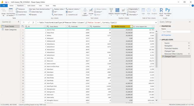
Screenshot showing the result after transforming the data in the ‘Town Details’ table using Power Query Editor in Power BI Desktop © Microsoft
Task 3: Transform the ‘State Categories’ table of the ‘AUS-towns’ dataset by referring to the specifications provided.
Follow similar steps as Task 2.
CHECKPOINT
Screenshot of the transformed ‘State Categories’ table.
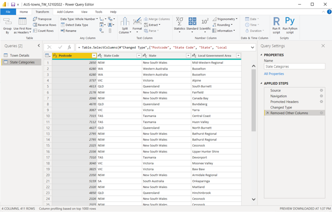
Screenshot showing the result after transforming the data in the ‘State Categories’ table using Power Query Editor in Power BI Desktop © Microsoft
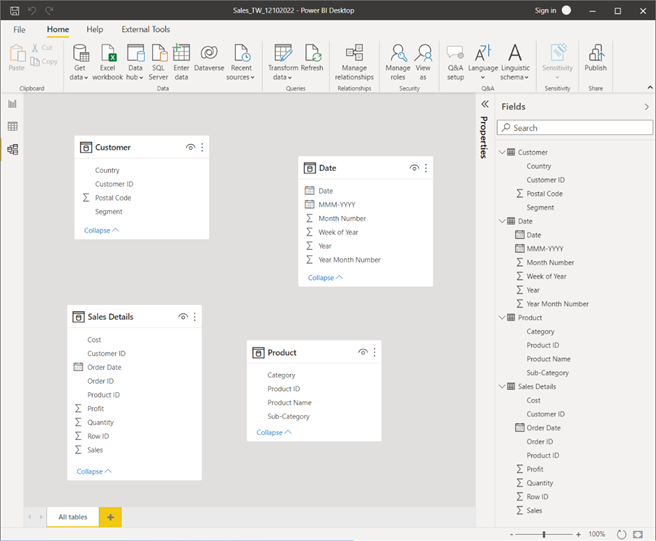
Task 4: Load the transformed tables of the ‘AUS-towns’ dataset into the Power BI data model.
Steps:
- From the ‘Home’ tab in ‘Power Query Editor’, click on ‘Close & Apply’.
- Go to the ‘Model’ view in Power BI Desktop to view the data model for the ‘AUS-towns’ dataset.
CHECKPOINT
Screenshot of the loaded data from the AUS-towns dataset.
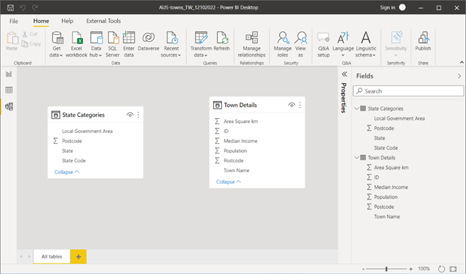
Screenshot showing the result after loading the data tables in the AUS-towns dataset in ‘Model’ view of Power BI Desktop © Microsoft
Task 5: Extract the reference tables required from the ‘Sales’ dataset into Power BI work file’s Power Query Editor. Use the correct procedure, comply with legislative requirements and also consider the specifications provided, when performing this task.
Follow similar steps as Task 1.
Note: The reference tables, ‘Sales Details’, ‘Customer’, ‘Product’ and ‘Date’ should be loaded into Power Query Editor for further transformations.
Task 6: Transform the ‘Sales Details’ table of the ‘Sales’ dataset by referring to the specifications provided.
Ensure that the ‘Sales Details’ table is grouped by ‘Order ID’, ‘Order Date’ and ‘Customer ID’ having summarized values for ‘Sales’, ‘Cost’ and ‘Profit’ columns.
In ‘Power Query Editor’, select the ‘Sales Details’ table from the ‘Queries’ pane and do the following.
Steps:
- Select the required fields (select multiple fields by pressing Ctrl key + click).
- Right-click on the header of one of the selected columns and choose ‘Remove Other Columns’.
- Select each field one by one to check if in the ‘Transform’ > ‘Data type’ is configured according to the specifications provided.
- Select the ‘Add Column’ >‘Custom Column’ and type in the correct M query formula to create the required new column.
- From the ‘Home’>Select ‘Group by’. Then select the ‘Advanced’ option and configure the following settings:
- Select ‘Order ID’ from the first drop-down list.
- Click on ‘Add grouping’. Then select ‘Order Date’ from the second drop-down list.
- Click on ‘Add grouping’. Then select ‘Customer ID’ from the third drop-down list.
- Then, under ‘New column name’ type, ‘Sales’, under ‘Operation’ select ‘Sum’ and under ‘Column’ select ‘Sales’.
- Select ‘Add aggregation’.
- Then, configure the second row as follows:
- New column name: Cost
- Operation: Sum
- Column: Cost
- Similar to the above steps, add a new aggregation to get the sum of the ‘Profit’ column.
- Click on ‘OK’.
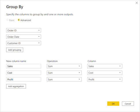
Screenshot showing how the ‘Group By’ options should be configured for the ‘Sales Details’ table of the ‘Sales’ dataset using Power Query Editor of Power BI Desktop © Microsoft
CHECKPOINT
Screenshot of the ‘Sales Details’ table with the ‘Advanced Editor’ window.
The ‘Advanced Editor’ window shows the M query generated whilst performing the transformations and creating new columns.
To open the ‘Advanced Editor’, select ‘Sales Details’ table, go to ‘View’ tab> select ‘Advanced Editor’.
![]()
Screenshot showing the result after transforming the data in the ‘Sales Details’ table using Power Query Editor in Power BI Desktop © Microsoft
Task 7: Transform the ‘Date’ table of the ‘Sales’ dataset by referring to the specifications provided.
Follow similar steps as Task 6.
CHECKPOINT
Screenshot of the ‘Date’ table and the ‘Advanced Editor’ window.
![]()
Screenshot showing the result after transforming the data in the ‘Date’ table using Power Query Editor in Power BI Desktop © Microsoft
Task 8: Transform the ‘Product’ table of the ‘Sales’ dataset by referring to the specifications provided.
Steps:
- Select the ‘Product’ table from the ‘Queries’ pane.
- In the ‘Home’ tab, select the option to ‘Use First Row as Headers’
- Select each field one by one and check if in the ‘Transform’ tab ‘Data type’ is configured as ‘Text’.
CHECKPOINT
Screenshot of the ‘Product’ table with the required columns for analysis.
![]()
Screenshot showing the result after transforming the data in the ‘Product’ table using Power Query Editor in Power BI Desktop © Microsoft
Task 9: Transform the ‘Customer’ table of the ‘Sales’ dataset by referring to the specifications provided.
Steps:
- Select the ‘Customer’ table from the ‘Queries’ pane.
- Select the required fields of the ‘Customer’ table according to the specifications and remove all other columns.
- Select each field one by one and check if in the ‘Transform’ tab ‘Data type’ is configured as ‘Text’.
CHECKPOINT
Screenshot of the ‘Customer’ table with the required columns for analysis.
![]()
Screenshot showing the result after transforming the data in the ‘Customer’ table using Power Query Editor in Power BI Desktop © Microsoft
Task 10: Load the transformed tables of the ‘Sales’ dataset into the Power BI data model.
Follow similar steps as Task 4.
CHECKPOINT
Screenshot of the loaded data from the Sales dataset.
Screenshot showing the result after loading the data tables in the AUS-towns dataset in ‘Model’ view of Power BI Desktop © Microsoft
Extracting and transforming unstructured data
Extracting unstructured data
As you’ve already leant, unstructured data in its natural form is difficult to analyse as it doesn’t have a structured format that the analytic tools can relate to and make sense of. Therefore, these unstructured data (e.g. PDF, TXT etc) need to be transformed into a structured format in preparation for analysis.
For example, the extraction of unstructured data (in PDF format) can be done by:
- using the ‘Get data’ option in Power BI
- using the ‘New source’ option in Power Query Editor, if adding new data into an existing data model.
Refer to the following resources to understand more about the process.
Power Query PDF connector - Power Query | Microsoft Learn
Connect to a PDF file in Power BI Desktop - Power BI | Microsoft Learn
Transforming unstructured data
The Tutorial: Shape and combine data in Power BI Desktop - Power BI from Microsoft Learn will help you learn a variety of techniques used to shape and combine data especially when processing unstructured data formats.
The methods and techniques used to transform unstructured data varies from dataset to dataset. Some of the common transformation techniques are as follows:
Note: Refer to the Power Query documentation - Power Query from Microsoft Learn official website relevant for each of the following examples of transformation techniques.
| Transformation category | Transformation techniques and links to Microsoft Learn resources. |
|---|---|
| Table transformations | Filter a table by row position - Power Query | Microsoft Docs |
| Filter by values in a column - Power Query | Microsoft Docs | |
| Choose or remove columns - Power Query | Microsoft Docs | |
| Data types in Power Query - Power Query | Microsoft Docs | |
|
Working with duplicate values - Power Query | Microsoft Docs |
|
| Column transformations | Fill values in a column - Power Query | Microsoft Docs |
| Split columns by delimiter - Power Query | Microsoft Docs | |
| Combining data using merge queries | Left outer join - Power Query | Microsoft Docs |
| Right outer join - Power Query | Microsoft Learn | |
| Fuzzy merge - Power Query | Microsoft Learn |
Once all the transformations are done in the Power Query Editor window, select the option to Close and Apply.
Practical activity: working with unstructured data
Do the tasks in this activity by putting into practice what you’ve learnt so far in this topic. This activity will help you prepare for the demonstration tasks in your formal assessment.
If you are unsure of the steps required to perform any of the tasks in this activity, you can expand the ‘Hint’ sections to see the detailed steps. Screenshots are provided at several checkpoints so that you can check your work against the desired end result.
Task 1: Create a new Power BI work file and rename it as ‘Demo1-Working with unstructured data’.
Task 2: Extract the unstructured data from the ACE Finance_Product List (.PDF file) document into the Power BI work file.
Steps:
-
- Either in the Power BI work file, click on ‘Get data’> ‘More…’ > ‘PDF’ > ‘Connect’. or...
- Click on ‘Transform data’ to open Power Query Editor and then select ‘New Source’> ‘More…’ > ‘PDF’ > ‘Connect’
- Browse and select the .pdf file that contains the unstructured data.
- Select one of the pages from the tables/pages listed in the Navigator window.
Note: There may be multiple tables/pages in the Navigator window, you would only need to select one page/table to load to the platform at this stage. From this single table, you can obtain the entire set of data from the source during the transformation stage.
Task 3: Ensure that the ‘Supplier ID’, ‘Supplier Name’, ‘Associated Product’ information is expanded into separate columns.
In Power Query Editor, do the following.
Steps:
- In ‘Query Settings’ pane, under ‘Applied Steps’, remove the ‘Changed Type’ and ‘Navigation’ steps leaving only the first step recorded which is ‘Source’.
- On the ‘Data’ column click on the icon
 to expand the required columns. Ensure the ‘Expand’ option is selected and the check boxes for all columns are selected. You may untick the option to ‘Use original column name as prefix’. Then, click on ‘OK’.
 - Ensure that the ‘Supplier ID’, ‘Supplier Name’, ‘Associated Product’ information is captured within the expanded columns.
CHECKPOINT: Completing this task will have the following result as shown in the screenshot.
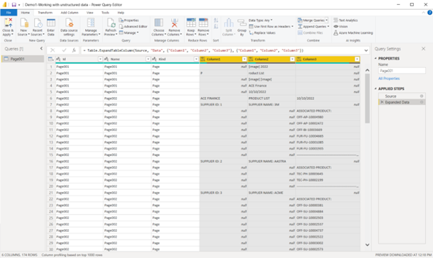
Screenshot showing the result after extracting unstructured data using Power Query Editor in Power BI Desktop © Microsoft
Task 4: Transform the unstructured data into a structured table called ‘Supplier’ that contains data in separate columns as ‘Supplier ID’, ‘Supplier Name’, ‘Product ID’.
This task will require you to perform multiple transformation steps. Do the following sub-tasks.
4.1 Identify any top rows that contains unwanted data and remove them.
In the ‘Home’ tab > Select ‘Remove Rows’ > ‘Remove Top Rows’ > Enter ‘6’ to remove the top 6 rows.
*Document this step in the Query Settings pane >‘Applied Steps’ as ‘Removed the Topic 6 Rows’.
4.2 Fill-in the null columns with the required ‘Supplier ID’ and ‘Supplier Name’ details.
Select ‘Column 1’ and ‘Column 2’ that contains ‘Supplier ID’ and ‘Supplier Name’ details. Then, select the ‘Transform’ tab > ‘Fill’ > ‘Down’
*Document this step in the Query Settings pane >‘Applied Steps’ as ‘Filled Down data for Supplier ID and Supplier Name’.
4.3 Filter any unwanted values (e.g. null, page numbering, repetitive text’) from ‘Column 3’.
Select ‘Column 3’, click on the down arrow ![]() to select values to be filtered.
to select values to be filtered.
Untick (null) and --------------------, ‘ASSOCIATED PRODUCT’ to exclude them from the values.
*Document this steps in the Query Settings pane >‘Applied Steps’ as ‘Filtered rows to exclude null values, repetitive text and characters’
To remove page number details, click on the down arrow on ‘Column 3’, select the option ‘Text Filters’ > ‘Does not begin with’ > type in the word ‘Page’, to exclude page number details in the column.
*Document this steps in the Query Settings pane >‘Applied Steps’ as ‘Filtered rows to exclude page numbering’.
4.4 Separate the words ‘Supplier ID’ and the actual supplier ID number into two separate columns.
Select ‘Column 1’ that contains Supplier ID details. Right click on it to select ‘Split Column’ > ‘By Delimiter…’
Select ‘Colon’ from the drop down. Change Quote Character as ‘None’. Leave other options as default and select ‘OK’.
*Document this steps in the Query Settings pane >‘Applied Steps’ as ‘Split Column by Delimiter to separate Supplier ID data’.
4.5 Separate the words ‘Supplier Name’ and the actual supplier names into two separate columns.
Follow similar steps to the above task.
*Document this step in the Query Settings pane > ‘Applied Steps’ as ‘Split Column by Delimiter to separate Supplier Name data’.
4.6 Rename the columns that contain supplier id data as ‘Supplier ID’.
4.7 Rename the column that contains supplier name data as ‘Supplier Name’.
4.8 Rename the column that contains product id data as ‘Product ID’.
4.9 Remove unwanted columns leaving only the ‘Supplier ID’, ‘Supplier Name’, and ‘Product ID’ columns in the table.
Press the CTRL key and select the ‘Supplier ID’, ‘Supplier Name’ and ‘Product ID’ columns. Right-click and select the option to ‘Remove other columns’.
4.10. Ensure the columns are formatted with the correct data type.
Select the ‘Supplier ID’ column and go to ‘Transform’ tab. As this contains numerical data, the data type should be set as ‘Whole Number’.
Select the ‘Supplier Name’ column, go to Transform tab and ensure the data type is set to ‘Text’.
Select the ‘Product ID’ column, go to Transform tab, and ensure the data type is set to ‘Text’ as it contains alphanumeric characters.
*Document these stesp in the Query Settings pane > ‘Applied Steps’ as appropriate
4.11 View column profile details to detect any errors
In ‘View’ tab > Tick the ‘Column distribution’, ‘Column quality’ and ‘Column Profile’ options.
4.12. Rename the table as ‘Supplier’.
Under the Queries pane, right-click on the ‘Page001’ table name > Select ‘Rename’ > type new name ‘Supplier’.
CHECKPOINT:
Completing Task 4 (including sub tasks 4.1-4.12) will have the following result as shown in the screenshot.
![]()
Screenshot showing the result after transforming unstructured data using Power Query Editor in Power BI Desktop © Microsoft
Task 5: Once all transformations are done, go to the ‘Home’ tab and select ‘Close & Apply’.
Task 6: Extract and transform structured data into the same Power BI work file from the Product Details (an Excel worksheet file) to create a table called ‘Product’.
Download the Product Details dataset and do the following.
Steps:
- Use the ‘Get data’ option to extract product details (Product ID, Category, Sub-Category, Product Name) into the Power BI work file.
- Select the option to ‘Transform’ the data before loading it to Power BI.
- Select the option to ‘Use First Row as Headers’.
- Check that the data type of all columns in this dataset is set to the type ‘Text’.
- Rename the table as ‘Product’.
- View column profile details to detect any errors.
CHECKPOINT: Once these steps are done correctly, you should get the following result as shown in the screenshot.
![]()
Screenshot showing the result after transforming structured data using Power Query Editor in Power BI Desktop © Microsoft
Task 7: Merge the data from the ‘Product’ table into the ‘Supplier’ table.
Before merging you must identify a column that is common between the two tables. In this case, the ‘Product ID’ column is the column that links both tables.
To merge data into the ‘Supplier’ table,
- First select the ‘Product ID’ column in the ‘Supplier’ table
- Go to ‘Home’ tab, select ‘Merge Queries’>‘Merge Queries’
- Select the second table for merging from the drop-down list and select the ‘Product ID’ column to be used for the merge.
Note: At the bottom of the ‘Merge’ window, it should indicate that all rows from the first table have a successful match with rows from the second table.
CHECKPOINT:
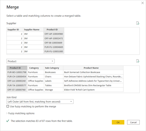
Screenshot showing the ‘Merge’ process between two tables using Power Query Editor in Power BI Desktop © Microsoft
- Once the correct selections are made, click on ‘OK’ to perform the merge.
- Expand the merged ‘Product’ table columns by clicking on the on the icon . Ensure the ‘Expand’ option is selected and the check boxes for all columns are selected. You may untick the ‘Product ID’ column and the option to ‘Use original column name as prefix’. Then, click on ‘OK’.
CHECKPOINT: Once these steps are done correctly, you should get the following result as shown in the screenshot.
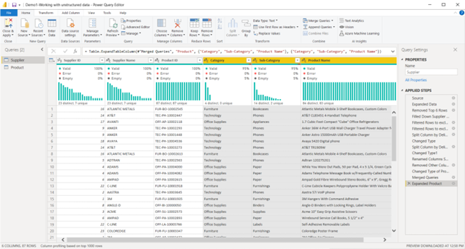
Screenshot showing the result after merging data from two tables using Power Query Editor in Power BI Desktop © Microsoft

Categorising and preparing each dataset must be done correctly, efficiently and in a logical sequence so that accurate results from the dataset can be obtained during the analysis.
Categorising data
When categorising the data in the dataset analysts must,
- first, create the required parameters (measures, calculated columns and manage relationships) required for the analysis
- second, categorise these parameters using the correct data type, format, category, sorting criteria and summarisations.
To learn how to perform each of the following tasks, refer to the recommended resources and articles from Microsoft Learn. These articles will provide you with up-to-date information on Microsoft Power BI’s features and functions that helps to accomplish these tasks using industry standard procedures with examples.
- Set and use date tables in Power BI Desktop – helps to understand how Power BI automatically identifies columns that contain date information
- Measures in Power BI Desktop – helps to understand the basic process followed when creating measures in Power BI
- Using calculated columns in Power BI Desktop
- Using calculated tables in Power BI Desktop
Refer to the article Data categorization in Power BI Desktop to find out the variety of data categorisation types that are supported by Power BI. Based on this information answer the following question.
Knowledge check
Recommended training from Microsoft Learn
Refer to the learning module called Model data in Power BI - Training from Microsoft Learn official website. This learning module will take you through the step-by-step process of how to categorise and prepare data from various sources to create a data model in preparation for analysis.
Read through specifically the following sections of this learning module.
- Introduction to modeling your data
- How to manage your data relationships
- Create calculated columns
- Optimize data models
- Create measures
- Using calculated tables in Power BI Desktop
- Explore time-based data
Practical activity: categorising data
Do the tasks in this activity by putting into practice what you’ve learnt so far in this topic. This activity will help you prepare for the demonstration tasks in your formal assessment.
If you are unsure of the steps required to perform any of the tasks in this activity, you can expand the ‘Hint’ sections to see the detailed steps. Screenshots are provided at several checkpoints so that you can check your work against the desired end result.
Do the preparation task first before doing Task 1.
Preparation tasks: Prepare for the activity by loading a sample dataset into your Power BI work file.
- Create a new Power BI work file and rename it as ‘Demo2-Categorising data’.
- Select the option to ‘Try a sample dataset’ > ‘Load sample data’ into your Power BI work file.
- Continue to load the ‘financials’ data table into Power BI data model.
Do the following tasks using the ‘financials’ data table loaded into Power BI.
Task 1: Create a ‘Date’ table using the following DAX script.
Date =
ADDCOLUMNS(
CALENDARAUTO(),
"Year",YEAR( [Date] ),"Month",FORMAT( [Date],"mmm"),
"Month Number", MONTH( [Date] ), "Quarter", FORMAT( [Date], "\QQ")
)
- From ‘Home’ tab, select ‘New table’
- Copy and paste the DAX script into the formula bar to create the new ‘Date’ table.
Task 2: Mark the ‘Date’ table as ‘date table'.
- Select the ‘Date’ table in the ‘Fields’ pane.
- Go to ‘Table tools’ > select ‘Mark as date table’ > ‘Mark as date table’. Then select the date column as ‘Date’. Note: This step should indicate that the ‘Date’ column is validated successfully. Then, click ‘OK’.
Task 3: Create a relationship between the ‘Date’ dimension table and the ‘financials’ fact table.
- Go to the ‘Model’ view in Power BI Desktop.
- Drag and drop the ‘Date’ column in the ‘Date’ table, onto the ‘Date’ column in the ‘financials’ table.
- Note: This should form a one-to-many (1:*) relationship between the ‘Date’ and ‘financials’ tables.
CHECKPOINT: Once these steps are done correctly, you should get the following result as shown in the screenshot.
Screenshot showing the result after creating a ‘Date’ table using Power Query Editor in Power BI Desktop © Microsoft
- ‘Close and Apply’ the transformations in Power Query once done.
Task 4: Create the following new measures within the ‘financials’ table and categorise each measure according to the specifications provided.
| New Measures | DAX Statement | Format | Data Category | Home table |
|---|---|---|---|---|
| Total Sales | Total Sales = SUM(financials[Gross Sales]) | Currency (2 decimal places) | Uncategorised | financials |
| Gross Profit | Gross Profit = SUM(financials[Profit]) | Currency (2 decimal places) | Uncategorised | financials |
| Total COGS | Total COGS = SUM(financials[COGS]) | Currency (2 decimal places) | Uncategorised | financials |
- To create a new measure,
- right-click on ‘financials’ table > Select the option ‘New measure’
- type in the DAX formula in the formula bar to create the new measure.
- To format the measure,
- select the measure from the ‘Fields’ pane.
- Then, under ‘Measure tools’ tab, select the correct ‘Format’ type, ‘Data category’ from the drop-down options
Task 5: Create the following new calculated columns within the ‘date’ table and categorise and sort each column according to the specifications provided.
| New Calculated column | DAX Statements and mathematical formulas | Data type and format | Sort by column | Reference table name |
|---|---|---|---|---|
| Year Month Number | Year Month Number = [Year]*100 + [Month Number] | Whole Number | Year Month Number | Date |
| Month-Year | Month-Year = [Month] & "-" & [Year] | Text | Year Month Number | Date |
- To create a new calculated column,
- right-click on ‘date’ table > Select the option ‘New column’
- type the DAX formula in the formula bar to create the new column.
- To categorise and sort the column,
- Select the column from the ‘Fields’ pane.
- Under ‘Column tools’ tab, select the correct ‘Format’ type from the drop-down.
- Under the ‘Column tools’ tab, select the correct ‘Sort by column’ from the drop-down.
Task 6: Hide all the fields in each table in the data model, except for the following measures and calculated columns required for the analysis.
- ‘Date’ table required fields: ‘Month-Year’, ‘Quarter’, ‘Year’
- ‘financials’ table required fields: ‘Total Sales’, ‘Gross Profit’, ‘Total COGS’ and ‘Country’.
- In ‘Model’ view, select the icon
 to hide all the fields in both ‘Date’ and ‘financials’ tables.
 - Then, unhide only the required fields for the analysis.
CHECKPOINT: Once these steps are done correctly, you should get the following result as shown in the screenshot.
Screenshot showing the result after categorising the data in the data model using Power Query Editor in Power BI Desktop © Microsoft
Preparing captured big data for analysis
Once all the parameters are created, categorised, formatted and sorted analysts need to create a dashboard to visualise the data obtained from these parameters. This is a crucial step to further prepare for the analysis. A dashboard helps to provide an overview of the important data points in the dataset and helps to verify how effectively the established parameters can be visualised.
Creating a dashboard
According to Microsoft a dashboard is defined as follows.
A dashboard is a single page, often called a canvas that tells a story through visualisations. Because it is limited to one page, a well-designed dashboard contains only the highlights of that story. Readers can view related reports for the details. 54(Microsoft)
To learn more about dashboards, refer to the following articles from Microsoft.
Often an organisation would have their recommended format, structure including brand guidelines (e.g. inclusion of the company logo, company colour schemes etc) that analysts would need to follow when creating dashboards.
Note: The Dashboards feature is only available with ‘Power BI service’ and it is not available in ‘Power BI Desktop’. However, for the purpose of this module, you will be using the ‘Report’ view in Power BI Desktop to create a report page called ‘Dashboard’ page which provides a summary/overview (also called a ‘source report’ or ‘source page’) of the dataset and would represent basic characteristics of a dashboard. This dashboard page (source page) will be used to create target reports (also called ‘drill-through reports’) in the next section.
Using report view in Power BI Desktop to create a dashboard
To learn more about the report view in Power BI Desktop, refer to the article Report View in Power BI Desktop - Power BI from Microsoft Docs.
Visualisation types
There are a variety of visualisation types available in Power BI Desktop. To learn more, refer to Visualization types in Power BI from Microsoft Docs.
Specifically, you will need to be familiar with the following visualisation types and their basic format settings. 55
- Line charts – used to emphasise the overall shape of a series of values, usually over time.
- Bar and column charts – used to visualise specific values across different categories.
- Matrix – a type of table visual. To learn how to create matrix visuals refer to, Create a matrix visual in Power BI - Power BI | Microsoft Learn.
- Cards – These can be of two types; single number or multi-row. To learn how to create card visuals, refer to Card visualizations (large number tiles) - Power BI | Microsoft Learn.
- Area charts – These can be of two main types; basic (layered) and stacked. To learn how to create and use basic area charts refer to, Basic area chart - Power BI | Microsoft Learn.
- Combo charts – a type of chart that combines column and line chart types. E.g. Line and clustered column chart. To learn how to create and use combo charts, refer to Combo chart in Power BI - Power BI | Microsoft Learn
- Slicers – A standalone chart that is used to filter other visuals on the report page. For more information refer to Slicers in Power BI - Power BI
- Standalone images – these are graphics that are added to the report. E.g. A company logo can be added as a standalone image.
- Tree maps – these are charts of coloured rectangles, with size representing value. To learn more, refer to Treemaps in Power BI - Power BI | Microsoft Learn
- Waterfall chart – these help to show a running total as values are added or subtracted. It is useful to understand how an initial value is affected by a series of positive and negative changes. To learn more, refer to Waterfall charts in Power BI - Power BI | Microsoft Learn.
Field parameters
The term ‘Field Parameters’ refers to a method of visualising fields and should not be considered as an input to a report visualisation.
To learn more about field parameters and how to create them, refer to the article Let report readers use field parameters to change visuals (preview) - Power BI.
Conditional table formatting
Often it is necessary to use colour gradients, based on field values to make a matrix visual more meaningful. Especially when matrix visuals are used in dashboards (summary/overview pages) they need to visually indicate the meaning of the values in the table/matrix.
To learn more, refer to Apply conditional table formatting in Power BI - Power BI.
Practical activity: preparing for analysis
Do the tasks in this activity by putting into practice what you’ve learnt so far in this topic. This activity will help you prepare for the demonstration tasks in your formal assessment.
If you are unsure of the steps required to perform any of the tasks in this activity, you can expand the ‘Hint’ sections to see the detailed steps. A screenshot is provided at the end so that you can check your work against the desired end result.
Use the same Power BI work file you’ve created in the previous practical activity and save it as ‘Demo3-Preparing for analysis’.
Dashboard structure and format
Refer to the following dashboard template and structure when placing visuals on the report page.

Task 1: Rename the report page as ‘Dashboard: Financials overview’
- In ‘Report view’, right click on the ‘Page 1’ tab at the bottom of Power BI Desktop.
- Select ‘Rename Page’.
- Type in the new name as ‘Dashboard: Financials overview’
Task 2: Add the dashboard title as ‘Finances Overview’.
Increase the font size to 20, format as bold and position the title according to the Dashboard structure and format provided.
- In ‘Report view’, go to ‘Insert’ tab.
- Click on ‘Text box’, which will add a text box onto the report canvas.
- Type in the title name ‘Finances Overview’
- Customise the font size, format and position according to the guidelines provided.
Task 3: Add the ACE Finance company logo to the report page.
- In ‘Report view’, go to ‘Insert’ tab.
- Click on ‘Image, which will open another window to browse and select the image you want to add to the report canvas. Once the image is selected, click on ‘Open’.
- Type in the title name ‘Finances Overview’
- Customise the font size, format and position according to the guidelines provided.
Task 4: Add ‘Card’ visuals for the measures ‘Total Sales’, ‘Total COGS’ and ‘Gross Profit’ and position these visuals according to the Dashboard structure and format provided.
- Click on an empty space on the report canvas.
- Then, from the ‘Visualizations’ pane, click on the ‘Card’ visual to add this visual to the report canvas.
- Click on the new ‘Card’ visual added to the report canvas
- Then from the ‘Fields’ pane, select the measure name (e.g. ‘Total Sales’) to display its associated value on the visual.
- Position the ‘Card’ visual according to the guidelines provided.
- Repeat steps 3-5 to include the rest of the card visuals to display the values of the measures ‘Total COGS’ and ‘Gross Profit’. OR, as an alternative method, you can create three copies of the first ‘Card’ visual (by simply copying and pasting), and then customise the selected measures of the copied ‘Card’ visuals to display the correct values.
Task 5: Add a ‘Slicer’ visual to provide the option to select the ‘Year’ range, according to the Dashboard structure and format provided.
- Click on an empty space on the report canvas.
- Then, from the ‘Visualizations’ pane, click on the ‘Slicer’ visual to add this visual to the report canvas.
- Click on the new ‘Slicer’ visual added to the report canvas.
- Then from the ‘Fields’ pane, select the ‘Year’ field to display the range of values on the visual.
- Position the visual according to the guidelines provided.
Task 6: Add a new ‘Field parameter’ called ‘Parameter-Measures’ with the measures ‘Total Sales’, ‘Total COGS’ and ‘Gross Profit’.
Position the visual according to the Dashboard structure and format provided and format the orientation of this visual to ‘Horizontal’ and enable single select.
- Select the ‘Modeling’ tab.
- Select ‘New parameter’ > ‘Fields’
- In the ‘Parameters’ window, type in the name as ‘Parameter-Measures’.
- From the ‘Fields’ pane (as displayed on the ‘Parameters’ window) select the required measures.
- Ensure the ‘Add slicer to this page’ option is selected.
- Once all measures are included/added, click on ‘Create’.
- Select the new ‘Parameter-Measures’ visual and in the ‘Visualizations’ pane, select the ‘Format your visual’ icon and do the following.
- Under ‘Visual’, expand to see ‘Slicer settings’.
- Under ‘Options’, change the orientation to ‘Horizontal’ from the drop-down options.
- Under ‘Selection’, turn on the ‘Single select’ option.
- Position the visual according to the guidelines provided.
Task 7: Add a new ‘Field parameter’ called ‘Parameter-Time’ with the measures ‘Month-Year’, ‘Quarter’ and ‘Year’.
Position the visual according to the Dashboard structure and format provided and format the orientation of this visual to ‘Horizontal’ and enable single select.
The general steps followed to do this task is same as for Task 6.
Task 8: Add a ‘Line and clustered column chart’ visual to display the ‘Parameter-Measure’ [in Column y-axis], ‘Parameter-Time’ [in X-axis] and ‘Gross Profit’ [in Line y-axis].
Position the visual according to the Dashboard structure and format provided and format the visual by turning on the ‘Data labels’.
- Click on an empty space on the report canvas.
- Then, from the ‘Visualizations’ pane, click on the ‘Line and clustered column chart’ visual to add this visual to the report canvas.
- Click on the new visual added to the report canvas and position the visual according to the guidelines provided.
- Then from the ‘Fields’ pane, drag and drop the ‘Parameter-Measures’ into the ‘Column y-axis’ input under the ‘Visualizations’ pane.
- Similarly, drag and drop the ‘Parameter-Time’ into the ‘X-axis’ input under the ‘Visualizations’ pane.
- Also, drag and drop ‘Gross Profit’ into the ‘Line y-axis’ input under the ‘Visualizations’ pane.
- To format the visual, first select the visual and in the ‘Visualizations’ pane, select the ‘Format your visual’ icon and turn on the, ‘Data labels’ option.
Task 9: Add a ‘Matrix’ visual to display ‘Gross Profit’ [in Values] for each ‘Month-Year’ [in Rows]. Position the visual according to the Dashboard structure and format provided and format the visual to:
- display the title as ‘Monthly Gross Profit Figures’
- turn off, column/row totals
- display data bars for ‘Gross Profit’ values
- sort the ‘Gross Profit’ column in descending order (high to low values).
- Click on an empty space on the report canvas.
- Then, from the ‘Visualizations’ pane, click on the ‘Matrix’ visual to add this visual to the report canvas.
- Click on the new visual added to the report canvas and position the visual according to the guidelines provided.
- Then from the ‘Fields’ pane, drag and drop the ‘Gross Profit’ measure into the ‘Values’ input under the ‘Visualizations’ pane.
- Similarly, drag and drop the ‘Month-Year’ measure into the ‘Rows’ input under the ‘Visualizations’ pane.
- To format the visual, first select the visual and in the ‘Visualizations’ pane, select the ‘Format your visual’ icon and do the following:
- Under the ‘General’ tab, turn on the ‘Title’. Enter title text as ‘Monthly Gross Profit Figures’.
- Under the ‘Visual’ tab, turn off ‘Column subtotals’ and ‘Row subtotals’.
- To apply conditional formatting, select the ‘Add data to your visual’ icon in the ‘Visualizations’ pane.
- Under the ‘Values’ input field, click on down arrow on the ‘Gross Profit’ field > Select ‘Conditional Formatting’ > ‘Data bars’ > change colour schemes as required > Click ‘OK’.
- On the ‘Matrix’ visual, click on the column heading ‘Gross Profit’ to sort it in descending order.
CHECKPOINT: Once these steps are done correctly, you should get the following result as shown in the screenshot.
Screenshot showing the result after creating the dashboard (Summary/overview) report page using Power Query Editor in Power BI Desktop © Microsoft
Putting it all together
The following video will give you a recap of what you’ve learnt so far and will demonstrate how various visualisations are used to create a report page.

In the previous section you learnt how to categorise and prepare the datasets for analysis. In this section you will learn how to analyse the datasets for trends and relationships using drill-through reports.
Drill-through reports
To learn how to setup and use drill-through reports in Power BI, refer to Set up drill-through in Power BI reports - Power BI from Microsoft Learn.
Watch the following video that demonstrates how drill-through reports can be created in Power BI.
Using smart narratives
To provide brief explanations of the overall results, key outcomes of a Power BI report, smart narratives can be used.
Smart narratives are types of visuals that can be added to a report. It adds text to reports to point out trends, key outcomes, explanations and context.
To learn how to create smart narrative summaries in Power BI, refer to Smart narratives tutorial - Power BI.
Watch the following video to learn how to create smart narratives and customise them as required using dynamic values.
Practical activity: create a drill-through report for analysis
Do the tasks in this activity by putting into practice what you’ve learnt so far in this topic. This activity will help you prepare for the demonstration tasks in your formal assessment.
If you are unsure of the steps required to perform any of the tasks in this activity, you can expand the ‘Hint’ sections to see the detailed steps (Note: If similar tasks were performed in previous practical activities, these tasks will not include hints.). A screenshot is provided at the end so that you can check your work against the desired end result.
Use the same Power BI work file you’ve created in the previous practical activity and save it as ‘Demo4-Creating a drill-through report’.
Report structure and format
Refer to the following report template and structure when placing visuals on the report page.
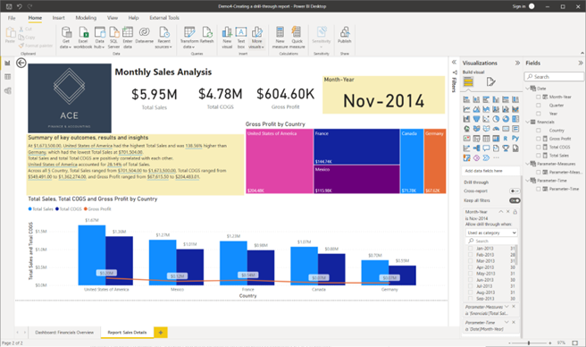
Task 1: Rename the report page as ‘Report: Monthly Sales Details’.
Task 2: Add the dashboard title as ‘Monthly Sales Analysis’.
Increase the font size to 20, format as bold and position the title according to the Report structure and format provided.
Task 3: Add the ACE Finance company logo to the report page.
Task 4: Add ‘Month-Year’ as a drill-through field to this report page.
- Click on the canvas of the report page.
- From the ‘Fields’ pane, drag and drop the ‘Month-Year’ fields into the ‘Drill through’ field in the ‘Visualizations’ pane.
Task 5: Add ‘Card’ visuals for the measures ‘Total Sales’, ‘Total COGS’ and ‘Gross Profit’
Position these visuals according to the Report structure and format provided and format the ‘Callout Value’ of these visuals to ‘35’.
Task 6: Add another ‘Card’ visual to display ‘Month-Year’ information and format it as follows.
- Category label: Off
- Title: On
- Title text: Month-Year
- Background colour of the visual: #CBFFD7
- First select the visual.
- Then go to the ‘Visualizations’ pane and select the ‘Format your visual’ icon to do the following.
- Under the ‘Visual’ tab, turn off ‘Category label’.
- Under the ‘General’ tab, turn on the ‘Title’. Enter title text as ‘Month-Year’.
- Under the ‘General’ tab, expand the ‘Effects’ and change the ‘Background’ > ‘Colour’ to #F8EEB9.
Task 7: Add a ‘Line and clustered bar chart’ as the primary visual to display the following parameters.
- Column Y-axis: ‘Total Sales’, ‘Total COGS’
- Line Y-axis: ‘Gross Profit’
- X-axis: ‘Country’
Position this visual according to the Report structure and format provided and format the visual by turning on the ‘Data labels’.
Task 8: Add a ‘Tree map’ as a secondary visual to display the ‘Gross Profit’ [Values] for each ‘Country’ [Rows].
Position this visual according to the Report structure and format provided and format the visual by turning on the ‘Data labels’.
Task 9: Generate a summary (smart narrative) of the data presented in the ‘Line and clustered column chart’ visual. Format the visual by;
- setting the ‘Title’ as ‘Summary of key outcomes, results and insights’
- change the background colour of the visual to #CBFFD7.
Position this visual according to the Report structure and format provided
- Right-click on the ‘Line and clustered column chart’ visual on the report canvas and select > ‘Summarize’.
- To format the visual, then go to the ‘Format’ pane to do the following.
- Turn on ‘Title’ and type in the title ‘Text’ as ‘Summary of key outcomes, results and insights’
- Expand ‘Effects’ and change the ‘Background’ > ‘Color’ to #F8EEB9.
- Position the visual according to the guidelines provided.
Task 10: Analyse the trends and relationships using the drill-through report page ‘Report: Sales Details’ according to the following context and suggested method.
- Context: Analyse the sales, cost of goods sold and profit figures for all countries for the ‘Month-Year’ that reported the lowest gross profit figures.
- Method: From the ‘Dashboard: Financials Overview’ page, right-click on the ‘Month-Year’ of interest from a visual (according to the given context) and select ‘Drill through’ > ‘Report: Sales Details’ to go to the analysis report page for further details.
- In the ‘Dashboard: Financial Overview’ page, you can see which ‘Month-Year’ reports the lowest gross profit figures, which is November 2014.
- Once this is identified, right-click on any visual that contains ‘Nov-2014’. This can either be from the ‘Matrix’ visual or the ‘Line and clustered column chart’ visual.
- After right-clicking ‘Nov-2014’, select the ‘Drill-through’ > ‘Report:Sales Details’ to go to the details page.
CHECKPOINT: Once these steps are done correctly, you should get the following result as shown in the screenshot.
Topic summary
Congratulations on completing your learning for this topic Analyse initial trends and relationships in captured big data.
In this topic you have learnt and have gained hands-on experience on the following key skills required for analysing big data.
- Extracting and transforming structured and unstructured big data in preparation for data analysis.
- Categorising and preparing captured big data for analysis.
- Analysing big data and derive insights into trends using required tools and dashboards.
- Using mathematical concepts required to analyse big data and records numerical data.
- Using appropriate technology platforms to analyse big data.
- Basic programming to conduct big data analysis.
Check your skills
Please make sure that you are familiar with all the practical activities covered in this topic. These activities will help you prepare for the demonstration tasks in the final project assessment.
What’s next?
Next, we will learn how statistical analysis is carried out to confirm the analysis results and the overall process involved when finalising the big data analysis.