This is the last phase of any data analysis project. In this topic we will look at,
- how you can conduct statistical analysis to confirm accuracy of big data analysis
- how to isolate and remove identified incorrect results
- how to develop report on key outcomes from analysis
- how to store analytic results, associated report and supporting evidence.
In this topic, you will also be introduced to some of the key foundation skills and hands-on (practical) skills you will need to have as a data analyst to conduct statistical analysis and finalise the key outcomes of the data analysis project successfully.
The importance of analytical skills more than arithmetic skills
Analysts need to have technology, numeracy, writing, planning and organising skills to conduct statistical analysis and to finalise the data analysis results successfully. Let’s take a closer look at what each of these foundation skills mean.
Technology: Analysts need to have the basic knowledge of how to use the analytical tools/platforms and have basic programming skills to conduct big data analysis.
Using software does not mean memorising long lists of software commands or how-to operations, but knowing how to review, modify and possibly create software solutions. 41(Levine et al. 2020)
Numeracy: Analysts need to use mathematical and statistical concepts required to analyse big data and are required at times to complete complex calculations and record numerical data. Not understanding statistical concepts can lead to making wrong choices in the application and can make interpreting results difficult.
With software you can perform calculations faster and more accurately than if you did those calculations by hand, minimising the need for advanced arithmetic skills. However, with software you can also generate inappropriate or meaningless results if you have not fully understood a business problem or goal under study or if you use that software without a proper understanding of statistics. 41(Levine et al. 2020)
Writing: Analysts must have the ability to use clear, specific and industry-related terminology to clearly document the key outcomes and results of the statistical analysis.
Planning and organising: Analysts need to understand how to organise and present the information from the results that the analytical tool or platform produces.
Think about the best ways to arrange and label the data. Consider ways to enhance or reorganise results that will facilitate communication with others. 41(Levine et al. 2020)
The practical tasks in this sub-topic will help you put these foundation skills into practice.
Why we need to confirm the accuracy of an analysis?
When looking for patterns in the data being analysed, you must always be thinking of logical causes. Otherwise, you are misrepresenting the results. 41(Levine et al. 2020)
Can statistics lie?
No. Statistics cannot lie. In fact, statistics play a significant role in the way of thinking and can enhance one’s decision making and can increase effectiveness in confirming the accuracy of data analysis.
However, it should be noted that faulty or invalid statistics can only be produced through wilful misuse of statistics or when the stages of the data analysis process are done incorrectly.
For example, many statistical methods are valid only if the data being analysed have certain properties. To some extent we make assumptions about certain properties of the data that we are analysing. However, when these assumptions are violated (or shown to be invalid) for the data analysed, the methods that require that assumption should not be used.
To make these decisions and to test out the properties of the data analysed, we need to conduct statistical analysis.
Statistical methods for evaluation
It is important to use statistical techniques to evaluate the final data analysis models. When evaluating a data model, statistics can help answer the following questions.
- Is the model accurate?
- Does the data model contain extreme values (outliers)?
- If outliers exist,
- is it a result of incorrect data?
- does it significantly affect the results of the analysis?
There are three different types of analysis; univariate, bivariate and multi-variate. Out of these types we will mainly focus on univariate and bivariate analysis.

What is univariate analysis?
Univariate analysis is the simplest form of analysing the data. The data has only one variable. No dealings with cause or relationships among different variables. 56(Skillsoft 2022)
Earlier in this module, you leant basic statistical concepts that helps to describe the central tendency (mean, median, mode), dispersion (range, variance, standard deviation) and shape (skewness, kurtosis) of a single numerical variable. Keeping these basic concepts in mind, analysts are required to perform univariate analysis of the key numerical variables used in an analysis.
Some important facts to remember when evaluating statistics are as follows. 41
- Examine both the mean and the median and identify if they are similar or whether they are very different.
- If only the mean is presented, then one cannot determine whether the data are skewed or symmetrical or whether the median might be a better measure of central tendency than the mean.
- In addition, one should look to see whether the standard deviation or interquartile range of a very skewed set of data has been included in the statistics provided. Without these, one cannot determine the amount of variation that exists in the data.
Watch the following video that will take you through the process of analysing the statistical measures of numerical variables. Pay close attention to how the descriptive statistics obtained for each numerical variable tells a story about its central tendency, dispersion and shape.
Note: This demonstration uses Microsoft Excel to perform basic demonstrations. The same concepts will later be used to carry out demonstration tasks in Power BI Desktop.
Using histograms to visualise distributions
To understand the basics of what a histogram is, what it consists of and why it is used to visualise statistical measures, watch the following video demonstration. Pay close attention to the concepts of ‘frequency counts’ and ‘bins’, and how they are used to represent and group the numerical data.
Note: This demonstration uses Microsoft Excel to perform basic demonstrations. The same concepts will later be used to carry out demonstration tasks in Power BI Desktop.
Binning in Power BI Desktop
Bin sizes can be set for numerical fields in Power BI Desktop. Bins can be created for calculated columns, but not for measures. It is important to allocate the right bin size in order to visualise the data properly.
To learn more refer to the article Use grouping and binning in Power BI Desktop from Microsoft Learn.
Watch the following video that demonstrates how to create groupings and bins in Microsoft Power BI Desktop.
Creating a histogram and adding a distribution curve in Power BI
Watch the following video demonstration that will show you how to create a histogram, and then how a distribution curve can be added to it. Pay close attention to how the NORM.DIST function is used in the demonstration.
Practical activity: conduct univariate analysis in Power BI Desktop
Do the tasks in this activity by putting into practice what you’ve learnt so far in this topic. This activity will help you prepare for the demonstration tasks in your formal assessment. You will specifically learn how to:
- Create statistical measures required for the univariate analysis
- Record numerical data in the report
- Create a histogram to visualise the distribution of the data
- Generate report of the key outcomes of the analysis
If you are unsure of the steps required to perform any of the tasks in this activity, you can expand the ‘Hint’ sections to see the detailed steps (Note: If similar tasks were performed in previous practical activities, these tasks will not include hints.). A screenshot is provided at the end so that you can check your work against the desired end result.
Use the same Power BI work file you’ve created in the last practical activity in Topic 4 (where you have already extracted, transformed, loaded, categorised and prepared the financials dataset) and save it as ‘Demo5-Univariate analysis’.
Refer to the Statistical functions (DAX) - DAX for more information on the statistical functions used in this exercise.
Create statistical measures required for the univariate analysis
Do the following tasks in ‘Data’ view of the Power BI work file.
Task 1: Create a new empty table called ‘Statistics’
- Go to ‘Table tools’ tab.
- Click on ‘New table’
- Type in ‘Statistics =’ in the formula bar.
- Press the ‘Enter’ key or click on the
 icon to apply the formula.
Within the ‘Statistics’ table do tasks 2 to 12.
Task 2: Create a new measure to calculate the count of ‘Sales’ field called ‘Frequency of Sales’.
- Right-click on ‘Statistics’ table > Select ‘New measure’
- Type in the formula bar: Frequency of Sales = COUNT(financials[Sales])
- For more information on the function used refer to COUNT function (DAX)
Task 3: Create a new measure to calculate the arithmetic mean of the ‘Sales’ field called ‘Sales Average’.
- Sales Average = AVERAGE(financials[Sales])
- For more information on the function used refer to AVERAGE function (DAX)
Task 4: Create a new measure to calculate the median of the ‘Sales’ field called ‘Sales Median’.
- Sales Median = Median(financials[Sales])
- For more information on the function used refer to MEDIAN function (DAX)
Task 5: Create a new measure to calculate the standard deviation of the ‘Sales’ field called ‘Sales Standard Deviation’.
- Sales Standard Deviation = STDEV.P(financials[Sales])
- For more information on the function used refer to STDEV.P function (DAX)
Task 6: Create a new measure to obtain the minimum value of the ‘Sales’ field called ‘Sales Min’.
Sales Min = MINA(financials[Sales])
For more information on the function used refer to MINA function (DAX)
Task 7: Create a new measure to obtain the maximum value of the ‘Sales’ field called ‘Sales Max’.
Sales Max = MAXA(financials[Sales])
For more information on the function used refer to MAXA function (DAX)
Task 8: Create a new measure to calculate the range of the ‘Sales’ field called ‘Sales Range’.
Sales Range = [Sales Max] – [Sales Min]
Task 9: Create a new measure to calculate the first quartile of the ‘Sales’ field called ‘Sales Q1’.
Sales Q1 = PERCENTILE.INC(financials[Sales], 0.25)
For more information on the function used refer to PERCENTILE.INC function (DAX)
Task 10: Create a new measure to calculate the third quartile of the ‘Sales’ field called ‘Sales Q3’.
Sales Q3 = PERCENTILE.INC(financials[Sales], 0.75)
Task 11: Create a new measure to calculate the interquartile range (IQR) of the ‘Sales’ field called ‘Sales IQR’.
Sales IQR = [Sales Q3] - [Sales Q1]
Task 12: Create a new measure to calculate the ‘Pearson’s Median Skewness’ for the ‘Sales’ field called ‘Sales Median Skewness’.
Note: Use the “Pearson’s Median Skewness” equation to calculate the skewness.
$$\text{Pearson's Median Skewness} = \frac{\text{3(Mean-Median)}}{\text{Standard Deviation}}$$
Sales Median Skewness = DIVIDE(3*([Sales Average]-[Sales Median]),[Sales Standard Deviation], 0)
Record numerical data in the report
Task 13: Create a new report page and rename it as ‘Sales univariate analysis’.
Task 14: Add a ‘Multi-row Card’ visual to the report page displaying the following statistical measures calculated for the ‘Sales’ field.
- Sales Average
- Sales Median
- Sales Standard Deviation
- Sales Min
- Sales Max
- Sales Range
- Sales Q1
- Sales Q3
- Sales IQR
- Sales Median Skewness
Format the visual by turning on the ‘Title’ and customising the ‘Title Text’ as ‘Sales Statistics’.
- From the ‘Visualisations’ pane, select the ‘Multi-row Card’ visual.
- Then, select the statistical measures in the given order to add them into the visual.
- Select the visual and go to the ‘Visualizations’ pane and select the ‘Format your visual’ icon
 . Under the ‘General’ tab, turn on the ‘Title’. Enter title text as ‘Sales Statistics.
Task 15: Within the ‘Statistics’ table, create a new calculated measure to determine the shape of the ‘Sales’ data called ‘Shape of the Sales data’ using the following DAX formula.
Shape of the (X variable) data =
VAR SK = [X Median Skewness] // Name of the measure that calculates the skewness of the variable
VAR _1 = SK > 0
VAR _2 = SK < 0
RETURN (
IF (_1, "Positively Skewed",
IF (_2, "Negatively Skewed", "No Skew; Data is normally distributed")) )
Shape of the Sales data =
VAR SK = [Sales Median Skewness]
VAR _1 = SK > 0
VAR _2 = SK < 0
RETURN (
IF (_1, "Positively Skewed",
IF (_2, "Negatively Skewed", "No Skew; Data is normally distributed") ) )
Create a histogram to visualise the distribution of data
Task 16: Within the ‘financials’ table create the required bins to group the ‘Sales’ data. Determine an appropriate bin size.
- Right-click on the ‘Sales’ field.
- Select ‘New group’
- Configure the bin size to an appropriate value. (e.g. 7500)
Task 17: Within the ‘financials’ table, create a new calculated column called ‘Sales Distribution Curve’ using the NORM.DIST function for the ‘Sales’ field.
Note: When using the NORM.DIST calculation formula, you will need to type in the exact values obtained for the associated arithmetic mean and standard deviation values for ‘Sales’ field as displayed in the ‘Multi-row Card’ visual in the report.
For more information on how to use this function refer to NORM.S.DIST function (DAX).
- Right-click on ‘financials’ table > Select ‘New column’
- Type the following in the formula bar:
Sales Distribution Curve = NORM.DIST(‘financials’[Sales (bins)], 169609.07, 236557.20, FALSE())
Task 18: Add a ‘Line and clustered column chart’ visual to display the distribution of the ‘Sales’ field according to the following criteria.
- Column Y-axis: ‘Frequency of Sales’
- Line Y-axis: Average of ‘Sales Distribution Curve’
- X-axis: ‘Sales[bins]’
Ensure that the ‘Zoom Slider’ is turned on to help zoom-in to further investigate the shape of the distribution.
- Drag the fields ‘Frequency of Sales’, ‘Sales[bins]’ and ‘Sales Distribution Curve’ to the appropriate visual input as specified.
- However, the ‘Sales Distribution Curve’ as an input to the ‘Line Y-axis’ will display as a Sum value at first. You must change it to an average value by clicking on the down-arrow next to the field, and selecting ‘Average’.
- Select the visual and go to the ‘Visualizations’ pane and select the ‘Format your visual’ icon . Under the ‘Visual’ tab, turn on the ‘Zoom slider’.
Generate report of the key outcomes of the analysis
Task 19: Generate a summary (smart narrative) of the data presented in the ‘Line and clustered column chart’ visual for the ‘Sales’ data. Format the visual as follows:
- Title: On
- Title Text: Statistical Analysis of Sales
- Background Color of the visual: #F8EEB9
Task 20: Customise the summary text created for ‘Sales’ and ‘Profit’ data to only include information related to the statistical analysis. Such as the following.
- Shape of the data: Indicate whether it is symmetrical, positively skewed or negatively skewed. Add here a dynamic value to display the relevant information from the previously created measures ‘Shape of the Sales data’ or ‘Shape of the Profit data’ as appropriate.
- Central tendency: Indicate where the data is centred in terms of mean, median and mode? Are there any observations that are radically different from the rest which may have an effect on the arithmetic mean?
- Spread of the data: How broadly is the data dispersed? Range (Max value – Min value) and IQR. Are there huge differences between the range and the IQR indicating that extreme values may be present in the data?
Note: Delete the automatically generated summary text and only include a summary of your statistical analysis.
The smart narrative can be customised as follows:
- Click on ‘+Value’ to add dynamic values to the smart narrative.
- The dynamic values added are within <> symbol. This will generate dynamic text on the narrative automatically.
An example of summary text (smart narrative) is shown below.
Shape of the data: <Shape of the Sales data>
Central tendency: Data is not centred. Mean (Average) > Median > Mode. Extreme values present in the data can have an impact on the average.
Spread of the data: Measures are dispersed with a range of <Sales Range> and IQR of <Sales IQR>. This indicates that there are extreme values within the data.
CHECKPOINT: Once these steps are done correctly, you should get the following result as shown in the screenshot.
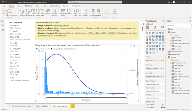
Screenshot showing the result after creating the Sales univariate analysis report page using Power BI Desktop © Microsoft
Try it yourself
Use the same Power BI work file you have used in the previous practical activity to conduct a univariate analysis for the ‘Profit’ field of the ‘financials’ dataset by
- creating the necessary statistical measures
- recording numerical data in the report
- creating a histogram to visualise the distribution of the data
- generating a report of the key outcomes of the analysis.
CHECKPOINT: Once these steps are done correctly, you should get the following result as shown in the screenshot.
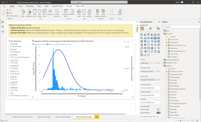
Screenshot showing the result after creating the Profit univariate analysis report Power BI Desktop © Microsoft
What is bivariate analysis?
Bivariate analysis is the simultaneous analysis of two different variables. It helps to explore the concept of relationships between two variables. 56(Skillsoft 2022)
In Topic 2.7 of this module, you learnt about basic statistical concepts that helps to describe the association between two variables (i.e. correlation) and that it is measured by ‘correlation coefficient’ which is a calculated value that ranges between -1 and 1. In addition to this correlation coefficient value, the relationship between two variables needs to be described in terms of the type of relationship and the strength of the relationship.
Calculating the correlation coefficient value
The formula used to calculate the correlation coefficient value is quite complex. To understand more about how this value is calculated, watch the following video.
Although the correlation coefficient is a complex calculation (as you’ve seen in the video demonstration), this calculation can be easily done in Power BI using a feature called ‘Quick measures’.
Quick measures in Power BI Desktop
‘Quick measures’ in Power BI are used to easily perform calculations by running a set of DAX commands behind the scenes. Then it presents the results for you to use in the analysis reports. This feature is extremely useful when analysts need to perform complex statistical and mathematical calculations. 57
Read the article Use quick measures for common and powerful calculations - Power BI to learn more and familiarise with the step by step process used when creating quick measures in Power BI Desktop.
Determining the correlation strength and type
When the correlation coefficient value is calculated, it is important to determine the type of correlation and its strength based on this calculated value.
For example,
- If the correlation coefficient is 1 (one), this identifies a ‘perfect positive’ correlation type, and the correlation strength is determined as ‘very strong’.
- If the correlation coefficient is -1 (minus one), this identifies a ‘perfect negative’ correlation type and the correlation strength is determined as ‘very strong’.
- If the correlation coefficient is 0 (zero), this identifies a ‘zero’ correlation type and the correlation strength is determined as ‘none’.
The following table shows how the correlation type and strength can be determined based on the correlation coefficient value as it varies between +1 and -1. 58
| Correlation coefficient | Correlation strength | Correlation type |
|---|---|---|
| -0.7 to -1.0 | Very strong | Negative |
| -0.5 to -0.7 | Strong | Negative |
| -0.3 to -0.5 | Moderate | Negative |
| 0 to -0.3 | Weak | Negative |
| 0 | None | Zero |
| 0 to 0.3 | Weak | Positive |
| 0.3 to 0.5 | Moderate | Positive |
| 0.5 to 0.7 | Strong | Positive |
| 0.7 to 1.0 | Very strong | Positive |
Using scatter charts to visualise correlations
Scatter charts or ‘scatter plots’ are used to explore the possible relationship between two numerical variables by plotting the values of one numerical variable on the horizontal (or X) axis and the values of the second numerical variable on the vertical (or Y) axis. 41
Watch the following video to understand the basics of why scatter plots are used, how they can be created and how to interpret the results from these visuals.
Note: This demonstration uses Microsoft Excel to perform basic demonstrations. The same concepts will later be used to carry out demonstration tasks in Power BI Desktop.
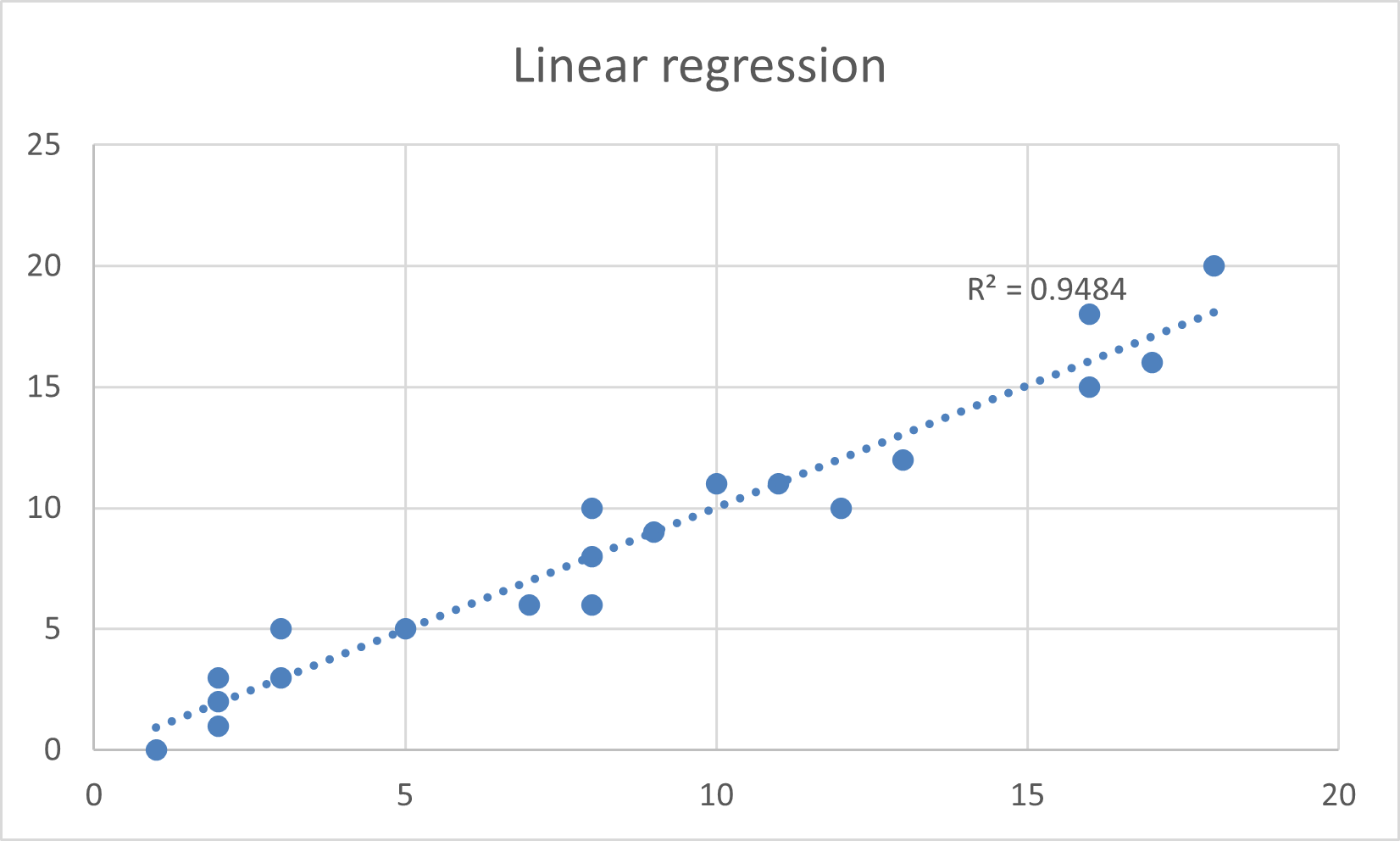
Try it yourself
Use Excel to draw scatterplots and determine the correlation.
Q1. Use the following data to draw a scatterplot, fit a linear trendline and show the correlation factor.
| 3 | 3 | 18 | 16 | 5 | 13 | 2 | 17 | 2 | 1 | 8 | 10 | 2 | 11 | 9 | 12 | 8 | 7 | 8 | 16 |
| 4 | 2 | 17 | 15 | 5 | 15 | 1 | 19 | 3 | -1 | 10 | 12 | 0 | 9 | 10 | 10 | 10 | 9 | 7 | 15 |
Q1. Check your answers.
Practical activity: conduct bivariate analysis
Do the tasks in this activity by putting into practice what you’ve learnt so far in this topic. This activity will help you prepare for the demonstration tasks in your formal assessment. You will specifically learn how to:
- Create the necessary statistical measures to analyse the relationship between two variables
- Record numerical data in the report
- Create a scatter chart to visualise the relationship between the variables
- Generate report to confirm the accuracy of the initial analysis
If you are unsure of the steps required to perform any of the tasks in this activity, you can expand the ‘Hint’ sections to see the detailed steps (Note: If similar tasks were performed in previous practical activities, these tasks will not include hints.). A screenshot is provided at the end so that you can check your work against the desired end result.
Use the same Power BI work file you’ve created in the last practical activity (where you have performed the univariate analysis) and save it as ‘Demo6-Bivariate analysis’.
Create statistical measures required for the bivariate analysis
For this activity, the X and Y variables are defined as follows:
- Variable X = ‘Total Sales’
- Variable Y = ‘Total COGS’
Task 1: Create a new measure to calculate the correlation coefficient for the X and Y variables by ‘Country’.
Name this measure as ‘Correlation coefficient for Total Sales & Total COGS’.
- Right-click on ‘Statistics’ table > Select ‘New quick measure’
- Select the Calculation from the drop-down menu ‘Coefficient of correlation’.
- Drag and drop the ‘Country’ field as an input for ‘Category’.
- Drag and drop the ‘Total Sales’ measure as an input for ‘Measure X’.
- Drag and drop the ‘Total COGS’ measure as an input for ‘Measure Y’.
- Click on OK to generate the quick measure.
- Rename the measure as ‘Correlation coefficient for Total Sales & Total COGS’.
Task 2: Create a new measure called ‘Correlation strength of Total Sales & Total COGS’ to determine the strength of relationship between the X and Y variables using the sample DAX formula provided.
Correlation strength of X & Y =
VAR CC = [Correlation coefficient for X and Y] // Name of the measure that calculates the coefficient of correlation between the two variables.
VAR _1 = CC > 0.7
VAR _2 = CC < -0.7
VAR _3 = CC > 0.5
VAR _4 = CC < -0.5
VAR _5 = CC > 0.3
VAR _6 = CC < -0.3
VAR _7 = CC > 0
VAR _8 = CC < 0
RETURN (
IF (_1 || _2, "Very Strong",
IF (_3 || _4, "Strong",
IF (_5 || _6, "Moderate",
IF (_7 || _8, "Weak", "None") ) ) ) )
- Right-click on ‘Statistics’ table > Select ‘New measure’.
- Copy and paste the DAX script into the formula bar to create the new measure.
- Customise the DAX script as follows:
Correlation strength of Total Sales & Total COGS = VAR CC = [Correlation coefficient for Total Sales & Total COGS]
VAR _1 = CC > 0.7
VAR _2 = CC < -0.7
VAR _3 = CC > 0.5
VAR _4 = CC < -0.5
VAR _5 = CC > 0.3
VAR _6 = CC < -0.3
VAR _7 = CC > 0
VAR _8 = CC < 0
RETURN ( IF (_1 || _2, "Very Strong",
IF (_3 || _4, "Strong",
IF (_5 || _6, "Moderate",
IF (_7 || _8, "Weak", "None")
) ) ) )
Task 3: Create a new measure called ‘Correlation type of Total Sales & Total COGS’ to determine the type of relationship between the X and Y variables using the sample DAX formula provided.
Correlation type X & Y =
VAR CC = [Correlation coefficient for X & Y] // Name of the measure that calculates the coefficient of correlation between the two variables.
VAR _1 = CC <= 1
VAR _2 = CC > 0
VAR _3 = CC >= -1
VAR _4 = CC < 0
RETURN (
IF (_1 && _2, "Positive",
IF (_3 && _4, "Negative", "Zero")
))
The Customised DAX script is as follows:
Correlation type of Total Sales & Total COGS =
VAR CC = [Correlation coefficient for Total Sales & Total COGS]
VAR _1 = CC <= 1
VAR _2 = CC > 0
VAR _3 = CC >= -1
VAR _4 = CC < 0
RETURN (
IF (
1 && _2, "Positive",
IF (_3 && _4, "Negative", "Zero")
))
Record numerical data in the report
Task 4: Create a new report page and rename it as ‘Bivariate analysis’.
Task 5: Add a ‘Card’ visual to the report page to display the value for the calculated measure ‘Correlation coefficient for Total Sales & Total COGS’.
Task 6: Add a ‘Slicer’ visual to the report page to provide the option to select between the ‘Year’ ranges.
Format this visual as a ‘Dropdown’.
To format the ‘Slicer’ visual, click on the down arrow on the top right corner of the visual and select the ‘Dropdown’ option.
Task 7: Add a ‘Slicer’ visual to the report page to provide the option to select a specific ‘Month’.
Format this visual as a ‘Single select’ option with ‘Horizontal’ orientation.
- From the ‘Model’ view, you would first have to unhide the ‘Month’ field of the ‘Date’ table so that it appears in the ‘Report’ view.
- Create the ‘Slicer’ visual using the ‘Month’ as the input field.
- Select the visual and go to the ‘Visualizations’ pane and select the ‘Format your visual’ icon . Under the ‘Visual’ tab, select the ‘Orientation’ as ‘Horizontal’ and turn ‘On’ the ‘Single select’ option.
Create a scatter chart to visualise the relationship between the variables
Task 8: Add a ‘Scatter chart’ visual to display the relationship between X and Y variables according to the following criteria.
- Values: ‘Country’
- X Axis: ‘Total Sales’
- Y Axis: ‘Total COGS’
Ensure that the ‘Trend line’ is turned on.
Drag the fields ‘Country’, ‘Total Sales’ and ‘Total COGS’ to the appropriate visual input as specified.
To add the ‘Trend line’, select the visual and go to the ‘Visualizations’ pane and select the ‘Add further analysis to your visual’ icon ![]() . Then, turn on ‘Trend line’.
. Then, turn on ‘Trend line’.
Generate report to confirm the accuracy of the initial analysis
Task 9: Generate a summary (smart narrative) of the data presented in the ‘Scatter chart’ visual as follows:
- Title: On
- Title Text: Relationship analysis: Total Sales, Total COGS
- Background Color of the visual: #F8EEB9
Task 10: Customise the summary text in the smart narrative visual to only include information related to the bivariate analysis. Such as the following.
- Correlation strength: Add here a dynamic value to display the relevant information from the measure ‘Correlation strength of Total Sales & Total COGS’.
- Correlation type: Add here a dynamic value to display the relevant information from the measure ‘Correlation type of Total Sales & Total COGS’.
Note: Delete the automatically generated summary text and only include a summary of your bivariate analysis.
Task 11: Conduct statistical analysis to confirm the accuracy of the relationship between X and Y variables as reported drill-through report page ‘Report: Sales Details’ according to the following context and suggested method.
- Context: The previously created ‘Report: Sales Details’ drill-through report (in Topic 4.4) analysed the sales, costs and profit figures for all countries for the specific month-year that reported the lowest ‘Gross Profit’. The drill-through report for this specific month-year identified the type of correlation between ‘Total Sales’ and ‘Total COGS’. This correlation type needs to be confirmed by conducting a bivariate analysis.
- Method: In the ‘Bivariate analysis’ report page, select the ‘Year’ and ‘Month’ of interest from the ‘Slicer’ visuals according to the context. Ensure other visuals in the report (‘Scatter Chart’, ‘Card’, ‘Smart Narrative’] display the relevant statistical information that confirms the correlation strength and type.
- In the ‘Report: Sales Details’ drill-through report page, you can see which ‘Month-Year’ reports the lowest gross profit figures, which is November 2014.
- Once this is identified, customise the ‘Slicer’ visuals in the ‘Bivariate analysis’ report page to reflect data for the year 2014, and month ‘November’.
- After right-clicking ‘Nov-2014’, select the ‘Drill-through’ > ‘Report: Sales Details’ to go to the details page.
- As the smart narrative in the ‘Report: Sales Details’ drill-through report states, “Total Sales and total Total COGS are positively correlated with each other.”
- This statement can be confirmed as true and accurate since the analysis results from the smart narrative in the ‘Bivariate analysis’ report page also indicates that the relationship between the ‘Total Sales’ and ‘Total COGS’ variables is very strong and positive.
CHECKPOINT: Once these steps are done correctly, you should get the following result as shown in the screenshot.
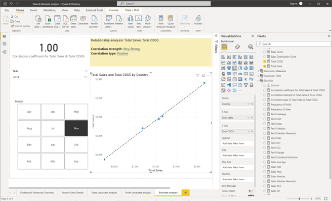
Screenshot showing the result after creating the bivariate analysis report page using Power BI Desktop © Microsoft
Incorrect analysis results due to outliers
In Topic 2.7 of this module, you were introduced to a basic statistical term called ‘outliers’.
Outliers are values that seem excessively different from most of the other values. Such values may or may not be errors, but all outliers require review. 41(Levine et al. 2020)
Can outliers significantly affect the outcomes of an analysis?
When outliers (or extreme values) are present in the key numerical variables analysed, it will influence the mean value of those variables. Outliers will pull the value of the mean toward the extreme values.
Therefore, identifying outliers is important as some analysis methods are sensitive to outliers and produce very different results when outliers are included in the analysis. 41
When analysts need to decide to remove or keep outliers, the following flow chart can help to make a decision. 59

Adapted from The Complete Guide: When to Remove Outliers in Data by Zach 2021
Ethical considerations when reporting analysis results
Ethical considerations arise when deciding which results to include in a report. Presentations of key outcomes and results of the analysis should report results in a fair, objective and neutral manner.
Unethical behaviour occurs when one selectively fails to report pertinent findings that are detrimental to the support of a particular position. 41(Levine et al. 2020)
Therefore, it is important that analysts should document both good and bad results.
In situations where the outliers detected are genuine and are not due to errors, analysts should develop reports to present the analytic results with outliers as well as without outliers.
Finding outliers and isolating incorrect results
Outliers can be found for numerical variables that does not have a defined range of possible values. Although there is no standard for defining outliers, statistical measures such as standard deviation or the interquartile range can be used to find outliers in numerical variables.
When performing the practical activity on conducting a univariate analysis in Topic 5.2, you have learnt that measures such as ‘standard deviation’ and ‘interquartile range’ can be easily computed using analytical tools. Therefore, spotting outliers can also be done using analytical tools.
Creating conditional columns
Conditional columns can be created to tag or categorise the numerical values, so that any categories of these values that are invalid for the analysis can be easily identified and filtered out.
To learn more about conditional columns refer to Add a conditional column - Power Query from Microsoft Learn.
Filter incorrect results
Using Power Query, you have the option to include or exclude rows according to a specific value in a column. This will then, only load the correct or valid data into the Power BI data model.
For example, consider a scenario where there are both positive and negative values in a numerical column. However, for the analysis only the positive values are relevant. In this case, Power Query can be used to filter any values that are less than zero, so that only the positive values get loaded into the Power BI data model for the analysis.
To learn more, refer to Filter by values in a column - Power Query from Microsoft Learn.
Using Z-scores to find outliers
In Topic 2.7 of this module, you were introduced to the formula for calculating ‘Z-scores’ which is as follows:
$$\textit{Z-Score} = \frac{(X_i-\mu )}{ \sigma}$$
When extreme data points in a numerical variable are converted to standardised values (Z-scores), this will help identify how many standard deviations away they are from the mean. Generally, values with a Z-score greater than three (3) or less than minus three (-3) are often determined to be outliers. 60
Isolating and removing outliers from visuals in the analysis
In situations where outliers are genuinely present in numerical data (not due to errors in data entry), organisations would want to visualise their analytical results with/without outliers. Therefore, analysts need to know how to implement this.
To isolate and remove outliers from an analysis, analysts can implement the following general steps using their preferred analytical tool.
- Step 1 – Use a query to calculate the average
- Step 2 – Use a query to calculate the standard deviation
- Step 3 – Create a custom column to calculate standardised (Z-score) values
- Step 4 – Create a conditional column to isolate outliers from non-outlier values
- Step 5 – Filter visuals in the analysis to show results with or without outliers.
Watch the following video demonstration to learn the how these five steps are implemented using Microsoft Power BI Desktop. Pay close attention to how Z-scores are calculated, and how outliers are isolated and removed from visuals used in an analysis.
Practical activity: isolating and removing outliers
Do the tasks in this activity by putting into practice what you’ve learnt so far in this topic. This activity will help you prepare for the demonstration tasks in your formal assessment. You will specifically learn how to:
- create statistical measures required to calculate the Z-score values
- create a custom column to record the Z-score values
- create a conditional column to categorise outlier and non-outlier values
- filter the outliers from the visuals in the dashboard.
If you are unsure of the steps required to perform any of the tasks in this activity, you can expand the ‘Hint’ sections to see the detailed steps (Note: If similar tasks were performed in previous practical activities, these tasks will not include hints.). A screenshot is provided at the end so that you can check your work against the desired end result.
Use the same Power BI work file you’ve created in the last practical activity (where you have performed the univariate analysis) and save it as ‘Demo7-Isolate and remove outliers’.
Create statistical measures required to calculate the Z-score values
Do the following tasks in ‘Power Query Editor’ of the Power BI work file.
Note: To open ‘Power Query Editor’, click on ‘Transform data’ option in Power BI Desktop.
Task 1: Create a query called ‘Sales_AVG’ that calculates the average values in the ‘Sales’ field of the ‘financials’ table.
- Right-click on the ‘Sales’ column
- Select the option ‘Add as Query’
- Use the ‘Statistical functions’ to calculate the ‘Average’
- Rename the query as ‘Sales_AVG’.
Task 2: Create a query called ‘Sales_STD’ that calculates the average values in the ‘Sales’ field of the ‘financials’ table.
- Right-click on the ‘Sales’ column
- Select the option ‘Add as Query’
- Use the ‘Statistical functions’ to calculate the ‘Standard Deviation’
- Rename the query as ‘Sales_STD’.
Task 3: Disable loading of the queries created to calculate the average and standard deviation.
- Right-click on the ‘Sales_AVG’ query and untick the option ‘Enable Load’. This name of the query will display as italicised when loading is disabled.
- Similarly disable loading of the ‘Sales_STD’ query.
Create a custom column to record the Z-score values
Task 4: Create a custom column called ‘Sales Z-scores’ that calculates standardised values based on the formula:
$$\text{Sales }\textit{Z-Score} = \frac{\text{([Sales]-Sales_AVG)}}{ \text{Sales_STD}}$$
- In the ‘Add Column’ tab, click on ‘Custom Column’.
- Enter ‘New column name’ as ‘Sales Z-scores’
- Enter the ‘Custom column formula’ as = ([Sales] – Sales_AVG) / Sales_STD
Note: Query names should not be contained within square brackets [ ]. They should be typed in as it is. Only column names should be enclosed in square brackets when writing M query formulas.
- Click on ‘OK’.
Task 5: Change the data type of the new custome column ‘Sales Z-scores’ to ‘Decimal Number’. Ensure there are no errors.
- From ‘Transform’ tab, select ‘Data Type: Decimal Number’.
- To check if no errors exist in this column, go to ‘View’ tab and tick the options ‘Column distribution’, ‘Column quality’ and ‘Column profile’.
Create a conditional column to categorise outlier and non-outlier values
Task 6: Add a conditional column called ‘Display Outliers’ to isolate the outliers in the ‘Sales Z-score’ column.
Note: If the ‘Sales Z-score’ values is greater 3 and less than -3, the output should be ‘YES’ to indicate these values are outliers. Else the output should be ‘NO’ to indicate those values are non-outliers.
- Click on ‘Add Column’ tab
- Select ‘Conditional Column’
- Enter ‘New column name’ as ‘Display Outliers’ and add the conditional statements as shown in the screenshot.
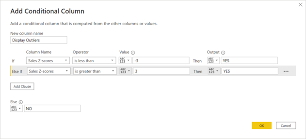
Screenshot showing the setting when adding a conditional column using Power Query Editor in Power BI Desktop © Microsoft
- Once all conditions are added, click on ‘OK’ to create the conditional column.
Task 7: Change the data type of the new conditional column ‘Display Outliers’ to ‘Text’ and ensure there are no errors.
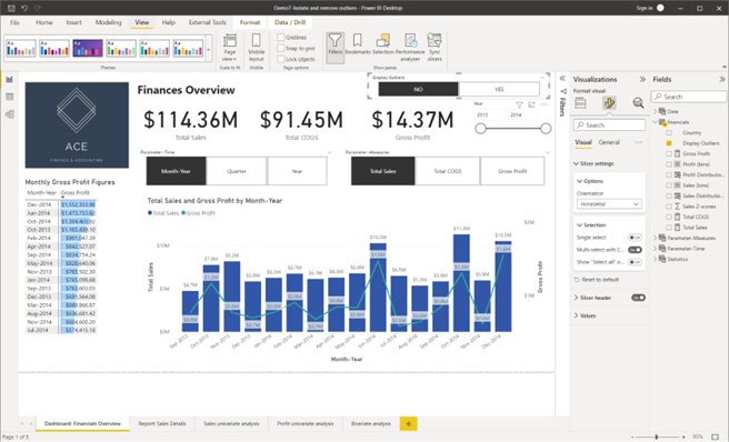
CHECKPOINT: Once these steps are done correctly, you should get the following result as shown in the screenshot.
![]()
Screenshot showing the transformations done to the ‘financials’ dataset using Power Query Editor in Power BI Desktop © Microsoft
Task 8: Apply the transformations and return back to the ‘Report’ view of the Power BI Desktop work file.
- ‘Home’ tab > ‘Close & Apply’.
Filter the outliers from the visuals in the dashboard
Task 9: Add a new ‘Slicer’ visual to the dashboard page ‘Dashboard: Financials Overview’ to view the options from the ‘Display Outliers’ field. Format the ‘Slicer Settings’ > ‘Orientation’ to ‘Horizontal’.
Task 10: Filter the dashboard page to display the analysis with ‘NO’ outliers.
Click on the ‘NO’ option in the ‘Display Outliers’ slicer.
Task 11: Change the theme of the final dashboard with the filtered results to ‘Executive’.
- Click on ‘View’ tab
- Expand the ‘Themes’ options to see the types of themes available and select the ‘Executive’ theme.
CHECKPOINT: Once these steps are done correctly, you should get the following result as shown in the screenshot.
Screenshot showing the result after isolating and removing outliers from the dashboard page using Power BI Desktop © Microsoft
Try it yourself
Use the same Power BI work file you have used in the previous practical activity to isolate and remove outliers from the ‘Profit’ field of the ‘financials’ dataset by
- creating the statistical measures required to calculate the Z-score values
- creating a custom column to record the Z-score values
- create a conditional column to categorise outlier and non-outlier values – here you should customise the previously added conditional column ‘Display Outliers’ to include the conditions to identify outliers from the ‘Profit’ column as well
- filter the outliers from the visuals in the dashboard.
- First create the ‘Profit_AVG’ and the ‘Profit_STD’ queries.
- Then, in the ‘Query Settings’ pane, you must insert a step to add the new custom column ‘Profit Z-scores’ before the step where you have previously added the conditional column ‘Display Outliers’. (See the ‘Query Settings’ pane in the screenshot provided.)
- Then, you’ll be able to further change the settings of the ‘Display Outliers’ conditional column to add conditional statements related to the ‘Profit Z-score’ field.
CHECKPOINT1: Once the necessary steps are done correctly in Power Query Editor, you should get the following result as shown in the screenshot.
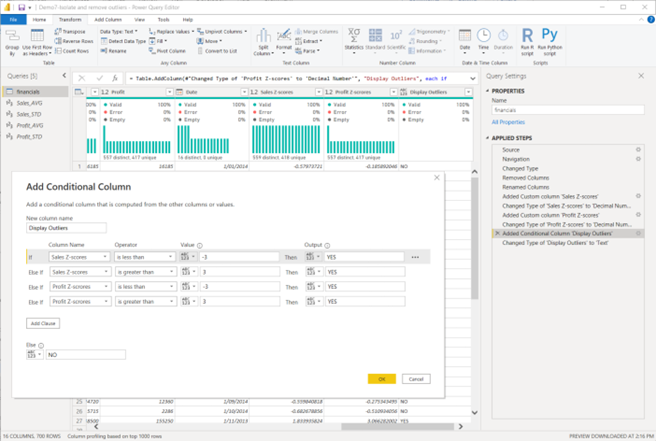
Screenshot showing the settings after customising the conditional column using Power Query Editor in Power BI Desktop © Microsoft
CHECKPOINT2: Once the necessary steps are done correctly in Power BI report view, you should get the following result as shown in the screenshot.
Notice how the results in the visuals have changed after removing the outliers from both the ‘Sales’ and ‘Profit’ numerical variables.
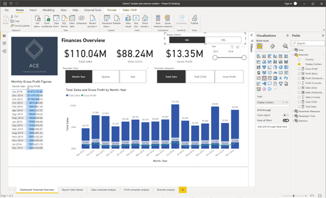
Screenshot showing the settings after customising the conditional column using Power Query Editor in Power BI Desktop © Microsoft

After removing or filtering-out incorrect results from an analysis, it is important to also revise the key outcomes and results in the drill-through reports generated during the initial analysis.
Customising smart narratives with correct values
Watch the following video to learn how to add dynamic values to a smart narrative visual. Pay close attention to things you need to watch out for when customising smart narratives to avoid any configuration issues.
Finalise drill-through reports
Once the dashboard of a report is filtered to only show the results with or without outliers, this information needs to reflect in the drill-through reports.
Therefore, analysts would need to create a new drill-through report from the customised dashboard to display the revised analysis results.
The following practical exercise will take you through the process of finalising a drill-through report.
Practical activity: develop final report
Do the tasks in this activity by putting into practice what you’ve learnt so far in this topic. This activity will help you prepare for the demonstration tasks in your formal assessment. You will specifically learn how to:
- customise the smart narrative visual
- create a revised drill-through report.
If you are unsure of the steps required to perform any of the tasks in this activity, you can expand the ‘Hint’ sections to see the detailed steps (Note: If similar tasks were performed in previous practical activities, these tasks will not include hints.). A screenshot is provided at the end so that you can check your work against the desired end result.
Use the same Power BI work file you’ve created in the last practical activity (where you have performed the univariate analysis) and save it as ‘Demo8 – Develop final report’.
Customise the smart narrative visual
On the drill-through report page ‘Report: Sales Details’ add the following two sentences the ‘Smart Narrative’ with the title ‘Summary of key outcomes, results and insights’.
The [Variable X] and the [Variable Y] have a < Correlation Strength of X & Y>, <Correlation Type of X & Y> correlation with each other.
The average ‘Total Sales’ is <Sales Average>.
Note: These two sentences include variable names and dynamic values. Therefore, when developing the report summary you must:
- replace the text ‘[Variable X]’ and ‘[Variable Y]’ with the full names of the variables used in the analysis
- create and add dynamic values in the sentences as indicated within the ‘< >’ signs.
- The variables specific to this report are defined as follows.
- Variable X – Total Sales
- Variable Y – Total Cost
- In the ‘Report:Sales Details’ page, select the sentence that mentions about the correlation between ‘Total Sales’ and ‘Total COGS’ and delete it.
- Type in the two sentences provided in the activity, replacing any values given within <> with dynamic values.
- Instead of [Variable X], type in ‘Total Sales’.
- Instead of [Variable Y], type in ‘Total COGS’.
CHECKPOINT: Once these steps are done correctly, you should get the following result as shown in the screenshot.
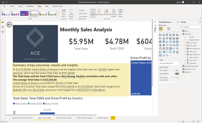
Screenshot showing the result after customising the smart narrative visual in the drill-through report page using Power BI Desktop © Microsoft
Create a revised drill-through report
Revise the drill-through report to analyse report for the sales, cost of goods sold and profit figures for all countries for the ‘Month-Year’ that reported the lowest gross profit figures.
Method: From the finalised ‘Dashboard: Financials Overview’ page, right-click on the ‘Month-Year’ of interest from a visual (according to the given context) and select ‘Drill through’ > ‘Report: Sales Details’ to go to the analysis report page for further details.
- From the finalised ‘Dashboard: Financial Overview’ page, you can see which ‘Month-Year’ reports the lowest gross profit figures, which is now changed to December 2013 as per the corrected results (after removing outliers from both ‘Sales’ and ‘Profit’ variables)
- Once this is identified, right-click on any visual that contains ‘Dec-2013’. This can either be from the ‘Matrix’ visual or the ‘Line and clustered column chart’ visual.
- After right-clicking ‘Dec-2013, select the ‘Drill-through’ > ‘Report: Sales Details’ to go to the details page.
CHECKPOINT: Once these steps are done correctly, you should get the following result as shown in the screenshot.
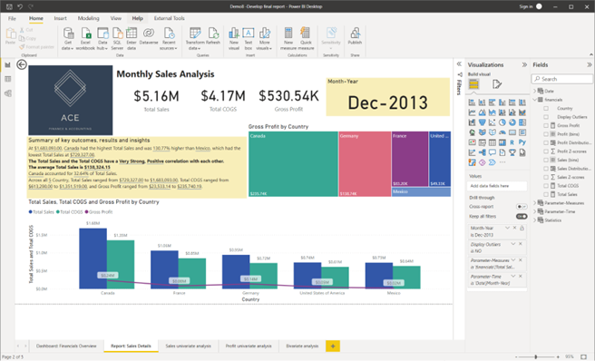
Screenshot showing the finalised drill-through report page using Power BI Desktop © Microsoft
Storing analytic results and reports
For data analysis projects, it is important to have a secure file management system to store and manage all relevant documents, reports and analytic results of the project. Organisations may use cloud-based services or company’s own file management servers to manage documents. Regardless of type of file management system, organisations would generally have their own folder structure or hierarchy. It is within this hierarchical structure that analysts are required to store pieces of information relevant to their data analysis project.
Analytic results can be generated in various file formats depending on the platform/tool used to perform the analysis. For example, if the analysis was performed using:
- Microsoft Power BI Desktop, the results and reports are saved in its original form as .pbix files.
- Microsoft Excel, the results and reports are saved in its original form as .xlsx files. (However, there’s the option of converting this into .pdf and other file formats as well)
Types of associated reports and supporting evidence
These may include evidence of:
- the initial exploratory data analysis reports
- evidence of corresponding with stakeholders to confirm business requirements (e.g. copies of emails sent, and responses received that confirmed the essential parameters for the analysis)
- up to date versions of technical specifications related to the data transformations and categorisations performed during the analysis
- reports confirming the accuracy of the initial analysis using statistical analysis
- finalised analytic reports containing key outcomes and results.
Follow organisational policies and procedures
Organisations may require all generated validation activity and associated supporting evidence to be stored in a secure location. Organisations may have their recommended folder structure and version control requirements when saving documents and files, which you would need to consider.
Consider the following extract from a sample policy document regarding the storage of evidence related to data analysis activities.
All relevant supporting documents, results and reports related to the analytic activities must be stored according to the following folder structure. The documents stored must be named according to the appropriate naming format as shown below, under each folder.
Supporting documents (folder) - This folder should contain copies of, up to date versions of documents that contain technical specifications related to the data transformation and categorisation of the parameters used for the analysis for each dataset analysed.
Analytic results and reports (folder) – This folder should contain up to date versions of the Power BI work files that contain analytic results and reports. The Power BI work files for each dataset should be named according to the format below. (The file type/extension of these documents are indicated within brackets)
- Document naming format: <Company Name>_<Dataset Name> Analysis_<Analyst Name Initials>_ddmmyyyy (.pbix)
- Example: A data exploration document prepared for the Customer dataset by John Smith on 16th September 2022, would be named as AUS Retail_Customer Analysis_JS_16092022(.pbix)
Follow legislative requirements
Depending on the type of organisation or industry sector, or type of data you are working with, there are various legislative requirements that need to be considered when storing sensitive data.
Due to legislative requirements, organisational policies may require you to ensure that,
- the analytic results documented do not contain any personally identifiable data of the organisation’s customer
- if the analytic results contain customer data, they are stored in a secure location in encrypted format where information is accessible only within the organisation internally and cannot be easily understood by unauthorised individuals or entities.
Knowledge check
Complete the following five (5) tasks. Click the arrows to navigate between the tasks.
Topic summary
Congratulations on completing your learning for this topic Finalise big data analysis.
In this topic you have learnt and have gained hands-on experience on the following key skills required for analysing big data.
- Conducting statistical analysis to confirm the accuracy of big data analysis
- Isolating and removing identified incorrect results
- Analyse trends and relationships in both transactional and non-transactional datasets
- Developing reports on the key outcomes, results and insights from the analysis
- Storing analytic results, associated report and supporting evidence according to organisational policies and procedures, and legislative requirements.
- Using appropriate technology platforms to analyse big data.
- Basic programming to conduct big data analysis.
Check your skills
Please make sure that you are familiar with all the practical activities covered in this topic. These activities will help you prepare for the demonstration tasks in the final project assessment.
Assessments
Now that you have completed all topics for this module, you are ready to complete the following assessment event:
- Assessment 4 (Project).