Create presentation proof of concept
Creating a proof of concept is the first step of a well-constructed big data presentation. The proof of concept is a working model of the presentation to demonstrate functionality to stakeholders.
Presentation creation techniques
The design of the presentation is important to articulate insights and requires a unique set of skills. Some of the design recommendations include: (Gemignani 2021)
- visual consistency to help avoid distraction
- increase engagement through the use of data story tools
- keep the presentation simple
- provide context
- build interaction to allow responsiveness that builds trust
- know your audience.
Consideration needs to be given to presenting insights for different data types; for example, transactional and non-transactional data are displayed quite differently. Structured data is readily shown with statistical graphs, plots or infographics. Unstructured data requires extra processing with bespoke visualisation. These requirements will be explored later in this topic.
Proof of concept (POC)
With an understanding of presentation creation techniques, a proof of concept (POC) can be drafted.
To drive digital change in your organization, particularly in the data analytics space, you need to make proofs of concept (POC) a regular habit.(Nyquist 2020)
Reasons for assembling a POC include: (Nyquist 2020)
- identifying opportunities
- unlock new possibilities
- develop an innovative and agile culture.
Planning a proof of concept
Planning a proof of concept involves a strong understanding of the identified business solution and following recommended steps to develop the plan.

The steps include: (Nyquist 2020)
- Identify pain points
- keep in mind that pain points may be difficult to see without an external perspective
- Assemble a team
- choose a widely representative team
- ideally, a team will include six to ten people
- articulate how long the project will run and the time commitment required
- Obtain senior executive approval
- ensure your project receives the required resources through this approval
- Define success
- make sure goals are well chosen and measurable
- Establish a testing plan
- agree on milestones
- Establish costs and timeline
- costs and timelines need to be estimated
- Design a roadmap to develop the proof of concept
When developing the POC, it can help to ask a set of questions. The answer to these can assist with the POC design. The questions could include the following:
- What level of functionality is required?
- How can the layout best show the required insights?
- Where can interactivity be used?
- Which visualisation tool and techniques best show the selected data insight?
- What visualisation techniques will best explain the development of the insights?
Organisational policies, procedures and protocols
Organisations may have policies, procedures and protocols relating to the presentation of data. It is important to read and understand these when performing analysis for presenting insights. Company documentation will give expectation guidelines.
Let’s start with defining what policies, procedures and protocols mean and learn how they may apply to the presentation of big data.
Policies
A policy clearly indicates an organisation’s position and values on a given subject. A policy document is a guidance document and is generally written and readily accessible by staff and publically viewable. An organisation may have a set of policies covering different subjects. (Bettal Consultancy 2020)
For big data analysis and the presentation of insights, there may be situations when a policy can offer guidance, such as testing or confirming the proof of concept. Other examples include:
- How to handle complaints or respond to criticism
- The level of detail required when documenting the process
- What information collected during the process can be shared.
Procedures
Procedures are formal documents that include approved steps to be taken when performing tasks as a representative of an organisation. A procedure supplements a policy by providing more instruction. (Bettal Consultancy 2020)
Through the process of presentation prototyping, referral to procedures may be required. Examples, when this may be the case, include the following:
- implementation guidelines
- recommended chart types to use with transactional and non-transactional data
- selection of visualisation types.
Protocols
A protocol is similar to a procedure but provides more detail. Protocols specify the steps to be followed in defined situations. (Bettal Consultancy 2020)
When designing or confirming the requirements of a presentation, an organisation’s protocols may offer guidance. Situations when referring to protocols may be useful include:
- The use of exempla storytelling techniques
- How an analysis outcome report can be shared
- Guidelines to follow presenting outcomes from an ad-hoc analysis
- Report details such as branding and colour schemes
- Format and design principles required for reports, presentations and dashboards.
Visualisation tools and techniques
A wide array of visualisation tools and techniques are used in creating reports, with different tools applicable to different data types. These will be examined in detail later in this topic.
Proof of concept launch
Watch this video showing how to launch a data analytics proof of concept. In this case, the presenter is using Power BI.
Test presentation proof of concept
Once the POC has been built, it should be tested. Key stakeholders should be invited to provide critical analysis and feedback on the test POC presentation.
Feedback can be conducted through different methods, but it is important to collect data on how well the presentation meets the criteria and leave freeform space for any other suggestions.
Written or online surveys can be used. Refer to the previous topic discussing consultation with stakeholders for suggestions on how surveys can be used.
Popular online survey sites include SurveyMonkey, Typeform and Google Forms.

A considered plan will be required to identify the features and trends in the captured big data set. The plan should start with the requirements, examine the captured data type, and utilise the appropriate tools to develop the presentation. This needs to be done within the business context and to satisfy the target audience.

Key features and trends of captured big data
The key features of big data include format (type), source, categories and context. Data exploration methods will depend on these key features.

Big data formats
Big data falls into three different formats (or types). Let’s further explore these types to understand the differences.
Expand each item below to see more details.
Structured data refers to data that is identifiable and organised in a defined way (AGIMO 2013). Therefore, this data type is easier to search and analyse as its elements are addressable for effective analysis. Structured data is usually stored in a database having one or more tables.
Some of the identifiable features of structured data are that: (Forta 2013)
- it is organised into a well-designed format (e.g. tabular)
- it is generally stored in relational databases (e.g. SQL, MySQL, Oracle) and enterprise management systems (e.g. ERP, CRM)
- it is less flexible and less scalable as it confines to its pre-defined structure
- it is easier to query and process this data to obtain meaningful results
- it allows for parallel data processing and is often used to capture transactional data generated from multi-tasking systems such as point-of-sales terminals, retail systems etc.
Unstructured data refers to data with little identifiable structure (AGIMO 2013) and cannot be contained in a row and column database.
Unstructured data can be textual (e.g. email body, log files, documents, social media posts) or non-textual (e.g. audio, video, images).
Some of the identifiable features of unstructured data are that: (Forta 2013)
- it does not have a pre-defined data format
- it is usually stored in datalakes*
- it does not have a specific format or structure
- it cannot be stored in traditional relational databases
- it does not contain any identifying tags or keywords
- it is harder and more complex to query and process this data to obtain meaningful results
- it requires a specialised skill set to analyse and model this type of data.
A datalake is a centralised repository that allows general storage of all data types from any source.
Semi-structured data refers to data that does not conform to a formal structure based on standardised data models. (AGIMO 2013) As semi-structured data appears to be unstructured at first glance, it is often hard to clearly differentiate between these two types. (Parahar 2022)
However, some of the identifiable features of semi-structured data are that: (Forta 2013)
- it is not fully formatted as structured data
- it is organised up to some extent (e.g.CSV, XML, JSON, HTML), but not at the level of structured data
- it is not stored using tabular formats or in traditional relational databases
- it is more flexible and scalable than structured data, but when compared with unstructured data, it is less flexible and scalable
- it is best managed in NoSQL databases
- it contains identifiable tags or keywords that help query and process the data somewhat more easily than unstructured data. However, the process is not as easy as structured data.
Knowledge check
Complete the following two (2) tasks. Click the arrows to navigate between the tasks.
Visualisation of different data formats
Different visualisation tools apply to different data formats. Structured data is generally easier to work with and display. In contrast, unstructured and semi-structured data typically require some transformation steps, depending on the format, before visualisation tools can be applied. Commonly used visualisation tools for structured data will be covered later in this topic.
The following tools and techniques are used with unstructured and semi-structured data formats to prepare the data for visualisation. This data preparation is also required for the application of machine learning algorithms. (Agrawal 2022)
| Tool/technique | Description |
|---|---|
| Tokenisation | Splits a sequence of strings into words. |
| Filter stop words | Removes contextually unimportant words (such as “and”, are” etc.) |
| Symbol removal | Removes special characters, symbols, emojis, URLs etc. |
| Stemming | Words are taken back to their stem (such as removing plurals, such as men to man, and tenses, such as made to make). |
| Lemmatisation | A similar technique to stemming, but typically more accurate as it refers to a language dictionary. |
| Transform case/ Case folding | A technique that normalises uppercase and lowercase characters and treats them as equivalent. |
| Contraction removal | Converts contracted or abbreviated words to expanded form (for example, “don’t” to “do not”). |
| Data anonymisation | Deletes identifying information. |
| Sentiment analysis | Extracts sentiment (emotion) from a string of text as positive, negative or neutral. |
| Word cloud | Used to find the relative frequency (and importance) of words in a text document. This tool may incorporate stop word filtering and stemming. |
| Parsing | Converts data formats, for example JSON to CSV. |
| Topic modelling | Statistical analysis to discover the topic of a string of text. |
| D3.js | Data Driven Documents (hence D3) is a JavaScript library for visualising and manipulating data within a document. |
Knowledge check
Methods for conducting exploration and discovery
Different methods for exploring and discovering new and big data are available. Appropriate tools can be used to explore the data and build visual presentations to discover and present trend insights.
Visualisation software
Visualisation is a powerful method of presenting key insights. Software can combine data from different sources and allow exploration through visualisation.
Visualisation of data insights is described as a method of reducing noise to reveal key features or patterns.
A variety of different software packages are available. It is recommended that the following features and capabilities are available as they will lead to more efficient exploration and discovery. (Lawton 2018)
- Embeddability: Software needs to be embedded into the operational business systems. This gives the software access to the required data and allows business users to view dashboards and run queries.
- Actionability: The package should provide insights such as trend lines so users can take appropriate action.
- Performance: Visualisation systems need to provide a prompt and reliable response so users gain trust and make best use of the tools.
- Dynamic infrastructure: Moving some of the infrastructure to the cloud to improve ad hoc analytics.
- Interactive exploration: Allow individual users to explore with ad hoc analysis through visualisation.
- Collaborative: Enables groups and individuals to share findings and files with each other.
- Streaming data support: Systems need to be able to collect and collate large sets of real time data.
- AI integration: Flexibility to facilitate progress in machine learning and natural language processing capability.
- Integrated metadata management: Improved usability and accuracy.
- Self-service capability: Allow for rapid prototyping to accelerate hypothesis testing.
Business Intelligence (BI) tools to discover and present hidden insights
Business intelligence (BI) tools can be used to discover and present hidden insights in big data sets. They can be used to identify patterns and trends that may be more difficult to find in more traditional approaches.
The benefits of utilising BI tools include: (Calzon 2022)
- Improved decision making: Making decisions based on data instead of human intuition
- Enhanced communication: Allowing teams to communicate findings and visualisations
- Reduction in bottlenecks: Data analysis is often close to real-time and processed quickly
- Saving time and resources: Automation improves resource usage efficiency.
Hidden trends and insights can be discovered by utilising BI tools. These tools can perform the following tasks: (Calzon 2022)
- connect data across different databases
- user-friendly application of analytics
- readily apply dashboards
- provide efficient reporting
Using BI tools allows users to find patterns and trends hidden within datasets. Users can filter and rearrange elements to reveal these features.
BI tools empower more staff across a business to perform analysis and make data-driven solutions. With the implementation of BI tools, users can take advantage of accessible, intuitive and powerful analysis and reporting features. Data-driven decisions will give a business considerable benefits. (Calzon 2022)
Data-driven solutions can apply to many areas of an organisation, such as procurement, value chain analysis, process efficiency and resource management.
The key performance indicators (KPIs) relating to big data presentations need to be known and understood to allow the generation of appropriate models.
Key performance indicators (KPI)
First of all, we need to understand what a KPI is. Peter Drucker famously said, “What gets measured gets done.”
Key Performance Indicators, also called critical success factors, are often confused with other measures and objectives. KPIs are quantifiable performance measures for specific objectives linked to strategic goals over time. They provide targets for teams to aim for, milestones to gauge progress and insights to enable better decisions. (Qlik n.d.)
This video describes what a KPI is.
Many types of KPIs measure and report progress. Some common ones are:
- Strategic: indicators monitor progress against goals
- Operational: short time frame indicators of organisation process and efficiencies
- Functional: indicators for specific organisational functions
- Leading vs lagging: indicators predicting outcomes or tracking recent activity (Qlik n.d.).
To generate big data models, an analyst must locate and understand the organisation’s KPIs that apply to big data presentation. These KPIs frame the data models and subsequently visualise progress against the indicators.
This video explains how KPIs relate to data analytics.
Generate data models
A clear understanding of the organisation’s KPIs is needed to design and generate data models. These models need to be developed for streamlined analysis to visualise big data insights and show evidence of performance against the KPIs.
Design approaches to visualise big data insights and indicators
Careful consideration is required to design database structures for presenting transactional and non-transactional data. Requirements may include:
- Presenting insights using interactive dashboards to engage the audience
- Use of models to best visualise the insights
- Presenting information using data story telling techniques.
This video shows some ideas on how to visualise KPIs using Microsoft’s Power BI.
Visualisation design requirements should optimise the effectiveness of message delivery. Following are some guidelines to assist when presenting insights and indicators:
- Declutter the visuals; only include the necessary information
- Draw attention to important figures, numerical information and metrics
- Provide a logical sequence to the layout
- Think about how people read and interpret data
- Use of appropriate colours and themes
- Use proper orientation of the visuals
- Think about interaction and engagement
- Tell a story with the visuals
Visualisation tools are investigated later in this topic.

Visualising data
The visualisation of data is critical in relaying important information to an audience accurately and effectively. The data to be presented will contain different data types; therefore, there will be design considerations to show each type optimally.
Some examples of how different data types can be displayed are explored in this video.
Interactive dashboards
As a one-page summary of an organisation’s health, the accuracy and design of dashboards are critical. Combinations of important metrics, key performance indicators (KPIs) , result indicators (RIs), performance indicators (PIs) or key result indicators (KRIs) are displayed, with detail easily obtained through links, drill throughs and pop ups, hence the term “interactive dashboard”.
Interactive dashboards display data obtained from automatically refreshed sources. With a well designed dashboard the visualisation will be close to real-time, referred to as real-time data dashboards.
We will now explore the functional aspects of a dashboard and good design practices.
What is a dashboard?
A dashboard can be defined as:
A data dashboard is a tool many businesses use to track, analyze, and display data — usually to gain insight into the overall wellbeing of an organization, department, or specific process.(Microsoft n.d.)
The effectiveness of a dashboard relies on its design and formatting, consequently, dashboard creation is referred to as an art and a science. This concept is explored further in the following article.
The Art and Science of Effective Dashboard Design by the Power BI team.
Interactive dashboard design
A dashboard must meet the audience’s needs, providing the right level of detail with an easy-to-understand layout that avoids clutter.
To design a dashboard, following best practice guidelines can be the quickest way to an effective outcome. Best design practice is explored by Underwood & Fox (2015), and they provide the following summary:
Best Practice Dashboard Designs (Underwood & Fox, 2015)
- “Good design should tell a story with data that does not become overwhelming with way too much information, clutter or noise. Limit content to fit entirely on one screen.
- Be cognizant of audience natural textual reading tendency. Starting with the highest level of detail in the upper corner of the screen and show more detail you move down in the direction the audience is used to reading.
- Keep your dashboard simple with only 3 to 5 key values, charts, or tables. Avoid putting too much information on a dashboard.
- Remember to provide adequate context and keep related items near each other.
- Avoid displaying “singular numbers” without any other context. Show degrees of change for quick comparisons.
- Avoid data visualization variety for the sake of variety.”
- Focus on data ink (versus non-data ink) for presentation.
- Provide logical titles, labels and legends (rather than default settings)
- For non-transactional data, select optimal visualisation tools.
- Transactional data must be shown chronologically.
- Minimise or abbreviate text as long as the meaning is not lost.
Presentation of the data is important, but an analyst needs to consider what action the user may take after. Underwood & Fox (2015) provide the following checklist to keep in mind.
Consider Your Audience (Underwood & Fox, 2015)
- “Ask how a dashboard will be used and design for next step actions.
- What information does the reader need to be successful?
- How much detail does the reader need?
- What action can be taken and how?
- How are exceptions or insights that need action highlighted?
- What learned or cultural assumptions may affect design choices?
- What do colors mean and can they be visually interpreted?
- Which icons are familiar?
- Don’t forget to use color blind friendly palettes or icons.”
Underwood & Fox (2015) also list guidelines to make insights easier to interpret and avoid misleading users.
Avoid Common Data Visualization Issues (Underwood & Fox, 2015)
- “Choose appropriate data visualizations. Don’t use charts that distort reality i.e. 3-D charts. Keep in mind that it is difficult for the human brain to interpret circular shapes. Pie charts, donut charts, gauges and other circular chart types may look pretty but they are not a data visualization best practice.
- Be consistent with chart scales on axes, chart dimension ordering and also the colors used for dimension values within charts.
- Be sure to encode quantitative data nicely. Don’t exceed three or four numerals when displaying numbers. Display measures to one or two numerals left of the decimal point and scale for thousands or millions i.e. 3.4 million not 3,400,000.
- Don’t mix levels of precision and time. Make sure that time frames are well understood. Don’t have one chart that has last month next to filtered charts from a specific month of the year.
- Don’t mix big and small measures on the same scale, such as on a line or bar chart. For example one measure can be in the millions and the other measure in the thousands. With such a large scale, it would be difficult to see the differences of the measure that is in the thousands.
- Don’t clutter your charts with data labels that are not needed. The values in bar charts are usually well understood without displaying the actual number.”
Knowledge check
Complete the following two (2) tasks. Click the arrows to navigate between the tasks.
Considerations when creating visualisations
The role of visualisations is to provide an audience with a simple view of the data to provide insights and prompt further investigation. To do this, here are some tips from Cornerstone Solutions Group 2020:
“6 Tips for Creating Effective Data Visualizations:
- Data visualizations should have a clear purpose and audience.
- Choose the right type of viz or chart for your data.
- Use text and labels to clarify, not clutter.
- Use color to highlight important information or to differentiate or compare.
- Avoid misleading visualizations.
- Keep your visualizations simple. Less is more.”
Cornerstone Solutions Group provide examples of ineffective and effective visualisations based on these tips at this link.
Dashboards with statistical plots may show many data points, especially if multiple plots are needed. Some protocols should be followed to ensure fair comparisons and show the importance of representing all data consistently. These include:
- Ensure consistency across different plots to help avoid data being misread
- Maintain consistent axes and scales to avoid distortion of data trends
- Ensure labels and titles are accurate
- For transactional time-series plots, ensure equalised and proportional time spacing
- Check all data points are clearly visible and not lost due to resolution issues and not obscured
- Any relationships between data sets shown with scatterplots (or similar such as bubble charts)
- Distribution data visualised with boxplots (or equivalent such as distribution histograms).
Data storytelling has been discussed in earlier sections and is worth considering when building dashboards and reports. Watch the following video on how storytelling can affect the effectiveness of data visualisation, and then complete the following activities.
Knowledge check
Complete the following three (3) tasks. Click the arrows to navigate between the tasks.
How can a dashboard be interactive?
A dashboard gives a one-page snapshot of selected KPIs or other measures. Data trends can often trigger questions and require further investigation. A carefully designed dashboard will allow interactivity for a user to gain more detail to inform decision-making.
Interactivity includes: (Pawar 2020)
- Dashboard click and filter: clicking on a part of a chart gives further detail and tiles update to show trends based on this selection.
- Drill down: shows more detailed information and additional elements.
- Navigation: a menu to display other dashboards.
- Time interval widget: allows adjustment of time scale.
- Zooming chart: allows zoom in or out.
- Tool-tip: hovering over chart elements provides data point values.
Tools for presenting insights
Selecting the correct visualisation tool is important to represent the data and highlight important features effectively. To help decide which of the many visualisation tools to use, consider the data type, format, and message you want to provide.
This video discusses how to choose the correct chart.
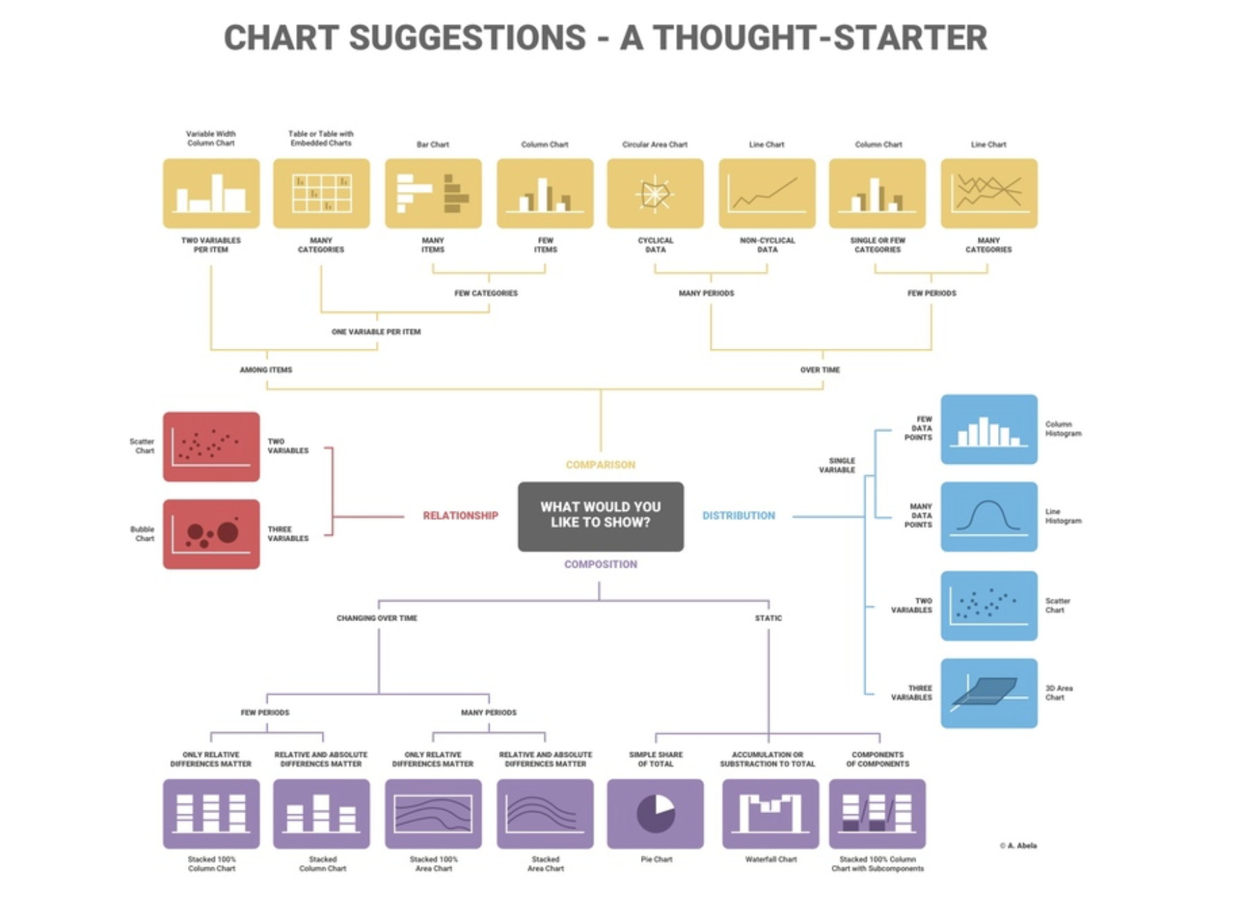
This infogram offers a guide by suggesting chart type for different uses.
Visualisation tools for Power BI
Different software packages offer various tools to present data visually. For this course, we will use Microsoft’s Power BI to learn how these tools can be used and gain experience representing data in different formats.
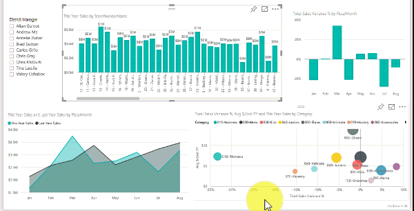
Watch this video for some visualisation ideas highlighting the capability of Power BI.
Key performance indicator (KPI) visualisation
Power BI has a method of visualising KPIs with colour and presentation options and also shows KPI targets.
Read the details on how to set this up is available at this Power BI page.
Dashboards
By definition, dashboards are a single page or screen designed to give all the important, high-level information required, usually through a mixture of visualisations. Dashboards are made up of smaller tiles, each visualising data from a report.

Read this information on the advantages of dashboards and how to build them in Power BI here.
A full training package from Microsoft for connecting data, transforming and visualising data and how to build a dashboard in Power BI is available here.
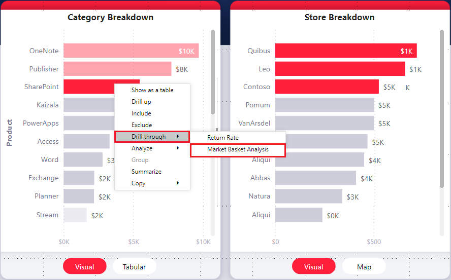
Interactive reports using drillthrough
The drillthrough function in Power BI creates a target page from a report to show specific information. For example, a report may display a list of suppliers, and the drillthrough could show filtered details about a chosen supplier.
Read about setting up this report interactivity here.
Slicer
Slicers are a powerful visualisation tool that performs dynamic filtering. They provide an easy method for a user to select data with the dashboard automatically updating.
More detail on how to add slicers in Power BI is available here.
Bidirectional cross-filtering
Bidirectional cross-filtering allows filters to be applied to both sides of a table relationship.
Drill mode
Power BI has a function called drill mode. The user can move up and down a hierarchy to see more details.
Learn more about drill mode here.
Drillthrough filters
Drillthrough filters get passed from one page to another using the drillthrough feature.
Other filtering types
Power BI has many types of filters, each with their with different functionality. A summary of filter types can be found here.
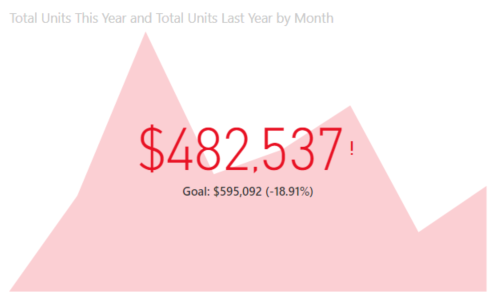
Card visualisation
Cards are a visualisation that shows a single number, for example, the value of total sales or a profit figure. One or more cards are commonly added to dashboards.
More details can be found here.
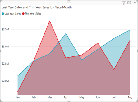
Area chart
Area charts are comparative line charts, emphasising the change across one or more variables by using solid colour under the line graph.
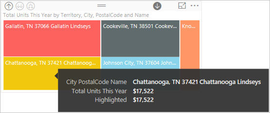
Tooltips information pop up
Tooltips provide additional information for users as they hover their mouse over a part of a visual on a report. As the user scrolls over a report's active components, this extra detail appears in a pop up.
Read about how to create tooltips here.
Mobile layout view
Layouts can be optimised for devices to ensure access across multiple platforms. For example, the mobile layout view shows how a report page will appear on a mobile device. The option can be found in the view tab.
Read the details of how to view the report page when optimised for a mobile device here.
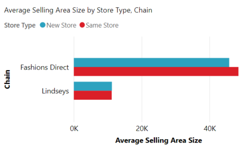
Bar and column chart
Bar charts, with horizontal bars, and column charts with vertical columns representing the comparative size of different data points are commonly used charts available in Power BI.
KPI visualisation
This Power BI function shows a visual to show progress towards a measurable goal.
Learn more about KPI visualisation here.
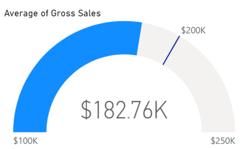
Gauge charts
This visual shows a circular arc representing progress towards a goal.
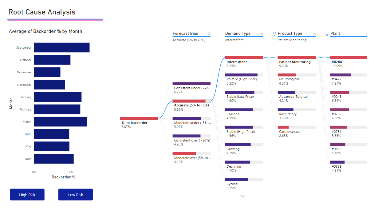
Decomposition tree
A decomposition tree allows a view data across multiple dimensions.
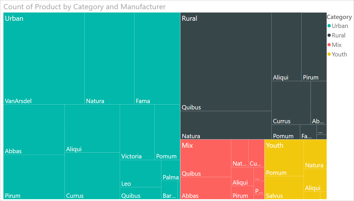
Treemap
Treemaps help visualise data components and hierarchy. Relative values are displayed as areas with categories colour coded.
Matrix
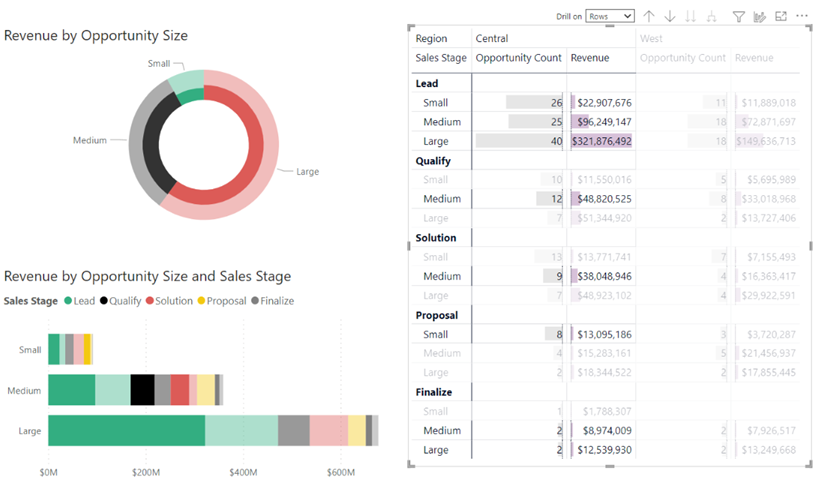
A matrix visual is a method of representing the relative size of tabulated data. This visualisation facilitates drill down.
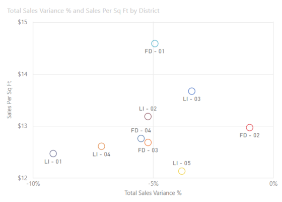
Scatter chart
Power BI has a scatter chart that allows visualisation of the relationship between two data sets.
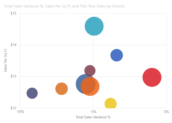
Bubble chart
The bubble chart is similar to the scatter chart, showing the relationship between two data sets, with the addition of bubbles representing an additional dimension.
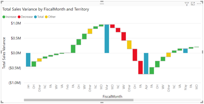
Waterfall chart
Waterfall charts show a running total and colour codes the change and the size of the change.
More information can be found here.
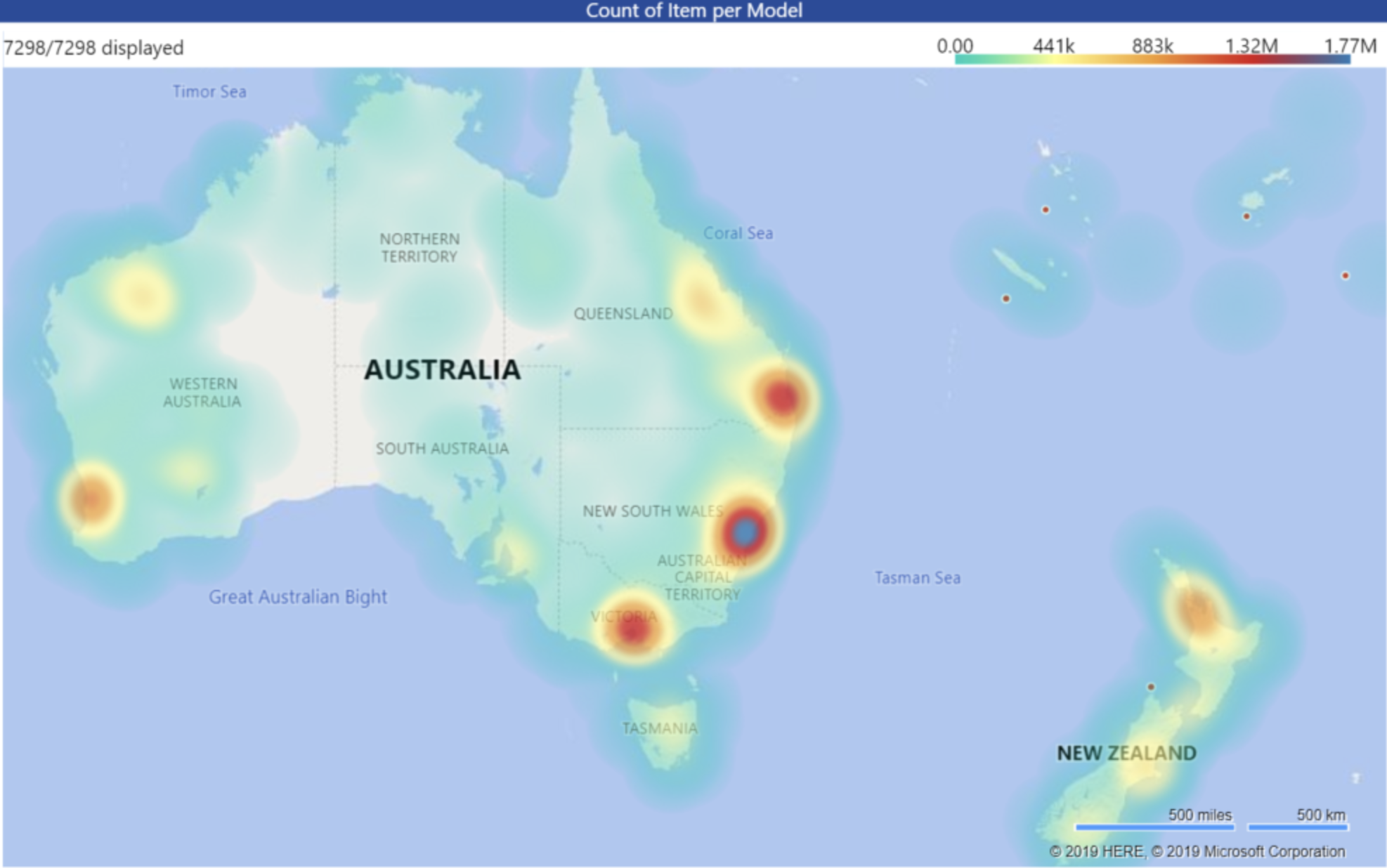
Heat maps
Heat maps (or density maps) place density indicators on an area map. In Power BI the Azure Maps visual feature adds maps as a base for charting functions such as heat maps. Power BI obtains the map details from the cloud-hosted Azure service.
Examples of where this function could be used include showing population density.
Interactive maps
The interactive maps feature in Power BI gives the user a search option to find different map locations. Analysts or programmers can add code to show particular features on the map. This could simply be displaying store locations or other more advanced functions showing insights about specific areas or regions. Viewing data mapped in this way can enhance an audience’s understanding of the data.
Building dashboards
The confirmed proof of concept design can be used to build a dashboard from the visualisation tools. Microsoft’s training package to do this can be found here.
Topic summary
Knowledge check
Complete the following five (5) tasks. Click the arrows to navigate between the tasks.