Interpreting big data sources and summaries involves the use of appropriate tools/platforms and applying the mathematical and statistical concepts covered in the previous topics.
In this topic you will learn how to:
- use Power BI Desktop platform to access data sources and summaries
- apply insight analysis and descriptive statistics
- identify insights related to operational decision-making requirements.
Foundation skills
In this topic, you will develop the following foundation skills.
- Technology: Analysts must be able to use appropriate technology platforms to use big data for operational decision-making. In this topic you will be introduced to Microsoft Power BI Desktop, which is a single tool and a technology platform with multiple capabilities. Therefore, you are required to be familiar with the basic concepts and terminology related to this technology platform. The practical activities in this topic will guide you through the basic steps on how to use the tool/platform efficiently to perform the required analysis tasks.
- Numeracy: Analysts need to use mathematical and statistical concepts when analysing big data and are required at times to record numerical data in reports. The practical activities in this topic will help you learn how mathematical formulas are used when writing queries and DAX statements in Power BI Desktop.
- Planning and organising: Analysts must be able to efficiently and logically sequence the stages of the big data analysis process. There can be many steps, processes and stages specific tasks carried out using big data for operational decision-making. The practical activities in this topic will help you develop good planning and organising skills that will enable you to perform these tasks efficiently, using the correct logical sequence.
- Writing: Analysts must have the ability to use clear, specific and industry-related terminology to clearly represent key outcomes and recommendations related to big data analysis in reports and other forms of written communication with stakeholders.
You will put these foundation skills into practice by performing the practical tasks in this topic.
You will use Power BI Desktop to carry out the demonstration tasks in this module. This tool would enable you to learn the hands-on skills required for this module.
Installing Power BI Desktop
Do the following to prepare your computer with the required software before proceeding any further in the module content.
- Install Power BI Desktop software.
- Refer to the article Introduction to Power BI | Microsoft Learn
The following video will demonstrate the installation steps in detail.
Accessing big data sources and summaries
Power BI Desktop has three views: Report, Data and Model. To access data summaries and data sources as required for this unit, you will mainly access the ‘Report view’ and ‘Data view’.
- The Power BI 'Report' view - can be used to view big data summaries.
- The Power BI 'Data' view - can be used to access data source details such as tables, measures and other data that is associated with the Power BI reports.
The following short video will demonstrate how you can navigate from one view to another in Power BI desktop.
Microsoft Power BI is used with permission from Microsoft. Power BI is a trademark of the Microsoft group of companies.
Refer to the article What is Power BI Desktop? from Microsoft Learn for more information on the three views.
Making data fields accessible in the report view
Sometimes data columns in the ‘Data’ view may be hidden from the ‘Report’ view. To ensure the required fields from the ‘Data’ view are visible and accessible from the report view, you will need to unhide the required tables/columns either from the ‘Data view’ or the ‘Model’ view.
The following video demonstrates how hidden data tables and fields can be made visible and accessible in the ‘Report’ view of a Power BI Desktop file.
Microsoft Power BI is used with permission from Microsoft. Power BI is a trademark of the Microsoft group of companies.
Practical activity 1: Use Power BI to access data sources and summaries
- Download the zipped file Demo 1 - Access data sources and summaries_v1.zip which contains the Power BI work file required for this activity.
- Unzip the downloaded file to find the Power BI work file inside of it.
- Note: In a Windows computer, you can right-click the file and select 'Extract All...' to unzip the file.
- Open the Power BI work file 'Demo 1 – Access data sources and summaries.pbix' using the Power BI Desktop application and do the following tasks.
Note: If you are unsure of the steps required to perform any of the tasks in this activity, you can expand the ‘Hint’ section to see the detailed steps. A screenshot is provided at the end under ‘Checkpoint’ so that you can check your work against the desired end result.
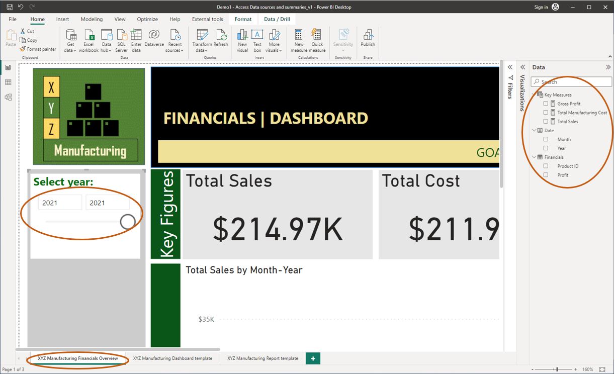
Task 1 - Access big data summaries
- Navigate to the ‘Report’ view.
- View the XYZ Manufacturing Financials Overview report page.
- Customise this page to only show data from the year 2021.
Use the year filter to select the required date range
Task 2 - Access big data sources
Using the same Power BI work file, do the following:
-
Navigate to the ‘Data’ view.
-
View the data source tables and columns available in the Power BI work file.
-
Make the following fields accessible in the ‘Report’ view of the file.
'Key Measures'[Gross Profit]‘Key Measures’[Total Manufacturing Cost]‘Key Measures’[Total Sales]Date[Year]Date[Month]Financials[Product ID]Financials[Profit]
Once all tasks are completed correctly, you should get the following result, as displayed in the screenshot.

Applying descriptive statistics
Descriptive statistics are explanations and information components that can be used to describe data sets to ensure that they are able to be understood. Descriptive statistics can be applied to support operational decision-making by using the information as evidence that can be used to:
- form a position
- select an option
- determine an answer to a question.
What is univariate analysis?
Univariate analysis is the simplest form of analysing the data. The data has only one variable. No dealings with cause or relationships among different variables. 31
Earlier in this module, you learnt basic statistical concepts that help to describe the central tendency (mean, median, mode), dispersion (range, variance, standard deviation) and shape (skewness, kurtosis) of a single numerical variable. Keeping these basic concepts in mind, analysts must perform univariate analysis of the key numerical variables used in an analysis.
Some important facts to remember when evaluating statistics are as follows. 17
- Examine both the mean and the median and identify if they are similar or whether they are very different.
- If only the mean is presented, then one cannot determine whether the data are skewed or symmetrical or whether the median might be a better measure of central tendency than the mean.
- In addition, one should look to see whether the standard deviation or interquartile range of a very skewed set of data has been included in the statistics provided. Without these, one cannot determine the amount of variation that exists in the data.
The following video will take you through the process of analysing the statistical measures of numerical variables. Pay close attention to how the descriptive statistics obtained for each numerical variable tell a story about its central tendency, dispersion and shape.
Note: This demonstration uses Microsoft Excel to perform basic demonstrations. The same concepts will later be used to carry out demonstration tasks in Power BI Desktop.
Practical activity 2: Creating statistical measures in Power BI Desktop
The tasks in this activity will help you practice what you learnt so far in this topic and help you prepare for the demonstration tasks in your formal assessment. You will specifically learn how to:
- create a report page using a given template and customise report elements
- create statistical measures required for the univariate analysis
- record numerical data in the report.
Use the same Power BI work from practical activity 1, 'Demo 1 - Access data sources and summaries' (where you accessed the financials dataset) and save it as ‘Demo2-Univariate analysis’. In this activity, we will conduct a univariate analysis of the Financials[Profit] data.
Refer to the Statistical functions (DAX) - DAX for more information on the statistical functions used in this exercise.
Note: Additional steps on how to perform the tasks are provided in the ‘Hint’ sections. Screenshots are provided within the 'Hint' sections and under the 'Checkpoint' sections so that you can check your work against the desired end result.
Task 1 - Customise a new report page for the univariate analysis
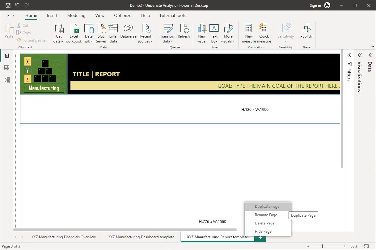
In the Power BI Desktop work file, duplicate the ‘XYZ Manufacturing Report template’ and rename it as ‘Profit: Univariate Analysis Report’.
Step 1 – Create a new report page using XYZ Manufacturing’s standard report template.
To do this, right-click on the ‘XYZ Manufacturing Report template’ > Select ‘Duplicate Page’.
The following screenshot further demonstrates how this task can be done.
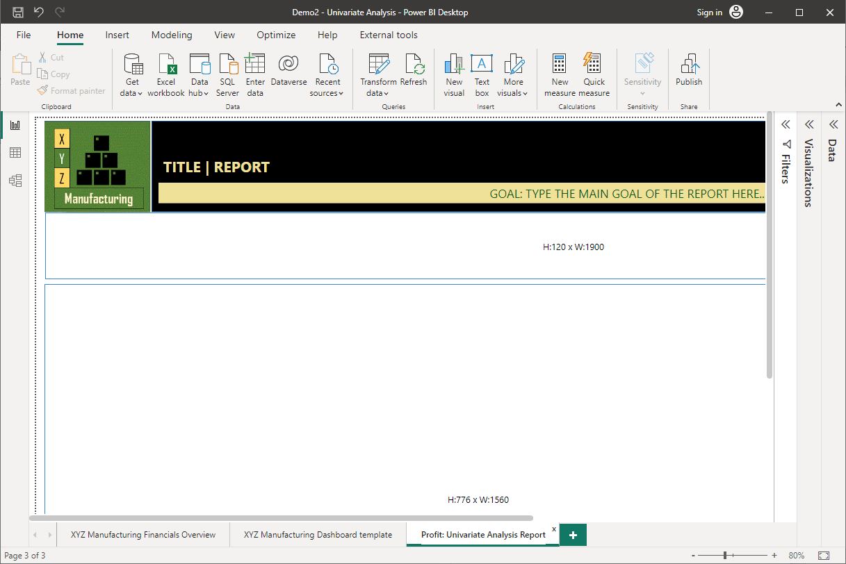
Step 2 – Rename the new report page as ‘Profit: Univariate Analysis Report’.
Double-click on the duplicate report page name (at the bottom) and start typing in the new name. Once done, press the ‘Enter’ key.
The following screenshot further demonstrates how this task can be done.
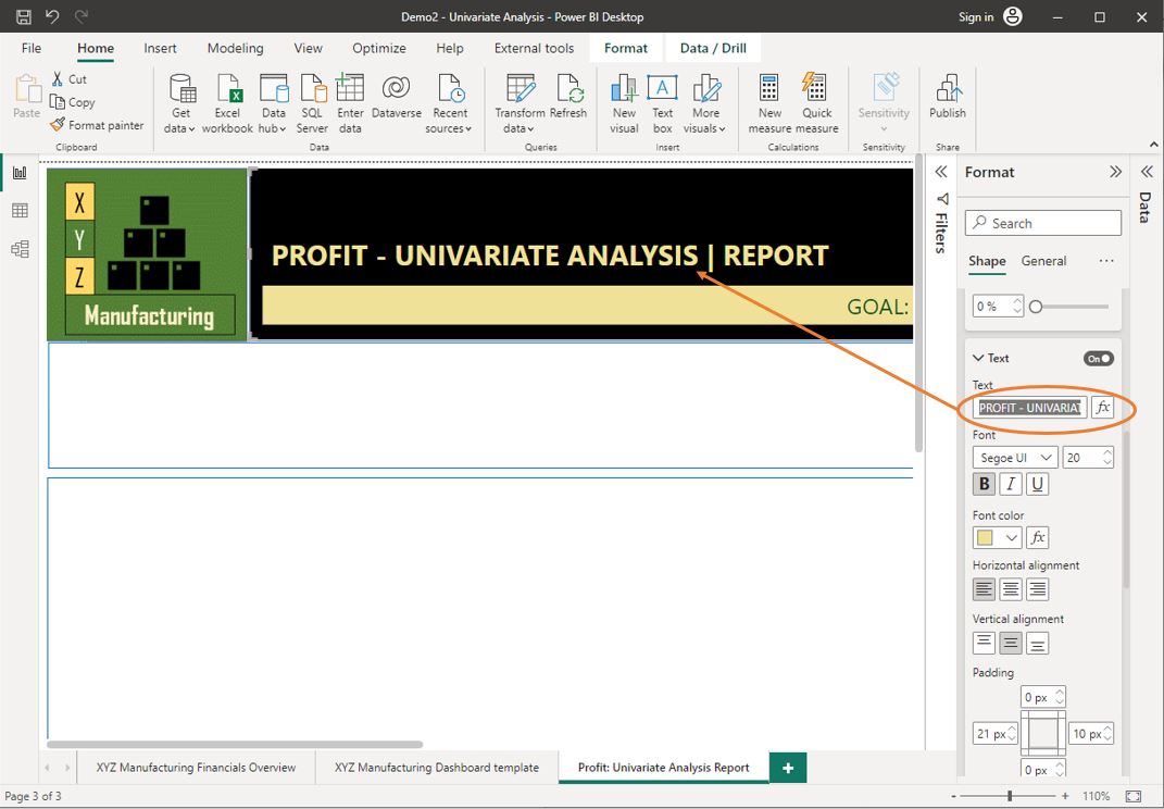
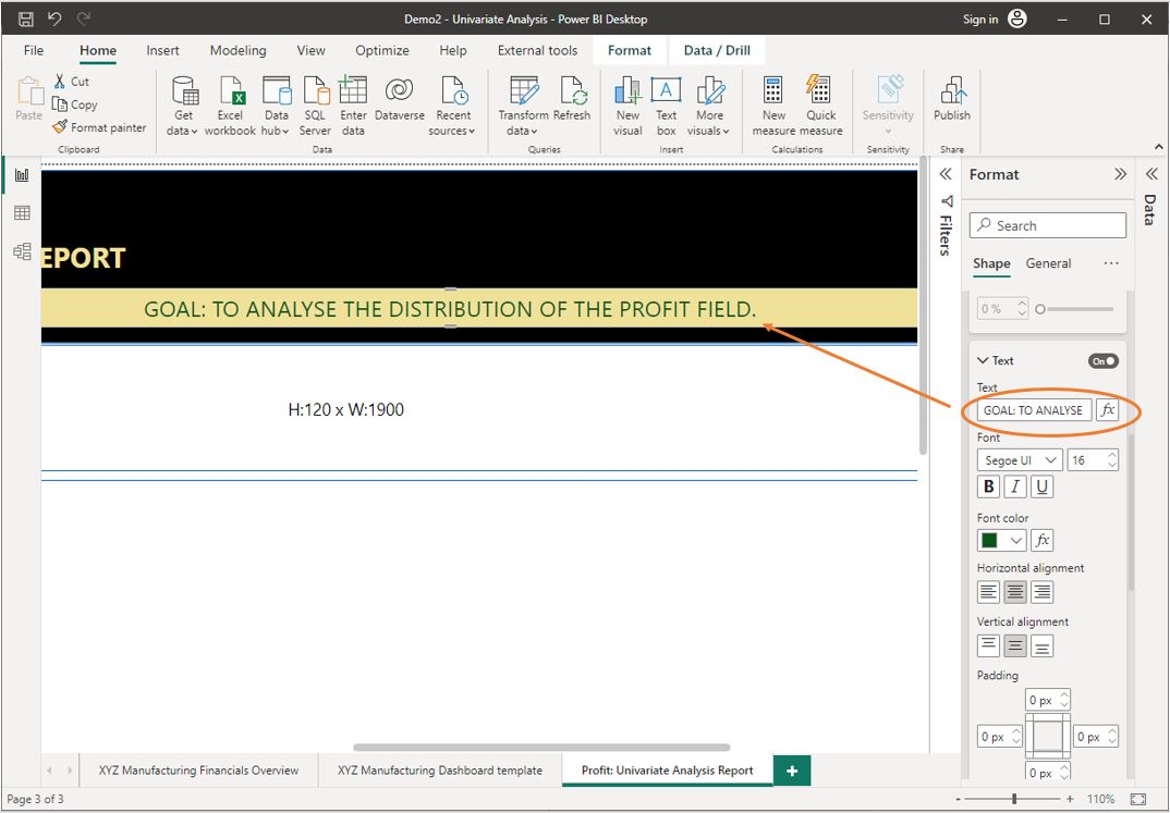
Step 3 – Customise the ‘Title’ of the report page as ‘PROFIT – UNIVARIATE ANALYSIS’.
- First, select the report element that contains the title (e.g. the black rectangle at the top)
- Then, expand the ‘Format’ pane (at the right side of the Power BI Desktop application) and do the following.
- Under the ‘Shape’ tab, expand the ‘Style’ options and scroll down to the ‘Text’ section.
- Type in the new title name in the input text box.
The following screenshot further demonstrates how this task can be done.
Step 4 – Customise the ‘Sub-title’ of the report page to state the goal of the analysis as “GOAL: TO ANALYSE THE DISTRIBUTION OF THE ‘PROFIT’ FIELD”.
Follow the same process in Step 3.
The following screenshot further demonstrates how this task can be done.
Task 2 - Create the statistical measures required for the univariate analysis
Refer to the Tutorial: Create your own measures in Power BI Desktop - Power BI | Microsoft Learn for more step-by-step instructions on creating measures in Power BI Desktop.
Do the following tasks in the ‘Data’ view of the Power BI work file.
Step 1: Create a new empty table called ‘Statistics’
- Go to the ‘Table tools’ tab.
- Click on ‘New table’
- Type in ‘Statistics =’ in the formula bar.
- Press the ‘Enter’ key or click on the
 icon to apply the formula.
Within the ‘Statistics’ table, do tasks 2 to 11.
Step 2: Create a new measure to calculate the arithmetic mean of the ‘Profit’ field called ‘Profit Average’.
- Profit Average = AVERAGE(Financials[Profit])
- For more information on the function used, refer to AVERAGE function (DAX)
Step 3: Create a new measure to calculate the median of the ‘Profit’ field called ‘Profit Median’.
- Profit Median = Median(Financials[Profit])
- For more information on the function used, refer to MEDIAN function (DAX)
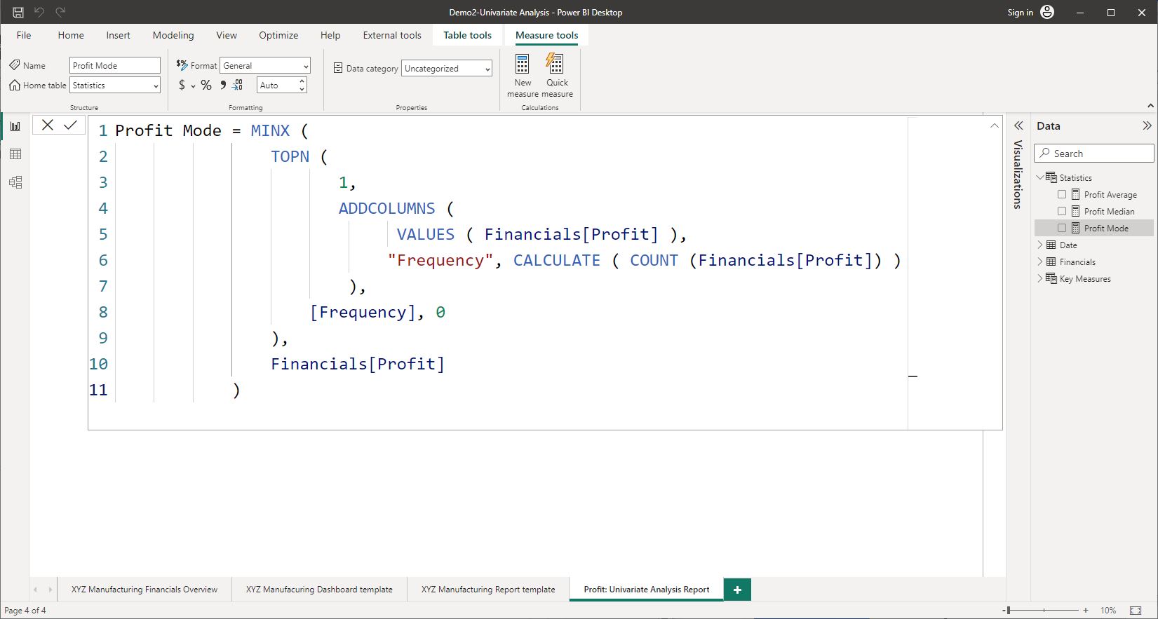
Step 4: Create a new measure to calculate the mode of the ‘Profit’ field called ‘Profit Mode’ using the following sample DAX formula.
Note: Ensure that you replace the TableName[X] with the fully qualified column name of the 'Profit' field in the DAX statement provided.
= MINX(
     TOPN (1,
          ADDCOLUMNS(
               VALUES(TableName[X]),"Frequency", CALCULATE( COUNT (TableName[X]))
                    ),
                    [Frequency], 0
          ),
          TableName[X]
      )
- The following screenshot further demonstrates how the standard protocols of writing DAX statements are used to create this measure.
- Notice that several DAX functions (e.g. MINX, TOPN, ADDCOLUMNS, CALCULATE, COUNT and VALUES) are used to calculate the mode.
Step 5: Create a new measure to calculate the standard deviation of the ‘Profit’ field called ‘Profit Standard Deviation’.
- Profit Standard Deviation = STDEV.P(Financials[Profit])
- For more information on the function used, refer to STDEV.P function (DAX)
Step 6: Create a new measure to obtain the minimum value of the ‘Profit’ field called ‘Profit Min’.
Profit Min = MINA(Financials[Profit])
For more information on the function used refer to MINA function (DAX)
Step 7: Create a new measure to obtain the maximum value of the ‘Profit’ field called ‘Profit Max’.
Profit Max = MAXA(Financials[Profit])
For more information on the function used refer to MAXA function (DAX)
Step 8: Create a new measure to calculate the range of the ‘Profit’ field called ‘Profit Range’.
Profit Range = [Profit Max] – [Profit Min]
Step 9: Create a new measure to calculate the first quartile of the ‘Profit’ field called ‘Profit Q1’.
Profit Q1 = PERCENTILE.INC(Financials[Profit], 0.25)
For more information on the function used refer to PERCENTILE.INC function (DAX)
Step 10: Create a new measure to calculate the third quartile of the ‘Profit’ field called ‘Profit Q3’.
Profit Q3 = PERCENTILE.INC(Financials[Profit], 0.75)
Step 11: Create a new measure to calculate the interquartile range (IQR) of the ‘Profit’ field called ‘Profit IQR’.
Profit IQR = [Profit Q3] - [Profit Q1]
Task 3 - Record numerical data in the report using visuals
Step 1: Add a ‘Multi-row Card’ visual to the report page to visualise the ten (10) statistical measures created previously in task 2.
Place this visual on the top row within the body of the report.
Note: The report has placeholders (rectangular shape elements) that indicate the placement of visuals and their approximate size. You may wish to delete these placeholder elements from the report page or place the visuals on top of these elements.
- Click on an empty space on the report page canvas (Note: If a report element is selected, the ‘visualisations’ pane will not be visible).
- Expand the ‘Visualisations’ pane and select the ‘Multi-row card’ visual. This visual will then be added to the report page.
- Place and resize the visual according to the placement guidelines.
Step 2: Add measures to the visual so that the required numerical information can be displayed in the report.
- Select the ‘Multi-row card’ visual added to the report
- Then, from the 'Data' pane, expand the 'Statistics' table.
- Then, select each of the ten (10) statistical measures to add them to the 'Multi-row card' visual in the following order.
- Profit Average
- Profit Median
- Profit Mode
- Profit Standard Deviation
- Profit Min
- Profit Max
- Profit Range
- Profit Q1
- Profit Q3
- Profit IQR
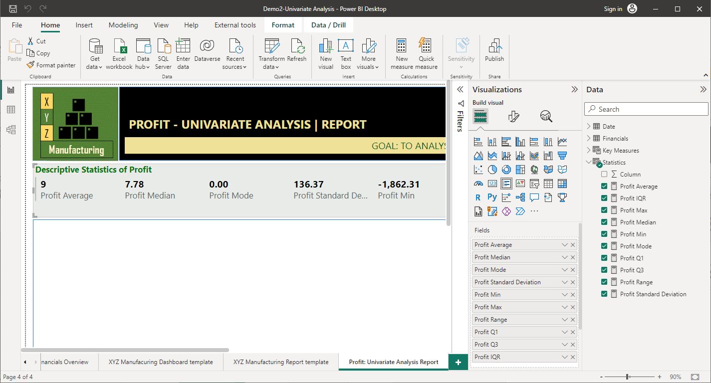
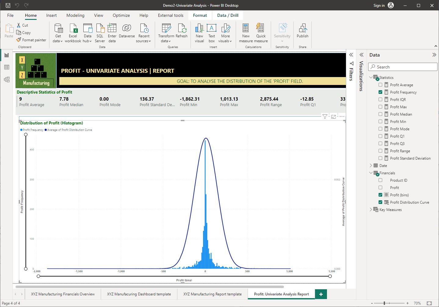
Step 3: Customise the 'Multi-row card' visual according to the following specifications.
Customise the title of this visual to ‘Descriptive Statistics of Profit’ according to the following standard guidelines.
- Font type ‘Segoe UI’
- Font size ‘14’
- Font-style ‘Bold’
- Text colour “#0A7411”
Also, increase the font size of the values displayed to ‘14’ and change the background colour of the visual to ‘#E8EBE7’.
- Select the visual and go to the ‘Visualizations’ pane and select the ‘Format your visual’ icon
 .
. - Select the ‘General’ tab > ‘Title’ > Turn ‘On’. Then, expand the ‘Title’ section and input the title text accordingly.
- Format the ‘Title’ using the font type ‘Segoe UI’, font size ‘14’, font style ‘Bold’ and text colour as “#0A7411”.
- To increase the size of the callout values displayed on the visual, go to the ‘Visual’ tab > expand ‘Callout values’ > Increase the font size to ‘16’, and format font style as ‘Bold’.
- To increase the size of the category labels, go to the ‘Visual’tab > expand ‘Category labels’ > Increase font size to ‘14’.
- To change the background colour of the visual, go to the 'General' tab > expand 'Effects' > 'Background' > set the colour to '#E8EBE7'.
Once these steps are done correctly, you should get the following result, as shown in the screenshot.
Visualising distributions using frequency tables and histograms
To understand the basics of what a histogram is, what it consists of and why it is used to visualise statistical measures, watch the following video demonstration. Pay close attention to the concepts of ‘frequency counts’ and ‘bins’ and how they are used to represent and group numerical data.
Note: This demonstration uses Microsoft Excel to perform basic demonstrations. The same concepts will later be used to carry out demonstration tasks in Power BI Desktop.
Binning in Power BI Desktop
Bin sizes can be set for numerical fields in Power BI Desktop. Bins can be created for calculated columns, but not for measures. It is important to allocate the right bin size in order to visualise the data properly. To learn more refer to the article Use grouping and binning in Power BI Desktop from Microsoft Learn. Watch the following video that demonstrates how to create groupings and bins in Microsoft Power BI Desktop.
Creating a histogram and adding a distribution curve in Power BI
The following video will demonstrate how to create a histogram and how a distribution curve can be added. Pay close attention to how the NORM.DIST function is used in the demonstration.
Practical activity 3: Visualise the distribution of data
The tasks in this activity will help you practice what you learnt and will help you prepare for the demonstration tasks in your formal assessment. You will specifically learn how to create a frequency distribution table and a histogram to visualise the distribution of the data. Continue to work on the same Power BI work file from practical activity 2, ‘Demo2-Univariate analysis’.
Task 1: Create a frequency distribution table
Step 1: Within the ‘Financials’ table, create bins to group the data in the 'Profit' field using an appropriate bin size.
- From the 'Data' pane, expand the 'Financials' table to find the 'Profit' field.
- Right-click on the ‘Profit’ field and select ‘New group’
- Adjust the bin size to a suitable value (e.g. 10)
Notice the name of the new field created - Profit(bins). You will be using this new (bins) group when creating the distribution curve in the next task.
Step 2: Within the 'Statistics' table, create a new measure to calculate the count of the ‘Profit’ field called ‘Profit Frequency'.
- Right-click on the ‘Statistics’ table > Select ‘New measure’
- Type in the formula bar: Profit Frequency = COUNT(Financials[Profit])
- For more information on the function used, refer to COUNT function (DAX)
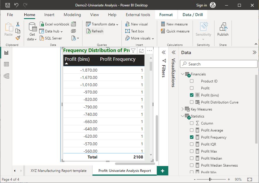
Step 3: Add a 'Table' to the report to create a frequency distribution table.
Place this visual at the bottom-right corner body of the report and resize according to the placement guidelines.
Note: The report has placeholders (rectangular shape elements) that indicate the placement of visuals and their approximate size. You may wish to delete these placeholder elements from the report page or place the visuals on top of these elements.
- Click on an empty space on the canvas of the report page (Note: If a report element is selected, the ‘visualisations’ pane will not be visible.)
- Expand the ‘Visualisations’ pane and select the ‘Table’ visual. This visual will then be added to the report page.
- For more information on the function used refer to COUNT function (DAX)
Step 4: Add the ‘Profit(bins)’ and ‘Profit Frequency’ measures to the visual to display as columns on the table.
- Select the table in the report.
- From the ‘Data’ pane, expand the ‘Statistics’ table and select the ‘Profit Frequency’ measure as an input field of the table.
- Expand the ‘Financials’ table and select the ‘Profit(bins)’ field as an input field of the table.
Step 5: Customise the 'Table' according to the following specifications.
Customise the title of this visual to ‘Frequency Distribution of Profit’ according to the following standard guidelines:
- Font type ‘Segoe UI’,
- Font size ‘14’,
- Font style ‘Bold’
- Text colour “#0A7411”
Also, change the style pre-set of the table to ‘Bold header’, increase the font size of the column headers to ‘14’ with emphasis and change the background colour of the visual to ‘#E8EBE7’.
- Select the visual and go to the ‘Visualizations’ pane. Then select the ‘Format your visual’ icon .
- Select the ‘General’ tab > ‘Title’ > Turn ‘On’. Then, expand the ‘Title’ section and input the title text accordingly.
- Format the ‘Title’ using the font type ‘Segoe UI’, font size ‘14’, font style ‘Bold’ and text colour as “#0A7411”.
- To increase the size of the column headers, go to the ‘Visual’ tab > expand ‘Column headers’ > Increase font size to ‘14’, and format style as ‘Bold’.
- To change the style pre-set of the table, go to the 'Visual' tab > expand ‘Style presets’ > select the ‘Bold header’ option
- To change the background colour of the visual, go to the 'General' tab, and expand 'Effects' and select the background colour to '#E8EBE7'.
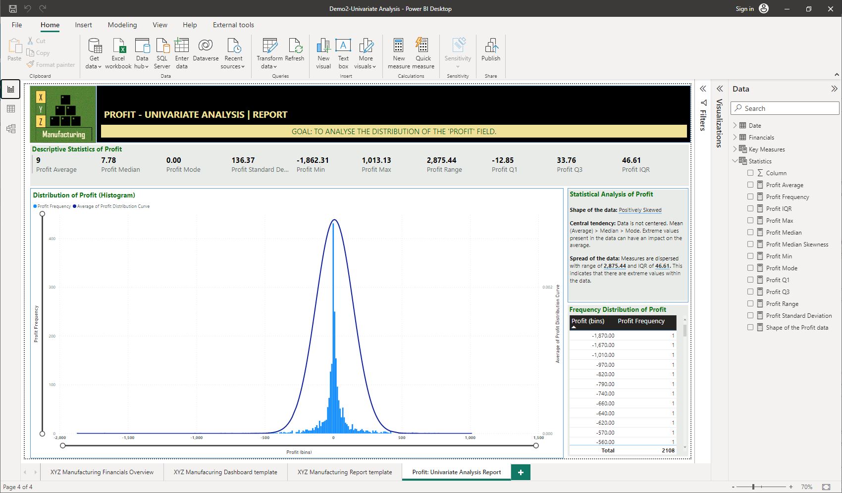
Once these steps are done correctly, you should get the following result, as shown in the screenshot.
Task 2: Create a histogram
Step 1: Within the ‘Financials’ table, create a new calculated column called ‘Profit Distribution Curve’ using the NORM.DIST function for the ‘Profit’ field.
Refer to the Tutorial: Create calculated columns in Power BI Desktop - Power BI | Microsoft Learn for more information on how to create calculated columns.
Note: When using the NORM.DIST calculation formula, you will need to type in the exact values obtained for the associated arithmetic mean and standard deviation values for the ‘Profit’ field as displayed in the ‘Multi-row card’ visual in the report.
For more information on how to use this function, refer to NORM.S.DIST function (DAX).
- Right-click on the ‘Financials’ table > Select ‘New column’.
- Type the following in the formula bar:
Profit Distribution Curve = NORM.DIST(‘Financials’[Profit (bins)], 9, 136.37, FALSE())
Step 2: Add a ‘Line and clustered column chart’ visual to display the distribution of the ‘Profit’ field according to the following specifications.
- Column Y-axis: ‘Profit Frequency’
- Line Y-axis: Average of ‘Profit Distribution Curve’
- X-axis: ‘Profit[bins]’
Place this visual below the multi-row card visual, left of the frequency distribution table.
Ensure that the ‘Zoom Slider’ is turned on to help zoom in to further investigate the shape of the distribution.
- Drag the fields ‘Profit Frequency’, ‘Profit[bins]’ and ‘Profit Distribution Curve’ to the appropriate visual input as specified.
- However, the ‘Profit Distribution Curve’ as an input to the ‘Line Y-axis’ will display as a sum value at first. You must change it to an average value by clicking on the down arrow next to the field by selecting ‘Average’.
- To turn on the zoom slider, select the visual > go to the ‘Visualisations’ pane > select the ‘Format your visual’ icon . Then, under the ‘Visual’ tab, turn 'On' the ‘Zoom slider’.
Step 3: Customise the title of this visual to '‘Distribution of Profit (Histogram)’ according to the standard guidelines as applied to other visuals in the report:
- Option 1: Follow similar steps as Task 1 > Step 5 of this practical activity.
- Option 2: Use the 'Format Painter' to apply formatting. To do this:
- select a visual in the report with the required formatting already configured.
- then, click on the 'Format Painter' icon on the 'Home' tab, 'Clipboard' section of the Power BI Desktop menu bar.
- Once the mouse pointer changes to a paintbrush symbol, click on the visual to be formatted. This will then apply the same formatting configurations. However, you will need to input title text separately for each visual.
Once these steps are done correctly, you should get the following result, as shown in the screenshot.
Applying insight analysis
Insight analysis refers to the analysis of the big data insights that have been collected and that will be applied to support operational decision-making. The insights from the big data sets should be used to assess and inform on problems that exist so that operational decision-making can be maintained.
When insights are collected from the big data sets, these will need to be analysed using appropriate tools so that they can be better understood.
Once insights are understood, these will need to be used to justify and substantiate decision that applies within the organisation.
Using smart narratives to record insights into the analysis
Smart narratives are used to provide brief explanations of the overall results and key outcomes of a Power BI report. They are a type of visual that can be added to a report in the form of text to outline summaries of trends, key outcomes, explanations and context.
To learn how to create smart narrative summaries in Power BI, refer to Smart narratives tutorial - Power BI.
The following video further demonstrates how to create smart narratives and customise them as required using dynamic values.
Practical activity 4: Displaying statistical analysis insights
The tasks in this activity will help you practice what you learnt so far in this topic and will help you prepare for the demonstration tasks in your formal assessment. You will specifically learn how to generate a report of the key outcomes of the analysis using the smart narratives feature in Power BI Desktop.
Continue to work on the same Power BI work file from practical activity 3, ‘Demo2-Univariate analysis’.
Task 1 - Create required statistical analysis measures
Create a new measure to calculate ‘Pearson’s Median Skewness’ for the ‘Profit’ field called ‘Profit Median Skewness’.
Note: Use “Pearson’s Median Skewness” equation to calculate the skewness.
$$\text{Pearson's Median Skewness} = \frac{\text{3(Mean-Median)}}{\text{Standard Deviation}}$$
Profit Median Skewness = DIVIDE(3*([Profit Average]-[Profit Median]),[Profit Standard Deviation], 0)
Task 2 - Record numerical data in the report
Within the ‘Statistics’ table, create a new calculated measure to determine the shape of the ‘Profit’ data called ‘Shape of the Profit data’ using the following DAX formula.
Note: You must customise the DAX formula by replacing the 'X' with the variable name 'Profit'.
Shape of the (X variable) data =
VAR SK = [X Median Skewness] // Name of the measure that calculates the skewness of the variable
VAR _1 = SK > 0
VAR _2 = SK < 0
RETURN (
IF (_1, "Positively Skewed",
IF (_2, "Negatively Skewed", "No Skew; Data is normally distributed")) )
Shape of the Profit data =
VAR SK = [Profit Median Skewness]
VAR _1 = SK > 0
VAR _2 = SK < 0
RETURN (
IF (_1, "Positively Skewed",
IF (_2, "Negatively Skewed", "No Skew; Data is normally distributed") ) )
Task 3 - Generate a report of the key outcomes of the analysis
Step 1: Add a 'Smart narrative' visual to the report.
Place this at the top-right corner within the body of the report.
- Click on an empty space on the canvas of the report page (Note: If a report element is selected, the ‘visualisations’ pane will not be visible).
- Expand the ‘Visualisations’ pane and select the ‘Smart Narrative’ icon. This visual will then be added to the report page.
Step 2: Customise the title of this visual to ‘Statistical Analysis of Profit’ and apply standard formatting.
Also, set the background colour of the visual to '#E8EBE7'.
- Option 1: Follow similar steps as Practical activity 3 > Task 1 > Step 5.
- Option 2: Use the 'Format Painter' to apply formatting. Detailed steps are outlined in Practical activity 3 > Task 2 > Step 3
Step 3: Customise the summary text ‘Profit’ data to only include information related to the statistical analysis, such as the following.
- Shape of the data: Indicate whether it is symmetrical, positively skewed or negatively skewed. Add here a dynamic value to display the relevant information from the previously created measures ‘Shape of the Profit data’ as appropriate.
- Central tendency: Indicate where the data is centred in terms of mean, median and mode? Are there any observations that are radically different from the rest which may influence the arithmetic mean?
- Spread of the data: How broadly is the data dispersed? Range (Max value – Min value) and IQR. Are there huge differences between the range and the IQR, indicating that extreme values may be present in the data?
Customise the text in the smart narrative visual to be font type ‘Segoe UI’ and size 12.
The smart narrative can be customised as follows:
- Click on ‘+Value’ to add dynamic values to the smart narrative.
- In the following example, the dynamic values added are within <> symbol. This will generate dynamic text on the narrative automatically.
An example of summary text (smart narrative) is shown below.
- Shape of the data: <Shape of the Profit data>
- Central tendency: Data is not centred. Mean (Average) > Median > Mode. Extreme values present in the data can have an impact on the average.
- Spread of the data: Measures are dispersed with a range of <Profit Range> and IQR of <Profit IQR>. This indicates that there are extreme values within the data.
CHECKPOINT
Once these steps are done correctly, you should get the following result, as shown in the screenshot.
Practical activity 5 - Putting it all together
Note: This activity will help you prepare for the demonstration tasks in your formal assessment. The analysis in this task will form the basis for the type of analysis we will discuss next in this topic. Therefore, it is recommended that you attempt this activity in preparation for the next section.
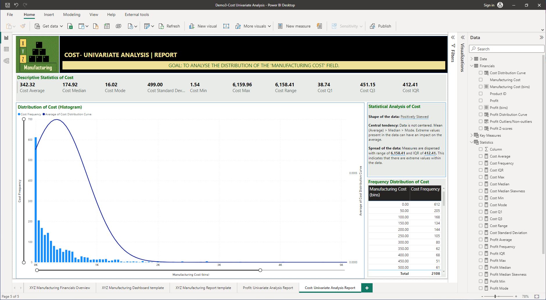
Continue to work on the same Power BI work file from the previous practical activity, and rename the file as ‘Demo3 -Cost Univariate Analysis’.
Tasks: Conduct a univariate analysis for the ‘Manufacturing Cost’ field of the ‘Financials’ dataset by:
a. making the Financials[Manufacturing Cost] field accessible from the report view of Power BI
b. creating the necessary statistical measures for the analysis
c. recording numerical data in the report
d. creating a frequency table and histogram to visualise the distribution of the data
e. generating a report of the key outcomes of the analysis.
CHECKPOINT
Once these steps are done correctly, you should get the following result as shown in the screenshot.

Findings from the statistical analysis refer to the information components that have been discovered, such as:
- outcomes
- trends
- patterns
- links
- relationships
- existence of extreme values in the data (outliers).
These findings will then need to be used to identify the insights that relate to the identified operational decision-making requirements. For example, let us explore how outliers or extreme values, when found in a dataset, could impact operational decision-making.
The effects of extreme values on operational decision making
Finding outliers in a dataset means that the result from any further analysis using this data may be impacted and may even provide inaccurate outcomes or skewed results.
To ensure that the operational decision-making does not have any effects from extreme values, it is important to implement a method to isolate the outliers from the rest of the data in the analysis.
“Outliers are values that seem excessively different from most of the other values. Such values may or may not be errors, but all outliers require review.” 17
When outliers (or extreme values) are present in the key numerical variables analysed, it will influence the mean value of those variables. Outliers will pull the value of the mean toward the extreme values. Therefore, identifying outliers is important as some analysis methods are sensitive to outliers and produce very different results when outliers are included in the analysis. 17
The following video discusses the effects of outliers on the distribution of data.
When analysts need to decide to remove or keep outliers, the following flow chart can help to make a decision. 32

Finding outliers and isolating incorrect results
Outliers can be found for numerical variables that do not have a defined range of possible values. Although there is no standard for defining outliers, statistical measures such as standard deviation or the interquartile range can be used to find outliers in numerical variables.
When performing the practical activity of conducting a univariate analysis, you learnt that measures such as ‘standard deviation’ and ‘interquartile range’ can be easily computed using analytical tools. Therefore, spotting outliers can also be done using analytical tools.
Using Z-scores to find outliers
When extreme data points in a numerical variable are converted to standardised values (Z-scores), this will help identify how many standard deviations away they are from the mean. Generally, values with a z score greater than three (3) or less than minus three (-3) are often determined to be outliers. 33
A calculated column can be created to compute the z-score values in Power BI Desktop using the following standard formula.
$$\textit{Z-Score} = \frac{(X_i-\mu )}{ \sigma}$$
Isolating outliers from visuals in the analysis
In situations where outliers are genuinely present in numerical data (not due to errors in data entry), organisations would want to visualise their analytical results with/without outliers. Therefore, analysts need to know how to implement this.
Analysts can implement the following general steps to isolate outliers from an analysis using their preferred analytical tool.
- Step 1 – Create a calculated column to compute the standardised (z-score) values. Note: The formula will need to use previously calculated average and standard deviation figures of the data.
For example, a conditional column using an if condition to tag the values in each row of data in the previously calculated ‘Z-Score Cost’ column will look like the following:
Z-Score Cost = DIVIDE(([Cost]- X), Y )
- Step 2 – Create a conditional column to categorise the z-score values as ‘Outliers’ and ‘Non-outliers’. For example, a conditional column using if condition to tag the values in each row of data in the previously calculated ‘Z-Score Cost’ column will look like the following:
Cost Outliers/Non-outliers = If (
                              ( [Z-Score Cost] > 3 || [Z-Score Cost] < -3 ),
                              "Outliers", "Non-outliers"
                              )
- Step 3 – Filter visuals in the analysis to show results with or without outliers.
For example, this can be done by using a slicer visual in the report, where the option is provided to the user to select only outliers, only non-outliers or include both in the analysis.
Practical activity 6: Isolating outliers from the analysis

Let’s put into practice what you’ve learnt so far in this topic. This activity will help you prepare for the demonstration tasks in your formal assessment. You will specifically learn how to:
- create a calculated column to compute the z-score values
- create a conditional column to categorise outlier and non-outlier values
- filter the outliers from the visuals in a report.
Note: If you are unsure of the steps required to perform any of the tasks in this activity, you can expand the ‘Hint’ sections to see the detailed steps (Note: If similar tasks were performed in previous practical activities, these tasks would not include hints.). Screenshots are provided under the ‘Checkpoint’ sections so that you can check your work against the desired end result.
Use the same Power BI work file you created in the last practical activity (where you have performed the univariate analysis) and save it as ‘Demo4-Isolating outliers’.
Task 1 - Create a calculated column to record z-score values
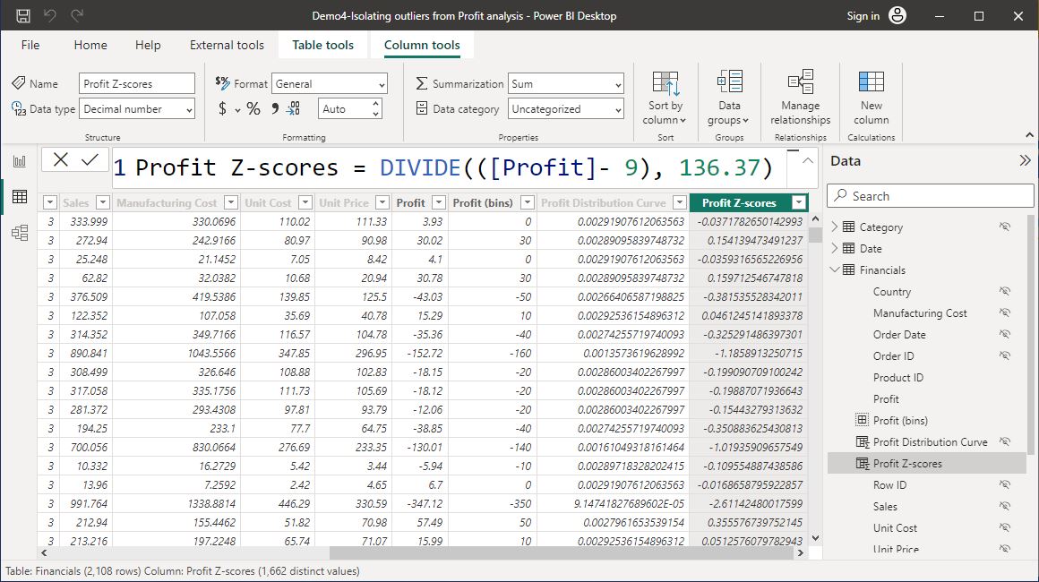
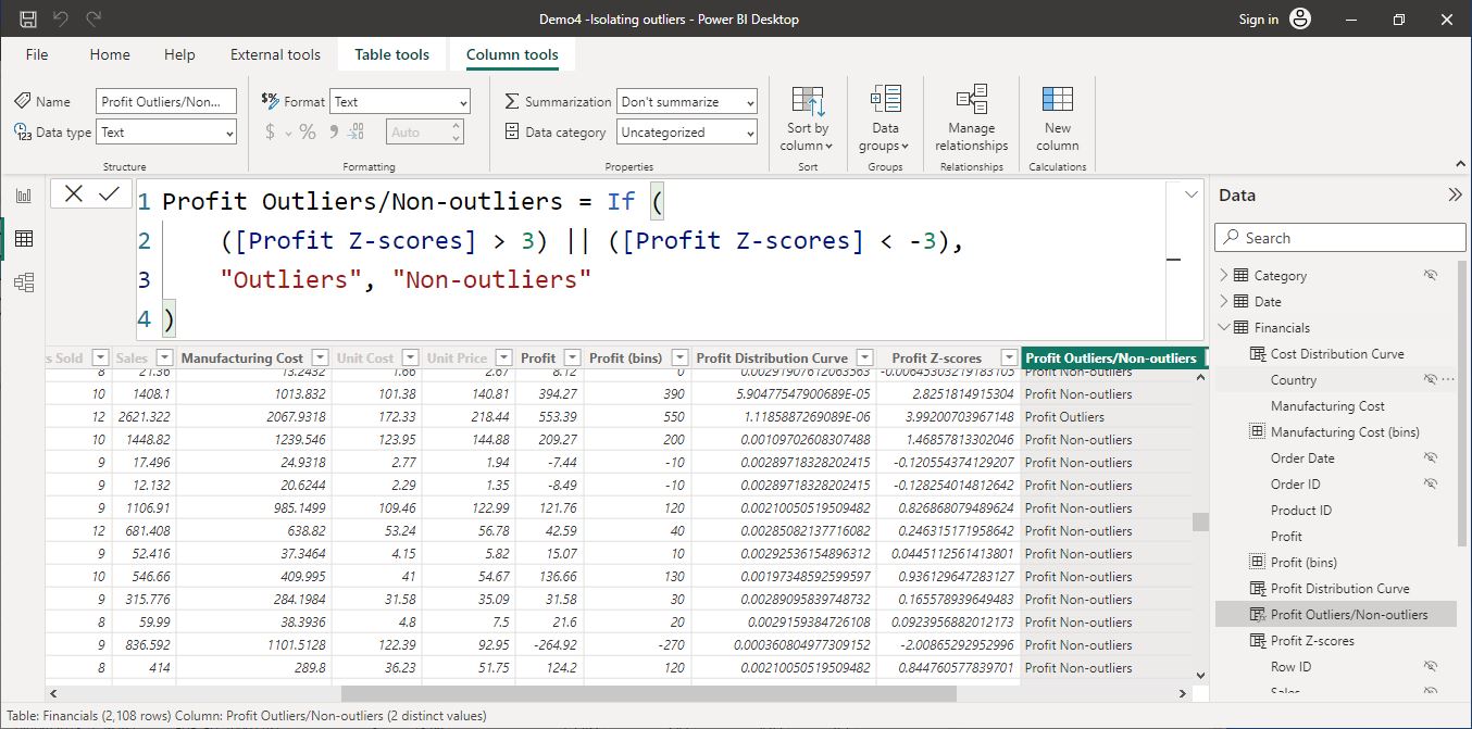
Create a calculated column called ‘Profit Z-scores’ in the ‘Financials’ table that calculates standardised values based on the formula:
$$\textit{Profit Z-Scores} = \frac{([Profit]-\ Profit \ Average )}{ \ Profit \ Standard \ Deviation}$$
To do this, you must go to the ‘Data’ view in Power BI Desktop. You must enter the actual values for average and standard deviation as calculated in the previous univariate analysis.
- From the ‘Data’ view in Power BI Desktop, right-click on the ‘Financials’ table and select ‘New Column’.
- Enter ‘New column name’ as ‘Profit Z-scores’.
- Enter the formula as = DIVIDE(([Profit] – 9), 136.37).
The following screenshot demonstrates how the standard protocols of writing DAX statements are used to create this calculated column.
Task 2 - Create a conditional column to categorise outlier and non-outlier values
Add a conditional column called ‘Profit Outliers/Non-outliers’ to isolate the outliers in the ‘Profit Z-scores’ column.
Note: If the ‘Profit Z-scores’ values are greater than three (3) and less than minus three (-3), the output should be ‘YES’ to indicate these values are outliers. Otherwise, the output should be ‘NO’ to indicate those values are non-outliers.
- From the ‘Data’ view in Power BI Desktop, right-click on the ‘Financials’ table and select ‘New Column’.
- Enter ‘New column name’ as ‘Profit Outliers/Non-outliers’ Write a conditional statement using the following as a guideline:
- = If( ([Z-Score] > 3) || ([Z-Score] < -3), "Outliers", "Non-outliers" )
The following screenshot demonstrates how the standard protocols of writing DAX statements are used to create this conditional column.
Task 3 - Filter the outliers from the visuals in the dashboard
Step 1: Add a new ‘Slicer’ visual to the ‘XYZ Manufacturing Financials Overview’ page.
Step 2: Position the slicer visual within the ‘Filters’ section on the left side of the report.
Step 3: Select the ‘Profit Outliers/Non-outliers’ column as the slicer input field.
Step 4: Customise the ‘Slicer’ visual title as ‘Display Profit:’ and apply the standard formatting style.
- Click on another slicer visual that is already formatted according to XYZ Manufacturing’s standard style.
- Then, click on the ‘Format Painter’ option under the ‘Home’ tab in Power BI Desktop.
- Then click on the new slicer visual where you want to apply the formatting.
Step 5: Ensure the slicer shows the ‘Select all’ option. (hint: Visual > Slicer settings > Selection
Visual > Slicer settings > Selection.
Task 6: Filter the dashboard page to display the analysis without any outliers.
Click on the ‘Outliers’ option in the slicer visual to de-select or exclude the outliers from the data.
Once these steps are done correctly, you should get the following result, as shown in the screenshot.

Practical activity 7: Try it yourself.
This activity will help you prepare for the demonstration tasks in your formal assessment. The analysis in this task will form the basis for the type of analysis we will discuss next in this topic. Therefore, it is recommended that you attempt this activity in preparation for the next section.
Continue to work on the same Power BI work file from the previous practical activity and save it as ‘Demo5 -Isolating Cost Outliers’.
Isolate the outliers of the ‘Manufacturing Cost’ field of the ‘Financials’ dataset by doing the following tasks.
- Task 1: Create a calculated column called ‘Cost Z-scores’ in the ‘Financials’ table that calculates standardised values for the values in the ‘Manufacturing Cost’ field.
- Task 2: Adding a conditional column called ‘Cost Outliers/Non-outliers’ to isolate the outliers in the ‘Cost Z-scores’ column.
- Task 3: Filter out the cost outliers from the visuals in the ‘XYZ Manufacturing Financials Overview’.
CHECKPOINT
Once these steps are done correctly, you should get the results as shown in the following screenshots.
Screenshots were taken using Power BI Desktop © Microsoft

Identifying insights
Identifying insights refers to gaining a deeper understanding of an organisation's dataset by analysing information on a particular problem or decision-making requirement. This level of understanding helps organisations make better decisions than by relying on gut instinct.
The term 'actionable data insights' refer to insights that are specific and relevant enough that they lead to actions that can increase efficiency, revenue and profits.
Data insights will provide information about what the data is saying or what insights into the factors related to the decision-making can be identified.
Relating insights to operational decision-making requirements
Once findings have been assessed and the insights have been identified, it is important to acknowledge the relevance of those findings to operational decision-making requirements.
The identified operational decision-making requirements refer to the items that are within the decision-making scope as part of the work task or project.
Using the Pareto (80/20 Rule) analysis to identify insights
What is the Pareto principle (or 80/20 rule)?
The generic situation in which 80% of some output comes from 20% of some input is referred to as the Pareto principle. Therefore, the Pareto principle is also commonly known as the “80-20 rule”. 19
When applying the Pareto principle to any characteristic of interest, analysts need to know how to sort the data and calculate the cumulative percentage. To learn more about the Pareto principle and how it works, refer to the article The 80-20 Rule (aka Pareto Principle): What it is, How it works. 22
The following video explains in simple terms and examples how the Pareto analysis is used as a common method to solve problems and in support of making operational decisions in businesses.
Creating a Pareto Chart in Power BI
Refer to the article What Is Pareto Analysis? How to Create a Pareto Chart and Example (investopedia.com) to learn more about the pareto analysis.

The following video will demonstrate how a Pareto Chart is created in Power BI Desktop using DAX formulas.
Testing the Pareto rule
The following video discusses how the Pareto Rule can be tested using a sample dataset. Pay close attention to the various DAX statements used and how they are formulated to produce the required results in Power BI visualisations.
Creating smart narrative summaries from visuals
In Power BI, smart narratives can be used to auto-generate summary text of the data displayed in report visuals. The following video demonstrates various methods that can be used to generate and further edit smart narrative summaries.
For more information, refer to the article Create smart narrative summaries by Microsoft Learn.
Practical activity 8: Creating a basic Pareto Analysis dashboard
The tasks in this activity will help you practice what you learnt so far about the Pareto principle and will help you prepare for the demonstration tasks in your formal assessment.
You will specifically learn how to:
- create a report page using a given templates and customise report elements
- include required filters in the analysis
- create a numeric range parameter
- create the required calculated measures for the analysis
- record numerical data in the dashboard
- visualise data using a Pareto chart, table and a scatter chart
- generate summaries to report on analysis outcomes
- use parameters in the dashboard to identify insights that relate to operational decision-making requirements.
Use the same Power BI work file you created in the last practical activity and save it as ‘Demo6-Pareto Analysis’.
Note: If you are unsure of the steps required to perform any of the tasks in this activity, you can expand the ‘Hint’ sections to see the detailed steps. If similar tasks were performed in previous practical activities, these tasks would not include hints. Screenshots are provided under the ‘Checkpoint’ sections so that you can check your work against the desired end result.
Scenario:
The management at XYZ Manufacturing wants to identify the portion of products with the greatest contribution to the total manufacturing costs so that necessary cost optimisation strategies can be applied for next year’s production focused on the selected products.
Let us use the Pareto rule to see whether the Top N percentage (approx. 20%) of products cause 80% of the total manufacturing costs.
Task 1 - Create a new report page for the Pareto Analysis
Step 1 – Create a new report page using XYZ Manufacturing’s standard dashboard template.
Step 2 – Rename the new dashboard page as ‘Top N Product Costs: Pareto Analysis’.
Step 3 – Customise the ‘Title’ of the report page as ‘TOP N Product Costs | PARETO ANALYSIS’
Step 4 – Customise the ‘Sub-title’ of the report page to state the goal of the analysis as “GOAL: TO IDENTIFY THE TOP N PRODUCTS THAT CAUSES 80% OF THE MANUFACTURING COSTS”.
Task 2 – Include the required filters for the analysis
From the previous ‘XYZ Manufacturing Financials Overview’ page, copy and paste the following filters to this dashboard page.
- ‘Select year: ‘ – containing values from the input field ‘Year’.
- 'Select Cost data: ‘ – containing values from the input field ‘Cost Outliers/Non-Outliers’.
Task 3 – Create a numeric range parameter
Procedure: From Power BI Desktop, navigate to the ‘Modelling’ tab> ‘New parameter’ > Select ‘Numeric range’ and customise according to the following specifications.
- Name of the parameter: TopN%
- Data type: Decimal Number
- Min: 0.005
- Max: 1.0001
- Increment: 0.001
- Default: 0
- Select the option to ‘Add slicer to the page’.
Field formatting and placement: Configure the TopN% field as a ‘Percentage’ format with one decimal point. The correct format should be visible in the ‘Slicer’ visual. Place this visual in the ‘Filters’ section of the dashboard.
Apply the following format specifications to the parameter slicer so that it stands out from the rest of the filters.
- Visual > Slicer header: Off
- Visual > Values > Values> Font: Segoe UI, Size: 14, Style: Bold, Color: #F0E199
- Visual > Slider: On
- General > Title> On
- Text: Top N %
- Font: Segoe UI
- Size: 14
- Style: Bold
- Text color: #FFFFFF
- General > Effects > Background > Color: #0A5619, Transparency: 0%
Task 4 – Create the required calculated measures for the analysis

Create the following five (5) measures within the ‘Key Measures’ table using the DAX statements provided. Apply correct programming protocols and techniques when typing in the DAX statements into Power BI’s formula bar.
Measure 1
Cost($) from TopN% Products =
VAR ProductPercent = [Distinct Products] * [TopN% Value] // Calculates the percentage of products using the Top N parameter selection
RETURN
 CALCULATE([Total Manufacturing Cost],
    FILTER(VALUES('Financials'[Product ID]),
        RANKX(VALUES('Financials'[Product ID] ), [Total Manufacturing Cost], , DESC ) <= ProductPercent ) )
Note: Change the format of this measure to 'Currency'.
- Create a new measure in the ‘Key Measures’ table.
- Copy and paste this code into the DAX formula bar.
- Once the measure is created, select it from the ‘Data’ pane and go to the ‘Measure tools’ tab from the top menu.
- Then, select ‘Format’ as ‘Currency’ from the drop-down options.
Measure 2
Cost(%) from TopN% Products = DIVIDE([Cost($) from TopN% Products], [Total Manufacturing Cost])
Note: Change the format of this measure to 'Percentage'.
Measure 3
Product-Cost Cumulative Percentage =
VAR ProductCost = [Total Manufacturing Cost]
VAR AllFinancials = CALCULATE([Total Manufacturing Cost], ALLSELECTED(Financials))
RETURN
DIVIDE (
SUMX (
    FILTER(
        SUMMARIZE( ALLSELECTED(Financials), 'Financials'[Product ID],
            "Cost", [Total Manufacturing Cost]),
                [Cost] >= ProductCost),
                    [Cost]),
    AllFinancials, 0)
Note: Change the format of this measure to 'Percentage'.
Measure 4
Product Rank = RANKX (ALLSELECTED('Financials'[Product ID]), [Product-Cost Cumulative Percentage], , ASC)
Measure 5
No. of Selected Products from TopN% = [Distinct Products] * [TopN% Value]
Note: Change the format of this measure to 'Whole number'.
Task 5 – Record numerical data in the dashboard
Use ‘Card’ visuals to display the following key measures relevant to the analysis and format according to the following specifications.
- [Total Manufacturing Costs] – change the name to display on the visual as ‘Total Costs’.
- [Cost($) from TopN% Products] – change the name to display on visual as ‘Cost ($) of Top N’.
- [Cost(%) from TopN% Products] – change the name to display on visual as ‘Cost (%) of Top N’.
- [No. of Selected Products from TopN%] - change the name to display on visual as ‘Top N Products’.
Format each of these card visuals as follows:
- Visual >Category label: Off
- General > Title: On
- Title text: Display as specified in ‘Name to display on visual’ column.
- Font: Segoe UI, Size: 22
- General > Effects > Background colour: #CCCCCC
Important: Ensure that the numerical values displayed on the ‘Card’ visuals are in their correct formats (e.g. currency, percentage or whole number).
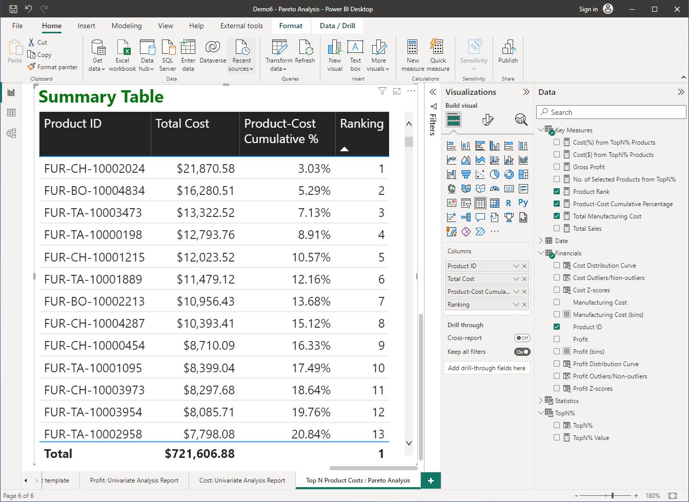
Task 6 – Visualise sorted data in a table
Create a summary table using the following specifications.
- Table Title: Summary Table
- Table columns:
- ‘Financials’[Product ID]
- ‘Key Measures’[Total Manufacturing Costs]
- Note: Change the name of this field for this visual as ‘Total Cost’
- ‘Key Measures’[Product-Cost Cumulative Percentage]
- Note: Change the name of this field for this visual as ‘Product-Cost Cumulative %’
- ‘Key Measures’[Product Rank]
- Note: Change the name of this field for this visual as ‘Ranking’
- Table format: Set the visual > Style presents to ‘Bold header’.
- Sort the table by the ‘Total Cost’ column in descending order.
The following screenshot demonstrates how the summary table is configured to display data from the required fields.
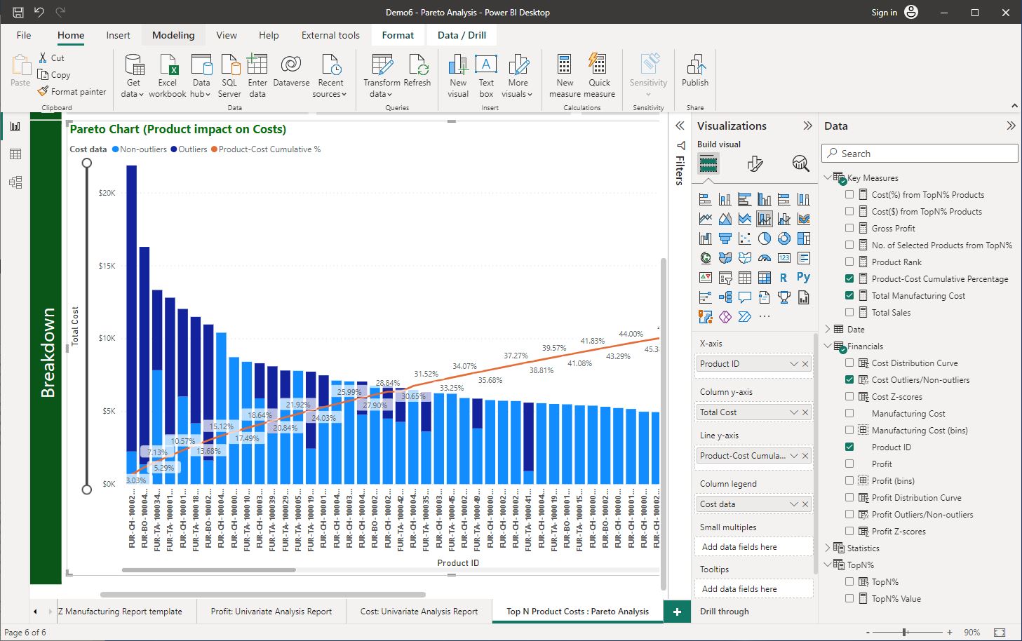
Task 7 – Create the Pareto chart
Create a Pareto chart to showcase the ‘Product’ impact on ‘Profit’, using the necessary visualisations, data fields and previously created calculated measures according to the following specifications.
- Chart type: Line and stacked column chart
- X-axis: ‘Financials’[Product ID]
- Column y-axis: ‘Key Measures’ [Total Manufacturing Costs]
- Note: Change the name of this field for this visual to ‘Total Cost’
- Line y-axis: ‘Key Measures’ [Product-Cost Cumulative Percentage]
- Note: Change the name of this field for this visual to ‘Product Cost. Cumulative %’
- Column legend: ‘Financials’[Cost Outliers/Non-outliers]
- Note: Change the name of this field for this visual to ‘Cost data’
- Chart title: ‘Pareto Chart (Product impact on Revenue)’
- Data labels: 'On'
The following screenshot demonstrates how the Pareto chart is configured and formatted to display data from the required fields.
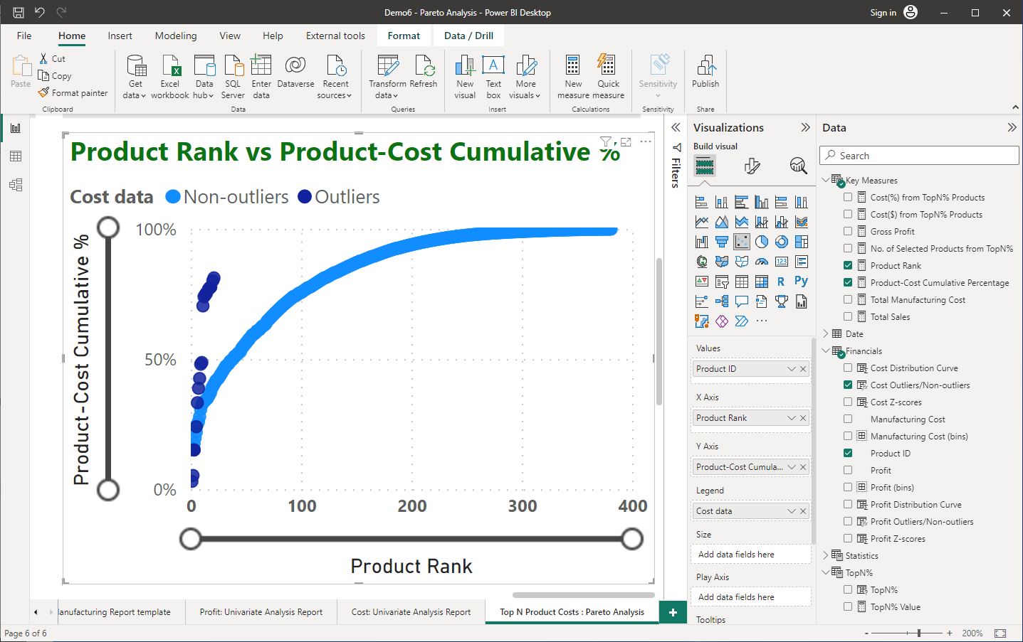
Task 8 - Create a scatter chart
Create a ‘Scatter’ chart to show the relationship between [Product Rank] vs. [Product-Cost Cumulative Percentage] according to the following specifications.
- Chart type: Scatter chart
- Values: ‘Product’[Product ID]
- X-axis: ‘Key Measures’[Product Rank]
- Y-axis: ‘Key Measures’[Product-Cost Cumulative Percentage] o Note: Change the name of this field for this visual as ‘Product-Cost. Cumulative %’
- Legend: ‘Financials’[Outliers/Non-outliers] o Note: Change the name of this field for this visual as ‘Cost data’
- Chart title: ‘Scatter Chart (Product Rank vs. Product-Cost Cumulative %)’
The following screenshot demonstrates how the Scatter chart is configured and formatted to display data from the required fields.
Task 9 - Contextualise the report.
Report context: The management wants to only focus on data from the last year (assume that this is 2021 in the given dataset).
Task: Use the ‘Select year:’ slicer to select only the required year.
Task 10 - Generate summaries from the chart visuals
Generate a summary (smart narrative) of the data presented in the ‘Pareto chart’ visual for the ‘Cost’ data. To do this:
- Step 1: Right-click on the ‘Pareto chart’ visual and select ‘Summarise’.
- Step 2: Place this visual below the multi-row card visual, above the ‘Pareto chart’.
You can also use the scatter chart to generate a summary. Then, copy and paste the auto-generated text into the first smart narrative visual to combine this information.
Format Specifications: Change the background colour of the smart narrative visual to ‘#E8EBE7’. (Hint: General > Effects). Apply standard formatting for the titles of visuals.
- Option 1: Follow similar steps as Practical activity 3 > Task 1 > Step 5.
- Option 2: Use the 'Format Painter' to apply standard formatting to the visual from other visuals in the report. . Detailed steps are outlined in Practical activity 3 > Task 2 > Step 3
The dashboard with its default settings should look like the following. We will further learn to use this dashboard to conduct a Pareto Analysis and relate it to operational decision making requirements in the next section of this topic
Identifying key insights and providing recommendations

Ethical considerations when reporting analysis results
Ethical considerations arise when deciding which results to include in a report. Presentations of key outcomes and results of the analysis should report results in a fair, objective and neutral manner.
“Unethical behaviour occurs when one selectively fails to report pertinent findings that are detrimental to the support of a particular position”. 17
Therefore, it is important that analysts should document both good and bad results. In situations where the outliers detected are genuine and are not due to errors, analysts should develop reports to present the analytic results with outliers as well as without outliers.
Let us implement this using the ‘Pareto Analysis’ dashboard created in the previous practical.
Writing summaries of key insights
When writing a summary based on a completed analysis report or dashboard, the general process is as follows.
- First, describe the context of the analysis.
- Then, outline the numerical data that supports the operational decision-making.
- State what percentage of causes (e.g. products, customers) resulted in what percentage of the total value (e.g. sales, profit, costs, margin).
- State outcomes with the effects of outliers and without the effects of outliers.
Use data storytelling to provide recommendations
When providing recommendations, it is important to apply logical thinking and consider aspects of the business operations, which will greatly differ in each analysis.
Analysts basically need to tell a story using the data whilst applying context and relating to the problem.

When writing a summary of the recommendations based on analysis outcomes, the general process is as follows.
- First, briefly outline the operational decision-making requirement.
- Then, state your recommendation providing any numerical figures relevant to the analysis.
- Finally, provide logical reasoning behind the recommendation (may include a comparison of numerical figures to convince the reader).
Practical activity 9: Using the Pareto Rule to support operational decision-making
Let us now test the Pareto rule using the 'Pareto Analysis Dashboard' created in the previous practical.
Task 1 – Adjust the parameters in the dashboard
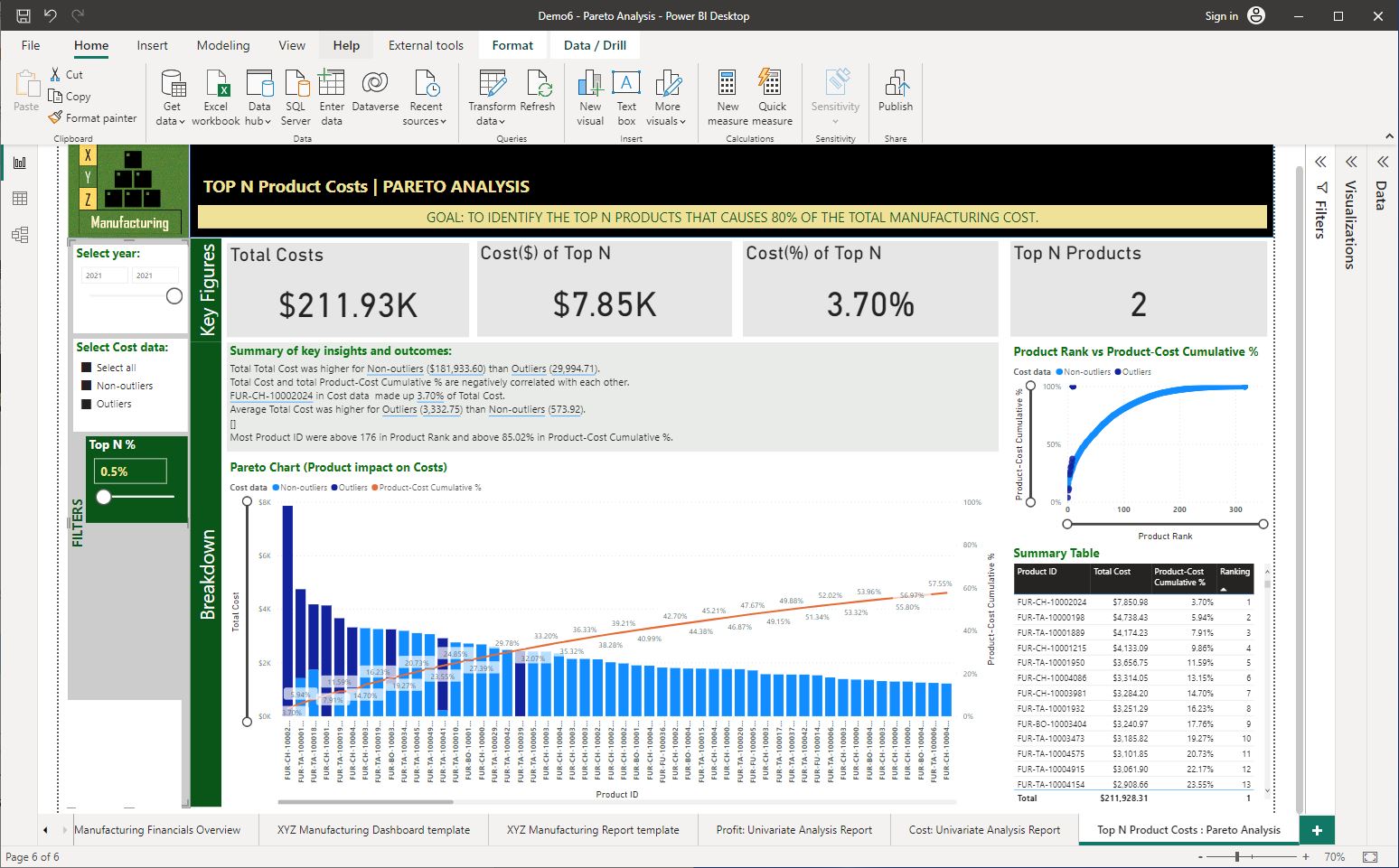
To test the Pareto rule, we need to use the numeric range parameter ‘Top N %’ to vary the selection of the top portion of products and evaluate the ‘Cost(%) of Top N’ value displayed in the card visual.
Open the Power BI Desktop file from the previous practical activity 'Demo6 -Pareto Analysis', and do the following.
- Increase the ‘Top N%’ to approximately 20% and evaluate the value displayed in the ‘Cost(%) of Top N’ card visual.
- Increase the ‘Top N%’ value until the ‘Cost(%) of Top N’ displays a value close to 80%.
The following screenshot shows the analysis parameter selection.
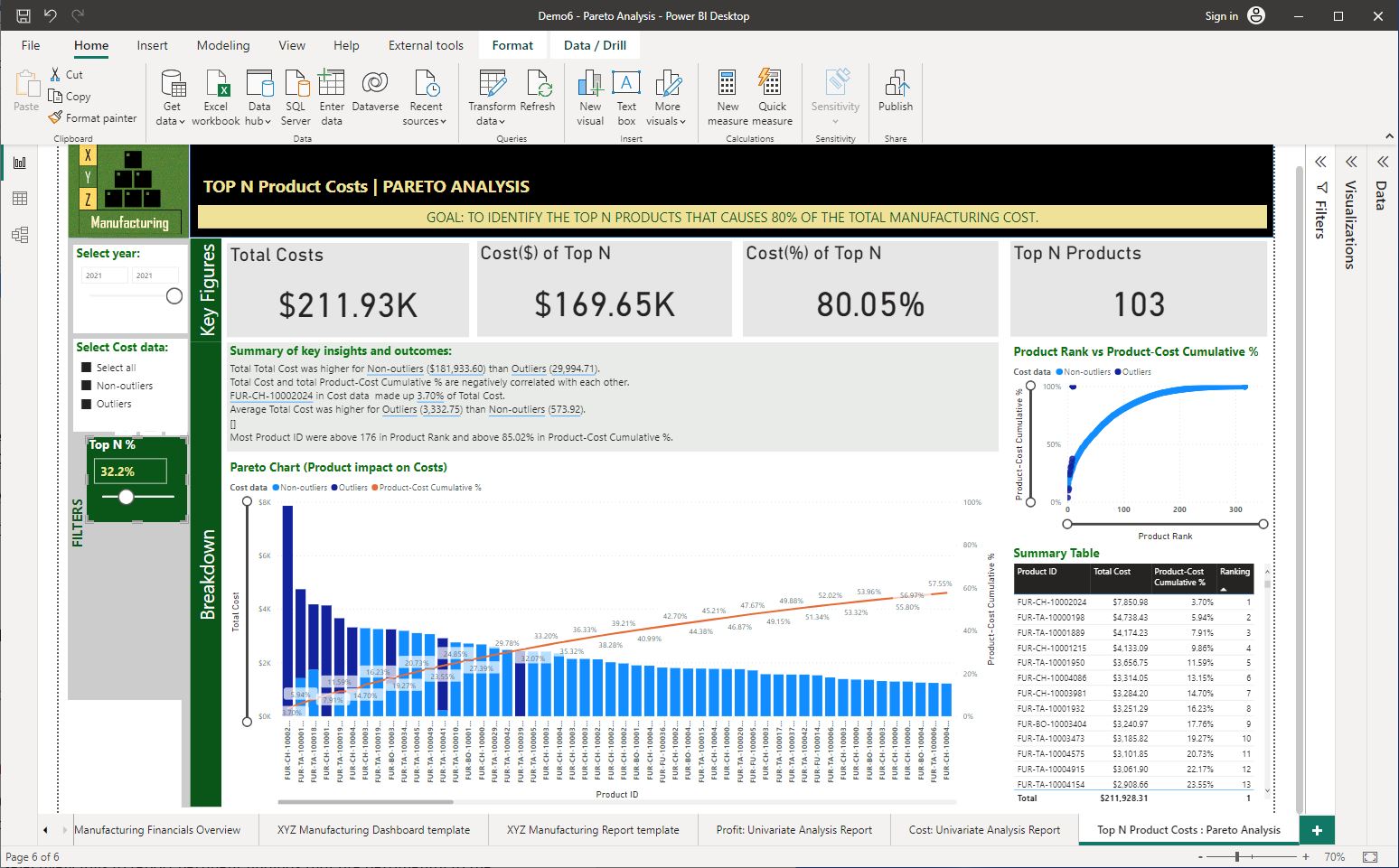
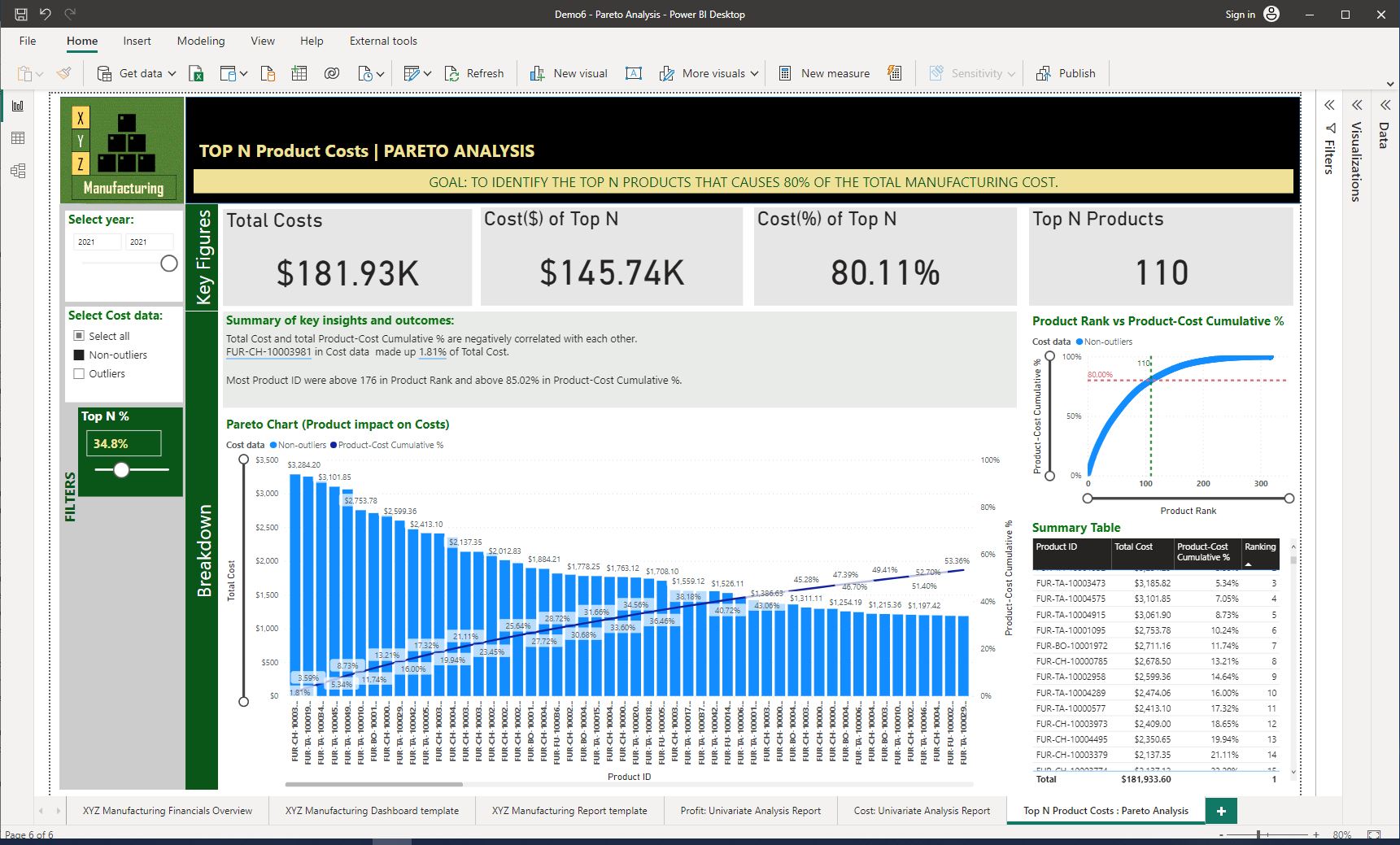
As you can see from the analysis, for all 2021 data from the 'Financials' dataset, the top 32.2% of products (that is a total of 103 items) are contributing to 80.05% of the total manufacturing costs.
Industry insights
The analysis will generally help identify products of interest from a grouping of products, customers and so on that relate to a large part of the value (e.g. revenue, profit, costs) of the whole.
Task 2 – Change the context of the report (e.g. without outliers)
Let us evaluate this further by doing the following:
- De-select ‘Outliers’ from the ‘Select Cost data:’ slicer to exclude the outliers from the cost data.
- Adjust the ‘Top N%’ value until the ‘Cost(%) of Top N’ displays a value close to 80%.
The following screenshot shows the new analysis parameter selection.
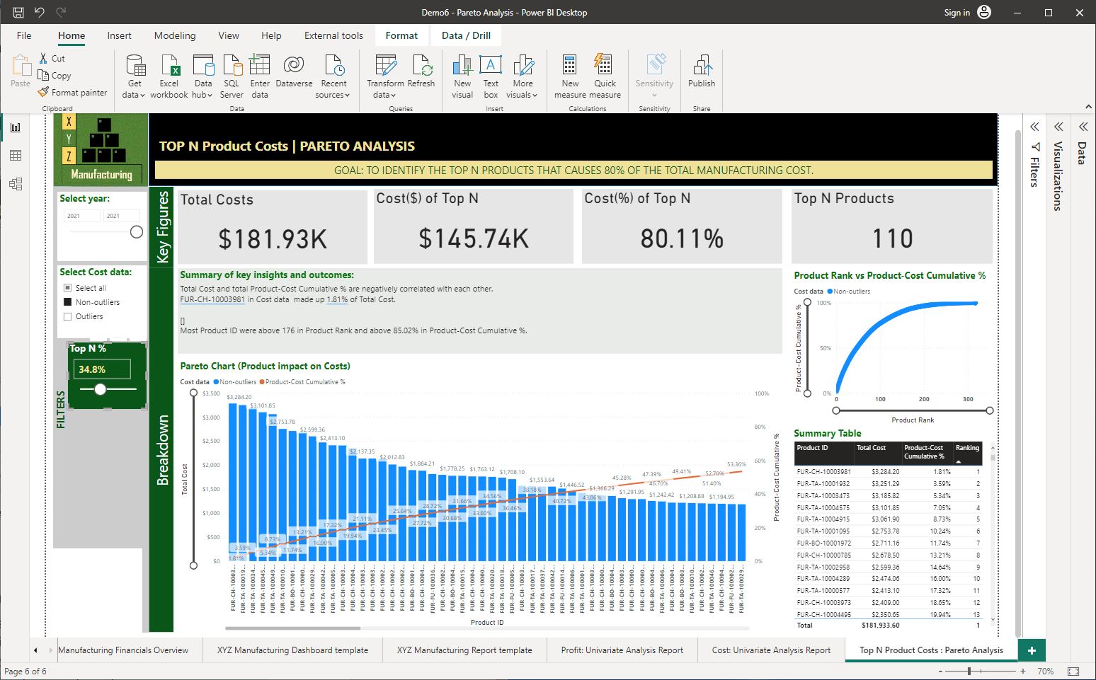
The revised analysis shows that after excluding any outliers in the data, the top 34.8% of products (that accounts for 110 items) are contributing to the 80.11% of total manufacturing costs.
Industry insights
The 80/20 rule is not a hard-and-fast rule. Therefore, the outcome when analysed may not always be 80/20 exactly, as you can see in the above analysis. It is the concept behind the rule that matters.
Task 3 – Another approach (e.g. including outliers whilst ensuring its impact on the decision is minimal)
Further to this observation, keeping the revised Top N as 34.8% let us, re-select the outliers into the analysis to see what effect it would have.
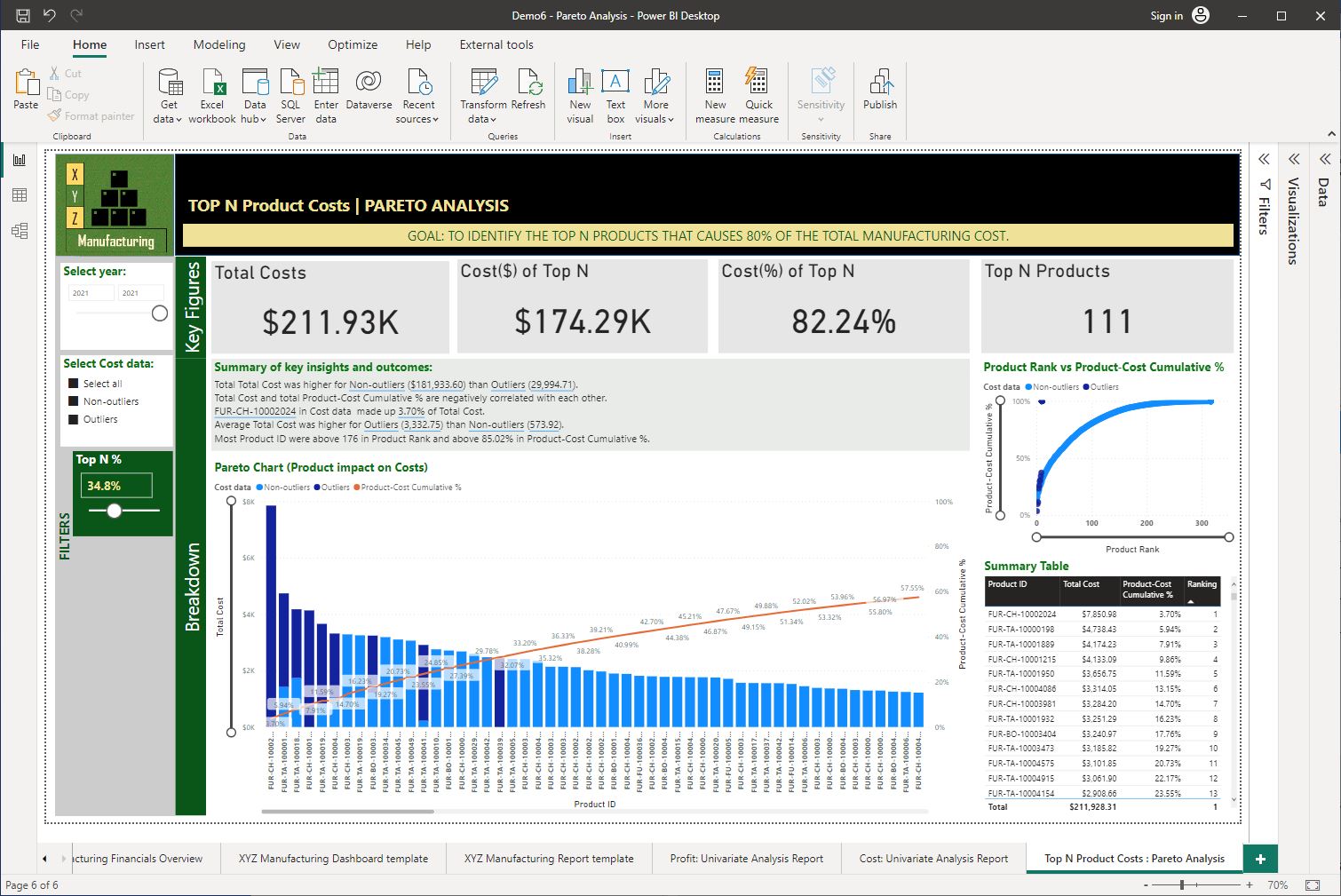
This revised analysis will then indicate, whilst ensuring the effects of the outliers are minimal if we still need to include all data in the analysis, the analysis represents the following information.
Including outliers in the data whilst maintaining the top N as 34.8% (which accounts for 111 products) shows that the Top 111 products contribute to 82.24 % of total manufacturing costs.
Industry insights
Whilst the analysis may point to certain outcomes, the recommendations made regarding the analysis may depend greatly on other considerations and what the specific analysis is trying to determine.
Task 4 – Write a summary of key insights from the analysis to support operational decision-making
Based on the completed ‘Top N Product Costs: Pareto Analysis’ dashboard page write a paragraph summarising the key findings of the analysis.
Remember to follow the general process when writing summaries of key insights which is:
- First, describe the context of the analysis.
- Then, outline the numerical data that supports the operational decision making.
- State what percentage of causes (e.g. products, customers) resulted in what percentage of the total value (e.g. sales, profit, costs, margin).
- State outcomes with the effects of outliers and without the effects of outliers.
Based on the 2021 data (without considering the effects of outliers), a total of 103 products (32.2% Top N) contributed to 80.05% of the total manufacturing costs, which is equivalent to $169,650.
When outliers are excluded from the analysis, a total of 110 products (34.8% Top N)) contributed to 80.11% of the total manufacturing costs which is equivalent to a value of $145,740.
However, keeping the Top N % at 34.8% and including the outliers in the data shows that there are 111 top N products that contribute to 82.24% of the total manufacturing costs, equivalent to a value of $174,290.
Task 5 - Highlighting key insights and figures related to operational decision-making
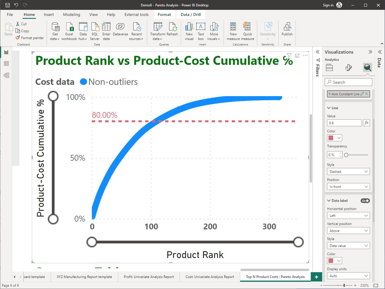
When providing recommendations, it is important to highlight the decision points and important numerical figures using the visuals in the dashboard. For example, let’s highlight the 80% mark of the product-cost cumulative value and the top N number of products in the scatter chart using constant lines.
Step 1: Add a ‘Y-axis’ constant line to indicate the 80% mark of the cumulative product-cost value in the chart.
- Select the ‘Further analysis’ icon (i.e. the third main icon/tab) in the ‘Visualisations’ pane.
- Expand the ‘Y-Axis Constant Line’ > click on ‘Add line’. In this new line added, configure the following:
- Value: 0.8, Color : #DE6A73, Transparency: 0%
- Data label: turned ‘On', Colour: #DE6A73
The following screenshot demonstrates how the Y-axis constant line is added to the chart and its format options.
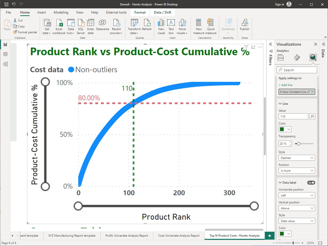
Step 2: Add an ‘X-axis’ constant line to indicate the range of items to be selected for production cost optimisation against the ‘Product Rank’ in the scatter chart.
Expand the ‘X-Axis Constant Line’ > click on ‘Add line’. In this new line added, configure the following: -
- Value: 110, Color: #0A7411, Transparency: 20%
- Data label: turned ‘On’, Colour: #0A7411
The following screenshot demonstrates how the X-axis constant line is added to the chart and its format options.
CHECKPOINT
Once these steps are done correctly, you should get the following result as shown in the screenshot.
Task 6 – Outline recommendations
Write a paragraph outlining your recommendations on the operational decision based on the insights from the analysis.
Remember to follow the general process when providing recommendations for operational decision-making.
- First, briefly outline the operational decision-making requirement.
- Then, state your recommendation providing any numerical figures relevant to the analysis.
- Finally, provide logical reasoning behind the recommendation (may include a comparison of numerical figures to convince the reader).
To decide on a percentage of products (or a selection of products) to apply cost reduction strategies in manufacturing, consider the following recommendations.
- It is not advisable to select only the 103 products (Top 32.2%) as this result is impacted by the effects of outliers in the dataset.
- Selecting 110 items (the top 34.8%) of products is recommended as these products have the most contribution to manufacturing costs and the analysis is not affected by outliers.
- However, if all data (including outliers) is preferred to be included in the analysis, it is advisable to select 111 items (still maintaining the top N percentage as 34.8%) as the effect from outliers in the data is then minimal.

Topic summary
Congratulations on completing your learning for this topic Interpret big data sources and summaries.
In this topic, you learnt how to:
- use Power BI Desktop to access data sources and summaries
- apply descriptive statistics and insight analysis
- use findings from statistical analysis
- identify insights relevant to operational decision-making requirements.
Assessments
Now that you have completed the basic knowledge and skills in this topic, you are ready to commence working on the following assessment event.
- Assessment 4 (Project) – Parts A to D
What’s next?
Next, we will learn how to identify business requirements relating to big data.