We use the term 'colour theory' to describe a group of rules and conventions relating to how colour is created, presented and perceived.
Much of our understanding of colour is centred around the colour wheel (first described by Sir Isaac Newton in his research with white light and prisms in the 1600s). You may have heard the term ROYGBIV (red, orange, yellow, green, blue, indigo and violet), perhaps during science or art classes. This was part of Newton’s discovery and defines the colours we now associate with a traditional colour wheel.
The traditional colour wheel is divided into 12 hues and consists of primary, secondary and tertiary colours.

Primary colours
Newton’s colour wheel defines the primary colours: red, yellow and blue. They are the colours that, when combined, create the 'secondary' and 'tertiary' colours.
The primary colours are evenly spaced around the colour wheel, sitting 120° from each other.
The most helpful definition of primary colours is 'any group of colours from which all other colours within the gamut can be obtained by mixing'. By this definition, you cannot create primary colours by mixing other colours.
(Later in this topic, you will read about how colour models can change the primary colours used.)

Secondary colours
The 'secondary' colours are created by mixing 2 of the primary colours. For example, mixing yellow and red will make orange, and mixing blue and yellow will make green.
For a designer, being creative with secondary colours allows you to create interesting colour combinations which can lead to a unique and original piece of work. Colour is everything for a designer: 'it is estimated that brand recognition can be increased by up to 80 per cent by effective use of colour throughout marketing, packaging and logo design' - Manchester Digital.

Tertiary colours
'Tertiary' colours are the result of combining a primary colour and a secondary colour.

Warm versus cool
'Temperature' is often used to describe colours:
- warm colours are more closely related to reds and yellows
- cool colours tend to be associated with blues and greens.
These terms are not hard and fast rules, and the description can be relative. Some colours may appear either warm or cool--depending on their context and the colours that are around them (as illustrated below).


The colour wheel described above defines the primary colours as red, yellow and blue. However, within the world of design, computers and printers, we have a slightly different understanding of how colour is created.
Additive

We use the term 'additive' when describing colour created by emitted light: computer screens, television and projectors. The additive primary colours are red, green and blue (RGB). In an additive colour model, mixing the three primary colours will create white. Black is the absence of any colours.
Subtractive

The term 'subtractive' colour is usually associated with printing. When looking for printer inks, you may have heard of cyan, magenta, yellow and black (CMYK). Colours are removed in a subtractive colour model to reveal white (or the paper/substrate).
Black is represented in CMYK (K is for 'key'). Without it, the closest black that can be created by mixing the primaries cyan, magenta and yellow would be a muddy brown.
Watch this video for an illustrated explanation of additive and subtractive colours.
So far, we have discussed colours concerning their position on the colour wheel and how they might be created depending on the colour model being used.
It is important to remember that colours have 3 main properties that influence how we perceive them.
Hue
We use 'hue' to describe a colour's purest form, similar to how we have described them with the colour wheel.

Value
Value describes the brightness and darkness of a colour. Adding black to a colour gives us 'shades', and adding white gives us 'tints'. We can adjust a colour’s 'tone' by adding grey.

Saturation
Describing the saturation of a colour refers to the intensity of the colour. Highly saturated colours appear bright and vibrant. Reducing saturation brings the colour closer to grey.

We have discussed how colour theory can describe individual colours and how they are being created and represented. Another important aspect of colour theory is explaining how colours can work together.
These relationships are referred to as 'colour harmonies'. We can use colour harmony rules to create aesthetically pleasing palettes to use in our designs. Colour harmonies are usually referred to using Newton's traditional colour wheel; however, the rules still work when applied to other colour wheels with alternative primary colours.
Analogous

Analogous colours sit next to each other on the colour wheel. Their relationship is often very easy on the eyes and creates a comfortable and calming feeling within a piece of design. Analogous palettes often appear in nature--think autumn leaves and bush walks.

An easy way to make your design work appear harmonious is to implement an analogous colour palette. They work well with both muted and vibrant hues.

Complementary

Complementary colours sit opposite each other on the colour wheel. Their relationship is defined by high contrast, and when used at full saturation, their appearance can be visually jarring and appear to vibrate.
Complementary colours create a high energy, impactful and striking design. Yet, be careful using complementary colours with text because it can make it difficult to read (see the example below of orange text on the cyan background).


Above, the poster for the movie Godzilla vs. Kong (2021) uses a complementary palette. The contrasting colours emphasise the energy and danger, while conveying that the characters may have something in common.
Split complementary

A split complementary colour palette is similar to a complementary palette; however, instead of using colours opposite each other on the colour wheel, this palette uses colours on either side of the complementary colour.
Split complementary colour palettes have similar high contrast to complementary palettes, but with less jarring and visual tension.
A split complementary colour palette can be an excellent choice for new designers, as they are often much easier to implement.

Take a look at this animated ad for Tide using a split complementary colour palette.
There are other colour harmonies that you may wish to explore using the Adobe colour website here.

Finding colour harmonies
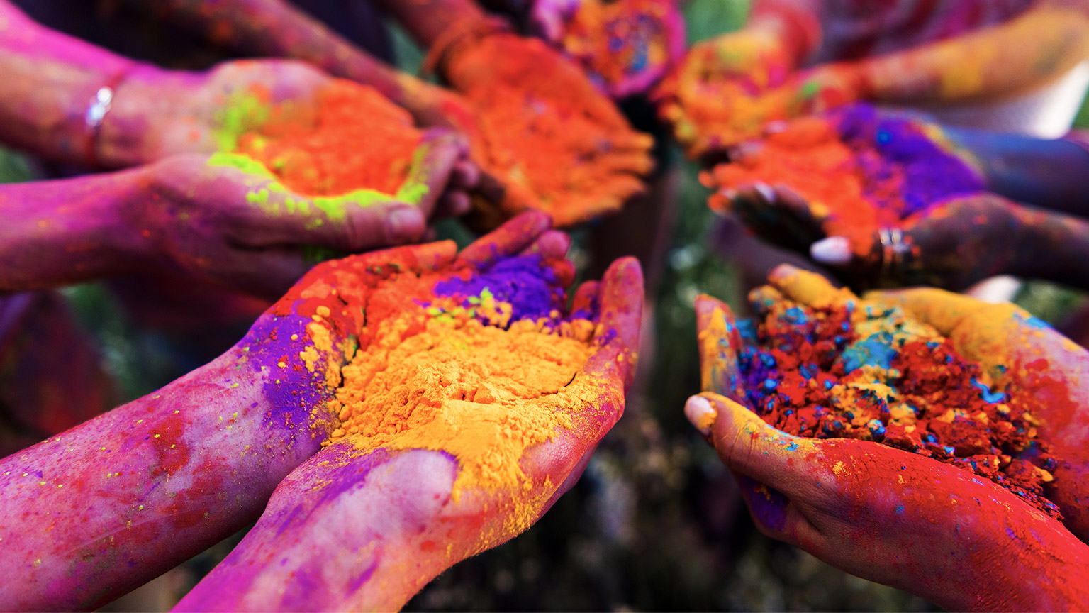
Colour harmonies are everywhere. We see them in the colour scheme of building, the paint jobs on cars and the clothing people wear.
Your task is to photograph a space, place, person or product, then extract its colours and describe their relationship.
You might consider photographing:
- your room
- a car
- your favourite pair of shoes
- a garden you like to visit.
You can sample colours from your image using the eyedropper tool in either Adobe Photoshop or Adobe Illustrator, or by uploading an image to color.adobe.com.
Using canva.com or any of the Adobe software, create a single page that includes your photograph, your extracted colours, and which colour harmony you have identified.
Share your work in the forum.
Take a look at the following 2 examples:


One exciting feature of color.adobe.com/ is extracting a colour palette from an existing piece of design and analysing it based on colour harmony rules.
Follow the instructions below, to explore with your own colour palette.
Select extract theme from the set of tabs at the top of the screen.
Then drag an image or a piece of design work to the centre of the window.
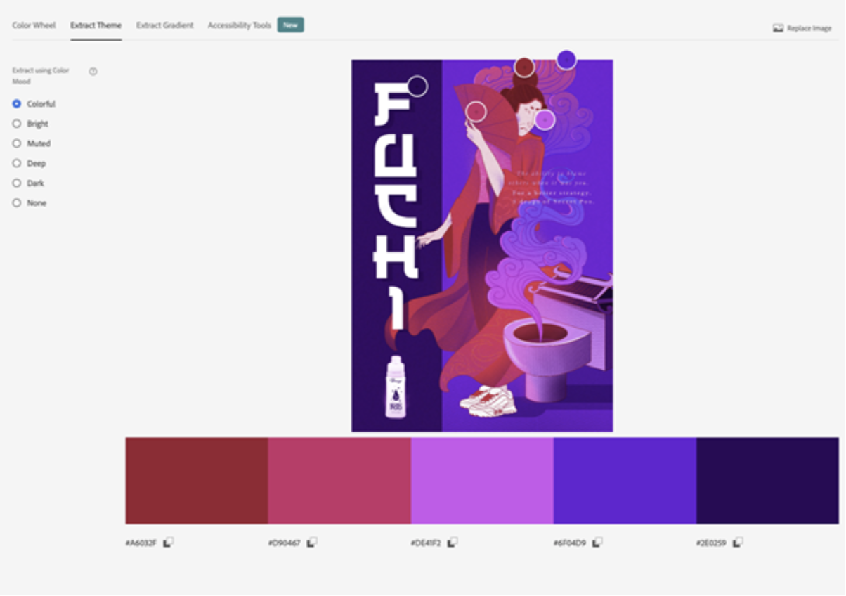
With Colorful selected on the left, the site will find the most vibrant version of the hues in the image.
Now switch back to Color Wheel in the tabs to see how the colours are arranged on the colour wheel.
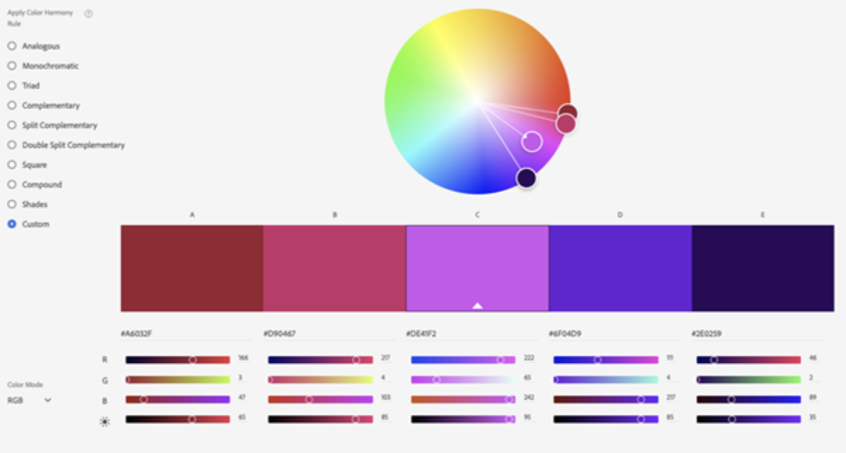
We can see here that this example is strongly analogous.
Continue practising using different images, and exploring with different colours.
Knowing which colours work well together is essential. It is arguably just as important to understand how much of each colour to use.
The 60-30-10 rule was initially conceived for interior decor and decorating, but it works well for all designs, including print and web.
It is applied by proportioning the amount of each colour that should be used in a composition or layout. (This is explained further in the video below.)
Rather than evenly distributing the colour throughout the design, creating a confused and untidy composition, hierarchy is established and each colour is given a role. You will use your primary and secondary colours the most--at 60% and 30%--and use the colour to occupy 10% of your hierarchy for accents.


Take another look at this Tide commercial featured earlier in this topic.
Notice how the colours are used?
- Blue would be considered the primary.
- White the secondary.
- Yellow and red as accents.
The ad is obviously animated, so the ratios vary from frame to frame, but an overall hierarchy does stand out.
'Colour psychology' refers to the study of human behaviour concerning colour. It looks at how colour can influence the perception of brands, products, services and anything else people engage or interact with.
Making informed decisions about the colours you use for the design work you are doing is essential. In a marketing context, choosing the right colours can be the difference between the success and failure of a campaign. It is important to understand what colours mean, how people perceive them and what they say when applied to design work.
Colour associations
Red
Red is one of the more powerful and dramatic colours. It is often associated with love, lust and energy. You will see red in Valentine's Day promotions and romance movies. Red demands attention and can be seen as a show of strength or aggression (like the iconic red Ferrari).
Red also has some negative associations, too. It can be used as a warning or threat or to indicate terror and violence (consider stop signs and signs showing consequences, and horror movies).
Yellow
Optimistic, happy and joyful, yellow is a colour that inspires positivity and confidence with its association with sunshine. Yellow can also act as a warning and indicate safety concerns to indicate fear and produce anxiety.
This ad (below) for Laithwaites associates the positive feelings of owning or accessing a wine cellar with the main character in the ad by having him wear yellow.
Orange
On the colour wheel, orange sits between red and yellow, and this position enables it to combine some of the power and energy of red with the joy and optimism of yellow.
Orange is a warm, friendly colour that can be motivational, enthusiastic, comforting and creative.
Mitre10’s use of orange helps to convey a feeling of approachability and confidence, and what could be more creative than a bit of DIY. Their 'Easy As' how-to guides feature orange prominently in both the video and printed resources.
Popular weight loss app, Noom, uses orange in its logo and interface. Noom’s app offers a friendly and approachable coaching service that motivates users to stick to goals.
Blue
Closely associated with reliability and trust, blue can also be calming and peaceful; however, in some uses, blue can appear depressive and cold.
Financial institutions, health services and tech companies are among the brands that often use blue to convey dependability, reliability and responsibility.
Green
Green is strongly connected to nature and the environment, growth, health and money. Green is also associated with envy.
Meal kit company Hello Fresh features green prominently in their identity and the imagery they use to promote their product. Their use of green connects them to their target audience’s desire for a fresh, healthy service.

Now that we know how to define and mix colours using colour models and colour harmonies, it’s time to look at some of the methods for selecting colours during the production of a design.
In the printing industry, there are 2 main ways colours are produced on a substrate. Depending on the print run size and the job’s complexity, these methods can be used independently or combined.
Process colours
We looked at CMYK earlier in the topic. These are the subtractive primary colours used in laser and inkjet printers to produce full-colour documents, including the faithful reproduction of photos.

CMYK inks or process colours are also used in offset and screen printing environments for the same reasons, in full-colour documents and photos.
Spot colours
Sometimes in a print job, there is a need for much higher accuracy of a colour’s reproduction, or perhaps you don’t need to print in full colour but want to be able to add an accent colour to an otherwise monochromatic document. These are scenarios where spot colours become particularly useful.
Rather than mixing colour during the design and printing of a document, spot colours are premixed colours that can be included as part of an offset or other traditional commercial printing process.
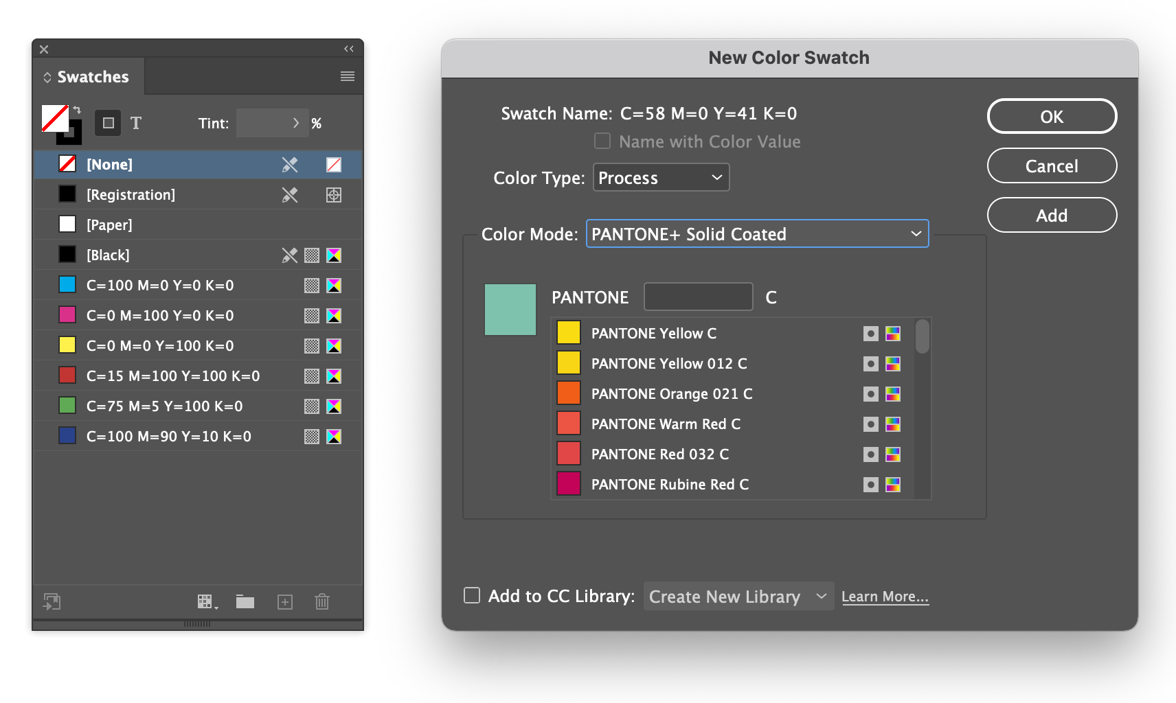
Pantone
The most common spot colours you are likely to see are part of the Pantone Solid library. Pantone produces a set of swatch books that include all the colours available within the system. Users of the system can reference the colours in the swatch book and select them in software during production.
Because commercial printers know the exact colour and can also reference it in their swatch books, they can ensure much higher accuracy of colour than when working with process inks (CMYK).

In Adobe Indesign, they are available when adding a new swatch.
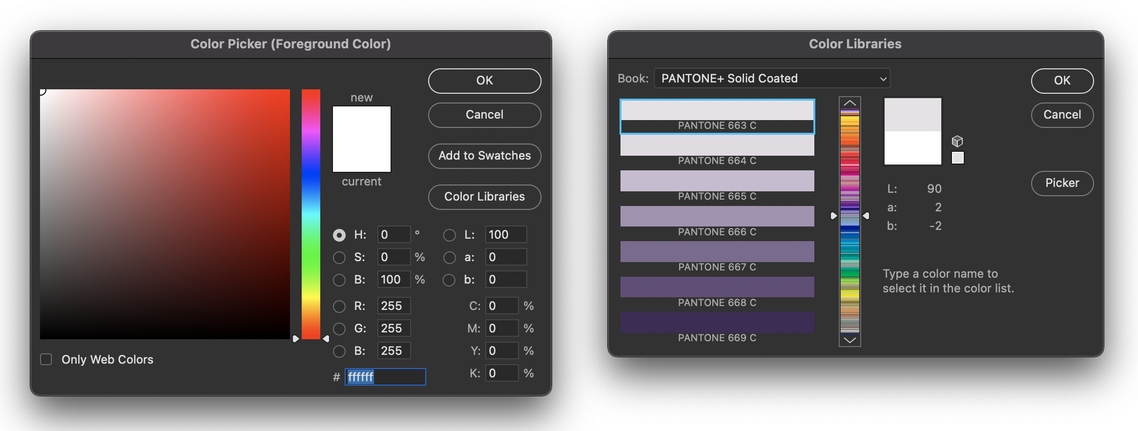
In Adobe Photoshop, they are part of the colour picker by selecting Color Libraries.
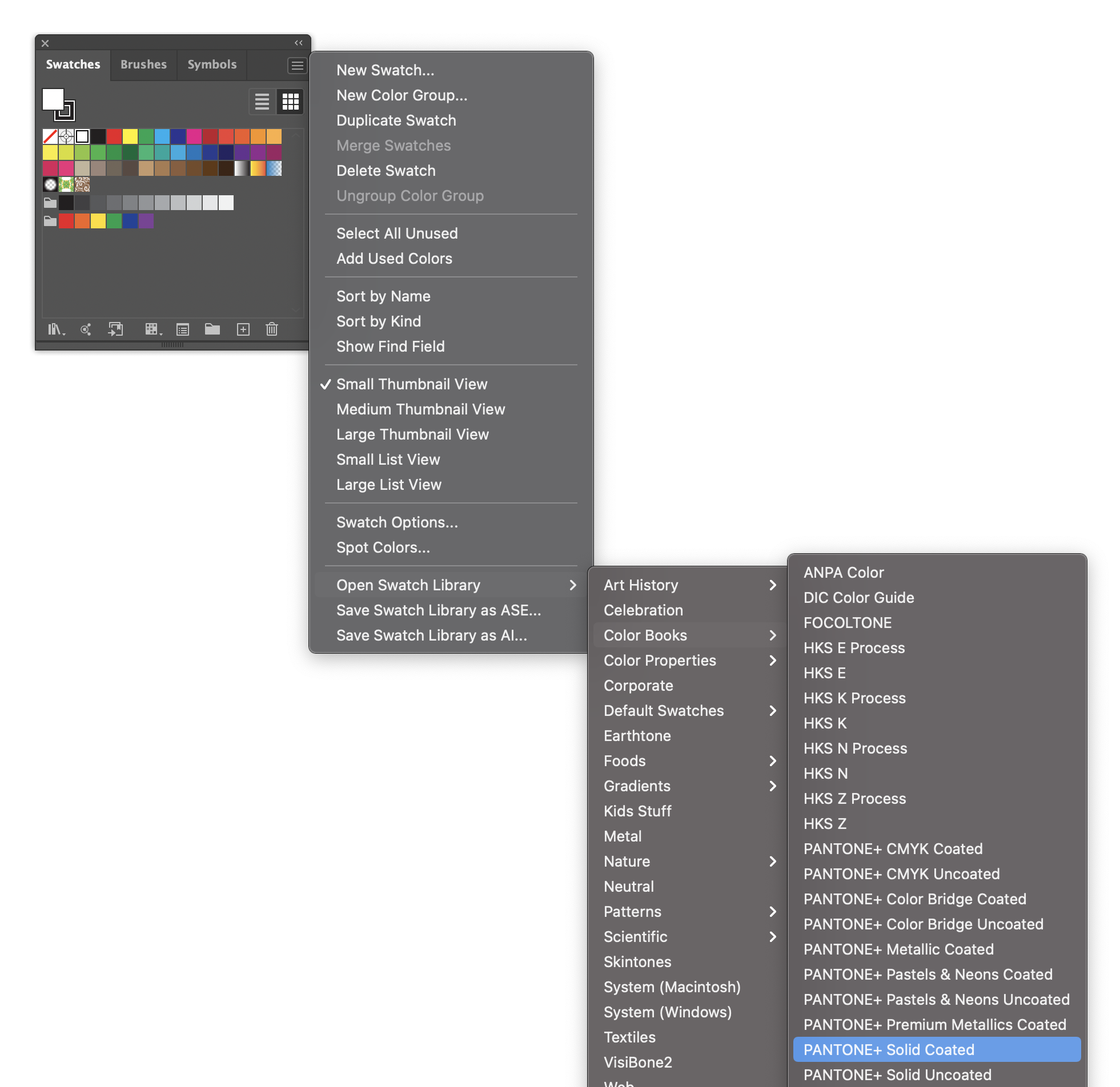
In Adobe Illustrator, they are available by selecting Color Books from the swatches panel menu.
Digital environments
When choosing colours in a digital environment, we usually work with the additive colour model (RGB). The additive RGB colour gamut (range of possible colours) is significantly wider than CMYK and relies on the device’s accuracy to display the colour.

- Visible
- RGB
- CMYK
By now, you may be familiar with the Adobe Photoshop colour picker.
This famous colour picker allows you to select a hue using the centre slider then adjust its saturation at brightness by positioning a point within the tone square. Once a colour has been selected, a breakdown of its CMYK, RGB and HEX values can be seen in the window’s lower right corner.
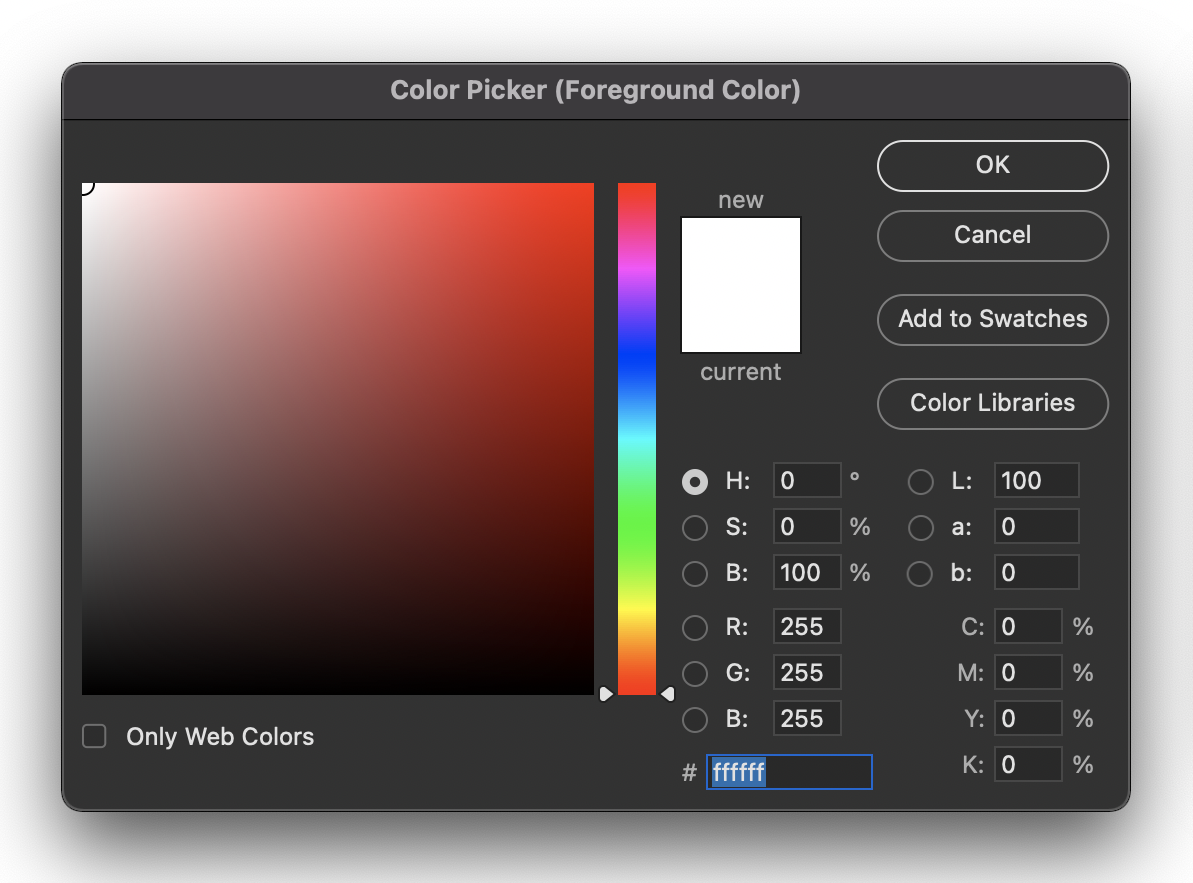
The most common way to define colours on websites has been through HEX codes like the one at the bottom of the example image.
Each HEX code is a way to represent binary bytes in a shorter base 16 format. Each colour code is made up of 6 characters from 0 to 9, and 'a' to 'f' (10-15). The six characters make up three pairs, one for each of the additive primary colours: 00 is no colour, and ff is 255 or 100% colour.
Including a HEX value with relevant property in CSS will assign the selected element the colour value defined.
p { color: #000000; } /* black */
h1 { color: #ffffff; } /* white */
h1 { color: #aaaaaa; } /* medium gray */
ul { color: #8050c8; } /* purple */
RGB values are defined by giving a value to each additive primary colour from 0 (not visible) to 255 (100% visible).
p { color: rgb(0, 0, 0); } /* black */
h1 { color: rgb(255, 255, 255); } /* white */
ul { color: rgb(128, 80, 200); } /* purple */
/* percentages work too */
h1 { color: rgb(100%, 100%, 100%); } /* white */
HEX and RGB can be challenging to visualise in your head while you are working. Most people wouldn’t read #3b5998 and immediately think, 'That’s Facebook blue'. With practice, it can become more manageable, but it will still be tricky.
HSL (hue, saturation and lightness) is another way of defining colours. It is currently one of the least used methods but is increasing in popularity because of its more intuitive description of colours.
Similar to RGB, HSL colours have 3 variables. The first variable defines hue in degrees around the colour wheel, with red at 0 and cyan at 180.

- Red 0°
- Yellow 60°
- Green 120°
- Cyan 180°
- Blue 240°
- Magenta 300°
It can become easy to associate these positions with their hues in memory with a bit of practice.
The following variable is saturation from 0% (grey) to 100% (full saturation).
The last variable is lightness: 50% is where the hue is at its maximum vibrancy, 0% will give you black, and 100% will provide you with white.
This system makes it easy to create colour palettes based on colour harmony rules by spacing hues evenly for analogous colours or selecting hues 180° apart for complementary colours.
h1 {

  background-color: hsla(240, 25%, 50%);

}
In this topic, we reviewed the traditional colour wheel. This is divided into 12 hues consisting of primary, secondary, and tertiary colours. Temperature is also used to describe colour:
- Warm colours are associated with reds and yellows
- Cool colours are associated with blues and greens.
However, in the world of design, computers and printers, we have a slightly different understanding of how colour is created.
- Additive describes colour created by emitted light: computer screens, television and projectors. The additive primary colours are red, green and blue (RGB). In an additive colour model, mixing the three primary colours will create white. Black is the absence of any colours.
- Subtractive colour is usually associated with printing. The subtractive primary colours are cyan, magenta, yellow and black (CMYK). Colours are removed in a subtractive colour model to reveal white (or the paper/substrate).
Colours have 3 main properties that influence how we perceive them.
- Hue (colour's purest form)
- Value (brightness and darkness of a colour)
- Saturation (intensity).
Colour harmonies explain how well colours can work together. We can use colour harmony rules to create aesthetically pleasing palettes to use in our designs.
- Analogous colours sit next to each other on the colour wheel.
- Complementary colours sit opposite each other on the colour wheel.
- A split complementary colour palette is similar to a complementary palette; however, instead of using colours opposite each other on the colour wheel, this palette uses colours on either side of the complementary colour.
'Colour psychology' considers how colour can influence the perception of brands, products, services, and anything else people engage or interact with. Making informed decisions about the colours you use for the design work you are doing is essential.
In the print industry, colours are produced on a substrate by either process colours or spot colours (including Pantone). In digital environments, we usually work with the additive colour model (RGB) as the colour gamut is significantly wider than CMYK.
Additional resources
Here are some links to help you learn more about this topic.
It is expected that you should complete 12 hours (FT) or 6 hours (PT) of student-directed learning each week. These resources will make up part of your own student-directed learning hours.
- Vector conversions: Raster vs. Vector
- Mike Gracey: Raster vs Vector
Adobe Photoshop Layer Adjustments (Non-destructive editing):
- Adobe Help
- Youtube Tutorial: Working With Adjustment Layer Masks
Adobe Photoshop Layer Masks (Non-destructive editing):
- Adobe Help masking layers
- Adobe Help masking layers tutorial
- Youtube Tutorial: Photoshop: Understanding Layer Masks
Colour
- Spot Colours – the Pantone site is always fun to look at
- Colour mixing game
- Cool illusion
- Great websites for colour mixing and colour palettes
- Colour Scheme Designer
- Link to more in depth Colour Theory – great for an extra read
- What does your fave colour say about you