Grid
Digital, web and print layouts can all benefit from grid layouts. The grid format is created by dividing the page or canvas horizontally and vertically, creating a series of cells populated with content elements. Then the design principle of proximity is applied to build relationships between the elements.

Grids make structuring a layout into meaningful blocks of content more accessible.
Focal point
Giving your viewers and readers a single focal point can be a great way to balance a composition. Structuring your content around a single focal point helps build hierarchy and creates a sense of flow between elements.
Consider using a large image, graphic or even a pulled quote, as the focal point.
Rule of thirds
The 'rule of thirds' refers to a composition that is roughly divided into 3--horizontally and/or vertically--with points of interest being placed along the third lines or where horizontal and vertical lines intersect.
The rule of thirds has similar spacing and arrangement to the golden ratio, making it particularly appealing to the human eye.
Negative/white space
White space doesn’t have to be white! It is probably easier to understand when referred to as 'negative space'. Negative space is the space left empty in a composition. It is the gaps between elements and the comfortable spaces your viewer’s eyes can rest on.
There is a tendency for people new to design to want to fill up every space in a composition. However, it is essential to leave enough negative space to help make the content the focus.
Try:
- increasing your margin and gutter sizes
- making the space between your headings and body text bigger
- leaving a column free of content.
Hierarchy
Establishing a clear hierarchy makes it easier for viewers to receive the information you are trying to convey.
You can create a hierarchy using size, colour and positioning. Make the more vital elements more dominant.
Repeated elements
Using repeat elements, colours, shapes, etc., helps build consistency and balance within a composition or series of designs. Repeating details in a multipage document help readers view the documents in one cohesive design.

Many printed documents are folded. Folding can make a large, cumbersome document into a more compact and manageable reading experience.
Single-fold/half-fold
Folding a sheet of paper in half creates 4 separate areas for content. While folded, a cover or front page will be visible. Opening the fold reveals an internal spread, and the back is seen when the document is closed.
Half-folded documents resemble books or multipage documents and can be set up as either 2 single-page spreads with fold lines or a 4-page, facing-page document.
Tri-fold/Roll or C-fold
Folding a sheet of paper twice creates 3 content areas on each side. Rolling the sections from right to left creates a cover and 2 opportunities to reveal content: one when the cover opens to the left and another when the inside edge folds to the right.
Tri-folds are popular for brochures and are often designed to fit a standard DL-size card rack.
Z-fold
This is similar to a tri-fold, except rather than rolling, the sheet is concertinaed. This type of fold is suited to documents that are best viewed unfolded.

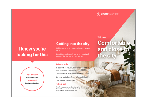
Airbnb brochure
Airbnb is an online accommodation provider that connects hosts with guests for boutique local experiences. There are millions of listings on airbnb.com, with each one offering a unique experience.
Your task is to create a folded brochure advertising a listing from airbnb.com that uses the text and images found in the listing.
Choose one of the fold styles explored in the topic:
- Single-fold/Half-fold
- Tri-fold/roll or C-fold
- Z-fold.
Check out the example below, and follow the folded document tutorial video in the software tutorials for information on setting up your document correctly.

Share your brochure in the forum.
In this topic, we covered various layout techniques including composition and document folds.
Composition can benefit from;
- Grid layouts
- Focal points
- Rule of thirds
- Negative/white space
- Hierarchy
- Repeated elements
Document folds include single-fold/half-fold, tri-fold/roll or C-fold, and Z-fold.
Additional resources
Here are some links to help you learn more about this topic.
It is expected that you should complete 12 hours (FT) or 6 hours (PT) of student-directed learning each week. These resources will make up part of your own student-directed learning hours.
Grids
Paragraph rules
- Tips and Tricks
- Great website for some InDesign tutorials
- Smashing magazine is a great place for tips and tricks
- WATCH Drop Caps & nested styles
- Visual hierarchy
- Paragraph and character styles
Inspiration
- Diecut Inspo - The Inspiration Grid
- Diecut Inspo - Behance

