
In this topic we will cover the following:
- Margins and guides
- Document grid - Manuscript, column, and modular
- Columns including orphans, widows, rivers, and rags
- Finding the balance in your layout.
Whether you are using Adobe InDesign or another tool, always set up your document correctly from the start.
Set up for success
Set the number of pages, initial margins, and columns in the New Document dialog box. You may want to alter some of these settings — for the whole document, or just for individual pages.
Add guides, arrange pages in a different order, or combine pages to make bigger spreads, depending on the outcome of your project.
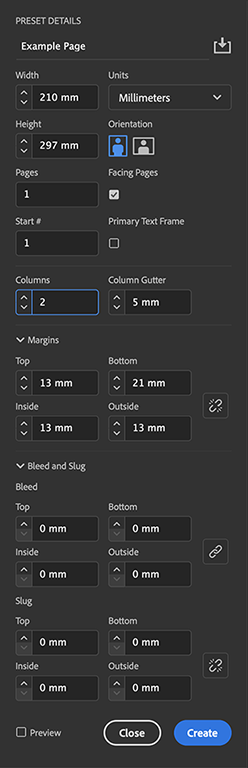
You can modify the number of columns on your pages as well. This lets you break up text into easily readable sections, create different layouts within the same document, or simply divide up the page evenly.
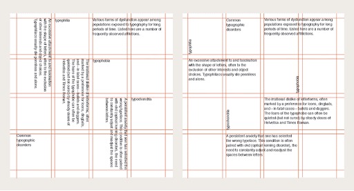
The following is an example of a three-column grid document on a double page spread, complete with annotations on the different page guides and grids.

- Violet lines are column guides.
- Magenta lines are margin guides.
- Grey lines are the grid.
- Cyan lines are ruler guides, when selected, ruler guides change colour to match the colour of the layer they are placed on.
- Black lines indicate the edges of pages in a spread. A thin drop shadow helps distinguish a spread from its pasteboard.
What are guides?
Guides help you to position images and elements precisely across the width or length of a document. Some guides in Adobe InDesign show you the structural areas of a page. These include the margin and column guides, and the black line that defines the size of the page or spread.
Margins
In a multi-page document, the inside margins are the smallest measuring at least 10mm (depending on your binding method). The top margin should be a little larger, and the outside margin larger again. The bottom is usually the largest at around 20–25mm. For example, a multipage document may have the following margins.
- Inside margin of 10mm
- Top margin of 12mm
- Outside margin of 15mm
- Bottom margin of 20mm.
Trim
Most commercially printed documents are printed on sheets or rolls of paper that are larger than the page size of your document. Once the document has been printed, it is trimmed to the correct size with a guillotine.

Bleed
Bleed is a special margin of about 3–5mm that you specify beyond the edge of the page. Any page elements that are to be printed to the edge of the page should extend past the page edge into the bleed area. This provides a margin for error when your final printed document is trimmed. If you do not extend into the bleed area, slivers of white may appear around the edge of the page if the guillotine does not cut accurately. The bleed will be cut off, so do not put any essential page contents within this area.
Slug
Slug is the area used for instructions for the printer, sign-off forms, or other information related to your document. The slug area is discarded when the document is trimmed to its final page size.

- Slug line (blue)
- Bleed line (red)
- Trim line / edge of page (black)
- Margin (violet/magenta)
- Column
- Gutter
- Pasteboard (non-printing area that can be used to store placed items)
- Object printing to edge of page extended to the bleed lines
- Slug area containing additional information that will be printed but trimmed away
Grid systems help define how content is presented, where elements are placed, and how elements are arranged. Once a grid is established it should be used consistently to create cohesion. There are three popular grid types.
- Manuscript grid
- Column grid
- Modular grid.
Manuscript grid
A manuscript grid has one column.
You will often see a manuscript grid in documents that deal with a large volume of text. Text spans the page between margins with space left above and below for running headings, folio, and page numbers.

Books, essays, and blogs are good examples of situations that lend themselves to using a manuscript grid. Images can be included, often spanning the same width as the text frame.
Popular digital publishing platform Medium.com uses a manuscript grid for its articles:

Column grid
A column grid is made up of at least two columns.
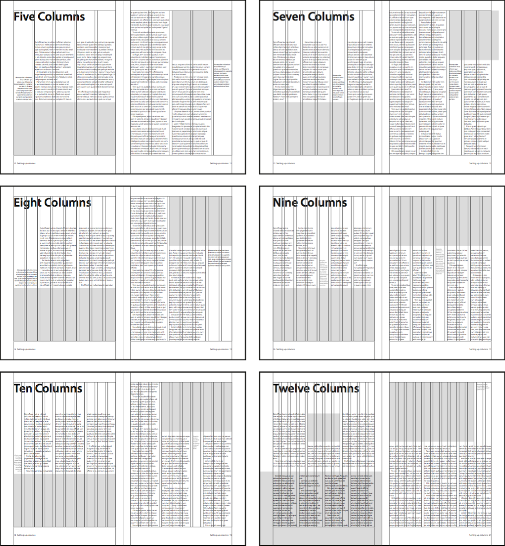
A column grid divides each page vertically into separated columns, the gap between columns is called the gutter. Text and images usually sit within a column or span multiple columns. Magazines often use column grids.
Twelve-columns
A twelve-column grid is popular in many publications because it divides easily into two, three, or four even column groups.
Grids for web
Column grids are also effective on web pages. The 960 grid system and popular CSS framework Bootstrap both use a twelve-column grid system. By default, columns are proportioned evenly.
Their width can also be specified by defining the number of columns to span using classes.
<div class="row">
  <div class="col-8">Eight columns</div>
  <div class="col-4">Four columns</div>
</div>
The following video covers the basics of grid systems in design projects, with an emphasis on column grids for web and UI design.
Modular grid
Modular grids are similar to column grids, but they include horizontal rows separated by gutters.

Defined cells
Modular grids create defined cells that content can be contained within. They are useful for projects with complex layout requirements.
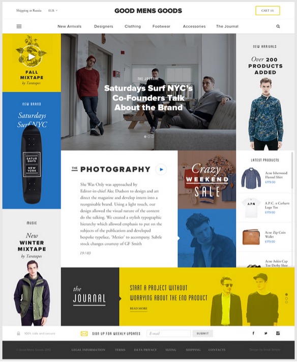
Image galleries, product brochures, and navigation elements are examples of the types of content suited to modular grids.
If a line of text is too long, the eyes can quickly tire, and the reader will skip lines. Shortening the length of text blocks helps improve readability. On the flip side, you do not want to have line lengths that are so short that only a few words fit.
Tips for great columns
The ideal line length
It is hard to set a magic number for the ideal line length as it differs depending on the typeface and its size. A comfortable size is between five and fifteen words per line. To create shorter line lengths and efficiently use the full width of a page, text can be flowed into columns.
The basics
Follow these pointers to get the most out of columns.
- On a portrait A4 page, two to three columns is a good number.
- Span headlines across two or more columns if necessary. Avoid hyphenating headlines to fit into a single column.
- Take care to align the top edges of the columns. If paragraph spacing is used it may not be possible to precisely align the bottom edge (or each line of text), but this is acceptable. Using first line indents instead of paragraph spacing can resolve this issue if it annoys you.
- Check that the reading order is obvious, particularly when breaking columns with graphics.
- The space between columns is known as the gutter. Remember that you can change the width of the gutter to suit the text formatting and layout.
Orphans, widows, rivers, and rags
Computers automatically wrap text and can hyphenate words at the end of each line. However, the results can sometimes be undesirable.
The following are some issues to look out for.
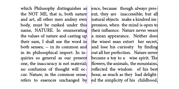
Orphans
An orphan is when the first line of a paragraph appears by itself, at the end of a column or text frame. It is rare for an orphan to be a single word.
Orphans can easily be fixed by inserting a column or page break to force the new paragraph to start on the next column or text frame.
Widows
A widow is when the last line of a paragraph appears by itself, at the start of a column or text frame. Widows could be a line of text or a single word.
Single word widows can easily be fixed by:
- Forcing a line break before a word on the previous line.
- Adjusting the text formatting.
- Editing the text to add or remove auxiliary words.
Line widows can be trickier to fix without heavily editing the text so you may need to try a few of the above suggestions.
Can you identify whether the highlighted text in the following image is an orphan or widow?

Rivers
Rivers are when white space within a block of text gives the illusion of a river. Rivers are more likely to appear if text is justified. Similarly, a lake is a hole or block of white space within the text.
To fix rivers or lakes, try turning on hyphenation as this will better distribute the words on each line.


Rags
A rag is an uneven vertical margin in a block of text. The margin appears raggedy.
Rags can be fixed by using justified alignment or hyphenation.
Naturally we prefer things to be in balance and can subconsciously feel uncomfortable or tense if something is out of balance.
This applies to the layout of elements in a design, so try to balance a layout unless your design objective is to invoke tension, fear, or nonconformity.
Balance is achieved by careful placement of elements in relation to each other, and with the weight of each element distributed evenly. The element’s size, shape, colour, and tone determine weight in a layout.
Hierarchy
Hierarchy means that there is a clear order of importance established.

You can achieve hierarchy by distinguishing elements using contrast, size, shape, style, colour, and movement. Or simply by using a clearly numbered sequence.
In documents containing text you can create hierarchy using styles. For example, there may be a large heading, followed by a smaller sub-heading and then the body text.

Alignment
Alignment is one way to organise elements visually. To prevent a haphazard layout, any element that you place should generally have a visual connection to something else.
Elements in your design can be aligned in a variety of ways depending on your design requirements.


The choice of how and what you align will depend on other design decisions and principles. But if you want professional results, all elements in your layout must be precisely aligned to something.
Make use of tabs, guides, grids, and align features to ensure that alignment is precise.
If you are designing on paper, use a pencil and ruler to lay down some temporary guidelines. It is not good enough to just assume that something is aligned.
Symmetry
To achieve symmetry, elements are placed evenly about a central axis to create an effective mirror image of the overall shapes and spacing of elements.

A flipped mirror image of elements can also be symmetrical. This type of formal symmetrical balance is very easy to achieve and is a good choice if you want your design to imply dignity, strength, and dependability. However, it can also be considered boring, old fashioned, and predictable.
Asymmetrical balance
Asymmetrical balance can create a more dynamic layout, but it is not so simple to achieve.

Asymmetrical balance requires taking the effective weight of elements into account. A solid filled or coloured element will have more effective weight than an equally sized unfilled or greyscale object.
Multiple smaller elements can balance a larger single element. Images generally have more weight than a similar sized block of text.
Document layout
Your task
Create two layouts for a recipe for a summer cocktail using the text and image supplied. Use each grid system to create a unique layout – Manuscript, column, and modular. Share your designs in the forum.
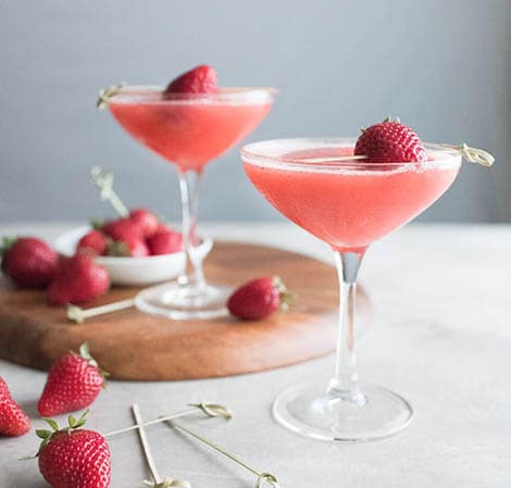
Frosé
A perfect summer cocktail for entertaining friends and family. Try substituting blackberries or raspberries for the strawberries for an entirely new twist on this recipe.
Yield: 1.2 l (4 cups)
Total Time: 4 Hours 5 Minutes
Difficulty: Easy
Ingredients
- 750 ml (1 bottle) Pinot Noir Rosé
- 100 g (½ cup) granulated sugar
- 230 g (8 ounces) hulled strawberries
- 120 ml (½ cup) fresh lemon juice
Directions
- Place all ingredients into the Vitamix container and secure lid.
- Select Variable 1 or the Puree setting.
- Start the machine, slowly increase to its highest speed, and blend for 45 seconds; or start the machine and allow the Puree program to complete.
- Pour contents into a 9 x 13-inch (22 x 33-cm) cake pan.
- Freeze for 4 hours, or overnight.
- Use a fork to scrape the frozen mixture into the Vitamix container. Select Variable 5 and start the machine. Blend for 6 to 8 seconds, or until slushy. Serve immediately.
Margins, guides, grids, and columns all assist with creating a design that looks professional and clean.
The three main types of grids are manuscript, column, and modular. Column grids are popular in magazines and for web design. Twelve is a great number of columns to use as it is easily divisible by one, two, three, four, or six.
Columns are important to break up a page and make content easier to read. However, be aware of orphans, widows, rivers, and rags. Adjust format and text if necessary.
Balance creates a feeling of calm in a design. Balance can be achieved through hierarchy, alignment, symmetry, and asymmetrical balance.