'Colour theory' refers to the science and art behind the use of colour. It explains how humans perceive colour, along with the visual effects of how colours can be mixed, matched or contrasted.
Having this knowledge will allow any marketer to integrate these many aspects appropriately into their branding and products whilst communicating their intended message clearly and effectively. Let us delve into and explore the various factors that marketers need to consider when working with colour to create a successful product/brand.
As a designer in the area of marketing, making informed decisions about the colours you use for the design work you are doing is essential. In a marketing context, choosing the right colours can be the difference between the success and failure of a campaign. It is important to understand what colours mean, how people perceive them and what they say when applied to design work.
To effectively integrate colour theory, marketers must understand the following aspects of colour:
- rigid colour application
- colour psychology
- colour harmony and relationships.
In some instances, colour theory may require research and understanding to develop your own ideas and application of colour.
The term 'rigid' implies the lack of flexibility or inability to adapt or change. A rigid application of colour can be seen often with design in branding. Usually, a logo of a brand will evolve to stay current. However, if the design changes too much, it can lose meaning, perception and credibility; therefore, some companies choose to integrate a rigid application of colour theory into their brand’s logo.
This enables the brand to remain recognisable and avoid losing its connection to its audience.
For example, look at the image of Pepsi cans below. Pepsi has changed its branding and logo progressively over time; however, with a rigid application of colour, they remain recognisable with an unchanged connection to its audience.

There are many ongoing benefits of brands successfully applying the rigid application of colour, among them:
- consumers are able to understand the message behind the brand
- it aids in communicating the personality and identity of a business, product or brand
- it enables the audiences to distinguish a business/product/brand from competitors.
Colour is more than what is visual to the naked eye--it works as a powerful communication tool that influences reactions from individuals and evokes emotion (whether it be good or bad). It can influence the perception of brands, products, services and anything else people engage in or interact with.
Marketers find colour extremely important as they use this to attract customers to their brand and logos. They see this as a crucial part of their marketing as it can influence a consumer’s behaviour and assessment of the goods that are being promoted.
As a designer in marketing, this is important to you because choosing the wrong colour can be detrimental to the products being sold--and the overall profit and recognition that the business will receive.
Below are some examples of the psychology behind each colour.
Red
The colour red is one of the colours that evoke strong emotions within consumers. It can be associated with passion and love, but also reflects determination and courage. Depending on its use, marketers choose this colour for its powerful symbolism and ability to attract the consumer’s eye.
You will see red in Valentine’s Day promotions and romance movies. Red demands attention and can be seen as a show of strength or aggression (like the iconic red Ferrari).
Red also has some negative associations, too. It can be used as a warning, or threat or to indicate terror and violence (think about 'Stop' signs showing consequences and horror movies depicting fear).
Some familiar examples of businesses that use the colour red include:
Blue
Blue exudes harmony and peace. Consumers feel an instant sense of trust towards branding with the colour blue. Businesses may use this colour if they are wanting to evoke stability and loyalty.
As a designer in marketing, this is important to know as many services may rely heavily on consumer trust (e.g. shipping companies, tech companies, financial services and medical services).
Yellow
Yellow is a fun colour!
The colour yellow signifies positivity and happiness. When looking at yellow, consumers often feel a sense of optimism.
With its eye-catching bright nature, yellow is often used to stand out and attract consumers with warm and cheerful branding.
It stimulates the brain and helps individuals feel energised and alert, as it promotes interaction and a thirst for knowledge.
The ad (below) for Laithwaites visually associates the positive feelings of owning or accessing a wine cellar by dressing the main character in yellow.
Some other examples include:
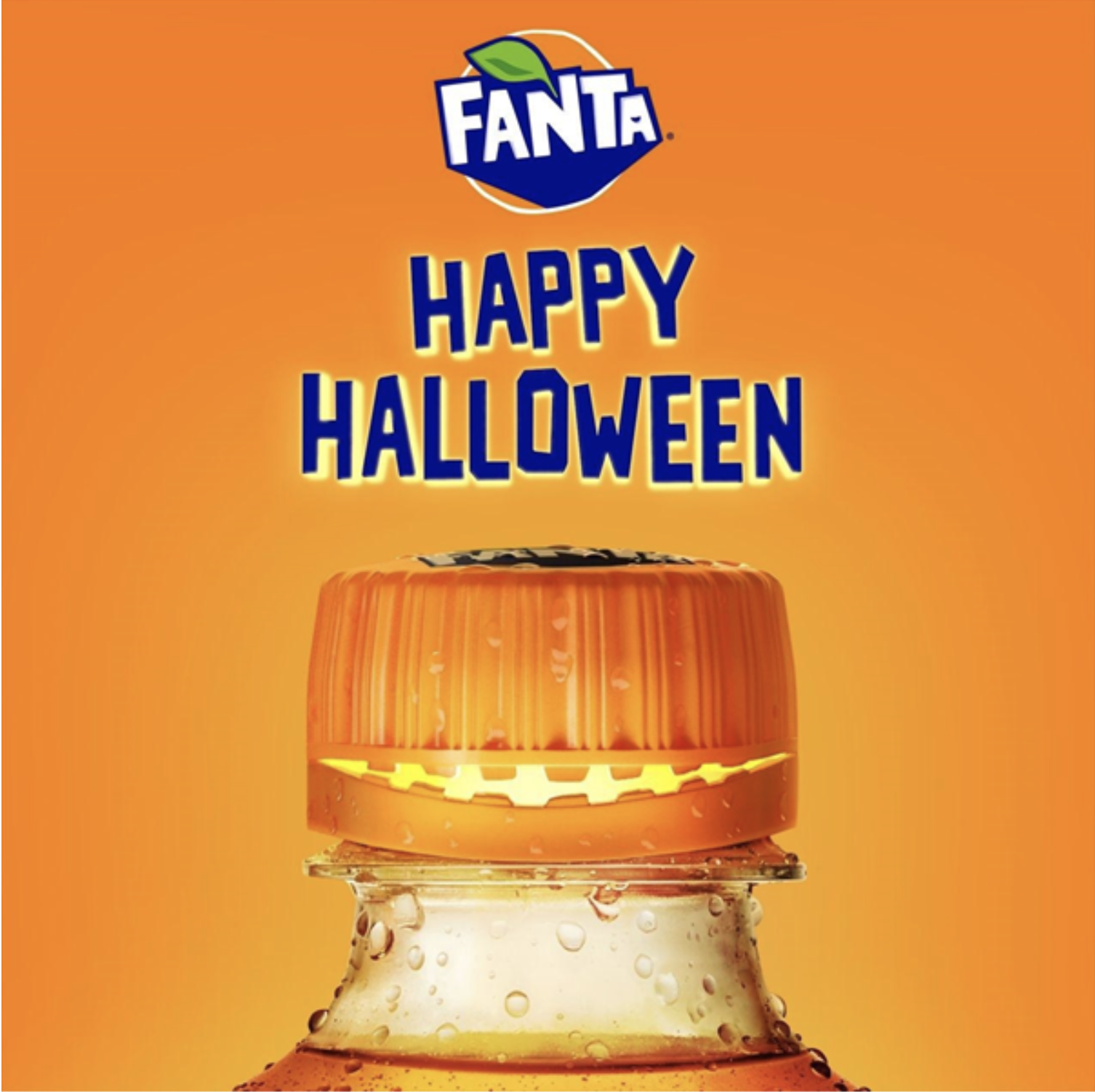
Orange
Orange represents creativity, adventure and enthusiasm. It is the result of red’s energy and yellow’s optimism. It is dynamic, without the strong symbolism of red.
The colour orange can be used to add fun and freedom to images, websites or marketing material.
Mitre10’s use of orange helps to convey a feeling of approachability and confidence, and what could be more creative than a bit of DIY? Mitre10’s 'Easy As' how-to guides feature orange prominently in both video and printed resources.
A popular weight loss app, Noom, uses orange in its logo and interface. Noom’s app offers a friendly and approachable coaching service that motivates users to stick to their goals.
Some other examples include:
Purple
In colour psychology, purple is the colour of royalty. This colour is connected to power, mystery, elegance, luxury and spirituality. Marketers use this colour when they are wanting to portray their brand as luxurious and premium.
Consider:
Green
Green is an earthy colour that is predominantly connected to nature and money. It represents growth, fertility and generosity. It is an excellent colour for marketers working to connect a company to nature and sustainability.
Meal kit company, Hello Fresh, features green prominently in its identity and the imagery they use to promote its product. Their use of green connects them to their target audience’s desire for a fresh, healthy service.

Before marketers develop branding and advertising, they go through a process to ensure the campaign is sending out a powerful message to the consumers about what they are advertising. They make it a priority to understand the psychology of colour in order to develop effective designs.
Colour psychology is a crucial tool for advertisers to better connect with their ideal target audience. Consumers are attracted to what catches their eye and if the colour implementation is not effective, marketers can potentially see consumers turn away--especially in an oversaturated market.
If a marketer chooses the wrong colour scheme, it can damage a brand's image, but if they can get this right, they can:
- predict how consumers will respond to the marketing message
- effectively provoke the emotional response they were looking for
- ultimately sell their products and boost the brand.
A lot of our understanding of colour is centred around the colour wheel (first described by Sir Isaac Newton in his research with white light and prisms in the 1600s). You may have heard the term ROYGBIV (red, orange, yellow, green, blue, indigo and violet) before, perhaps during science or art classes. This was part of Sir Isaac Newton’s discovery and defines the colours we now associate with a traditional colour wheel.

We have discussed how individual colours can persuade and evoke specific emotions within consumers; however, in order to successfully create a design, marketers will experiment and work with a range of colours to create a relationship. Colours used in branding will need to harmonise to ensure the message that they are trying to convey is effective.
These relationships are referred to as 'colour harmonies'. We can apply colour harmony rules to create aesthetically pleasing palettes to use in our designs. Colour harmonies are usually referred to using the traditional colour wheel created by Sir Isaac Newton, but the rules still work when applied to other colour wheels with alternative colours.
We will start by looking more closely at how colours can be defined.
Hue
We use 'hue' to describe a colour's purest form, similar to how we have described them with the colour wheel.

Value
Value describes the brightness and darkness of a colour. Adding black to colour gives us 'shades', and adding white gives us 'tints'. We can adjust a colour’s 'tone' by adding grey.

Saturation
Describing the saturation of a colour refers to the intensity of the colour. Highly saturated colours appear bright and vibrant. Reducing saturation brings the colour closer to grey.

Now we can take a look at the relationships between colours.
Analogous

Analogous colours sit next to each other on the colour wheel. Their relationship is often very easy on the eyes and creates a comfortable and calming feeling within a piece of design. Analogous palettes often appear in nature--think about autumn leaves and bush walks.
An easy way to make your design work appear harmonious is to implement an analogous colour palette. They work well with both muted and vibrant hues.

Complementary

Complementary colours sit opposite each other on the colour wheel. Their relationship is defined by high contrast, and when used at full saturation, their appearance can be visually jarring and appear to vibrate.
Complementary colours create a high-energy, impactful and striking design. Yet, be careful using complementary colours with text because it can make it difficult to read (see the example below of orange text on the cyan background).


Above, the poster for the movie Godzilla vs. Kong (2021) uses a complementary palette. The contrasting colours emphasise the energy and danger while conveying that the characters may have something in common.
Split complementary

A split complementary colour palette is similar to a complementary palette; however, instead of using colours opposite each other on the colour wheel, it uses colours on either side of the complementary colour.
Split complementary colour palettes have similar high contrast to complementary palettes, but with less jarring and visual tension.
A split complementary colour palette can be an excellent choice for new designers, as they are often much easier to implement.
After countless studies across thousands of years, there is no doubt that colour theory impacts human behaviour. When it comes to marketing, colour is a powerful tool that can evoke emotion, convey a message and influence purchasing decisions. It is also a great way to create a connection with customers and represent a brand's personality.
However, there is no golden rule when it comes to colour in marketing. Colour theory shows that everyone experiences colours differently, and what works for one target audience might not work for another.
For more inspiration, check out the following Adobe tutorial which provides more colour harmony examples.
https://helpx.adobe.com/illustrator/using/color-groups-harmonies.html

Colour can elevate one preference over another when making a purchase so experimenting with colour is an important factor when creating your brand or logo.
Brush up on your skills with colour harmonies and experiment with this interactive colour wheel.
You will be tested on your knowledge regarding the techniques of:
- hue
- saturation
- complementary analogous
- triadic
- tetradic.
A colour wheel will be presented with each technique. As the colours are shown, you will need to correctly identify the colours that match.
You can have as many attempts as you like in order to learn about the relationship between colours. Once you have completed the tasks, share your results and how you felt about this colour experience in the forum with your peers.
Visit color.method.ac, and remember to have fun!