
Design 'elements' are fundamental to all design. Designers use the elements to create images, convey mood, draw the eye in a particular direction, or evoke emotions. These elements include point, line, shape, texture, colour, space, pattern and many more.
The information below will cover 5 of these elements. It is important when marketing or creating brands or logos that these are taken into consideration--if they are not then the design will not effectively reach consumers the way it was intended to.
Read through the element descriptions to identify and link their importance within each design.
Line
'Line' is one of the most fundamental of all the elements of design; and the starting place for most artistic creations.
It is a mark between two points that can be expanded into all sorts of forms. This element can change shape, direction or style. It can also create patterns and shapes, move elements, apply rhythm and emphasis, or create effects--and much more.
Line is an important element within your design as it can be used to divide or to organise and structure your layout. It plays a vital role in setting the mood, message, and tone of your design: creating flow and adding emphasis on certain information through the illusion of movement and depth.

Lines are a powerful design element that can be used effectively for many different purposes, for example, lines can:
- direct a reader’s eye
- connect information
- separate information
- highlight information
- define forms (shapes or 3-dimensional objects)
- create a pattern or rhythm when repeated
- imply movement
- suggest moods and emotions
- create a sense of perspective/depth
- represent data (e.g. barcodes, graph lines).
Qualities of line
Lines don’t have to be consistent, continuous or straight. They can be applied in various formats to express different concepts, emotions, styles etc. For example:
- jagged, straight lines could be used to suggest energy, excitement, violence etc.
- smooth, flowing curves create a soft, gently flowing, tranquil feeling
- a dashed line might suggest that something should be cut out
- curvy lines have an organic, natural association
- fine, straight lines might suggest precision.
Always consider the possible associations when using lines, so you don’t confuse or mix emotions. For example, using jagged or vertical lines in the logo for an airline might, on a subliminal level, suggest turbulence and danger.
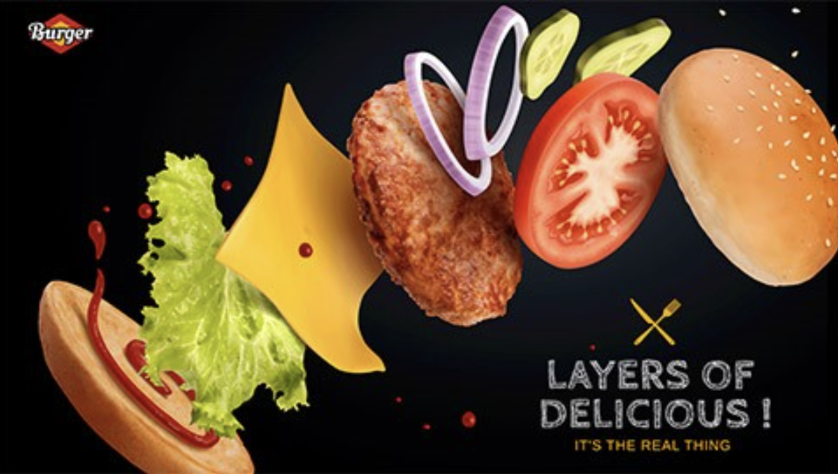
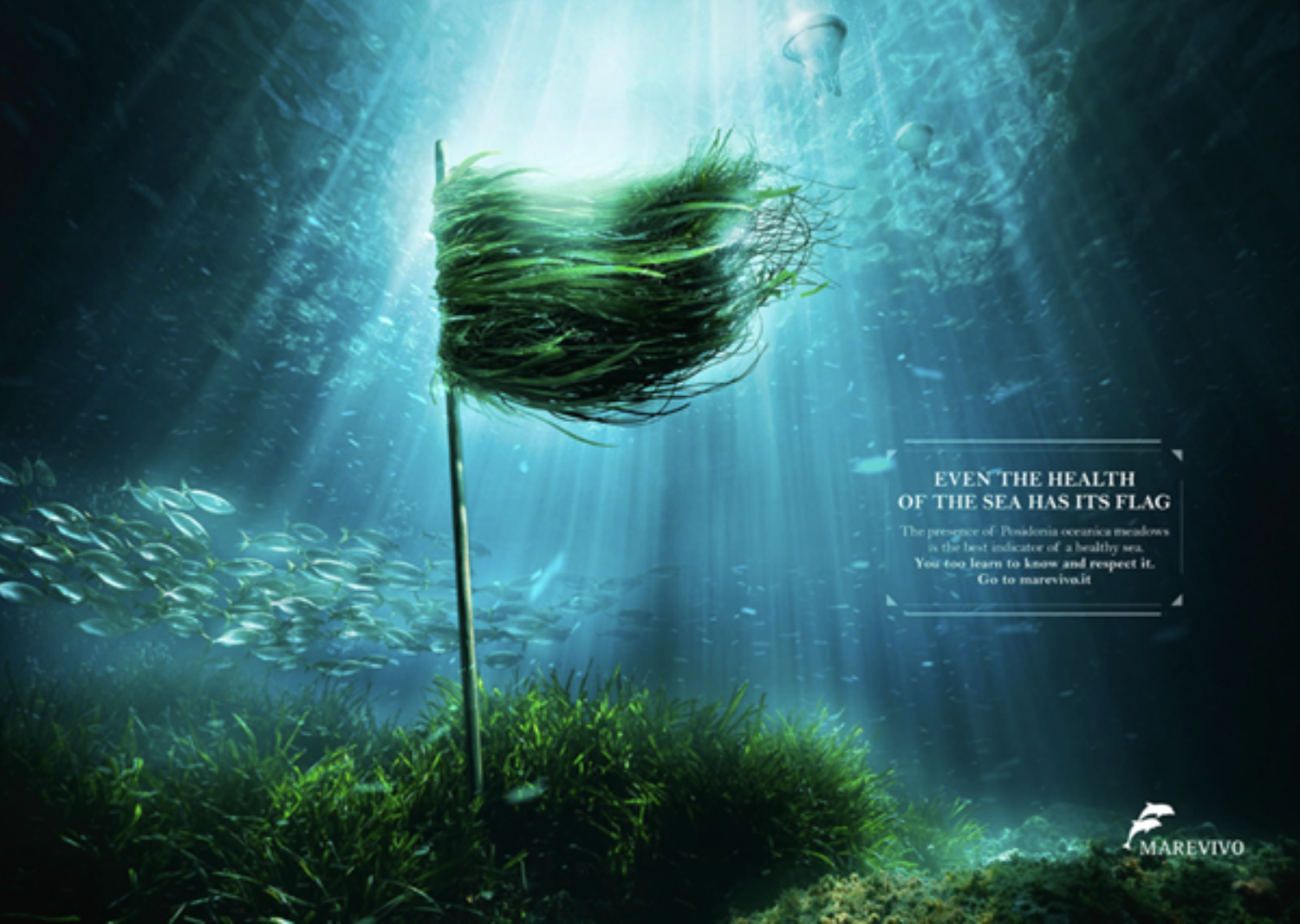
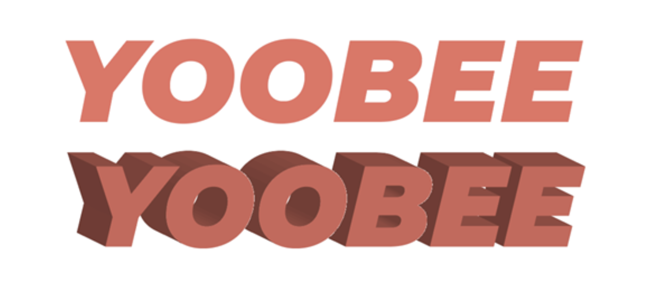
Shape

A shape does not necessarily have to be filled with a solid colour or defined by an outline. The distinct form of a shape can be defined in a variety of ways.
There are different categories of shapes:
- geometric: triangles, rectangles, circles, polygons etc.
- natural/realistic: closely representing any natural or manufactured forms
- stylised: based on natural or geometric forms but with modified attributes
- random: without any conscious reference to any natural or geometric forms.
Shape can be used as an influential element in design. It can:
- attract attention to your design or the elements within it
- make a design more interesting
- symbolise an idea
- tie elements together in a design
- guide the eye around a layout.

Reflective question: Can you think of a logo that has resonated with you or powerfully conveyed its message?
Below are some examples of shapes in logo designs.

Space
A common error when laying out a document is thinking that every space needs to be filled. You should be aiming to create space, not to fill it. A common phrase to sum this up is ‘less is more’.

Space is a vital element required to separate information in a layout. People can scan, absorb and process information more efficiently when it is presented clearly in separate chunks.
If the information is surrounded by clutter, the brain has to work harder to filter out the excess information in order to find out what is important--especially in marketing, as consumers will find it difficult to see what is actually being advertised.
Subconsciously, a reader will be drawn toward those elements in a layout that have plenty of space surrounding them.
The term ‘space’ does not necessarily mean an empty area of white space. It may be filled with a colour or a simple background texture.
'Positive space' is the area the main objects in the design occupy. 'Negative space' is all the other areas and space between and around the objects.

Texture
Texture is the way a surface feels (or the way it is perceived to feel). It can be applied to lines, shapes and forms.
There are 2 types of texture: image and pattern.
Image texture: triggers feelings of sensation and touch (such as wood, grain, sand and fur). Textures can add a distinct visual tone to a piece of graphic design work.
Pattern: triggers our visual sensors, rather than our emotional senses. Pattern is more about visual recognition due to the shapes that repeat themselves.
Texture is important as it allows the viewer to use their senses to imagine how something might feel and may provide a visual connection to the message you are wanting to convey.
Look at the following examples of textures that can be used throughout your designs.
- Natural: Surfaces that occur naturally (e.g. tree bark, leaves, rock, water ripples, sand, fingerprints, skin, fur).
- Man-made: Manufactured surfaces (e.g. fabric, paper, printed text, bricks, metal, plastic, tiles, glass).
- Imperfections: Added (random) textures (e.g. scratches, tears, cracks, rust, splotches, stains, effects of weather).
Many of these textures are 'tactile' (meaning that you can touch and feel them). Adding visual textures to elements in your designs adds a certain quality that will often make your work a lot more interesting than boring, flat, plain areas of colour.
What are the 'principles of design'?
Design 'principles' are guidelines to follow when designing graphics and compositions. They help to create a compelling and attractive composition.
Design principles are not a definitive roadmap from A to B like you would find in a set of standard operating procedures (SOP). Instead, they work more like a compass--pointing in the right direction and providing guidance, influencing how you develop your design.
When used successfully, these design principles can transform designs, enhance usability, influence perception and increase appeal as well as convey various messages to consumers.
Let's explore several of the key principles.
Flow
'Flow' is about movement and directing the eye from one part of a composition to another in the direction you want it to move. You can create flow through visual cues such as arrows and lines to support the reader in understanding the order of where and what you want them to read.
Utilising the design principle of flow is important as it determines where you want the reader to look first, where their eyes should pause and how long you want them to stay there.
Alignment
Alignment is about connections. Assets you place should have a visual connection to something else in a composition. 'Alignment' is one way to organise assets visually. The assets in your design can be aligned in a variety of ways, depending on your design requirements.
In design, we use alignment to organise elements, group elements, create balance, create structure, create connections between elements, and create sharps.
Alignment is used everywhere we look. Think about the last time you read a menu at a restaurant or entered a website to see products. The alignment will have been used to ensure the visual elements are in line with the text in order to balance and structure the page.
We often associate alignment with text. Text is often more legible when left-aligned because it creates a consistent starting point for each line of type. We see left-aligned text in books, magazines and on the web. Other elements in a composition can also be aligned to the left, helping to connect them visually.

Centring elements can help with symmetry. However, components that do not conform to the alignment can look out of place. Greeting cards and wedding invitations commonly use centred text. Centring creates inconsistent start and endpoints and can make reading a more extended section of text more difficult. For these reasons, centred text should be used sparingly.
A connection can be made both horizontally and vertically, and the choice of alignment will depend on other design decisions and principles.
To ensure that alignment is precise, you can use tabs, guides, grids and alignment features available in all Adobe software. If you are designing on paper, use a pencil and ruler to lay down some temporary guidelines.
Proximity
Closely related design elements should be grouped near each other. This is to establish clear visual units and relationships. Avoid scattering related elements around a layout unless they are visually connected by some other means.
Some proximity guidelines you may already recognise are:
- captions should be placed near the graphic they relate to
- subheadings should be spaced closer to the paragraph they relate to than the previous unrelated paragraph
- elements within a logo should be close together so they form a single, compact unit.

In the image above, the text '0.57 seconds late' relates to the missed catch. Having the text in close proximity to the 'moment of impact' reinforces that relationship.
Proximity is about creating and reinforcing the relationships between elements. The closer together they are, the stronger their relationship.
Balance and symmetry
We naturally prefer things to balance and can subconsciously feel uncomfortable or tense if something is 'out of balance'. This applies to the layout of elements in a design.
Balance is achieved by the careful placement of elements to each other and with the weight of each component distributed evenly. The components' size, shape, colour and tone determine their weight in a layout.
Symmetrical balance
Symmetrical balance is achieved when elements are placed evenly about a central axis of a composition to create a mirror image of the elements’ overall shapes and spacing.
This formal, symmetrical balance is straightforward to achieve and is a good choice if you want your design to imply dignity, strength and dependability. However, it can also be considered boring, old-fashioned and predictable.

Asymmetrical balance
Asymmetrical balance can create more dynamic layouts; however, it is not as simple to achieve. Considering the effective ‘weight’ of elements–solid-filled or coloured features will have more effective weight; while smaller, unfilled or greyscale objects have less.
The image below illustrates how the use of multiple minor details can balance a more significant single element.

Note also, that images generally have more weight than a similar-sized block of text.
Radial balance
With radial balance, elements radiate out from a centre point in a circular arrangement. Components can be evenly spaced and sized for a more formal, symmetrical radial balance or be asymmetrically arranged for less formal results.
Hierarchy
'Hierarchy' is the control of visual information in an arrangement or presentation to imply importance. Hierarchy influences the order in which the human eye perceives what it sees.
Typically, visual elements with the highest contrast are noticed first.
Using hierarchy, we can control how a viewer engages with information to ensure that information is navigated and digested in the way it is intended. For example: Where we want the eye to look first, second, third and so on.
Establishing a clear visual hierarchy is important because it holds a design together. Used effectively, hierarchy can make a complex message simple.
Hierarchy in a composition is achieved when there is a clear order of importance--this is done by distinguishing elements using contrast, size, shape, style, colour, movement, or a numbered sequence.
![[INSERT ALT TEXT]](/sites/default/files/design-team/YOOB5002A/3181/contrast_menu-l3.jpg)
In documents containing text, hierarchy is created by using styles for headings, subheadings and body text. Notice the variety of heading sizes in this image.

On a poster, the main graphic might be used to attract the initial attention of a passer-by who will then see the title text, followed by the smaller details.

Larger documents might be broken up into chapters and sections.
Large technical documents often have each heading, subheading, or paragraph numbered sequentially (e.g. 2.39) for quick cross-referencing.
Movement
Movement can be used to convey energy, even with a static page. Angling text forward, using lines and applying motion blur are all ways to show movement in a static document. Consider the path the viewer’s eye will follow. Does the movement match the motion?
Depth
On a 2-dimensional surface, the illusion of depth and distance between elements can be simulated and manipulated in a variety of ways.
We can imply that objects and elements have a 3-dimensional form and volume by projecting isometric (30°/60°) or oblique (45°) faces.

Longer projected faces imply taller or larger objects.
Photographing objects from an angle helps to convey their volume.
Perspective
The further away an object is in our vision, the smaller it appears. We can use this principle with one, two or three vanishing points.
One-point perspective
Used when viewing something face-on. A single vanishing point with all parallel lines converges at this point. Elements get smaller as they get closer to the vanishing point.


Two-point perspective
Two vanishing points are used and lines on each facing side of an object go towards a different vanishing point.

Three-point perspective
This is the most true-to-life method of drawing perspective. It uses a third vanishing point for converging vertical lines. It only really becomes useful for a very tall object, such as a skyscraper. The three-point perspective is difficult to apply and is primarily used in illustration and drawing.

Lighting, shading and shadows
Brighter objects or elements tend to feel closer. Using gradients and shading on components can help to imply they have a 3-dimensional form.

We expect physical objects to cast shadows, and the qualities of a shadow tell us how big and how close to a surface an object is. 'Drop shadows', if applied effectively, can provide depth to an otherwise flat design.


Scenario
Events NZ (ENZ) is hosting a full-day music event in your city/town. There will be a least 12 acts, including 2 headliners. The event is catered, with food being provided by local restaurants and/or food trucks, and beverages supplied by local breweries and/or vineyards.
The event is intended to be a great opportunity for music lovers to see and hear some homegrown local talent.
To promote the event, ENZ requires a flyer to be designed and distributed to the community.
Task
Design a flyer or social media carousel ad that exemplifies 1 element and 1 principle of design.
Use Adobe InDesign or Illustrator to produce the design.
You can choose the name of the event, and the acts that will perform.
The design must include the:
- name of the event
- at least the 2 headline acts
- at least 2 food or beverage providers
- location
- date and time
- a catchy slogan.
Share your design in the forum with your peers and provide feedback on at least one other design posted.