Page layouts
Whether it's for a printed brochure or the latest web app, the basic goal of any page layout you create is to deliver information to the reader clearly and effectively.
A balanced page layout is one of the finest strategies to ensure that the main messages are delivered to the reader. A good page composition should be both pleasing to the eye and communicate those key messages clearly to the intended audience.
Let us have a look at some of the elements that facilitate good access to content.
Grid
Digital, web and print layouts can all benefit from grid layouts. The grid format is created by dividing the page or canvas horizontally and vertically, creating a series of cells populated with content elements. Then the design principle of proximity is applied to build relationships between the elements.
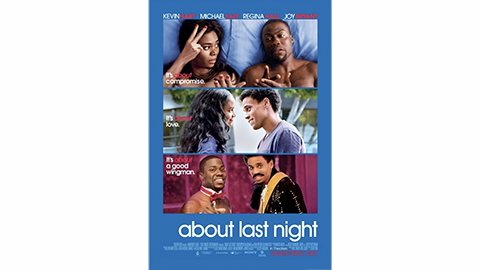
Grids make structuring a layout into meaningful blocks of content more accessible.
Focal point
Giving your viewers and readers a single focal point can be a great way to balance a composition. Structuring your content around a single focal point helps build hierarchy and creates a sense of flow between elements.
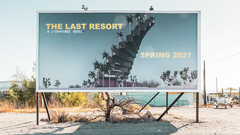
Consider using a large image, graphic or even a pulled quote, as the focal point.
Rule of thirds
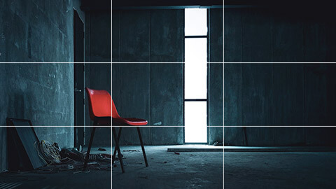
The 'rule of thirds' refers to a composition that is roughly divided into 3--horizontally and/or vertically--with points of interest being placed along the third lines or where horizontal and vertical lines intersect.
We have a natural tendency to want to place the main subject in the middle; however, placing it off-centre, using the rule of thirds, will lead to a more attractive composition.
Negative/white space
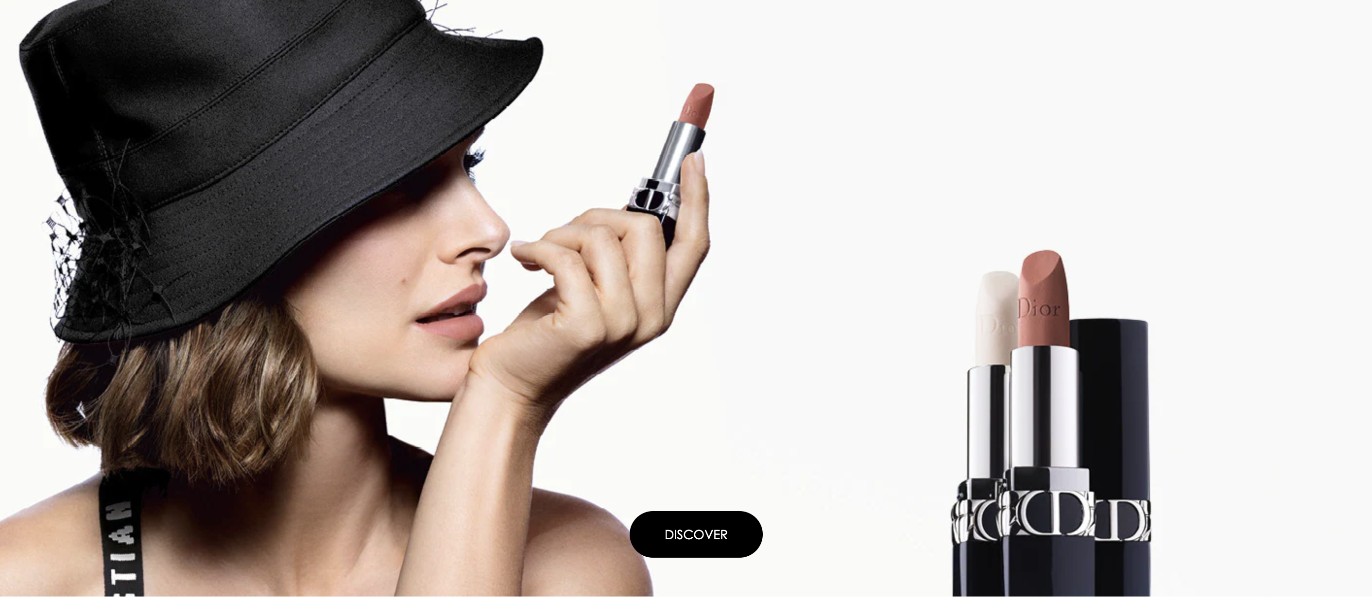
White space doesn’t have to be white! It is probably easier to understand when referred to as 'negative space'. Negative space is the space left empty in a composition. It is the gaps between elements and the comfortable spaces your viewer’s eyes can rest on.
There is a tendency for people new to design to want to fill up every space in a composition. However, it is essential to leave enough negative space to help make the content the focus.
Try:
- increasing your margin and gutter sizes
- making the space between your headings and body text bigger
- leaving a column-free of content.
Hierarchy
Hierarchy is the control of visual information in an arrangement or presentation to imply importance. Hierarchy influences the order in which the human eye perceives what it sees. Establishing a clear hierarchy makes it easier for viewers to receive the information you are trying to convey.
You can create a hierarchy using size, colour and positioning. Make the more vital elements more dominant.
Typically, visual elements with the highest contrast are noticed first.
Using hierarchy, we can control how a viewer engages with information to ensure that information is navigated and digested in the way it is intended.
Remember we asked when we looked at the concept of hierarchy earlier in the module: Where do we want the eye to look first, second, third and so on? Establishing a clear visual hierarchy is important because it holds a design together. Used effectively, hierarchy can make a complex message simple.
Have you ever noticed that the main character is always the biggest or the first in the lineup on a movie poster? The designers would intentionally create a hierarchy, presenting the most important characters to the least important--effectively utilising the hierarchy principle to show the audience at a glance who the main character is. The lead actors presented in the posters are often A-list celebrities and marketers are aware that if they are at the centre, more viewers may be interested in watching their movies.
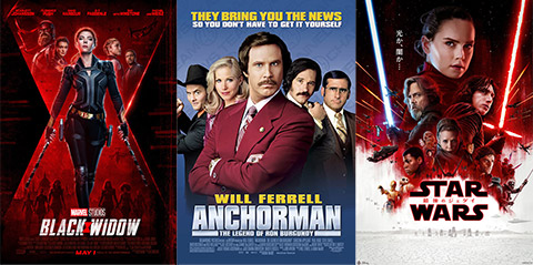
Can you think of other brands that focus on hierarchy within their advertising?
Repeated elements
Using repeat elements, colours, shapes, etc., helps build consistency and balance within a composition or series of designs. Repeating display in a multipage document helps readers view the document in one cohesive design.
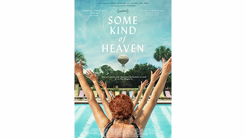
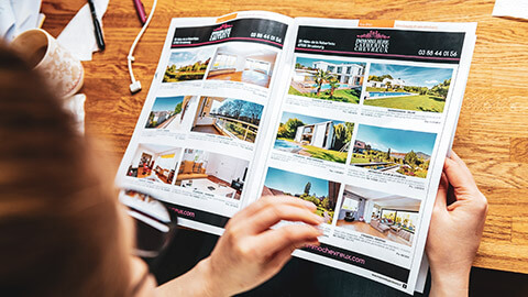
Many printed documents are folded. Folding can make a large, cumbersome document into a more compact and manageable reading experience.
Single-fold/Half-fold
Folding a sheet of paper in half creates 4 separate areas for content. While folded, a cover, or front page, will be visible. Opening the fold reveals an internal spread, and the back is seen when the document is closed.
Half-folded documents resemble books or multipage documents and can be set up as either 2 single-page spreads with fold lines or a 4-page, facing-page document.
Tri-fold/roll or C-fold
Folding a sheet of paper twice creates 3 content areas on each side. Rolling the sections from right to left creates a cover and 2 opportunities to reveal content: one when the cover opens to the left and another when the inside edge folds to the right.
Tri-folds are popular for brochures and are often designed to fit a standard DL-size card rack.
Z-fold
This is similar to a tri-fold, except rather than rolling, the sheet is concertinaed. This type of fold is suited to documents that are best viewed unfolded.

Create a simple restaurant menu using one of the folding methods below:
- Single-fold/Half-fold
- Tri-fold/roll or C-fold
- Z-fold.
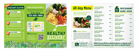
Keep in mind that layout techniques can be helpful in creating a successful design. Let your creativity soar! Share your final design with your peers in the forum.

