
Sass is an extension of CSS that adds power and elegance to the basic language.
Sass has features that do not currently exist in CSS, such as:
- nesting
- mixins
- inheritance.
Sass basics 2020 explains when you use Sass, it will take your preprocessed Sass file and save it as a standard CSS file that you can use on your website.
Let’s explore what Sass is in 100 seconds with the video below.
To use Sass:
- Install
- Compile Sass to CSS using sass command by:
- Telling Sass where to build from
- Telling Sass where to output CSS to.
For example, running sass input.scss output.css from your terminal would take a single Sass file, input.scss, and compile that file to output.css.
| Sass: Set up. |
|
Use VSCode Live Sass Compiler extension, use a task runner or download a software tool like Prepros or Codekit. |
You can watch individual files or directories with the –watch flag. The watch flag tells Sass to watch your source files for changes and re-compiles CSS:
| Watch flag command | Result |
|---|---|
sass –watch input.scss output.css |
Watch your input.scss file. |
sass –watch app/sass:public/stylesheets |
Watch your app/sass directory. |
Nesting
HTML has a clear nested and visual hierarchy. CSS does not.
That is where nesting comes in. Nesting allows you to nest your CSS selectors in the same way HTML follows a visual hierarchy.
| SCSS | Sass | CSS |
|---|---|---|
nav { ul { margin: 0; padding: 0; list-style: none; } li { display: inline-block; } a { display: block; padding: 6px 12px; text-decoration: none; } } |
nav ul margin: 0 padding: 0 list-style: none li display: inline-block a display: block padding: 6px 12px text-decoration: none |
nav ul { margin: 0; padding: 0; list-style: none; } nav li { display: inline-block; } nav a { display: block; padding: 6px 12px; text-decoration: none; } |
Mixins
It can be tiresome to write some things in CSS. Mixins allow you to make a group of declarations that you want to reuse throughout your site.
You use the @mixin directive to create a mixin and give it a name. The example below has used theme.
| SCSS | Sass | CSS |
|---|---|---|
@mixin theme($theme: darkgray) { background: $theme; box-shadow: 0 0 1px rgba($theme, 0.25); color: #fff; } .info { @include theme; } .alert { @include theme(darkred); } .success { @include theme(darkgreen); } |
@mixin theme($theme: darkgray) background: $theme box-shadow: 0 0 1px rgba($theme, 0.25) color: #fff .info @include theme .alert @include theme(darkred) .success @include theme(darkgreen) |
.info { background: darkgray; box-shadow: 0 0 1px rgba(169, 169, 169, 0.25); color: #fff; } .alert { background: darkred; box-shadow: 0 0 1px rgba(139, 0, 0, 0.25); color: #fff; } .success { background: darkgreen; box-shadow: 0 0 1px rgba(0, 100, 0, 0.25); color: #fff; } |
Inheritance/extend
@extend allows you to share a set of CSS properties from one selector to another. A placeholder class is a special type of class that only prints when it is extended. It can help keep your CSS neat and clean.
Below is an example of simple series of messaging for errors, warnings and successes using another feature. This feature goes hand in hand with extend, placeholder classes.
| SCSS | Sass | CSS |
|---|---|---|
/* * This CSS will print because * %message-shared is extended. */ %message-shared { border: 1px solid #ccc; padding: 10px; color: #333; } // This CSS won't print because // %equal heights isn't extended. %equal-heights { display: flex; flex-wrap: wrap; } .message { @extend %message-shared; } .success { @extend %message-shared; border-color: green; } .error { @extend %message-shared; border-color: red; } .warning { @extend %message-shared; border-color: yellow; } |
/* * This CSS will print because * %message-shared is extended. */ %message-shared border: 1px solid #ccc padding: 10px color: #333 // This CSS won't print because // %equal heights isn't extended. %equal-heights display: flex flex-wrap: wrap .message @extend %message-shared .success @extend %message-shared border-color: green .error @extend %message-shared border-color: red .warning @extend %message-shared border-color: yellow |
/* * This CSS will print because * %message-shared is extended. */ .message, .success, .error, .warning { border: 1px solid #ccc; padding: 10px; color: #333; } .success { border-color: green; } .error { border-color: red; } .warning { border-color: yellow; } |
Watch the video below to learn how to organise Sass when building a website.
Folder Structure
Use the project you have been working on and in the project’s public directory (the same place you have your css/js/etc. folders):
- Create an "scss" folder with folders (i.e. scss > abstracts, base, modules, layout, pages, themes, vendors ).
- Create main Sass file (i.e. scss > main.scss).
- Add an index partial file to each folder (i.e. _index.scss).
- Add imports for each index partial file to the scss > main.scss file (i.e.
@import"abstracts/index";) - Add scss files to each folder.
- In each folder’s index file, import the other scss files in the folder.
See sass-guidelin.es/#architecture to learn more about the 7 and 1 pattern.
Re-engineering a project to include Sass: Part 1
- Make sure the name of your main css file has the same name as your main scss file (i.e. "css/main.css" will correspond to the scss > main.scss file).
- Comment out the includes in scss > main.scss (we’ll use them later) and copy and paste the contents of the freelancer.css file below the comments.
- Use your transpiler (Koala, Prepros, Codekit, etc) to transpile the main.scss contents into the main.css file. The website should now show the styling.
Re-engineering a project to include Sass: Part 2
- Modularise the CSS in the scss > main.scss file into the the relevant scss files.
- Now, use Sass’s features to create a cleaner, more scalable and more maintainable code base (as you go, create variables in abstracts > variables.scss out of any globally used values.):
- Extract base styles to base folder.
- Extract main modules to the “modules” folder.
- Extract page (or main section if one page website) styles into pages folder.
- And so on…
- Create mixins, use nesting where appropriate, etc.

With CSS3 you can find an element based on (position, attribute, and state):
Position
Relational Selectors:
- Descendant:
E F - Child:
E > F - Adjacent Sibling:
E + F - General Sibling:
E ~ F
| Structural Pseudo-classes | |
|---|---|
:root |
The root element, which is always the html element. |
E F:nth-child(n) |
The element F that is the nth child of its parent E. |
E F:nth-last-child(n) |
The element F that is the nth child of its parent E, counting backwards from the last one. li:nth-last-child(1) would match the last item in any list - this is the same as li:last-child (see below). |
E:nth-of-type(n) |
The element that is the nth element of its type in a given parent element. |
E:nth-last-of-type(n) |
Like :nth-of-type(n), except counting backwards from the last element in a parent. |
E:first-child |
The element E that is the first child E of its parent. This is the same as :nth-child(1). |
E:last-child |
The element E that is the last child E of its parent, same as :nth-last-child(1). |
E:first-of-type |
Same as :nth-of-type(1). |
E:last-of-type |
Same as :nth-last-of-type(1). |
E:only-child |
An element that’s the only child of its parent. |
E:only-of-type |
An element that’s the only one of its type inside its parent element. |
E:empty |
An element that has no children; this includes text nodes, so <p>hello</p> will not be matched. |
E:not(exception) |
This is a particularly useful one: it will select elements that don’t match the selector in the parentheses. Selectors with the :not pseudo-class match everything to the left of the colon, and then exclude from that matched group the elements that also match what’s to the right of the colon. The left-hand side matching goes first. For example, p:not(.copyright) will match all the paragraphs in a document first, and then exclude all the paragraphs from the set that also have the class of copyright. You can string several :not pseudo-classes together. h2:not(header > h2):not(.logo) will match all h2 elements on a page except those that are in a header and those that have a class of .logo.1 |
| Attributes | |
|---|---|
E[attr] |
Matches any element E that has the attribute attr with any value. We made use of this back in Chapter 4 to style required inputs—input:required works in 122 HTML5 & CSS3 for the Real World the latest browsers, but input[required] has the same effect and works in some slightly older ones. |
E[attr="val"] |
Matches any element E that has the attribute attr with the exact, case-insensitive value val. While not new, it’s helpful in targeting form input types—for instance, target checkboxes with input[type="checkbox"]. |
E[attr|="val"] |
Matches any element E whose attribute attr either has the value "val" or begins with "val-". This is most commonly used for the lang attribute (as in lang="en-US"). For example, p[lang|="en"] would match any paragraph that has been defined as being in English, whether it be UK or US English. |
E[attr~="val"] |
Matches any element E whose attribute attr has within its value the full word "val", surrounded by whitespace. For example, .info[title~="more"] would match any element with the class info that had a title attribute containing the word "more", such as "Click here for more information." |
E[attr^="val"](IE8+, WebKit, Opera, Mozilla) |
Matches any element E whose attribute attr starts with the value "val". In other words, the "val" matches the beginning of the attribute value. |
E[attr$="val"](IE8+, WebKit, Opera, Mozilla) |
Matches any element E whose attribute attr ends in "val". In other words, the "val" matches the end of the attribute value. |
E[attr*="val"](IE8+, WebKit, Opera, Mozilla) |
Matches any element E whose attribute attr matches val anywhere within the attribute. In other words, the string val is matched anywhere in the attribute value. It is similar to E[attr~="val"] above, except the val can be part of a word. Using the same example as above, .fakelink[title~="info"] would match any element with the class .fakelink that has a title attribute containing the string "info", such as "Click here for more information."1 |
State
CSS2 and below
:link, :visited, :hover, :active, and :focus.
CSS3
| Pseudo-classes | |
|---|---|
:enabled |
A user interface element that’s enabled. |
:disabled |
Conversely, a user interface element that’s disabled. |
:checked |
Radio buttons or checkboxes that are selected or ticked. |
:indeterminate |
Form elements that are neither checked nor unchecked. This pseudo-class is still being considered, and may be included in the specification in the future. |
:target |
This selector singles out the element that is the target of the currently active intrapage anchor. That sounds more complicated than it is: you already know you can have links to anchors within a page by using the # character with the id of the target. For example, you may have href="#content">Skip tocontent</a> link in your page that, when clicked, will jump to the element with an id of content. This changes the URL in the address bar to thispage.html#content—and the :target selector now matches the #content element, as if you had included, temporarily, the selector #content. We say “temporarily” because as soon as the user clicks on a different anchor, :target will match the new target. |
:default |
Applies to one or more UI elements that are the default among a set of similar elements. |
:valid |
Applies to elements that are valid, based on the type or pattern attributes. |
:invalid |
Applies to empty required elements, and elements failing to match the requirements defined by the type or pattern attributes. |
:in-range |
Applies to elements with range limitations, where the value is within those limitations. This applies, for example, to number and range input types with min and max attributes. |
:out-of-range |
The opposite of :in-range: elements whose value is outside the limitations of their range. |
:required |
Applies to form controls that have the required attribute set. |
:optional |
Applies to all form controls that do not have the required attribute. |
:read-only |
Applies to elements whose contents are unable to be altered by the user. This is usually most elements other than form fields. |
:read-write |
Applies to elements whose contents are user-alterable, such as text input fields. |
Part of an element
| Pseudo-elements | |
|---|---|
E::first-letter |
Match the first letter of a text node. |
E::first-line |
Match the first line of a text node. |
Insert content at a specific location
Pseudo-elementsE::beforeE::after
Because you can absolutely position pseudo elements relative to their parent element, you can think of them as two extra layers to play with for every element. To generate content for a pseudo-element, use the content property: content: "";
To access an attribute of the selected element (CSS2) use attr(). For example:
<!-- HTML -->
<p data-foo="Hello">world!</p>

/* CSS */
p::before {
  content: attr(data-foo) " ";
}
Having easy to use navigation is an aspect that is look at from a UX design perspective. Navigation is about the easy of use and persuading users to go where the business needs them to go.
With CSS, you can transform HTML menus into cool navigation bars.
Navigation Bar = List of Links
A navigation bar needs standard HTML as a base.
A navigation bar is basically a list of links – using the ul and li elements makes sense.
<ul>
  <li><a href="default.asp">Home</a></li>
  <li><a href="news.asp">News</a></li>
  <li><a href="contact.asp">Contact</a></li>
  <li><a href="about.asp">About</a></li>
</ul>
Next, the bullets, margins and padding are removed from the list.
ul {
  list-style-type: none;
  margin: 0;
  padding: 0;
}
list-style-type: none; - Removes the bullets. A navigation bar does not need list markers.
Set margin: 0; and padding: 0; to remove browser default settings.2
Now that we have covered the standard navigation code, we can be creative with vertical and horizontal navigation.
Vertical Navigation Bar
In addition to the code above, you can style the a elements inside the list to build a vertical navigation bar.
li a {
  display: block;
  width: 60px;
}
display: block; - Displaying the links as block elements makes the whole link area clickable (not just the text), and it allows us to specify the width (and padding, margin, height, etc. if you want)
width: 60px; - Block elements take up the full width available by default. We want to specify a 60px; width
You can set the width of <ul>, and remove the width of <a>. They will take up the full width available when displayed as block elements.
ul {
  list-style-type: none;
  margin: 0;
  padding: 0;
  width: 60px;
}

li a {
  display: block;
}
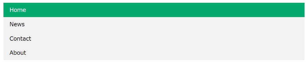
Below is a basic vertical navigation bar with a grey background colour. The links will change colour when the user moves the mouse over.2
ul {
  list-style-type: none;
  margin: 0;
  padding: 0;
  width: 200px;
  background-color: #f1f1f1;
}

li a {
  display: block;
  color: #000;
  padding: 8px 16px;
  text-decoration: none;
}

li a:hover {
  background-color: #555;
  color: white;
}
Horizontal navigation bar
A horizontal navigation bar can be created using inline or floating list items.
Inline List Items
Specify the <li> elements as inline. This in addition to the standard code explained above. display: inline; - By default, <li> elements are block elements. The example below removes the line breaks before and after each list item. This displays them on one line.
li {
  display: inline;
}
Floating List Items
Below is an example of how to float the <li> elements, and specify a layout for the navigation links.2
float: left;- Use float to get block elements to float next to each otherdisplay: block;- Allows us to specify padding and height, width, margins.padding: 8px;- Specify some padding between each<a>element, to make them look goodbackground-color: #ddd;- Add agraybackground-colorto each<a>element
ul {
  backround-color: #ddd;
}
Watch and try the tutorial below on building a responsive navigation bar.

Chrome Developer Tools – Getting started
This project will be a chance for us to practice our technical skills. Imagine that you are a web designer in an agency and have been handed a project from the UX team.
The earlier stages of the UX process have been completed and you have access to the documentation.
For this documentation, use one of the UX Portfolios from
From a technical standpoint, the CSS in your project should:
- have a browser reset and any default styles
- be well commented and structured (generic to specific
- follow a CSS methodology (be modular and reusable)
- have a low specificity
- have no unnecessarily repeated styles
- use CSS3 Flexbox or Grid for layout
The HTML should:
- be initially generated from boilerplate
- be formatted
- use HTML5 semantic tags (like "section", "footer", etc.)
The site/app should:
- be responsive (if it's a mobile app, design for tablets as well)
- contain some micro-interactions
CSS Grid is a two-dimensional layout for the web. It allows you to layout columns and grids by defining their relationships (in terms of size, position, and layer).
The horizontal and vertical lines create a pattern that can align design elements. This means your elements will not move around and change as you move from page to page.
A grid will have columns, rows, and then gaps between each row and column. These gaps are called gutters.

- Columns
- Gutters
Grid Layout
The first step is to decide on the grid that your design needs. The grid is created on 12 columns. To begin, you need to decide how many columns your content will take up (out of 12).
Columns should be nested in a row class, or you may choose to nest rows in a container class.
Below is an example code of 3, 6 and 9 out of 12 columns.
<div class="container">
  <div class="col-3">
    <!-- This content will take up 3/12 (or 1/4) of the container -->
  </div>
  <div class="col-6">
    <!-- This content will take up 6/12 (or 1/2) of the container -->
  </div>
  <div class="col-9">
    <!-- This content will take up 9/12 (or 3/4) of the container -->
  </div>
</div>
Below is an example of a three-column track grid with new rows created at a minimum of 100px and a maximum of auto.
HTML
<div class="wrapper">
  <div class="one">One</div>
  <div class="two">Two</div>
  <div class="three">Three</div>
  <div class="four">Four</div>
  <div class="five">Five</div>
  <div class="six">Six</div>
</div>
CSS
.wrapper {
  display: grid;
  grid-template-columns: repeat(3, 1fr);
  gap: 10px;
  grid-auto-rows: minmax(100px, auto);
}

.one {
  grid-column: 1 / 3;
  grid-row: 1;
}

.two {
  grid-column: 2 / 4;
  grid-row: 1 / 3;
}

.three {
  grid-column: 1;
  grid-row: 2 / 5;
}

.four {
  grid-column: 3;
  grid-row: 3;
}

.five {
  grid-column: 2;
  grid-row: 2;
}

.six {
  grid-column: 3;
  grid-row: 4;
}
All CSS grid properties
| Property | Description |
|---|---|
column-gap |
Specifies the gap between the columns |
gap |
A shorthand property for the row-gap and the column-gap properties |
grid |
A shorthand property for the grid-template-rows, grid-template-columns, grid-template-areas, grid-auto-rows, grid-auto-columns, and the grid-auto-flow properties |
grid-area |
Either specifies a name for the grid item, or this property is a shorthand property for the grid-row-start, grid-column-start, grid-row-end, and grid-column-end properties |
grid-auto-columns |
Specifies a default column size |
grid-auto-flow |
Specifies how auto-placed items are inserted in the grid |
grid-auto-rows |
Specifies a default row size |
grid-column |
A shorthand property for the grid-column-start and the grid-column-end properties |
grid-column-end |
Specifies where to end the grid item |
grid-column-gap |
Specifies the size of the gapbetween columns |
grid-column-start |
Specifies where to start the grid item |
grid-gap |
A shorthand property for the grid-row-gap and grid-column-gap properties |
grid-row |
A shorthand property for the grid-row-start and the grid-row-end properties |
grid-row-end |
Specifies where to end the grid item |
grid-row-gap |
Specifies the size of the gap between rows |
grid-row-start |
Specifies where to start the grid item |
grid-template |
A shorthand property for the grid-template-rows, grid-template-columns and grid-areas properties |
grid-template-areas |
Specifies how to display columns and rows, using named grid items |
grid-template-columns |
Specifies the size of the columns, and how many columns are in a grid layout |
grid-template-rows |
Specifies the size of the rows in a grid layout |
row-gap |
Specifies the gap between the grid rows |
Defining a grid
Begin with this code:
<!DOCTYPE html>
<html lang="en">

<head>
  <meta charset="uf-8">
  <title>CSS Grid starting point</title>
  <style>
    body {
      width: 90%;
      max-width: 900px;
      margin: 2em auto;
      font: 0.9em / 1.2 Arial, Helvetica, sans-serif;
    }

    .container > div {
      grid-column: 1 / 3;
      border-radius: 5px;
      padding: 10px;
      background-color: rgb(207, 232, 220);
      border: 2px auto rgb(79, 185, 227);
    }
  </style>
</head>

<body>
  <div class="container">
    <h1>Simple grid example</h1>
    <div>One</div>
    <div>Two</div>
    <div>Three</div>
    <div>Four</div>
    <div>Five</div>
    <div>Six</div>
  </div>
</body>

</html>
The example above has a container, with child items.
By default, these will display the normal flow.
We use the grid value of the display property to define a grid. This enables Grid Layout. Meaning all the direct children of the container become grid items.
Add the CSS file:
.container {
  display: grid;
}
These items will not look different immediately. Declaring display: grid; gives you a one-column grid.
Add more columns to see something resembling the grid. Add the CSS below to create three 200px columns.3
.container {
  display: grid;
  grid-template-columns: 200px 200px 200px;
}
Flexible Grids
Flexible grids create a responsive site. Previously a site was built to a particular size, such as a desktop. If that site was accessed via a mobile, it would look disorientated and magnified.
That was before Ethan Marcotte invented the term responsive design in 2010.
This term describes a combination of three techniques:
- Fluid grids
- Fluid images
- Media query.
A flexible grid means that you do not need to manually add every screen size your site will be viewed on. Instead you input a percentage.
Marcotte developed the formula to convert the normal pixels layout design, and convert it into a percentage.
For example:
target / context = result
}
If the target column size is 60px, and the container it is in is 960px, you divide 60 by 960 to work out the value that will be used in the CSS.
For example:
.col {
  width: 6.25%; /* 60 / 960 = 0.0625 */
}
Follow along with the video below to try out building a grid.
There are layout methods that are responsive by default. They create an easier way to make a flexible grid.
There are three modern layout methods that do this:
- Flexbox
- Multiple-column layout (multicol)
- Grid.
Flexbox
The flexbox, or flexible box layout module, allows you to create a responsive layout without using float or positioning.
Flexbox is used to create a row or a column axis layout.
The content will shrink and distribute space between the items according to the space in their container.
You can indicate how you would like the items to behave towards the space around them with the values:
flex-growflex-shrink
To begin, set up a special value of display on the parent element you want to affect.
The example below is set on <section>:
section {
  display: flex;
}
The section element will become a flex container and its children will become flex items.
Multiple-column layout (Multicol)
Multicol allows you to take a lump of content and spread it across multiple columns. Think of it like a newspaper.
A column-count can indicate how many columns you want to spread your content across.
The browser will adjust the size of the column to the user's screen size.
.container {
  column-count: 3;
}
A column-width indicates the minimum width. The browser will automatically create as many columns at your specified width, to comfortably fit into the container. The remaining space will be shared out between all columns. The number of columns will change according to how much space there is.
.container {
  column-width: 10em;
}
Grid
As explained above, grids allow content to be distributed across the grid tracks.
Jen Simmons
Jen is the creator of an experimental layout lab.
Jen explores what is possible with graphic design on the web.
Explore her channel below for inspiration.