
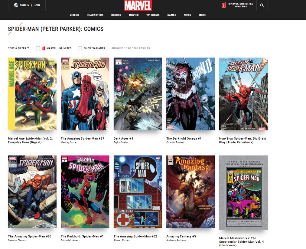
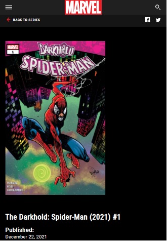
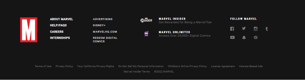
Picture this: You have just watched the latest Spider-Man movie and you were wondering, 'What species of spider bites Peter Parker?' Where can you find that information quickly? Would you ask a friend or your teacher? Would you go to the library? Or would you Google it?
I have Googled it.
And the Marvel fandom webpage provided me with the information I was looking for. It’s the Steatoda Nobilis.
The information I have accessed on that webpage is part of the 200,756,193 active websites available out there as of October 2021 (Huss, 2022).
This webpage is one of the many information technologies (IT) solutions that IT professionals like you need to oversee as part of your day-to-day job.
Others include:
- cloud computing
- data centres
- computers
- servers
- storage
- databases
- data and data management
- operating systems
- applications
- networks
- telecommunications
- application development
- security
- websites and web portals
- the internet.
An IT graduate will be competing for entry-level IT positions such as:
- web administrator
- web designer
- helpdesk technician
- client support
- systems administrator.
And there are many other job titles out there!
Your tasks might involve some or all of this or many others that might not be listed here (Half, 2022) (Wikiversity, 2022). This might include:
- security maintenance
- testing new technology
- system performance tuning
- performing backups of data
- creating and maintaining websites
- keeping the network up and running
- morning checks of systems and software
- troubleshooting any reported problems
- documenting the configuration of the system
- repairing and replacing equipment as necessary
- installing and configuring new hardware or software
- monitoring and maintaining computer systems and networks
- applying operating system updates and configuration changes
- adding, deleting, creating, modifying, user account information, resetting passwords, etc.
- providing technical support across the company (this may be in person by phone)
- installing and configuring computer hardware, software, systems, networks, printers and scanners.
Statistically, New Zealand has one of the highest percentages of small to medium enterprises (SME) compared to many other countries. Around 90 per cent of NZ businesses are small- to medium-size (less than 50 employees) and what this means to IT professionals in NZ is that they are likely to be employed in an IT generalist role. SMEs do not have the resources to hire many individuals to perform specialised IT tasks.
As a generalist, SMEs greatly appreciate your adaptability to problem-solve a range of tasks. As you progress through medium or senior roles in bigger companies, you will have the option to specialise and mentor junior IT team members.
The web is a fascinating expression of human creativity and ingenuity. Heavily reliant on technology for its infrastructure and participation, the internet has become one of the world's most important communication tools and a vital space to engage for almost all businesses.
Over the years, as technology has progressed and become more accessible, the internet itself has become more accessible. It is available on our home computers, laptops, phones and even wearable devices like watches--and likely glasses in the very near future.
Billions of devices connect and communicate over the internet. More internet-connected devices presently exist than humans worldwide. A 2014 estimate of 10 billion devices currently connected to the internet also predicted 26 billion by 2020.
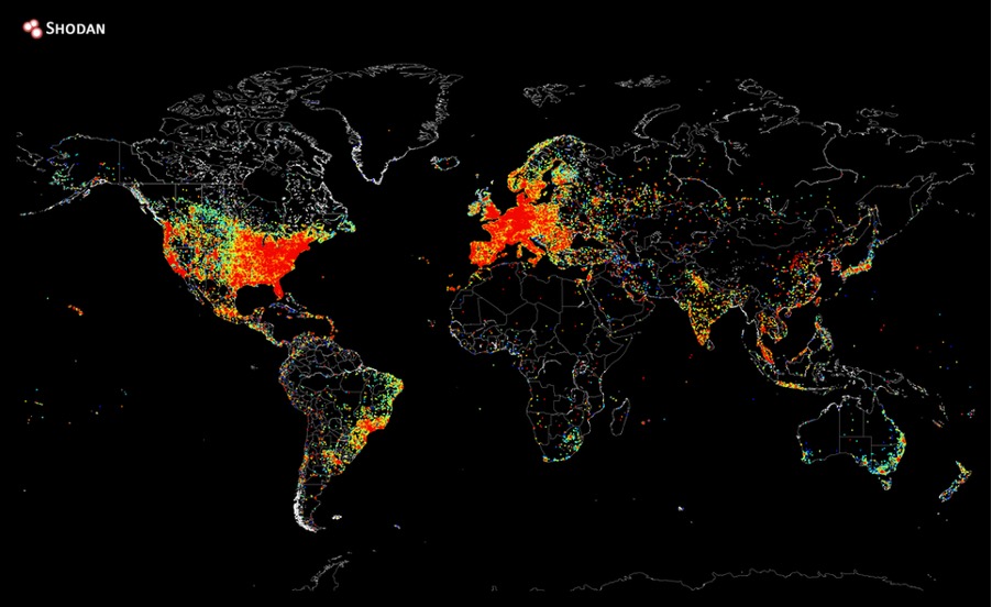
On 2 August 2014, this map was produced by Shodan (an internet-connected device search engine) founder, John Matherly. The red hot spots indicate the location of the most concentrated devices that access the internet.
But how did it all begin? How does it all work?
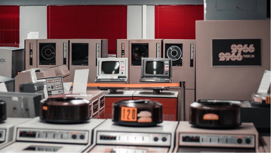
In the early 1960s, computers were huge, room-size machines. This made them prohibitively expensive and impractical for the average person to own or use. They were most commonly found in research institutes, universities and government departments, meaning you had to travel to the computer's location to use it. Moving data was not as simple as a little USB either; this required large magnetic reels for storage.
The origins of the Internet, the Advanced Research Projects Agency Network (ARPANET), connected four universities in 1969 using the protocol NCP (Network Control Protocol) so they could share files. In 1983 they implemented TCP/IP as the communication protocol, which became the foundation of the Internet as we know it today. Many large organisations use WANs for their network services
The terms 'internet' and 'web' are often conflated.
- The 'internet' describes the network and protocols that connect computers.
- The 'web', or World Wide Web, describes the billions of interconnected webpages using the Hyper Text Transfer Protocol (HTTP).
The web is what you access using a browser like Google Chrome, Apple Safari, Microsoft Edge or Mozilla Firefox.
HTTP
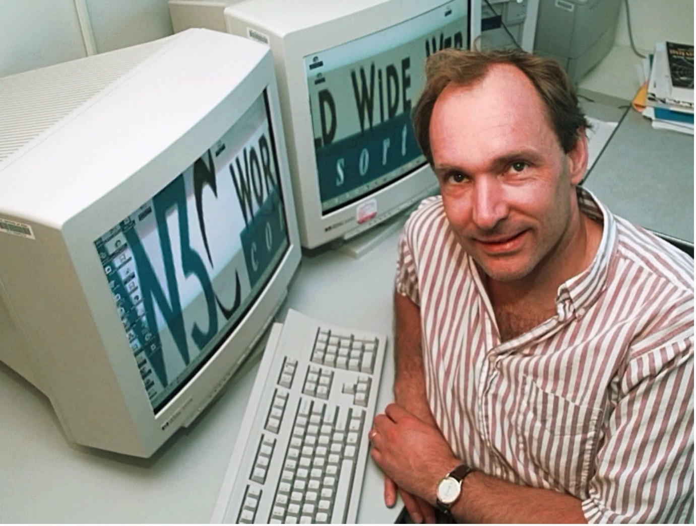
Sir Tim Berners-Lee is a British computer scientist who invented the World Wide Web in 1989. In 1990, he was responsible for creating the technologies we now know as 'the Web'. These technologies are:
- HTML: HyperText Markup Language. The markup (formatting) language for the web.
- URI: Uniform Resource Identifier. A kind of 'address' that is unique and used to identify each resource on the web. It is also commonly called a URL.
- HTTP: Hypertext Transfer Protocol. Allows for the retrieval of linked resources from across the web.
You will be familiar with the acronym HTTP. It is often visible in the address bar when entering a URL you are about to visit. It is more likely to be HTTPS, where the 'S' stands for 'Secure', meaning the site has been verified as legitimate and your connection to it is encrypted.

Adapted from Google Chrome Web Browser by Vance Banks, used under Creative Commons 4.0
- HT: HyperText. Refers to the way pages on the web are connected using links.
- TP: Transfer Protocol. Refers to making pages available, transferring the information between computers.
Webpages are written in HTML, a markup language that defines the page’s structure and content--where the headings are, which text elements are links and where images will go. The pages are stored on computers on networks around the world. The computers, known as 'web servers', are configured to run special software to host the pages and make them available. With the proper configuration, nearly any computer connected to the internet can become a web server.
Users access webpages using a browser that can read the HTML and display it.

Browsers
Early web browsers could only display text. It was not until 1993 that a browser named Mosaic became the first to support graphics and images.
Now there is a wide variety of different browsers to choose from. Each browser will offer features that its makers think are important--some provide higher speeds, others more privacy or use unique ways of managing multiple tabs and browser windows or methods to manage bookmarks.
Which browser you use can affect how you experience a webpage. Most modern browsers conform to a set of standards that make the viewing experience consistent between different browsers. However, it is essential to remember that you need to test your design for compatibility as a web designer.
The following graph identifies the top web browsers used from January 2021 to January 2022.
StatCounter Global Stats - Browser Market Share, © copyright Statcounter
Hosting services
As mentioned above, any suitably configured computer connected to the internet can host webpages. However, it is more common and beneficial to use a hosting service.
Hosting services provide users with a platform to store webpages, a unique IP address to access them, and a method for uploading files to the service. Many providers also offer database, email and DNS (see below) services.
Hosting services may also offer high levels of uptime (meaning your website will very rarely be offline) and load-balancing (meaning the services can respond to increases in traffic).
Domain Name System (DNS)
A Domain Name System, or DNS, is like a huge contact list for webpages. It is a distributed system that associates easily recognisable domain names like yoobee.com or youtube.com with complicated IP addresses like 52.187.229.23 or 142.250.191.46. IP addresses are assigned uniquely to each computer or device connected to a network. Each server on the internet also has a unique IP address.
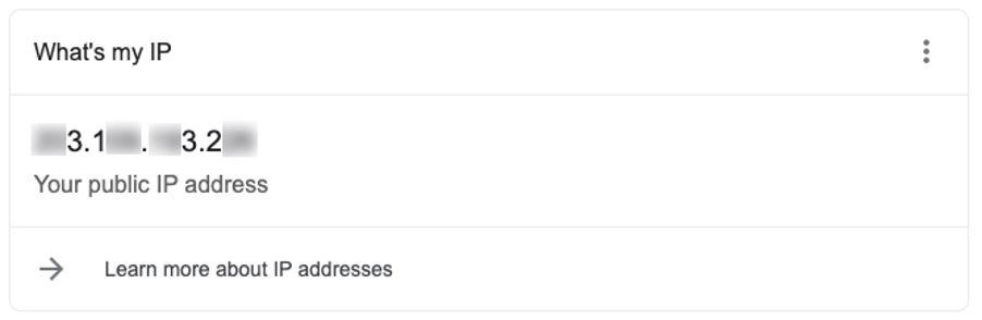
You can view the IP address your computer uses by checking your computer’s network settings.
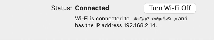
This is your local IP address.
To see the address your router uses to connect to the internet, search “what’s my IP address” in Google.
It is obviously a lot easier to remember the domain names than to remember the IP addresses of a website you visit regularly.
Domain names consist of a Top Level Domain like .com, .nz, or .org, preceded by a unique name (or Second Level Domain) like YOOBEE or YouTube.
Let’s have a look at this short video that talks about Domain Name System.
Domain names are assigned by ICANN (Internet Corporation for Assigned Names and Numbers) and can be purchased from domain registrars like discountdomains.co.nz or domains.com. Domain registrars sell domain names and manage their records, renewals and transfers.
Domain names vary in price between different registrars, Top Level Domains and length of subscription. Browse the price list for discountdomains.co.nz

- Second Level Domain
- Top Level Domain
- URL
- Domain
You may remember seeing web addresses with 'www' preceding the domain name. When you own a domain name, you can create subdomains. 'www' specifies a subdomain called 'www' and was a way to distinguish which server on a network to contact for the webpages. However, using 'www' is often unnecessary now as it is the default for most browsers.
Subdomains are still a useful way some companies separate the services and content they provide.
YouTube uses subdomains for different countries and languages. Subdomains are also used to provide access to services for account access and uploading. You can see a list of subdomains used by Youtube here.
URLs

- Protocol
- Subdomain
- Domain and domain suffix
- Directory
- Web page
A Uniform Resource Locator (URL) is used to navigate to a specific location on the web.
A URL will include the protocol (HTTP://), the domain name (yoobee.ac.nz) and often a series of folders separated forward slashes, followed by the name of a file (like index.html or photo.png).
Here is a short video that explains what a URL is.
Let’s look at another example.
You are looking at the E-Commerce (Micro-credential) course on the YOOBEE website.
You will be navigating to the course page.
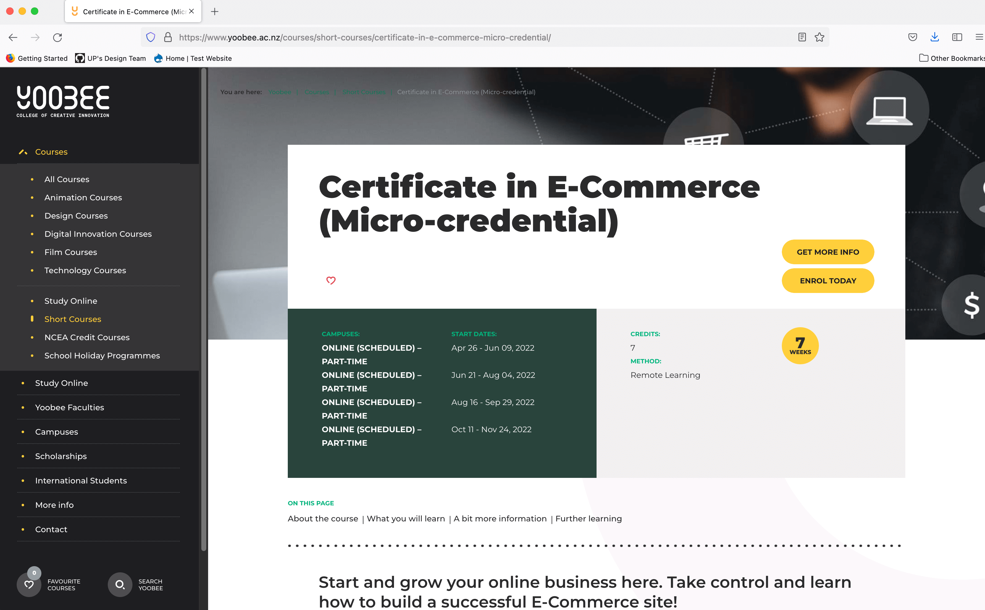
Yoobee certificate-in-e-commerce-micro-credential course page, © copyright Yoobee
If you right-click an image and select Open Image in New Tab, you can identify the URL of that image in the address bar.

FTP
File Transfer Protocol (or FTP) is used to move files between computers. A hosting service may provide FTP access to your services with a username and password.
Web uploaders
Many hosting services include a web-based file upload platform which makes getting files onto a hosting service a lot easier.
What makes a website beautiful?
Like the phrase 'beauty is in the eye of the beholder', effective web design is judged by the website's users, not the website owners. Many factors affect the usability of a website, and it is not just about form (how good it looks), but also function (how easy is it to use).
Design is not just what it looks like and feels like; design is how it works.
Websites that are not well-designed tend to perform poorly and have sub-optimal Google Analytics metrics–high bounce rates, low time on site, low pages per visit and low conversions. So, what makes good web design? Pay attention to the following principles to make your website aesthetically pleasing, easy to use, engaging and effective.
Purpose
Good web design always caters to the needs of the user. Are your web visitors looking for information, entertainment, some type of interaction or transacting with your business?
Each page of your website needs to have a clear purpose and fulfil a specific need for your website users in the most effective way possible.
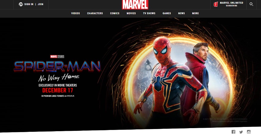
The following screenshot of a webpage displays a structured navigation bar for the user to move through the website, along with clear text to display important information. This is a good example to show the purpose of the website which is to attract customers to watch the new spiderman film in cinemas.
Communication
People on the web want information quickly. Communicate clearly and make your information easy to read and digest.
Some effective tactics include: organising information using headings and subheadings, using bullet points instead of long-winded sentences, and cutting the waffle.
Typefaces
The typefaces you choose should be legible at the very least. In general, Sans Serif fonts such as Arial and Verdana are easier to read online. Consider line length, line spacing, and kerning. The ideal font size for reading easily online is 16px (or 12pt) and stick to a maximum of 3 typefaces in a maximum of 3-point sizes to keep your design streamlined.
Colours
Limit how many colours you use. It is recommended to use a maximum of 5 (+/- 2) colours in your website design. A well-curated colour palette can go a long way to enhance the user experience.
Using contrasting colours for the text and background will make reading easier. Vibrant colours create emotion and should be used sparingly–such as for buttons and call-to-actions.
Last but certainly not least, white/negative space is highly effective at giving your website a modern, uncluttered look.
Images
Choosing the right images for your website helps brand positioning and connecting with your target audience. If you lack high-quality professional photos, consider purchasing stock photos to lift the look of your website.
If your budget allows, Shutterstock is one of the most widely used image repositories in the world, but you don't have to break the budget for good images. Envato Elements offer reasonable subscriptions for an unlimited amount of royalty-free media. Unsplash is also a very good option for photography and it's entirely free.
Think about using infographics, videos and illustrations. These can often be much more effective at communicating than even the most well-written piece of text.
Navigation
How easy is it for people to move around your website? Some tactics for effective navigation include: a logical page hierarchy, using breadcrumbs, designing clickable buttons, and following the ‘3-click rule’ (can users find the information they are looking for within 3 clicks?).
A clear navigation system must answer 2 questions instantly: ‘Where am I?’ and ‘Where can I go from here?’ If the user sees this information at a glance, the navigation is great.
Grid-based layouts
Placing content randomly on your web page can lead to a messy, haphazard appearance. Grid-based layouts arrange content into sections, columns and boxes that line up and feel balanced–leading to a better-looking website design.
When text and images are aligned so that the overall impression translates into clarity, harmony and comfort, the website gets credits. A well-organised website (see below) has an invisible grid beneath it.
'F' pattern design
Eye-tracking studies have identified that people scan computer screens in an 'F' pattern. Most of what people see is in the top left of the screen, and the right side is rarely seen.
Rather than forcing the viewer’s visual flow, well-designed websites will work with a reader’s natural behaviour and display information in order of importance (left to right and top to bottom). However, this is culturally specific so consider the localised design.
For example, Arabic is the fourth most popular language globally and read right to left (Worrick 2020). Eye-tracking studies with Arabic readers have revealed a tendency towards a flipped 'F' pattern (Pernice 2017).
Load time
If you can make yourself a cup of tea while waiting for a website to open completely in your browser, there is something amiss. Either you have an extremely slow internet connection, or the website is 'too heavy'. Even today, with super high-speed internet, a website should be built 'light and fast'.
Speed up page load times by optimising image sizes (size and scale), combining code into a central CSS or JavaScript file (this reduces HTTP requests) and minifying (compressing) HTML, CSS and JavaScript.
Mobile-friendly
Accessing websites from multiple devices with multiple screen sizes is commonplace, so it is important to consider if your website is mobile-friendly. If your website is not mobile-friendly, you can either:
- rebuild it in a 'responsive layout' (this means your website will adjust to different screen widths)
- build a dedicated mobile site (a separate website optimised specifically for mobile users).
Consistency
Is the overall visual impression of the website the same from page 1 to page 'end'? Or does the design change drastically? Are text and images displayed differently?
The design concept mimics that of a book–it must be consistent from the first to the last page.
Browser compatibility
All browsers are different and they all allow different rules and codes in websites.
This means that while some websites look good in Safari, they look terrible--or will not even show up--in Microsoft Edge. Professional web designers know this and only use code interpreted in the same way in all browsers. Check a website in all browsers to see how it performs.
It is easy to create a beautiful and functional website simply by keeping these principles in mind.

While every designer may have a different plan when it comes to building a website, they do have a common checklist. No matter how you try to avoid it, there are a few elements every website should (and usually does!) include.
From plenty of whitespace and great images to search functionality and clear calls-to-action, these common elements are what users expect when it comes to using a site with ease. Today we are taking a look at 10 elements you should prioritise on your website, perfectly designed examples of each, and tips on how to use each in your next website design project. As the saying goes, 'the devil is in the detail'.
Web layout
The first aspect considered when you start planning a web design is the layout--the basic structure of a website design. At this stage, you plan which component goes where. But before you start working on the layout, you should know the required layout size, layout style and website components.
Space
Space is one of the most important design tools because it dictates everything—from flow to readability. Designers are beginning to use space in ways that we did not see on the web a decade ago. More site designs include vast spaces, increased spacing between lines of text, and overall use of open space.
Key spatial relationships include consistency in spacing; i.e. similar elements should include similar spacing. The amount of space between lines in a paragraph should be the same, as should the amount of wrap-around images.
Space is also important for creating a focal point for users. An image or piece of text surrounded by white space will appear larger and more important than one crammed into a smaller or tighter location in the design.
It is also important to note that space is not always white. It refers to the lack of elements and could equally be a background colour or a texture.
How to Use it: Start with key elements such as navigation menus, for example. Make sure elements are organised to include set spacing between the elements. This will make each button or word stand out more clearly on its own.
Simple Navigation
Navigation can be considered in 3 parts.
- Where am I? (Present)
- Where can I go? (Future)
- Where have I been? (Past)
Web navigation is not just about the primary 'menu'. Navigation cues appear in many forms (such as menus, icons/symbols, words, quick links and buttons).
Effective navigation considers the audience. Consider what your target users are accustomed to using and what they will find easy (and hard) to use. Think about the position, appearance, actions and naming conventions of labels. If web conventions are not applied, ensure the navigation is intuitive and easy to learn.
Think about e-commerce. When you add an item to the cart, you expect 2 options–'Continue shopping' and 'View cart and checkout'. If you choose to checkout at a point after this, you know to look for a symbol of a cart or basket. What happens if you do not receive the 2 options to Continue shopping or View cart and checkout? Or if the cart and basket are replaced by a symbol of a till? In both cases, you would probably figure it out eventually, but it will require a bit more work.
How can you direct or guide users to achieve the website's primary goals? Reduce complexity. What is important enough to be seen? Group and categorise the content.
Leave a trail
Indicate to the user where they are located. This can be achieved by:
- menu appearance (change the colour and/or appearance)
- breadcrumbs
- page and section headings
- URL (page names).
Is it responsive?
Consider changing navigation structure for responsiveness. Does navigation need to be structured differently for varying viewport sizes? Or can it work effectively with just one?
About Us
A small business or site owner needs to tell users who they are. (This is less important for major companies that are household names, although it is still a common practice.)
The 'About Us' page should tell users who you are and what you do. It can outline company philosophies or goals or how the site came to be. This page can also be the place for customer or user testimonials and success stories or serve as a gateway to related pages or even social media profiles.
The one problem with About Us pages is that they get long and wordy. Keep the page simple; give users just enough information to be interested but not bored. And remember to keep the design interesting.
How to Use it: Use the About Us page to give your brand a little personality. Consider including photos of your team and a short company biography.
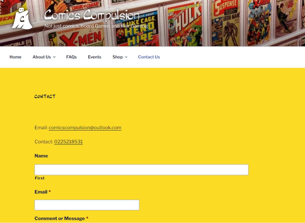
Contact Information
Contact Information commonly appears in one of two ways–in the header or main navigation or as a Contact Us page with a form or expanded information. Either option can work well, depending on your site design.
The key is making it highly visible. Contact information such as a phone number, physical address, or form to contact the website owner adds legitimacy to your site and business. It can be frustrating for users to find you if the information is not listed on the site.
How to Use it: Add contact information to all static headers and/or footers. If you have a physical business address, include location information. Consider a contact form so users can email directly from the website.
Call-to-Action (or Signup)
In most instances, a website is the gateway to an action – make a sale, provide information, gather contact information. To ensure this action, calls to action prompts need to be obvious and strong.
First, determine what your site is supposed to do. Then design it so that action is obvious and lead users to it. Techniques such as colour, contrast and space can help lead users to the “right” buttons. Connect Mania, for example, wants users to download an app. The only clickable space about the scroll on the landing page takes you to the App Store.
Another popular call to action is a signup form. If this is your goal, place the form in a prime location and size it prominently. Make the form simple and quick to fill out. (If you need more than two or three pieces of information, consider a follow-up email rather than a complicated signup form.)
How to Use it: Make calls to action obvious. Placement should be in a highly visible part of the page, and next to the item it relates to. Buttons should be of a contrasting colour and say exactly what you should do: Buy Now, Join, Download, Sign Up Free.
Search
How often have you wanted to find older information or something you remember seeing on a favourite website? That’s where search comes in. The tool is vital for repeat users. Design the box, so it doesn’t get in the way and is easy to use. Make sure the box is big enough to type terms from your website. If you use an icon for search, there’s no need to invent something new; use the standard magnifying glass.
How to Use it: Design a simple box that lives at the top of your website for search. The top right corner is the most popular location; using that space is expected and easy for users to find.
Informational Footer
A footer is how you can connect to your audience with a wealth of information without getting in the way of the design. Because the footer is at the bottom of the page, it is a logical location for a small site map, company or contact information, links and context for your site.
Make the footer useful and keep it simple. Whether you opt for a couple of buttons or a link-style design, the footer should be designed to mesh with your site but may have a much more minimalistic feel. Make it easy to use.
How to Use it: Some of the best footers combine many of the above elements. The footer is often a repeat of elements found elsewhere (such as adding search to the top of the page in the main navigation and again in the footer). It can also introduce some of the above elements and house them if there is no other logical location in the design scheme.
Style for Buttons

Every button on a site should be recognizable as a button. They should have the same shape, design effects and feel regardless of purpose or location. Creating a distinct set of buttons can be somewhat of a daunting task for sites with a lot of clickable items. Consider using a design kit to create a consistent set of elements.
How to Use it: Develop a set of buttons unique to your site. Create a consistent color theme–every button is a single hue–or overall style, such as shape or texture.
Great Images
People love to see things in action. Create stunning visuals to draw users into your site. Great images or illustrations are one easy way to do this. With a relatively small set of great photographs, you can show products, people, whatever to entice users to your site.
Both of the sites above do a great job with images that show their product and style. This type of custom imagery is important. Be cautious of using too many stock images because your site could end up looking just like something else.
How to Use it: Hire a photographer or illustrator to develop and create a great set of images for your site. Rely on custom images rather than stock images for a unique visual experience.
Web Fonts
The web was once filled with a handful of typefaces – Arial and Courier come to mind – because they were readable by most computers and browsers. A font for text (or several for the browser to work through) was defined in the HTML/CSS and as long as the user had the font on their computer, it would display. The web developer would also have added "sans-serif" or "serif" as a catch-all font descriptor in case the specified font(s) was not on the users computer—in which case the computer would substitute a sans-serif or serif font as appropriate.
If a designer wanted something fancier, they would use a design application, like Photoshop® and use a licensed font to render the text, then save the text as an image. In contrast, to a web page calling on font files on the user's computer, web font files are stored in the cloud and the font type and location is defined in the CSS. That way, anyone that accesses that webpage, also accesses that web font, regardless of whether the font was stored on the computer or not.
Web fonts are important for two key reasons – broad compatibility and no need for licensing. In addition, there are SEO benefits. When a designer creates a logo, for example, using a web font instead of an image then the business name will be picked up by search engines much more easily because the logo is text-based, and ranks higher in SEO algorithms than image names.
How to use it: Start with a service such as Google Web Fonts, which is free, to implement a set of beautiful and interesting typefaces into your site design without having to spend a fortune on licensing or worry about compatibility issues.
While there are a lot of important components to effective website design, including these ten key elements can make a difference. Take care designing with space, simple navigation, about us, contact information, calls to action, search, footer information, buttons, images and web fonts. These often-overlooked details can make or break your complete site design.
With your scope defined and content sourced, create a sitemap so you have an outline of what pages are needed and where they should go.

Basic Components:
- Header (Logo)
- Navigation
- Banner (Billboard)
- Main content area
- Footer
Secondary Components:
- Sub Navigation (Quick Links)
- Search Area
- Subscription Area
- Latest News Offers or Products
- And many more
Based on structure
The following are the three website layout based on their information structure.
- Hierarchical
- Linear
- Random
Hierarchical
This is the most common way to organise a website. A clearly defined home page characterises it with links to major site sections.

Avoid a shallow hierarchy with too many major site sections instead of chunking content into fewer, easily managed topics. Three of four items (or chunks of items) tend to be manageable for most users. Likewise, avoid deep hierarchies that break the '3-click rule' and result in frustrated users.


Linear
Pages are viewed one after the other. This is useful when all information must be presented in a defined order, such as a tutorial or tour. Occasionally a website will have a hierarchical structure overall, but linear organisations in selected areas.

Random
There is no clear path, no obvious home page, no discernible structure. This is not a common structure and usually only found on website that strive to be different and original.

Based on size
Based on the size, the layout can be:
- fluid and fit any screen resolution
- or a fixed width size.
Fluid layouts are not common nowadays; Wikipedia is among today’s top websites using a fluid layout. In the old days, layout width used to be from 900px to 990px, which were the best fit for the screen resolution 1024px and wider.
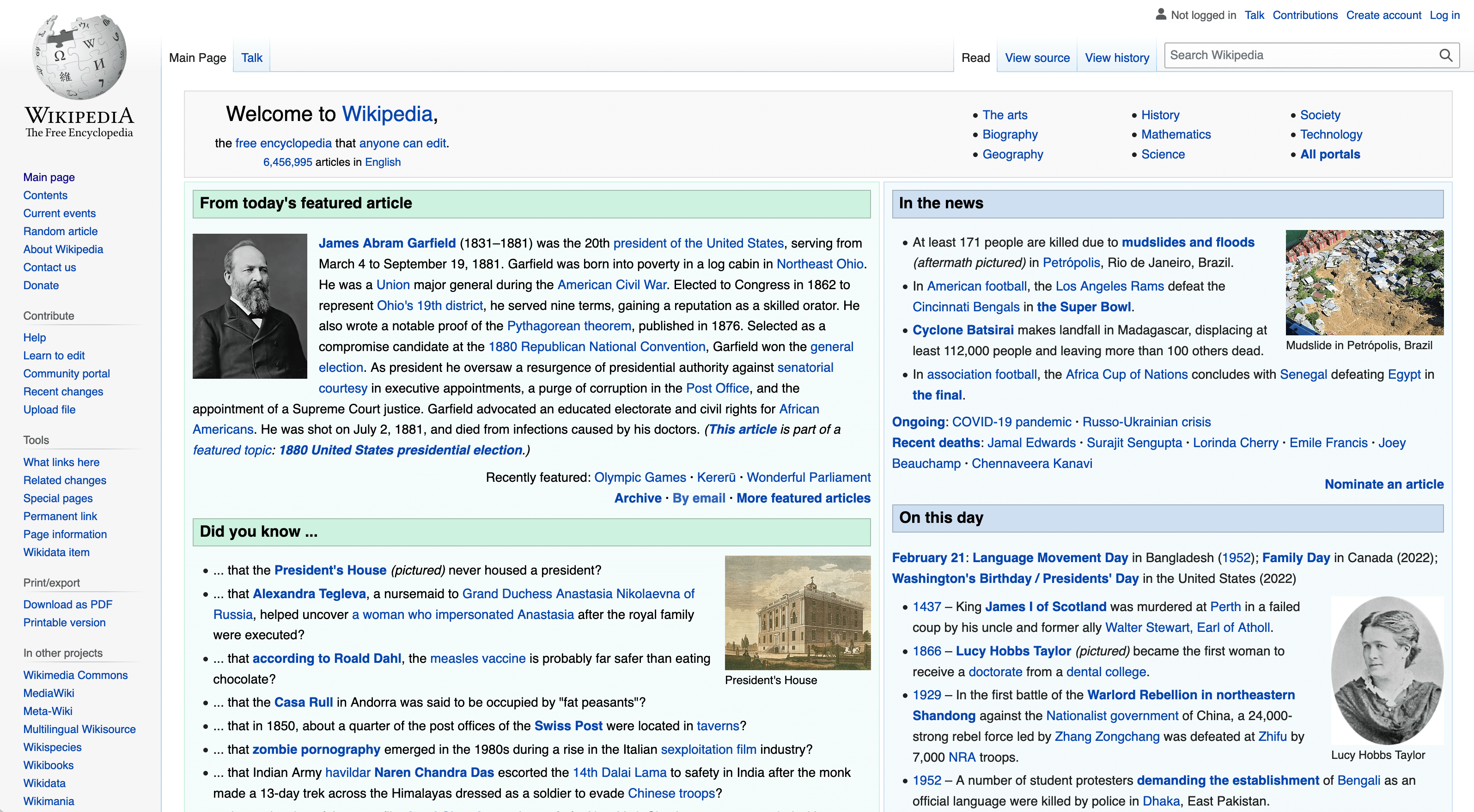
Wikipedia home page, © copyright Wikipedia
Most of today’s websites use different layout widths for different devices, referred to as responsive layouts. There are different CSS frameworks/grid systems for responsive website development. The most famous ones are Bootstrap framework, Foundation and Pure.CSS.
Each of them has its benefits. If we consider Bootstrap, the key width breakpoints are:
- 768px and up (tablets),
- 992px and up (desktop)
- For a large desktop, it starts from 1200px and goes up.
Users can add more breakpoints for mobile devices if required.
There is no standard for height; it depends on the client's content and any specifications or technology used in website development.
The correct layout size decision can be made in the light of your web page components, industry, web development technology and the end-users screen resolution. For example, suitable width for large websites is 900 to 990 pixels. Small websites with limited content can be 900 pixels or less.
Based on alignment
Like fixed-width layouts, the left-aligned layouts are not common in modern websites.
Most website designs are centre aligned; it balances the website and fits for wide screens better than the left or right-aligned websites. The website's content stays in front of the user all the time, which gives a little comfort to the user.

- Link to home page
- Primary location for shopping cart, search
- Navigation and search, identity and titles, navigation links, tab navigation
- Alternative location for scan column, navigation and search. Comon location for banner ads. Last revised, jump-to-top button
- Search, banner adds, contact information
- Contact information, copyright, dates.
Banking App
Instructions
Picture yourself visiting a weekend market. You decide on buying a burger from one of the food vendors. Unfortunately, they do not accept cash and their EFTPOS machine is down. They have asked buyers to do online banking payment using their mobile phones. Identify your steps as you open the app on your mobile device to complete payment.
Consider the following questions:
- How many steps does it take to complete the payment?
- Do you need to enter their bank account number and their name?
- Does it provide you with other options, such as entering by mobile number or email address?
- How long does it take to complete the task?
- Did you find the process to be hassle-free or troublesome?
Share your findings in the forum, and remember not to post any banking screenshots with personal information.

You will have tested throughout the process in an iterative design process, particularly during the design and development stages. Testing prototypes and coding as you create them. Once you are happy with your website, you should do a final test before going live. Run through the website with your peers and test users, checking everything from start to finish (including hyperlinks!)
Nothing devalues a brand more than a site that does not function properly, has misspellings, or has broken design elements.
It is essential to validate your website on various devices, browsers, and operating systems to ensure it works smoothly regardless of how your target audience uses the site. Combine manual browsing of the site on various devices with automated site crawlers to identify everything from user experience issues to simple broken links. Use code validators to ensure your code follows current web standards and conventions.
Launch
Now it is time to see all your hard work come to fruition – make the website live!
Maintenance
After a site is launched, it still needs to be maintained, reviewed, and content kept fresh.
This may or may not be part of the project scope. You may need to draw up a new agreement with the client for maintenance services. Or perhaps part of the project deliverables is to hand over the source code and project documents to the client to maintain.
Web design is an ongoing process where updates and changes must be made regularly to keep up with the market environment and target audience.
Validation Techniques
Validators detect problems in your web page and style sheet. It could be a tag that was opened and never closed. It could be a misspelt piece of code or a forgotten element the tag or style requires to work properly. You become a detective, hunting and solving the little problems occurring on your web page. The resources and articles on validation below will help you learn more about validating your web page.
If you have a page with a lot of HTML coding, validate it to ensure you have it all correct. And occasionally check random posts to make sure everything is still okay from time to time as part of your general housekeeping.
Validation doesn't just mean putting your pages through some web-driven testers. It also means test-driving it with friends, relatives, co-workers, and strangers. Everyone has a different system and way of working, so ask for others to test-drive your styles or themes before you make them public.
Validation Checklist
To help you validate your site, here is a quick checklist:
- Validate HTML/XHTML
- Validate CSS
- Validate for Section 508 Standards (accessibility)
- Validate for WAI standards (accessibility)
- Validate Links (check for dead links)
- Validate Feeds
- Check across different browsers (include handheld computers, Mac, PC, and cellphones, too)
- Re-validate HTML and CSS
- Have friends, relatives, co-workers check your site
- When ready, you can post your site on the WordPress Forum's Your WordPress for review
Testing
To get started, you need an environment where you have available several different browsers.
To understand which browsers your visitors use most, consult your analytics.
Google Analytics provides this information for free.
It's a safe bet that you're going to want to code your CSS for the latest versions of Firefox and Internet Explorer, Chrome (version doesn't matter much here in that Google provides automatic updates and does not force the user to install new versions manually) and Safari.
The problem here is that to install multiple versions of Internet Explorer. You'll need to set up an emulator that allows you to run another copy of Windows within your existing setup.
Sounds like a pain?
Another problem is that Firefox won't even allow you to download 3.6 anymore. So, unless it's already installed and you haven't upgraded yet, you're kind of out of luck. This brings us to the availability of online tools such as crossbrowsertesting.com and browsershots.org.
The results are not instant, they give you a range of five minutes to an hour as to when the results are ready, and the results will quickly expire if you don't view them the instant they are made available. You now have the means to test your CSS across multiple browsers.
Then there's the W3C CSS Validator.
This is a useful tool if your code needs to comply with W3C standards.
To use the validator, you plug in the URL you want to test, upload a file, or submit a direct input, and it spits back the results to you, showing where the errors are. I entered the URL of a well-established design site to test it out. It's a good bet their code is up to standards.
Imagine the surprise when the validator returned well over 100 errors.
This shows that not all professional designers adhere to W3C standards. It's up to you and your clients if that's important to you. However, one good use of this tool is finding any possible errors if you're stuck trying to fix something.
Browsers may include:
- Google Chrome
- Firefox
- Safari
- Internet Explorer
- Konqueror
- Lynx
- Mozilla
- Netscape Navigator
- Opera
Validate the web pages against industry standard
Now that you know which browsers you want to design for and know about possible tools for testing, you'll need to know how to set up your web pages to allow different CSS files to be used with different browsers.
My current understanding is that it's best to first code for Firefox and Chrome, as these two browsers allow for the most CSS3 and HTML5 and don't have the hang-ups like Internet Explorer. When you're done with the coding, test it in Internet Explorer 9 and then 8, possibly even 7. Hopefully, when you ran your analytics report, you did not see IE 6, and you can put that monster to bed.
DTD
Document Type Definition (DTD). This shows which international standard SGML and XML documents should conform to and informs how browsers, search engines etc., should handle the document. All SGML and XML documents (including HTML and XHTML) should include a Doctype reference to a DTD. Doctype is short for 'Document Type Declaration'
W3C
The World Wide Web Consortium (W3C) recommendations, www.w3.org, are widely accepted as international web mark-up languages.
The W3C website contains vast resources for web developers. Much of the discussion of evolving technologies and standards are highly technical. However, there are also significant tools for general web development, such as validators for various mark-up languages.
You must also validate your website against the industry standards as well, such as:
- W3C
- Web 2.0.

The Design of Everyday Things
Before Joining Apple, Donald Norman wrote a book titled “The Design of Everyday Things” that is now considered a significant resource for UX designers.
In the book, Norman defines his six principles of interaction design.
- Visibility
- Feedback
- Constraints
- Mapping
- Consistency
- Affordance
Visibility
The more visible something is, the more likely it will know about it and how to use it.
Applying this principle means thinking about the most important to the user and prioritizing it. It may not be possible for everything to be visible at once, so establish a hierarchy and clarify where to go next.
Feedback
Providing feedback is important. Users need to know that their action has been registered and something is happening.
There are many great ways to give feedback: changing colour, making a sound, vibrating, animation.
How do you know a web page is loading? How does the browser give you feedback?
Constraints
Limit the number of possibilities to reduce confusion and clarify the intention. Presenting too many options can overwhelm users.
Implementing this principle is about reducing complexity. Do not force the user to make too many decisions or interact with too many elements.
Look at the way modern apps handle signing up. You are often only asked for an email address or name. During each stage in the process, you only need to provide the information necessary to continue.
This is the same for a lot of shopping sites. You rarely enter all your information and payment details on one big screen. It is more likely to be broken down into stages.
Mapping
The controls of a product should have a clear relationship to their output.
This principle is about matching the controls to an outcome. The classic example is often given as the arrangement of controls on a stove top.
The examples for good mapping have controls laid out to match the positions on the stove.

The position indicator in a web page slider is another example of how mapping can aid the user.
Consistency
Similar actions should have similar results. Your users will expect similar-looking elements on a page or screen to do a similar task or behave similarly.
Imagine if all the light switches in your house flicked in different directions to turn on. Or if some of the switches were buttons. This would be an example of inconsistency: users learn how an interface works by using it. If you change the behaviour of an element, it becomes confusing and difficult to learn and remember.
Affordance
Norman Doors and Affordance

An example where bad user interface results in a poor experience are the Norman Door.
Norman Doors are named after Donald Norman.
Put simply, they are any door that is confusing or difficult to use. Have you ever pushed a door that can only be pulled? Or pulling on a door that is meant to slide?
In most cases, we tend to blame ourselves. However, there is a good chance that you were following an affordance that was presented incorrectly.
Affordance is a design aspect of an object that suggests how it should be used; it gives us a clue. When we see a doorknob, we assume that its circular appearance will allow us to rotate it to unlatch and pull to open. A door without a handle, we can assume, is to push.
A door becomes a Norman Door when its affordance does not match what it is intended to do.
Do you know of any Norman Doors?
It's not you. Bad doors are everywhere.
This same principle applies to digital products and services like apps and websites. Elements and objects on the screen have affordance, and as users, we instinctively know what to expect from them.
When we see a rounded corner object with a slight drop shadow, we recognize it as a button. We know it can be clicked, we might expect it to change slightly if we hover over it, and if we click it, we expect it to do something.

Our technology heavily relies on a Graphical User Interface (GUI).
As part of the human-computer interaction, a GUI acts as an intermediary product that connects a human's intended action with the computer's operating system. These computer operating systems power devices such as smartphones, tablets, laptop or desktop personal computers, large interactive displays, navigation systems and many more.
Designing a user interface for any device starts with the same standards and good user experience elements. However, each device is used in different contexts and therefore, as a designer, adjusting your design to enhance each experience is necessary.
There are different technologies employed to make responsive designs. Responsive designs are scalable designs that adapt accordingly to the screen size. Windows relies on its Universal Windows Page App to automatically adjust UI elements. The elements will be legible and easy to interact with no matter what devices or screen sizes they are displayed on. Apple iMac Operating System, on the other hand, uses the Auto Layout feature to adapt to its different devices and screen sizes dynamically. Both systems use EPX or Effective Physical Pixels, also called ep or px.

‘Web accessibility is about inclusion — making sure everyone, including disabled people and those using assistive technologies, can access online information and services.’ (Digital Government and New Zealand Crown 2021 CC BY 4.0)
Watch the video below and reflect on the different ways people access online content. Think about how we can create inclusive websites and mobile apps.
Here are the reasons why we need to apply accessibility in UI design,
- Great UI design relies on usability, visual aesthetic, and accessibility. Designing with accessibility in mind helps create positive user experiences and enables people with disabilities to access information and participate.
- We have an ethical obligation to ensure the design is inclusive. For many people with disabilities, technology and the internet have been transformational tools allowing them to feel connected and participate in society.
- We have a legal obligation to create accessible designs. Multiple articles in the United Nations Convention on the Rights of Persons with Disabilities set out requirements for accessible online content.
- Article 4: General obligations
- Article 9: Accessibility
- Article 21: Freedom of expression and opinion and access to information.
Ronald Mace and his team developed seven universal design principles in 1997. These design principles help ensure we design products for all abilities.
| Principle | Definition | Example | |
|---|---|---|---|
| 1 | Equitable use | The design is useful and marketable to people with diverse abilities. | Images have alt text so blind and vision-impaired users can use screen reader technologies. |
| 2 | Flexible use | The design accommodates a wide range of individual preferences and abilities. | Audio visual media has closed captions, sign language, and transcripts options. |
| 3 | Simple, intuitive use | The use of the design is easy to understand, regardless of the user's experience, knowledge, language skills, or current concentration level. | Headings and page titles are meaningful. |
| 4 | Perceptible information | The design communicates necessary information effectively to the user, regardless of ambient conditions or sensory abilities. | Icons and text are used together. |
| 5 | Tolerance for error | The design minimises hazards and the adverse consequences of accidental or unintended actions. | Data validation to ensure users cannot book reservations in the future. |
| 6 | Low physical effort | The design can be used efficiently and comfortably and with minimal fatigue. | Keyboard shortcuts. |
| 7 | Size and space for approach and use | Appropriate size and space is provided for approach, reach, manipulation, and use regardless of the user's body size, posture, or mobility. | Buttons are large and appropriately spaced out. |
Knowledge check
Complete the following three activities.