
In this topic, we will cover:
- Overview
- Web fonts for WordPress
- Principles of typography
- Best practices
- CSS.
Typography refers to the design (art and technique) of arranging type for display. It is a key aspect of any design project that utilises text. The root words that comprise typography are typos, meaning impression or mark, and graphia, meaning writing. Typography then literally means “making impressions with writing”.
All textual elements in your project can benefit from productive use of typographic principles, even functional elements you may not think of as strictly related to design. For example, as far as site visitors are concerned, buttons are just text inside a shape that produces a result when clicked. Therefore, having an appealing design is important to communicate its function and encourage usage.
Good typography makes text easy to read and understand. It can also add visual interest and personality to your project. Typography can be used to convey a certain mood or tone. For example, a more serious tone can be conveyed with a serif font, while a playful tone can be conveyed with a sans-serif font.
There are a few key things to keep in mind when working with typography:
- Use a hierarchy to organise your text. This means using different font sizes, weights, and styles to create a visual hierarchy of importance.
- Limit the number of fonts you use. Too many fonts can be distracting and make your project look cluttered.
- Consider the readability of your text. Choose fonts that are easy to read and make sure there is enough contrast between the text and the background.
- Use white space to your advantage. Give your text room to breathe by adding extra space between lines and around elements.
- Pay attention to the details. Make sure your text is properly aligned and kerned (the space between letters).30
Typography should honor the content in a way that never adds to the user’s cognitive load. 31Nick Babich
Font versus typeface
People often confuse fonts and typefaces or use them synonymously, but there is a difference.
A typeface is a set of distinct glyphs that characterise a particular style of lettering.
Fonts are variations within a typeface, like italic or bold.
You might hear someone using the 2 terms interchangeably because of the genericisation of “font.” Think of the way someone might refer to a vacuum cleaner as a “Hoover,” or a tissue as a “Kleenex.” The particular style (font) has come to represent the generic style (typeface). While the difference may seem negligible, knowing the distinction will help you better articulate your ideas to stakeholders.
A typeface is a set of styles, while a font is a specific instance of that style. For example, Helvetica Neue is a typeface, while Helvetica Neue Regular is a font.32

Typefaces
Typefaces are known as “font families,” referring to lettering design. These design elements include:
- size – refers to the measurement of the font’s dimensions (for example, 12pt)
- weight – refers to the thickness of the font’s stroke (for example, bold)
- slope – refers to the slant of the font (for example, italics)
- width – the side-to-side measurement of the font’s characters (condensed).
There are 3 basic typefaces:
- serif – which includes embellishments at the end of letter strokes
- sans-serif – which does not include embellishments at the end of letter strokes
- decorative – which refers broadly to elaborate/creative fonts that do not fit neatly into either of the previous categories.32

Serif fonts have been traditionally thought to provide better readability, perhaps due to the little strokes acting as visible anchors in the absence of marked lines. This is why we often see them in physical printed publications with enormous volumes of text, such as newspapers. However, other studies have proved this theory to be inconclusive, particularly for web design. This is because embellishments might be distracting and slow down comprehension.30
Anatomy of a letterform
To help us understand the language and basics of type, let us break down the anatomy of a letterform. Consider the following diagram:

1. Baseline
The baseline is the imaginary horizontal line on which most characters sit. The only character that hangs below the baseline in the diagram previous is the lowercase "q".
2. Cap height
The cap height or capline is another imaginary line. This one marks the height of all capital letters in a typeface. Notice that the cap height is below the maximum height of the typeface.
3. Crossbar
A crossbar is a stroke that connects 2 lines in the capital letterforms of "A" and "H". A horizontal stroke that does not connect 2 lines, like the one in the lower case "f" or "t", is known as a cross stroke.
4. Serif
As previously noted, serif is the name given to finishing strokes at the bottoms and tops of certain typefaces.
5. Mean line
The mean line (or midline) is another imaginary horizontal line. This one marks the top edge of the lowercase letters. Despite what its name might imply, the mean line is not always exactly centred between the baseline and the cap height.
6. Bowl
The bowl of a letter is the rounded curve that encloses negative space in a letterform. Examples of bowls can be seen in the letters "D", "o", and "g".
7. Descender
The descender is the lower portion of a lowercase letter (such as "g", "j", "p", "q", and "y") that extends below the baseline of a typeface. The only other characters that typically extend below the baseline are the old-style numerals in some typefaces. Here is an in the Georgia typeface (right):

These types of numerals were thought to blend better with lowercase roman numerals. They also look good when used in body text.
8. Counter
The counter is the negative space within a letter. Counters can be fully enclosed (such as in the letters "A", "o", and "P"), or non-closed, as in the letters "G", "u", and "c").
9. Tittle
Tittle is the name given to the dot above the lowercase "j" and "i”.
10. Stem
A stem is the main vertical or diagonal stroke in a letterform. These include the vertical portions of the letters "I" and "H", as well as all the strokes in the letter "W".
11. Terminal
A terminal is the end of a stem or stroke that has no serif. However, even the ends of some serif typefaces have terminals, as you can see in the letter "c” from the diagram previous.
12. Ascender
An ascender is an extension in lowercase letters that rises above the mean line. Those letters include "b", "d", "f", "h", "k", "l", and "t".
13. Leg
Legs (or tails) are the lower-angled strokes seen in the letters "K", "R", and "Q".
14. Ligature
In the previous image, you might have noticed that the "f" and "i" of the word "fix" are combined into a single character. This joining of characters is known as a ligature.
15. x-height
x-height is the distance between the baseline and mean line that defines the body of lowercase letterforms—excluding ascenders and descenders. In short, it is the vertical space occupied by the lowercase "x" in a given typeface. X-height is a key factor in typeface identification, and typefaces with larger x-heights are generally regarded as being more readable. You can actually use x-height (ex) as a relative unit of measurement in CSS, although it is not very practical.33
Typography terminology
Now you know the elements of a letterform, let us take it one step further and cover some basic typography terminology. Understanding the jargon will help you communicate more effectively with stakeholders and create better designs.34
Kerning

Kerning adjusts the space between 2 letters. Set too closely together and words are indecipherable; while set too far apart and they become awkward to read. Furthermore, if the spacing between letters is inconsistent, it can be frustrating for someone to read without, even if they do not pick up on what is wrong.34, 35
Tracking

Tracking is also an adjustment in letterspacing, but this time refers to uniformly increasing or decreasing the horizontal spacing between a range of characters (within words).34, 35
Leading

Leading (pronounced “ledding”) is the vertical spacing between 2 baselines of type. This is more frequently called line height nowadays.
Here are a few helpful heuristics to follow for line height:
- Experiment with 130%-180% for optimal readability and accessibility. Test different scales on your typeface. The goal is to find a sweet spot — too much spacing will make it easy to get lost, while too little will make it hard to read.
- Check line spacing when changing fonts or font sizes. Different fonts have different maximum heights, so double-check line spacing for readability.
- Limit line length to no more than 80 characters. Long lines of text can be intimidating and confusing to follow.
- Small fonts should have more spacing because they are harder to read. Additional space makes it easier to parse.34, 35
Web fonts are fonts that have been licensed specifically for web use. Traditionally, designers were limited to a small set of common system fonts that were already installed on a user’s computer (think Times, Arial, Helvetica, and Verdana). Around 2008 or so, each of the major web browsers began implementing a version of @font-face linking, which allowed designers to use a wide range of fonts to improve the website's design and/or readability significantly.
There are a few things to keep in mind when using web fonts from WordPress:
- Web fonts are subject to copyright and licensing agreements. Be sure to check the terms of use before using any web fonts on your WordPress site.
- Web fonts are often served from a third-party server, meaning an additional DNS lookup and connection are required to load them. This can impact the loading speed of your pages, so be sure to test your pages with and without web fonts to see which works better for your particular site.
- Web fonts are not always supported by all browsers, so you may need to provide a fallback font in your CSS.36
What is @font-face?
@font-face is a CSS rule that allows you to embed a custom font from your server to render a webpage, even if it is not already installed on the site visitor’s computer. Not only is it cross-browser compatible, but it also means a designer is not limited to relying on “web safe” fonts.
In addition, designers and ‘type foundries‘ (companies that design or distribute typefaces) do not want their raw (.ttf and .otf) fonts uploaded to websites where they can easily be downloaded (stolen). “Raw” means an uncompressed, unprotected font file like you would find in the font folder on your computer. @font-face permits linking directly to the raw font file.36
Using @font-face
Imagine we have a website, and we want to make the headers of posts stand out by changing their font. We will use WordPress TwentySixteen Theme to demonstrate throughout this tutorial.
Remember to back your site up before proceeding with any changes.
1. Find the font you want to use
We will be using the free Meadowbrook font.
- Download the font from the website by clicking the Download button.
- Open the zip file. You will see Meadowbrook.ttf file there. Keep in mind there are various font formats and they are not all suitable for different platforms. TTF is a font format compatible with Internet Explorer version 9.0 and above, Chrome 4.0 and above, Firefox 3.5 and above, Safari 3.1 and above, and Opera 10.0 and above. To make your website work on all cross-platform web browsers, we need to get the same font in multiple formats.
- It is possible to convert a font yourself, but a simpler way is to use Squirrels @font-face generator. This also generates the CSS code we need for the next step.
- Upload the Meadowbrook.ttf file to the generator, choose “Optimal,” and tick the agreement.
- Download the resulting kit. It should be a .zip file with the font formats required, a .css file, and an .html test file.
2. Place the font files in your theme directory
- Make sure you have activated WordPress TwentySixteen theme.
- Upload the fonts to the base directory of your theme. It is easier to keep your files organised if you create a fonts folder in /wp-content/themes/twentysixteen and put the files there.
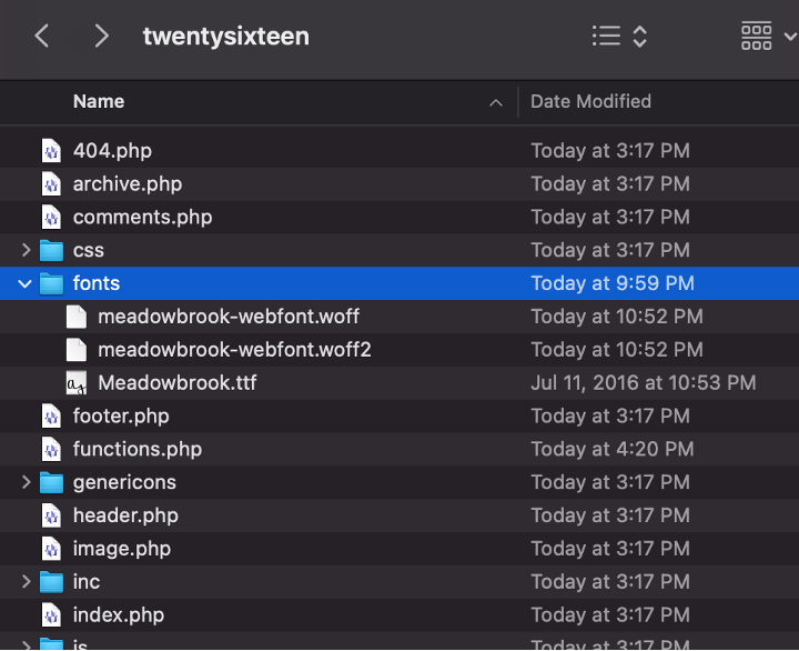
Web Fonts by WordPress, © WordPress
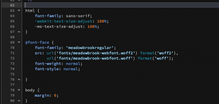
3. Add the @font-face declaration code into your CSS
- Open stylesheet.css in the .zip file you downloaded from Squirrel @font-face generator.
- Copy its content.
- Embed it to your theme’s stylesheet: Open the style.css file in your text editor. The theme’s style.css file’s path should be: /wp-content/themes/twentysixteen.
- Paste the @font-face {...} piece right before the body {...} part.
- Because we made a fonts folder, we now need to modify the code a bit. Add “fonts/” to the beginning of each font location:
- Save the file.
Web Fonts by WordPress, © WordPress
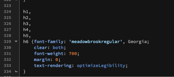
4. Call the font using font-family:
- Continue editing style.css file: Find a section where all the headers are described. You can search for ‘h1,\nh2,\nh3,\nh4,\nh5,\nh6 {‘. Add the following line to the body of this attribute:
font-family: 'meadowbrookregular', Georgia;
Here ‘meadowbrookregular’ is a reference to the font-family name we initialised in the previous step, and Georgia is a failover font that will be used in case ‘meadowbrookregular’ is not available. - Save the file.
Web Fonts by WordPress, © WordPress - Create a new post with some headers, or refresh an old one. Note the new styling.
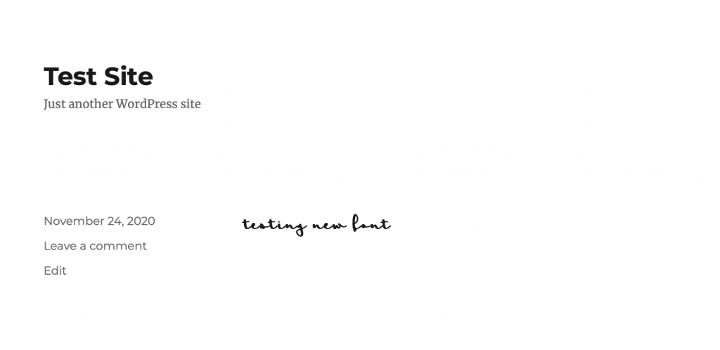
Web Fonts by WordPress, © WordPress

Typographic principles are not just arbitrary design rules to follow; they are techniques to make your writing more legible, readable, accessible, and aesthetically pleasing, which in turn helps better communicate ideas. Here are some basic, universal typography elements you should know about.30
Consistency
In any project, it is advisable to avoid clutter by limiting the number of fonts used – 2 or 3 fonts in a single project are usually sufficient. When in doubt, use standard fonts.
Good typography draws readers to the content, not the type itself.31Nick Babich
Whatever your preference, try to keep typefaces consistent. For example, use sans-serif fonts for headings, serif fonts for body text, and reserve decorative fonts for titles as these usually have low readability. Avoid tacky, overused fonts if you want your project to stand out.30, 31
Here is an example of what not to do:

Hierarchy
Typographic hierarchies keep your ideas organised so viewers can easily identify the information they need. We do this by structuring the size and weight of fonts on a page.
For example, a restaurant website could have the site name at the very top of the page in a large decorative font. Underneath, there may be a navigation bar, with sections of the site listed in a consistent style and smaller font size (for example, Home, About, Menu, Contact). The Menu page could have additional subheadings (Entrees, Mains, Dessert) in bold, and include descriptions in small body text.
Hierarchy breaks up your content and helps viewers scan for specific information. In the age of information overload, people want digestible information quickly, and readers’ attention comes at a premium.
Particularly for web content, it is important to break information down into smaller, concise paragraphs to reduce cognitive load.34

Contrast
Contrast is important for emphasis and visual interest. We utilise contrast by varying the size, typeface, weight, colour, and style of the text. You can also use typographic contrast to present 2 opposing ideas in a visual way.
Typography Elements Everyone Needs to Understand by Laura Martin, © Laura Martin
The more visible text is, the easier it will be to scan and read. We can improve text visibility by contrasting text and background colours. The W3C recommends the following contrast ratios for body text and image text:
- Small text: Contrast ratio of at least 4.5:1 against its background
- Large text (at 14 pt bold/18 pt regular and up): Contrast ratio of at least 3:1 against its background.
Once you have determined which colours to use, test it on real clients across multiple devices to confirm readability and accessibility.31
Colour
Colour is arguably where you will have the most variation in your typographic design. There are 3 main components of colour:
- hue – the shade of the colour
- saturation – the intensity of the colour (the horizontal axis of the colour gradient)
- value – the lightness/darkness of the colour (the vertical axis of the colour gradient).

Typography Elements Everyone Needs to Understand by Laura Martin, © Laura Martin
A compelling colour design will have all 3 components working in contrast. An effective way to check if your colours have enough contrast is to view the design in greyscale. If the elements blend into each other, you may not have enough contrast.
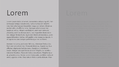
Typography Elements Everyone Needs to Understand by Laura Martin, © Laura Martin
You might have seen some contemporary websites invert traditional contrast by using light text against a dark background. While this is visually striking, it is more difficult to read than the standard dark on light, so use your discretion when applying this style, and reserve it for smaller chunks of text.30
Alignment
Alignment refers to the orientation of the text (which “line” it points towards). This can be on the level of individual words, sentences, or paragraphs, and applies to images too.
Like other typographical elements, alignment should be consistent. Each design element should align with another to maintain equal size and distance between objects. For example, you might want the logo to align with your main header, and your subheadings to align with the same margins as your body text.
Typography Elements Everyone Needs to Understand by Laura Martin, © Laura Martin
Many publishing and design programmes have ruler tools to help you align design elements. Try contrasting right and left-aligned text to make your project more exciting. However, reserve left alignment for body text, as English readers naturally read left to right, and upsetting that expectation may be jarring.30
Whitespace
Whitespace refers to the empty areas around objects or text and includes margins, padding, or any uncluttered area. These give the viewer breathing room and make the design elegant.
As mentioned, readers do not want to be bombarded with large volumes of information all at once. Rather than strengthening your perspective, it has the opposite effect: providing all the text upfront can be intimidating or hard to read. Instead, employ whitespace to highlight key sections.

Contrasting text with empty areas is an effective way to grab the audience’s attention. Use strategically, whitespace can be just as powerful as text and is estimated to improve comprehension by up to 20%.30, 31

An estimated 95% of information on the internet is in the form of written language.31 Therefore, clear and concise writing is invaluable to help us capture readers’ attention, and effectively communicate ideas to each other. Typography can be leveraged in this effort to make text elements more attractive. Oliver Reichenstein even goes as far as to say:
Web Design is 95% TypographyOliver Reichenstein
Now that we have covered the basic principles of typography, let us cover some best practices in utilising those principles.
Minimise the number of fonts used
UX designers often cite 3 as the maximum number of fonts that should be used in any one project. Any more than this can make your website look disorganised and unprofessional. Here is another example of what not to do:

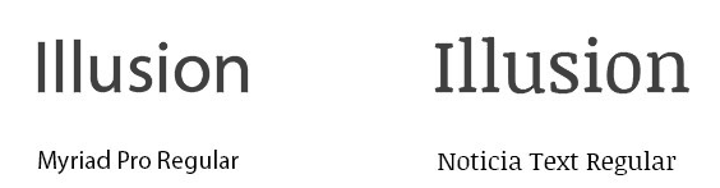
Try to stay within the same font families, and be consistent in how you use them throughout the site. Make sure the different fonts also complement each other. A good rule of thumb is to choose font pairings with similar typeface design elements (character size, weight, slope, and width). Look at the following example:

Georgia and Verdana are complimentary fonts because they share similar character values, while Baskerville and Impact are an inharmonious pairing because the weight of Impact is far heavier than that of Baskerville.31
Learning activity: Complimentary font pairings
Open any software with a selection of fonts and find 2 fonts that are complimentary. Note any observations about their character values, then repeat the process with 2 non-complimentary fonts.
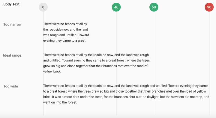
Limit line length
Limiting the number of characters on each line of text will help maximise the readability of your work. This is not project-specific, and is particularly important for body text. Your priority should ways be legibility rather than design. The Bayman Institute suggests 60 is the golden number of characters per line on a standard screen.
Consider the following example:
10 Tips on Typography in Web Design by Nick Babich, © Nick Babich
If a line is too short, the eye must travel back frequently, breaking the reader’s rhythm. If a line is too long, the reader will have difficulty focusing on the text.
Bear in mind different screen sizes will have different optimal line lengths. Your typography design should be scalable, so the number of characters per line is proportionate to screen size. For mobile devices, it is recommended to limit line length to 30–40 characters.31
Choose typefaces that work well in various sizes
Because users are likely to access your site from all kinds of devices with different screen dimensions and resolutions, it is also advisable to use typefaces that are versatile, and maintain readability in multiple weights and sizes.31
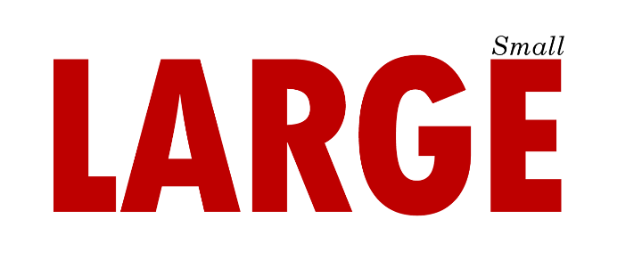
A good way to test your fonts is to view them on a mobile device. For example, decorative fonts that use cursive script are often more difficult to read in smaller font sizes:

Use fonts with distinguishable letters
Many typefaces make it too easy to confuse similar letterforms (such as, “i”s and “L”s), as in the following example:
10 Tips on Typography in Web Design by Nick Babich, © Nick Babich
When choosing a typeface, test it out in different contexts to make sure it will not confuse your readers.31
Avoid all caps
Using all caps will slow down the speed readers can scan a text and comprehend it. This is compounded if the body text is bolded.
Therefore, paragraphs and content that requires the reader to focus for longer periods of time, should have usual case conventions.
But, not all text requires significant reading comprehension. For example, logos and acronyms have low comprehension costs because you do not “read” them the same way you would normal words, so you might see all caps there.31
Accessibility
Everyone wants a website that will stand out from the rest but keep accessibility at the forefront of your design decisions too. Remember the purpose of your design should be to convey your ideas effectively – do not sacrifice clarity for aesthetics. When in doubt, ask yourself: is this the best way to communicate my idea to my audience?31
Here are some guidelines.
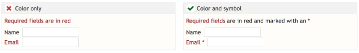
Avoid red and green text
Colour blindness is a common condition affecting an estimated 4.5% of the entire population.37 For inclusivity, avoid using red or green text in your projects. This is particularly important when conveying essential information.
For example, do not rely on the colour of a red message at the end of a term sheet to prompt readers to stop and consider the fine print, or a green message to confirm an order has been received after buying something online.
Consider the following example:
10 Tips on Typography in Web Design by Nick Babich, © Nick Babich
On the left is an example of poor inclusive design because the critical information and instruction rely on users’ ability to see the colour red. The left example is more inclusive because it uses a combination of symbol (asterisk [*]) and colour (red) to identify the required field.
Avoid blinking text
Content that flashes or flickers can trigger seizures in susceptible individuals. Think of a typographical animation on an online marketplace alerting you to multiple deals. Even for those unaffected by seizures, it is annoying or distracting at best. If you want readers to read your work, one of the worst things you can do is have disappearing text, or draw their attention away from something important with an animation that is too loud.
Prioritise readability
To ensure our typography is easily readable and accessible to people with disabilities like colour blindness, vision disabilities, hearing disabilities, and more, follow Web Content Accessibility Guidelines (WCAG).
Here are a few standards that will optimise your UI for readability. Find more at Accessible.org.
- Text size should be 16pt at minimum. This is device-specific, but it is a good rule of thumb. On a TV interface, the text should be even larger.
- There must be a colour contrast ratio of at least 4.5:1 between all text and background. Download the Stark plugin to ensure you are meeting this standard in XD, Sketch, and Figma.
- Do not rely on colour alone to convey information. For example, an error state should not only be displayed with a red outline – use a warning icon and descriptive text as well to alert that an issue has occurred.
- Text resize (1.4.4): Text must be able to be resized up to 200% without negatively affecting the ability to read content or use functions.
- Images of text (1.4.5): Do not use images of text unless necessary (for example, logos).31
Define type scale guidelines

To create type scale guidelines for a UI project:
- Select a font to work with – You can get high-quality UI fonts from Google fonts or Adobe Fonts.
- Establish a base font size – Start by establishing the most used type scale for body copy (for example, 16pt), then determine a suitable line height.
- Line height – As previously mentioned, experiment with between 130%-180% for optimal readability. This ratio is not always accurate, but is a good place to start, then adjust as needed.
- Define a scale – A scale provides consistency, rhythm, and hierarchy to your typography. To set the type scale for H1, H2, H3, body, captions, buttons, and so on, we need a scale value to multiply by our base font size. Common scales for type are 1.250x,1.414x, 1.5x, 1.618x. Again, find a scale that works for your typeface and UI.
- Test scales on devices – Test font with different scales on multiple device sizes to decide on the right value.
If you do not want to create typography guidelines from scratch, try the Material type scale generator to generate font sizes for paragraphs, headings, buttons, and so on.34
Use recognisable words and phrases

Remember, typography design is intended to keep the focus on what is really important: the information contained in the text.
Here are some tips to convey clear messages:
- Avoid jargon – Try writing in plain English to reach a broader audience. Unless you are designing an app for experts, avoid industry-specific terminology.
- Write in the present tense – This makes the writing more direct. For example, instead of saying “message has been sent” say, “message sent.”
- Keep it concise – Most of the time, there is fluff in UX copy that can be removed. Do a quick audit and see if you can reduce the words to a bare minimum.
- Begin with the objective – When a phrase describes a goal and the action needed to achieve it, start the sentence with the goal. This prioritises the purpose of the information, so readers immediately know what to expect. For example, instead of saying “Drag a photo to the trash to remove it from this album” say, “To remove a photo from this album, drag it to the trash.”
- Keep it consistent – When addressing the user, be sure to remain in the first or second person, whichever was chosen. This will help avoid confusion.
Make writing decisions with the intention of providing readers with digestible information – get rid of any superfluous details.34
Watch the following video for tips on how to streamline your writing.
Consider language support
10 Principles for Typography in UI Design by Danny Sapio, © Danny Sapio
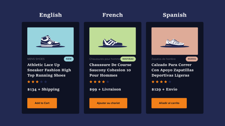
If you have multi-language support for your software, this is a constraint that needs to be accounted for appropriately, as different languages have different typefaces that can drastically change page layouts.
The first thing to keep in mind is word length — it can vary across languages, even those that use similar glyphs, such as English and German. For example, “new” is a short 3-letter word in English and fits nicely into a few pixels. However, in French, we would need enough space for “nouveau” and its 7 characters.
Some languages like Arabic and Hebrew display characters appearing from right to left. Those fonts may appear smaller than Latin ones at the same font size, requiring adjustments to line spacing and alignment so the typography works well in that UI for all languages.34

Cascading Style Sheet (CSS) is the language we use to style a web page. It is the code that determines how web pages look. CSS defines elements such as layout, colours, and fonts.38 It can control the layout of multiple pages at once, thereby saving a lot of work. External stylesheets are stored in CSS files.39
CSS Syntax

- Selector
- declaration
- declaration
- property
- value
- property
- value
It is easier to understand CSS if we break down each “sentence” into individual components.38 A CSS rule consists of a selector and a declaration block.
In the preceding example:
- The selector points to the HTML element you want to style.
- The declaration block contains one or more declarations separated by semicolons.
- Each declaration includes a CSS property name and a value, separated by a colon.
- Multiple CSS declarations are separated with semicolons, and declaration blocks are surrounded by curly braces.40
In the following example, all <p> elements will be left-aligned, with the blue text colour.
- p is a selector in CSS (it points to the HTML element you want to style: <p>).
- color is a property, blue is the property value
- text-align is a property, and left is the property value
Try changing the style by modifying the code.
How to target a specific element in CSS
There are different ways to target a specific element in CSS depending on the element itself. Let us explore a few of the most common methods.38
Using its element name
We can target an element with its name, and give it new properties and values. This is the most common way to target an element. In the following example, we target a ‘p’ tag and pass its font-size property to 16px:
All ‘p’ tags in your document will be targeted.
Using its class
A single class can be used multiple times and for different elements in a single document. If the element you want to target has a class, you can target it using that class. We do this by using a dot ‘.’ before its class name.
Assume you have a ‘p’ tag with class ‘text-small’, which will look something like: <p class="text-small">Hello World!</p>, and you want its ‘font-size’ to be ’12px’. You will write it as:
Here, only ‘p’ tags with class ‘text-small’ will be targeted. If you want all the elements no matter which they are to be targeted, simply remove ‘p’ and just use .text-small. This will target all the elements with class ‘text-small’.
Using its ID
Unlike class, id should always be unique in your HTML document. To target an element using its id, just replace the dot ‘.’ used for class with hash ‘#’. For example, if you have a ‘p’ tag with id ‘name’ that looks something like: <p id="name">John Doe</p> and want it to be bold, target it as follows:
When targeting id, you can also mention tag name before id name. It will look like ‘p#name’.
CSS for WordPress development
In the context of WordPress, CSS is responsible for the “look and feel” of your theme. HTML on its own has no style. The code in your theme’s CSS file applies style rules to the HTML content on your site, which determines its appearance.
Think of HTML as a mannequin which is responsible for the structure of your site, and CSS as the clothing you put on the mannequin. You can change the CSS anytime without altering the underlying HTML structure.38
How to edit theme CSS
While it is possible to locate and edit the existing CSS file hosted on your server, it is not recommended. This is because when your theme is updated (after new features are released or to improve security), any changes you make to the existing style sheet are overwritten by the update, erasing your customisation.
We can rectify this issue by using a plugin that keeps your changes safe from updates. We will use a plugin called “Jetpack” to demonstrate this task. This plugin’s function leaves the theme’s existing CSS untouched while inserting your modified style rules, before rendering in the browser.38
Using the WordPress Customizer
WordPress allows you to add custom CSS styles via the WordPress Dashboard. Follow these steps:
- Go to ‘Appearance -> Customise’.
- Click on the ‘Additional CSS’ tab.
- Type in your custom styles without the <style>...</style> tag.
- Save your changes by clicking the ‘Publish’ button at the top.
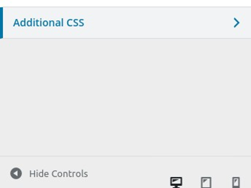
Using the WordPress Customizer by WordPress, © WordPress
Using Gutenberg Blocks (WordPress 5.0+)
The introduction of Gutenberg Blocks in WordPress 5.0 allows users to add Custom HTML blocks to individual pages or posts. Follow these steps:
- In the Editor, add a Custom HTML block.
- Inside the block, type your CSS within the <style>...</style> tag.
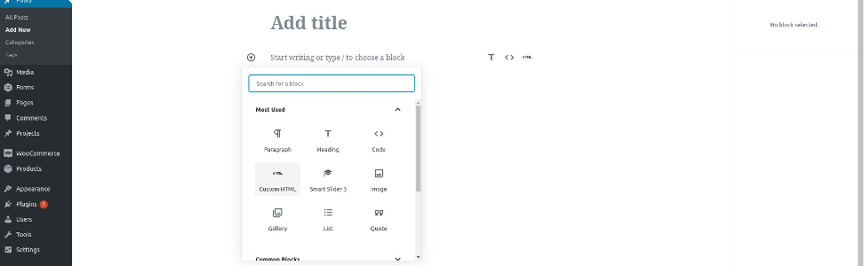
Using Gutenberg Blocks (WordPress 5.0+) by WordPress, © WordPress
Knowledge check
Modify pullquote block styles
After you have selected a theme, you may want to create your own unique look for the site.
In block themes, you can customise the styles to set your preferred typography, colours, and more for your entire site. You can also override these styles for just a few blocks.
On your sandpit site, create your own styles for the Pullquote block.
- Go to Appearance > Editor > Styles > Blocks > Pullquote.
- Configure your own font and colour styles.
- Share your pullquote style with your peers in the forum. Provide feedback on at least one other person's pullquote style.