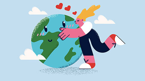
Illustrations are usually creative, fun, playful graphics that can help with appearing friendly and communicating a message more organically.
In this platform, graphics communicate ideas and concepts. It provides a visual rather than a lot of text.
Styles and techniques are as unique as they are personal to the artist. Each business would have its own unique branding that you need to follow when creating illustrations.
There are a few styles of illustration that have been around for a long time. As we explore these styles, consider the country they are most related to.
The Illustrators produced the following types of illustrations—the Illustrators are a graphic design and illustration company in Australia.
Anime
Anime is a style of Japanese film and television animation, typically aimed at adults as well as children.
The following video is an ad campaign for Nescafe in anime. Although it is not in English you can grasp the storyline of the film.
Caricature
A person referred to as a cartoonist or caricature artist is the creator of caricatures.
Caricatures can be insulting or complimentary, serve a political purpose, or be drawn solely for entertainment.
Digital Illustration Styles by Andrew Hoare © 2022 The Illustrators.
Cartoon
Cartoons are simple drawings and are popular styles for children's books and picture books. There are hundreds of different non-realistic cartoon styles.
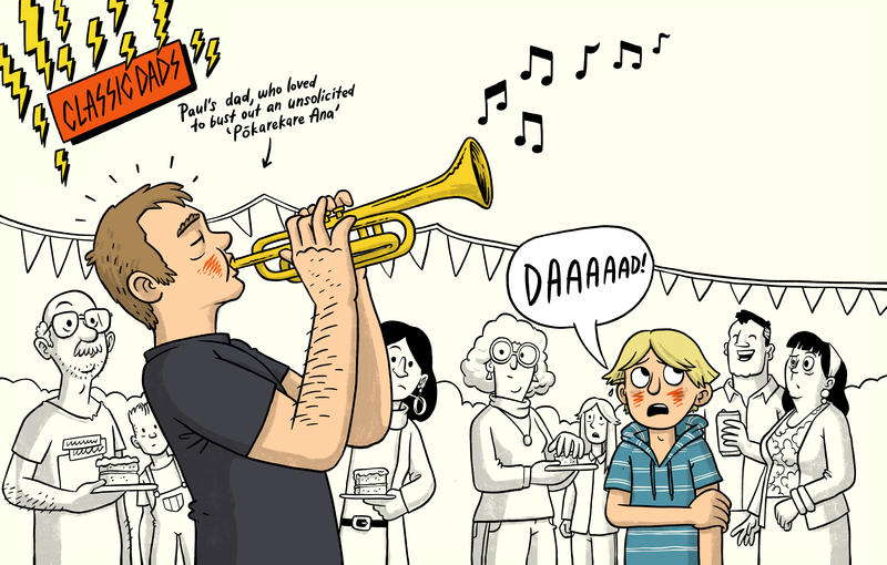
Toby Morris's Dead Man Walking, © copyright Toby Morris
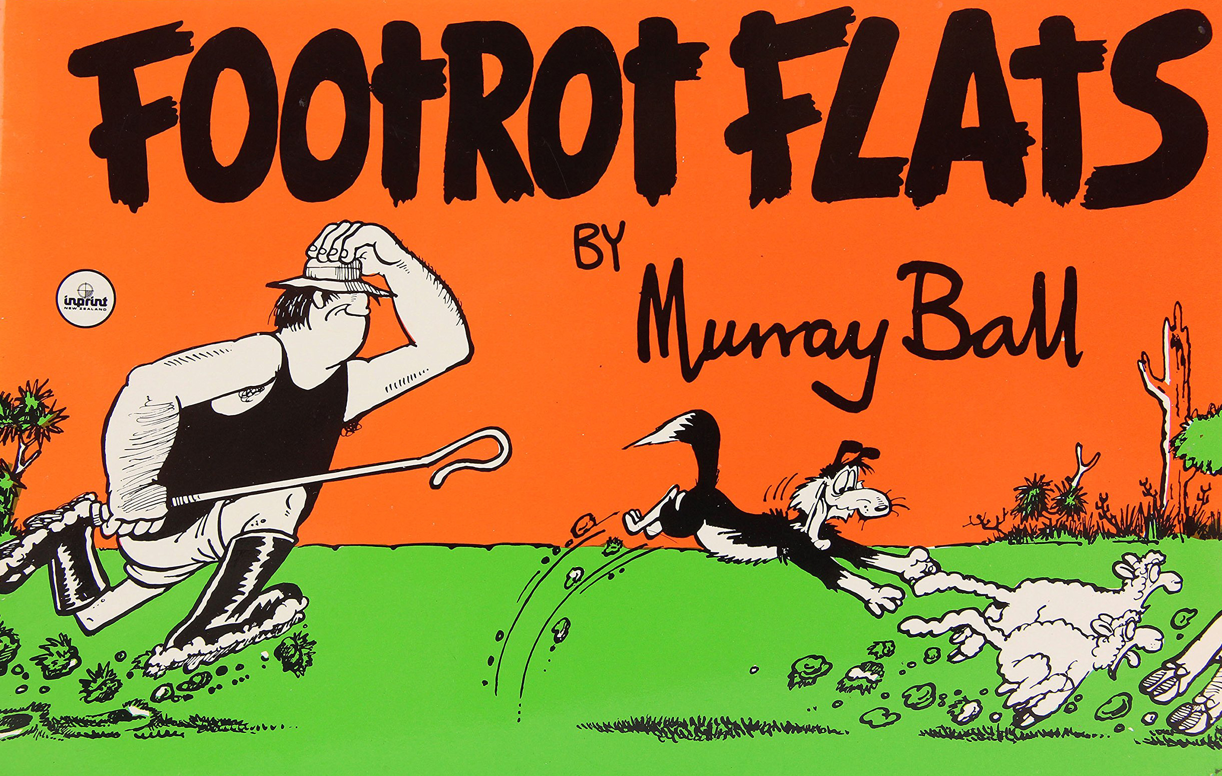
The cover of Footrot Flats, © copyright Murray Ball
Commercial art
Commercial art is used for advertising products, services, and ideas. The primary goal is to drive sales and awareness. Artists design commercial art for logos, packaging, billboards, and magazines.
Illustrations have some advantages over photography. Illustration can simplify and explain confusing or complicated subjects.
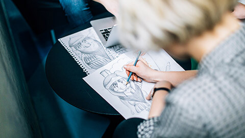
Drawing is a form of creative expression through mark making.
Drawing is associated with engaging the right hemisphere of the brain which is also known as the creative or spatial perception side. It is often a direct translation of what a person sees through their observation.
Drawing can come in the form of:
- Gesture, contour, or line drawing
- Negative spaces drawing
- Perspective drawing
- Shading drawing
- Gestalt drawing.
Practising drawing has proven to enhance the creative problem-solving ability as well as the ability to connect disparate subjects into a theme.
Gesture, line, or blind contour drawing
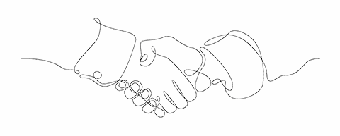
Gesture, line, or blind contour drawing is drawing with minimal reference to the page.
It is a process of letting your eyes trace and follow the contour of the subject or object as you glide your pencil on the page the whole time, without lifting it up.
The following is an example of how gesture drawing can be applied commercially as a branding identity. The Imperial is a co-working space in Christchurch, New Zealand.

External view of the Imperial building, © copyright Cequent
Negative spaces drawing
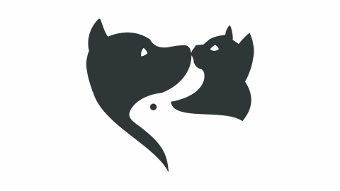
Negative spaces drawing is drawing the spaces that surrounds and occupies an object or subject.
The object or subject is considered the positive space or foreground, and the background is the negative space. Blocks of white (paper or canvas) and black are applied to separate and create a distinction between the foreground and the background.
The following logo example utilises negative spaces as part of the design.

Perspective drawing
Perspective drawing is drawing the spaces and relationships created by the vanishing points and horizon line.
There are three types of perspective drawing based on the vanishing points:
- One point perspective
- Two points perspective
- Three points perspective.
The vanishing points also relates to the three types of horizon line:
- Eye level
- High horizon or above the eye level
- Low horizon or below the eye level.
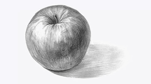
Shading drawing
Shading drawing is sculpting an object or subject to represent its three-dimensional values by plotting the areas of lights and shadows.
Objects or subjects around us can be seen by our eyes when there is light reflected on them. If we observe the object carefully and shift our thinking pattern, we are able to see which area has the most and the least light. We will also see that colours translate into a tonal gradation, from white, to light grey, dark grey and eventually pitch black.
Gestalt drawing
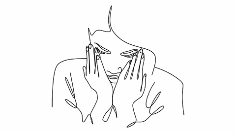
Gestalt drawing is drawing using a combination of techniques to represent the object or subject in its entirety.
Engage the right brain
It is important to switch to engage the right brain fully. Train the mind to not name the object we are drawing. For example, when drawing portraits, not to name the eye or the nose, but instead notice the different qualities of line, spaces, relationships, lights, and shadows that forms the shapes of the face.
But what if I cannot draw?
Everyone can draw in their own unique way.
It is the opinion given about the drawing that shapes the thought of whether someone can or cannot draw. Adults were once children who loved to draw, but at some point, they were told that their drawings were not good enough.
So, do I have to be good at drawing to be a good designer? The answer is NO.
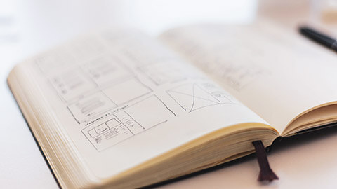
However, it is essential and helpful to be able to convey your concepts using these drawing conventions in design;
- Squiggly lines can indicate larger text, for example, headlines.
- Simple repeating lines can be used to represent lines of text or body text.
- Crossed boxes or grey shaded shapes can be used to indicate the positioning of images.
- Horizontal and vertical lines can be drawn to indicate document grid lines (margins, columns, etc).
Keeping a visual diary
If you do not have a visual diary already, go out and buy one today. A hard back, A4 spiral bound, with plain white pages can usually be found in any stationery shop.
Once you get a hold of a visual diary, be conscious of designs that surround you in your everyday environment. Consider the design of a menu when you visit a restaurant, signage as you walk along a street, or advertisements in a magazine that stand out.
Learning from good design
You should be constantly identifying and collecting examples of good design.
Ask yourself questions such as:
- "What makes this design so great?"
- "What do I not like about it?"
- "How did the designer achieve the results?"
Write your answers and thoughts down in the visual diary. Not only does this engage your thought processes, but you will find your notes useful for inspiration later if you are stuck for ideas. And as always, if you are ever bored, get drawing. Exercise those finger muscles, develop hand-eye coordination and most importantly, have fun.
You can practice doing the following as a warmup and create patterns in your diary:
- Short and long straight lines
- Squiggles and wavy lines
- Shapes such as circles, squares, triangles.


Digital illustration is the technique of using a computer to produce original artwork.
Digital art has reshaped marketing with visual storytelling.
Inkbotdesign.com states, "Anyone with the ability to see can relate to evocative visual imagery without having to have pre-existing knowledge of the shared message. The organic immediacy of how visual storytelling translates information is why visual media have dominated marketing campaigns."1
Digital illustration in marketing
Digital illustration has become a prominent tool in the marketing industry. This is mainly due to its ability to convey the personality of a company, how customisable it is, and how it can emotionally appeal to stakeholders.
There are a few reasons why illustration has become an essential part of marketing:
- Visual elements aid people to remember any information more than text
- Digital illustration tools have provided more graphics than ever
- Digital illustrations in marketing appeal to crisp campaigns online as well as print
- Illustrations can persuade, inform, and influence viewers
- Offers a fresh new perspective to businesses.
Look at some of the following digital campaigns.

Hatchbox, © copyright Platform 29
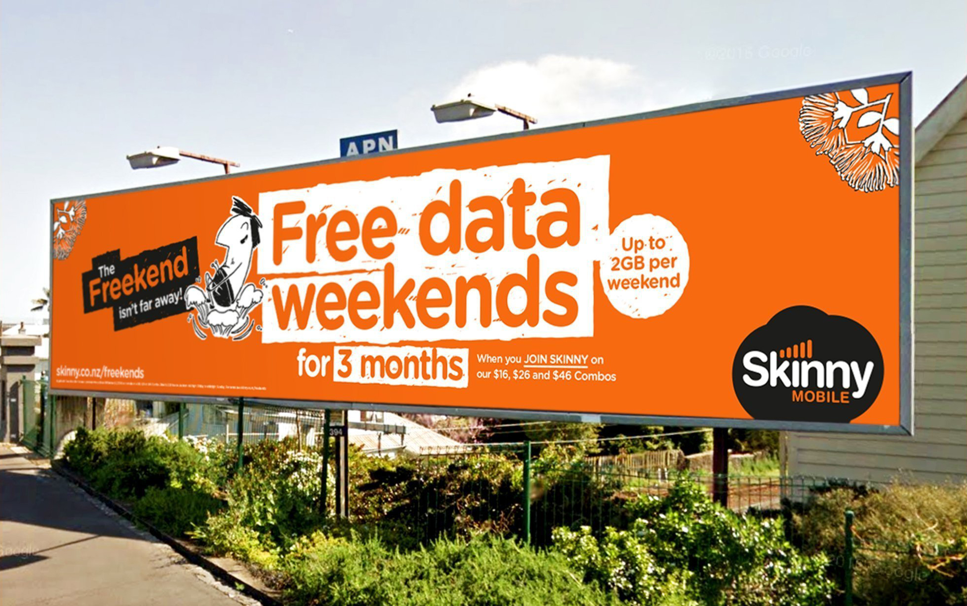
Skinny Freekend, © copyright Platform 29

Levi's for Little Toughies, © copyright BBH Asia Pacific
Raster VS Vector
Technology is improving and there is a growing relevance for illustration and its use in marketing, it is essential to understand the difference between Raster and Vector graphic file formats.
One may be more applicable than the other during a campaign development.
Raster
Raster (also known as bitmap) images are described by an array or map of bits within a rectangular grid of pixels or dots. Pixel-based software, a camera or scanner are used to create raster images. They are more frequently used on the web and are generally more common.
Vector
Vector images are described by lines, shapes, and other graphic image components stored in a format that incorporates geometric formulas for rendering the image elements.
Vector graphics draw continuous, smooth lines, and keep this composure even when scaled up and down.
| Vector | Raster | |
|---|---|---|
| Comprised of | Multiple reference points and curves | Pixels |
| Scalability | Scalable without quality loss | Loses quality when scaled |
| Convertability | Convertible to raster | Not convertible to vector |
| File formats | EPS, AI, SVG, PDF | BMP, JPG, GIF, PNG |
Why is this important in marketing?
Choosing the correct format before editing or creating a graphic is needed. To establish what type of image is needed, consider the size that the image will be used with. If it is a fixed sized and a once off creation than raster images should do the job.
If you are creating an image that will be used across different medias, sizes, and contexts (such as a logo) than vector is the way to go.
Adobe Illustrator is a digital image creator. It gives you the freedom as a designer to create any vector-based image.
Some of the benefits of Adobe Illustrator include:
- The interface allows for custom viewing.
- It provides document guides and layers.
- Templates of color groups.
- Creates scalable vector graphics.
- The software allows you to make web and print graphics.
- Allows you to recolour logos.
Adobe products have learn & support features that allow you to develop your skills and find help when you need it.
Adobe Illustrator makes for a versatile creative marketing tool. Especially with features such as:
- Logo Design
- Typography font design
- Hand letting design
- Icon design
- Infographic design
- Banner design
- Chart design
- Wallpaper maker.
Below are some examples of features in Adobe Illustrator.
Blog illustration, © copyright Lana Marandino
Media logo, © copyright MD Alamin
Fairly font collection, © copyright Illham Herry
The EcoDen, a client working in sustainability are looking for a character (anime or cartoon) to use of promotional purposes and to create a connection with a younger audience, as children need to be taught about sustainability and how to create a better future. The client has requested that you produce a visual design of the character that would apply to the item.
They also require a visual mock-up of what the character may look like in its final form of approval.
Once you are done, share your character with your peers on the forum.
