
Why do you visit?
Think about the last time you navigated to a website. What was the purpose of this visit related to?
- E-commerce
- Social Media
- Research
- Entertainment
- Brand Awareness.
Businesses create websites to raise awareness, for self-expression, to capture potential prospects, to sell, to inform, or to entertain.
In today's world, the pressure to have an online presence for businesses is always increasing.
Kasey Kaplan from Forbes Magazine (2020) states:
Having a strong online presence, particularly a website, can be make or break for generating more revenue.1Kasey Kaplan
The top reasons stated for the importance of a website include:
- Credibility
Having a website shows a business is legitimate. People can connect with the brand and services. This is particularly important in an industry where there are others that do what you do. Having a website is a chance to build brand identity and differentiate a brand from competitors. - Brand
Showcasing your brand to clients is one of the most important things you can do. Having a space to proudly display who you are, what you are about, and what you represent will increase buyers, customers, and/or clients. - Leads
Once people find you online, your website will be able to show them how they can get in contact or become involved. It is also an opportunity to collect contact information such as an email address. This email can be used in ongoing email campaigns, sales, or special events and can lead to increased sales. - Organic traffic
This means that when people are searching on Google for a brand, product, or service, your website will have a chance of showing up. This provides an opportunity to drastically increase your customer base. - Time saving and customer service
A website allows the business to provide customers with all the information they need including opening times, prices, services, and locations. This means that business owners do not have to spend time answering the same questions over and over. - Digital marketing
Landing pages and websites are powerful for leveraging digital marketing and creating leads. This will increase the growth of the business. Website creation is not something that is done when a business plans on doing a digital marketing campaign. If a business is planning on doing any marketing campaigns, or growing in the future, set up a website.
Landing Pages
Let us have a closer look at the purpose of a landing page and how it compares to a home page.
A home page's main function is to direct users around your site. This is where they will go to navigate to the about me page, services, products, and blogs. The home page gives site visitors a general run down on who you are, what you do, and how can you add value to them.
A landing page's main purpose is – conversion.
Landing pages help with converting visitors to "leads". A lead means that they have provided their contact information. Once someone provides their contact information, that is when a company can begin its sales funnel. Think of those times you have put your email in when visiting a website, and consistently after you are receiving emails either marketing their products or trying to encourage you to come back.
Landing pages are where potential consumers "land" after clicking on a link displayed in subscriptions, emails, promotions, social media, targeted ads, and other SEO (search engine optimisation) results. Landing pages:
- Increase conversation rates
- Improve performance
- Lead to significant improvements in sales.
There are many types of landing pages, and all come with various names including:
- Click-through landing pages
- Lead-generation/lead form pages
- Microsites
- Sales pages.
Click-through landing pages
A click through landing page is a warm-up page. It does not require the visitor to click any link or collect information. Its job is to warm them up for the next page, where hopefully they will become a conversion. Think of them like the middleman.
Lead generation / lead form page
In marketing, there is a process called a sales funnel. This funnel is planned out communication, with the intention to win over customers. A lead generation page is where you first capture someone in the sales or communication funnel.
A lead generation page aims to capture information from its visitors. This could be an email or phone number. Usually, visitors will do this in exchange for a resource. Think of free e-books or images. Something that you can provide the visitor with but need their email to do so.
Microsites
A microsite's usefulness is a debated topic. A microsite is basically a mini version of a website, that sits outside of your main website. It is a single-function website that usually consists of just one page. A microsite will look and feel completely different from the businesses branding.
It is usually used as a marketing tactic for a specific product, person or event.
Sales page
Sales pages are designed to sell one specific product to a specific audience. They always include a "Sales Letter".
This one is designed to persuade a visitor to purchase a product or service.
- It includes a "Sales Letter"
- Provides value and insight that strives to overcome last-minute objections.
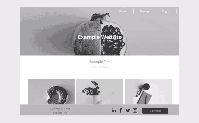
What makes a website beautiful?
Like the phrase ‘beauty is in the eye of the beholder’ effective web design is judged by the users of the website and not the website owners. There are many factors that affect the usability of a website, and it is not just about form (how good it looks), but also function (how easy is it to use).
Design is not just what it looks like and feels like, Design is how it works.Steve Jobs
Websites that are not well designed tend to perform poorly and have sub-optimal Google Analytics metrics – high bounce rates, low time on site, low pages per visit, and low conversions. So, what makes good web design? Pay attention to the following principles to make your website aesthetically pleasing, easy to use, engaging, and effective.
1. Content
An effective website has both great design and content. The best way to convert visitors into customers is by using persuasive language and great content.

There are many recipes for creating great content. A few of the ingredients include:
- Create a compelling headline
- Make the readers hooked through your intro
- Write your content for your audience
- Be engaging
- When writing, embody your brand's voice
- Use an outline, so the readers expect what will be covered.
Content on a webpage can include texts, links, images, audio, animation, and videos. Basically, anything on the page is content.
Below are video examples of marketing content. Which is your favourite piece of marketing content and why?
2. Communication
What information do you look for? Online communication needs to be fast, clear, and straight to the point. This is even more evident in an online marketing environment. You must cater for the needs of your customer before they leave your website.
Some effective tactics include; organising information using headings and subheadings, using bullet points instead of long windy sentences, and cutting the waffle.
Videos, images, graphics, text, animation, colour, and typography are all important and make up a great web page. But where do they sit? This is where visual hierarchy comes into play.
Visual hierarchy is the arrangement of elements in order of importance. This is done through:
- Size
- Colour
- Imagery
- Contrast
- Typography
- Whitespace
- Texture
- Style.
The most critical aspect of visual hierarchy is to establish a focal point. That being the centre of interest or activity.
The visual hierarchy creates a focal point for the viewer, which shows them where the most critical information is.
3. Typefaces
How easy is it to read online? In general, Sans Serif fonts such as Arial and Verdana are easier to read online. Consider line length, line spacing, and kerning. The ideal font size for reading easily online is 16px and stick to a maximum of three typefaces in a maximum of three point sizes to keep your design streamlined.
Typography is a visual interpretation of the brand voice. It aligns your messaging with your brand personality. Your typographic palette helps tie all communications together, from the copy of your website and direct mail to your logo.
4. Colours
How appealing is the user interface? Colour has the power to create emotions and to communicate messages. Finding a colour palette that represents your brand is an important decision. The colour palette will influence your customers' behaviours towards your brand.
Marianne from Feeling Peaky recommends keeping your colour selection limited to less than five colours. ‘Complementary colours work very well. Pleasing colour combinations increase customer engagement and make the user feel good.’2
5. Images
Because pictures speak a thousand words.
Pay attention to imagery – The visual images as a collective. This includes photos, illustrations, videos and all forms of graphics. Imagery is a brand's opportunity to express the company's spirit and embody the brand's personality.
Visual is the first impression on a website. We are drawn to the imagery before we look at the words.
From FeelingPeaky, Marianne states,
it is important that high-quality images are used to form an impression of professionalism and credibility in the visitors' minds2
6. Navigation
How easy is it for people to move around your website? Some tactics for effective navigation include a logical page hierarchy, using breadcrumbs, designing clickable buttons, and following the ‘three click rule’ – Can users find the information they are looking for within three clicks?
A clear navigation system has to answer two questions instantly: ‘Where am I?’ and ‘Where can I go from here?’ If you get this information at a glance, the navigation is great.
7. Grid based layouts
Placing content randomly on your web page can lead to a haphazard appearance that is messy. Grid-based layouts arrange content into sections, columns, and boxes that line up and feel balanced – leading to a better-looking website design.
When text and images are aligned in a way that the overall impression translates into clarity, harmony, and comfort, the website gets credits. A well-organized website has an invisible grid underneath it.
8. “F” pattern design
Eye tracking studies have identified that people scan computer screens in an “F” pattern. Most of what people see is in the top left of the screen and the right side of the screen is rarely seen.

Rather than trying to force the viewer’s visual flow, well-designed websites will work with a reader’s natural behaviour and display information in order of importance (left to right, and top to bottom). However, this is culturally specific so consider localised design. For example, Arabic is the fourth most popular language in the world and read right to left.6 Eye tracking studies with Arabic readers have revealed a tendency towards a flipped “F” pattern.3
Pernice (2017) from Neilsen Norman Group3 points out that studies have shown there are other scanning patterns in addition to “F” shaped including:
- Layer-cake. Scanning headings and subheadings, and skipping normal text
- Spotted. Skipping big chunks of text and looking for something specific such as hyperlinks, digits, or sets of words in a distinct shape (like an address)
- Marking. Eyes focused in one place as mouse scrolls or finger swipes the page. This is more common on mobile than desktop
- Bypassing. People deliberately skip the first words when multiple lines of text start exactly the same
- Commitment. Fixating on almost everything on the page. This occurs when people are highly motivated or interested in the content. This is rare.
9. Load time
Time is money. Even today, with super high-speed Internet, a website should be built light and fast.
Speed up page load times by optimising image sizes (size and scale), combining code into a central CSS or JavaScript file (this reduces HTTP requests), and minifying (compressing) HTML, CSS, and JavaScript.
10. Mobile friendly
We all have smartphones now. Over the past years, the industry standard is shifting to what we call “Mobile First Design”.

It is commonplace to access websites from multiple devices with multiple screen sizes, so it is important to consider if your website is mobile friendly. If your website is not mobile friendly, you can either rebuild it in a responsive layout (this means your website will adjust to different screen widths) or you can build a dedicated mobile site (a separate website optimised specifically for mobile users).
11. Consistency
Is the overall visual impression of the website the same from page one to page “end?” Or does the design change drastically? Are text and images displayed differently?
The design concept of a website mimics that of a book – it must be consistent from the first to the last page.
12. Browser compatibility
All browsers are different, and they all allow different rules and code in websites. So sometimes websites look good in Safari but look terrible, or will not even show up, in Microsoft Edge. Professional web designers know this and only use code that will be interpreted in the very same way in all browsers. Check a website in all browsers to see how it performs.
It is easy to create a beautiful and functional website, simply by keeping these principles in mind.
Website analysis
In this activity you will analyse the effectiveness and responsiveness of websites in relation to their identified primary purpose.
Your task
Review three (3) websites of your choice. Choose at least one good and one bad website to get a good comparison.
Write down a score on a scale of 0-10 reflecting how the website rates on each of the twelve principles. 0 being the lowest, 10 being the highest.
Principles of effective web design:
- Purpose
- Communication
- Typefaces
- Colours
- Images
- Navigation
- Grid based layouts
- “F” pattern design
- Load time
- Mobile friendly (responsiveness)
- Consistency
- Browser compatibility.
Comment what is working well and what could be improved. What are the advantages and disadvantages of each website? How could the websites be more engaging, useful, and memorable for visitors?
Share your analysis in the forum.
Creating an overall aesthetic
Layout techniques refer to the arrangement of content and visual elements. They work together to establish an overall aesthetic appearance and relationship between owner and user. In our case, the marketer and consumer.
We are going to focus on three layout techniques:
- Grids
- Fixed width
- Liquid layout.
Watch the video below to spark inspiration.
Grids
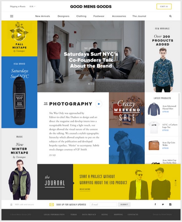
A grid is a system for organising the content of a design. They create alignment and order. Whether you are creating a layout for print like a magazine or combining images and text to design a landing page, you will use a grid to help you make design decisions and create a good experience for the user. There are various styles of grid types you can use.
Principles and elements of design require the use of grids. Specifically:
- Colour
- Contrast
- Repetition
- Texture
- Typography
- Hierarchy
- Alignment
- Balance
- Space.
Grids can be defined by how content is presented and placed to establish consistency and create a cohesive website.
The grid layout creates an organised layout of your design. They are also the basic structure of a user interface. In web design, grids are used to guide the designers with how and where to place elements using columns and rows to create balance.
From a customer's perspective, a design that has used the grid layout is easy to navigate, has a clear message, and is aesthetically pleasing.
Think of a website you have recently been on. Was it clear and engaging? Were you able to navigate through the sections to find what information you needed? Or were you lost with the amount of content or images present? If the grid layout is done effectively, customers may engage in their websites to purchase products. In contrast, if a web page is confusing, overwhelming, or lacks cohesion, you may find consumers leaving without returning.
An effective layout looks attractive and helps the viewer understand the message that needs to be conveyed. In other words, understanding the layout is key when it comes to creating an engaging design and a better user experience, particularly in the realms of web design and advertising.
Although grids are invisible in the user-facing design, it is easy to tell whether a layout follows a grid system. Some popular grid techniques include:
- Manuscript
- Column
- Modular.
These grids dictate where information and images will be located throughout the page.
Throughout this topic, we will discuss grids in more detail and look at some examples of different types of grids that can be used when creating websites.
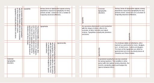
Manuscript grid
You will often see a manuscript grid in documents that deal with a large volume of text. Text spans the page between margins with space left above and below for running headings, folio and page numbers. Books, essays, and blogs are good examples of situations that lend themselves to using a manuscript grid.
Images can be included, often spanning the same width as the text frame.

Popular digital publishing platform Medium.com uses a manuscript grid for its articles:

Column grid
A column grid divides each page vertically into separated columns. The gap between columns is called the gutter. Text and images usually sit within a column or span multiple columns.
Magazines often use column grids. A twelve-column grid is popular in many publications because it divides easily into two, three or four even column groups.
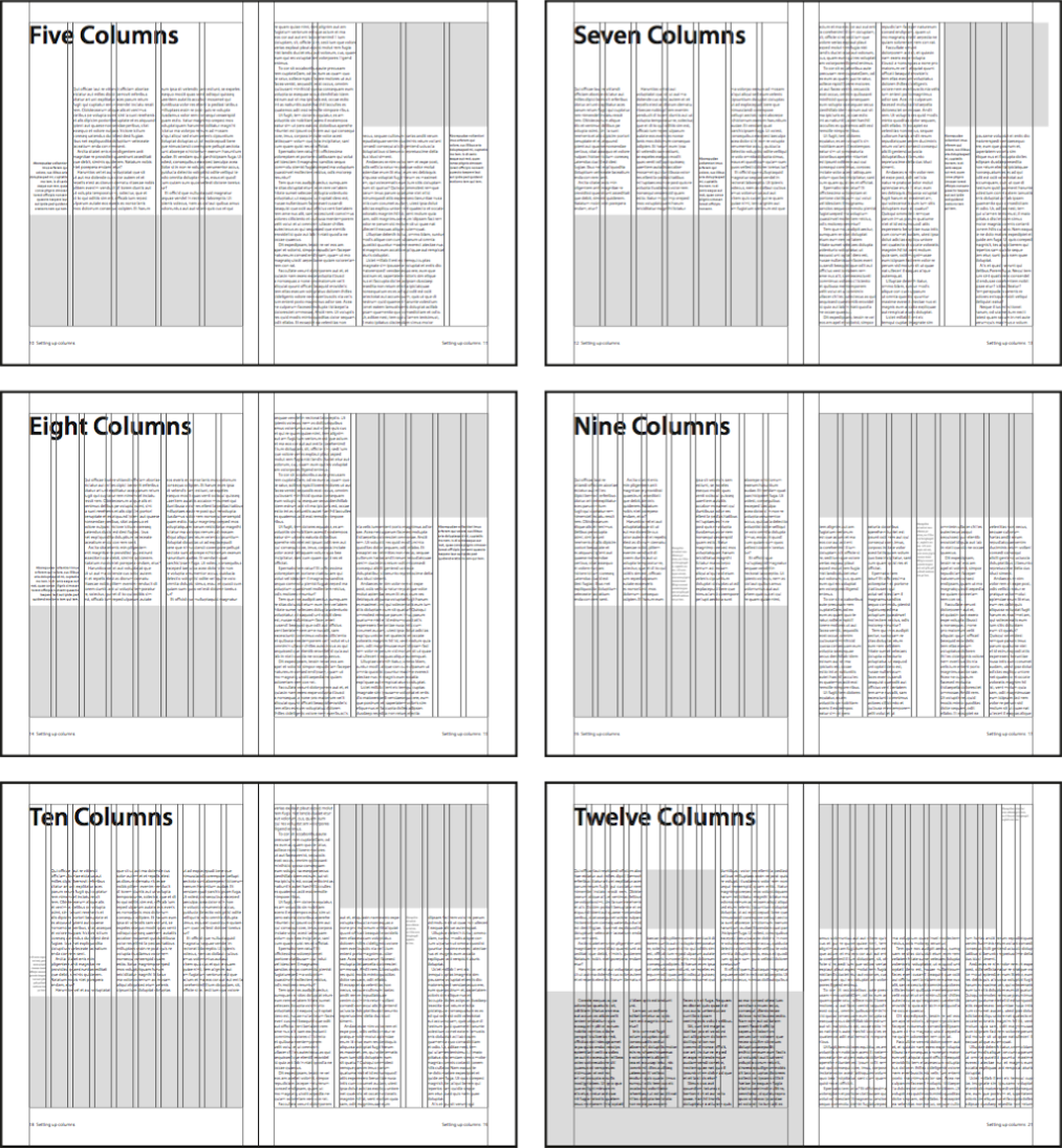
Column grids are also effective on web pages. The 960 grid system and popular CSS framework Bootstrap both use a twelve-column grid system. By default, columns are proportioned evenly.
Their width can also be specified by defining the number of columns to span using classes.
<div class="row">
  <div class="col-8">Eight columns</div>
  <div class="col-4">Four columns</div>
</div>
Modular grid
Modular grids are similar to column grids. However, they include horizontal rows also separated by gutters. Modular grids create defined cells that content can be contained within. They are useful for projects with complex layout requirements. Image galleries, product brochures, and navigation elements are examples of the types of content suited to modular grids.
Fixed width
To describe fixed width, picture an image on a website. If this image is a fixed width, the image would have started with a specific size selected by the web designer. Regardless of the width of the screen it is viewed on, this image would stay the same size.
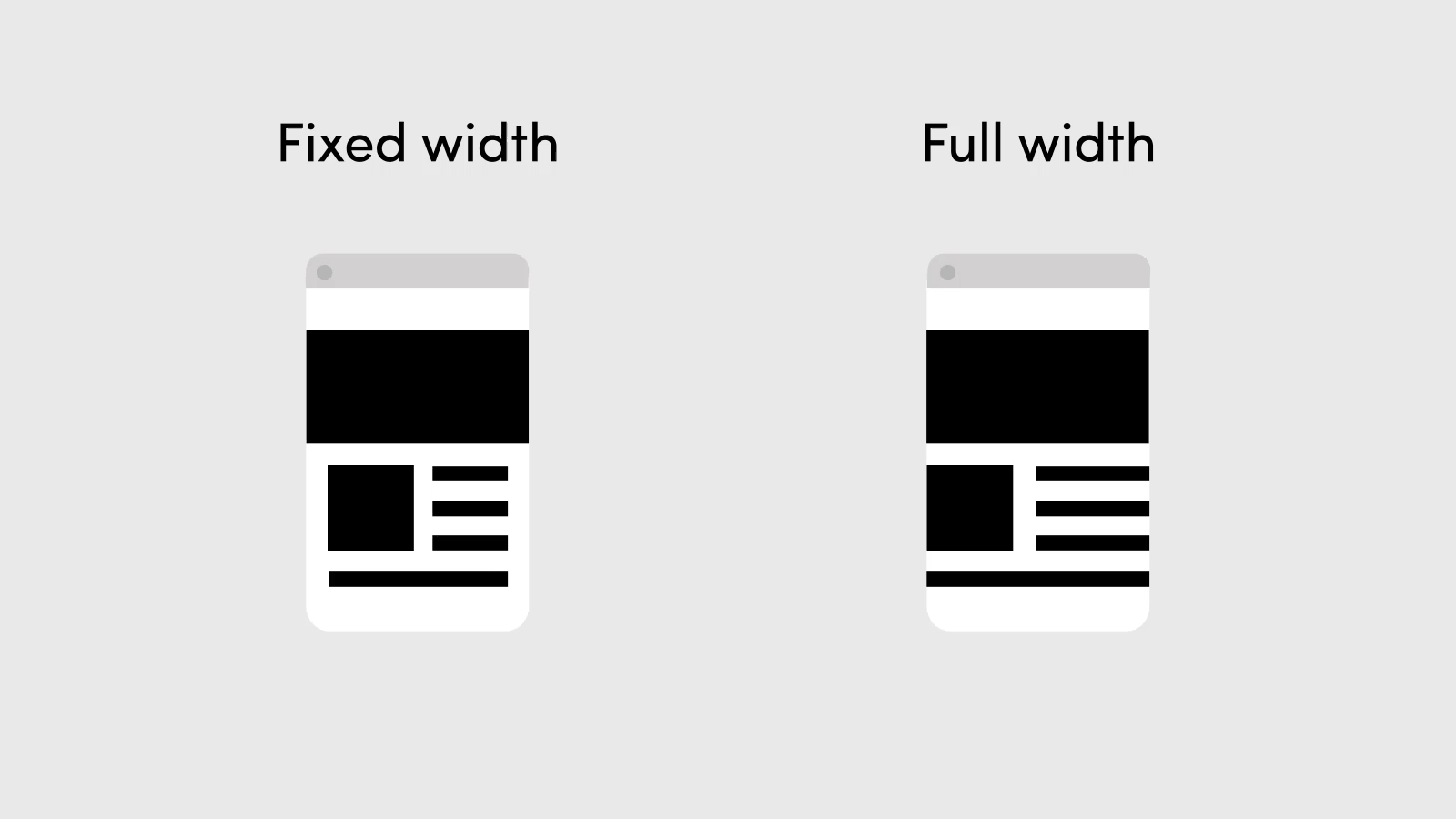
This allows web designers to have more control over how their pages will look, regardless of the screen size- desktop, laptop, iPad, mobile phone.
Fixed width can be applied to anything on a web page. From images, to text, to columns and videos.
Choosing whether fixed width is the way to go, is a layered decision. Here are pros and cons to help with that potential decision.
Pros:
- Fixed width layouts are easier to customise in terms of design
- There are less problems with images, videos and other content that are fixed, as the widths are the same for every browser
- Minimum or maximum width is not always supported in every browser. Luckily with fixed width, these are not needed
- Even on small screens, the content will still be wide enough at a larger resolution to be easily legible.
Cons:
- The overall balance and other design principles can be disrupted; fixed width may create excessive white space for users with larger screen resolutions
- Smaller screen resolutions may require a horizontal scroll bar, depending the fixed layout's width
- There is more pressure on having seamless textures, images and patters to accommodate those with larger resolutions
- When rating a website for usability, fixed width layouts generally have a lower overall score.
Liquid layout
Liquid layouts, also referred to as fluid layouts, mean that the components in the site have a percentage width. They adjust to the user's screen resolution.
So, for example, if the width of an image is at 40% of the screen, no matter the size of the screen, it will still sit at 40%.
There are two general ways of setting liquid layouts. Some designers will give a set width to certain elements, such as margins. Others generally use percentages so that the view is adjusted for each user.
Pros:
- Web pages with liquid layouts can be more user-friendly due to their adjustment for the user's set-up
- The white space on a browser and screen resolution is similar – which can create a more visually appealing appearance
- Depending on the effectiveness of the design, a liquid layout can remove the horizontal scroll bar in smaller screen resolutions.
Cons:
- The designer does not have the greatest control over what the user sees. This means they may overlook problems because of the layout
- When inputting the width data, a designer may have to set multiple ones to accommodate different screen resolutions
- If a designer is going for the minimalist appeal, there may be excessive white space on larger screen resolutions. This can cheapen the aesthetic appeal.
Design that is effective, efficient, and satisfying
A well-designed website means users can do what they need to do without thinking. Usability is how we measure this.
The International Organisation for Standardisation (ISO) sets out the standards for usability in ISO 9241-11 Ergonomics of Human-System Interaction. The standard defines usability as the ‘extent to which a product can be used by specified users to achieve specified goals effectively, efficiently and with satisfaction in a specified context of use’.4
Usability may overlap with accessibility when “specified users” includes people with a range of disabilities and “specified context of use” includes accessibility considerations such as assistive technologies.
Practical evaluation
We know as users of the web that usability matters. If a website is not intuitive, we will flee. We certainly will not go looking for an instruction manual. So how do you measure usability on a practical level and ensure web design is usable? Shneiderman (2018) sets out five key things to evaluate to assess usability.5
- Time to learn
How long does it take a typical user to learn the actions required to complete a task? - Speed of performance
How long does it take a typical user to carry out standard tasks? - Rate of errors by users
How many errors did the user make? What kind of errors? And how did they recover? - Retention over time
How well do users retain their knowledge a day later? A week later? A month later? - Subjective satisfaction
Lastly, from a qualitative point-of-view, how much did users like using various aspects of the interface? Use open-ended questions or sliding scales to evaluate their preferences.
Always test your content to ensure that it is usable and that your target market can get the best experience from your site.
A well-designed website should offer more than just aesthetics. This is the reason designers focus on the process behind the visuals of the website they create.
- Goal identification
- Research and concept
- Development
- Launch.
1. Goal identification
Goal identification is the opportunity for you to understand the needs and goals of your client and/or brand. This is the best time to discuss strategy to achieve the set goals.

Open communication in the form of meetings, developing briefs and proposals is key to identifying goals. This will ensure you are creating a user centered product while being within budget.
Key questions to consider:
- Why do people visit the website? For example, is it a service or product being advertised?
- What is the aim of the website?
- What is the brief and timeline?
- Are there any expectations?
2. Research and concept
Once you have direction from goal-setting. It is time to work out the best way to get there. This is where research and concept begin.
Research will be very specific to the industry's target audience. Research means becoming familiar with the way the target audience use websites, what their wants and needs are and the best way to make the site user friendly.
A good starting point is by researching market studies and competitors.
Once you have researched and developed a clear understanding of your target market, you can begin your concept design.

Creating a concept means:
- Creating mood boards to identify style and impressions
- Creating mock-ups
- Setting up a style guide using the principles of web design and the client’s needs
- Utilising grids to create a concept for the layout
- Map out the user journey from start to finish to ensure usability
- Creating an inspiration folder of past designs.
Utilising the open communication developed from the goal setting phase, it is now time to share your concepts with the client. Just as you have been incorporating the user's emotions in your design, present to the client’s emotions and motive. Sharing your idea can be as creative as a flash presentation, or as simple as sharing your drawings. The main intention should be to take the client on a journey, just as you have mapped out for the user.
3. Development
After potentially going back and forth with the client, and finding compromise here and there, it is now time to develop these ideas.
The development involves:
- Developing content
- Bringing the design and layout to life
- Content Management (CMS) set up and coding
- Development of Search Engine Optimisation (SEO) and keywords
- Determine functionality
- Working on front end design as well as back-end development
- Testing accessibility, usability, and engagement
- Reviewing for final approval.

In the development stage, testing is key. Testing will ensure that any potential problems can be addressed early. Especially before it is launched to the public where bad websites leave lasting impressions.
4. Launch
3, 2, 1, Blastoff! The most exciting part of the website design process and the most satisfying, is launching the website to the world.
Since nothing is ever perfect, there may be some elements that need to be reviewed and amended. These amendments will sit under maintenance and review. This is part of an iterative process.
A modern site is never complete, there will be an ongoing process to make updates and small adjustments to the website, so it maintains currency with the industry and target audience.
Depending on the client, the company you work for and the size of the project, the design process can vary.
Watch the video below to see another in-depth approach to the web design process.
Web designer
Let's get creative and practice developing our website development skills.
For this creative activity, you will have the opportunity to develop a web home page that shows us who you are as a designer, demonstrating your creative flair and marketing skills.
Enter the Wix website and begin exploring.
Project scenario:
The organisers of a youth event in your local area have approached you to produce a web site banner on a home webpage to help promote their upcoming event to the public.
They would like to a see an initial mock-up of a visual concept to be delivered once the design is approved.
Requirements:
- Use a range of digital tools and techniques to produce a mock-up of your design, include any native and exported files in your submission.
- Consider the web design principles and lay out techniques
- Provide evidence of research into Māori/Pasifika cultural considerations regarding the event visuals and message being conveyed. Research of these cultural considerations is to be undertaken even if the defined target audience, language, or imagery is not directly representative of these demographics
- Self-evaluation highlighting the process taken, what went well, areas of limitation and future improvement.
Before you begin, feel free to explore through the WIX website to see the different templates and web lay outs. You can also view tutorials and step by step videos.
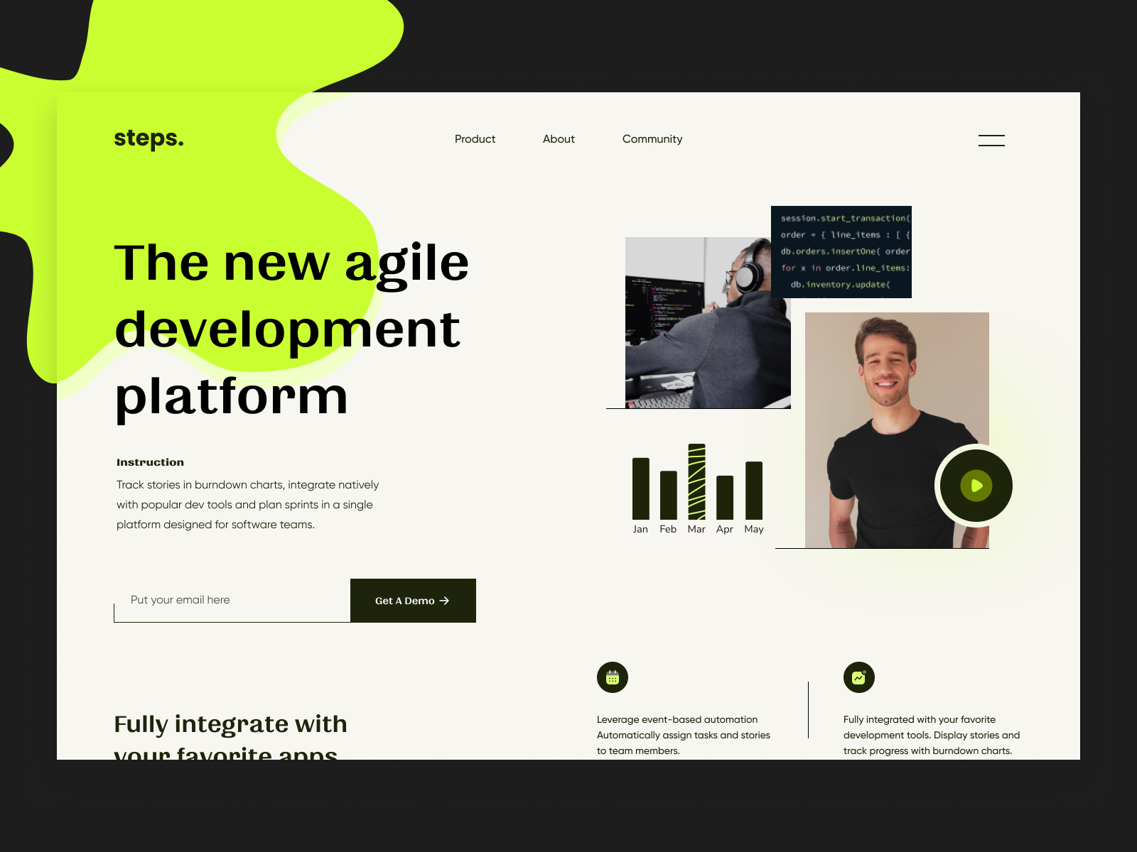
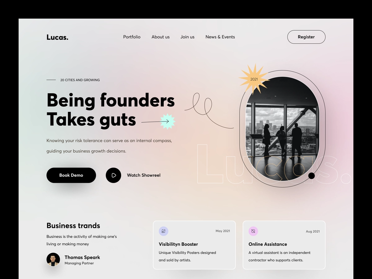
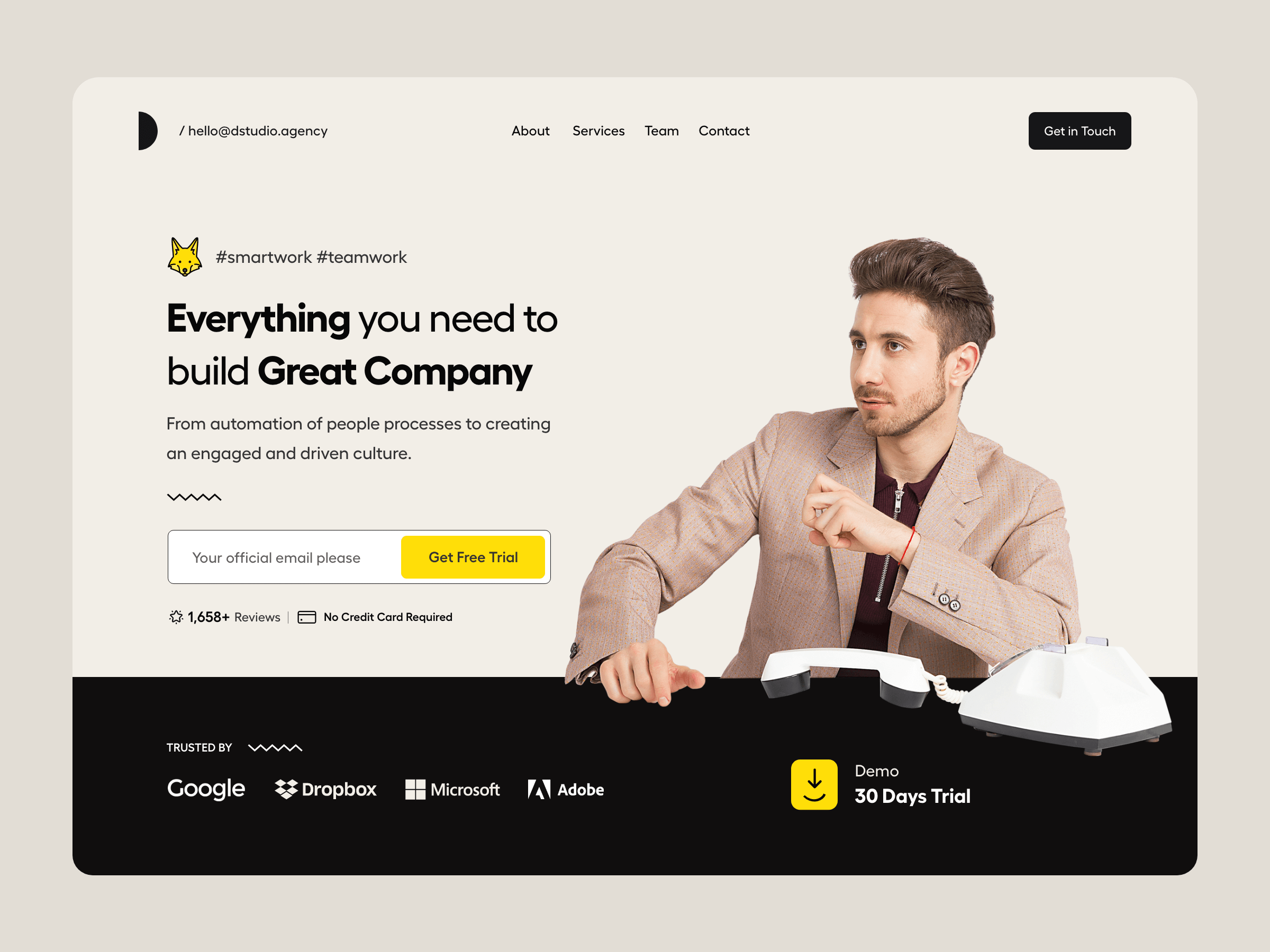
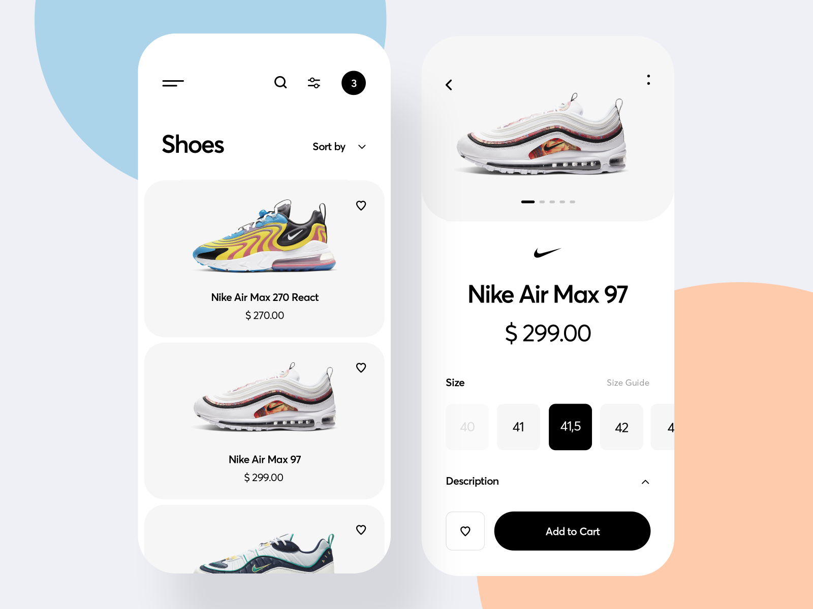
To gain some inspiration, visit Dribbble to see work by other designers.
Remember, to be creative whilst also sticking to the brief.
Once complete, take a screenshot and share this with your peers discussing the reasons behind your layout and how you have considered the web design principles.