Have you ever wondered what makes up a great design?
Design is intelligence made visible.Alina Wheeler
Creating a beautiful and effective design is more than just inspiration or a great idea, it is about understanding the fundamentals of the subject. Design elements are the basic building blocks in visual design and they support designers in constructing and developing their work of art or design piece.
Gaining an understanding of when, why and how to use the design elements below will greatly improve the effectiveness of your design solutions.
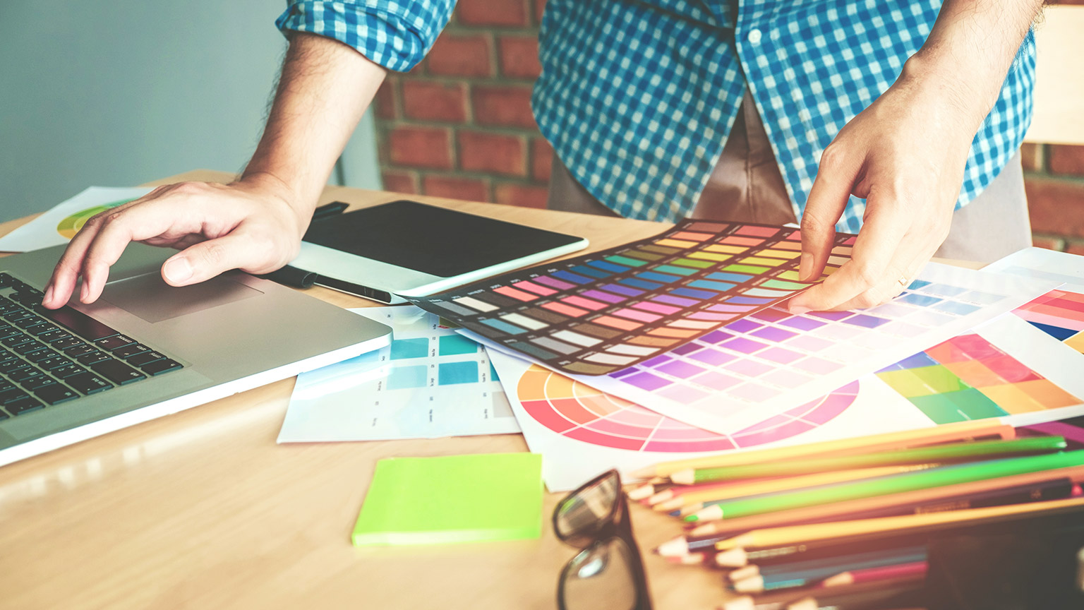
Before we guide you through the elements of design, let's introduce ourselves to CANVA.
CANVA is the platform you will use to create your very own portfolio design pieces. It is a graphic design platform that allows you to create social media graphics, presentations, posters and other visual content.
You will use this platform throughout the course to create and invent new designs for various projects.
Click here to familiarise yourself with CANVA.
Once you have had the chance to explore the platform, watch their videos and become familiar with how you can use it, you will be able to begin your first creative activity below.
Vision/mood board activity
Create a vision/mood board with examples of images that give you inspiration. It can be anything you like including movies, music, nature, art, books, fashion or family and friends. These images will reflect your interests, goals, future aspirations as well displaying your own personal flare that represents you.
- Create an account in CANVA or a portfolio host of your choice.
- Get creative!
- Save your work as this will need to be submitted at the end of the module.
'Line' is one of the most fundamental of all the elements of design. It is the starting place for most artistic creations.
A line is a mark between two points that can be expanded into all sorts of forms--changing shape, direction or style. It can also create patterns, shapes, move elements, rhythm, emphasis, effects and much more.
Lines are an important element within your design plan as they can be used as dividing points to organise and structure your layout as well as play a vital role in setting the mood, message and tone of your design. They can direct the user’s eyes, create flow, add emphasis on certain information, create the illusion of movement and organise all design elements into form.
Below are some examples of how the design element 'line' can portray various messages within your design piece.
The second design element is 'shape'.
All objects are composed of shapes, and all elements of design are shapes in some way. Using the element of shape is important as it is used to add interest and substance to a piece of graphic work.
They can be used to decorate, create patterns, textures and provide symbolic meaning.
Whether your design is simple or complex the relationship between shapes can trigger feelings, convey messages, engage an audience and create movement.
Shapes can be used to create two-dimensional pieces through both organic and geometric shapes.
Geometric shapes can be drawn using a ruler, compass or digital instrument. They feel very precise, like an architectural rendering.
Organic shapes are found in nature or drawn by hand. They are the opposite of geometric, and often feel natural or smooth. The utilisation of both embeds creativity and create form within your design.
Shapes can be seen in logos, layouts, packaging and illustrations.
Reflective question: Can you think of a logo that has resonated with you or powerfully conveyed its message?
Below are some examples of very good illustrations of shapes in logo designs.
'Colour' is also an important element to consider when creating your design. Colour can help the organisation of a design and give emphasis to specific areas or actions.
It has the ability to connect people to objects, images and scenes as well as ignite emotions.
- Red is typically seen as a colour of passion, danger, romance or violence.
- Green relates to nature or sickness.
- Blue is linked to calm or depression.
- Yellow is warm and inviting or a warning.
- Purple is connected with royalty.
Colour is one of the hardest elements to harness, and probably one of the most challenging to understand as you work with all the different ranges--including all the hues, tints and tones within the colour spectrum.
When creating a portfolio, the colours you choose can help or harm your work. There are amazing techniques when playing with colour. The video below explains some of these cool techniques.
'Value' is a design element that refers to the relationship between light and dark on a surface or object. The amount of darkness or light that tonal ranges have is used to create depth, shape and texture.
Value is also referred to as 'tone' when talking about black and white images. It is created by a light source that shines on an object creating highlights and shadows. It also illuminates the local or actual colour of the subject.
There are various techniques that are used to maximise the power of value when creating your design piece.
Next time you are looking at a photograph painting or drawing, try to notice how the artist is rendering value and when you are creating your own artwork practice creating value scales with a variety of different mediums and hues.
Let's experiment with value in drawings. Select a photo of a city scape or landscape. In pencil, redraw the image. To show distance, eliminate the detail in further objects. This is not a drawing to show precision, but to show detail in closer objects and haziness in farther objects.
Below are some examples of artworks that have effectively incorporated the design element 'value'.
Typography is everywhere we look! The websites we visit, the books we read, advertisements on television and packaging on food and materials. We use typography in everyday life.
Typography is defined as 'the style or appearance of text'.
Typography is considered as one of the most important elements in graphic design. It is an element in the form of visual communication. It conveys a message you want to communicate to your targeted audience and has the powerful ability to evoke a mood or emotion in its readers.
Reading the same words with different display fonts can release different feelings from their audience as well as establish information hierarchy by guiding the readers' eyes.
When designers repeat the same pattern throughout their design, it creates harmony and continuity throughout their piece.
Below are some examples of how typography can draw out specific emotions and messages.
'Texture' is the way a surface feels, or the way it’s perceived to feel. It has the power to attract or detract an interest and can be applied to lines, shapes and forms.
There are two types of textures: pattern and image.
Image texture triggers feelings of sensation and touch. Some examples of image texture include wood, fur, sand and grain. Textures can add distinct visual tone to a piece of graphic design work.
Patterns trigger our visual sensors instead of our emotional senses. Pattern is more about visual recognition due to the shapes that repeat themselves. A good example of this is branding materials and gift wrap.
Texture is important as it allows the viewer to use their senses to imagine how something might feel and may provide a visual illusion towards the message you are wanting to convey.
Below are some examples of how you can influence the feel of texture throughout your art pieces.
'Graphics' are visual elements often used to point readers and viewers to specific information. They are also used to supplement text to aid readers in understanding a particular concept, inform, illustrate or entertain.
Great graphics differentiate from the rest as they communicate with their customers through eye-catching design and alluring colours.
Have a look at the famous logos below. Their designs have made it easier for customers to use to recognise the brand and their products in a matter of seconds.
Reflect on your favourite logos--what caught your attention? These are important aspects to think about when designing as this is the impression you want to pass on to your client.

When creating designs and font sizes, it is crucial you consider the audience as this will determine the effectiveness of the message to be delivered.
You can contrast large and small elements or make an image larger and crop it in an interesting way to make it appealing to their eyes.

To attract your viewers’ attention, make the most important element the largest and the least important element the smallest.
Headlines are usually the largest type element on the page, while sub-headlines and body text is smaller. Larger objects appear to be closer on the page than smaller ones, and that can be used to reinforce the importance to the message being conveyed.

As an element of design, 'space' refers to the area around, above, below or behind an object.
The main objects in a work of art are identified as 'positive space' and the area around them is called 'negative space'.
Positive space is the area of space the objects occupy and negative space is all the other areas and space between and around the objects.
Space can be used to both separate and connect elements in a design. Wider spaces separate elements from each other and narrower spaces connect elements to reveal relationships between them.
Examples of Space in Design
Below are a few examples that showcase how space has been successfully used in everyday design.
You have been hired as a Digital Designer for a new music festival called 'Edge'.
Spotify's playlist Are & Be, is bringing together the pulse of R&B music today for a full-day festival.
The festival will include special guests such as Brandy, Jhene Aiko and Rotimi with 5 special guests not being announced yet.
Edge has hired you to create the flyers to post on their social media platforms, as well as to be posted around the cities where the event will be held.
Details of event
Theme: Modern R&B
Time: 12:00pm- 11:00pm
Location: New Zealand - Wellington, Christchurch, Auckland.
Australia - Sydney, Melbourne, Brisbane, Perth and Adelaide.
Company slogan: Bringing together the pulse of R&B music today.
Details of clients/campaign
Client: Spotify Are & Be
Target Audience: R&B lovers 18+ years
It is your role to create this flyer and have it ready for distribution.
Be as creative as you like, ensuring you implement the elements of design including line, shape, colour, value, type, texture, graphics, size and space.
You will need to save this task in CANVA, as you will be referring back to this throughout this module.
Note: Be creative but remember to follow the brief.