The principles of film are the rules that a filmmaker will follow to create an effective and attractive composition. All designs have basic building blocks chosen to convey the message. How we place those items on the page determines the structure of our design and affects the overall readability and determines how well our design communicates the desired message. The principles of design govern placement and structure.
Let’s explore a few principle techniques
Balance
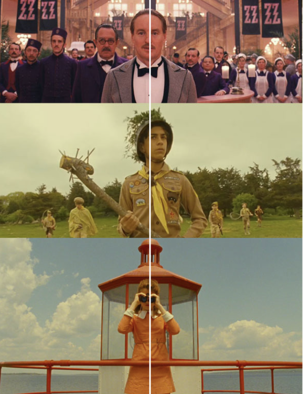
Balance and symmetry feel stable and aesthetically pleasing. This technique can be a powerful tool to convey a story regarding the character--revealing character traits and power dynamics, or they can create a place so perfectly symmetrical, the audience feels instantly overwhelmed.
Blocking the actor in a symmetrical shot can be a very effective way to lead the viewer to a certain feeling or emotion.
Within a shot, there are 3 types of balance that can be portrayed. These are:
Symmetrical

The film is visually equal throughout the film. What you have on one side of the frame, you also have on the other.
Asymmetrical

The film is visually unequal throughout the film. What you have on one side of the frame is different than the other side. However, the weight is evenly distributed to create a level of stability.
Radial Balance

Often in film, you see circles spiralling from the middle or like bike wheel spokes: lines extending out from a central point.
Alignment
Alignment is the process of identification with a character, group, or ideology when the audience watches a film. Filmmakers try to manipulate an audience’s point of view with form and content so the audience can relate and identify with characters. Most films have this alignment happen in the first few scenes and it helps shape the audience's understanding of the story.
Emphasis
Emphasis is also called a 'focal point'. The character that is emphasised attracts the eyes of the audience. This occurs any time an element of a piece is given dominance by the film artist. In other words, the artist makes part of the work stand out, to draw the viewer’s eye there first.
There are different methods in which emphasis can be achieved:
- Emphasis by contrast
- Emphasis by focal point
- Emphasis by placement
- Emphasis by colour
- Emphasis by movement
- Emphasis by difference.
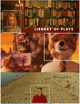
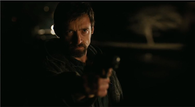
Looking at the image below, how do you believe the filmmaker has achieved emphasis?
Proportion
This is the relationship between the sizes of objects or components in a film. The camera angle can manipulate a proportion. For example, if the camera angle was closer to a person's shoe and looked up at their body from this angle, the shoe can appear to look bigger than the person’s body.
Proportion in film creates perspective and is commonly used during sad scenes in film.

In the instance of a relationship of size, a comparison is made between the:
- height, width and depth of one element to that of another
- size of one area to the size of another area
- size of one element to the size of another element
- amount of space between two or more elements.
Movement
Movement is the path the viewer’s eye takes through the film, often to a focal area. It can be directed along lines, edges, shapes and colour. In the video, it is an actual movement that constantly changes from frame-to-frame.
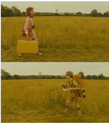
Pattern
The above image is a great example of pattern. The two characters are different, yet follow the same pattern to compliment each other.
The pattern is achieved by the consistent repetition of any of the elements of art. This could be wallpaper in the background or square shapes repeating themselves in a music video.
Unity
Unity occurs when all of the elements of a piece combine to create balance, harmony and completeness. This can be done with similar colours or calming music and sounds. Another way to achieve unity is by repeating effects.
Great cinematography creates a sense of unity and rhythm between all its shots during the film. This also creates a consistent look and feel throughout the running time.
Ways that unity can be achieved could be through:
- consistent use of a film's colour palette
- specific camera filters
- a unique visual setting.
Contrast
Unique elements in a design should stand apart from one another. One way to do this is to use contrast. Good contrast in a design allows the viewer’s eye to flow naturally and occurs when two related elements are different. The greater the difference, the greater the contrast. Contrast adds variety to the total design and creates unity.
How can we achieve contrast?
Contrast occurs through the use of elements such as colour, tone, size, shape, value, direction and more.
Composition is the act of combining parts or elements to form a whole. In film, 'composition' refers to the way elements of a scene are arranged in a camera frame.
If you simply make a beautiful shot without structure, your audience’s attention is going to scatter as they attempt to take everything in; while composition allows the audience to not just see something but it tells the audience something about what they are seeing, making it a part of the storytelling.
Composition does not need to be perfect or centre, it is about balance, order and symmetry.
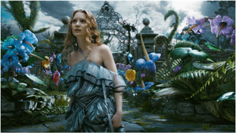
The image below, is not perfect, but it is balanced, it is layered and it creates a story.
Techniques that assist with composition
The Rule of Thirds
This is where you divide the frame up into 3 parts vertically and horizontally.
Comfortably fitting major elements onto these lines and intersections of the frame will create a decent composition. It is about positioning a character to show their relation to other elements in the scene.


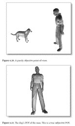
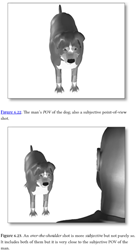
Point of View
Film-making uses point of view in 2 ways. The first is the point of view (POV) of the camera. Having a wider shot with the camera further away from the scene, an objective POV is created. Bringing the camera closer, typically using a handheld camera, a subjective POV can be achieved. The subjective POV is used to see what the character is seeing. Having a handheld camera allows the audience to feel as though they are the character.
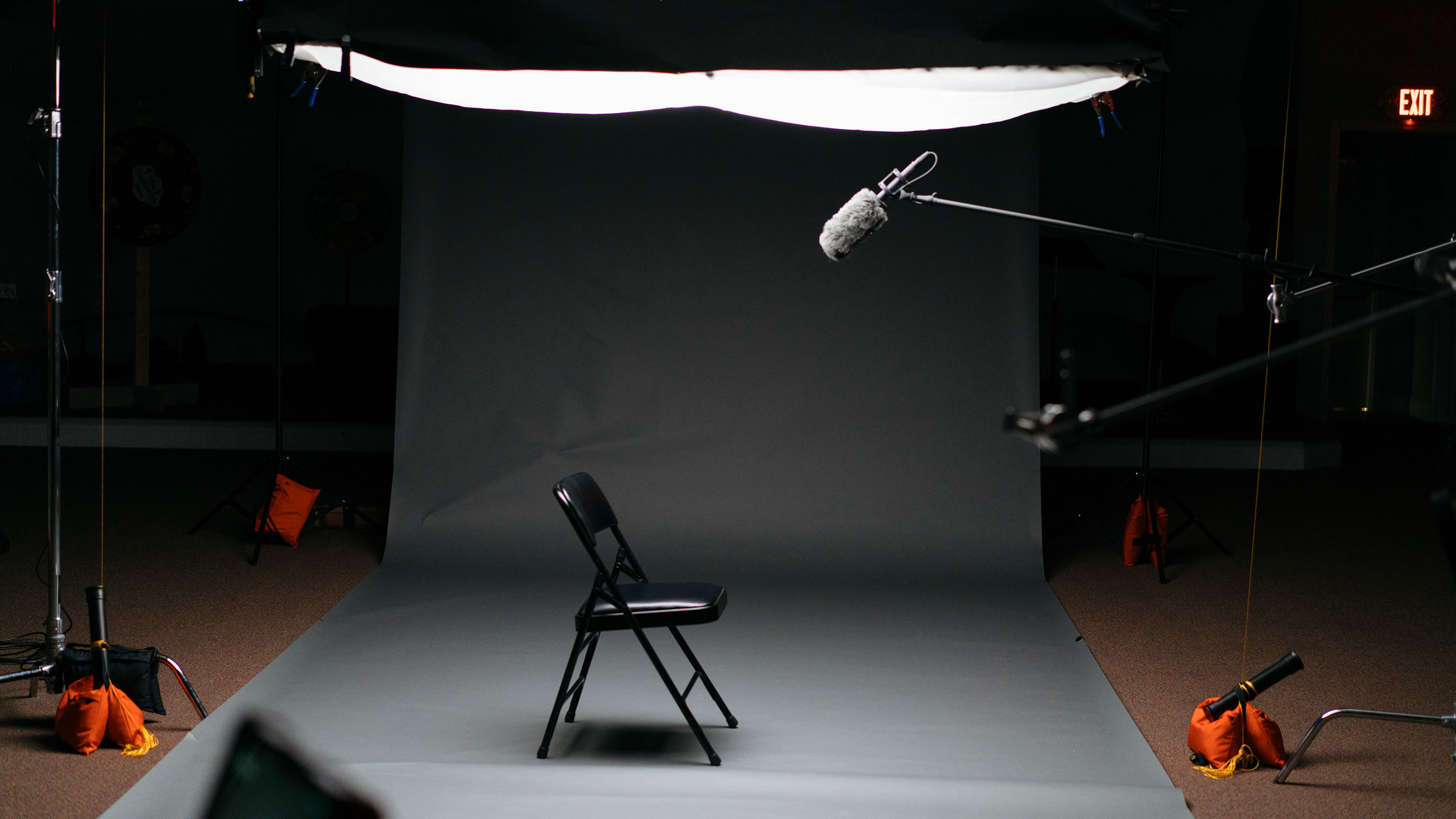
Light and dark
Remember how we learnt earlier that the first goal of composition is to direct your audience’s attention. A great way of doing this is through lighting contrast. By placing your subject in the brightest spot for the frame, you isolate them and guide the audience.
Lighting contrast has to be used appropriately. It should fit the theme and emotions that you are trying to communicate to your audience.
Typography | the style and appearance of printed matter
The art or procedure of arranging type or processing data and printing from it.
In the context of film, when thinking of typography we immediately go to the opening and closing titles. The opening credits are often the first clue you have to a film’s theme and tone, and typography is integral to that.
While the typography looks at the font, size, colours or the opening credits, they also dive deeper into finer details like the effects, how they appear on the screen and how they exit. What happens behind their showing.
The opening sequence can provide an introduction into the main character, provide a peek into the challenges that will be upcoming, or begin to tell the story.
Below is a collection of an excellent movie title sequence. Look at it. Reflect on how the typography and other effects made you feel. Do they draw you in? Spark emotion? Encourage you to stay and watch the film?

Using Canva, create a mood board with typography from older B-grade sci-fi movies (i.e. the 1950s-1970s).
Reflect on the feelings associated with this style of text.
Advertising aims to influence the target audience, encourage purchasing decisions and create impact.
Where do we begin?
Once the film has been created, it is time to begin implementing your movie promotion plan. To make your film stand out from the crowd, you need a savvy marketing strategy.
Blockbuster movies, with a wealth of money carrying them, will be able to tap into specific businesses that assist with the marketing and advertising of their film.
For an independent film creator, MasterClass has provided the following points to assist with advertising your work:
- Create a hook-filled trailer.
- Roll out your marketing campaign on social media.
- Create a simple film website.
- Stage a public event.
- Build word-of-mouth.
The film industry needs to stick together, right? So when thinking about the promotion of your film, you can talk to other filmmakers and tap into existing fan bases of film and television shows.
In an upcoming topic, we will explore finding your target audience. The research you do into the ‘hubs’ your target audience gravitates towards can be a great tool to utilise for advertising.
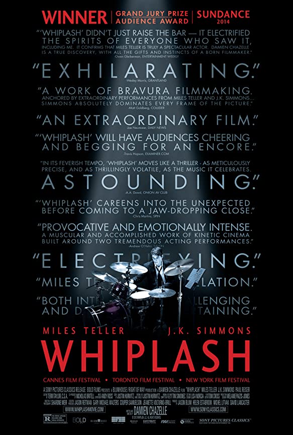
Movie posters are a key element in the film industry. Why? The movie poster encompasses the whole feeling and message of the film. Let’s break down movie posters and have a look at what they involve.
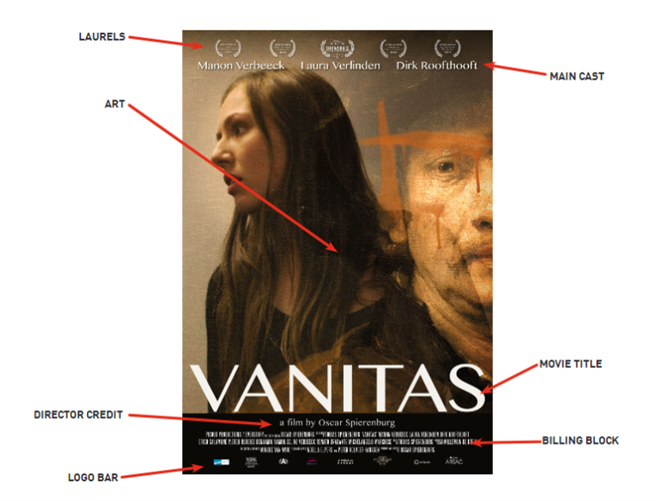
Movie title
Title of the film...pretty simple. Just make sure you place it at the lower part of the bottom half of the poster. (Book covers have the title on top and movie posters have the title on the bottom.) Also, give a lot of thought to the Typeface you plan on using for the title.
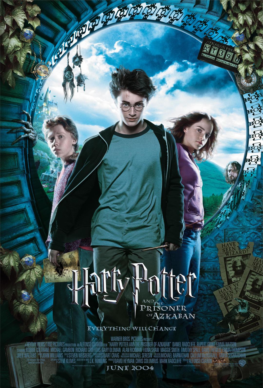
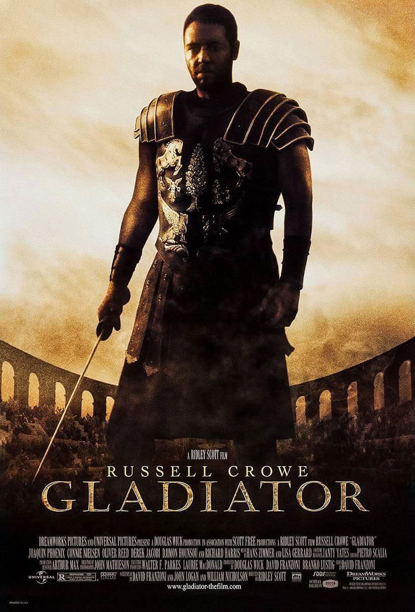
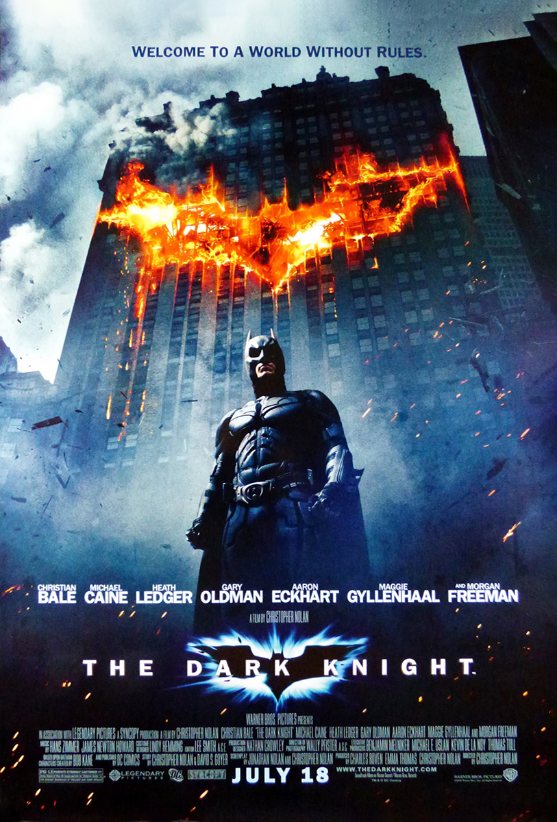
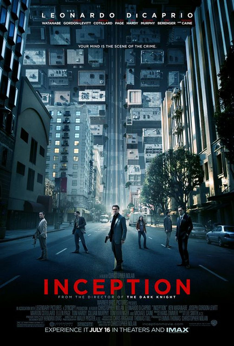
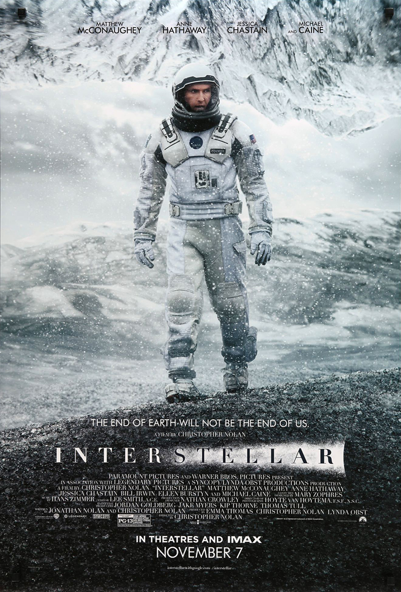
Looking at the images below. Which differences and similarities can you point out?
Laurels
Each laurel represents an award or nomination the film has received. Usually, the festival provides the vector art of the laurel for the producers of the movie. Laurels are a great sales point and also help define your target audience--a movie that won an Oscar for Best VFX most likely will have a different audience to a movie that won the International Film Festival Rotterdam.
![]()
Logo bar and billing block
The logo bar is a legal requirement for the poster. Logos from the studios, production companies and key investors must be present and in a specific order. Usually, whoever made the biggest investment goes in front.
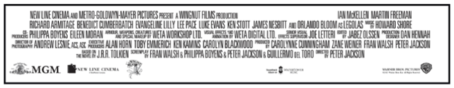
Another legal requirement of a movie poster is the 'billing block' (or credits of the film).
Can you guess the movie by the billing block below?
Director’s credit and main cast
This space is dedicated to presenting the talent that plays the main roles in the story. Many times, due to contract arrangements, some actors will have their names in a bigger size than others or be placed in a specific position. Take the Star System into consideration and think of this as a major selling point as well. Also, the director will quite often be one of the highest selling points of a movie. Many people would choose one movie over another due to the director. The director is the one responsible for bringing a vision for the story, so it’s only fair they get their credit line as well.
Extra content
- Tagline: This is a marketing strategy quite often used to help sell the film. The tagline is a selling point created by distribution companies that acts like a slogan for the movie.
- Other lines: Some movies might use extra lines such as 'based on a true story' or have a subtitle. These are placed usually close to the title or right under the main cast line.
- Reviews from critics: Movies that had a good rep in the media often use the reviews they get to help sell the movie as well.
- Opening day: The day the movie enters the circuit.