
XD is Adobe’s collaborative UI prototyping and Experience Design software. We can use XD to quickly wireframe, prototype and move from low to high fidelity mock-ups of our digital experience projects from phone apps and websites to any other device interface.
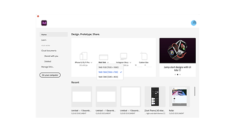
The opening dialogue box for XD contains options for opening a previous document or creating a new one.
You can create a new document using the predefined sizes or by entering a custom size. The size you are selecting is the viewport size. The viewport is the area where an app or web page will be displayed. For web pages, that will be the browser window. You can see how big your viewport is by visiting whatismyviewport.com. Notice how the viewport size changes as you make your browser window larger and smaller.
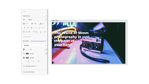
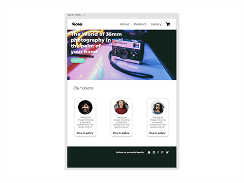
In this exercise, we are going to mock up a simple website for a camera, and it is going to look a bit like this:
Download the necessary assets here.
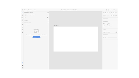
- Start by creating a new document using the Web 1366 template.
- You will see the toolbar on the left-hand side of the interface with our first artboard in the centre and properties panel on the right-hand side.
- XD’s artboards are very similar to Illustrator. You can have multiple artboards that represent the different screens your app or website will display. The artboards can be different sizes to accommodate different amounts of content or different types of devices.
- At the top of the screen, we can switch between Design, Prototype and Share. The home icon will bring up the open dialogue window.
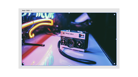
- Design is where we can draw and create our ideas and Prototype is how we can add interactivity and links to our wireframe. We will start by bringing in an image for our splash page. Use the rectangle tool to draw a box that fits the entire artboard.
- Drag the image from its folder into the new rectangle.
- Use the Text tool to add the banner text. You can adjust the Font, Color and Shadow setting in the properties panel to make it stand out. A single-click with the text tool will create point type, dragging a box will create area type. (This is the same as in Illustrator.)
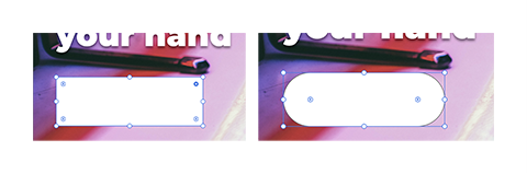
- Now, we will make a button that we can use to take visitors straight to the Shop.
- Use the rectangle tool again to make a shape under the text. Use the corner radius node to fully round the corners.
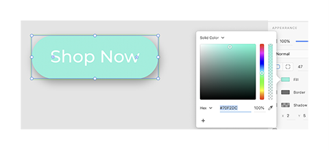
- With the rectangle selected, press ‘I’ on the keyboard to use the eyedropper. Select the teal colour from the neon background.
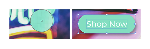
- Use the Properties panel to remove the border and give in a long shadow.
- Now put some text on top of it.
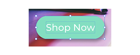
- With the button text, and the button selected, press Command+G to group the elements.
- Open the Layers panel by clicking the icon at the bottom of the toolbar.
- Right-click on Group 1 to rename it ‘Teal button’.
- Now, group all the banner elements and rename the group ‘banner’. This is the background image, the banner text and the button. You can navigate through the layers in the Layer panel by double-clicking on the folder icons to expand them.


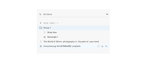
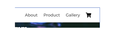
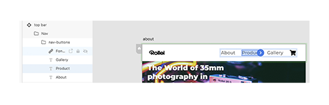
Navigation bar
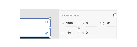
- Create a white rectangle at the top of the artboard and use the Transform section of the Properties panel to make its height 140px.
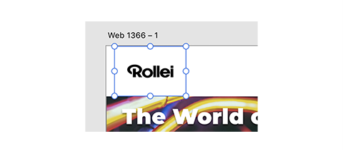
- Create another box at the right-hand end of the board and drag the logo file into it.
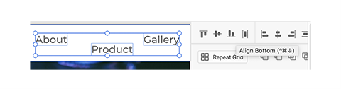
- Create 3 text elements, one for each page of the website: About, Gallery and Product.
- Use the Align tools in the Properties panel to align and distribute them evenly.
- To add a Shopping cart icon to the menu bar, open the icon.xd file and copy and paste the shopping cart icon to the Rollei page.
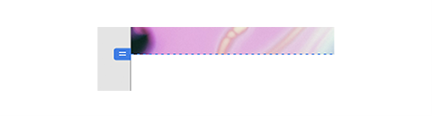
- Select all the navigation elements–group and name them. Currently, our artboard is the same size as our viewport. If we want to add some more content to the page, we need to extend it past the fold.
- Select the artboard either by selecting it in the Layers panel or clicking the artboard name above the artboard. Click and drag the bottom centre node down to extend the artboard. The viewport height will be indicated on the left side of the artboard and by a dotted line.
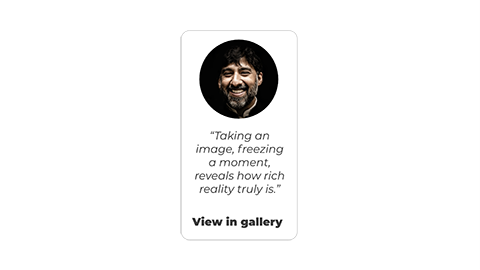
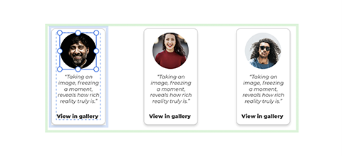
- Use the drawing and text tools to recreate the card below. Group and name it in the Layers panel.
- With the card group selected, click the repeat grid button in the Properties panel.
- Drag the right side of the green bounding box to create 3 cards.
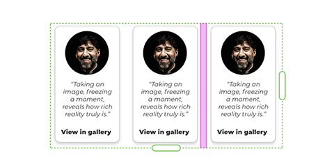
- Click and drag between the cards to adjust their spacing.
- Drag all the images from the supplied users folder into the image in the first card. Each card will now have a different image.
- Create a simple footer using the icons in the icon.xd file.
- Preview your web page by clicking the Play button above the Properties panel. (You’ll be able to scroll up and down to see the content below the fold.)


The Assets panel is where we can store elements of our design (such as type styles and colours) that we want to re-use or that should be consistent. We can also store groups of elements that we want to re-use (such as the header and footer). Any features to be consistent across all pages should be added to our Assets panel as components.
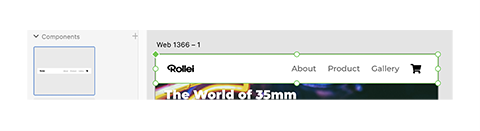
- Select the group of elements that make the header. Click the + icon in the Components section of the Assets panel.
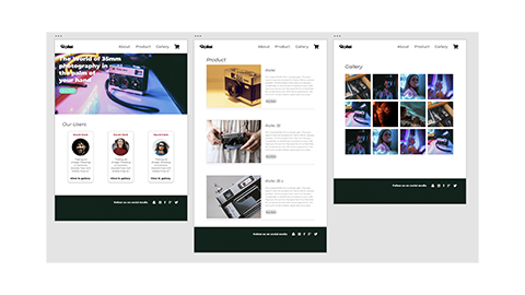
- Now use the artboard tool and single-click to the right of the current artboard to create a second artboard with the viewport dimension we set earlier.
- Drag a copy of the header from the component panel and align it on the new artboard. The original header which is still on the first artboard is the 'master' component. Any changes you make to it will be reflected in all other instances of the component. Note: It’s a good idea to delete the master component from the artboard and replace it with a copy from the component panel so we don’t risk accidentally making changes to it.
- With any other element selected, clicking either + icon next to either the Colors or Character Styles sections in the asset panel will add any of the defined styles to the asset list.
- You can edit an asset in the asset list by right-clicking on it and selecting Edit.
- Use the images and assets provided to recreate the next 2 pages.


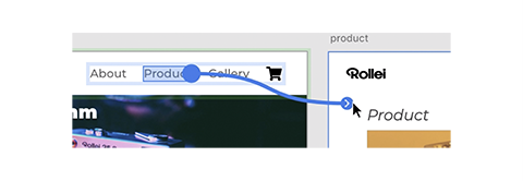
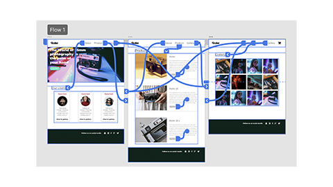
Now that we have a few pages, we can link them up using the Prototype tab.
- Click the Prototype tab in the top bar.
- Select the ‘Product’ text element in the header.
- Drag the blue arrow and drop it on the Product page.
- Repeat the process for the Gallery link and page.
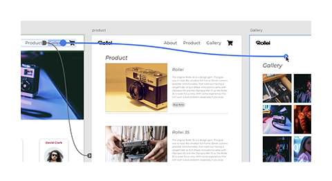
- With the first page selected, click the home icon in the top left of the artboard then press the Play button to preview the links working. Currently, the links will only work on the first page.
- Repeat the process for all pages.


A great way to make your mock-up feel more like a web page is to add hover effects. We can add hover effects to any component by adding a Hover State in the Properties panel.
New states can only be added to components.

- Create a component using the Shop Now button group.
- Click the + icon next to the Default state in the Properties panel and select Hover State.
- With Hover State selected, change the colo[u]r of the button.
- Reselect the Default State and preview your webpage.
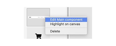
- Add hover states to your header bar by right-clicking on it in the Assets panel and selecting Edit Main component.