A common result from UX, is a product's user interface. For digital products, the user interface is the software layer that users interact with to access the product’s features and data. Over the years, patterns and paradigms have been introduced that are adopted and carried forward. As with fashion, certain visual aesthetics become popular and as technology improves, so does the ability to present interfaces in new and interesting ways.
Skeuomorphism
'Skeuomorphism' is about making a visual link between digital interfaces and the real world. It helps the user understand what the interface does and how to use it. Both macOS and Windows have used elements of skeuomorphism in their operating systems. Consider the Recycle Bin or Trash Can--to inexperienced users, it is obvious that this is where you would put things you no longer want. File and Folder icons still represent their physical equivalents.
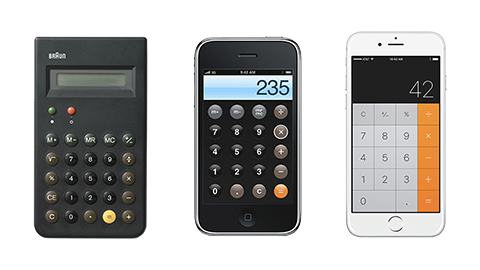
Early versions of Apple’s iOS on iPhone, iPod touch and iPad had a highly skeuomorphic interface design. Apps were designed to appear like real objects using real-world textures and lighting effects. The Calendar and Notes apps were made to look like bound books and the calculator app looked like a real calculator. Buttons and switches were often made to look and behave as if they were a physical object.
It can be argued that skeuomorphism was necessary because at the time, glass touch devices were new. Users would have been unfamiliar with the multi-touch capabilities of the products so creating interfaces that look and feel like real-world objects gave those products a level of affordance that was necessary for them to be understood.

Can you think of any other example of skeuomorphism in apps you use?
Flat UI
Flat UI is almost the opposite of skeuomorphism. It does away with textures and shadows in favour of clean typography, simple shapes, colour and girds.
Interfaces designed using flat UI principles don’t try to represent a physical equivalent or real-world object.
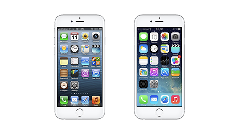
Microsoft is often credited with helping to popularise flat UI when it was used in its Windows Phone interface in 2010. Apple’s iOS7 release in 2013 also adopted principles of flat UI.

Neumorphism
Modern implementations of Flat UI often use gradients, transparency and layering to separate elements and windows. Design systems like Material by Google and the Human Interface Guidelines by Apple often include notes on how to implement colour and layers of different types of information. In these cases, it is strongly implied that the elements are 'floating on top of each other', affecting the visibility of the elements below.
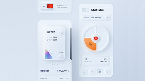
Neumorphism uses a visual style that makes elements appear to be extruded out from the same surface. It keeps the simplified visual aesthetic that Flat UI introduced, but cleverly introduces positive and negative shadow values to create the illusion depth.
This trend is relatively new, surfacing in 2019 in the form of a post on dribble.com by designer Alexander Plyuto.

His concept for a banking app interface combined a stark white interface with pops of colour and subtle shadows to create an extruded effect. The style has elements of skeuomorphism without trying to represent real-world objects. With the gradients and glows, instead, it seems to try and represent objects that couldn’t exist.
Do you know of any other interface or design trends that you have seen in apps or websites you use?

