Designing an informative website relies on many of the skills and techniques that have previously been covered in this course. Now we'll add to that understanding of design elements and principles and UX design. Let's focus on a few Web-specific principles that should be considered.
A cluttered website can be difficult to engage with. Try not to over-design by putting too many elements on the page. Remember that white space will make your designs look clean and fresh and help to highlight your content. Every element on the page should have a purpose, so avoid including things that might be distracting.
Have a look at the difference between these two car rental websites: lingscars.com and budget.co.nz.
'Consistency' is one of the principles of interaction design and is an important consideration for all types of design. Applying consistency to your fonts, sizes, headings and colours will make your pages easier to understand and feel familiar. Once you have decided on a style for your buttons, links, images and text, stick to it!
Every product page on the trademe.co.nz marketplace has the same layout, fonts and colours. It is very consistent.
ebay.com users have more control over how their listings are presented. This can make it feel inconsistent when looking at an item's description.
Compare the 2 sites:
Websites are usually for reading. Text is particularly important, and you must make it easy for your users to read. Choose highly legible fonts. (Remember, modern sans-serif fonts often look great on the web.) Choose fonts that work well together and avoid using too many fonts. It is better to use a few different weights of one or two fonts than to find a new font for every element.
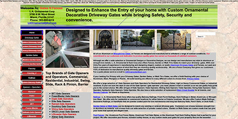
Take a look at gatesnfences.com. This site has a lot of poorly formatted text with very little hierarchy. It is difficult to see how important each element is.


There is a good chance that any website you design is going to be viewed on a mobile device--the first interaction a user will have with your site will probably be on a phone or tablet. It is important to design your pages to adapt and respond to both mobile and desktop-sized browsers.
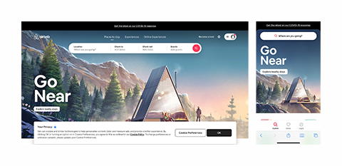
airbnb’s website is accessible on both mobile and desktop browsers (see below). The layout, colours and typography are consistent.

The mobile version has fewer input fields and simpler navigation elements that are more suited to touch-based interaction.
Most modern web templating systems (like Wix, SquareSpace and Webflow), have easy to use tools for applying responsive design techniques.
Responsive design techniques can also be implemented using CSS media-queries, grids and percentage-based sizing in CSS. (These more advanced techniques are covered in Yoobee’s Level 5 and Level 6 programmes.)

Whether your website is a single page or multiple pages, easy and effective navigation remains important. Make sure it is clear where your users are on your site, and how to get to where they want to go. Using breadcrumbs can be helpful on large websites or following the 3-click rule so that users are never more than 3 clicks from the content they are looking for.
Creating a sitemap of all your pages will give a better idea of how easy your site is to navigate.
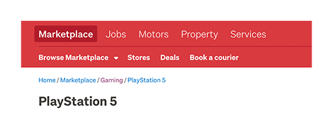
As an example, each listing page on trademe includes breadcrumbs near the top of the page.

This allows a user to see where they are on the site and navigate back to widen their search.

