For creative people, a portfolio is how you highlight your skills and achievements. It demonstrates your abilities to potential clients, colleges and employers. It is an opportunity to show your versatility, creative flair and the amazing work that you have completed.
Your portfolio should be an extension of you, your successes, your creative process and how you solve problems. When looking for a creative job, or continuing to study, your portfolio is the first connection you will make with a client, workplace or course.
It allows people to be introduced to you and get a feel of what you are all about.
A portfolio will often include examples of your work, information about yourself and contact details so that you are reachable.
Problem-solving skills are becoming increasingly important to employers. Sharing aspects of your design process alongside your final work can give potential clients and employers a valuable insight into your approach to solving problems while working within project constraints.
Portfolios can be shared in a variety of formats. It could be a physical document, a digital document, a video or a website containing your content.
Here are some tips from CANVA.

Be thoughtful about what you include
As excited as we all get about what we have done, consider what the work you are including says about you and if it will be appealing to your intended audience.
Select only your strongest pieces
Goes without saying, but if you have work that is not your best, best to leave it out.
Showcase your most unique and creative work
A portfolio is an opportunity to showcase what you are proud of. Make sure you include work that will make people think, 'Wow, now this is cool!'
Go for variety
When displaying your work in a portfolio, diversity is important. If you have a particular style strength, then ensure you show variety in that style. Include a variety of techniques that can show off your work.
Stay current
The projects that you include in your portfolio should depict the current trends and styles. Ensure that your portfolio is interesting and up to date.
Simplicity is key
Remember whitespace is your friend. Not every space in your portfolio needs to be filled. Having clear spaces helps direct the audience's eyes to focus on where you need them to.

Snap a pic
If you have printed pieces that you would like to use in your portfolio–take some pictures. You can create professional-looking photoshoots from your own home with a phone camera. Think about aesthetics, plain backgrounds, adding in some flowers or texture and making your work the focus.
Non-client work is ok
The work you include in your portfolio does not need to be paid client work. Show off what you can do by including work you have done for friends, volunteer work and personal projects. You can include work that is inspired by big brands, just remember to always consider copyright.
The 'Halo Effect' is an interesting social psychological theory that describes how humans tend to associate positive attributes with people they are attracted to. It is a form of cognitive bias that affects the way people perceive not only other people, but anything that can be engaged with.
The more aesthetically pleasing something is, the more likely we are to believe that it is of a high quality.
Aesthetics in your portfolio is important–it creates a connection and attraction to your audience. Because your portfolio is a personal representation of you, your creative flair and what qualities you have, the aesthetics of your portfolio should keep your audience engaged. If your portfolio is messy, uneasy on the eyes and not organised, it will be hard for an audience to remain engaged. A clean portfolio that has a nice look and feel will keep your audience engrossed and wanting to read more.
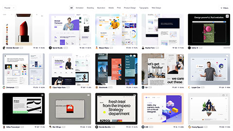
Online platforms are a fantastic way to start exploring different aesthetics and styles to present your portfolio.

You should definitely look at these platforms:
Exploring different platforms will help you see what is 'out there'. You can see what style appeals to you and will best represent your work. The more you expose yourself to distinctive styles and creative ways of presenting work, the more able you will be to come up with your concepts.
The following video provides more platforms and ideas for you to build on.
Colour is an essential element to consider when designing your portfolio. Colour can connect people to objects, images and scenes as well as ignite emotions. Let's remind ourselves of how to use some familiar colours:
- Red is typically seen as a colour of passion, danger, romance or violence.
- Green can relate to either nature or sickness.
- Blue is linked to calm or depression.
- Yellow is warm and inviting, or a warning.
- Purple is often connected with royalty.
When creating a portfolio, the colours you choose can help or harm your work. There are amazing techniques when playing with colour.
When choosing the background of your portfolio, consider a colour that will not distract viewers from your work. Background colours such as light and dark greys, white, black and neutral tones allow the focus to be on your work.
A good starting point is to choose backgrounds that contrast with your work. Think about opposites: if your work is brightly coloured then choose a muted colour to help your work stand out, and vice versa.
The table below gives a broader explanation of the 'language' of colours.
| Colour | Meaning |
|---|---|
| Red | Anxiety, arousing, daring, dominant, energy, excitement, health, life, love, passion, power, protection, spirited, stimulating, strength, up-to-date, danger |
| Orange | Abundance, arousing, comfort, daring, excitement, extraversion, fun, happiness, lively, security, sensuality, spirited, warmth |
| Yellow | Arousing, cheerful, confident, creativity, excitement, extraversion, friendliness, happiness, optimism, self-esteem, sincerity, smiley, spirited |
| Green | Calm, comfort, equilibrium, harmony, health, hope, nature, outdoorsy, peace, prosperity, relaxation, security, serenity, soothing, tender |
| Blue | Calm, comfort, competence, coolness, dignified duty, efficiency, intelligence, logic, peace, reflection, relaxation, reliability, security, serenity, soothing, successful, tender, tranquillity, trust |
| Purple | Authenticity, charming, dignified, exclusive, luxury, quality, regal, sensuality, sophistication, spiritual, stately, upper class |
| Pink | Charming, cheerful, feminine, gentle, nurturing, sincerity, soft, sophistication, tranquillity, warmth |
| Brown | Nature, outdoorsy, reliability, ruggedness, security, support, tough |
| Black | Dignified, efficiency, elegance, emotional safety, glamour, power, richness, ruggedness, security, sophistication, stately, substance, tough, upper class |
| White | Calm, clarity, cleanness, down-to-earth, happiness, heavens, honesty, hygiene, innocence, peace, purity, serenity, soothing, tender |
'Layout' refers to the way in which text or pictures are set out on a page. The purpose of layout is to distribute the text, images and other content on a page to achieve a clear and legible composition.
Strong composition is achieved when the elements and principles of design are used to enhance the look of the individual objects and the objects as a whole.
As you'll see in the video below, whether you're designing a page for print or a website, there are some common principles you can apply to ensure balance.

Using the information above, create a mood board for your portfolio in CANVA. Begin by selecting a colour scheme and layout that resonate with your style. Then include the moods that you would like, using either your own work or inspired pieces from Pinterest.

