
In this topic we will cover:
- Principles of effective web design
- Web Design Process Breakdown
- Stakeholder mapping
- Information gathering
- Use cases
- Project (proposal) definition
- Content strategy
- Layout planning
- Coding and development
- Testing and launch.
What makes a website beautiful?
Like the phrase ‘beauty is in the eye of the beholder’ effective web design is judged by the website's users and not the website owners. Many factors affect the usability of a website, and it is not just about form (how good it looks), but also function (how easy it is to use).
‘Design is not just what it looks like and feels like. Design is how it works.’ Steve Jobs
Websites that are not well designed tend to perform poorly and have sub-optimal Google Analytics metrics – high bounce rates, low time on site, low pages per visit, and low conversions. So, what makes good web design? Pay attention to the following principles to make your website aesthetically pleasing, easy to use, engaging, and effective.
Purpose
Good web design always caters to the needs of the user. Are your web visitors looking for information, entertainment, some type of interaction, or transacting with your business?
Each page of your website needs to have a clear purpose and fulfil a specific need for your website users in the most effective way possible.
Communication
People on the web want information quickly. Communicate clearly and make your information easy to read and digest.
Some effective tactics include; organising information using headings and subheadings, using bullet points instead of long windy sentences, and cutting the waffle.
Typefaces
The typefaces you choose should be legible at the very least. In general, Sans Serif fonts such as Arial and Verdana are easier to read online. Consider line length, line spacing, and kerning. The ideal font size for reading easily online is 16px and stick to a maximum of three typefaces in a maximum of three-point sizes to keep your design streamlined.
Colours
Limit how many colours you use. It is recommended to use a maximum of five (+/- two) colours in your website design. A well-curated colour palette can go a long way to enhance the user experience.
Using contrasting colours for the text and background will make reading easier. Vibrant colours create emotion and should be used sparingly – Such as for buttons and call-to-actions. Last but certainly not least, white/negative space is highly effective at giving your website a modern, uncluttered look.
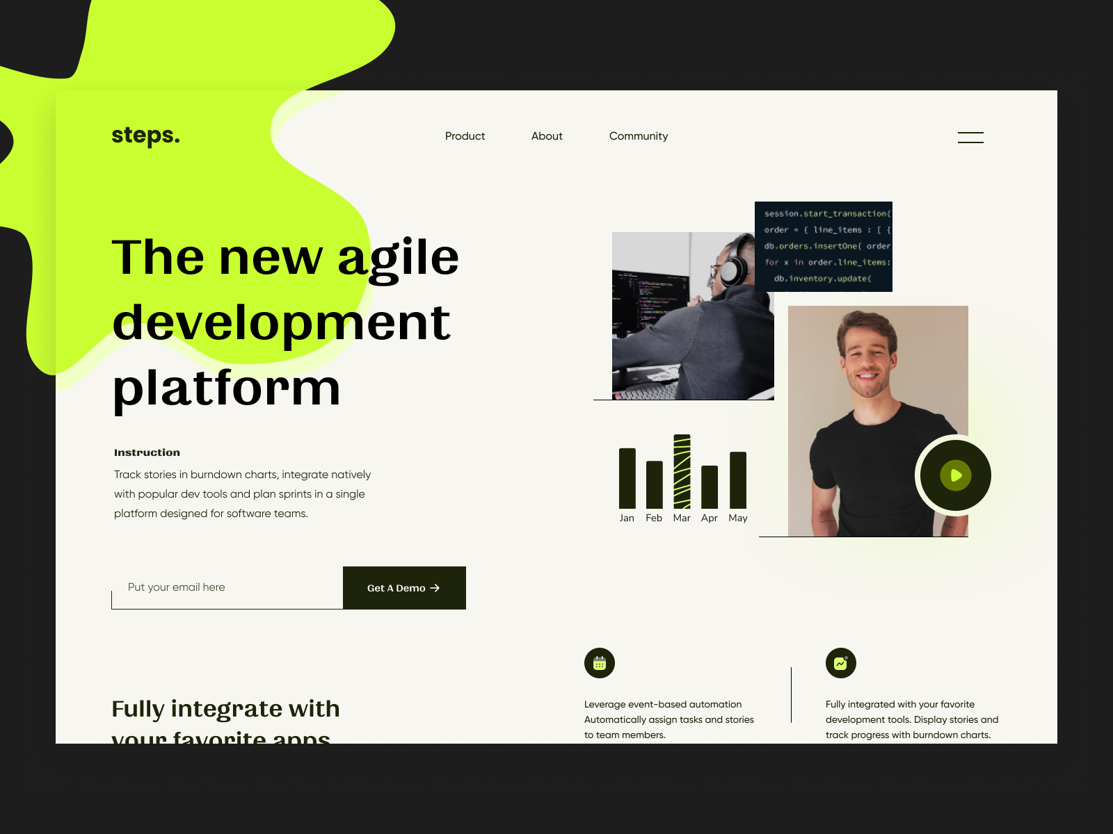
Images

Choosing the right images for your website helps with brand positioning and connecting with your target audience. If you lack high-quality professional photos, consider purchasing stock photos to lift the look of your website.
Think about using infographics, videos, and illustrations. These can often be much more effective at communicating than even the most well-written piece of text.
Navigation
How easy is it for people to move around your website? Some tactics for effective navigation include a logical page hierarchy, using breadcrumbs, designing clickable buttons, and following the ‘three click rule’ – Can users find the information they are looking for within three clicks?
A clear navigation system has to answer two questions instantly: ‘Where am I?’ and ‘Where can I go from here?’ If you get this information at a glance, the navigation is great.
Grid based layouts
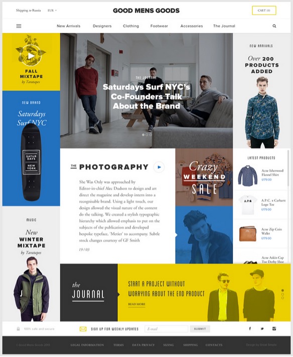
Placing content randomly on your web page can lead to a messy haphazard appearance. Grid-based layouts arrange content into sections, columns, and boxes that line up and feel balanced – leading to a better-looking website design.
When text and images are aligned in a way that the overall impression translates into clarity, harmony, and comfort, the website gets credits. A well-organized website has an invisible grid underneath it.
“F” pattern design

Eye-tracking studies have identified that people scan computer screens in an “F” pattern. Most of what people see is in the top left of the screen and the right side of the screen is rarely seen.
Rather than trying to force the viewer’s visual flow, well-designed websites will work with a reader’s natural behaviour and display information in order of importance (left to right, and top to bottom). However, this is culturally specific so consider localised design. For example, Arabic is the fourth most popular language globally and read right to left (Worrick 2020). Eye-tracking studies with Arabic readers have revealed a tendency towards a flipped “F” pattern. 1
Pernice (2017) from Nielsen Norman Group points out that studies have shown there are other scanning patterns in addition to “F” shaped, including:
- Layer-cake: Scanning headings and subheadings and skipping normal text.
- Spotted: Skipping big chunks of text and looking for something specific such as hyperlinks, digits, or sets of words in a distinct shape (like an address).
- Marking: Eyes focused in one place as mouse scrolls or finger swipes the page. This is more common on mobile than desktop.
- Bypassing: People deliberately skip the first words when multiple lines of text start exactly the same.
- Commitment: Fixating on almost everything on the page. This occurs when people are highly motivated or interested in the content. This is rare.2
Load time
If you can make yourself a cup of tea while waiting for a website to open entirely in your browser, there is something amiss. Either you have an extremely slow Internet connection, or the website is way “too heavy.” Even today, with super high-speed Internet, a website should be built light and fast.
Speed up page load times by optimising image sizes (size and scale), combining code into a central CSS or JavaScript file (this reduces HTTP requests), and minifying (compressing) HTML, CSS, and JavaScript.
Mobile friendly

Accessing websites from multiple devices with multiple screen sizes is commonplace, so it is important to consider if your website is mobile-friendly. If your website is not mobile-friendly, you can rebuild it in a responsive layout (this means your website will adjust to different screen widths) or you can build a dedicated mobile site (a separate website optimised specifically for mobile users).
Consistency
Is the overall visual impression of the website the same from page one to page “end?” Or does the design change drastically? Are text and images displayed differently?
The design concept of a website mimics that of a book – it must be consistent from the first to the last page.
Browser compatibility
All browsers are different, and they all allow different rules and code in websites. So sometimes websites look good in Safari but look terrible, or will not even show up, in Microsoft Edge. Professional web designers know this and only use code that will be interpreted in the very same way in all browsers. Check a website in all browsers to see how it performs.
It is easy to create a beautiful and functional website, simply by keeping these principles in mind.
The art of making decisions
We often sit, paralysed by our own indecision (or creative block), waiting for that 'Ah-Ha!' moment where a design will just come to us or click. To become a better designer is to become better at making decisions.
When you analyse a situation, you make a series of quick decisions and come to an outcome. How do we make those decisions and how can we improve our decision making? Making decisions with increased calibre done in less time – more efficient design.
Experience
We use our past experiences to help create present designs. Improve your ability to draw on experience by:
- Having more experiences
- Design from outside your comfort zone
- Learn from other art forms.
Reference
The obsession with being up to date with new products, trends, and styles, makes designers powerful. Add to your toolkit by:
- Be actively looking for inspiration
- Find new sources.
Intuition
Designing based on intuition is probably the best way to work fast, and get stuff done quickly. Our intuition tells us what to do by having us “feel good” about something. Develop your intuition by:
- Education
- Familiarisation
- Feeding your experience and reference.
Experience, reference, and intuition form a design conscience that informs the decisions we make. A healthy design conscience means smarter, more efficient design and reduced creative block.
Spend some time creating your own strategy for how you are going to develop your decision-making process.
Website analysis
In this activity, you will analyse the effectiveness and responsiveness of websites in relation to their identified primary purpose.
Your task
Review 3 websites of your choice. Choose at least one good and one bad website to get a good comparison.
Write down a score on a scale of 0-10, reflecting how the website rates on each of the twelve principles. 0 being the lowest, ten being the highest.
Principles of effective web design:
- Purpose
- Communication
- Typefaces
- Colours
- Images
- Navigation
- Grid-based layouts
- “F” pattern design
- Load time
- Mobile-friendly (responsiveness)
- Consistency
- Browser compatibility.
Comment on what is working well and what could be improved. How could the website be more engaging, useful, and memorable for visitors?
Share your analysis in the forum.

Where do we start?
The web design process starts with knowing your client and having a clear, shared vision and strategy. How will the website achieve the client’s goals and optimise user experience?
Information is gathered through key stakeholder interviews. But wait! Before you jump into stakeholder interviews, you need to identify the key stakeholders.
What are stakeholders?
Stakeholders are those people, groups, or individuals who either have the power to affect or affect the product you are creating. Stakeholders are also known as primary and secondary target audiences.
They range from the head of your organisation to the man on the street who may experience the effects of what you set out to do. Stakeholders can affect your endeavours to varying degrees, and the degrees should be considered when analysing and mapping out the stakeholder landscape.
Think of all the people who are affected by your work, who have influence or power over it, or have an interest in its successful or unsuccessful conclusion.
Stakeholder types

- Core stakeholders are part of the direct stakeholders. They are entities that have a visible role in the organisation, regulation, operation, and support.
- Direct stakeholders are people, communities and entities that use the service or are impacted by it – The target audience. You may create personas to represent groups of direct stakeholders that have things in common.
- Indirect stakeholders are anyone else whose interests are either enhanced or threatened. They may be more difficult to identify and engage with.

Once you have identified your stakeholders, it is time to gather the information that you would want to determine the primary purpose of the web design. You may discover more stakeholders to add to your stakeholder map during this stage.
Avoid making assumptions about what the client wants. Instead, meet with them (face-to-face or virtually) and discuss the requirements and scope of the website (re)design.
Questions to ask your client:
- Do you have current branding? Including logo, website, signage, stationery, and brand guidelines.
- If they do not have current branding, or need an update – Do you have any preferred direction? Including colours, imagery, or logo ideas.
- What is the message you would like to convey?
- Do you have a point of difference you would like to focus on? For example, special service, sustainability, or locally sourced/produced.
- What service(s) do you offer?
- What will the primary purpose of the website be? For example, bookings, presence on the internet, e-commerce, to inform.
- Are there any specific details you would like included on the website, such as history, prices, or testimonials?
- Do you have any imagery or assets you can supply?
- What are the call-to-action (CTA) details, such as forms and contact details?
In addition to client interviews, you should also complete research about the market position and an analysis of competitors’ websites. Identify the primary and secondary target audience. Use this information to create personas and use cases to assess who will use the website and how.
What are use cases?
A use case is really just a list of the steps a user might take to achieve their goal on your site/app.
How to write them?
Write the steps in a use case in an easy-to-understand narrative. Kenworthy (1997) outlines the following steps:
- Identify who is going to be using the website.
- Pick one of those users.
- Define what that user wants to do on the site. Each thing the user does on the site becomes a use case.
- For each use case, decide on the normal course of events when that user is using the site.
- Describe the basic course in the description for the use case. Describe it in terms of what the user does and what the system does in response to what the user should be aware of.
- When the basic course is described, consider alternate courses of events and add those to “extend” the use case.
- Look for commonalities among the use cases. Extract these and note them as common course use cases.
- Repeat steps 2 through 7 for all other users.3
Project scope
Once the interviews and research are complete, they are formatted into the project scope. Why is this important?
A written (and signed) project scope is an agreement between you and the client. It is evidence of a shared understanding of the requirements, and without it, you risk misunderstandings and scope creep. What is scope creep? Lots and lots of revisions. Some are minor, but they add up to a lot of time, money, and confusion. And most importantly, it takes you further away from achieving the primary purpose of the website (re)design.
The scope is helpful to set boundaries, manage expectations and get buy-in, reduce project risk, budget and resources appropriately, set out primary objectives and goals, prevent scope creep, and establish a change request process.
You should include the following in your project scope.
- Key details. Project name, owner, and start date.
- Project overview/summary. Who is the website for and what does it need to do?
- Target audience. Primary and secondary personas. May include demographics, psychographics, and surveys.
- Goals/objectives. How will you measure success? Keep goals SMART – Specific, measurable, achievable, relevant, and time-bound.
- Competitor analysis. Identify gaps and shifts in the market. What are the strengths and weaknesses of the competition?
- Out-of-scope/exclusions. Is there anything not covered? For example, you build a client website but will not provide hosting once the website is launched.
- Outline of required functionality/workflow. Use cases to identify personas and how tasks are achieved on the website. Walk through the user experience step-by-step.
- Priority level. A website can be built and released in stages. What features are the highest priority and must be released early, and what can be pushed back?
- Roles and approval process – Who does what, and who needs to sign off at each stage? Who is providing the content, and by when? Will there be additional charges for redesigns/revisions? How many reviews/revisions are fair?
- Timeline. Map out a realistic schedule with key milestones and dates identified. Deadlines should be realistic and necessary; otherwise, you are setting yourself up for stress and failure.
- Budget. Project cost. Will there be additional charges for revisions?
- Technical requirements. Is the website public-facing or online for members? Are there any applications the website must integrate with, such as a Customer Relationship Management (CRM) system or Application Programming Interface (API)?
- A place to sign (you and the client!) After all the project scope is an agreement.
Stakeholder mapping and use case
In this activity, you will identify stakeholders and map them to the core, direct, and indirect stakeholders. You will identify the primary and secondary target audience for a web design solution and create use cases for them.
Your task
Select one of the websites you completed website analysis for in the previous Creative Activity.
Identify the website's core, direct, and indirect stakeholders and map them in the following graph.
Identify the primary and secondary target audience for the website. Create personas to represent these audiences.
Follow Kenworthy’s steps to create a use case for primary and secondary personas.
Kenworthy’s steps to writing use cases:
- Identify who is going to be using the website.
- Pick one of those users.
- Define what that user wants to do on the site. Each thing the use does on the site becomes a use case.
- For each use case, decide on the normal course of events when that user is using the site.
- Describe the basic course in the description for the use case. Describe what the user does and what the system does in response to what the user should be aware of.
- When the basic course is described, consider alternate courses of events and add those to “extend” the use case.
- Look for commonalities among the use cases. Extract these and note them as common course use cases.
- Repeat steps 2 through 7 for all other users.
Share your stakeholder mapping and use cases in the forum.
The content of the actual webpages consists of the copy (text information) and sourced images. Here are some strategies you can put into practice when putting together your content.
Typography without words is meaningless
And websites without words are not as effective.
The written copy includes:
- body text
- image captions
- navigation labels
- headings.
It is essential to a successful web design solution. Well-written copy, presented with effective typography, helps create an aesthetic user experience.
The quality and conciseness of written copy contribute to the tone of voice and reflects the depth of understanding of the primary audience. Good written copy facilitate call to actions and help the user identify what needs to be done and how.
Good copy is engaging
Too often, website copy is too lengthy or corporate for its primary audience.
People tend to scan text on a screen rather than reading it in full, and many websites have far more copies than is needed. All content should have a clear purpose. If it is superfluous, cull it.
It is up to both the client and the design team to understand the copy's purpose. Determine an appropriate depth and tone of voice. Should the tone be conversational and informal? Or corporate and formal?
Style and branding guidelines should include clear guidance on written copy style. This means that copywriters can give clear instructions to produce appropriate material tailored to the primary audience.
Know how much copy is required so it can be accommodated in the layout design. Except for news sites and blogs, most websites do not need a lot of text.
The art of copywriting
Copy needs to be in a tone and level appropriate to the primary audience. It should be concise, scannable, and readable so that users do not get confused and give up.
Consider copy in two groups:
- Content
- Labels.
Copy for labels such as icons, image captions, headers, and subheaders must be short and easy to understand. Compare the labels “return to level one” and “home”. Which one is friendlier, more inviting, or easier?
Copy for content such as body text, needs to be short, concise sentences. Paragraphs should have no more than five or six sentences. Keep the “F” pattern in mind and use white space.
Sourced images and copy
Within the project scope, you will define who will provide a copy and when. You will also have established whether the client has high-quality images they are providing or whether you are sourcing images.
Free, high-quality images can be sourced from unsplash.com for commercial and non-commercial purposes. FancyCrave is another online resource providing high-quality images for free. If the budget allows, you may wish to purchase images from Shutterstock or other stock image libraries.4
Layout planning
What are some ways you can put together the decisions on planning your website layout?

Mood boards and ideation
Research and create mood boards to convey visual themes and ideas for image style, typography, colour palette, and layout. Analyse good websites and take inspiration. Mood boards are useful to get the overall visual idea in front of your client before going ahead with the design.
Sitemaps
With your scope defined and content sourced, create a sitemap so you have an outline of what pages are needed and where they should go.
A sitemap is a list of pages of a website. There are three primary kinds of site maps:
- Sitemaps are used during the planning of a website by its designers.
- Human-visible listings, typically hierarchical, of the pages on a site.
- Structured listings intended for web crawlers such as search engines.
Create an accurate sitemap before wireframing to know what to include and where each page sits in the page hierarchy. A sitemap visually communicates which pages link together.
Sitemaps illustrate the organisation of a website. The most common types of website organisation are hierarchical, linear, and random (also known as web organisation).5
Hierarchical
Hierarchy is the most common way to organise a website. A clearly defined home page characterises it with links to significant site sections.
Avoid a shallow hierarchy with too many major site sections and instead focus on chunking content into fewer, easily managed topics. Three of four items (or chunks of items) tend to be manageable for most users. Likewise, avoid deep hierarchies which break the “3-click rule” and can result in frustrated users.


Linear
Pages are viewed one after the other. This is useful when all information needs to be presented in a defined order such as a tutorial or tour. Occasionally a website will have a hierarchical structure overall, but linear organisations in selected areas.

Random
There is no clear path, no obvious home page, and no discernible structure. This is not a common structure and is usually only found on a website that strives to be different and original.

Web navigation
With the sitemap produced, think about how you will communicate this to users. Web navigation is the way a user finds their way (wayfinding) and/or is guided around a website.
Navigation can be considered in three parts.
- Where am I? (Present)
- Where can I go? (Future)
- Where have I been? (Past)
Web navigation is not just about the primary “menu”. Navigation cues appear in many forms such as menus, icons/symbols, words, quick links, and buttons.
Effective navigation considers the audience
Consider what your target users are accustomed to using and what they will find easy (and hard) to use. Think about the position, appearance, actions, and naming conventions of labels. If web conventions are not applied, ensure the navigation is intuitive and easy to learn.
Think about e-commerce. When you add an item to the cart, you expect two options – “Continue shopping” and “View cart and checkout”. If you choose to checkout at a point after this, you know to look for a symbol of a cart or basket. What happens if you do not receive the two options to continue shopping or view cart and checkout? Or if the cart and basket are replaced by a symbol of a till? In both cases, you would probably figure it out eventually, but it is going to require a bit more work.
How can you direct or guide users to achieve the primary goals of the website?
Reduce complexity. What is important enough to be seen? Group and categorise the content.
Leave a trail
Indicate to the user where they are located. This can be achieved by:
- Menu appearance. Change the colour and/or appearance.
- Breadcrumbs.
- Page and section headings.
- URL (page names).
Is it responsive?
Consider changing the navigation structure for responsiveness. Does navigation need to be structured differently for varying viewport sizes? Or can it work effectively with just one?
Wireframes and mockups

Start sketching! Produce as many wireframes as possible. Use ideation techniques such as crazy 8s to generate a lot of ideas.
Mockups (and prototypes) are valuable artefacts to create before developing your site. It takes a little time to make these artefacts – but in the long run, it is much quicker than "playing around" in the development stage with colours and other design elements. You should know exactly what to code with all design and functionality decisions already made by the development stage.
Wireframes communicate:
- the framework
- layout
- functionality.
Mockups communicate:
- colours
- typefaces
- button styles
- and other design decisions.
Prototypes provide something tangible to test and communicate your vision.
Check out Sneakpeekit for printable grids for wireframing.
Before moving on to coding and development, check in with the client. Recap the project scope, and share mockups, wireframes, and prototypes. Most importantly, encourage feedback and design iteration before development begins.

You are ready to start coding
Always allow yourself enough time to code as it may be the longest phase.
A web developer will code the site to make it function and run smoothly. It is one of the most exciting steps in the web design process as your design comes to life. Following the sitemap, a home page is designed first, followed by the other pages according to the site hierarchy.
Content Management System (CMS)
CMS platforms like WordPress and Webflow make it easy for people without coding experience to build a website through drag and drop interfaces. However, if you want to develop a unique, bespoke website that looks professional, you will need to develop your coding skills.
You can edit WordPress code to get more control over how the site looks and functions. Some CMS platforms such as Joomla and Drupal allow developers to build highly customised sites – but you will need to know how to code if you want to create something complicated and bespoke.
Watch the video below, and pay attention to why a CMS is important when developing a website.
Search Engine Optimisation (SEO)
Search Engine Optimisation, or SEO, is about making your site better for search engines like Google. By making small modifications to your website (particularly the coding), you can increase performance in search results and drive traffic to your site.
But it is not just about increasing random visitors to your page. Good SEO will ensure your target audience finds you and help meet the website's primary goals.
Search engines use bots to crawl web pages, collecting information and collating pages into an index. Algorithms analyse pages in the index and determine the order a page appears in a search result. You can help your website rank well (and appropriately) by:
- Considering the words you use in written copy
- Writing meaningful titles in the code
- Making links meaningful – Not “click here”
- Building relationships with other sites and producing fresh content that gets linked.
Coding
HyperText Markup Language (HTML) and Cascading Style Sheets (CSS) are the building blocks of websites. The arrival of HTML5 and CSS3 represents a dynamic and powerful evolutionary stage in web design development.
HTML5 and CSS3 make it possible to apply styling and formatting, present audio and video, and create animation and interactivity in ways that were not previously possible without stringing together plugins, image files, and JavaScript.6
The builder, the artist, and the wizard
Watch the video for a short intro to the three coding languages.
To recap, HTML, CSS, and JavaScript are code languages and are used in front end web development – what you see when you land on a page. Back-end development (or server-side development) is what makes a website work – databases, backend logic, APIs, and servers.
Web browsers translate these languages. Different browsers translate code differently, so it is important to check how your website looks in different browsers.
Code languages evolve over time. The World Wide Web Consortium manage best practices for front end web development.

Testing
You will have tested throughout the process in an iterative design process, particularly during the design and development stages. Testing prototypes and coding as you create them. Once you are happy with your website, but before going live, you should do a final test. Run through the website with your peers and test users, checking everything start to finish (including hyperlinks!)
Nothing devalues a brand more than a site that does not function properly, has misspellings, or has broken design elements.
It is essential to validate your website on various devices, browsers, and operating systems to ensure it works smoothly regardless of how your target audience uses the site. Combine manual browsing of the site on various devices with automated site crawlers to identify everything from user experience issues to simple broken links. Use code validators to ensure your code follows current web standards and conventions.
Launch
Now it is time to see all your hard work come to fruition – make the website live!
Maintenance
After a site is launched, it still needs to be maintained, reviewed, and content kept fresh. This may or may not be part of the project scope. You may need to draw up a new agreement with the client for maintenance services. Or perhaps part of the project deliverables is to hand over the source code and project documents to the client for them to maintain.
Web design is an ongoing process where updates and changes need to be made regularly to keep up with the market environment and target audience.
In this topic, we summarised the principles of web design including the importance of a clear purpose and communicating information quickly.
We also learned about typefaces, colour, images, navigation, grid-based layout, and F-pattern design. Good web design also considers load time, mobile responsiveness, consistency, and cross-browser and cross-device compatibility.
We reviewed the web design process from stakeholder mapping through to testing and launch. Some key takeaways from this section included:
- How to map core, direct, and indirect stakeholders
- Information gathering
- Creating use cases
- Project scope
- Content strategy - including the art of copywriting
- Layout planning - including sitemaps (shallow, deep, linear, random hierarchy) and navigation.
- Methods for developing layouts using wireframes and mockups.
- A brief introduction to Content Management Systems, Search Engine Optimisation, and coding languages HTML, CSS, and JavaScript
- Testing and launching. In an iterative design process, you test throughout the design process. You test prototypes and coding as you create them. Test cross-browser, operating system, and device. After launch, a site needs to be maintained, reviewed, and content kept fresh.
Knowledge check